9,691 search results
(0.031 seconds)
- Anacostia NF by Nick's Fonts,
$10.00The 1923 Barnhart Brothers & Spindler specimen book called this typeface "Cardstyle", and suggested its use at small sizes for business cards. It also work quite well in large sizes when a warm, casual antique feeling is called for. Named for a river that flows through Washington, DC. Both versions of the font include the 1252 Latin and 1250 CE character sets (with localization for Romanian and Moldovan). - ITC Stenberg by ITC,
$29.99ITC Stenberg was designed by Tagir Safeyev based on the forms characteristic of the Constructivism in the early days of the USSR. The brothers Vladimir and Georgii Stenberg were two of the creative artists of this movement who were turning older forms to revolutionary use. ITC Stenberg has a caps and small caps alphabet and is available in a bold and an inline version. - Mail Route JNL by Jeff Levine,
$29.00 It’s not often a vintage cartoon can inspire a type design, but such is the case when the name “Daffy Duck” is hand lettered on a mailbox in the 1946 Warner Brothers cartoon “The Great Piggy Bank Robbery” (famously being a send-up of the popular Dick Tracy comic strip by Chester Gould). Mail Route JNL is available in both regular and oblique versions.
 - Mazurka NF by Nick's Fonts,
$10.00Two typefaces from the 1923 Barnhart Brothers & Spindler specimen book have been combined to produce this gem. Swagger Capitals, designed by Carl S. Junge, for the uppercase and Gothic Novelty Title for the lowercase. Named for a lively dance from the nineteenth century. Both versions of this font contain the Unicode 1252 Latin and Unicode 1250 Central European character sets, with localization for Romanian and Moldovan. - Tea And Oranges by Hanoded,
$15.00 Tea And Oranges is a line from Leonard Cohen’s song Suzanne. “She feeds you tea and oranges that come all the way from China”… The song was a favourite of my brother Rizja who, sadly, recently passed away. Tea And Oranges is a a handwritten ‘pencil’ style font. It comes with impressive language support and a bunch of Discretionary ligatures for you to play with!
 - Verner by Fenotype,
$35.00 Verner, the script brother of Verna, is a versatile contemporary script font. Verner has a set of automatic ligatures, swash characters and a selection of ornaments and a couple of alternate characters that you can easily access in any Opentype savvy program. Ornaments are placed in Stylistic set 1 but you'll also find them from the glyph panel. For the best price purchase Verna together with Verner.
 - Putney Junction NF by Nick's Fonts,
$10.00This elegant offering is based on a typeface originally called "Design", from Barnhart Brothers & Spindler’s Specimen Catalog Number 9, published in the first decade of the twentieth century. This version has been fine-tuned to set tight, and is suitable for headlines, subheads, and limited amounts of body copy. Both versions of this font include the complete Unicode Latin 1252 and Central European 1250 character sets. - Bogie Bogie by Dumadi,
$20.00 Bogie Bogie – Logo Typeface A special font for the company logo and the logo of the project you are working on will certainly make it easier to create a logo. so for those of you who are still starting a business, this font will be very suitable for your identity and you will not bother anymore to create a logo. Bogie Bogie is perfect for logo designs, electronic logos, drone logos, smartphone logos, computer brand logos, camera logos, and other logo logos. What’s Included : + Standard glyphs + Multilingual Accent + Works on PC & Mac, Simple installations Accessible in Adobe Illustrator, Adobe Photoshop, Adobe InDesign, even work on Microsoft Word. PUA Encoded Characters – Fully accessible without additional design software. Fonts include multilingual support + Image used: All photographs/pictures/vectors used in the preview are not included, they are intended for illustration purposes only. Thanks
 - Bombastic by Michael Browers,
$25.00Bombastic is a distressed grunge font developed by Michael Browers. - Helga by Corradine Fonts,
$14.95 Based in the handwriting of Helga Mora, Manuel Corradine's mother.
 - HopefulGrasshopper by JBFoundry,
$5.00 You want to write differently: HopefulGrasshoper is for you. Recommended uses: packaging, children's book, title, brochure, label, advertising...
 - The font named Black Metal G encapsulates the raw energy and unbridled aggression found in the black metal music genre. Designed to echo the visual aesthetics commonly associated with this style of m...
- The font named ALCATRAZ, created by the designer known as SpideRaY, is a distinctive typeface inspired by the infamy and intrigue surrounding its namesake, the Alcatraz Federal Penitentiary. This his...
- Gypsy Tarot-Major Arcana - Unknown license

- Compact Hebrew MF by Masterfont,
$59.00 This font family is your best choice when you want to effortlessly make your brochure or signs stand out!
 - Joyvrie by Greater Albion Typefounders,
$15.00 Joyvrie is inspired by the rather characterful lettering to be seen on a local grocer’s blackboard. It’s lettering in the style of beautifully clear, yet individualistic, hand printing. We’re pleased to report that this particular rather splendid grocer, does not succumb to the ‘Grocer’s apostrophe’ either…
 - Liviatica by Letterhend,
$19.00 Liviatica is a sophisticated serif with unique letterform. This typeface has been made carefully to make sure its premium quality and luxury feel. The letterform makes this typeface unique and stands out rather than the regular serif font. Very suitable for logo, headline, tittle, and the other various formal forms such as invitations, labels, logos, magazines, books, greeting / wedding cards, packaging, fashion, make up, stationery, novels, labels or any type of advertising purpose. Features : numbers and punctuation multilingual ligatures alternates PUA encoded We highly recommend using a program that supports OpenType features and Glyphs panels like many of Adobe apps and Corel Draw, so you can see and access all Glyph variations.
 - Jeunesse Sans by Monotype,
$29.99The design of the Jeunesse font family derives from a study of primers which the designer undertook earlier in his career. Jeunesse was designed with the intention of combining excellent legibility and character recognition with the ability to create compact, distinctive words and lines while maintaining basic flourishless letterforms. The sans serif style is pre-dominant in this design, but serifs or rather parts have been added where necessary, mostly at the top left hand parts of the characters, to aid readability. Use Jeunesse as a text and display face. There are also fully sans serif and slab serif versions available which can be used on their own or mixed with each other and the parent fonts. - Gruesome by Letterhend,
$17.00 Introducing, Gruesome - a display serif font with vintage looks. The stylistic alternates and ligatures make this font event more unique and stands out rather than the regular serif font. This font perfectly made to be applied especially in logo, and the other various formal forms such as invitations, labels, logos, magazines, books, greeting / wedding cards, packaging, fashion, make up, stationery, novels, labels or any type of advertising purpose. Features : Regular & slant style Uppercase & lowercase Numbers and punctuation Alternates & Ligature Multilingual PUA encoded We highly recommend using a program that supports OpenType features and Glyphs panels like many of Adobe apps and Corel Draw, so you can see and access all Glyph variations.
 - Mochest Romantic by Ergibi Studio,
$20.00 Mochest Romantic, these fonts are of two types serif and script. This typeface has been made carefully to make sure its premium quality and luxury feel. The ligatures on script makes this typeface unique and stands out rather than the regular serif font, perfectly for headlines, logos, posters, packaging, T-shirts,coffee shops, restaurants, magazine’s headers, signs or gift/post cards,cafe’s and weddings or any type of advertising purpose. What's Included Mochest Romantic Script Mochest Romantic Serif Mochest Romantic include, numbers, punctuation,alternates, and it also supports other languages Mochest Romantic it also supports multilingual If there is a problem, question, or anything about my fonts, don't hesitate to ask! Ergibi Studio
 - Crescent Slim by Letterhend,
$19.00 Introducing, Crescent Slim, A sophisticated ligature serif from us. This typeface has been made carefully to make sure its premium quality and luxury feel. The ligatures makes this typeface unique and stands out rather than the regular serif font, very suitable for logo, headline, tittle, and the other various formal forms such as invitations, labels, logos, magazines, books, greeting / wedding cards, packaging, fashion, make up, stationery, novels, labels or any type of advertising purpose. Features : numbers and punctuation multilingual ligatures alternates PUA encoded We highly recommend using a program that supports OpenType features and Glyphs panels like many of Adobe apps and Corel Draw, so you can see and access all Glyph variations.
 - Pandora Emotion by Letterhend,
$14.00 Introducing, Pandora Emotion, A stylish serif with classy thin lines. This typeface has been made carefully to make sure its premium quality and luxury feel. The ligatures makes this typeface unique and stands out rather than the regular serif font, very suitable for logo, headline, tittle, and the other various formal forms such as invitations, labels, logos, magazines, books, greeting / wedding cards, packaging, fashion, make up, stationery, novels, labels or any type of advertising purpose. Features : Uppercase & lowercase Numbers and punctuation ALternates & Ligatures Multilingual PUA encoded We highly recommend using a program that supports OpenType features and Glyphs panels like many of Adobe apps and Corel Draw, so you can see and access all Glyph variations.
 - Old Sport JNL by Jeff Levine,
$29.00 The 1930s era French textbook on lettering "100 Alphabets Publicitaires déssinés par M. Moullet" featured a hand lettered chamfered alphabet with slab serifs reminiscent of sports lettering. Although intended for advertising and signage inspiration, only a partial lower case was illustrated along with the capitals and no numbers or other characters existed. These had to be created from scratch. The finished result is not only a bit of classic lettering from the past, but the font also doubles as a typeface with a sports look and feel. A traditional (rather than stylized) M and N are located on the solid bar key and the broken bar key respectively. Old Sport JNL is available in both regular and oblique versions.
 - Brillo by Alessandro Pivetta Type,
$15.00 Brillo Typeface stems from the effort of combining the modern look of a grotesque sans serif font with the elegance of the calligraphic copperplate's swashes. The result is a typeface that is perfectly suitable for modern graphic applications, such as publishing, branding and web, but which has some ornamental features that differentiate it from all the other grotesque families. Brillo doesn't want to be a neutral typeface. It's a font with a strong personality, which can give outstanding aesthetic and conceptual relevance to the graphic projects which will be used in. Brillo is a typeface thought for titling rather than for texts. For this reason it works better with character sizes bigger than 16 points.
 - Jeunesse Slab by Monotype,
$29.99The design of the Jeunesse font family derives from a study of primers which the designer undertook earlier in his career. Jeunesse was designed with the intention of combining excellent legibility and character recognition with the ability to create compact, distinctive words and lines while maintaining basic flourishless letterforms. The sans serif style is pre-dominant in this design, but serifs or rather parts have been added where necessary, mostly at the top left hand parts of the characters, to aid readability. Use Jeunesse as a text and display face. There are also fully sans serif and slab serif versions available which can be used on their own or mixed with each other and the parent fonts. - Jeunesse by Monotype,
$29.99The design of the Jeunesse font family derives from a study of primers which the designer undertook earlier in his career. Jeunesse was designed with the intention of combining excellent legibility and character recognition with the ability to create compact, distinctive words and lines while maintaining basic flourishless letterforms. The sans serif style is pre-dominant in this design, but serifs or rather parts have been added where necessary, mostly at the top left hand parts of the characters, to aid readability. Use Jeunesse as a text and display face. There are also fully sans serif and slab serif versions available which can be used on their own or mixed with each other and the parent fonts. - Droid Sans by Ascender,
$92.99 Droid Sans Pro Font Family (2 fonts) are a humanist sans serif typeface designed by Steve Matteson, Type Director of Ascender Corp. The Font Family is an approachable, friendly set of typefaces optimized for display on screen. It was designed to provide optimal quality and legibility. It features upright stress, open forms and a neutral appearance. The font was optimized for user interfaces and to be comfortable for reading on a mobile handset in menus, web browser and other screen text. The font family contains Old Style Figures (requires an application that support advanced OpenType typographic features) and extensive character set coverage including Western Europe, Eastern/Central Europe, Baltic, Cyrillic, Greek and Turkish support. Contains: Droid Sans Pro Regular & Droid Sans Pro Bold
 - Narziss Pro Cyrillic by Hubert Jocham Type,
$59.90 Since Mommie, I gradually got more into swirly ornaments. The massive contrast in the neoclassic style is perfect for thin swirly extentions to the characters. Even in an upright typeface. Narziss is very elegant in big headlinesizes. Use it only very big. What was the inspiration for designing the font? spencerian calligraphies and neoclassic contrast What are its main characteristics and features? Narziss is very elegant in very big sizes. The Regular version is without any ornament. The Drops version has some character like the e and the k that are more unique. The Swirls version has got carefully added swirls, that come out of the basic stroke and flow into other characters. Usage recommendations: Big headlines in magazines, brochures and invitations
 - Kitetsu Faux by Twinletter,
$15.00 Kitetsu is a spoof Japanese typeface that we created especially for those of you who need writing for a Japanese-themed design. Of course, this typeface is also very attractive when used for other graphic display purposes. If you choose this typeface, your project will leave an impression on your audience because of its unique, abstract, and different shape, which will set it apart from the rest. Logotypes, food banners, branding, brochure, posters, movie titles, book titles, quotes, and more may all benefit from this font. Of course, using this font in your various design projects will make them excellent and outstanding; many viewers are drawn to the striking and unusual graphic display. Start utilizing this typeface in your projects to make them stand out.
 - Uma by Sudtipos,
$39.00 Uma is a typeface family consisting of two weights: light and bold. The typography is fresh, informal and friendly at first glance, but the constructive architecture makes it elegant and modern. It works equally as well in large or small sizes, and the combination between the two weights is very interesting to work with. It is a contemporary typeface, ideal for use in magazines, brochures, flyers and advertising among other applications. Uma may seem simple at a first glance, but it is very functional and professional, with aesthetic enchanting details. Uma has a wide range of functionality and has a great personality. Designed by Ariel Di Lisio and digitized by Ale Paul, Uma includes alternates, fractions, ligatures and a wide range of latin languages.
 - Linotype Mega by Linotype,
$29.00Linotype Mega is part of the Take Type Library, chosen from the entries of the Linotype-sponsored International Digital Type Design Contests of 1994 and 1997. The fun schrift of German designer Till F. Teenck is available in three weights whose names are word plays in themselves. Mega in (which we hope the font will be) contains relatively light, somewhat irregularly-drawn characters which look as though they were printed by hand and the characters are set rather far apart from each other. This weight is good for short and middle length texts in point sizes of 10 and larger. Mega normal is anything but. The characters are the outline forms of Mega in and their larger width reduces the distance between them. This weight is generally a headline font. Mega out is a very heavy weight and is the filled-in version of Mega normal. The characters flow into each other and look almost like silhouettes. The reduced legibility makes this font suitable exclusively for headlines in larger point sizes. - Vogue by E-phemera,
$12.00Vogue is extrapolated from some words in a 1930s brochure from Western Union called The Vogue of the Social Telegram. - Brilliant Starlight by Silverdav,
$14.00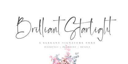 Brilliant Starlight is a very elegant and simple handwritten font, suitable for business cards, signatures, brochures, logos, quotes and more.
 - Chesta by RahagitaType,
$14.00 Chesta is playful monoline font for a lot of purposes. Such as branding, packaging, logo, craft, fashion, poster, brochure, etc.
 - Shady Lady NF by Nick's Fonts,
$10.00 The 1907 Barnhart Brothers & Spindler type specimen catalog called this unique typeface simply "Umbra". Since that name is already taken, it now has another. Due to the highly ornate nature of this face, the font has a limited character set (all accented characters, but no math operators or fractions). The Opentype version of this font supports Unicode 1250 (Central European) languages, as well as Unicode 1252 (Latin) languages.
 - Packard Patrician NF by Nick's Fonts,
$10.00Here’s a new take on the hand-lettered alphabet Oswald Bruce Cooper used in ads for the Packard Motor Company, later converted into a metal typeface by the Barnhard Brothers & Spindler foundry. This version has smoother outlines and an increased x-height, but retains all of the elegant charm of the original. Both versions of this font include the complete Unicode Latin 1252 and Central European 1250 character sets. - Tide Sans Condensed by Kyle Wayne Benson,
$6.00 Tide Sans Condensed is fresh, carefree, and just as good looking as its extended brother, Tide Sans. The Tide Sans family includes beautiful italics and an overall affable look lost somewhere between a humanist and a neo grotesque. Tide Sans does the work for you by providing a ridiculously large stylistic alternates set, fine tuned small caps, and a whole beach of alternate (amper)sands to feel between your toes.
 - Curves by Just My Type,
$15.00Be it a blessing or a curse, when a type designer sees a shape that could be interpreted as a letter, his/her mind is off and running. My parents loved to travel; Dad drove to Florida seven different years, winding on (barely) two-lane “highways” clinging to the hills of Kentucky and Tennessee. My brothers and I saw many of these letters along the way. Watch those Curves . - P22 Vincent by P22 Type Foundry,
$24.95 This set is inspired by the work of Vincent van Gogh. The alphabet captures the essence of van Gogh's handwriting style, using his extensive correspondence with his brother Theo as the primary reference. This lettering style presents a bold brush-stroke appearance which bears striking similarities to the painting style of Van Gogh. A full international charcter set is featured. The extras feature selected imagery from van Gogh's drawing and paintings.
 - Library Book Initials JNL by Jeff Levine,
$29.00 Library Book Initials JNL was modeled from examples of Sidney Gaunt's Publicity Initials; originally sold in metal type by Barnhart Brothers and Spindler as a companion to the Publicity Gothic typeface. The smoothed-down lines of the original characters allow for these initials to balace better when set against complementary type faces. A regular version is on the upper case keys, with an oblique version on the lower case keys.
