10,000 search results
(0.237 seconds)
- Tescellations by Ingrimayne Type,
$9.95 Though there are many thousands of digital typefaces available, none seem to be made exclusively of letters that tessellate, a complete tessellating alphabet. This void is now filled with not one typeface, but a group of typefaces, the Tescellations kinship group. Even though I am aware of only one use for this typeface--writing about tessellations--that does not mean there are not hundreds or perhaps thousands of other uses. These typefaces are a byproduct of two maze books I designed, Puzzling Typography and Puzzling Typography A Sequel. I found the challenge of making mazes from tessellations, including letter tessellations, intriguing and these typefaces are a byproduct that endeavor. There are seven members of this typeface kinship group. I tried to select the the glyphs that fit together best to form Tescellations; it is the most readable of the lot. The reason for an Italics version is that I needed one for the maze project. In constructing it, I tried to include as many different lower-case glyphs as I could rather than just skew the regular version. A purist might insist that the tessellation deal with the counters. My approach was to worry only about the exterior of any letter that has an interior, but for anyone who who might object to the counters, versions with filled counters are included. What did not fit into Tescellations was dumped into Tescellations Two, which is somewhat of a ransom-note type of face. It comes in two styles, a regular version and a version in which the counters are removed. TescellationPatterns shows how many of the characters in these typefaces tessellate. It has over 100 tessellation patterns, each on only one character. Simply type several lines with any character and make sure the leading is the same as the font size, and you have an instant tessellation pattern of a letter.
 - Regato by La Boîte Graphique,
$39.00 Regato is a hand made font ideal for your graphic project. Usage recommendations : Title, short text, children's book, poster, book cover, brochure, label, magazine
 - Schein by Almarkha Type,
$29.00 Schein – Sans & Slab inspired by the famous minimalist logo and perfect for the purposes of designing templates, brochures, videos, advertising branding, logos and more.
 - Water by La Boîte Graphique,
$25.00 Water is a rounded hand-printed font ideal for graphic project. Usage recommendations : Title, short text, children’s book, poster, book cover, brochure, label, magazine
 - Manbokun by ahweproject,
$10.00 Introducing Manbokun – a typeface that has a unique letterform inspired by Japanese kanji typography. Suitable for headlines, titles, logos, logotypes, posters, brochures, and more!
 - Banner by URW Type Foundry,
$39.99 Jan Koller designed the Banner typeface family especially for the creation of animated web banners. Banner is best used at 80p without antialiasing. The family comes in 24 styles which, in combination, create great, unusual screen effects. Three different animation modells provide the basis: extrusion, cutting in/out by ‘pixelation’, outline pixel rotation. The available flash clip listed in the Related Links below demonstrates some of the effects. Take a look! The swf clip runs in any web browser (drag & drop) but you need the flash player plugin. Apart from animation use, Banner also works well in print. Since all 24 styles are identical in width and kerning, you can set several styles on top of each other, maybe using different colours for each style. Look at the nice effects yourself!
 - Dezaru Faux by Twinletter,
$15.00 DEZARU is a fictitious Japanese display font created by combining Japanese letters with well-known and understood san serif fonts from throughout the world. Imagine all promotional materials can be understood and understood by all audiences in various parts of the world, your message will reach the hearts of the audience, and your brand will be very easy to remember by many people because the display of this font is contemporary and different from the others. Logotypes, food banners, branding, brochure, posters, movie titles, book titles, quotes, and more may all benefit from this font. Of course, using this font in your various design projects will make them excellent and outstanding; many viewers are drawn to the striking and unusual graphic display. Start utilizing this typeface in your projects to make them stand out.
 - Alys by Red Rooster Collection,
$45.00An original design. A memorial typeface by Pat for her mother, Alys, who was tragically killed. - Romans Story by Letterhend,
$19.00 Romans Story is a sophisticated ligature serif from us. This typeface has been made carefully to make sure its premium quality and luxury feel. The ligatures makes this typeface unique and stands out rather than the regular serif font. Very suitable for logo, headline, tittle, and the other various formal forms such as invitations, labels, logos, magazines, books, greeting / wedding cards, packaging, fashion, make up, stationery, novels, labels or any type of advertising purpose. Features : numbers and punctuation multilingual ligatures alternates PUA encoded We highly recommend using a program that supports OpenType features and Glyphs panels like many of Adobe apps and Corel Draw, so you can see and access all Glyph variations. How to access opentype feature : letterhend.com/tutorials/using-opentype-feature-in-any-software/
 - The Royal Chambers by Letterhend,
$19.00 The Royal Chambers is a sophisticated display serif typeface. This typeface has been made carefully to make sure its premium quality and luxury feel. The unique letterforms makes this typeface unique and stands out rather than the regular serif font. Very suitable for logo, headline, tittle, and the other various formal forms such as invitations, labels, logos, magazines, books, greeting / wedding cards, packaging, fashion, make up, stationery, novels, labels or any type of advertising purpose. Features : numbers and punctuation multilingual ligatures alternates PUA encoded We highly recommend using a program that supports OpenType features and Glyphs panels like many of Adobe apps and Corel Draw, so you can see and access all Glyph variations. How to access opentype feature : letterhend.com/tutorials/using-opentype-feature-in-any-software/
 - Laterlocks by Letterhend,
$22.00 Introducing, Laterlocks, A sophisticated ligature serif from us. This typeface has been made carefully to make sure its premium quality and luxury feel. The ligatures makes this typeface unique and stands out rather than the regular serif font, very suitable for logo, headline, tittle, and the other various formal forms such as invitations, labels, logos, magazines, books, greeting / wedding cards, packaging, fashion, make up, stationery, novels, labels or any type of advertising purpose. Features : numbers and punctuation multilingual ligatures alternates swashes PUA encoded We highly recommend using a program that supports OpenType features and Glyphs panels like many of Adobe apps and Corel Draw, so you can see and access all Glyph variations. Email us to letterhend@gmail.com if you need something! Happy Designing!
 - Cristola Display by Masa Type,
$15.00 Cristola Display is a sophisticated ligature serif from us. This typeface has been made carefully to make sure its premium quality and luxury feel. The ligatures makes this typeface unique and stands out rather than the regular serif font. Very suitable for logo, headline, tittle, and the other various formal forms such as invitations, labels, logos, magazines, books, greeting / wedding cards, packaging, fashion, make up, stationery, novels, labels or any type of advertising purpose. Features : numbers and punctuation multilingual ligatures alternates PUA encoded We highly recommend using a program that supports OpenType features and Glyphs panels like many of Adobe apps and Corel Draw, so you can see and access all Glyph variations. Email us to masatype195@gmail.com if you need something! Happy Designing!
 - Crainzel by Letterhend,
$19.00 Crainzel is a sophisticated high contrast display serif typeface. The ligature character makes this typeface unique and stands out rather than the regular serif font. Very suitable for logo, headline, tittle, and the other various formal forms such as invitations, labels, logos, magazines, books, greeting / wedding cards, packaging, fashion, make up, stationery, novels, labels or any type of advertising purpose. Features : numbers and punctuation multilingual ligatures alternates PUA encoded We highly recommend using a program that supports OpenType features and Glyphs panels like many of Adobe apps and Corel Draw, so you can see and access all Glyph variations. How to access opentype feature : letterhend.com/tutorials/using-opentype-feature-in-any-software/ Email us to letterhend@gmail.com if you need something! Happy Designing!
 - British Castilla by Ergibi Studio,
$19.00 British Castilla Luxury Font Duo, these fonts are of two types serif and script. This typeface has been made carefully to make sure its premium quality and luxury feel. The ligatures on serif makes this typeface unique and stands out rather than the regular serif font, perfectly for headlines, logos, posters, packaging, T-shirts,coffee shops, restaurants, magazine’s headers, signs or gift/post cards,cafe’s and weddings or any type of advertising purpose. British Castilla Luxury font includes over 94 ligatures to make it more natural and has a beautiful characteristic hand lettering What's Included British Castilla* include, numbers, punctuation, alternates, and it also supports other languages British Castilla* it also supports multilingual if you have any questions, don’t hesitate to contact us
 - Myhota by Ingrimayne Type,
$7.00Myhota is a condensed sans-serif face that has a bit of rawness to it. It is condensed and has a very high x-height, so it more useful for display than text. Myhota-Bold and Myhota-Light were designed in 1990 and the other seven weights were added in 2021 as were the italic and backslanted styles. There is rarely a use for backslanted type, but when it is needed, Myhota provides an option. Myhota-Hatched was an attempt to see if a readable text font could be hatched out of Myhota by lowering the x-height and widening the letters. The result is a face with rather squarish letters. The regular and bold were original styles with the medium and italic styles added in 2021. - Myhota Hatched by Ingrimayne Type,
$7.00 Myhota is a condensed sans-serif face that has a bit of rawness to it. It is condensed and has a very high x-height, so it more useful for display than text. Myhota-Bold and Myhota-Light were designed in 1990 and the other seven weights were added in 2021 as were the italic and backslanted styles. There is rarely a use for backslanted type, but when it is needed, Myhota provides an option. Myhota-Hatched was an attempt to see if a readable text font could be hatched out of Myhota by lowering the x-height and widening the letters. The result is a face with rather squarish letters. The regular and bold were original styles with the medium and italic styles added in 2021.
 - Afolkalips by Arterfak Project,
$15.00 Introducing 'Afolkalips' a tribal display font. Inspired by hinterland culture in the world, especially Papua Tribe, Indonesia. The Papuan Culture has many native tribes based on their location, culture and different ancestors. The equation is, they have a culture of decorating the body with paint from plants. The motives are also diverse, but with the characteristics of firm lines. In addition to various line motifs, Papuan hinterland people also explore colors that distinguish one tribe from another. You can see it on face decoration, as well as their body parts. The tools they used to paint their faces were usually with wood or leaves. Clear lines are etched, producing a natural, rough and authoritative form. It is this form that inspires us in designing the 'Afolkalips' typeface. All-capitals font with strong strokes that very recommended for headline or display on a traditional theme. Complete with 50+ custom ligatures that give you more variations. Also featured with 28 accents. This font also has ornament swashes to give your design more tribal looks, you can use the swashes as a frame or decoration. Suitable for your design such as poster, flyer, t-shirt design, logo, magazine, signage, or billboard. Afolkalips is a minimalist-joyful font which is flexible to apply in bright theme or elegant style. What you'll get : - Uppercase - Lowercase - Numbers - Punctuations - Symbols - Stylistic alternates - Ligatures - Accents Hope you like it! Thank you for your support and happy designing!
 - Open-Dyslexic - Personal use only

- Radona by insigne,
$29.00 Radona is a blast from the 80’s that's rader than rad. Radona is the typeface version of Synthwave, an electronic music subgenre that takes influence from the 1980s but builds on it, resulting in a construct that lives in the minds of both those who have experienced it and those who haven't. Radona expresses a nostalgia for 1980s culture, attempting to replicate and appreciate the era's vibe, but extends it further with something new. This sans family has plenty of 80's flavor, but with some fresh twists to push it to the limit. Radona is a geometric sans-serif typeface. Radona has a few quirky characteristics, but it has a generally neutral tone and structure that makes it ideal for usage in print, especially when a contemporary look is desired. It looks amazing in both body text and headlines. The geometric grotesques that were popular in the 1980s served as inspiration. It's a typeface that's been crafted for usage in a range of design fields, from branding to packaging, and it can be used in anything from interfaces to apps. Radona is an excellent typeface for use on websites and other digital applications. Radona comes with a wide variety of styles and a large selection of stylistic alternatives, ligatures, small caps and other special features. Along with parachute pants, synthesized guitar riffs, and VHS scanlines, Radona brings back the 1980’s.
 - Nimbus Sans by URW Type Foundry,
$35.00 The first versions of Nimbus Sans have been designed and digitized in the 1980s for the URW SIGNUS sign-making system. Highest precision of all characters (1/100 mm accuracy) as well as spacing and kerning were required because the fonts should be cut in any size in vinyl or other material used for sign-making. During this period three size ranges were created for text (T), the display (D) and poster (P) for small, medium and very large font sizes. In addition, we produced a so-called L-version that was compatible to Adobe’s PostScript version of Helvetica. Nimbus was also the product name of a URW-proprietary renderer for high quality and fast rasterization of outline fonts, a software provided to the developers of PostScript clone RIPs (Hyphen, Harlequin, etc.) back then. Also in the 80s, a new, improved version of the Nimbus Sans, namely Nimbus Sans Novus was designed. Nimbus Sans Novus was conceptually developed entirely with URW’s IKARUS system, i.e. all styles harmonize perfectly with each other in terms of line width, weight, proportions, etc. On top of that, Nimbus Sans Novus contains more styles than Nimbus Sans. Now, Nimbus Sans is also available as Round (like the popular URW fonts Futura Round and Eurostile Round). The Round versions are intended to facilitate the work of designers and typographers. The fonts can be used directly, without further preparatory work in graphic programs as finished, high-quality Rounds.
 - Linotype Aroma by Linotype,
$29.99From the designer, Tim Ahrens... I started designing this typeface about half a year after learning that Frutiger was not a new brand of sweets and that Garamond is not the name of a fragrance. In time it became clear that designing a sans serif must always be considered as a transformation of traditional serifed typefaces instead of deriving it from typefaces that have been derived from others which have been derived from others again. I did not want Aroma to be one of those odourless and tasteless typefaces wich sacrifice a natural feeling and the characteristic shapes of the letters to neutrality. I think that beauty often evolves unintentionally. For example, I am fascinated by the beauty of airfoils, which are actually a careful transformation of a bird's wing. I love their anorganic and abstract shape which still bears the essence and all the complexity of what they are modelled on. This is exactly the formal concept behind Aroma. Many of the outlines are actually parabolics. The small r, for example, consists exclusively of straight lines and parabolics. I decided to give Aroma more stroke contrast than it is usual for sans serif designs. Many strokes are slightly convex, which gives the font an anorganic feeling. The font was intended to have a feel similar to the antiqua. More specifically, it is based on Old Style Faces. The character of those fonts, which were cut during the Renaissance, is still inherent to Aroma. - Nimbus Sans Round by URW Type Foundry,
$35.99 The first versions of Nimbus Sans have been designed and digitized in the 1980s for the URW SIGNUS sign-making system. Highest precision of all characters (1/100 mm accuracy) as well as spacing and kerning were required because the fonts should be cut in any size in vinyl or other material used for sign-making. During this period three size ranges were created for text (T), the display (D) and poster (P) for small, medium and very large font sizes. In addition, we produced a so-called L-version that was compatible to Adobe’s PostScript version of Helvetica. Nimbus was also the product name of a URW-proprietary renderer for high quality and fast rasterization of outline fonts, a software provided to the developers of PostScript clone RIPs (Hyphen, Harlequin, etc.) back then. Also in the 80s, a new, improved version of the Nimbus Sans, namely Nimbus Sans Novus was designed. Nimbus Sans Novus was conceptually developed entirely with URW’s IKARUS system, i.e. all styles harmonize perfectly with each other in terms of line width, weight, proportions, etc. On top of that, Nimbus Sans Novus contains more styles than Nimbus Sans. Now, Nimbus Sans is also available as Round (like the popular URW fonts Futura Round and Eurostile Round). The Round versions are intended to facilitate the work of designers and typographers. The fonts can be used directly, without further preparatory work in graphic programs as finished, high-quality Rounds.
 - Saylist by Ardyanatypes,
$15.00 Saylist is a serif font that exudes luxury and elegance. It has various features that will make your designs look beautiful and sophisticated. This font is highly recommended for logos and branding purposes. Still, its versatility allows you to use it for a wide range of design themes, such as luxurious, unique, vintage, and elegant. One of the standout features of Saylist is its unique shape, which gives off a creative impression. The font's clean lines and sharp edges make it easy to read, while its elegant curves add a touch of sophistication. Saylist's balanced letterforms and consistent spacing provide a harmonious and cohesive look, making it an excellent choice for any design project. Saylist is a font that can be used for various design projects. Its elegant and luxurious style makes it ideal for fashion, beauty, and lifestyle branding. It can also be used for headings, body text, invitations, and other print materials. Saylist's versatility allows it to be paired with other fonts to create a unique and cohesive design. Overall, Saylist is a beautiful and versatile serif font that can add a touch of luxury and elegance to any design project. It's unique shape, and balanced letterforms make it a standout choice for logos and branding, while its versatility allows it to be used for various design themes. If you're looking for a font that exudes sophistication and creativity, Saylist is an excellent choice.
 - Roz by Gaslight,
$25.00 Roz is clean geometric sans round by one side and sharp on the other side. It has three weights and corresponding italics. Roz is ideal for package design, headlines and other typographic mediums.
 - Greene And Hollins by Greater Albion Typefounders,
$15.00 Greene and Hollins of Wolverhampton were a rather smart gentleman’s outfitter, much frequented by my late grandfather and altogether redolent (in memory and actuality) of a bygone age of retail service and respect. I believe they’re out of business now, but we’re rather pleased to offer them this very small if rather random memorial. Greene and Hollins is a set of seven display typefaces, with uniform metrics, which can be overlaid to create multi-coloured ‘engraved’ effects. Also ideal to recreate traditional sign-writing, garment labels, signage and anything else where a period flare is required.
 - Kermel Serif by La Boîte Graphique,
$19.00 Kermel serif is a hand made font ideal for your graphic project. Usage recommendations: Title, short text, children's book, poster, book cover, brochure, label, magazine
 - Hexore by Almarkha Type,
$29.00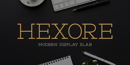 ntroducing Hexore – Modern Display Slab inspired by the famous minimalist logo, perfect for the purposes of designing templates, brochures, videos, advertising branding, logos and more.
 - Marzipan by Wilton Foundry,
$29.00The spontaneously fun font for all things whimsical. Outrageous and gregarious! Marzipan is great for a multitude of applications including brochures, identities, packaging and scrapbooking. - Lotus by Monotype,
$29.99The Lotus font consists of Art Nouveau initials ornamented with graceful flowers. Lotus is an attractive choice for posters and brochures relating to horticultural activities. - Modesfa by Almarkha Type,
$33.00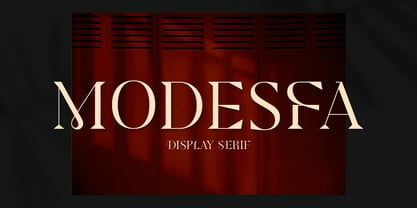 Introducing Modesfa – Modern Display Serif inspired by the famous minimalist logo perfect for the purposes of designing templates, brochures, videos, advertising branding, logos and more.
 - Quinger by Almarkha Type,
$33.00 Introducing Quinger - Unique Sans Display inspired by the famous minimalist logo perfect for the purposes of designing templates, brochures, videos, advertising branding, logos and more.
 - Luxoorea by Almarkha Type,
$25.00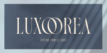 Introducing Luxoorea – Stylish Display Serif inspired by the famous minimalist logo perfect for the purposes of designing templates, brochures, videos, advertising branding, logos and more.
 - Delaproza by Almarkha Type,
$29.00 Introducing Delaproza – Modern Serif font inspired by the famous minimalist logo perfect for the purposes of designing templates, brochures, videos, advertising branding, logos and more.
 - Sangira by Almarkha Type,
$29.00 Introducing Sangira - Modern Ligature Serif inspired by the famous minimalist logo, perfect for the purposes of designing templates, brochures, videos, advertising branding, logos and more.
 - Glamorez by Almarkha Type,
$35.00 Introducing Glamorez - Luxury Display Serif inspired by the famous minimalist logo perfect for the purposes of designing templates, brochures, videos, advertising branding, logos and more.
 - Coegit by insigne,
$32.00 In the world of webfonts, Condensed proportions are key to maximizing your page's premium real estate while keeping your copy clean and catchy as you cut down to the essentials. Soon after the introduction of webfonts, I began to see Insigne's Le Havre used frequently for web headlines, not so much for its Art Deco look as for its more compact proportions. There seemed to be a need for a font that was designed to be used solely for the web's unique constraints. Enter Coegit Sans. Coegit is built specifically for web applications. Its highly Condensed forms range from thin--offering the greatest number of uses--to the attractive, accenting black. With three widths--Compressed, Compact, and the widest, Condensed --the family holds a total of sixteen fonts. The typefamily has also been hinted for excellent, onscreen display quality, even at small sizes. Overall, its lighter, humanist features provide the reader a more congenial welcome than its square, sans-serif counterparts can offer. Coegit is equipped for complex professional typography with stems, small caps and plenty of alts, including titling capitals. The face includes a number of numeral sets, including fractions, old-style and lining figures with superiors and inferiors. OpenType-capable applications such as Quark or the Adobe suite can take full advantage of automatically replacing ligatures and alternates. You can find these features demonstrated in the .pdf brochure. The family also includes glyphs to support a wide range of languages, including Central, Eastern and Western European languages. In all, Coegit supports over 40 languages that use the Latin script, making the new addition a great choice for multi-lingual publications and packaging. While the advanced OpenType features of webfonts are not currently supported in many browsers, the near future promises wide support. As acceptance of these features grow, Coegit Sans will prove to be a versatile element for your wide range of web projects.
 - Swollen - Unknown license

- PF DIN Mono by Parachute,
$45.00 PF DIN Mono is the latest addition to the ever-growing set of DIN super-families by Parachute. It was based on its proportional counterpart DIN Text Pro but was completely redesigned to reflect its new identity. DIN Mono is a monospace typeface which is comprised of characters with fixed width. Traditionally, monospaced fonts have been used to create forms, tables and documents that require exact text line lengths and precise character alignment. DIN Mono, on the other hand, can prove to be more than a useful typeface for technical applications. In the world of proportionality, DIN Mono stands out as a fresh new alternative to the popular standard, particularly for publishing and branding applications. Additional care was given to the aesthetic form and its pleasing characteristics. The spacing attributes of the glyphs were redefined and legibility was further improved by revising or changing the shape of the letterforms. Furthermore, kerning was not included in order to preserve the monospace nature of this typeface. The family consists of 12 weights including true-italics. Currently, it supports Latin, Eastern European, Turkish and Baltic.
 - Belanga by Gatype,
$10.00 Balanga is a smooth, elegant and flowing handwritten font. It has a beautifully balanced character, goes well with many designs. Balanga features varied baselines, smooth lines, beautiful glyphs, and stunning alternatives. Hand-drawn design elements allow you to create many beautiful typographic designs in an instant such as branding, web and editorial designs, prints, crafts, quotes, It's great for logo types, wedding invitations, romantic cards, labels, packaging, name spelling and other . Add to your most creative ideas and see how they make it happen! Balanga includes OpenType style alternatives, ligatures, and International support for most Western Languages. To enable the OpenType Stylistic alternative, you need a supporting program such as Adobe Illustrator CS, Adobe Indesign & CorelDraw X6-X7, Microsoft Word 2010 or a later version. Balanga is coded with PUA Unicode, which allows full access to all additional characters without having to design special software. Mac users can use Font Book , and Windows users can use Character Map to view and copy any additional characters to paste into your favorite text editor/application.
 - P22 Glaser Houdini by P22 Type Foundry,
$24.95 Milton Glaser commented about this type family: “The typeface is called Houdini after the famous American magician. I wanted to produce a letterform that would gradually disappear as one line after another was removed.” The various versions of Houdini presented by P22 include those originally offered as phototypesetting fonts, plus a solid and an outline version—a variation of which was used for Sesame Place children’s park in 1980. These Houdini variations can all be layered on top of each other for a range of chromatic effects. Each of the Houdini fonts contains over 375 characters for full European language coverage. The family is taken to its logical conclusion with the bonus font “P22 Glaser Houdini Vanished.” This font shares the same spacing and kerning as all of the Houdini font but lacks all visible outlines. Over the years there have been many typefaces that borrowed heavily from the Glaser designs, but these are the only official fonts approved by Milton Glaser Studio and the Estate of Milton Glaser.

