10,000 search results
(0.042 seconds)
- Eastlove by Forberas Club,
$16.00 Eastlove is a Handwritten Script font that will make your designs look classic, Farmhouse, Boho, and Feminine. It is a great font for events, Wedding Project, signature, album covers, logos, branding, magazines, social media posts, advertisements, but it also works great for other projects. Add it to your fonts’ library, and it will enhance your creativity! Eastlove is best for: - logos, branding, & Signatures. - Flyers, Album cover, Magazine, & Advertisements. - Website design , design blogs, & fashion. - Quote graphics for social media. - and also it works great for other projects. Whats included : - Font File - Character Set - Numerals and Punctuation (OpenType Standard) - Accents (Multilingual characters) If you have any questions, before or after purchase, please feel free to get in touch.
 - Minnesota Plaid by Breauhare,
$35.00 Minnesota Plaid is the baddest plaid ever! It may not be the choice pattern for golfers' slacks or bagpipers' kilts, but it has a City-like flavor with its own twist, a stylish ruggedness & toughness that could even be described as a sort of formal graffiti, thanks to the art deco swash of many of its strokes. It’s the kind of look that would be perfectly at home with hip hop or rap music, football and other sports, cars and trucks, power tools, and other manly, masculine usages. Of course, women are just as capable of having the aforementioned interests, too. Minnesota Plaid is the kind of font that can get stuck on you! Digitized by John Bomparte.
 - The Barethos by Figuree Studio,
$18.00 The Barethos is a Delicious display font inspired by tasty food. Its unique character is very suitable for logos, packaging, branding, and other creative design needs. Very suitable combined with other fonts. Features: - Basic Latin A-Z and a-z - Numbers - Symbols - Stylistic Alternate - PUA Encode - Multilanguage Support To enable the OpenType Stylistic alternates, you need a program that supports OpenType features such as Adobe Illustrator CS, Adobe Indesign & CorelDraw X6-X7. There are additional ways to access alternates, using Character Map (Windows), Nexus Font (Windows), Font Book (Mac) or a software program such as PopChar (for Windows and Mac). If you have any question, don't hesitate to contact me by email. :)
 - Sticky Glue by Putracetol,
$28.00 Sticky Glue is Quirky Bold Font. This font is a quirky font with a lot of character ligatures, as many as 325 ligatures. The concept of this font is to make the letters stick together, like glue. This font theme is more fun, playful and childish with quirky characters and displays. This font is suitable for your projects such as logos, branding, packaging, crafting, titles, books, headlines, posters, t-shirts, films and others. This font can be used and supported in various programs and OS, such as procreate, cricut, windows, macOS and others. Come with lot of ligatures character, its help you to make great lettering, quote, logos. This font is also support multi language.
 - Gastella Night by Fromletterel,
$12.00 Gastella Night is a handwritten font family consist of script, casual handwritten, and unique all caps font. In other words you can get four styles of fonts at once, all styles in this family is well matched to each other. Gastella Night Script font comes with few ligatures to make it looks more natural, also comes with slant style named Gastella Night Script Italic to make it looks more delicate when used as signature. Gastella Night Regular is a casual handwritten font, so it will be suitable to all kind of design, as tagline, quotes, etc Gastella Night All Caps consist the uppercase only, add this font to beautify your design with it's unique style.
 - Jagerlay by Picador,
$29.00 Jagerlay was brought to life to cope with diverse and complex data gathered in presentations, corporate identity and other office documents. Its geometric shape and characteristic endings are reminiscent of classic typography from Sci-Fi Movies from the 80's. The simple design makes Jagerlay outstandingly easy to use for every user. Jagerlay pairs with other typefaces in the blink of an eye – it goes well with display, serif or script fonts. The whole family consists of 9 weights and matching italics. Every style has almost 900 glyphs. Jagerlay has many opentype features such as tabular figures, fractions, superscript and subscript, small caps and arrows. Low contrast makes it easy to read. The rest makes it easy to use.
 - P22 CoDependent by IHOF,
$24.95 P22 CoDependent is a revival of the Independant typeface from 1930 created by Dutch designer Johannes Nicolaas Coenraad Collette along with Jos Dufour from Belgium. Independant was released in metal by the Belgian division of the Amsterdam Type Foundry in commemoration of the 100th anniversary of the independence of Belgium from the Netherlands. Despite the name, the two fonts contained in the set, Regular and Shadow, are not codependent upon each other. They can be used alone, but together they can create a dynamic two-color option. There have been other fonts inspired by and revived directly from Independant, but this version adheres the original design with the added consideration of how the shadow version will overlap.
 - Morable by Malindo Creative,
$10.00 Morable is a modern hand based typeface, This font consists of letters that flows irregularly, either between top-down and with the letter afterwards, which makes it suitable for Logotype, posters, businness card, merchandise, wedding invitations, greeting cards, blog banners, apparel, design of water-based paints/prints, correspondence, quotes and a variety of other! Morable has given PUA encoded (specially coded fonts). Files included: morable.otf If you want other files that are not here, please let me know. I will be happy to help. If you have any questions, please contact me at. malindocreative@gmail.com. Thanks for Support Feel free to contact me if you have any questions, I am happy to help you.
 - Mideo by Forberas Club,
$16.00 Mideo is a Handwritten Script font that will make your designs look classic, Farmhouse, Boho, and Feminine. It is a great font for events, Wedding Project, fashion, apparel projects, signature, album covers, logos, branding, magazines, social media posts, advertisements, but it also works great for other projects. Add it to your fonts’ library, and it will enhance your creativity! Mideo is best for: - logos, branding, & Signatures. - Flyers, Album cover, Magazine, & Advertisements. - Website design , design blogs, & fashion. - Quote graphics for social media. - and also it works great for other projects. Whats included : - Character Set - Numerals and Punctuation (OpenType Standard) - Accents (Multilingual characters) If you have any questions, before or after purchase, please feel free to get in touch.
 - Eclectic Pixel Web by Altered Ego,
$45.00Eclectic PixelWeb is a collection of three sizes of popular web icons in the pixel aesthetic. With 80+ icons designed for creating e-commerce, navigation, and interface designs. Use it as a starting point in your favorite vector program, or use the icons as is - they are optimized for sizes at 20 point and will work in Flash and other web graphics programs. Shopping carts, directional arrows, buttons galore! It's like a pinata in font format, surprises for everyone! This font includes: a new and search buttons, home, security, email, search, and a host of other icons and images to make designing your next website a breeze!. Available in Mac and PC formats, in TrueType, PostScript and OpenType formats. - Alternate Gothic by Linotype,
$20.99 Alternate Gothic was designed by Morris Fuller Benton for American Typefounders Company in 1903. All three weights of Alternate Gothic are bold and narrow. In fact, this face is essentially a condensed version of Benton’s other well-known sans serif types, Franklin Gothic and News Gothic. In the early twentieth century, the modern concept of type “families” had not yet been formed — and though Benton designed these sans serifs to harmonize with each other, the foundry gave them different names. Robust, dark, and coolly competent, Alternate Gothic is a good choice when strong typographic statements must fit into tight spaces. As a modern usage, it is currently the font of YouTube’s homepage logo.
 - Santorio by Skinny Type,
$15.00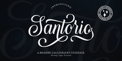 Please welcome our newest script typeface, Santorio Script, a beautiful script typeface with unique alternatives and strokes. This font is very suitable to be applied especially to logos, and various other formal forms such as invitations, labels, logos, magazines, books, greeting / wedding cards, packaging, fashion, make up, stationery, novels, labels or other types of fonts. advertising purposes. Feature : uppercase & lowercase numbers and punctuation multilingual ligature alternative PUA encoded We highly recommend using a program that supports the OpenType feature and the Glyphs panel like many Adobe and Corel Draw applications, so that you can view and access all variations of Glyphs. Email us to skinnyart871@gmail.com if you need anything! Happy Designing! Thank you
 - Ovenci by ENCI Fonts,
$19.00 Ovenci is a unique font family based on ovals and curves. Its unique and original design makes it unlike any other. As in nature, the oval curves of Ovenci family combine very well with the rest of the shapes. Trust your eyes to create the perfect mix for your projects using the Ovenci fonts family along with other fonts that you consider appropriate for what you want. For millions of years organic forms have been part of creation. The shape of Ovenci family glyphs is extremely organic, which makes it very pleasing to the eye, so you can give it the use you want. Thank you for choosing us, you will surely create great things with the Ovenci family.
 - Novecento Slab Rough by Synthview,
$22.00 Novecento Slab Rough adds a letterpress / analog effect to its Slab Serif parent. Each letter has a different pattern and gives you a truly realistic effect. Even accented variants of any base character are all different. This font has also a built-in feature that automatically displays a texture variant for the 2nd occurrence of a letter or a number when they appear close one to each other. For instance: AA OO TT ÜÜ. But also: AOA NON TXT etc. And don't forget alternate glyphs design such as N I J Q Y and all other features present in the Novecento mega family: 32 styles, 76 latin languages supported, 590 glyphs and 16 stylistic opentype features for advanced typography.
 - Starkido by Forberas Club,
$16.00 Introducing Starkido by Forberas Club Starkido is a handwritten script font that will make your designs look classic, Farmhouse, and Boho. It is a great font for events, wedding invitations, fashion, apparel, signature, album covers, logos, branding, magazines, social media posts, advertisements, but will also work great with any other project. Add it to your fonts’ library to enhance your creativity! Starkido is best for: - logos, branding & signatures - Flyers, album cover, magazine & advertisement - Website design, design blogs & fashion - Quote graphics for social media - Also works great with any other project Whats included : - Font provided in OTF format - Numerals and Punctuation - Accents (Multilingual characters) If you have any questions, before or after purchase, please feel free to get in touch.
 - Straits Light by AdultHumanMale,
$12.00 Straits is an oddball fun ALL-CAPS font, a modern take / re-imagining of some old Art Deco signage and a sister to my other font Penang. The font is available in 2 weights for now, a light and a medium. In general I think ALL-CAPS steal 26 characters from you, so each letter in each case is a little different, however subtly. This being an ALL-CAPS font I imagine it will work best in Headlines and other bold statements, but buy it and find out. The font is loaded with plenty of extras and glyphs. This was designed to be fun, so I hope you can have some with it.
 - Lastlap by Din Studio,
$29.00 Experience the amazing feeling with Lastlap that will make your work a lot easier than before. It is a display font designed in a racing theme. In accordance with its theme, Lastlap expresses a brave feeling with its dramatic bold style suitable to use in titles, logos, and any other designs with large-sized texts. Enjoy other incredible features available on this font. Features: Multilingual Supports PUA Encoded Numerals and Punctuation Lastlap fits best on various design projects such as posters, banners, logos, book covers, headings, printed products, merchandise, social media, etc. Find out more ways to use this font by taking a look at the font preview. Get it now. Happy designing
 - Naishila by FadeLine Studio,
$10.00 Introducing Naishila. This new font family includes a caps and script. Naishila is a lovely and sweet font duo with a dancing baseline. You will receive the regular font (not dancing) while the script comes with stylistic sets and ligatures. Like my other fonts, Naishila is made to meet the growing market of design today. This font is suitable for use in design styles such as watercolor, minimalist, flat, modern design, etc. With this font duo, you can very easily combine. Surely you can make something perfect for your design. Naishila will look gorgeous on cards, mugs, quotes, posters, shopping bags, logo's, t-shirts, branding, book covers, birthday invitations, greeting cards, and all your other lovely projects.
 - Nathallie by Tegaki,
$16.00 Hi all, Nathallie created with stylist and handwritten characters. This handwritten font was PUA encoded. Nathallie is a natural handwritten style that comes with Extended Latin Characters. Nathallie works perfectly for logos, display, product branding, wedding invitation card, stationary, packaging, clothing, flyer, apparel, magazines, brochures, lable, posters, badges, etc. Nathallie comes with 415 glyphs and 26 alternate characters contain with opentype features (supported with contextual alternates mode). Nathallie also comes with 164 extended ligatures that allowing you to make stuff looks more exclusive and pro standard. You can access all those alternate characters by using OpenType savvy programs such as Adobe Illustrator, Adobe InDesign and CorelDraw X6-X7, Microsoft Word 2010 or later versions. There are additional ways to access alternates/swashes, using Character Map (Windows), Nexus Font (Windows), Font Book (Mac) or a software program such as PopChar (for Windows and Mac). For other programs that doesn't support OpenType features or Glyphs Panel such as Photoshop, you can use Character Map in Windows to access the alternate characters. Files included: Nathallie (otf) How to access all alternative characters, using Windows Character Map with Photoshop: http://youtu.be/cxonI5QvULk How to access all alternative characters using Adobe Illustrator: https://www.youtube.com/watch?v=y5XTaWYwWA4 If you need help or advice, please contact me by email "tegakiscript@gmail.com" Thank you for your purchase!
 - Cabrito Flare by insigne,
$35.00 Cabrito Flare joins the Cabrito font family, a family designed to help younglings with the recognition of letter shapes. The original fonts are part of the development of a children's book, The Clothes Letters Wear. Cabrito Flare combines the simplicity and readability of the original Cabrito with an elegant flare serif. Now, this latest addition brings a new flavor to the table. Cabrito Flare brings fluid, carefree, medium contrast fun. It takes a more calligraphic direction than most. Cabrito combines structure and handwriting. There's a fluid balance of both characteristics, and Flare is no exception. It’s a unique combination of functional elegance with a little spice and a dollop of friendly. Fifty-four well-designed fonts give you many readable options to work with while developing your design. Cabrito Flare includes a suite of OpenType features. Alternative forms, ligatures, figures, and titling caps are all here. Preview these functions in the interactive PDF manual. There are glyphs for 72 languages; more than 600 glyphs await you. Cabrito Flare is an excellent choice for websites, as well as for brochures and packaging. Like Cabrito, used by several visible brands, Cabrito Flare is also an excellent option to define your logo. Try the taste of Cabrito Flare and be sure to dip in and sample some of the other Cabrito members: Original flavor, Didone, Sans, Serif, Semi, Contrast, and Inverto.
 - Kidela by insigne,
$21.99 Kidela is an exuberant and eccentric serif typeface reminiscent of hand painted signage. Kidela features tight kerning and spacing, and some interesting effects can be achieved by adjusting the tracking. The typeface includes 64 discretionary ligatures to extend the natural hand painted look, alternates, oldstyle figures and small caps. Please see the sample brochure to see these ligatures in action. Kidela is an excellent choice when you need a fun and interesting serif.
 - Kintamani by Ably Creative,
$12.00 Kintamani font is a casual handwritten font perfect for design purposes, web, logos, brochures, business cards, online stores, t-shirt designs, mockups, invitation cards, wedding cards, flyers, posters and more. Kintamani font beautiful typographic harmony for a diversity of design projects, including logos & branding, social media posts, advertisements & product designs. This font is PUA encoded which means you can access all of the glyphs and swashes with ease! Make stunning work with Kintamani font!
 - Diplomat by Wilton Foundry,
$29.00Diplomat was designed in response to Portfolio’s very ornate script - a much more legible and formal script that has plenty of flare but without the elaborations. It is still more ornate than Duet so if you need to find a script right in between Portfolio and Duet, Diplomat will do the trick! Diplomat in combination with its elegant lowercase, creates a prestigious presentation useful for Certificates, Wedding Invitations, Corporate Identities, Brochures, and Headlines. - Knighthood by Letterara,
$12.00 Knighthood is a elegant and masculin font Brush. with extra attention to quick strokes and sharp details, Knighthood contains uppercase, lowercase and ligature. This font can also be used to show elegance in a wedding and christmas. Grotters is ideal for logos, apparel, wedding, book, t-shirts, hoodies, quotes, youtube, quotte, product packaging, website or anything that needs a typographic turbo-boost and you’ll get a unique swash to accompany the font.
 - Spindrift by Ahmad Jamaludin,
$17.00 Spindrift - Incredibly versatile, making it a perfect fit for various projects. Whether you're working on a cover magazine, brochure, logo, headline, or quotes, this font adds a touch of personality and flair. It shines as a stand-alone display font and effortlessly enhances short paragraphs or content. Featured: Spindrift Main File Unique Alternates and Ligatures Instructions (Access special characters, even in circuit design) Letters, numbers, symbols, and punctuation Multilingual Support Thank you!
 - Bowling Script by Sudtipos,
$69.00 There is plenty of lyric and literature about looking over one's shoulder in contemplation. What would you have done differently if you knew then what you know now? This is the kind of question that comes out of nowhere. When it does and whether its context is personal or professional make very little difference. It's a question that can cause emotions to rise and passions to run hot. It can trigger priority shifts and identity crises. It's never easy to answer. Three years ago, I published a font called Semilla. My aim with that was to distill the work of Bentele, a lettering artist from early 1950s Germany. Picking such an obscure figure back then was my way of pondering the meaning and efficiency of objectivity in a world where real human events and existences are inevitably filtered through decades of unavoidably subjective written, printed and oral history. And maybe to pat myself on the back for surviving surprises mild and pleasant. Having been fortunate enough to follow my professional whims for quite some time now, I took another, longer look at my idea of distilling Bentele's work again. I suppose the concepts of established history and objectivity can become quite malleable when personal experience is added to the mix. I say that because there I was, three years later, second-guessing myself and opining that Bentele's work can be distilled differently, in a manner more suited to current cultural angles. So I embarked on that mission, and Bowling Script is the result. I realize that it's difficult to reconcile this soft and happy calligraphic outcome with the introspection I've blathered about so far, but it is what is. I guess even self-created first world problems need to be resolved somehow, and the resolution can happen in mysterious ways. Bowling Script is what people who like my work would expect from me. It's yet another script loaded with all kinds of alternation, swashing and over-the-top stuff. All of that is in here. These days I think I just do all that stuff without even blinking. But there are two additional twists. The more noticeable one is ornamental: The stroke endings in the main font are of the typical sharp and curly variety found in sign painting, while the other font complements that with ball endings, sometimes with an added-on-afterwards impression rather than an extension of the actual stroke. In the philosophical terms I was mumbling earlier, this is the equivalent of alternate realities in a world of historical reduxes that by their very nature can never properly translate original fact. The second twist has to do with the disruption of angular rhythm in calligraphic alphabets. Of course, this is the kind of lettering where the very concept of rhythm can be quite flexible, but it still counts for something, and experimenting with angular white space in a project of a very dense footprint was irresistible. After playing for a bit, I decided that it would interesting to include the option of using optically back-slanted forms in the fonts. Most scripts out there, including mine, have a rhythm sonically comparable to four-to-the-floor club beats. So the weirdly angled stuff here is your chance to do the occasional drumroll. Everyone knows we need one of those sometimes. Bowling Script and Bowling Script Balls fonts comes with 1600 characters and features extended Latin-based language support. There are also a basic version of both fonts without all the alternates and extra OpenType features. Bowling family ships in cross-platform OpenType format. We also want to present “Mute”, a visual essay narated by Tomás García and Valentín Muro, about digital life created specially to introduce Bowling Script.
 - Mundo Sans by Monotype,
$50.99 Mundo Sans, by Carl Crossgrove for the Monotype Studio, is distinctive, approachable – and ready to tackle jobs both big and small. Its open counters and large x-height, which give the design a straight-forward no-nonsense mien, are softened by inviting calligraphic undertones. With 10 weights and a complementary suite of cursive italics, there is little outside the range of the Mundo Sans family. The light weights are elegant in packaging and brochure design, the medium are easy readers in digital blogs and print periodicals and the bold command attention in banners and headlines. Mundo Sans is at home in a wide range of sizes, and comfortable in everything from wayfinding to mobile apps. Mundo Sans takes on complicated branding projects with efficient grace. The family enables companies and products to express their brand seamlessly in websites, advertising, corporate messaging, packaging – virtually everywhere visible engagement is possible. A large international character set, that includes support for most Central European and many Eastern European languages, ensures ease of localization. Mundo Sans was originally released with seven weights. The family was updated with three new roman weights and their italics in 2019 that extend and diversify its range of use: a fine hairline weight, a book weight, slightly lighter than regular, and a demi that is subtly lighter than the medium. The design is also is a good mixer. It easily pairs with everything from refined Didones to stalwart slab serif designs. And if you need a more harmonious palette, look no further than Mundo Sans’ relative, Mundo Serif. The two designs harmonize with each other perfectly in weight, typographic color and proportion. Mundo Sans’ italics are true cursive designs, with fluid strokes and obvious calligraphic overtones. The flick of the down-stroke in the ‘a,’ the descending stroke of the ‘f’ and baseline curve of the ‘z’ add grace to the design and distinguish it from more mechanistic styles. Mundo Sans is a design with deep roots. It was originally drawn to pair with classic Renaissance book typefaces like Bembo® and ITC Galliard®. With a hint of diagonal stroke contrast and gentle flaring of strokes, Mundo Sans complements these designs with warmth and grace. Crossgrove says that Mundo isn’t meant to be showy or distinctive. It is intended to follow the tradition of sans serif designs that have a wide range of uses, enabling comfortable reading and clear expression. Crossgrove has designed a variety of typefaces ranging from the futuristic and organic Biome™ to the text designs of Monotype’s elegant Walbaum™ revival. His work for Monotype also often takes Crossgrove into the realm of custom fronts for branding and non-Latin scripts.
 - Agmena Paneuropean by Linotype,
$103.99Agmena™ has no historical precursor; it was designed from scratch by Jovica Veljovi? whose aim was to create a new book typeface. Although it generally has certain similarities with the group of Renaissance Antiqua fonts, it is not clearly derived from any of these. Clear and open forms, large counters and a relatively generous x-height ensure that the characters that make up Agmena are readily legible even in small point sizes. The slightly tapering serifs with their curved attachments to letter stems soften the rigidity of the typeface, bringing Agmena to life. This non-formal quality is further enhanced by numerous tiny variations to the letter shapes. For example, there are slight differences to the terminals of the b", the "d" and the "h" and minor dissimilarities in the forms and lengths of serifs of many of the letters. The tittles over the "i" and "j" and those of the German umlauts are almost circular, while the diamond shape that is more characteristic of a calligraphic script is used for the punctuation marks. Although many of these variations are only apparent on closer inspection, they are enough to give Agmena the feeling of a hand-made typeface. It is in the larger point sizes that this feature of Agmena comes particularly into play, and individual characters gain an almost sculptural quality. The italic variants of Agmena are actually real cursives. The narrower and thus markedly dynamically formed lowercase letters have a wider range of contrast in terms of line thickness and have the appearance of having been manually produced with a quill thanks to the variations in their terminals. The lowercase "a" assumes a closed form and the "f" has a descender. The italic capitals, on the other hand, have been consciously conceived to act as a stabilising element, although the way they have been inclined does not produce a simply mechanical effect. This visual convergence with the upright characters actually means that it is possible to use letters from both styles in combination. Agmena is available in four weights: Book, Regular, Semibold and Bold, and each has its matching italic variant. Veljovi? designed Book and Regular not only to provide an optical balance between various point sizes, such as between that used for the text and that used in footnotes, but also to take account of different paper forms: Regular for lined paper and Book for publishing paper. Agmena's range of characters leaves nothing to be desired. All variants include small caps and various numeral sets with oldstyle and lining figures for setting proportional text and table columns. Thanks to its pan-European language support, Agmena can be used to set texts not only in languages that use the Latin alphabet as it also features Cyrillic and Greek characters. The set of standard ligatures has been extended to include special combinations for setting Greek and Serbian. Agmena also has some initial letters, alternative glyphs and ornaments. Agmena is a poetic text font with forms and spacing that have been optimised over years of work to provide a typeface that is ideal for setting books. But its letters also cut a good figure in the larger font sizes thanks to their individual, vibrant and, in some cases, sculptural effects. Its robust forms are not merely suited to a printed environment, but are also at home among the complex conditions on terminal screens. You can thus also use Agmena as a web font when designing your internet page."Agmena has received the Certificate of Excellence in Type Design at the Type Directors Club of New York TDC2 competition in 2013. - Yusyad by Eyad Al-Samman,
$20.00 The typeface Yusyad is designed mainly for a very sentimental and emotional reason. Metaphorically, it is a modest artistic gift offered virtually from the designer to one of his beloved and cherished persons in this life, namely, his loyal and devoting wife. She represents one of the most essential motives for many artistic and non-artistic works that the designer achieved during his life. This was done through her tranquil personality, infinite patience, sincere support, and endless encouragement. The designer's partner (i.e., the significant other) lives with him along with their three children looking both always for a life full of peace, achievements, philanthropy, and of course love. The typeface's name Yusyad is a portmanteau word consists of two morphemes. It is a simple name-meshing for two different names. Those names represent the name of the designer's wife (Yusra) and the name of the designer (Eyad). Yusyad is like an epithet that ties the two partners' honest and eternal relationship until the last day of their lives. Technically, Yusyad is a sans-serif condensed and display typeface. It comprises seven fonts with dual styles and multiple weights. Specifically, it has two main styles, namely, the normal and the inline design. The normal style comes in five weights (i.e., thin, light, regular, bold, and black) whereas the inline style has two weights (i.e., regular and bold). The typeface is designed with more than 700 glyphs or characters. Its character set supports nearly most of the Central, Eastern, and Western European languages using Latin scripts including the Irish and the Vietnamese languages. The typeface is appropriate for any type of typographic and graphic designs in the web, print, and other media. It is also absolutely preferable to be used in the wide fields related to publication, press, services, and production industries. It can create a very impressive impact when used in movies' or TV-series titles, posters, products’ surfaces, logos, signage, novels, books, and magazines covers, medical packages, as well as the product and corporate branding. It has also both of lining and old-style numerals which makes it more suitable for any printing or designing purposes. To end, Yusyad's condensed appearance—especially the inline style—makes it very memorable, eye-catching, and striking for advertising, marketing, and promotional purposes.
 - Tandelle by Typodermic,
$11.95 Welcome to the world of Tandelle—a sans-serif typeface with a unique flavor that will make your designs stand out. Tandelle was designed with a specific purpose in mind: to operate efficiently when there is a limited amount of horizontal space available. Its narrow letterforms are perfect for headlines, captions, and other types of text where space is at a premium. What sets Tandelle apart from other sans-serif typefaces is its flat points on verticals such as “A” and sharp points on horizontals such as “Z”. These distinctive features add a touch of sophistication and elegance to your designs, making them visually appealing and easy to read. Tandelle’s spacious shapes and minimal detail make it simple to read despite its narrowness. The typeface’s clean lines and modern design lend themselves to a wide range of applications, from branding and advertising to packaging and web design. Tandelle comes in four styles: Regular, Italic, Bold, and Bold-Italic. Whether you’re looking for a subtle accent or a bold statement, Tandelle has you covered. With its narrow letterforms and unique flavor, Tandelle is the perfect choice for any project that requires a touch of sophistication and style. So why settle for ordinary when you can have extraordinary? Try Tandelle today and see the difference for yourself. Most Latin-based European writing systems are supported, including the following languages. Afaan Oromo, Afar, Afrikaans, Albanian, Alsatian, Aromanian, Aymara, Bashkir (Latin), Basque, Belarusian (Latin), Bemba, Bikol, Bosnian, Breton, Cape Verdean, Creole, Catalan, Cebuano, Chamorro, Chavacano, Chichewa, Crimean Tatar (Latin), Croatian, Czech, Danish, Dawan, Dholuo, Dutch, English, Estonian, Faroese, Fijian, Filipino, Finnish, French, Frisian, Friulian, Gagauz (Latin), Galician, Ganda, Genoese, German, Greenlandic, Guadeloupean Creole, Haitian Creole, Hawaiian, Hiligaynon, Hungarian, Icelandic, Ilocano, Indonesian, Irish, Italian, Jamaican, Kaqchikel, Karakalpak (Latin), Kashubian, Kikongo, Kinyarwanda, Kirundi, Kurdish (Latin), Latvian, Lithuanian, Lombard, Low Saxon, Luxembourgish, Maasai, Makhuwa, Malay, Maltese, Māori, Moldovan, Montenegrin, Ndebele, Neapolitan, Norwegian, Novial, Occitan, Ossetian (Latin), Papiamento, Piedmontese, Polish, Portuguese, Quechua, Rarotongan, Romanian, Romansh, Sami, Sango, Saramaccan, Sardinian, Scottish Gaelic, Serbian (Latin), Shona, Sicilian, Silesian, Slovak, Slovenian, Somali, Sorbian, Sotho, Spanish, Swahili, Swazi, Swedish, Tagalog, Tahitian, Tetum, Tongan, Tshiluba, Tsonga, Tswana, Tumbuka, Turkish, Turkmen (Latin), Tuvaluan, Uzbek (Latin), Venetian, Vepsian, Võro, Walloon, Waray-Waray, Wayuu, Welsh, Wolof, Xhosa, Yapese, Zapotec Zulu and Zuni.
 - Zrnic by Typodermic,
$11.95 Looking for a typeface that perfectly captures the essence of industrial precision and futuristic design? Look no further than Zrnic. With its unique blend of boxy, plastic letterforms and strategically placed gaps, Zrnic delivers a stark, high-tech look that’s perfect for conveying your message with clarity and impact. Zrnic’s six weights and italics give you a range of options to choose from, allowing you to fine-tune the look and feel of your designs to perfectly match your needs. Whether you’re creating technical documentation, product manuals, or other materials that require a precise, professional look, Zrnic has got you covered. With Zrnic, you don’t have to worry about your message getting lost in the noise. Our unique design allows your text to stand out with crystal-clear precision, ensuring that your audience can quickly and easily understand your message. Zrnic’s gaps are strategically placed to reduce overall weight, giving you a clean, minimalistic look that’s perfect for modern designs. These gaps also provide increased impact, allowing your text to stand out and capture your audience’s attention. Zrnic is the ultimate tool for designers who want to convey the notion of technological precision with their designs. With its high-tech, industrial look and range of weights and italics, Zrnic is the perfect choice for technical documentation, product manuals, and other materials that demand a precise, professional look. Most Latin-based European writing systems are supported, including the following languages. Afaan Oromo, Afar, Afrikaans, Albanian, Alsatian, Aromanian, Aymara, Bashkir (Latin), Basque, Belarusian (Latin), Bemba, Bikol, Bosnian, Breton, Cape Verdean, Creole, Catalan, Cebuano, Chamorro, Chavacano, Chichewa, Crimean Tatar (Latin), Croatian, Czech, Danish, Dawan, Dholuo, Dutch, English, Estonian, Faroese, Fijian, Filipino, Finnish, French, Frisian, Friulian, Gagauz (Latin), Galician, Ganda, Genoese, German, Greenlandic, Guadeloupean Creole, Haitian Creole, Hawaiian, Hiligaynon, Hungarian, Icelandic, Ilocano, Indonesian, Irish, Italian, Jamaican, Kaqchikel, Karakalpak (Latin), Kashubian, Kikongo, Kinyarwanda, Kirundi, Kurdish (Latin), Latvian, Lithuanian, Lombard, Low Saxon, Luxembourgish, Maasai, Makhuwa, Malay, Maltese, Māori, Moldovan, Montenegrin, Ndebele, Neapolitan, Norwegian, Novial, Occitan, Ossetian (Latin), Papiamento, Piedmontese, Polish, Portuguese, Quechua, Rarotongan, Romanian, Romansh, Sami, Sango, Saramaccan, Sardinian, Scottish Gaelic, Serbian (Latin), Shona, Sicilian, Silesian, Slovak, Slovenian, Somali, Sorbian, Sotho, Spanish, Swahili, Swazi, Swedish, Tagalog, Tahitian, Tetum, Tongan, Tshiluba, Tsonga, Tswana, Tumbuka, Turkish, Turkmen (Latin), Tuvaluan, Uzbek (Latin), Venetian, Vepsian, Võro, Walloon, Waray-Waray, Wayuu, Welsh, Wolof, Xhosa, Yapese, Zapotec Zulu and Zuni.
 - Ghibli by Eyad Al-Samman,
$- The word ‘Ghibli’ per se refers to a Saharan hot and dry wind commonly known as the Sirocco. In Arabic language, ‘Ghibli’ is known as ‘Qibli or Kibli’, meaning ‘Southern’ for those Arabic nations who live in the North of Africa. The ‘Ghibli’ wind is most common during spring and autumn, and can blow at almost 60mph; it is this wind which is responsible for the dry, dusty conditions on the Mediterranean coast of North Africa. ‘Ghibli’ can last for days making life miserable and is therefore feared by the desert dwellers in that region. It can also have profound effect on the landscape by moving vast quantities of sand and dunes. Inspired by the Studio Ghibli’s unique and magical characters, the ‘Ghibli’ typeface is designed as a Latin free and literary serif typeface. It strongly expresses transition, imagination, sharpness, characterization, and modernization. It is a literary type that can capture the eyesight of readers and other observers with its acute and stylistic letterforms, dots, and numerals. It has transitional serifs and it is generally based upon the Latin printing style of the 18th and 19th centuries, with a pronounced vertical contrast in stroke emphasis (i.e., vertical strokes being heavier than the horizontal strokes). It has more regular forms in which serifs are bracketed and more symmetrical. The main characteristic of ‘Ghibli’ typeface is in its new designed serif letters. Special letters that can be described as having modern designs include small ‘g’, ‘p’ (with their open ends), ‘x’, and capital ‘B’, ‘P’, ‘Q’, and ‘R’ (with their open ends). ‘Ghibli’ typeface has also both of lining and old-style numerals which makes it more suitable for any literary and printing purposes. This gratuitous font comes in only two weights (i.e., Ghibli Regular and Ghibli Bold). It is absolutely preferable to be used in the wide fields related to literature and publication industry. This includes typing titles of diverse literary and academic books, readable texts of novels, novellas, short stories, prose, poetry, textbooks, newspapers, and magazines. It is also notable if chosen for designs that include movies’ titles, logos of academic institutions such as colleges and universities, organizations and associations’ names, medical packages such as those dedicated for tablets and syrups, and also other different educational and social materials. ‘Ghibli’ is simply a free literary typeface dedicated for all who want to write and read using a modern and stylish serif font. Enjoy it.
 - LT Soul - 100% free

- Temporarium - 100% free

- LT Hoop - 100% free

- Gentium - 100% free

- Venereal - Unknown license

- The Spring by Sakha Design,
$14.00 The Spring is a romantic and sweet handwritten font. It looks astonishing on love letters, greeting cards, logos, business cards, and every other design which needs a personalized touch. This font is PUA encoded which means you can access all of the glyphs and swashes with ease!
 - Aristeo by MysticalType,
$10.00 Aristeo is a font family that is specifically designed for sports-related designs, although it can also be used for other designs. Aristeo is special because it is made with a balanced thickness and full of caution so that it emits a dynamic aura when viewed.
 - Angelin Love by Letterara,
$12.00 Angelin Love is a gorgeous script font, beautiful and romantic. This font looks perfect for Valentine’s Day designs, or for other romantically inclined styles and projects. To stay up to date for my latest job, follow me and let’s be friends because there will be many promos.


