10,000 search results
(0.162 seconds)
- Mad Props by Graffiti Fonts,
$19.99Classic & clean tag style lettering that's easy to read & flexible. Mad Props includes 2 full alphabets, full numbers, punctuation & other symbols. This style works well with outlines & effects. - Kidspace by Monoco Type,
$18.00 Kidspace is playful style font, with alphabet, numbers, symbol, and multilingual feature. You can use this on kids project, logo, social media post, book cover, and other project.
 - Balkerious by Kaptype,
$14.00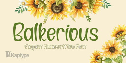 Balkerious is a modern elegant font. Font with a touch of classy elements. Perfect for logos, headlines, cards, invites, paragraphs, cover photos, web design, lettering, and other designs.
 - Oxbridge by Studio K,
$45.00 Crisp, classic and compact, Oxbridge is a distinguished display font ideally suited to branding luxury goods or other applications which call for a combination of style and authority.
 - 2031 by Noir Typo,
$15.00 The 2031 typeface is a toolbox made of fonts from the 2030 typeface. 3d, outlines, shadows and other graphic effects remix each style into a new postmodern typeface.
 - Kasper by Linotype,
$29.99Kasper was designed by Franco Luin in 1995. It is an informal script typeface and its playful, dynamic characters are perfect for greeting cards and other personal correspondence. - Ps Rooster 2 by Fontopia,
$25.00 Rooster Families are based on a ventilation grill. All the individual characters are isolated from this form. Rooster 1 and Rooster 2 can be combined with each other.
 - Ps Rooster 1 by Fontopia,
$25.00 Rooster Families are based on a ventilation grill. All the individual characters are isolated from this form. Rooster 1 and Rooster 2 can be combined with each other.
 - Palazzo by Jonahfonts,
$35.00 An oval-brush-script with some opentype discretionary ligatures along with other ligatures and fractions. Palazzo Solo is the same as Palazzo Regular but is an unconnected version.
 - Oval by Fontfabric,
$19.00 Oval is a custom sans font which is applicable for any type of graphic design - web, print, motion graphics etc and perfect for t-shirts and other items.
 - Bulughul Marom by Mokatype Studio,
$22.00 Hello Introducing, Bulughul Marom - Our new collection of modern display fonts inspired by Blackletter calligraphy with strong character and sharp edge suitable for designing logos, templates, brochures, videos, advertising branding, and more. Bulughul Marom font with strong and challenging nuances. very suitable for headlines, typography, Poster, magazines, brochures, packaging, Websites, and much more for your design needs, making your designs more modern and professional looks as vintage modern. What's Included: + Standard glyphs + Web Font + International Accent + Works on PC and Mac + Simple installations accessible in Adobe Illustrator, Adobe Photoshop, Adobe InDesign, and even works on Microsoft Word. PUA Encoded Characters: Fully accessible without additional design software. Fonts include multilingual support. + Image used: All photographs/pictures/vectors used in the preview are not included, they are intended for illustration purposes only. Thank you
 - Perron by Fontforecast,
$39.00 Meet the successor of our bestselling design kit 'Chameleon': Perron. The concept of designing multiple contrasting designs under the same name was first introduced by Fontforecast in TyfoonSans and TyfoonScript. Two font families that were designed to complement each other. And that's exactly what this new release does. With the three designs in Perron, which means 'platform' in dutch, you will be able to take your design projects where ever you want them to go. This flexible kit consists of 7 fonts in three basic designs, and when combined Perron No1, No2 and No3 reïnforce each others charm. This offers great potential for creating lively layouts for many different projects, e.g. invites, menu's, magazines, brochures, packaging, greeting cards, T-shirts, etc. Perron No1 is a serif display font with large and small Caps. This font requires an Opentype savvy application to reach its full potential. Turn on contextual alternates and beginning and ending characters are replaced by their alternative versions, as you type. Stylistic sets and swashes offer even more variations. Perron No1 comes in two versions: No1 and No1 Shade. They can be used separate or layered for a colorful or shaded effect (if your application allows you to stack text frames). Perron No2 is a charming handwritten font, with slightly rough contours, that was added for an extra personal touch. It comes in regular and Italic. Perron No3 is a clean, tall and very skinny font family. It has large and small Caps and comes in three weights: Light, Regular and Bold. Because of its clean appearance No3 adds a modern touch to the design kit.
 - Coomeec by Linotype,
$29.99 Although Andi AW. Masry designed his Coomeec typeface with one eye on comic books, this is more than just another cartoon font. Even in our short profile of the font below, we're sure you'll find enough to be surprised by the calligraphic aesthetic and the wide range of potential uses of Coomeec. Typography had been one of Andy AW. Masry's hobbies before he turned professional in 2008 and formed his own agency in Jakarta in Indonesia. The former construction engineer had already spent many hours of his leisure time in following his pastimes of designing, photography and Latin typography. Fascinated by the close interaction between text and image in comic books, one of his first projects was the development of his font Coomeec™. The condensed letters of Coomeec seem to have more in common with a calligraphic brush typeface than a more conventional cartoon font. With the characteristic line forms of a brush font, the not unextensive variations in line thickness and numerous small embellishments to the glyphs, Coomeec can be used to enhance your projects with animated effects. You can achieve this not just in the larger font sizes; the font is also very legible in small sizes thanks to its large x-height. There are certain unusual letter forms, such as that of lowercase 'g', 's' and uppercase 'Y', that provide Coomeec with a touch of the exotic. As Coomeec has numerous character alternatives, you can use it not only to create diverse designs but also to ring the changes with the character of the text itself. There are variants for most lowercase letters, some of which exhibit only minor differences, such as the lack of a curlicue on the 'b', a modified downstroke on the 'h' and an elongated base for the 'k'. In the case of other letters, such as the 'q' and the 'r', there are significant disparities between variants. The uppercase characters are also available in a lively swash style with significantly extended terminals. Among the range of characters of Coomeec are oldstyle and lining figures designed for proportional and tabular setting. All alternatives are available in the form of the corresponding OpenType versions. Coomeec comes in two weights; Regular and Bold, each with its Italic version. The form of the slightly inclined Italic characters is identical to that of their upright counterparts with the exception of the lowercase 'f', which has an ascender in its Italic version. As an OpenType Pro font, the glyphs available for Coomeec ensure that it can be used to set not only western European but also central European texts. Coomeec is not just at home when used to set headlines. The excellent legibility of this individual and vibrant typeface means that it's also ideal for setting shorter texts. The various alternative letters provide the designer with the opportunity to vary the textual appearance, and to choose between creating a more formal or more light-hearted effect. Coomeec is not only available in an OpenType version but is also obtainable as a web font, so that you can employ its exotic features to good effect when creating internet pages.
 - P22 Typewriter by IHOF,
$24.95 This font is not overly distressed, nor is it overly clean. It is a typewriter font. It is perfect when you want a document to look like it was made on a typewriter. This font is primarily based on the typewriter used for a typographic conference document from 1966 in Mainz Germany. The model and age of the typewriter used is not known. Additional characters were sourced from other vintage typewriters and others were designed to complete the full character set.
 - VakaDi by Tadiar,
$15.00 vakaDi is stylish futuristic tech font designed for such areas as hi-tech, future, sport, space, army, games and many others. In the process of creating the font, we faced the choice of which letters are better - this or that... Each of them was beautiful in its own way and so we decided to include them all!:) Some you will find in upper case, others in lower case. Multilingual support (Latin extended). It is designed for header and text both.
 - OffBit by Power Type,
$15.00 OffBit is a font type derived from Bitmap with various variations from each box. The term bitmap comes from computer programming terminology, which means simply a bit map, a spatially mapped array of bits. Now, together with PowerType, it usually refers to a similar concept of an array of pixels that are mapped spatially and into various shapes such as dots and other models. This font matches the theme of computing, graphic design, posters or other media, all of which can be combined.
 - Fingerz by Sergejs Kolecenko,
$19.95 This typeface was started as assignment in Academy, then the idea grew to develop into a font family with different styles for interesting combinations. Inspiration came from my own hands -- it is amazing how fingers can form letters, so each letter has it’s own personality. Fingerz font family is perfect to use in posters, booklets and other typographic elements also in all other media that needs to catch attention. This font comes in 5 different styles to combine in various color combinations.
 - Au Revoir by Hanoded,
$20.00 Au Revoir - saying goodbye is one of the hardest things in life, but in a sense it is also beautiful: there is a promise of seeing each other again, as 'Au revoir' literally means: 'to the next time we see one another'. Au Revoir font is slightly cursive, elegant without being posh, simple and legible. You could write a poem or a farewell letter with it, but I guess its simplicity lets you use it in various other, less dramatic, designs.
 - Emillisa by Yoga Letter,
$13.00 Emillisa is a modern handwritten font that is made with a subtle touch resulting in a high quality font. This font is very beautiful and elegant which is suitable for all kinds of your work. This font is perfect for all wedding needs (wedding invitations, wedding photography, decorations, and other wedding designs). It is also suitable for promoting your business (hotels, villas, vacation spots, products, services or other promotions. Also suitable for promo updates, logos, branding, posters, or status updates on social media.
 - FF Fago Monospaced by FontFont,
$67.99 FF Fago Thanks to his many years of involvement in major corporate type projects, Ole Schäfer had the necessary resources from which to construct his FF Fago™. The result is an extended family that provides comprehensive typographic support and whose qualities come to the fore in all relevant contexts ? from print to office through internet and wayfinding systems. FF Fago The sizable x-height together with the generous and open design of the characters ensure that the sans serif Fago remains clearly legible even in small point sizes or in potentially difficult situations, such as on wayfinding systems. A subtle contrast in line weight and letter forms that are reminiscent of those of an antiqua typeface provide the font with a restrained yet friendly and lively tone. Available in five weights, each with three different kerning widths and matching genuine italic variants, FF Fago is equipped for practically every situation. There are also small caps, oldstyle and lining figures, a selection of ligatures and geometric symbols. The range of potential applications of this universal font is almost inexhaustible ? it can be used in packaging design, on signs, posters and even for setting longer text sections. Fago is the ideal partner for those working on major corporate projects! FF Fago Correspondence Sans und Correspondence SerifThe Correspondence versions of Fago have been optimized for use in the business environment and in office communication. The carefully modified characters have a particularly robust feel, so that the clear, easily differentiated glyphs allow for straightforward communication even on screen. With these aims in mind, Schäfer has not only adjusted the x-height, but has provided certain letters in the sans variant ? such as the lowercase "i", the "r" and the uppercase "I" ? with serifs. Correspondence Serif, on the other hand, has been conceived as a slab serif throughout and in appearance has the look of the letters produced by the old office typewriting machines. An individual note has been added by providing a few unusual serif forms, as for example in the case of the "m", the "v" and the "y". Both Correspondence Sans and Serif are available in two weights with complementary italic versions and thus are ideally suited for use with standard office programs. This is all rounded off with a selection of office symbols. FF Fago Monospaced The use of a few typographic tricks is necessary to ensure that the letters of the alphabet appear to have the same width. Narrow letters such as "r" and "i" have been made to seem more expansive by using prominent serifs while the broader letters ? a good example is the "m" ? have the forms seen in a condensed font. And it is thanks to this design strategy that Fago Monospaced has the character of old typewriter text. What was once unavoidable because of the technology of the time is now a welcome alternative that can be used for the purposes of emphasis. As an additional supplement to the Fago superfamily, Fago Monospaced can be used, for example, to set short notes or draw attention to special text passages. There are three weights, in their original form without italic variants or small caps, but offering an alternative, technical form of the "0" with a crossbar.
 - CP Company by FSD,
$23.37 C.P. Company is a group of types including 4 different forms and it is a complementary sign of communication for the C.P. Company clothes maker. C.P. Company communication makes use of media such as the press and the web and that’s the reason why we have always felt the need for a font that would not show incongruities through the monitor. Therefore we have decided to change the structure of glyphs like a, e, g, s… in the most contrasted versions to prevent the serifs from touching the internal parts of the letters and in this manner we have made a really unusual stylistic choice for a group of types. The difference between the height of caps and smalls is very low (about 20%) so that the smalls are easy to read even when their dimensions are on a very small scale. Moreover this stylistic solution gives the possibility to avoid using the small capitals in case of charts and catalogue codes (i.e. Tricot M5) and provides more vertical compactness between the lines. Even a sentence written in capital letters next to another one written in smalls does not look so much contrasted from a typographical point of view and then it is not unpleasant. The limits due to different constructive principles have been overcome by means of a grid based on the automatic division of EM square of 9-point type and in this manner the letters have a wider face. The font is even more unusual owing to the style chosen that belongs to the classical tradition of hair-lined types for glyphs like e and also thanks to ligatures like ? in the characters set. CP Company is a geometrical font whose alphabet makes use of the style of types that preceded the Helvetica, matched with more experimental and updated solutions. Numbering is monospaced. The bending of number 2, the slight raising of the oblique serif of number 4 and the presence of a hair-line in number 7 are the solutions adopted to make the types match in a more balanced manner.
 - Tofes by Putracetol,
$28.00 Tofes - Modern Serif Font Tofes - Modern Serif Font is a versatile typeface that exudes elegance and sophistication. This font is perfect for any project that requires a touch of luxury and class, such as branding, packaging, logos, and more. The font's name is inspired by the Hebrew word for "apple," which symbolizes beauty and perfection. With its clean lines and modern look, Tofes is a must-have for any designer looking to create stunning and professional designs. If you're looking to create a romantic and elegant branding, Tofes is the perfect font for you. Its clean lines and modern look give it a timeless quality that works well for a variety of design projects. This font is particularly well-suited for use in packaging and logos, where it can help convey the quality and sophistication of your brand. Tofes comes with a range of features that make it a versatile and useful typeface. The font includes both uppercase and lowercase letters, as well as Opentype features such as alternates and ligatures. It also includes support for a wide range of languages, making it a great choice for designers working on international projects. Additionally, Tofes comes with number, punctuation, and symbol glyphs, allowing you to create a wide range of design elements with ease. In the font package, you will find Tofes in three different file formats: OTF, TTF, and WOFF. These formats ensure that the font is compatible with a wide range of software applications, including Adobe Creative Suite, Microsoft Office, and more. This means that you can use Tofes in virtually any design project, whether you're creating graphics for a website, designing a logo, or working on a print project. In summary, Tofes - Modern Serif Font is a versatile and elegant typeface that is perfect for a wide range of design projects. With its clean lines, modern look, and support for multiple languages, Tofes is an excellent choice for designers looking to create sophisticated and professional designs. Its features, including Opentype alternates and ligatures, make it a valuable addition to any designer's toolkit.
 - Connected Neon by Ditatype,
$29.00 Connected Neon is a mesmerizing display font that encapsulates the vibrant glow of neon lights, fusing it with a unique twist of connected letterforms. With its bold and uppercases design, this typeface commands attention, drawing the viewer into a captivating visual experience. The defining feature of Connected Neon lies in its elegant lines that seamlessly connect each letter, creating a unified and harmonious composition. These delicate lines flow effortlessly from one character to the next, accentuating the connectivity between them. As a result, the letters appear to dance with an electric energy, forming an enchanting tapestry of illuminated artistry. The neon-inspired style of Connected Neon is a nod to the retro-futuristic aesthetics of the 80s, reminiscent of the vibrant signage that adorned the bustling city streets. The font's luminous glow radiates with an otherworldly aura, casting a vivid hue that is both nostalgic and contemporary, evoking a sense of vibrant energy and modernity. Each character in Connected Neon has been meticulously crafted to strike the perfect balance between legibility and decorative flair. The bold letterforms boast a sleek, sans-serif design, ensuring clarity even in the midst of the dynamic interplay of lines. The seamless connections between letters create a sense of continuity and fluidity, enhancing the visual appeal without compromising readability. Enjoy the various features available in this font. Features: Multilingual Supports PUA Encoded Numerals and Punctuations Connected Neon is ideal for a range of creative projects that demand a touch of charismatic flair. From eye-catching headlines on posters and advertisements to striking branding elements, this font adds a touch of electrifying allure to any design. Whether you're designing a captivating logo, crafting an attention-grabbing title, or bringing a digital artwork to life, Connected Neon will effortlessly infuse your creations with a radiant glow and a sense of interconnectedness. Find out more ways to use this font by taking a look at the font preview. Thanks for purchasing our fonts. Hopefully, you have a great time using our font. Feel free to contact us anytime for further information or when you have trouble with the font. Thanks a lot and happy designing.
 - The "Djs Symbols" font by Phuxer Designs is a fascinating and innovative font that stands out in the realm of typography. Rather than focusing on traditional letters and numbers, this font explores t...
- Flower Sketch Neue by Okaycat,
$29.95 Okaycat presents "Flower Sketch Neue". Flower Sketch Neue contains beautiful illustrations of sunflowers, roses, tulips, olives, and leaves. You may also like our other fonts Flower Sketch and Orchids.
 - Viralles Script by Letterniz,
$20.00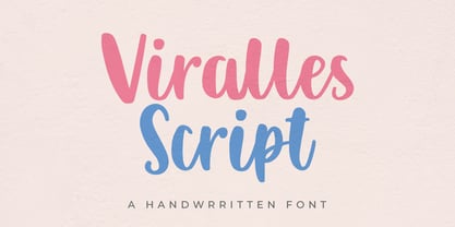 Viralles is a handwritten script font. Looks stunning on wedding invitations, thank you cards, quotes, greeting cards, logos, business cards and any other design that requires a handwritten touch.
 - Esmetralda by FHFont,
$17.00 Esmetralda is a Modern Calligraphy Script with opentype features included in the font. Suitable for design, element design, wedding, events, t-shirt, logo, badges, sticker, and other awesome work.
 - Delivery by Artyway,
$20.00 Delivery is a bold, geometrical font in square shapes with modern spurs, uppercase and lowercase, accented, additional characters ligatures and stylistic alternates, numbers and punctuations, currency and other symbols.
 - Metal rocker by Letterafandi Studio,
$14.00 Metal Rocker is a natural handwritten font. It looks stunning on thank you cards, quotes, greeting cards, logos, business cards, and every other design which needs a handwritten touch.
 - Rockids by Surotype,
$20.00 Rockids is a bold display typeface, Comes in two styles sharp and softed with bold characters, this font is perfect for headlines, posters, movie titles, Games, branding and others.
 - Blastero by Letterafandi Studio,
$14.00 Blastero is a natural handwritten graffiti font. It looks stunning on thank you cards, quotes, greeting cards, logos, business cards, and every other design which needs a handwritten touch.
 - Javarosa by Letterniz,
$25.00 Javarosa is a handwritten script font. Looks stunning on wedding invitations, thank you cards, quotes, greeting cards, logos, business cards and any other design that requires a handwritten touch.
 - Hardy Mind by Seemly Fonts,
$12.00 Hardy Mind is a simple, organic and bold display font. Simple but with a strong visual effect, this font will instantly make your creation more appealing than any others.
 - Letterpress Nostalgics JNL by Jeff Levine,
$29.00 Classic print shop stock cuts, cartoons, embellishments and other assorted imagery are collected within Letterpress Nostalgics JNL to add "a bit of yesterday" to your print or online projects.
 - Anathalya by Letterniz,
$27.00 Anathalya is a handwritten script font. Looks stunning on wedding invitations, thank you cards, quotes, greeting cards, logos, business cards and any other design that requires a handwritten touch.
 - Ps Javier by Fontopia,
$- The font is named after my son Javier. He studies architecture. Font Javier follows architectural principles. Javier 1, Javier 2 and Javier 3 can be combined with each other.
 - Banana Milk by wearecolt,
$19.00 Inspired by coffee shop chalkboards, Banana Milk is a bubbly font with a hand-drawn feel. A fun display font for logos, headings, books, posters and other cool stuff.
 - The id-Kaiou-LightOT font, created by Inoue Masaru, represents a striking example of modern typographic design that synthesizes traditional elegance with contemporary clarity. This font is part of a ...
- Garalda by TypeTogether,
$49.00 Type designer Xavier Dupré’s Garalda is a charming 21st century family that renews a legacy of finesse. As paragraphs on a page, Garalda’s overall impression is of a workaday personality, committed to the main purpose of the job: easy long-form reading. But setting it in display sizes proves something different: This reinvented Garamond is anything but basic. The Garalda story begins with the serendipitous finding of a book typeset in a rare Garalde, called Tory-Garamond, with which Dupré was not immediately familiar. This Garamond was used in bibliophile books in the decades surrounding 1920, but after that it became déclassé for an unknown reason. Dupré found the italic styles especially charming and discovered the family was probably the mythical Ollière Garamond cut from 1914. He obtained low resolution scans of the typeface and used them, rather than high resolution scans, as the basis for his new type family. This allowed Dupré the mental freedom to experiment and remix as he saw fit, culminating in a contemporary family with heritage. As seen in the simplistic rectangular serifs, Garalda is a humanist slab serif, but with a mix of angles and curves to give the classic shapes a fresh, unorthodox feeling. While almost invisible in paragraph text, these produce a graphic effect in display work. The set of ligatures in the roman and italics lend themselves to unique display use, such as creating lovely logotypes. In the italics, some swashes inspired by different historic Garamonds are included, sometimes breaking their curves to be more captivating. Just look at how the italic ‘*-s’ ligatures create ‘s’ with a cursive formation rather than merely a flowing slant. And how the roman ‘g’ link swings as wide as a trainer’s whip. These are all balanced by squared serifs in the roman to keep an overall mechanised regularity. The Garalda family comes in eight styles, includes some of the original arrows and ornaments, and speaks multiple languages for all typesetting needs, from pamphlets to fine book printing. The complete Garalda family, along with our entire catalogue, has been optimised for today’s varied screen uses.
 - Baraboo Banner by Solotype,
$19.95This was put together by Dan X. Solo to provide a quick way to set headings for a circus brochure. The name was given in recognition of the Baraboo Circus Museum. The end pieces are in pairs on the uppercase keys A-B, C-D, etc. The alphabet itself is in the lowercase position.