10,000 search results
(0.039 seconds)
- Madurai by insigne,
$24.75 The rounded forms found in Chennai have proven to be one of insigne's more popular designs for web-based company logotypes. Now, insigne's new superfamily Madurai takes its popular predecessor to a new level, offering a wide range of complementary fonts. Madurai removes Chennai's rounded stems and then adjusts the character width to account for its reduction in geometry, resulting in a balanced sans-serif face with humanist touches that works well for extended text. The Madurai family has a full range of six weights from thin to black and includes Condensed and extended options for a total of 36 fonts. All members of the Madurai series include a wide variety of OpenType alternates. Madurai is equipped for complex professional typography, including alternates, small caps and plenty of alts, including "normalized" capitals and lowercase letters that include stems. The face also has a number of numeral sets, including fractions, old-style and lining figures with superiors and inferiors. OpenType-capable applications such as Quark or the Adobe suite can take full advantage of automatically replacing ligatures and alternates. You can find these features demonstrated in the .pdf brochure. Madurai also includes the glyphs to support a wide range of languages, including Central, Eastern and Western European languages. In all, Madurai supports over 40 languages that use the extended Latin script, making the new addition a great choice for multi-lingual publications and packaging. For your next project, explore the fantastic potential of Madurai.
 - P22 Operina by IHOF,
$24.95 Operina is based on a 16th-century lettering model of the scribe Ludovico degli Arrighi (Vicentino Ludovico degli Arrighi) used in his 1522 instructional lettering book, "La Operina da Imparare di scrivere littera Cancellarescha." This book contains what is considered to be the earliest printed examples of Chancery Cursive. Rather than try to reproduce a perfect, smooth, type-like version of Ludovico's hand, which has been attempted in the past, the designer opted to leave in some rough edges and, thereby, create a look that mimics the endearing artifacts of quill and ink lettering on parchment. When reviving an old style, a designer is faced with many challenging decisions, such as whether to aim for ultimate authenticity or to modify the alphabet for modern use. The decision here was to create a font that resembles the 16th-century Italian hand-lettering master's, but is also useful to the contemporary user. Because the letters U u W w J j and our modern Arabic numerals were not in use during the advent of these original letterforms, these had to be interpolated. To make a complete and useable font set, we also had to fashion many of the extra and diacritical characters to match the look of the alphabet. There are three fonts in this set: Romano(simple), Corsivo(more complex), and Fiore(swash). Romano is the most subdued, it contains Roman looking caps and has lining figures. Corsivo is more elaborate, it has more decorative capital letters and an alternate version of the lowercase with longer ascenders and descenders, and old style figures. Fiore, the swash font, is the most elaborate with the longest ascenders and descenders. You may not wish to use the Fiore version on its own, especially as all caps; it is meant to enhance the other two alphabets because it contains the most elaborate capitals and has many extra ligatures. P22 Operina Pro is an OpenType version that contains over 1200 characters. It features Small Caps, Old Style Figures, full European, Cyrillic and Greek character sets and a new OpenType first with automatic Roman Numerals. Just type any number and with the feature, it will convert to Roman Numerals!
 - Trump Deutsch by RMU,
$25.00 This rather modern versions of a Gothic style blackletter were originally drawn by Georg Trump in 1936 and 1937 respectively. To access all ligatures, I recommend to activate both OT features, standard and discretionary ligatures.
 - Nouveau Date JNL by Jeff Levine,
$29.00 The hand lettered title on the cover of the 1914 tune “I Want you to Meet My Mother” served as the inspiration for Nouveau Date JNL, which is available in both regular and oblique versions.
 - Universal MICR Pi by Monotype,
$29.00MICR The MICR font has a very practical application. MICR numerals, when printed in magnetic inks, can be read by special scanners that recognize the characters from their magnetic fields rather than just their shapes. - Limoncello Recipe by PeachCreme,
$19.00 Savor the perfectly imperfect strokes of "Limoncello Recipe," a handwritten font that embraces the charm of human touch in every line. Just like the handwritten notes of a well-used family cookbook, this font features delightfully uneven lines and a casual, unrefined style that brings an approachable, personal feel to any project. With 84 standard ligatures, "Limoncello Recipe" reflects the natural variations of handwriting, creating connections that are as authentic as they are unique. These connections celebrate the beauty of imperfection, making your text resonate with the warmth and originality of a handwritten letter. The font's assortment of beginning and ending swashes provides a variety of expressive flourishes, giving your words a laid-back elegance. These alternates allow for a playful freedom in your designs, echoing the spontaneous and joyful scribbles found in the margins of a secret family recipe. Ideal for designs that call for a touch of rustic charm and a dash of whimsy, "Limoncello Recipe" is a reminder that beauty often lies in the flaws. Whether you're designing a quirky brand identity, a charming event invitation, or packaging for artisanal products, this font proves that sometimes the best approach is a little bit carefree and wonderfully imperfect.
 - Freundschafts-Antiqua AR by ARTypes,
$35.00Freundschafts-Antiqua AR is based on a 20th-century German type design. Freundschafts-Antiqua (which was also called Chinesische Antiqua) was designed by the Chinese calligrapher Yü Bing-nan when he was a student at the Hochschule für Grafik und Buchkunst at Leipzig in 1960. It was cast in 1964 by VEB Typoart, Dresden, in 9-pt and 28-pt (Didot). The design combines the best German traditions with the Chinese bamboo pen. It is a unique, wholly modern, yet quiet and dignified typeface which is well suited for text-setting in many sizes. The original design was carefully crafted with all non-kerning letters (none of the letters overhangs its side-bearings); the lower-case f was designed so that no ligatures were needed. The AR fonts include the type's ch and ck logotypes, monetary signs and all the standard accents. The letterfit of the original design is retained and, as can be seen in the attached printable .pdf, text composed at normal sizes is very agreeable indeed. Freundschafts-Kursiv AR A features old-style (non-lining) figures and 'kerning' letters; Freundschafts-Kursiv AR B contains lining (cap-height) figures and all non-kerning letters following the original design of the face. - Stancilo by Ardyanatypes,
$15.00 Stancilo is a type of serif font that offers uniqueness in its form. With a distinctive design and superior aesthetics, this font gives each character an elegant and modern touch. Stancilo font has nine different thicknesses, ranging from thin to bold, providing flexibility and variation. Thus, this font can be used for various design purposes, from main headings to body text, with the ability to adjust the desired intensity and emphasis. One of the advantages of Stancilo is the presence of alternate letters and ligatures that provide character variations for each letter. Allows users to combine alternate letters or use special ligatures to create more harmonious combinations and relationships between characters within words. This feature adds a sense of personalization and additional creativity to the design. Furthermore, Stancilo font also supports multiple languages, making it suitable for multilingual design projects. With the support of diverse languages, this font enables effective and comprehensive visual communication in various cultural contexts. Stancilo is a prominent serif font with a unique form, providing nine different thicknesses, alternate letters, and ligatures. These advantages make it suitable for elegant, modern designs and allow for creative exploration in using its letters. With support for multiple languages, this font becomes a versatile and inclusive choice for diverse design projects.
 - London Boutique by Mans Greback,
$69.00 London Boutique is a bold and cute script font that combines rustic charm and fine art elegance. Its cursive strokes and handwriting style give it a personalized touch that is perfect for adding a decorative flair to your designs. Designed with a focus on independent shop usage, London Boutique features fine swashes that add a touch of sophistication to any project. Whether you're creating logos, branding, or social media posts, this font is versatile enough to handle it all. London Boutique comes in four styles: Regular, Italic, Bold, and Bold Italic. This range of styles provides flexibility and allows for dynamic and creative designs. Use underscore _ anywhere in a word to make a swash. Example: Luxure_Shops Use multiple underscores to make different swashes. Example: Angel___Stars Use # before or after any letter to make an initial or finishing swash. Example: #loveletter# The font is built with advanced OpenType functionality and has a guaranteed top-notch quality, containing stylistic and contextual alternates, ligatures and more features; all to give you full control and customizability. It has extensive lingual support, covering all Latin-based languages, from Northern Europe to South Africa, from America to South-East Asia. It contains all characters and symbols you'll ever need, including all punctuation and numbers.
 - Tumbasan by Look Minus Today,
$16.00 Introducing Tumbasan - Modern Minimalist Sans Serif by Look Minus Today. Tumbasan is designed with a modern and minimalist aesthetic in mind. This versatile font is perfect for all design needs, from print materials to digital media. Geometric shapes give it a contemporary feel that will add a touch of sophistication to any project. The font's design is based on a simple and legible sans serif style, with just the right balance of thickness and spacing to ensure clarity and ease of reading. Its simple, elegant lines and smooth curves make it a great choice for a variety of design applications, including branding, advertising, packaging, and editorial design. Our modern and minimalist sans serif font is a versatile and stylish choice for any design project. Its clean lines, geometric shapes, and legibility make it an excellent choice for a wide range of applications, while its modern aesthetic ensures it will stand out and make a bold statement in any design. Features: - Uppercase - Lowercase - Alternates & Ligatures - Numerals & Punctuation - Multilingual & Symbol - HOW TO ACCESS ALTERNATE CHARACTERS - Open glyphs panel: In Adobe Illustrator go to Window - Type – glyphs In Adobe Photoshop go to Window – glyphs For any further questions or assistance, please feel free to contact us at look.minus.today@gmail.com Thank you and have a nice day!
 - Gareh Note by Afkari Studio,
$19.00 Introducing Gareh Handwritten Marker Note Font, a font that merges the liveliness of handwritten script with a unique, natural touch. Crafted to captivate attention and infuse a fresh vibe into your designs, Gareh strikes the perfect balance between the elegance of handwriting and a casual feel. With expressive characters and authentic marker accents, each letter exudes warmth and originality. Gareh is the ideal solution for design projects seeking a personal and creative touch. Whether you're creating posters, greeting cards, logos, or working on branding projects, this font will leave an unforgettable impression. Every stroke brings inviting warmth and inspirational vibes. With Gareh, you can add a new dimension to your messages. Easy to use, this font grants the freedom to express limitless creativity. Get Gareh now and discover how each letter can lend that special handmade touch to every design of yours." Highlighted Features: – Uppercase, Lowercase, Number, and Punctuation – Special alternates and ligatures – Works on PC & Mac – Simple installations – Accessible in Adobe Illustrator, Adobe Photoshop, Adobe InDesign, and even work on Microsoft Word – Fully accessible without additional design software. – Mültîlíñgúãl Sùppört for; ä ö ü Ä Ö Ü ß ¿ ¡ Hope you enjoy our font and this font is a useful font for your projects!
 - The Cartel by Say Studio,
$12.00 About the Product The Cartel is a elegant serif font . This typeface has been made carefully to make sure its premium quality and luxury feel. The ligatures makes this typeface unique and stands out rather than the regular serif font. Very suitable for logo, headline, tittle, and the other various formal forms such as invitations, labels, logos, magazines, books, greeting / wedding cards, packaging, fashion, make up, stationery, novels, labels or any type of advertising purpose. Features : numbers and punctuation multilingual ligatures alternates PUA encoded FAQ's : Where are the TTF's? They are included in a download link( in a text file) in your main download file. 1 user 2 computers installation (Desktop License) You may NOT use for broadcast or Cinema/Motion Picture. You may NOT resell this font in any platform without further permission from designer. Do NOT embed font files in app/game/e-pub (for desktop license) You may NOT use the fonts in templates for sale/free. ( web/print/app ) For other license use please contact us. SOFTWARE REQUIREMENTS : Fonts and alternate : No special software required they may be used in any basic program /website apps that allows standard fonts That's it folks! You can go ahead and get cracking :) Follow My Shop For Upcoming Updates Including Additional Glyphs And Language Support. And Please Message Me If You Want Your Language Included or If There Are Any Features or Glyph Requests, Feel Free to Send me A Message. Have a Good Day !
 - Sirba by TypeTogether,
$49.00 Sirba, a serif typeface family with a friendly personality, was conceived especially for the demands in complex text environments like dictionaries, academic texts, annual reports, novels and magazines. It has many design features that were particularly designed with Sirba’s purpose in mind. Because of its open counters, the large x-height and its short ascenders and descenders, this typeface conveys a pleasant reading experience and high legibility even in small sizes. Sirba is a low-contrast typeface, contemporary but with a classical touch, revealing its beauty in design details, such as the asymmetrical bottom serifs, curved bracketing and calligraphically reminiscent terminals. Furthermore, the capitals appear integrated into the text, thanks to the low cap height, and the constant width of all tabular numbers between the weights make this typeface very usable in annual reports and tables. Sirba is available in the four classic styles plus a special heavy (Black) version, which is particular in that its proportions are designed so the counters remain big enough when set in very small text sizes. This means that Sirba Black’s spacing and letter width are rather generous in comparison to other typefaces of that colour. This ensures excellent legibility. During the design of the typeface family, much attention was given to the italic and regular as counterparts of each other. The italic distinguishes itself just enough while reading without creating strange spots within the text when looking at the text as a whole.
 - Gendouki by Typodermic,
$11.95 Introducing Gendouki, the ultimate futuristic typeface that will transport your designs to the cutting-edge of technology. With its striking filament stencil lines, reminiscent of spacecraft access panels, Gendouki is the perfect choice for projects that demand a bold and hyper-futuristic look. Imagine using Gendouki as a large, low-contrast backdrop element, setting the stage for your content to shine. The sleek and modern lines of the font will add depth and dimension to your design, creating a dynamic visual experience that’s sure to capture your audience’s attention. But that’s not all. Gendouki is also perfect for producing movement in your paragraphs when applied as a techno drop-cap. Watch as your text springs to life, animating your words and drawing your reader in with its captivating energy. So if you’re looking for a font that combines the sleek, hyper-futuristic look of a spacecraft with the sharp, clean lines of modern design, look no further than Gendouki. Try it today and take your designs to a whole new level of cool. Most Latin-based European writing systems are supported, including the following languages. Afaan Oromo, Afar, Afrikaans, Albanian, Alsatian, Aromanian, Aymara, Bashkir (Latin), Basque, Belarusian (Latin), Bemba, Bikol, Bosnian, Breton, Cape Verdean, Creole, Catalan, Cebuano, Chamorro, Chavacano, Chichewa, Crimean Tatar (Latin), Croatian, Czech, Danish, Dawan, Dholuo, Dutch, English, Estonian, Faroese, Fijian, Filipino, Finnish, French, Frisian, Friulian, Gagauz (Latin), Galician, Ganda, Genoese, German, Greenlandic, Guadeloupean Creole, Haitian Creole, Hawaiian, Hiligaynon, Hungarian, Icelandic, Ilocano, Indonesian, Irish, Italian, Jamaican, Kaqchikel, Karakalpak (Latin), Kashubian, Kikongo, Kinyarwanda, Kirundi, Kurdish (Latin), Latvian, Lithuanian, Lombard, Low Saxon, Luxembourgish, Maasai, Makhuwa, Malay, Maltese, Māori, Moldovan, Montenegrin, Ndebele, Neapolitan, Norwegian, Novial, Occitan, Ossetian (Latin), Papiamento, Piedmontese, Polish, Portuguese, Quechua, Rarotongan, Romanian, Romansh, Sami, Sango, Saramaccan, Sardinian, Scottish Gaelic, Serbian (Latin), Shona, Sicilian, Silesian, Slovak, Slovenian, Somali, Sorbian, Sotho, Spanish, Swahili, Swazi, Swedish, Tagalog, Tahitian, Tetum, Tongan, Tshiluba, Tsonga, Tswana, Tumbuka, Turkish, Turkmen (Latin), Tuvaluan, Uzbek (Latin), Venetian, Vepsian, Võro, Walloon, Waray-Waray, Wayuu, Welsh, Wolof, Xhosa, Yapese, Zapotec Zulu and Zuni.
 - Book Report JNL by Jeff Levine,
$29.00Here's another stencil font designed from and inspired by the lettering guides used for years by teachers, school children, merchants and others. - Retro Qalva by Nirmana Visual,
$24.00 Retro Qalva Inspired by magazine adverts from the 70'sand 80's, suitable for branding, logo, promotion, product packaging, and other needs.
 - Advent by Jonahfonts,
$25.00 A Semi-Slab face with a distinct emphasis on power and legibility. Very paced for packaging, posters, logos and various other applications.
 - FG Rochelle by YOFF,
$16.95FG Rochelle has some special capitals like the B and R that makes it stand out from other script fonts. A beauty! - Zero_G by fontkingz,
$19.00Type/Usage: Technoid Display Font for spacecraft visual identification in high and low gravitation. Mixes well with all other kinds of GROTESKES. - Bat Ghost by Letterafandi Studio,
$14.00 Bat Ghost is a Halloween decorative font. Add it to your Halloween crafts, horror movie posters, t-shirts and other about Halloween.
 - Ordin by Robert Corseanschi,
$24.99 Ordin is inspired by today's technology with a unique and clean look which stands out from the other fonts from its category.
 - Corvinus Skyline by GroupType,
$15.00 Corvinus Skyline is an elegant retro 1920/30's looking font great for headlines in magazines, posters, signage and other design projects.
 - Geometry pair by Etewut,
$20.00 Welcome to my Geometry Pair. Introducing two fonts Forma & Structure that will make you happy. One of them is a compilation of shadow-based symbols like silhouettes. Another one has a rock of glyphs that don't repeat each other, but looks in the same style. Surprisingly they fit to each other and you can mix them in your works, be it print or web design. Make your graphic works more stylish that highlight your uniqueness from other. Just wonder people who loves funky design and who respect tiny details. Now you have opportunity to grab them both at the same time! There are all caps fonts kerned with microscope with multi language support.
 - Manuel by profonts,
$51.99 Manuel, a simple, almost mathematically constructed typeface, includes stylistic alternates for a number of upper case characters. This comes in very helpful when designing logo letterings. Manuel(a) is a very charming, self-confident und exciting typeface design. The idea was to try to apply a given design criteria (also see Volker Schnebel's Marita and Martin fonts) to every single character. In other words, start with a character and develop all of the others from it. This is quite easy for some characters but extremely difficult for others. This process generates creativity and the characters move away from the initial constructed sketch. Together in a typeface, the individual characters are now all of a piece and character.
 - Optima Cyrillic by Linotype,
$65.00Many typefaces are distinctive or attractive at the expense of legibility and versatility. Not so the Optima® family. Simultaneously standing out and fitting in, there are few projects or imaging environments outside of its range. Although Optima is almost always grouped with sans serif typefaces, it should be considered a serifless roman. True to its Roman heritage, Optima has wide, full-bodied characters – especially in the capitals. Only the E, F and L deviate with narrow forms. Consistent with other Zapf designs, the cap S in Optima appears slightly top-heavy with a slight tilt to the right. The M is splayed, and the N, like a serif design, has light vertical strokes. The lowercase a and g in Optima are high-legibility two-storied designs. Optima can be set within a wide choice of line spacing values – from very tight to very open. In fact, there are few limits to the amount of white space that can be added between lines of text. Optima also benefits from a wide range of letter spacing capability. It can be set quite tight, or even slightly open – especially the capitals. If there are any guidelines, Optima should be set more open than tight. It’s not that readability is affected that much when Optima is set on the snug side; it’s just that the unhurried elegance and light gray typographic color created by the face are disrupted when letters are set too tight. Optima is also about as gregarious as a typeface can be. It mixes well with virtually any serif design and a surprisingly large number of sans serif faces. The Optima family is available in six weights, from roman to extra black, each with an italic counterpart. In addition, the family is available as a suite of OpenType® Pro fonts, providing for the automatic insertion of small caps, ligatures and alternate characters, in addition to offering an extended character set supporting most Central European and many Eastern European languages. When you’re ready to find its perfect pairing, browse these fantastic matches: Monotype Century Old Style™, Dante®, Frutiger® Serif, Joanna® Nova, Malabar™, and Soho®. - Cabo Soft by Design A Lot,
$15.00 Cabo Soft is the 2.0 version of our original Cabo Rounded Typeface, created back in 2015. With this new version, Cabo Soft, we have brought multiple upgrades and updates compared with the original version. Some of those consist in the addition of more glyphs and accents, alternate designs for many of the glyphs (including an alternate for @, #, some of the numbers and more), and most importantly, we have done a slight update in the design of the letters, which we'll give more details in the following paragraphs. The main style and thought behind our Cabo fonts has always been the rounded corners and the soft and welcoming vibe that it gives. It's friendly and familiar, but also modern and slightly elegant, especially the Thin and Light styles. With Cabo Soft we have worked on adding an extra touch to the design of the letters by working on the termination edges of each letter. If Cabo Rounded had an exact round termination for each letter, with Cabo Soft we have developed a unique non-equally rounded shape that is applied to all types of terminations for each letter. This new design approach makes it have a more clean style, a more modern and unique look, but it also gives stylish, exclusivist and elegant vibes, while still being friendly and familiar. Thanks to it's variety in weights and styles, you can use Cabo Soft in almost any design project. It works well with headlines and paragraphs, it's a perfect match for logo design and branding, but can also do wonders in videos, signage and many other elements. The typeface covers most likely the entire Latin Alphabet, it comes with multiple design alternates for many of the letters, glyphs and numbers, with accents applied for all of the available alternates. As a finishing note, with the help of our Cabo Soft typeface you can create an friendly and welcoming designs, as well as stylish, elegant and exclusivist. It has all the necessary glyphs and accents for any Latin Alphabet projects, and you can play around with all of the alternates to create unique designs right from the start.
 - Corleone by FontMesa,
$- Corleone was originally designed as a two font family in 2001 and offered for free. This year we've expanded the font family to twelve fonts including small caps and italics. While the new Corleone has been greatly refined and is a much more professional quality font we've decided to still offer the original two fonts for free. Corleone is the perfect font for t-shirts and other merch, the new small caps make this font stand out and bring attention to whatever you use it on. Corleone is the font you can't refuse. Tech notes: Corleone was designed after a famous movie logo in the 1970's with a title name that sounds a lot like The Grandfather if you know what I mean. The movies had three installments, my original font was patterned after the logo for the third movie, the new Corleone Primo and Secondo versions are patterned after the logos of the first two movies. The differences are noticed mostly in the lowercase letters. One thing you will not find in this font family is the puppeteer or puppet master hand because it's been registered as a separate trademark of Paramount Pictures. If you're using an application that works in layers then you'll be interested in the four extra over score glyphs included in some of the versions of this font. Sorry, MS Word does not work in layers so this feature will not work in MS Word. When you open up the glyph map in Adobe Creative Suite you should see the over score glyphs when you scroll down to the bottom. These extra over score glyphs allow you to extend the top line of a single capital letter, with four different lengths you should be able to mix and match to achieve the length that you desire. When using the over score glyphs it's best to divide your word or headline into separate text objects, the cap being one object and the remaining letters being the second. If you try using the over score glyphs on a single text object then with each over score that you add the text after it will get pushed down the line.
 - Optima by Linotype,
$45.99 Many typefaces are distinctive or attractive at the expense of legibility and versatility. Not so the Optima® family. Simultaneously standing out and fitting in, there are few projects or imaging environments outside of its range. Although Optima is almost always grouped with sans serif typefaces, it should be considered a serifless roman. True to its Roman heritage, Optima has wide, full-bodied characters – especially in the capitals. Only the E, F and L deviate with narrow forms. Consistent with other Zapf designs, the cap S in Optima appears slightly top-heavy with a slight tilt to the right. The M is splayed, and the N, like a serif design, has light vertical strokes. The lowercase a and g in Optima are high-legibility two-storied designs. Optima can be set within a wide choice of line spacing values – from very tight to very open. In fact, there are few limits to the amount of white space that can be added between lines of text. Optima also benefits from a wide range of letter spacing capability. It can be set quite tight, or even slightly open – especially the capitals. If there are any guidelines, Optima should be set more open than tight. It’s not that readability is affected that much when Optima is set on the snug side; it’s just that the unhurried elegance and light gray typographic color created by the face are disrupted when letters are set too tight. Optima is also about as gregarious as a typeface can be. It mixes well with virtually any serif design and a surprisingly large number of sans serif faces. The Optima family is available in six weights, from roman to extra black, each with an italic counterpart. In addition, the family is available as a suite of OpenType® Pro fonts, providing for the automatic insertion of small caps, ligatures and alternate characters, in addition to offering an extended character set supporting most Central European and many Eastern European languages. When you’re ready to find its perfect pairing, browse these fantastic matches: Monotype Century Old Style™, Dante®, Frutiger® Serif, Joanna® Nova, Malabar™ and Soho®.
 - Ainslie Sans by insigne,
$- Say g'day to Ainslie Sans, insigne Design’s new typeface. Like its big brother, the new face incorporates a mix of influences from Oz, although Sans is pared down from the original semi-serif. The original Ainslie was inspired by Mt. Ainslie and the city of Canberra’s inner suburb of the same name. Canberra is Australia’s capital--a planned city designed by American architect Walter Burley Griffin. Griffin’s style and geometric design for the city, which include Mt. Ainslie, are now also the same structure that make up the foundation of Ainslie Sans. Unlike the original Ainslie family member, though, Ainslie Sans does away with much of the aboriginal-inspired touches by eliminating the semi-serifs, forcing the font to borrow more heavily than its predecessor from Canberra’s distinct, geometric design and style. The result’s a spiffy Australian font that’s usable within a wide array of applications. The trendy typeface incorporates a multitude of alternates. You can access these in any OpenType-enabled application. Alternates, swashes and alternate titling caps allow you to customize the look and feel. Also incorporated are capital swash alternates, old style figures, and compact caps. Check out the PDF brochure to view these options in action. OpenType enabled applications can take complete benefit of your automatic replacing ligatures and alternates. This font also presents the glyphs to help a wide array of languages. Try it for copy. Try it for a headline. Try it alongside the original Ainslie. Whichever way suits you best, give it a burl. You won't be sad you did.
 - Ainslie Slab by insigne,
$- Holy Dooley! It’s a new Ainslie! Based on the inspiration from Mt. Ainslie and the Ainslie suburb outside Canberra, the original Ainslie adds geometric simplicity with a hint of aboriginal flair to the project. And now the muses of Ainslie are back at work, lending their structure as the foundation of Ainslie Slab. Like its big brothers, the new Ainslie Slab puts together a great mix of influences from Oz for a great looking typeface with some ace new shoes. Slab’s spiffy new slab serifs complement the classic frame, making the result a ripper Aussie typeface that can be used in a great number of applications. Take a look at the trendy typeface’s alternates in action, too. You can access these in any OpenType-enabled application. Alternates, swashes and alternate titling caps allow you to customize your look and feel. Capital swash alternates, old style figures, and compact caps are included to add a bit more flexibility to your work as well. OpenType enabled applications can take complete benefit of your automatic replacing ligatures and alternates, and this font also presents the glyphs to help a wide array of languages. View all of these in the PDF brochure. And then try them out. Combine it with the original Ainslie and Ainslie Sans for more flexibility. Whether you need a good slab for the copy or you want a clean, upbeat look for your headline, Ainslie Slab offers you a unique touch of the Outback that’s anything but out of touch.
 - Radical Brush by Hanoded,
$15.00 Radical Brush is a rather radical font: I made it with a really wild brush and Chinese Ink. I’d probably use it for revolutionary posters, packaging design for extreme products or for R-rated movie posters.
 - Rockstage by Mozatype,
$17.00 Rockstage Calligraphy Font is an incredibly distinct, delicate and timeless handwritten font. It looks stunning on wedding invitations, thank you cards, quotes, greeting cards, logos, business cards and every other design which needs a handwritten touch. What’s Included : – Works on PC & Mac – Easy to use ( Installations ) – Easy Convert to webfont – Compabilty Windows, Apple, Linux, Cricut, Silhouette and Other cutting machines Thanks for downloading, and I hope you enjoy it!
 - Incus by VladB,
$20.00 Incus is a modern sans serif geometric font, includes upper and lower case characters, Latin, Cyrillic, Latin Eastern Europe, Turkish, Baltic and other. The Incus family consists of 6 fonts, divided into 2 subgroups (according to the type of style - St, Cut), and have the 3 types of thickness in each subgroup. Incus fonts will be useful in developing a brand, creating posters and other graphic products, and for word processing
 - Lazycat by VladB,
$28.00 Lazycat is a modern sans serif geometric font, includes upper and lower case characters, Latin, Cyrillic, Latin Eastern Europe, Turkish, Baltic and other. The Lazycat family consists of 8 fonts, divided into 2 subgroups (according to the type of style - St, Rg), and have the 4 types of thickness in each subgroup. Lazycat fonts will be useful in developing a brand, creating posters and other graphic products, and for word processing.
 - Migelia by Romie Creative,
$12.00 Migelia is a beautiful script font with perfect alternatives. This font will add a romantic and elegant feeling to your design. Migelia can be used for various applications, such as wedding designs, logos, invitations, posters, social media posts, and others. Additional characters are coded by PUA with a love accent Can be used in any software, such as Adobe Photoshop, Illustrator, Microsoft Word, PowerPoint, and others. Multilingual glyphs.
 - Overskrift by PizzaDude.dk,
$17.00 Overskrift is headline in danish. My mind was set on making a font suitable for headlines, and that is exactly what this font is useful for - but, I found it suitable for many other things as well. I was thinking about packaging, posters, postcards and other things that needs a super legible handmade font! I have added 5 different versions of each letter, and they automatically cycle as you type!
 - Monisha by Rotterlab Studio,
$12.00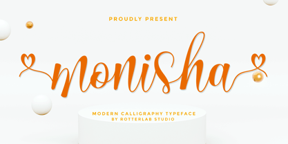 Monisha is a beautiful script font with perfectly perfect alternates. This font will exude a romantic and elegant feeling of your design. Monisha can be used for various applications, such as wedding designs, logos, invitations, posters, social media posts, and others. Features: - Additional characters encoded by PUA with a love accent - Can be used in any software, such as Adobe Photoshop, Illustrator, even Microsoft Word, PowerPoint, and others. - multilingual glyphs
 - Beliber by Ridtype,
$15.00 Beliber is a Serif Font Family, this font is specially designed to get the best feel and high quality to get the touch of a high end product This font supports Opentype Features, such as Alternate and Ligatures, as well as other forms of support symbols, numeric, mathematical symbols and others characters to be used. Thank you for your support of our product and using it in your project.
 - Bladis Night by Scoothtype,
$10.00 Bladis Night is a font duo between a serif and modern script fonts. Bladis Night is good for logo branding, wedding invitation, typography wedding, quotes text, magazine, or anything you want to do. Bladis Sans Serif includes numbers punctuation, alternates, and it also supports other languages. Bladis Night was built with OpenType features and includes ligatures, beginning and ending swashes , numbers, punctuation, and it also supports other languages. Thank you!
 - Lokko by VladB,
$20.00 Lokko is a modern sans serif geometric font, includes upper and lower case characters, Latin, Cyrillic, Latin Extended symbols and other. The Lokko family consists of 8 fonts, divided into 2 subgroups (according to the type of style - St, Cut), and have the 4 types of thickness in each subgroup. Lokko fonts will be useful in developing a brand, creating posters and other graphic products, and for word processing.