10,000 search results
(0.113 seconds)
- FF Dirty Three by FontFont,
$41.99 British type designer Neville Brody created this display FontFont in 1994. The font is ideally suited for music and nightlife and poster and billboards. FF Dirty Three provides advanced typographical support with features such as ligatures. It comes with proportional lining figures. This FontFont is a member of the FF Dirty super family, which also includes FF Dirty Four, FF Dirty One, FF Dirty Seven, and FF Dirty Six.
 - Hasan Alquds U by Hiba Studio,
$59.00 Hasan Alquds U is an Arabic display typeface. It is useful for titles and graphic projects where a contemporary, streamlined look is desired. The font is based on the simple lines of Kufi calligraphy, and the uniform slope of its strokes gives it a structured, geometric feel. It supports Arabic, Persian and Urdu languages. Hasan Alquds is the first released typeface of collaboration between Hasan Abu Afash and Mamoun Sakkal.
 - Funkadelity by PizzaDude.dk,
$18.00 Funkadelity is a funky breed between 60ies poster typography and 80ies grafitti. Maybe even inspired a bit by comic book lettering! Funkadelity wants to burn off the dance floor and show off the fancy dance moves - at the same time, it want to show off the smooth and clean lines of the letters. Originally handdrawn, but I digitally remastered every single letter, leaving the curves smooth and clean!
 - MM Cruella by MM Fonts,
$39.00 MM Cruella is a monolinear display typeface well suited for magazines headlines, posters, catalogs, branding and packaging. The round, large counters combined with the rounded terminals gives it a very fluid look and a warm character while the straight lines establishes a nice rhythm. It comes in 5 weighs and is loaded with discretionary ligatures and contextual alternates that will give your next project a very distinctive look.
 - Molecula by Northeast Type Foundry,
$22.99 Molecula is grotesque sans serif of slightly condensed proportions and humanist-grotesk features. The family features 9 weights from Thin to Black, each of which has an italic. The character set is robust, covering extended latin. All completely equipped with opentype features, alternative glyphs, fractions, lining numbers, small caps, subscript and superscript. Molecula has been designed for advertising, branding, packaging or anywhere a clean and contemporary voice is needed.
 - Erangle by Gatype,
$14.00 Erangle is an elegant serif typeface inspired by a vintage type specimen I found recently at an art fair. Thin to thick contrasting lines and elegant curves make Beginta the perfect font for this type of logo and display purposes. Hope you enjoy it Feel free to contact you with any questions or concerns you may have and I will get back to you as soon as I can.
 - Mentah 1 by Sulthan Studio,
$10.00 This sketch font Sans serif was born from the lines in the font that we created for the (Rajin) font and we redeveloped it into a different style with a more minimalist and more powerful setting and looks stunning for any smooth and bold writing that can be used anywhere in your work This font has complete uppercase and lowercase letters with 4 thicknesses, numbers, punctuation, and also language support
 - WallAxe by Nocturnal Workspace,
$17.00 WallAxe Typeface is the first commercial typeface from illusletra Co. A Victorian font with a classic, elegant, vintage, luxury, and clean feel. It comes in 2 styles, inline and bold. Released since 2018. FEATURES Standard Ligature Stylistic Alternate Fraction, Numerator, Denominator Number Styles, Lining Figures, Old Style Ordinals Multi-lingual Characters WallAxe Typeface is suitable for various purposes like logotypes, signage, labels, posters, titles, letterhead, book covers and more. Thank you!
 - Chipper by ITC,
$29.99Chipper is the work of British designer Andrew Smith, an adorably awkward typeface resembling the first printing of a child. Shaky lines and irregular forms combine for this naive look, which is completed by tiny specks surrounding each form as well as a number of illustrations. Chipper reflects an innocent fun and is perfect for children's greeting cards, certificates, or magazines and advertising for or about the little ones. - Adverse Stencil JNL by Jeff Levine,
$29.00If you're old enough to remember having a lettering stencil in school, then you might have tried to save all of the waste paper punched out of the letters and numbers; hoping to do something with them later on. Jeff Levine took his Tramp Steamer JNL stencil font and gave it the look of those waste paper pieces - lined up to form erratic characters with a personality all their own. - Scamps by Spark Creative,
$39.00 I designed this font because it didn't exist - it’s based on hand rendered type created for black and white line marker scamps used in the advertising industry. I use it that way and it’s saved me a LOT of hand-rendering time over the years. Of course, Scamps works as an informal marker script in its own right too. I’ll be interested to see what you do with it.
 - CA Cula Superfat by Cape Arcona Type Foundry,
$40.00 CA Cula Superfat is a distinctive fatty typeface, mainly intended for display purposes. You will find out that it looks best in extremely large sizes, or in very small ones. Whatever you do, avoid the ordinary and expectable. It’s not only beautifully fat, it’s also useful. A central European character set, loads of ligatures, oldstyle and lining figures make it a versatile companion in the daily struggle for outstanding typography.
 - Chokana by NREY,
$19.00 Introducing Chokana, a nostalgic multi-line font inspired by the 70's aesthetic. Font looks amazing as alone words and as full text blocks. Also it good for bright captions and unforgettable logos. This font could be the perfect solution if you want to give a lovely retro touch to your designs. If you have any questions, please let me know. Thank you and have a great day!
 - Romeo by Font Bureau,
$40.00 David Berlow drew Romeo Medium Condensed during winter of 1990, basing the design on the Estrecha Fina weight of Electra, a spectacular art deco sanserif with an unusually fine condensed series. Carlos Winkow designed it circa 1940 for the Nacional typefoundry of Madrid, the leading typefoundry in Spain. Jill Pichotta drew the ultra-light Skinny Condensed, a digital tour de force released with Medium Condensed; FB 1990–91
 - Emosia by Gatype,
$14.00 Emosia is an elegant serif typeface inspired by a vintage type specimen I found recently at an art fair. Thin to thick contrasting lines and elegant curves make Beginta the perfect font for this type of logo and display purposes. Hope you enjoy it Feel free to contact you with any questions or concerns you may have and I will get back to you as soon as I can.
 - HU Specialmovie KR by Heummdesign,
$25.00 HU SpecialmovieKR is a retro, wide square typeface, characterized by streamlined, narrow stroke ends such as 'ㄴ,ㅅ,ㅈ'. The first consonants are designed to be large with full modules to improve readability. The grapheme 'ㅇ', which is the face of the font, is in the form of a square in harmony with straight lines and curves, expressing a solid and simple feeling overall. HU SpecialmovieKR includes Korean.
 - Rylan by Jen Wagner Co.,
$17.00 Rylan is the classic serif I've been looking for in my design work – clean lines, modern serifs, and just a touch of vintage. It looks gorgeous in logo work as well as web headings and printed materials! Rylan Serif includes: • Upper & lowercase letters • Numbers & punctuation • Foreign language accents & characters for the international designer Rylan Grotesque includes: • Upper & lowercase letters • Numbers & punctuation • Foreign language accents & characters for the international designer
 - Christmas Doodles by Outside the Line,
$19.00 The newest addition to the Outside the Line collection of picture Doodle fonts... Christmas Doodles. The perfect font for that quickie Christmas party flyer. It includes gifts, gift tags, gingerbread man, gingerbread house, candy canes, hot cocoa, bow, crackers, 2 kinds of trees, poinsettia, jingle bell, ornaments, snowflakes and a star. This font works well with Holiday Doodles and Holiday Doodles Too which have some Christmas icons in them.
 - Presser by Konstantine Studio,
$9.00 80s. , 90s, y2k, sometimes we just wonder, "what year is it today?" everything looks like we're going backward (in a good way though, calm down). Since luck is a form of preparation that meets a chance, again, we came up prepared. Introducing PRESSER. A new sans-serif family with the diverse vibes of nostalgia and modernism in one shot. ps: it's WIDE, like seriously wide, extended. We warned you.
 - Felt-Tip Futhark by Thomas Käding,
$1.00The vikings searched in vain for hundreds of years over much of the northern hemisphere, but their dreams of writing with felt-tip pens went unfulfilled--until now! This is a novelty font containing the 24 runes of the Futhark, but with a modern bent. In addition to regular, bold, oblique, and bold oblique, we have included two outline styles. Also included is a PDF page identifying the characters. - Cantiqe by XdCreative,
$25.00 Cantiqe the rational serif with a circular/ball terminal and strong vertical contrast and fine horizontal hairlines, This makes Cantique a blend of elegant and beautiful. Cantiqe Incredibly versatile is perfect for fashion branding or editorial designs. this font fits a wide pool of designs, elevating them to the highest levels. Add this font to your favourite creative ideas and notice how it makes them come alive! Thank You _xdCreative
 - Peaceful Island by Invasi Studio,
$16.00 Peaceful Island is a handwritten combo pairing font. It combines script and handwritten sans. This font has a retro feel, playful handwritten sans, and a casual script. This attractive combination with retro vibes is perfect for your Display Design. You can use it for logo designs, title vloggers, brand imagery, quotes, merchandise, social media posts, and more. Features: - Uppercase & Lowercase - Numerals & Punctuation - Alternates and Ligatures - Multilanguage Supports 60+ Latin based languages
 - Wusel by Loreley Design,
$28.00 Named by the german word for bustling around, to scurry or swarming the Wusel has a very active appearance. It's completely handmade and doodely because of all the crisscrossing lines, which forms big, bold, sanserif letters. These are very good to read wether they're big or small. Just a very playful, fun and simple font to use for headlines, tags and all kind of things which need al little attention.
 - Domosed Slab Serif by Etewut,
$29.00 Domosed Slab Serif typeface was build during lockdown. As a result of home sitting it appears in two weights. It refers to Italian futurism when all generation understand global changes of industrial revolution. The forth industrial revolution appears with new rules but the main idea is the same – simplifying the processes. Causing the vibe of a bright phenomenon I want you to use my font to match to zeitgeist.
 - Museo Sans by exljbris,
$- Museo Sans is based on the well-known Museo . It is a sturdy, low contrast, geometric, highly legible sans serif typeface very well suited for any display and text use. This OpenType font family offers also support for CE languages and even Esperanto. Besides ligatures, automatic fractions, proportional/tabular lining and old-style figures, numerators, denominators, superiors, and inferiors, Museo Sans also has a ‘case’ feature for case sensitive forms.
 - Monster Movies JNL by Jeff Levine,
$29.00 A 1967 ad for Aurora “Monster Scenes Custom Builder Kits” featured the drippy, gooey hand lettering long associated with science fiction and horror movies. The letters in the ad were auto-scanned and additional characters were completed with the end result being a horror-themed font with sharper angles and lines instead of drips. This is now available as Monster Movies JNL, which is available in both regular and oblique versions.
 - Kticha by Typink,
$11.00 Excellent futuristic font with pretty rounded angles will fit any title or heading. It supports more than 20 European languages. This font is unique for it's elegant and thin letters. Font's idea came to the designer in the late autumn when tender yellow leaves fell to his hands. The combination of straight lines and bows had sparked a thought about the font, that could be used as awesome decoration.
 - Metroland by takoliko,
$15.00 Metroland inspired by urban and modern life on a metropolis city. Metroland have a Subway vibe and a transportation theme that relate to our routine. Metroland is simple and modern sans serif display family font. it has a monoline geometric, and simple atmosphere. Metroland came with 9 weight and 9 italic fonts. It can easily be matched to an incredibly large set of projects, and good for communicating your brands.
 - Kuloko by Parker Creative,
$18.00 Bring a little tropical island vibe to your next project with Kuloko (Hawaiian for 'Inline')! Kuloko features offset handwritten characters with a bold marker like aesthetic, which gives the font a nice tropical tiki appearance. Kuloko's funky look is sure to capture attention in headlines on websites, social media graphics, logos, branding and so much more! Also included is a handwritten inline version of Kuloko for greater design variety!
 - Leafing by Illushvara,
$15.00 Leafing is a modern script font mix featuring leaf and florals with a natural vibe. The script is suitable for a wide range of products, including headlines, logotype, wedding invitations, Valentine’s Day, branding, packaging, advertising, watermark, and much more! This font is PUA encoded which means you can access all of the magical glyphs and swashes with ease! It also features a wealth of special features including alternate glyphs and ligatures.
 - Deco Drop Caps JNL by Jeff Levine,
$29.00 From the pages of the 1939 French lettering book “Modèles de lettres modernes par Georges Léculier” (“Models of Modern Lettering”) comes an attractive and unusual set of initial drop caps made from square letters adorned with multiple vertical lines. Originally designed as white letters on black backgrounds, an additional set with black letters on white backgrounds comprise Deco Drop Caps JNL; available in both regular and oblique versions.
 - Rolling Pen by Sudtipos,
$79.00 After doing this for so many years, one would think my fascination with the old history of writing would have mellowed out by now. The truth is that alongside being a calligraphy history buff, I'm a pop technology freak. Maybe even keener on the tech thing, since I just can't seem to get enough new gadgets. And after working with type technologies for so many years, I'm starting to think that writing and design technologies as we now know them, being about 2.5 post-computer generations, keep becoming more and more detached from what the very old humanity arts/tasks they essentially want to facilitate. In a world where command-z is a frequently used key combination, it’s difficult to justify expecting a Morris-made book or a Zaner-drawn sentence, but accidental artistic “mutations” become welcome, marketable features. When fluid pens were introduced, their liquid saturation influenced type design to a great extent almost overnight an influence professional designers tend to play down. Now round stroke endings are a common sight, and the saturation is so clean and measured, unlike any liquid-paper relationship possible in reality. Some designers even illustrate their work by overlaying perfect circles at stroke ends, in order to illustrate how “geometric” their work was. Because if it’s measured with precise geometry, it’s got to be meaningful design. And once in a while, by a total freak accident, the now-cherished mutations prove to have existed long before the technology that caused them. Rolling Pen was cued by just such a thing: A rounded, circular, roll-flowing calligraphy from the late nineteenth century seemingly one of those experimental takes on what inspired Business Penmanship, another font of mine. Looking at it now it certainly seems to be friendlier, more legible, and maybe even more practical and easier to execute than the standard business penmanship of those days, but I guess friendliness and simplicity were at odds with the stiff manner business liked to present itself back then, so that kind of thing remained buried in the professional penman’s oddities drawer. It would be quite a few years before all this curviness and rounding were thought of as symbolic of graceful movement, which brought such a flow closer to the idea of fine art. Even though in this case the accidental mutation just happens to not be a mutation after all, the whole technology-transforms-application argument still applies here. I'm almost sure “business” will be the last thing on people’s minds when they use this font today. One extreme example of that level of disconnect between origin and current application is shown here, with the so-called business penmanship strutting around in gloss and neon. Rolling Pen is another cup of mine that runneth over with alternates, swashes, ligatures, and other techy perks. To explore its full potential, please use it in a program that supports OpenType features for advanced typography. Enjoy the new Rolling Pen designed by Ale Paul with Neon’s visual poetry by Tomás García.
 - Milton Keynes by Dumadi,
$20.00 Milton Keynes is a modern thick font that comes from hand scratches so it is great for branding logos, t-shirt designs, posters, business cards, typography, newspapers, other design projects and many other media that can be manipulated with this font.
 - Infidel by Barnbrook Fonts,
$50.00 Infidel is based upon letterforms from the Lindisfarne Gospels and other manuscripts and bibles from across the Middle Ages. These are wonderfully idiosyncratic forms; some beautiful, others unsightly, but all far away from what we recognise as legible letterforms, today.
 - Gloria Beauty by Lettersams,
$18.00 Gloria Beauty is a script with a new idea that has letter characters connected to each other, so it looks unique and romantic with others. This font has beautiful, well-balanced characters, making it suitable for a variety of purposes. such as posters, wedding invitations, logos, branding, titles, signs, labels, mugs, quotes, and others. Gloria Beauty features 620+ glyphs covering characters, alternatives, and binders, including start and end letters, alternates, binders, and multiple language support.
 - MVB Verdigris Pro by MVB,
$79.00 Garalde: the word itself sounds antique and arcane to anyone who isn’t fresh out of design school, but the sort of typeface it describes is actually quite familiar to all of us. Despite its age—born fairly early in printing’s history—the style has fared well; Garaldes are still the typefaces of choice for books and other long reading. And so we continue to see text set in old favorites—Garamond, Sabon®, and their Venetian predecessor, Bembo®. Yet many new books don’t feel as handsome and readable as older books printed in the original, metal type. The problem is that digital type revivals are typically facsimiles of their metal predecessors, merely duplicating the letterforms rather than capturing the impression—both physical and emotional—that the typefaces once left on the page. MVB Verdigris is a Garalde text face for the digital age. Inspired by the work of 16th-century punchcutters Robert Granjon (roman) and Pierre Haultin (italic), Verdigris celebrates tradition but is not beholden to it. Created specifically to deliver good typographic color as text, Mark van Bronkhorst’s design meets the needs of today’s designer using today’s paper and press. And now, as a full-featured OpenType release, it’s optimized for the latest typesetting technologies too. With MVB Verdigris Pro Text, Van Bronkhorst has revisited the family, adding small caps to all weights and styles, extensive language support, and other typographic refinements. Among the features: • Support for most Latin-based languages, including those of Central and Eastern Europe. • Precision spacing and kerning by type editor Linnea Lundquist. The fonts practically set beautiful text by themselves. • Proportional and tabular figure sets, each with oldstyle and lining forms with currency symbols to match. • Ligatures to maintain even spacing while accommodating Verdigris’ elegant, sweeping glyphs. • Numerators and denominators for automatic fractions of any denomination. • Useful, straightforward dingbats including arrows, checkboxes, and square and round bullets in three sizes. • Alternative ‘zero’ and ‘one’ oldstyle figures for those who prefer more contemporary versions over the traditional forms. • An alternative uppercase Q with a more reserved tail. • An optional, roman “Caps” font providing mid-caps, useful for titling settings, and for those situations when caps seem too big and small caps seem too small. __________ Sabon is a trademark of Linotype Corp. Bembo is a trademark of the Monotype Corporation.
 - Hey Buffalo by HafisHidayat,
$19.00 Hey Buffalo is a rather unique handwriting script with 55 very beautiful ligatures, as well as several alternatives in the lowercase.
 - Rowling Stone - Unknown license

- FT Military Dingbats by Fenotype,
$19.00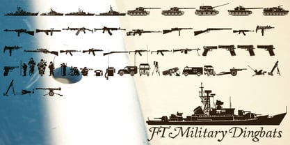 Pictograms of military boats, personnel, firearms and other weapons.
 - Emeralde Chamerions by Almarkha Type,
$29.00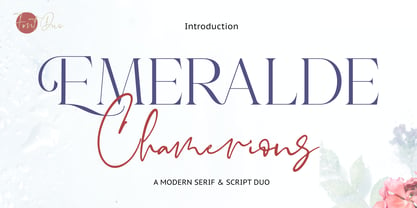 Introducing Emeralde Chamerions - Stylish Font Duo , Display Serif And Signature Stylish Script inspired by famous logo perfect for the purposes of designing templates, brochures, videos, advertising branding, logos and more.
