10,000 search results
(0.062 seconds)
- D-block A by AType,
$19.95 - Super Block MF by Masterfont,
$59.00 - NT Brick Sans by Nurrontype,
$17.00
- Calendar Blocks JNL by Jeff Levine,
$29.00 - Architect Small Block by Quiet Designs Inc.,
$20.00 - Thorm Block Graffiti by Sipanji21,
$18.00
- Ungap Blocks Variable by Pedro Teixeira,
$25.00
- PL Barnum Block by Monotype,
$29.99
- Straight Flush Block by Inumocca,
$18.00
- Campus Sans Block by MacCampus,
$30.00 - Children Block Letters by m u r,
$15.00 - KG PDX Blocks by Kimberly Geswein,
$5.00
- KG Geronimo Blocks by Kimberly Geswein,
$5.00
- Cell Block 6 by Enrich Design,
$24.95 - Smart Frocks NF by Nick's Fonts,
$10.00
- Rounded Block Display by NDS Fonts,
$15.00
- Dry Brush Blocks by BW90,
$24.99
- SK One Block by Salih Kizilkaya,
$3.50
- PIXymbols Baby Blocks by Page Studio Graphics,
$25.00
- FF Robot - Personal use only

- Scripty by Turtle Arts,
$20.00 - Escript by Linotype,
$29.99 - Skript by Wilton Foundry,
$49.00
- Scriptys by Atom,
$14.00
- Rock Show Whiplash - Unknown license

- Chinese Rocks Free - Unknown license

- Retro Rock Poster - Unknown license

- Rock ‘n Roller - Unknown license

- KG ROCK CONCERT - Unknown license

- Rock-A-Billy - Unknown license

- Glam Rock MF by Masterfont,
$59.00
- Rock Concert JNL by Jeff Levine,
$29.00
- MC Scar Rock by Maulana Creative,
$16.00
- Rock And Cola by Corradine Fonts,
$49.95
- MC Rock Ice by Maulana Creative,
$17.00
- Round Rock NF by Nick's Fonts,
$10.00 - Jaded Rock Stars by Throndsen,
$10.00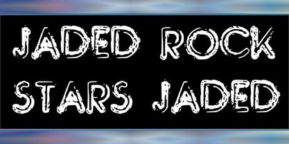
- CA Cape Rock by Cape Arcona Type Foundry,
$39.00
- LD Rock Hero by Illustration Ink,
$3.00 - Regulators Outline - Unknown license


