10,000 search results
(0.043 seconds)
- Lily Wang by Dharma Type,
$19.99 Based on some script in the 19th century. Inky texture gives realistic handwriting appearance. Smooth writing feeling creates antiqued and nostalgic atmosphere. Big flourish and elegant script! There are two other script designed by in the same concept. -Daisy Lau -Lily Wang -Pansy Bo
 - MODERN Hand Fraktur by TypoGraphicDesign,
$19.00 KONZEPT/BESONDERHEITEN Der schludrige und raue handgeschriebene Fraktur Charakter, geben der Schrift eine hohe Wiedererkennung und eine gewisse Einzigartigkeit. Das Motto lautet handgemacht, rau, Fraktur & modern. EINSATZGEBIETE Das dreckige, dicke Aussehen der handgeschriebenen Schrift würde sich über folgende Gebiete sehr freuen und sich dort dreckig heimisch fühlen: Logos/Wortmarken aller Art, Flyer für fast jede Party, PlattenCover, Comic-Cover und Graphic Novel Lettering, Plakat Design, Movie-Font, als Headlineschrift für print und digitale Magazine, Bücher und Webseiten u.v.m. TECHNISCHE INFORMATIONEN Überschriften | Auszeichnungsschrift | Fraktur Handschrift »Modern Hand Fraktur«. OpenType Schrift mit 258 Glyphen & 1 Schriftschnitt (regular). Symbole und Ligaturen (mit diakritischen Zeichen & €)
 - Grange by Device,
$39.00 The Device interpretation of the classic “Grot” thick/thin sans style. Unlike the traditional models on which it is based, Grange takes a rational, consistent approach across wide range of weights and widths for contemporary use. The "Text" weights are designed for use at smaller sizes, and have more open character shapes and spacing for legibility. The font includes alternative curved and straighter versions of key characters, most obviously the lower-case ‘g' and capital ‘R', allowing the font to take on either a sharper or warmer, more playful appearance. These can be toggled on or off using the ‘Alts' feature in Illustrator, or ‘Stylistc Sets’ in Indesign. Contains proportional, lining and tabular numerals. Perfect for both headline and text.
 - After 5 by Our House Graphics,
$17.00 From the basement labs and after hours lounge of R?U?S?S?T Institute, we present After 5. With a somewhat formal (ha ha) yet warm, friendly feel, its normally calm, even tempered and sensible rhythm takes on the syncopated, jazzy beat that goes along with too many martinis when discretionary ligatures are turned on. A friend once asked, was I trying to design a font that looked sort of �Korean?� I said no, I was trying to mess up the Latin alphabet. So, here it is: After 5, a bold, upright condensed slab-serif display typeface with a mixed-up attitude. Complete with bold roman and matching italics. This attention getting font is ideal for Posters, headlines, Packaging and logos.
 - Rama Gothic by Dharma Type,
$19.99 Rama Gothic is an antiqued sans serif, the design inspired by 1800s-style wood type. All glyphs have been designed carefully to be retro-looking of the old time and to fill all with nostalgia. This condensed font family with 18 styles will be the best solution for posters, titles and anywhere you need impact. To complete your work perfectly, Gothic Extras family is ready for free. They include borders, ornaments and frames designed using vintage catalog of Hamilton in 1800s as a model. Incidentally, -r- has its alternative glyph that can be used with OpenType salt feature. Be sure to check out the slab serif style of this Rama series named Rama Slab. When you need more modern gothic, please try our Kaneda Gothic and Fairweather
 - Nucliometer by Supremat,
$12.00 Nucleometer is a very contrasting and at the same time elegant display font. It is ideal for large headlines and impressionable typography. A feature of the Nucleometer is the rounding of the lowercase letters a, b and r, as well as a funny "tail" in the letters t, g, j, f, t, y. This gives it a more lively and unique character. Another interesting feature is the increased proportion of the ascender height of Ultra Condensed, which is larger than the usual Bold font. Together, this font is ideal for a designer who needs stylish and very contrasting typography in his work. Nucliometer is available in 5 styles, starting from Bold to Bold UltraCondensed and also has a variable format.
 - Vary by Monotype,
$50.99 Vary by Olli Meier is a geometric sans serif typeface inspired by Bulgarian Cyrillic. Vary is fun and adaptable and was built with three feelings (variations): classic, modern, and loopy, offering an opportunity for designers to be playful in their creations. The inspiration in Bulgarian Cyrillic is seen mostly in the character “g,” which was inspired by a very uncommon handwritten “?” spotted by the designer in a shop window in Sofia, Bulgaria. When he flipped this design in 180°, the Latin character ‘g’ was born for Vary Another example is the “R” in the modern stylistic set, which was inspired by the handwritten Cyrillic character “?”. Vary is available as a variable font and also comes with 10 preset instances from Hairline to ExtraBlack.
 - Bernhard by Linotype,
$29.99 The German typeface artist Lucian Bernhard designed Bernhard Antiqua as the first of his many text typefaces. The first weights were produced in 1912 by the foundry Flinsch in Frankfurt am Main. Further weights followed in the 1920s, produced by the Bauersche foundry, which had acquired Flinsch in the meantime. Bernhard font is an alphabet with a marked historical influence. It brings the viewer back to the early 20th century, when the bold forms of this typeface graced advertising displays and posters. Distinguishing characteristics of this typeface are the cross of the capital W and the rounding of the capital R. Linotype's Bernhard condensed bold, with its narrow, robust forms, is best for headlines in medium and larger point sizes.
 - Hawaii Summer by Gravitype,
$14.90 Hawaii Summer is a fresh and playful display font, designed to bring a unique style to your projects. Its natural look makes it perfect to be integrated into exotic environments, thanks to the warm vibes that its lines transmit. It is suitable in multiple situations, like for: food and beverage, bar signs, packaging, t-shirts, flyers, magazines, posters, ad campaigns, social media, banners, etc... Stylistic alternates are included for letters: “m” to be the inverse of “w” and thus be more symmetrical, for example, if a logo design requires it “p” and “r” with a slightly decreased contrast to appear neater, especially for big size text like headlines Hawaii Summer supports multiple languages to be tourist-friendly ;) Get ready for the summer!
 - Grange Rough by Device,
$39.00 Grange Rough is an inky, distressed version of Grange that mimics the effects of vintage hot-metal type on rougher paper. Grange is the Device interpretation of the classic “Grot” thick/thin sans style. Unlike the traditional models on which it is based, Grange takes a rational, consistent approach across wide range of weights and widths for contemporary use. The font includes alternative curved and straighter versions of key characters, most obviously the lower-case ‘g' and capital ‘R', allowing the font to take on either a sharper or warmer, more playful appearance. These can be toggled on or off using the ‘Alts' feature in Illustrator, or ‘Stylistc Sets’ in Indesign. Contains proportional, lining and tabular numerals. Perfect for both headline and text.
 - Dharma Slab by Dharma Type,
$19.99 Dharma Slab is an antiqued slab serif designed inspired by 1800s-style wood type. All glyphs had been designed carefully to be retro-looking of the old time and to fill all with nostalgia. This condensed font family with 42 styles will be the best solution for posters, titles and anywhere you need impact. To complete your work perfectly, Gothic Extras family is ready for free. They include borders, ornaments and frames designed using vintage catalog of Hamilton in 1800s as a model. Incidentally, g, r and y has their alternative glyphs that can be available with OpenType salt feature and tabular figures can be available with tnum feature. Be sure to check out the sans serif style of this Dharma series named Dharma Gothic.
 - Southern Nights by Breauhare,
$35.00 Based on the hit album by Glen Campbell, Southern Nights is the font with a style that’s “free as a breeze,” as the song says. It’s fun and casual, yet it has a flair for fashion and elegance. It also has an art nouveau look which lends itself to greeting cards as well as the branding of perfume, clothing, retailing, dining, and other luxury/high-end uses. This font includes alternate characters for the upper R, S, and T, the lower g and z, plus ligatures that include a double lower t and double lower l (L). As the song might say, I apologize to anyone who can truly say that they have found a better font! Digitized by John Bomparte.
 - Death Mohawk by Mans Greback,
$69.00 Death Mohawk is a rough metal font. This Korn/Slipknot style typeface with is distressed letterforms is optimized for a musical logotype. Its eroded and destroyed edges gives it a heavy and grungy look. Use parenthesis symbols ( ) [ ] { } < > to make wings around any word. Example: [Heavy Metal] Use % after any letter to make it symmetric. Example: MayheM% or Roxo%R% The font is built with advanced OpenType functionality and has a guaranteed top-notch quality, containing stylistic and contextual alternates, ligatures and more features; all to give you full control and customizability. It has extensive lingual support, covering all Latin-based languages, from Northern Europe to South Africa, from America to South-East Asia. It contains all characters and symbols you'll ever need, including all punctuation and numbers.
 - Thug Rose by Epiclinez,
$18.00 Thug Rose is a bouncy hand-lettered script font. This smooth hand-lettered script font is suitable for logos, headlines, branding, etc.
 - Beautiful Sky by Epiclinez,
$19.00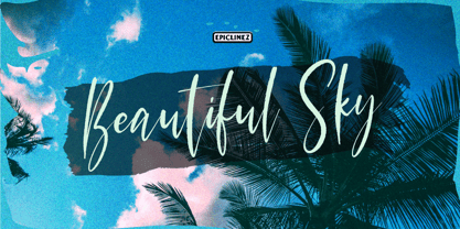 Beautiful Sky is a handwritten signature script font. This authentic script font is suitable for logos, headlines, branding, apparels, Instagram quotes, etc.
 - Magnetica by Galaxa,
$10.00 Magnetica font family combines design simplicity of modern sans serifs with a futuristic feel based on semi-rounded concept. Its fluent lines can bring unusual spark to logo designs, headlines, magazine designs, quotes, documentaries, advertisements or similar projects. This font, especially its Italic variation, will find its use also in larger text blocks where simplicity, clean lines and well applied kerning is a must. Create something spectacular with Magnetica.
 - Performance by ParaType,
$25.00 Performance is a set of perforated plates that appear to be characters. The construction of characters is described by sequences of holes whose shape and placement define the appearance and mood of font styles. An interesting feature of the design is an absence of side bearings and leading. Due to this feature a text article set by Performance forms a perforated coherent surface similar to postage stamp block.
 - Trilight by Pelavin Fonts,
$12.00 Trilight is a result of my fascination (obsession?) with how the appearance of a typeface can impact on the tactile as well as visual sense to strengthen and guide its imapct. It consists of simple block characters with a triple highlight to give the effect of dimension. The Trilight family consists of both highlighted and solid characters to provide a two color display without the need to convert characters to outline.
 - Notebook BH by BluHead Studio,
$20.00Notebook BH Black was inspired by the block lettering we used to draw on our school binders. Notebook is a unicase design, with the lowercase drawn to the cap height, and each "case" having a distinctly different flavor. The fun and seemingly unlimited combinations of the upper and lowercase forms make it difficult to stop typing innocuous phrases and, if you're mobile, can even make boring lectures tolerable! - Mikey Likes It Corpulent NF by Nick's Fonts,
$10.00Fat and sassy, this ultrabold brush font is based on the works of lettering legend Mike Stevens as seen in his book, Mastering Layout. A natural choice for can't-miss headlines, this typeface also works surprising well for short blocks of body copy. Both the OpenType and Truetype versions of this font contain the complete Latin language character set (Unicode 1252) plus support for Central European (Unicode 1250) languages as well. - Mivron by Aah Yes,
$4.95Mivron is a stand-out type of sans-serif block text especially suited for headlines and display work. There's a wide range of accented characters making this font appropriate for a wide variety of languages. The zip contains OTF and TTF versions - only install one version of a font on the same machine, either the OTF or TTF, but not both as that could cause various conflicts and erratic behaviour. - Kidsnote by Luxfont,
$20.00 Meet Kidsnote, where each letter is like a letter in the margins of the page, written with a ballpoint pen. This dissimilar family of different fonts is framed by the atmosphere of handwritten notes. From block and cursive letters to underlining and mini-doodles, every typeface captures the feeling of writing with a real pen. Like the pages of a notebook, written in small handwriting. Features: - Extras - Kerning
 - Real Fat by vanAllerlei,
$30.00 RealFat is a typeface that has been started with the intention to create a very squared bold font with a futuristic look and feel. The squared shapes also refer to the architecture of big city buildings with small windows. This font fits perfect on modern posters, flyers and other artwork or pixel based work. Most characters have the same width and height and are perfect 'building-blocks' for typographic compositions.
 - Guile by Bunny Dojo,
$10.00 A timeless and mighty sans-serif, Guile's chiseled forms make the font ideal for reaching into history, while its minimalism and balance are fit for propelling into the future. Guile voraciously absorbs and enhances the style of its surroundings. In sports, it's a true team player, from the jerseys to the on-air presentation. In film, it's a blockbuster star, from the title treatment to the billing block.
 - Tinseltown NF by Nick's Fonts,
$10.00Suitable for headlines, subheads and short copy blocks, this decidedly Deco number is based on Willard T. Sniffin’s Hollywood, designed for American Type Founders in 1932. A few of the fussier details have been modified from the original to render a clean, streamlined and sophisticated face. All versions of this font include the Unicode 1250 Central European character set in addition to the standard Unicode 1252 Latin set. - Slayray by Maulana Creative,
$15.00 Slayray is a decorative bouncy handwritten font. With block bold stroke, fun character. To give you an extra creative work. Slayray font support multilingual more than 100+ language. This font is good for logo design, Social media, Movie Titles, Books Titles, a short text even a long text letter and good for your secondary text font with sans or serif. Make a stunning work with Slayray font. Cheers, Maulana Creative
 - Magnesia SF by S6 Foundry,
$24.00 Magnesia Sf is a modern, one-of-a-kind font that will make your designs stand out against the competition. This stylistic semi-block serif comes in 4 styles and has Multi-languages support and the display typeface has what you need for all sorts of projects! Perfectly suited for headlines, large-format prints, brand identities, social media, advertising, editorial design, posters, magazines, logos, headings, digital and more.
 - Ray Johnson by K-Type,
$20.00 The Ray Johnson font was inspired by the Father of Mail Art. It's based on the block lettering style used by Ray to add the names of his correspondents to their bunny head portraits (the film How to Draw a Bunny is a superb introduction). The font includes blank bunny heads and other Ray Johnson graphics as scalable vector images, and separate bitmap images are also provided as jpegs and gifs.
 - Chokana by NREY,
$19.00 Introducing Chokana, a nostalgic multi-line font inspired by the 70's aesthetic. Font looks amazing as alone words and as full text blocks. Also it good for bright captions and unforgettable logos. This font could be the perfect solution if you want to give a lovely retro touch to your designs. If you have any questions, please let me know. Thank you and have a great day!
 - Gatlinburg Gossamer NF by Nick's Fonts,
$10.00 The original characters, and now-rarely-seen alternate characters, for Memphis, designed by Emil Rudolf Weiss for American Type Founders in 1930, provided the pattern for this wispy, ultralight typeface. Although intended primarily for headlines, this typeface can also be used for brief blocks of text, if set 18 pt. or larger. Both versions of the font include 1252 Latin, 1250 CE (with localization for Romanian and Moldovan).
 - Newt Juice by Cool Fonts,
$24.00 Newt Juice is a funky hand drawn font comes in both Outline and Fill styles. Put them both together in your favorite application and you can get some really organic looks. Newt Juice is perfect for kid stuff or grungy graffiti. While it is an all caps font, the upper and lower case characters are position differently to create more randomness. Be the first on your block to juice the newt!
 - Upton by Halbfett,
$30.00Upton is a modern and condensed sans serif. The initial inspiration for its design came from lettering Wim Crouwel created for a poster design. It also takes some cues from neutral grotesks like Helvetica and Akzidenz. Because of its narrow letterforms, Upton is best applied to headlines and poster-sized typography. Upton’s italics were designed with high-quality compensation for all circles and strokes. Upton ships in two different formats. Depending on your preference, you can install the typeface as two Variable Fonts or use the family’s 14 static OpenType font files instead. Those weights run from Extralight to Extrabold. While the static-format fonts offer a good intermediary-step selection, users who install the Variable Font have vastly greater control over their text’s stroke width. The weight axes in Upton’s Variable Fonts allow users to differentiate between almost 1,000 possible font weights. That enables you to fine-tune your text’s exact appearance on-screen or in print. In its fonts, Upton has several ligatures. That includes optional “discretionary ligatures,” which bring a unique tone to display usage. For instance, the fonts include optional ligatures for the letter combinations “E-T”, “F-l”, “L-E-T-T-E”, “L-E-T-T”, “L-E-T”, “L-E-L-O”, “L-U”, “i-j”. and “m-m”. There are also many alternate glyphs. Stylistic Set 1 substitutes in new forms for “G”, “R”, “a”, “f”, “g”, “i”, “r”, “t”, and “y”. Six more Stylistic Sets have alternates for the “æ”, “g”, “k”, “o”, “K”, “O”, and “Q”. Additional OpenType features activate other useful features, such as fractions, numbers in circles, or symbols. - Hermann by W Type Foundry,
$29.00 Hermann is one of our most readable typefaces so far. Since last year, the W Design team had been examining closely the possibility of developing a text font. Thus, we dug into concepts within some of our favorite novels, such as The Steppenwolf and Brave New World, written by Hermann Hesse and Aldous Huxley respectively. Ideas like duality, surrealism, and wildness mainly appeared. With these concepts in mind, we analyzed carefully the typefaces used in both Hesse’s and Huxley’s creations; Sabon and Garamond showed up catching our attention and, of course, awakening our admiration. Consequently, the challenge was to combine the key features of these fonts with the concepts already identified. At first, we made a text font which was suitable to compose long texts. However, we realized that we needed to refine some characteristics to convey all the ideas. A full set of capital discretionary ligatures was designed, which convert Hermann in a display font when is required. We also designed swashes (from A-Z) and final forms (in letters h, k, m, n, r and x in romans, and in letters a, d, e, h, i, l, m, n, r, t, u, x and z in italics), conveying more dynamism and versatility when it comes to composing visually. Hermann was designed not only to be accurate in terms of legibility but also to be wild and bold. That is why we took a big leap and designed from the beginning a font that is inspired by the world of 20th-century novels, using the name of one of its greatest exponents, Hermann Hesse.
 - Felt - Unknown license

- Salter - Unknown license

- Goudy Mediaeval - Personal use only

- Rudelsberg - Unknown license

- Zaleski - Unknown license

- Baldur - Personal use only

- Kramer - Unknown license


