8,919 search results
(0.057 seconds)
- Fort Mayhem by Letterhend,
$17.00 Fort Mayhem is a display marker font with hand drawn feel. The strokes make this font outstanding and looks great for title. This type of font perfectly made to be applied especially in logo, headline, signage and the other various formal forms such as invitations, labels, logos, magazines, books, greeting / wedding cards, packaging, fashion, make up, stationery, novels, labels or any type of advertising purpose. Features : 3 Styles-Regular, Extrude, & Online numbers and punctuation multilingual alternates / swashes and ligatures PUA encoded We highly recommend using a program that supports OpenType features and Glyphs panels like many of Adobe apps and Corel Draw, so you can see and access all Glyph variations.
 - Ground Castle by Letterhend,
$19.00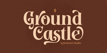 Introducing, Ground Castle - A Modern high contrast serif font with swashes. The stylistic alternates and ligatures make this font event more unique and stands from the crowd. This font perfectly made to be applied especially in logo, and the other various formal forms such as invitations, labels, logos, magazines, books, greeting / wedding cards, packaging, fashion, make up, stationery, novels, labels or any type of advertising purpose. Features : uppercase & lowercase numbers and punctuation multilingual alternates, swashes & ligatures PUA encoded We highly recommend using a program that supports OpenType features and Glyphs panels like many of Adobe apps and Corel Draw, so you can see and access all Glyph variations.
 - Giomonte by Keristyper Studio,
$14.00 Introducing Giomonte Handwritten Script. Signature script font that feels beautiful classy, elegant, and modern. This type of font is perfectly made to be applied especially in logos, and other various formal forms such as invitations, labels, logos, magazines, books, greeting/wedding cards, packaging, fashion, makeup, stationery, novels, labels, or any type of advertising purpose. Multilingual support: Afrikaans, Albanian, Catalan, Danish, Dutch, English, Estonian, French, Finnish, German, Icelandic, Indonesian, Italian, Malay, Norwegian, Portuguese, Spanish, Swedish, Zulu, and many more. What’s Included : Standard & Multilingual glyphs Ligature Works on PC & Mac Simple installations Accessible in Adobe Illustrator, Adobe Photoshop, Adobe InDesign, and even work on Microsoft Word. Hope you enjoy our font!
 - Candleton by Letterhend,
$19.00 Introducing, Candleton - A classic sans serif with swashes. The stylistic alternates and ligatures make this font event more unique and stands from the crowd. This font perfectly made to be applied especially in logo, and the other various formal forms such as invitations, labels, logos, magazines, books, greeting / wedding cards, packaging, fashion, make up, stationery, novels, labels or any type of advertising purpose. Features : uppercase & lowercase numbers and punctuation multilingual alternates, swashes & ligatures PUA encoded We highly recommend using a program that supports OpenType features and Glyphs panels like many of Adobe apps and Corel Draw, so you can see and access all Glyph variations.
 - Blooming Elegant by Nicky Laatz,
$10.00 Blooming Elegant Script Font is a hand-lettered modern calligraphy script with a playful yet elegant nature. It comes in 3 variants : Regular, Mono-line, and Mono-line Bold. The script fonts include Opentype Stylistic Alternates for all lowercase letters, and a selection of Ligatures to add some authenticity to your designs. Included alongside the script fonts, are two companion sans fonts : a neat and sturdy uppercase sans font for more formal-natured designs, and a jaunty, playful uppercase handwritten sans for more casual designs. Also included is a handy set of over 120 lovingly-drawn doodles is also included as 2 separate dingbat fonts.
 - Brown Holmes by Letterhend,
$19.00 Introducing, Brown Holmes - A fun and playful bold display font. The bulky shape make this font looks appealing, especially when it comes to casual fun theme design. This font also perfectly made to be applied especially in logo, and the other various formal forms such as invitations, labels, logos, magazines, books, greeting / wedding cards, packaging, fashion, make up, stationery, novels, labels or any type of advertising purpose. Features : numbers and punctuation multilingual alternate (uppercase & lowercase) & ligature PUA encoded We highly recommend using a program that supports OpenType features and Glyphs panels like many of Adobe apps and Corel Draw, so you can see and access all Glyph variations.
 - Morytone by Letterhend,
$18.00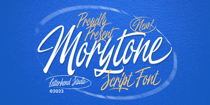 Morytone is a hand drawn brush script which is purposely made for headline, display or logotype, and signature which need a standout appearing. This font is also suitable to be applied especially in logo, and the other various formal forms such as invitations, labels, logos, magazines, books, greeting / wedding cards, packaging, fashion, make up, stationery, novels, labels or any type of advertising purpose. Features : Uppercase & lowercase Numbers and punctuation Swash, ligatures & alternates Multilingual PUA encoded We highly recommend using a program that supports OpenType features and Glyphs panels like many of Adobe apps and Corel Draw, so you can see and access all Glyph variations.
 - Royce by Jehoo Creative,
$18.00 Royce is a cute and minimalist designed font family with rounded edges on each character to make a fun and modern impression on your designs. It is very easy to combine this font with other types because it comes with 10 complete weights ranging from thin to extrablack, with a modern impression Royce has many useful features for example Alternate which is more formal in feel and Discretionary Ligature which is very eye-catching so it is ready to be used for various kinds design types such as displays, titles, body text, magazines, cover art, social media, logos, web Ui, clothing, posters, and others. Royce also has multilingual support.
 - Whimster Glympse by Letterhend,
$19.00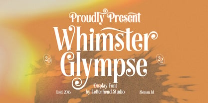 Whimster Glimpse is a stylish display font This font has unique letterform, make it looks great to be used for vintage & elegant design theme. This font perfectly made to be applied especially in logo, and the other various formal forms such as invitations, labels, logos, magazines, books, greeting / wedding cards, packaging, fashion, make up, stationery, novels, labels or any type of advertising purpose. Features : uppercase & lowercase numbers and punctuation multilingual alternates & ligatures PUA encoded We highly recommend using a program that supports OpenType features and Glyphs panels like many of Adobe apps and Corel Draw, so you can see and access all Glyph variations.
 - Vindale by Letterhend,
$19.00 Introducing, The Vindale - a vintage script with reverse contrast and a touch of nostalgic look. The unusual reverse contrast make this typeface one of a kind. This type of font perfectly made to be applied especially in logo, and the other various formal forms such as invitations, labels, logos, magazines, books, greeting / wedding cards, packaging, fashion, make up, stationery, novels, labels or any type of advertising purpose. Features : uppercase & lowercase numbers and punctuation multilingual alternates and ligatures PUA encoded We highly recommend using a program that supports OpenType features and Glyphs panels like many of Adobe apps and Corel Draw, so you can see and access all Glyph variations.
 - Binter Script by Romie Creative,
$10.00 Introducing Binter. A bold retro script that will take you back to the 60s. This typeface has an extrude version so you can create a retro effect font easily. This font is very suitable for application, especially on logos, and various other formal forms such as invitations, labels, logos, magazines, books, greeting/wedding cards, packaging, fashion, make up, stationery, novels, labels or all kinds of things. advertising purposes. Feature : uppercase & lowercase numbers and alternating PUA coded swash multilingual ligature punctuation We strongly recommend using programs that support OpenType features and Glyphs panels such as many Adobe and Corel Draw applications, so that you can view and access all variations of Glyphs.
 - Astropicks by Letterhend,
$19.00 Astropicks is a modern and playful typeface which is purposely made for headline, display or logotype. This type of font perfectly made to be applied especially in logo, and the other various formal forms such as invitations, labels, logos, magazines, books, greeting / wedding cards, packaging, fashion, make up, stationery, novels, labels or any type of advertising purpose. Features : uppercase & lowercase numbers and punctuation multilingual alternates & ligatures PUA encoded We highly recommend using a program that supports OpenType features and Glyphs panels like many of Adobe apps and Corel Draw, so you can see and access all Glyph variations. How to access opentype feature : letterhend.com/tutorials/using-opentype-feature-in-any-software/
 - The Ralston by Gloow Studio,
$13.00 Introducing The Ralston, A Retro Bold Script font. It was inspired by retro typography designs in 70's. There are more than 432 glyphs in this font including Multilanguage Support. OpenType features with Stylistic Alternates, Contextual Alternate and ligatures in some characters that allows you to mix and match pairs of letters to fit your design. The Ralston is perfectly suitable for made to be applied especially in logo, and the other various formal forms such as invitations, labels, logos, magazines, books, greeting / wedding cards, packaging, fashion, make up, stationery, novels, labels or any type of advertising purpose. Files Include: Multilanguage Support Thank You very much, hope you enjoy this fonts !
 - Garmouth Display by Letterhend,
$19.00 Introducing our latest display typeface named Garmouth Display. A unique serif with classy and classic look with vintage feel, inspired by 60s and 70s signages. This font perfectly made to be applied especially in logo, and the other various formal forms such as invitations, labels, logos, magazines, books, greeting / wedding cards, packaging, fashion, make up, stationery, novels, labels or any type of advertising purpose. Features : uppercase and lowercase numbers and punctuation multilingual PUA encoded We highly recommend using a program that supports OpenType features and Glyphs panels like many of Adobe apps and Corel Draw, so you can see and access all Glyph variations.
 - Chopader by Letterhend,
$17.00 Introducing, Chopader - a vintage sans serif font duo. Inspired by 50s 60s signages, this font made to bring back the good ol' days. This type of font perfectly made to be applied especially in logo, headline, signage and the other various formal forms such as invitations, labels, logos, magazines, books, greeting / wedding cards, packaging, fashion, make up, stationery, novels, labels or any type of advertising purpose. Features : Two fonts (Thin and bold style) numbers and punctuation multilingual PUA encoded Only caps We highly recommend using a program that supports OpenType features and Glyphs panels like many of Adobe apps and Corel Draw, so you can see and access all Glyph variations.
 - Fillerglad by Letterhend,
$19.00 Introducing, Fillerglad Script - an authentic hand writing with natural signature style. This type of font perfectly made to be applied especially in logo, and the other various formal forms such as invitations, labels, logos, magazines, books, greeting / wedding cards, packaging, fashion, make up, stationery, novels, labels or any type of advertising purpose. Features : uppercase & lowercase numbers and punctuation multilingual alternates and ligatures swashes PUA encoded We highly recommend using a program that supports OpenType features and Glyphs panels like many of Adobe apps and Corel Draw, so you can see and access all Glyph variations. How to access opentype feature : letterhend.com/tutorials/using-opentype-feature-in-any-software/
 - Khalifah Script by Solidtype,
$15.00 Khalifah Script is a calligraphy script font that comes with very beautiful changing characters, a kind of classic decorative copper script with a modern touch, designed with high detail to bring stylish elegance. Khalifah Script is attractive as a typeface that is smooth, clean, feminine, sensual, glamorous, simple and very easy to read, because there are many fancy letter connections. I also offer a number of viable style alternatives for many letters. The classic style is perfect to be applied in various formal forms such as invitations, labels, restaurant menus, logos, fashion, make up, stationery, novels, magazines, books, greeting / wedding cards, packaging, labels or any type of advertising purpose.
 - Morchain by Letterhend,
$17.00 Morchain is a classy script. This typeface has nostalgic feel because of its style, so the font is really match for your project with classic/vintage theme. T This font perfectly made to be applied especially in logo, and the other various formal forms such as invitations, labels, logos, magazines, books, greeting / wedding cards, packaging, fashion, make up, stationery, novels, labels or any type of advertising purpose. Features : Uppercase & lowercase Numbers and punctuation ALternates & Ligatures Multilingual PUA encoded We highly recommend using a program that supports OpenType features and Glyphs panels like many of Adobe apps and Corel Draw, so you can see and access all Glyph variations.
 - Antura Script by Solidtype,
$18.00 Antura Script is a calligraphic script font that comes with very beautiful changing characters, a kind of classic decorative copper script with a modern touch, designed with high detail to bring stylish elegance. Antura Script is an attractive typeface that is smooth, clean, feminine, sensual, glamorous, simple and very easy to read because there are many fancy letter connections. I also offer a number of viable style alternatives for many letters. The classic style is perfect to be applied in various formal forms such as invitations, labels, restaurant menus, logos, fashion, make up, stationery, novels, magazines, books, greeting/wedding cards, packaging, labels or any type of advertising purpose.
 - Black Ground by Letterhend,
$16.00 Black Ground a unique brush typeface with bold and strong feel. This font perfectly made to be applied especially in logo, and the other various formal forms such as invitations, labels, magazines, books, greeting / wedding cards, packaging, fashion, make up, stationery, novels, labels or any type of advertising purpose. Features : uppercase & lowercase (alternates) numbers and punctuation Ligatures and alternates multilingual support PUA encoded We highly recommend using a program that supports OpenType features and Glyphs panels like many of Adobe apps and Corel Draw, so you can see and access all Glyph variations. Email us to letterhend@gmail.com if you need something! Happy Designing!
 - Evidance by Letterhend,
$19.00 Evidance is a sophisticated display typeface with modern look and feel. Perfectly to be applied to the other various formal forms such as invitations, labels, logos, magazines, books, greeting / wedding cards, packaging, fashion, make up, stationery, novels, labels or any type of advertising purpose. Features : uppercase & lowercase (alternate) numbers and punctuation multilingual alternates & ligatures PUA encoded We highly recommend using a program that supports OpenType features and Glyphs panels like many of Adobe apps and Corel Draw, so you can see and access all Glyph variations. How to access opentype feature : letterhend.com/tutorials/using-opentype-feature-in-any-software/ Email us to letterhend@gmail.com if you need something! Happy Designing!
 - Fallery Script by Zane Studio,
$15.00 Fallery Script is a calligraphy script font that comes with exquisite character changes, a kind of classic decorative copper script with a modern twist, designed with high detail for an elegant style. Fallery Script is interesting because it is smooth, clean, feminine, sensual, glamorous, simple and very easy to read, because of its many fancy letter relationships. I also offer a decent number of stylistic alternatives for some of the letters. Classic style is very suitable to be applied in various formal forms such as invitations, labels, restaurant menus, logos, fashion, make up, stationery, novels, magazines, books, greeting/wedding cards, packaging, labels or all kinds of advertising purposes.
 - Aviano by insigne,
$24.99 Aviano is an extended titling face with influence from the power and timeless beauty of classical letterforms. Aviano features extended characters for a formal feel, sharp, powerful looking serifs and geometric and consistent letterforms. Use Aviano as an alternative to Trajan. Aviano includes a number of advanced OpenType features including alternates, 40 unique ligatures and old style figures. The Aviano family was updated in 2008 to include a light and black weight. Be sure to check out the rest of the Aviano series, including Aviano Serif, Aviano Sans and Aviano Slab. Aviano is named for a small town at the base of the Alps in northern Italy.
 - Moon Slayer by Letterhend,
$19.00 Moon Slayer is a display brush script font with fun and pop feel. The strokes make this font outstanding and looks great for title. This type of font perfectly made to be applied especially in logo, headline, signage and the other various formal forms such as invitations, labels, logos, magazines, books, greeting / wedding cards, packaging, fashion, make up, stationery, novels, labels or any type of advertising purpose. Features : numbers and punctuation multilingual alternates / swashes and ligatures PUA encoded We highly recommend using a program that supports OpenType features and Glyphs panels like many of Adobe apps and Corel Draw, so you can see and access all Glyph variations.
 - Runestars by Letterhend,
$19.00 About the Product RuneStars is a organic display typeface with unique ligatures. This typeface has unique looks and strong character with natural looks because it was made by manual hand lettering. This font perfectly made to be applied especially in logo, and the other various formal forms such as invitations, labels, magazines, books, greeting / wedding cards, packaging, fashion, make up, stationery, novels, labels or any type of advertising purpose. Features : Numbers and punctuation Stylistic alternates multilingual PUA encoded We highly recommend using a program that supports OpenType features and Glyphs panels like many of Adobe apps and Corel Draw, so you can see and access all Glyph variations.
 - Punkaholic by Sharkshock,
$115.00 Punkaholic started out as a loopy, all caps display font with a semi condensed feel. Before completion some of the letters such as A and W were given a more traditional look and were penciled in for alternates. In the end, however, they were added as uppercase characters instead. For this reason most words in lowercase vary in appearance from their uppercase counterparts. This dichotomy between straight lined capitals and rounded ones makes for some interesting contrasts. Punkaholic works best in less formal settings such as café menus, t-shirts, or children’s publications. It comes in 3 styles and contains Latin, extended Latin, punctuation, and kerning.
 - Mogaster by Letterhend,
$17.00 Introducing, The Mogaster - a bold monoline script with a touch of vintage look and feel. You will get 3 styles of font. This type of font perfectly made to be applied especially in logo, headline, signage and the other various formal forms such as invitations, labels, logos, magazines, books, greeting / wedding cards, packaging, fashion, make up, stationery, novels, labels or any type of advertising purpose. Features : uppercase & lowercase numbers and punctuation multilingual alternates / swashes and ligatures PUA encoded We highly recommend using a program that supports OpenType features and Glyphs panels like many of Adobe apps and Corel Draw, so you can see and access all Glyph variations.
 - Calfine by Letterhend,
$17.00 Introducing, Calfine, a Bold and strong serif with high contrast weight. This font very suitable to be used as a title or display, make it looks great and stands from the crowd. This font perfectly made to be applied especially in logo, and the other various formal forms such as invitations, labels, logos, magazines, books, greeting / wedding cards, packaging, fashion, make up, stationery, novels, labels or any type of advertising purpose. Features : uppercase & lowercase numbers and punctuation multilingual PUA encoded We highly recommend using a program that supports OpenType features and Glyphs panels like many of Adobe apps and Corel Draw, so you can see and access all Glyph variations.
 - Baille Simpson by Letterhend,
$18.00 Baille Simpson is a dry brush typeface with natural hand writing feel and feminine look. This font is perfectly made to be applied especially in logos, and the other various formal forms such as invitations, labels, magazines, books, greeting / wedding cards, packaging, fashion, make up, stationery, novels, labels or any type of advertising purpose. Features : uppercase & lowercase numbers and punctuation Ligatures and alternates multilingual support PUA encoded We highly recommend using a program that supports OpenType features and Glyphs panels like many of Adobe apps and Corel Draw, so you can see and access all Glyph variations. Email us to letterhend@gmail.com if you need something! Happy Designing!
 - Daily Flashback by Letterhend,
$17.00 Daily Flashback is a sophisticated serif typeface. Perfectly to be applied to the other various formal forms such as invitations, labels, logos, magazines, books, greeting / wedding cards, packaging, fashion, make up, stationery, novels, labels or any type of advertising purpose. Features : lowercase uppercase numbers and punctuation multilingual alternates PUA encoded We highly recommend using a program that supports OpenType features and Glyphs panels like many of Adobe apps and Corel Draw, so you can see and access all Glyph variations. How to access opentype feature : letterhend.com/tutorials/using-opentype-feature-in-any-software/ Email us to letterhend@gmail.com if you need something! Happy Designing!
 - Ouders by Garisman Studio,
$10.00 Introducing Ouders - Stencil & Regular Font A display font that has a strong and bold look. This font is made by hand so it looks natural and very suitable for vintage and rustic theme. Perfectly made to be applied especially in logos, and the other various formal forms such as invitations, labels, magazines, books, greeting/wedding cards, packaging, stationery, novels, labels or any type of advertising purpose. By combining both styles (stencil and regular) you will create a single design with an old style that is perfect! That's why you have to use this font. If you like the previous styles, you are right to use this font!
 - Sanford Region by Letterhend,
$17.00 Sanford Region is a condensed slab serif typeface with strong look and feel. This font is a variable font with 8 weight style you can choose from. Perfectly made to be applied especially in logo, headline, signage and the other various formal forms such as invitations, labels, logos, magazines, books, greeting / wedding cards, packaging, fashion, make up, stationery, novels, labels or any type of advertising purpose. Features : Variable font with 8 weight style uppercase & lowercase numbers and punctuation multilingual PUA encoded We highly recommend using a program that supports OpenType features and Glyphs panels like many of Adobe apps and Corel Draw, so you can see and access all Glyph variations.
 - Flinscher by Greater Albion Typefounders,
$16.00 The Flinscher family contains twenty display typefaces, in weights that vary from light to black, and widths that extend from condensed to expanded. The family’s design inspiration traces its roots to the early portion of the twentieth century. In essence, it is a calligraphic script typeface family with blackletter influences. The letter forms are decorative and distinctive, yet clear and easy to read, and in use set up a regular rhythm that leads the eye from character to character. The Flinscher typefaces are well suited to design work that needs to combine formality with fun. Just the thing for a certificate or a book cover!
 - Rogshire by Letterhend,
$14.00 Introducing, Roghsire.A stylish displa font with chic & classic looks. This typeface has been made carefully to make sure its premium quality and luxury feel. It comes with Slant Version. Very suitable for logo, headline, tittle, and the other various formal forms such as invitations, labels, logos, magazines, books, greeting / wedding cards, packaging, fashion, make up, stationery, novels, labels or any type of advertising purpose. Features : Uppercase & lowercase Numbers and punctuation Alternates & Ligatures Multilingual PUA encoded We highly recommend using a program that supports OpenType features and Glyphs panels like many of Adobe apps and Corel Draw, so you can see and access all Glyph variations.
 - Silver Broom by Letterhend,
$19.00 Silver Broom is a display font with fun and playful looks. This type of font perfectly made to be applied especially in storybook children or child theme which is need a standout font, and the other various formal forms such as invitations, labels, logos, magazines, books, greeting / wedding cards, packaging, fashion, make up, stationery, novels, labels or any type of advertising purpose. Features : uppercase and lowercase numbers and punctuation multilingual swashes feature ligatures PUA encoded We highly recommend using a program that supports OpenType features and Glyphs panels like many of Adobe apps and Corel Draw, so you can see and access all Glyph variations.
 - Ember by Device,
$29.00 Ember is an informal script with a judicious sprinkling of ligatures that give it a flowing freehand liveliness. Neither overly formal and stuffy nor cheap and cheerful, Ember is elegant yet friendly, sophisticated yet approachable, fun and frivolous but stylish and well bred. Ligatures are set to be on automatically, and the stylistic alternates and optional final forms for some of the characters can be toggled on and off using the OpenType panel in design applications with advanced OpenType support. Designer Rian Hughes says that he felt he was "possibly channeling the spirit of Roger Excoffon". Neither pastiche nor revival, Ember does seem to evoke the famous French designer's trademark elegance.
 - Haystack by Letterhend,
$19.00 Haystack is a handwritten script with many . You can use also for headline or signature. This type of font perfectly made to be applied especially in logo, and the other various formal forms such as invitations, labels, logos, magazines, books, greeting / wedding cards, packaging, fashion, make up, stationery, novels, labels or any type of advertising purpose. Features : uppercase & lowercase numbers and punctuation multilingual alternates and ligatures PUA encoded We highly recommend using a program that supports OpenType features and Glyphs panels like many of Adobe apps and Corel Draw, so you can see and access all Glyph variations. How to access opentype feature : letterhend.com/tutorials/using-opentype-feature-in-any-software/
 - Huyton by Letterhend,
$17.00 Introducing, Huyton- a unique display script with reverse contrast, comes with extrude. The unusual reverse contrast make this typeface one of a kind. This type of font perfectly made to be applied especially in logo, and the other various formal forms such as invitations, labels, logos, magazines, books, greeting / wedding cards, packaging, fashion, make up, stationery, novels, labels or any type of advertising purpose. Features : extrude version uppercase & lowercase numbers and punctuation multilingual alternates and ligatures PUA encoded We highly recommend using a program that supports OpenType features and Glyphs panels like many of Adobe apps and Corel Draw, so you can see and access all Glyph variations.
 - Railroad Gothic Pro by Red Rooster Collection,
$60.00 Railroad Gothic Pro is a condensed, sans serif typeface, exclusively licensed from the Ludlow Collection. The original Railroad Gothic was produced by Ludlow in the early 1900’s, and Steve Jackaman (ITF) produced the digital version in 2017. The font provides support for Latin 1, Central, and Eastern European languages, and Cyrillic. Railroad Gothic Pro is reminiscent of typefaces used in 1900’s railyards, hence the name.
 - India Ink by CounterPoint Type Studio,
$29.99 A heavy, bold font based on two hand lettered type specimens from the 1920s. Original designer unknown. The font has a unique combination of both Old World and Asian influences, while still maintaining a fun, upbeat casual feel. Contains a full set of Alternate Caps found under the "Stylistic Alternates" OpenType feature. Contains language support for both Latin-based and most Eastern European languages.