10,000 search results
(0.029 seconds)
- Coleface by Roy Cole,
$34.00 Coleface was created by the British typographer Roy Cole, completed shortly before his death in 2012. It comprises six fonts: Coleface 30, 60, 90 and the italics 33, 66, 99. As with his earlier typeface families - Lina, Zeta and Colophon - Coleface is a highly-readable sans serif typeface that offers significant flexibility in terms of its potential uses. Roy Cole studied typographic design under the tutelage of Emil Ruder at the Gewerbeschule in Basel, at a time when typographic history was being made through the creation of a style that epitomized modernity. Consequently the principles of order, simplicity and legibility, fused with experimentation, became a hallmark of his practice, as exemplified in his last font Coleface.
 - Goose Creek JNL by Jeff Levine,
$29.00 The hand lettered credits from the 1942 British film comedy “The Goose Steps Out” became the model for Goose Creek JNL, a simple sans serif design available in both regular and oblique versions. According to the Internet Movie Database (imdb), “A bumbling teacher turns out to be the double of a German general. He is flown into Germany to impersonate the general and cause chaos and hilarity in a Hitler Youth college.” The title is a parody of the “goosestep” style of marching by German soldiers during World War II. As a variant on the movie’s title, the font was named for Goose Creek, South Carolina – a charming community just northeast of historic Charleston.
 - Joanna by Monotype,
$40.99 The English stone carver, artist, and typographer Eric Gill conceived the Joanna typeface as a personal design for use in books printed at his Joanna Press."" Gill saw his press work there as a continuation of the British Arts and Crafts Movement, pioneered in the 19th Century by William Morris. Joanna is notable for its almost vertical ""upright"" italics, and the unusally small size of its italic characters. Joanna is versatile and extremely legible. The letterforms are a bit narrow, so the face is very economic as well. A lot of text may be packed densely together onto a page with Joanna. Joanna mixes very well with other typefaces designed by Eric Gill; especially Gill Sans.
 - NT Gagarin by Novo Typo,
$26.00 Anna Gagarin is the loving matriarch of the Gagarin Family. Her life was full of love and passion. She had several affairs with Futurist and Contstructivist artist in the beginning of the 20th century. She was in love with the Russian poet Vladimir Majakovski (born on July 19th, 1893 and died in Moscow on the April 14th, 1930). She gave birth to his son Boris. She called him 'a cloud with trousers'. After this love story, Anna Gagarin met the designer and artist Gustav Klucis in Italy. His radical and political ideas were much too childish for her. After a period of love and passion Anna gave birth to his son. At that time they were in Italy, which explains his italic forms. After her return to Moscow in the beginning of the 1920's Anna was introduced by Alexander Rodchenko. They were heavenly in love but Ilja Stepanova was very jealous on her husband. Anna once said that 'Alexander fills mine construction with love...' That phrase can be an explanation for the term Constructuvism as an art movement. Alexander was the great love of Anna. She gave birth to their love-baby Dimitri Gagarin. That night Alexander designed his most famous poster. A decade before that Anna told it was 'a time for a change'. In a local bar in Sint Petersburg she met Gregory Rasputin. At that time Rasputin was a well known person and a respected member of the Sint Petersburg upper class.His diabolic character influenced Anna and after several months she gave birth to their son Kurt. He inherited the main characteristics of his father. The Gagarin Family wants to give love and wants be loved...
 - Turquoise by Resistenza,
$59.00 Many calligraphers agree that Roman Capitals is one of the most beautiful yet difficult hands to master. Its beauty lies in its simplicity of form and structure, yet understanding and applying these skillfully can take years of mindful practice. My goal was to design Roman Capitals that were smoothly designed with a brush, not carved. The main concept was based on the fundamental strokes that are commonly studied when you practice Roman letters. That’s why many Serifs have these unfinished terminal serifs. I created the Turquoise typeface based on my Capitalis Romana practice with a flexible broad edged brush and gouache. During the lowercase process I was still following Foundational calligraphy with a flat brush. My Turquoise Capitals were then adjusted and redesigned at the Tipobrda calligraphy workshop in Slovenia. Turquoise contains small caps, many discretionary ligatures, ornaments, swashes as well as several brushy nature-inspired ornaments, accessible via OpenType. Ideally suited for headlines or body text in advertising, packaging and visual identities, its delicate shapes, curves and endings give projects a harmonious elegance and stylistic feel in unique Turquoise style. My inspiration for this font showcase is one of the richest islands in the Mediterranean, the place where my parents are from, Sicily. This southern Italian region has so many unique spots: Stromboli, part of the Aeolian Islands, and the Pelagie Islands is one of my favorite places in Sicily. The pictures I used were taken there this year. So enjoy the sun, the serifs, the water and its Turquoise colors. The brush is mightier than the sword. Opentype Features: https://www.rsztype.com/article/how-to-use-opentype-features-adobe-microsoft-pages Turquoise works very well with Nautica Check also Turquoise Inline
 - Gambler by Fenotype,
$25.00 Gambler is a characteristic display type collection of 7 font styles with both clean and textured -making it total 14 fonts designed to play together. Gambler strikes with witty and elegant appeal combining vintage and modern elements. Gambler is an effective set for creating identities for branding, posters, book covers, headlines, logotypes, prints on garments, restaurant menus, beer labels and so on, both offline and online. Gambler Script is a smooth contrasted script that comes in two weights and it is packed with plenty of OpenType features: Standard Ligatures and Contextual Alternates are automatically on and they help to keep the flow and connections smooth. From Stylistic Alternates you’ll find characters with pointed endings and some other small variations. For extra flair try Swash or Titling Alternates. Gambler Script is PUA encoded so you can access the extra characters in most graphic design softwares. Gambler Brush is a soft brush script with low contrast and large x-height. Gambler Brush comes with following OpenType features: Standard Ligatures and Contextual Alternates that are automatically on and that keep the connections smooth. For less uneven word picture try Stylistic or Swash Alternates. Gambler Brush is PUA encoded so you can access the extra characters in most graphic design softwares. Gambler Flare is a flared serif with sharp edges and wide characters Gambler Flare comes in two weights. Gambler Gothic is a rigid condensed sans serif that comes in two styles: Regular and Shadow. Gambler Gothic Shadow has a narrow lining giving a three dimensional expression to the font. Gambler fonts are designed to play together, in pairs, or all together but they also work great as themselves or combined with other Fenotype Fonts.
 - Cinema Macabre by Wing's Art Studio,
$10.00 Cinema Macabre: Horror Fonts Torn from the Pages of Giallo A Hand-drawn Display Font for Creating the Most Diabolical Horror Titles This loose and inky brush font takes its inspiration from the classic Giallo film posters of the 1960s to 1980s - a cult cinematic subgenre beloved for its stylish visuals, haunting soundtracks and exploitation led marketing. It's a devilishly drawn design that aims to capture the feeling of vintage horror, preserving analogue details of old print while remaining versatile enough to work across a variety of digital designs. The Cinema Macabre font family boasts six fonts, each containing a unique set of uppercase and lowercase characters, as well as numerals, punctuation and language support. Add to this a host of custom ligatures, underlines and graphic elements and you have an essential toolbox for creating truly hand-made looking title designs. Cinema Macabre if a font that rewards experimentation by mixing all the various upper and lowercase alternatives, with interesting combinations waiting to be found and inspire terror across your own movie posters, book covers, albums and editorials. Few other fonts offer the versatility to create such diabolical designs! A Brief Introduction to Giallo: In popular cinema, Giallo is a genre of mystery fiction and thrillers often containing slasher, psychological horror, exploitation, supernatural and erotic elements. The term giallo (meaning yellow) derives from a series of pulp novels published by Mondadori from 1929 taking the name from its trademark yellow covers. The series consisted of Italian translations of mystery novels by well-known authors such as Agatha Christie, Edgar Allan Poe and Raymond Chandler. The popularity of these cheap paperbacks eventually established the word Giallo as a synonym in Italian for a mystery novel. The cinematic Giallo subgenre developed during the 1960-80s and are noted for their vivid cinematography, memorable soundtracks and inventive gore-filled scenarios. Key examples include Dario Argento's Suspiria, Tenebrae and Deep Red - stylish films that at once influenced the American slasher (see Black Christmas and Friday 13th) up to todays horror in Censor and Last Night In Soho.
 - Sunblock Pro by Grype,
$19.00 Clean and geometric deco sans typefaces have been used in a range of scientific publications, corporate logotypes, and beauty products over the years. However, a typeface of this style has yet to have an expansive range of widths and weights to become a design workhorse, until now. The Sunblock family finds its origin of inspiration in the Coppertone sunscreen company logo, and from there expands to type megafamily. Sunblock celebrates the rounded geometric forms of deco and bauhaus lettering through a compressed lens, transcending its brand inspired origin to give birth to a font family that pulls on modern and historical styles. It inherited its soothing tone from the limited character logotype that inspired it, and goes on to include a lowercase, small caps, and a comprehensive range of widths and weights, creating a straightforward, uncompromising collection of typefaces that lend a solid foundation and a broad range of expression for designers. Here's what's included with the Sunblock Collection bundle: 643 glyphs per style - including Capitals, Lowercase, Numerals, Punctuation and an extensive character set that covers multilingual support of latin based languages. (see the 7th graphic for a preview of the characters included) 21 fonts in 5 width subfamilies: Ultra Condensed, Extra Condensed, Condensed, Semi Condensed, & Standard. 5 weights per subfamily (except Ultra Condensed): Thin, Light, Regular, Bold, & Black. Fonts are provided in both TTF & OTF formats. The TTF format is the standard go to for most users, although the OTF and TTF function exactly the same. Here's why the Sunblock Collection is for you: You're in need of a deco geometric font family with a big range of weights and widths You're love that Coppertone letter styling, and want to design anything within that genre You're looking for an alternative to Chalet Comprime with a more versatile range of styles You're looking to start up your own derivative Sunscreen product line You just like to collect quality fonts to add to your design arsenal
 - Vintage Glamour by Ardyanatypes,
$15.00 Vintage Glamour comes with an aesthetic style, and its serif-type tagline is Vintage and elegant. This font comes in eighteen thickness levels, from thin to black, to suit your needs. Vintage Glamour is also equipped with the latest professional characteristics that can present an elegant and attractive identity for your company or project for business purposes. It goes well with modern serifs and scripts that depict or stand firm as titles and brand representatives for an elegant look. Vintage Glamour has 18 font styles ranging from thin to regular and italic. This will go a long way in creating the perfect impression, giving you many options you'll want to use in each design. Vintage Glamour also comes with multiple languages, making any country and language easy to use. It also comes with alternative Ligatures and styles to make your designs more attractive. Vintage Glamour is suitable for branding projects and various design purposes such as business cards, name tags, and uniforms as a brand enhancement. Advertisements, posters, invitations, branding, logos, magazines, merchandise, presentations, etc. Supports languages: Afrikaans, Albanian, Asturian, Asu, Azerbaijani, Basque, Bemba, Bena, Bosnian, Breton, Catalan, Chiga, Colognian, Cornish, Croatian, Czech, Danish, Dutch, Embu, English, Esperanto, Estonian, Faroese, Filipino, Finnish, French, Friulian, Galician, German, Gusii, Hungarian, Icelandic, Igbo, Indonesian, Irish, Italian, Kabuverdianu, Kalaallisut, Kalenjin, Kamba, Kikuyu, Kinyarwanda, Latvian, Lithuanian, Low German, Lower Sorbian, Luo, Luxembourgish, Luyia, Machame, Makhuwa-Meetto, Makonde, Malagasy, Malay, Maltese, Manx, Meru, Morisyen, North Ndebele, Norwegian Bokmål, Norwegian Nynorsk, Nyankole, Oromo, Polish, Portuguese, Quechua, Romanian, Romansh, Rombo, Rundi, Rwa, Samburu, Sango, Sangu, Scottish Gaelic, Sena, Shambala, Shona, Slovak, Slovenian, Soga, Somali, Spanish, Swahili, Swedish, Swiss German, Taita, Teso, Turkish, Turkmen, Upper Sorbian, Vietnamese, Vunjo, Walser, Welsh, Western Frisian, Yoruba, Zulu A guide to accessing all alternatives can be read at http://adobe.ly/1m1fn4Y Adobe Photoshop go to Window - glyphs Adobe Illustrator go to Type - glyphs Features: A – Z Character Set a – z Characters set Numerals & Punctuations (OpenType Standard) Multilingual Thank you and have a nice day
 - Amienne by Typodermic,
$11.95 Looking for a typeface that’s full of life and energy? Look no further than Amienne! This charmingly informal brush script typeface is perfect for all your creative projects. With a nimble rhythm that moves gracefully across the page, Amienne is sure to capture attention and add a touch of whimsy to any design. But that’s not all—Amienne also features ligatures, which means that certain letter combinations will be replaced with custom glyphs to create a more natural-looking brush flow. This gives your text a unique and organic feel that’s perfect for everything from invitations to packaging design. And with both Regular and Bold styles available, you can choose the perfect weight to suit your project. Whether you’re creating a bold headline or a delicate script, Amienne has you covered. So why settle for a boring font when you can add a touch of charm and personality with Amienne? Try it out today and see the difference for yourself! Most Latin-based European, Greek, and some Cyrillic-based writing systems are supported, including the following languages. Afaan Oromo, Afar, Afrikaans, Albanian, Alsatian, Aromanian, Aymara, Bashkir (Latin), Basque, Belarusian (Latin), Bemba, Bikol, Bosnian, Breton, Bulgarian, Cape Verdean, Creole, Catalan, Cebuano, Chamorro, Chavacano, Chichewa, Crimean Tatar (Latin), Croatian, Czech, Danish, Dawan, Dholuo, Dutch, English, Estonian, Faroese, Fijian, Filipino, Finnish, French, Frisian, Friulian, Gagauz (Latin), Galician, Ganda, Genoese, German, Greek, Greenlandic, Guadeloupean Creole, Haitian Creole, Hawaiian, Hiligaynon, Hungarian, Icelandic, Ilocano, Indonesian, Irish, Italian, Jamaican, Kaqchikel, Karakalpak (Latin), Kashubian, Kikongo, Kinyarwanda, Kirundi, Komi-Permyak, Kurdish (Latin), Latvian, Lithuanian, Lombard, Low Saxon, Luxembourgish, Maasai, Macedonian, Makhuwa, Malay, Maltese, Māori, Moldovan, Montenegrin, Ndebele, Neapolitan, Norwegian, Novial, Occitan, Ossetian, Ossetian (Latin), Papiamento, Piedmontese, Polish, Portuguese, Quechua, Rarotongan, Romanian, Romansh, Russian, Sami, Sango, Saramaccan, Sardinian, Scottish Gaelic, Serbian, Serbian (Latin), Shona, Sicilian, Silesian, Slovak, Slovenian, Somali, Sorbian, Sotho, Spanish, Swahili, Swazi, Swedish, Tagalog, Tahitian, Tetum, Tongan, Tshiluba, Tsonga, Tswana, Tumbuka, Turkish, Turkmen (Latin), Tuvaluan, Uzbek (Latin), Ukrainian, Venetian, Vepsian, Võro, Walloon, Waray-Waray, Wayuu, Welsh, Wolof, Xhosa, Yapese, Zapotec Zulu and Zuni.
 - Nagomi by Typodermic,
$11.95 Introducing Nagomi, a stunning brush display typeface that boasts a uniquely beautiful aesthetic. With its delicate strokes and flowing lines, this typeface brings a sense of tranquility and serenity to any design. Whether you’re working on a digital project or crafting something by hand, Nagomi is sure to enhance your work with its natural, organic feel. One of the standout features of Nagomi is its natural design. This typeface captures the essence of nature with its graceful curves and understated elegance. Its brush strokes evoke the feeling of leaves rustling in the wind or the gentle flow of a stream. When you use Nagomi in your designs, you’ll feel as if you’re bringing a touch of the natural world to your work. But Nagomi is more than just a typeface—it’s an experience. Its subtle beauty and gentle charm make it a true joy to use. Whether you’re designing a logo, creating a poster, or crafting a handwritten note, Nagomi will help you express yourself with grace and ease. So why not try Nagomi today and discover the natural beauty for yourself? Most Latin-based European writing systems are supported, including the following languages. Afaan Oromo, Afar, Afrikaans, Albanian, Alsatian, Aromanian, Aymara, Bashkir (Latin), Basque, Belarusian (Latin), Bemba, Bikol, Bosnian, Breton, Cape Verdean, Creole, Catalan, Cebuano, Chamorro, Chavacano, Chichewa, Crimean Tatar (Latin), Croatian, Czech, Danish, Dawan, Dholuo, Dutch, English, Estonian, Faroese, Fijian, Filipino, Finnish, French, Frisian, Friulian, Gagauz (Latin), Galician, Ganda, Genoese, German, Greenlandic, Guadeloupean Creole, Haitian Creole, Hawaiian, Hiligaynon, Hungarian, Icelandic, Ilocano, Indonesian, Irish, Italian, Jamaican, Kaqchikel, Karakalpak (Latin), Kashubian, Kikongo, Kinyarwanda, Kirundi, Kurdish (Latin), Latvian, Lithuanian, Lombard, Low Saxon, Luxembourgish, Maasai, Makhuwa, Malay, Maltese, Māori, Moldovan, Montenegrin, Ndebele, Neapolitan, Norwegian, Novial, Occitan, Ossetian (Latin), Papiamento, Piedmontese, Polish, Portuguese, Quechua, Rarotongan, Romanian, Romansh, Sami, Sango, Saramaccan, Sardinian, Scottish Gaelic, Serbian (Latin), Shona, Sicilian, Silesian, Slovak, Slovenian, Somali, Sorbian, Sotho, Spanish, Swahili, Swazi, Swedish, Tagalog, Tahitian, Tetum, Tongan, Tshiluba, Tsonga, Tswana, Tumbuka, Turkish, Turkmen (Latin), Tuvaluan, Uzbek (Latin), Venetian, Vepsian, Võro, Walloon, Waray-Waray, Wayuu, Welsh, Wolof, Xhosa, Yapese, Zapotec Zulu and Zuni.
 - Parisine Std by Typofonderie,
$59.00 Ultra legible forceful sanserif in 32 fonts Parisine was born as official parisian métro signage typeface. This family of typefaces has become over years one of the symbols of Paris the Johnston for the London Underground or the Helvetica for the New York Subway. The Parisine was created to accompany travelers in their daily use: ultra-readable, friendly, human while the context is a priori hostile. Meanwhile, Parisine is now a workhorse and economical sanserif font family, highly legible, who can be considered as a more human alternative to the industrial-mechanical Din typeface family. More human, but not fancy: No strange “swashy” f, or cursive v, w etc. on the italics, to keep certain expected regularity, important for information design, signages, and any subjects where legibility, sobriety came first. Born as signage typeface family, the various widths and weights permit a wider range of applications. In editorial projects, the Compress version will enhances your headlines, banners, allowing ultra large settings on pages. The Narrow version will be useful as direct compagnon mixed to standard width version when the space is limited. The various Parisine typeface subfamilies Parisine is organised in various widths and subsets, from the original family Parisine, Parisine Gris featuring lighter versions of the usual weights and italics, Parisine Clair featuring extra light styles, to Parisine Sombre with his darker and extremly black weights as we can seen in Frutiger Black or Antique Olive Nord. Many years of adjustments were necessary to refine this complex family. Initially, Parisine was designed by Jean François Porchez in 1996 for Ratp to solely fulfil the unique needs of signage legibility. Parisine remain the official corporate typeface of the public transport in Paris, the worldwide capital for tourism, and now integral part of the French touch. Directly related, Parisine Office was initially created for Ratp’s internal and external communication, Parisine Office is available at Typofonderie too. Not connected with Ratp and public transports, Parisine Plus was created as an informal version of Parisine. Parisine: Introducing narrow and compressed families About Parisine Parisine helps Parisians catch the right bus Observateur du design star of 2007
 - TT Rationalist by TypeType,
$39.00 Please note! If you need OTF versions of the fonts, just email us at commercial@typetype.org TT Rationalist useful links: Specimen | Graphic presentation | Customization options We thought, "What if we provide the user with a collection of matching fonts, each of which would still be unique?"—and so we started developing TT Rationalist. For those familiar with the bestsellers TT Norms® Pro and TT Commons Pro, the new font will be intuitive to use. It has similar proportions, characteristics and functionality, but yet it is an independent and original font family. Unlike the geometric sans serifs TT Norms® Pro and TT Commons Pro, TT Rationalist is a slab serif typeface. It is functional and original. Slabs are characterized by massive rectangular serifs, but in TT Rationalist they are trapezoidal and refined, which makes them look modern. Speaking of modernity, when creating the typeface, we wanted to avoid the excessive historicism that can be seen in many slab serif fonts. We have been particularly careful working on the Black style, which in the first sketches had something in common with the Wild West posters. When we balanced out the excessive contrast caused by visual compensation, the font stopped evoking retro associations. Now TT Rationalist Black is perfect for headlines, especially on posters and posters, and works great with Light styles in TT Norms® Pro and TT Commons Pro. The new typeface works well for both headings and text arrays. It looks especially aesthetically pleasing in printed production (books, magazines, brochures). The TT Rationalist typeface consists of 22 two styles: 10 upright, 10 real Italics and two variable fonts, each with over 950 glyphs. It supports over 200 languages and contains 27 OpenType features. In addition to the standard ones, there are Small Capitals for Latin and Cyrillic languages, alternative versions of the ampersand and the letter g. The italics have two stylistic sets allowing to switch the design of style-forming characters (k, v, w, y, z) between italic and classical forms. TT Rationalist font field guide including best practices, font pairings and alternatives. FOLLOW US: Instagram | Facebook | Website
 - Trevor by TypeTogether,
$36.80 Teo Tuominen’s Trevor took its first breath as a revival of an 18th century antiqua, but culminated in an entirely new and good-natured family. Trevor is an affable slab serif in nature: both heavy and kind. Known for their familiarity and their dark colour, the terminals of slab serifs put additional weight along the line to maintain an inky presence. Their clunky forms reveal slight immaturity and arouse the reader’s sympathy for the subject at hand. Trevor connects with others by consciously riding the line between being personal and commanding. One goal with Trevor was to pair the robust nature of a low contrast slab serif with more sophisticated elements, such as the ball terminals. So wherever one looks in Trevor, rounded corners rule the day, softening the overall appearance by mimicking ink spread made by old metal type. The easygoing look is tempered by very few inktraps and sharp corners, mostly to the inside of characters and in acute angles. Whatever Trevor is paired with, it has an altruistic outlook in that it sees the best in others. It’s the neighbourly type family — the neighbour you actually want. Trevor’s almost monolinear weight and high x-height give it a typewriter look in the extralight and light weights, but the whole family was made to work with many other font styles, design work, and information structures. It certainly finds its home in packaging and advertising, its sturdy verticality and narrowness fit the needs of headlines and intro text, and its seven weights are primed for plays and involved text needing many layers of distinction. The black weight is treated like a separate display style with altered ball terminals and serifs to capitalise on the added heft. Trevor’s seven roman weights cover the Latin A Extended glyph set to bring its kindly and commanding outlook to your projects. Along with alternate version of the ‘R’ in the black weight, its OpenType features include both tabular and proportional lining and oldstyle figures, ligatures, and fractions. The complete Trevor family, along with our entire catalogue, has been optimised for today’s varied screen uses.
 - Elio & Oliver v2 by SilverStag,
$19.00 Embark on a journey of refined typography with the Elio & Oliver Font Family v2, an exquisite upgrade that seamlessly integrates italics into its nine meticulously crafted weights, so you will get 18 fonts, 9 weights - from Thin to Black, and an italics version for each of them. Inspired by the timeless elegance and undeniable allure of Italy, this sans serif typeface captures the essence of sophistication and refinement, now enhanced with a touch of expressive flair. Italic Magnificence - A Symphony of Style The new italics bring a captivating dimension to the Elio & Oliver family, adding a graceful fluidity and dynamic rhythm to your designs. Each italic weight complements its corresponding roman counterpart, creating a cohesive and harmonious visual aesthetic. Unveiling the Full Spectrum of Elegance From the delicate Ultra Light to the bold intensity of Black, Elio & Oliver v2 offers an expansive range of weights, allowing you to tailor your designs to any project or mood. Whether you're crafting elegant editorial layouts, crafting impactful branding materials, or crafting sophisticated digital interfaces, this font family seamlessly adapts to your creative vision. Language Versatility for Global Impact Recognizing the power of language diversity, Elio & Oliver v2 boasts full language support, enabling you to communicate your message effectively to a global audience. With seamless compatibility across English, Italian, French, Spanish, and beyond, this font embraces the richness and cultural nuances of diverse languages. Captivate Attention, Leave a Lasting Impression Elio & Oliver v2 elevates your creative projects to new heights of sophistication, infusing them with an aura of refined elegance. Its graceful curves, captivating italics, and versatile weights will effortlessly capture attention and leave a lasting impression on viewers. Step into the Realm of Timeless Design Immerse yourself in the world of Elio & Oliver v2, where every letter narrates a story and every curve embodies the essence of impeccable design. Let the spirit of Italian chicness and timeless elegance guide your creative endeavors. Unleash the Power of Elio & Oliver v2 and Elevate Your Designs Discover Elio & Oliver v2 and transform your creative projects into masterpieces of timeless elegance. Join the ranks of designers who elevate their work with this exquisite typeface and unleash the power of sophisticated typography. Happy creating everyone!
 - BD Megatoya by Balibilly Design,
$25.00 Overview of BD Megatoya Consists of 41 fonts, including nine upright, nine italics, nine extended, nine extended italics, all in nine weights from thin to black. 4 outline version in black weight. 1 variable with three axes (weight, width, slant). 1,470 glyphs in each font. Opentype features include small caps, stylistic alternates, ligatures, complete numeral figures, ordinal, case-sensitive forms. language support: Western European, Central European, and Southeastern European. About BD Megatoya Taking a geometric sans serif approach, we designed the letterform with details on round characters to pursue harmony and leave a slightly boxy feel to the extended style. The stylistic alternate is one of our concentrations to make them versatile yet still preserve consistency in stem and metrics to provide good readability in small text. Overall, the various treatments for each character will encourage each other to dynamic colours, flexible, and functional impressions in their application. Slicing edges The edge of the letter slice in 45 degrees will give the impression of a sparkle of light when you look at them for the first 2 seconds (our experience). This is what we did a few years ago when working on automotive branding. The word-mark logotype with slicing form gives an exclusive and different impression from its crowds. If you agree with us, does BD Megatoya deserve to be called a problem solver in branding projects? Jump over to .ss07, .ss08, .ss09, and .ss10 to find them! The Features BD Megatoya font family includes 41 great fonts in nine weights, an extended character set of over 1400 glyphs, multilingual support such as Southeastern Europe, Central Europe, Western Europe. Also advanced & useful open-type features: case-sensitive forms, small caps, standard and discretionary ligatures, stylistic alternates, ordinals, fractions, numerator, denominator, superscript, subscript, circled number, slashed zero, old-style figure, tabular and lining figure. Use BD Megatoya BD Megatoya is very suitable for branding projects and many designs purpose like advertising, posters, invitations, branding, logos, magazines, merchandise, presentations, etc. It's a FREE Get one weight from the BD Megayoya family for Free! Apply to your amazing projects and enlarge your creative tools by adding the complete BD Megatoya family to your font library.
 - Carnero Variable by Monotype,
$209.99Carnero™ is a feisty hybrid of precise geometry and calligraphic flair; a design that walks that fine line between being sensible and a standout. In an increasingly monotone typographic landscape – Carnero has a unique pulse that moves the reader along with a new energy. Carnero gives life to simple utility with kinetic letter shapes, open apertures, and generous counters Drawn by Steve Matteson for the Monotype Studio, Carnero’s versatility is its strength. From digital ads and applications to packaging and branding, Carnero is comfortable and contemporary. The lightest and boldest weights create inviting headlines, while the middle weights read well for body copy. Used together, they build a lively brand and a clear hierarchy. Matteson infused Carnero with a modernist exterior resting on a 10th century calligraphic foundation. Delightful flourishes on the capital R and K, and lowercase a, k and l, give the design a distinctive demeanor; while the alternate italic swash caps are a saucy nod to the scribes. The result is a design that is warm, approachable – and a bit lighthearted. Matteson describes Carnero as, “transcending the static posture of the geometric sans genre.” The Carnero family is a compact collection of six distinct weights, ranging from an engaging light to an authoritative black, each with an italic counterpart. Its extended Latin character set ensures worry-free localization for eastern/western European languages. This is a design that will prove its value many times over. Matteson has drawn over 80 distinctive typeface families for major corporations, branding firms and retail sales. His passions for the outdoors and performing music balances an intense focus on work – and subtly finds its way into typefaces like Carnero. Matteson has designed custom fonts for three generations of the Microsoft Xbox® game console, the original core fonts for the Android® mobile-phone platform, in addition to branding typefaces for Toyota®, Rocket Mortgage®, and Google®. He also drew the Kootenay™ family, Monotype’s proprietary branding typeface. Matteson’s retail designs range from the elegant and utilitarian Open Serif™ (a companion to Google’s Open Sans), to a growing series of Frederic Goudy revivals. Carnero Variables are font files which are featuring one axis and have a preset instance from Light to Black. - Carnero by Monotype,
$50.99 Carnero™ is a feisty hybrid of precise geometry and calligraphic flair; a design that walks that fine line between being sensible and a standout. In an increasingly monotone typographic landscape – Carnero has a unique pulse that moves the reader along with a new energy. Carnero gives life to simple utility with kinetic letter shapes, open apertures, and generous counters. Drawn by Steve Matteson for the Monotype Studio, Carnero’s versatility is its strength. From digital ads and applications to packaging and branding, Carnero is comfortable and contemporary. The lightest and boldest weights create inviting headlines, while the middle weights read well for body copy. Used together, they build a lively brand and a clear hierarchy. Matteson infused Carnero with a modernist exterior resting on a 10th century calligraphic foundation. Delightful flourishes on the capital R and K, and lowercase a, k and l, give the design a distinctive demeanor; while the alternate italic swash caps are a saucy nod to the scribes. The result is a design that is warm, approachable – and a bit lighthearted. Matteson describes Carnero as, “transcending the static posture of the geometric sans genre.” The Carnero family is a compact collection of six distinct weights, ranging from an engaging light to an authoritative black, each with an italic counterpart. Its extended Latin character set ensures worry-free localization for eastern/western European languages. This is a design that will prove its value many times over. Matteson has drawn over 80 distinctive typeface families for major corporations, branding firms and retail sales. His passions for the outdoors and performing music balances an intense focus on work – and subtly finds its way into typefaces like Carnero. Matteson has designed custom fonts for three generations of the Microsoft Xbox® game console, the original core fonts for the Android® mobile-phone platform, in addition to branding typefaces for Toyota®, Rocket Mortgage®, and Google®. He also drew the Kootenay™ family, Monotype’s proprietary branding typeface. Matteson’s retail designs range from the elegant and utilitarian Open Serif™ (a companion to Google’s Open Sans), to a growing series of Frederic Goudy revivals. Carnero Variables are font files which are featuring one axis and have a preset instance from Light to Black.
 - Blindshot by Crumphand,
$25.00 Introducing the Wild Brush Style Fonts, Blindshot. Blindshot inspired by vaporwave, graffity. This font have a good shape and texture. Good for your brand, clothing line, company and etc. What's Included Inside The Fonts ? Uppercase Lowercase Symbols Numerals Stylistic Set 1 Stylistic Set 2 Stylistic Set 3 Stylistic Set 4 European Multilingual Thank You, Regards!
 - Blue Rose by Din Studio,
$29.00 Say hello to Blue Rose Made from a chic brush, it will make your design more beautiful. Suitable for your any design like a quote, t-shirt printing, and etc. Features: Character Set A-z Numerals and Punctuation (OpenType Standard) Accents (Multilingual characters) PUA Encoded I hope you can enjoy the font. Happy design
 - Rebelion by Gassstype,
$23.00 Here comes a New font,Introducing REBELION It's Unique Rough Brush Font is a Strong Style and classy style, this font is great for your creative projects such as watermark on photography, and perfect for logos & branding, invitation,advertisements,product designs, stationery, wedding designs,label ,product packaging, special events or anything that need handwritting taste.
 - Pink Gladiolus by madeDeduk,
$15.00 Pink Gladiolus is a modern brush script! It comes with two variations and bonus ornaments. This font perfect for all your designs project, events and more. Feature Uppercase Lowercase Numbers & Symbol International Glyphs Alternative Uppercase Alternative Lowercase Ligatures If you need anything else just shoot me on email at: dedukvic@gmail.com Hope you enjoy it.
 - Jacksonville by Letterara,
$12.00 Jacksonville is a stylish signature brush script. It has a unique, striking look which can be used to make any design stand out. It’s perfect for logos, fashion designs, stationary, quotes, and much more! To stay up to date for my latest fonts, follow me and let’s be friends because there will be many promos.
 - Berliner Fraktur by Resistenza,
$49.00 Designed with a flat brush and inspired by the modern fraktur from Rudolf Koch, Berliner Fraktur is composed by broken strokes, adding a handmade feeling to this geometric kind of calligraphy. The font contains some interesting alternates and ligatures that make this type more real. We recommend to combine Berliner Frakture with: Turquoise Nautica
 - Dessert Script by ParaType,
$30.00 Dessert Script is a display font in one style based on flat brush calligraphy. It combines the smoothness of contours, overall dynamics of text setting, open and friendly nature. Dessert Script is good for short inscriptions, greetings, food packaging and menus. The typeface was designed by Alexander Lubovenko and released by Paratype in 2015.
 - Spaghetti Bolognese by Comics Font Store,
$14.00 SPAGHETTI BOLOGNESE is a versatile, discreetly smooth and slightly childlike font, reminiscent of handwriting. It is ideal for authorial and commercial comics and has a lowercase version. The stroke features little modulation, with low or no contrast and is made with a digital brush. The height of the lowercase makes it highly legible and clear.
 - Misterall by GRIN3 (Nowak),
$16.00Misterall is a hand made, all-caps, brush font by Bartek Nowak which contains two variations for each letter and a lot of ligatures. It can be used for invitations, greeting cards, posters, advertising, books, menus etc. Language support includes Western, Central and Eastern European character sets, as well as Baltic and Turkish languages. - Klyson by Abbasy Studio,
$15.00 Klyson Font Duo is a clean bold brush script and thin sans. This script font comes with multiple alternates that will make your words look more cool. With additional sans font you will be able to create the beautiful combination. Both of these font is great for Logos, Lettering, Clothing Design, Poster, Label, Quotes, etc.
 - Explorebrush by Allouse Studio,
$16.00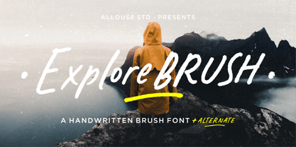 Proudly Presenting, Explorebrush A Handwritten Brush Font. Explorebrush is perfect for any titles, logo, product packaging, branding project, megazine, social media, wedding, or just used to express words above the background. Explorebrush also come with Multi-Lingual Support. Enjoy the font, feel free to comment or feedback, send me PM or email. Thank You!
 - Machiato by Letterhend,
$17.00 Machianto is a bold brush script which is purposely made for headline, display or logotype and the other various formal forms such as invitations, labels, logos, magazines, books, greeting / wedding cards, packaging, fashion, make up, stationery, novels, labels or any type of advertising purpose. Features : Uppercase & lowercase Numbers and punctuation Alternates/Ligatures Multilingual PUA encoded
 - Brushwork by Celebrity Fontz,
$24.99 Brushwork is a free-flowing brush font that combines a modern aesthetic with a very unique style. Some have suggested that Brushwork looks like a cross between Roman and Japanese characters but most agree it evokes total freedom of expression. Includes a full set of accented characters to accommodate most of the Romance languages.
 - Kailey by Great Lakes Lettering,
$40.00 Kailey font is a hand lettered, voluptuous typeface that is very special to the Great Lakes Lettering team. This oblique font is inspired by Molly Jacques’ “signature” lettering style, using bold brush strokes, fluid flourishes, and distinctive characters. Kailey has a distinct feminine feel that takes on a bold attitude to match her curves.
 - Smilena by Melvastype,
$32.00 Smilena is a stunning brush script font that has a modern touch. It can be used in various design projects, including package design. Smilena offers alternate characters, such as initial and final forms for lowercase letters, as well as swash characters. These features can be conveniently utilized in design software that supports Opentype capabilities.
 - HF Rainbug by Holis.Mjd,
$10.00 HF Rainbug is a natural brush font with all camps characters complete with alternates for each character. Not only that, this font also multilingual support. This font is suitable for various design themes that you will design, and can be adjusted easily to get a natural feel because alternates are available for each character. **Uppercase
 - Aokahori by Allouse Studio,
$16.00 Proudly Presenting, Aokahori A Brush Japanese Font. Aokahori is perfect for any titles, logo, product packaging, branding project, megazine, social media, wedding, or just used to express words above the background. Aokahori also come with Multi-Lingual Support. Enjoy the font, feel free to comment or feedback, send me PM or email. Thank You!
 - Heart Choise by Lucky Type,
$12.00 Heart Choise is the newest handwriting font made with pen brush, to help you create stunning handwriting looks.Heart Choise comes with alternate characters, punctuation marks, numbers. Also included is the added bonus, perfectly crafted for headlines and short text. Use for magazines, films, t-shirts, packaging, logos, advertisements, quotes, posters, editorials, cover art, websites, etc.
 - Okinawa by Din Studio,
$29.00 Okinawa is a classy script font. This brush font will make your design project more powerful. Made for any professional project branding. It is the best for logos, branding and quotes. Every letter has a unique and beautiful touch. Features: Ligatures Multilingual Support PUA Encoded Numerals and Punctuation Thank you for downloading from Din Studio.
 - Matteona by Akifatype,
$16.00 Matteona is a textured brush font, a contemporary approach to design, naturally handmade and with underscores. It also has alternatives and ligatures that make your design more attractive. Suitable for use in title design such as clothing, invitations, tittle books, stationery designs, quotes, branding, logos, greeting cards, t-shirts, packaging designs, posters and more.
 - Weatpoint by Stringlabs Creative Studio,
$25.00 Weatpoint is a playful and beautiful handwritten font. It’s great for comics, cartoons, birthday invitations, and any creative project that needs a fun look! Weatpoint is a flowing and elegant handwritten font, created with the help of a brush pen. Get inspired by its unique and beautiful style and add it to your favorite designs!
 - Something Shine by Letterafandi Studio,
$16.00 Something Shine is a natural and display font. It is a tough-looking font with a strong brush touch, ready to rock every design you want to create. It is perfect for logos, quotes, posters, clothing, and so much more! Add it to any of your creative projects, and be amazed by the generated outcome!