10,000 search results
(0.043 seconds)
- Novel Sans Hair Pro by Atlas Font Foundry,
$50.00 Novel Sans Hair is the new package of 24 ultra light weights of Novel Sans Pro, the humanist grotesque typeface family within the largely extended award winning Novel Collection, containing Novel Pro, Novel Sans Pro, Novel Sans Hair Pro, Novel Sans Condensed Pro, Novel Mono Pro, Novel Sans Rounded Pro and Novel Sans Office Pro. Novel Sans Hair has a carefully attuned character design and a well balanced weight contrast. Classic proportions and the almost upright italic makes Novel Sans Pro being a modern humanist with the calligraphic warmth of a real italic. Many similarities with the other typeface families within the Novel Collection enable designers to combine the families and reach highest quality in typography. Novel Sans Hair [1020 glyphs] comes in 24 styles and contains small caps, an extra set of alternate glyphs, many ligatures, lining figures [proportionally spaced and monospaced], hanging figures [proportionally spaced and monospaced], small caps figures [proportionally spaced and monospaced], positive and negative circled figures for upper and lower case, superior and inferior figures, fractions, extensive language support, arrows for uppercase and lowercase and many more OpenType™ features.
 - Maxima Now Pro by Elsner+Flake,
$59.00 The sans serif linear antiqua Maxima which was created in the beginning of the sixties by Prof. Gert Wunderlich for Typoart Dresden, was newly actualized in 2007 after more than 45 years. Many hands and heads were involved in the successful re-design of Maxima Now over a period of two years to assist the designers of the Elsner+Flake Design Studios in Hamburg, and the typeface family is now available. The re-design happened in close cooperation with Wunderlich who has given support to numerous projects in Elsner+Flake’s studio in Hamburg. A great deal of care was given to the necessary preliminary tasks such as the viewing of the original designs and print tests, the analysis of the digital Typoart data which had been in the possession of Elsner+Flake since 1985 and 1989, and a design conceptualization based on detail correlations, as well as the extension of the character complement. It had been Elsner+Flake’s goal to include as many of the existing Maxima cuts into the re-design program as possible. The result is an extended font family with 25 weights in EuropaPlus layout.
 - Lev Serif by TypeFaith Fonts,
$15.00 Lev is a slab serif font, the rectangular serifs and the straight angled shoulders and links contrasting the curves and loops. Lev Serif is characterized by thick, block-like serifs. Lev contains 12 high quality fonts.
 - Longbranch by Solotype,
$19.95A modern cutting designed to give the appearance of an old wood type. The letters were cut as linoleum blocks about 2 inches high, then duplicated as copper electrotypes. Used for some Ringling Bros. circus work. - PIXymbols Gridmaker by Page Studio Graphics,
$20.00Print quad paper and cross-stich chart grids, as large as your printer will allow. These blank grids are in sizes to match four fabric thread counts, plus 1/10", 1/8", and 1/2" grids. - Sveva by astype,
$58.00 Sveva Versal is a light swinging art nouveau caps only headliner, with swash like alternates and lots of special combinations. It's well suited to set a short and fancy block or line of text. PDF Specimen
 - Reacher Sans by Callout,
$19.00 Reacher-Sans is an elegantly simple sans-serif font. Designed for versatility, it possesses unique letters perfect for logos and still maintains a simple and readable look beautiful for both headlines and large blocks of text.
 - Flatsider JNL by Jeff Levine,
$29.00 Flatsider JNL is a simple block (square) stencil font available in both regular and oblique versions. Plain, stark and with no unwanted embellishments, Flatsider JNL gives the look of structured compliance to any stencil-based text.
 - AquilineTwo - Unknown license

- Panoptica by Shinntype,
$39.00 New formula for an alphabet: unicase + monowidth. Realized in an exceptional diversity of styles.
 - MEGA SLANT LINE by TypoGraphicDesign,
$19.00 CONCEPT/CHARACTERISTICS This strikingly bold, black and extended 3D font reminiscent of sci-fi films and experimental typeface design. The font acts as a chain of ligatures and thus receives a unique aesthetic. The unique letter forms are in sharp contrast to other fonts and thus stand out as a unique selling point. APPLICATION AREA Posters, music cover, book cover, logos, as a headline font for magazines or websites … TECHNICAL SPECIFICATIONS Headline Font | Display Font | Sci-Fi Font »Mega Slant Line« OpenType Font with 303 glyphs – alternative letters and ligatures (with accents & €) & 2 styles (regular & 3d) KONZEPT/BESONDERHEITEN Diese auffällig plakative, fette und breitlaufende 3D Schrift erinnert an Sci-Fi Filme und ist experimentelle Schriftgestaltung. Die Schrift wirkt wie eine Kette aus Ligaturen (Buchstabenverbindungen) und erhält somit eine ganz eigene Ästhetik. Die sehr eigenen Buchstabenformen werden sich deutlich von anderen Schriften abheben und somit als Alleinstellungsmerkmal herausstechen. Der Fluss ergiebt sich aus den EINSATZGEBIETE Plakate aller Art, Musik Cover, Buchcover, für Logos und Wortmarken, als Displayschrift für Zeitschriften oder Websites… TECHNISCHE INFORMATIONEN Headline Font | Display Font | Sci-Fi Font »Mega Slant Line« OpenType Font with 303 glyphs – alternative letters and ligatures (with accents & €) & 2 styles (regular & 3d)
 - Fluze by CozyFonts,
$20.00 The Fluze Fonts This is the 21st font release from CozyFonts Foundry, a California Font Foundry established in 2011 with it’s first Official Release in 2012 with the Aladdin Bold Family. Inspirations for the design of this font family, by California Graphic Designer/Illustrator/Font Designer Tom Nikosey, is based on the wacky, weird & quirky films that have graced the screen with their offbeat styles and characters. Movies that come to mind are Mary Poppins, Beetlejuice, Wizard of Oz, Edward Scissorhands, Alice in Wonderland, Little Shop of Horrors, Addams Family, Labyrinth, Ghostbusters, etc. The absurd, the sublime, the animated, the scary, and the illustrated are all descriptors to define the possibilities Of the many uses and applications of Fluze and Flute Outline as presented in a sampling of the posters here. The intentional crooked hand drawn’ glyphs and extras lend their personalities to create this effect. Whether in black, white & grays or psychedelic color combos, Fluze can be comical, frightening and Downright irreverent. This font works as main titles, end titles, branding, signage, numeric displays and even logotypes and monograms. Have fun and let your inner cartoonist inspire.
 - Soprani by insigne,
$39.00 Soprani is a unique typeface inspired by a plaque found in New Zealand dating from the 1920s. The design was contemporized and brought 100 years into the future. The serifs are dramatically flared at the end of the stems, while in the middle, they contract. This leads to a unique shimmering effect that draws the eye and catches your user's attention. This typeface meets the demand for unique serif types that are both eye-catching and delicate. It’s a display face that's ideal for very contemporary work. This typeface has plenty of alternates and has a full complement of OpenType features. The 1920s inspire the design, with a bit of art nouveau and arts and crafts, yet the typeface is designed to meet contemporary design requirements. It has a unique elegance and the letterforms are condensed more than most. Soprani is suggested for table books, menus, and various promotional materials, newspapers, television, motion pictures and other media. There is a wide range of widths and weights available, from the thin, which is delicate and graceful, to a bold and robust black. Production assistance by Lucas Azevedo and ikern.
 - Mandrel by insigne,
$39.99 From the realm of insigne, a new family has risen. By name, Mandrel. Courtly in character and elegant in appearance, the face finds great favor among those with whom it seeks audience. With confident air, Mandrel carries itself gracefully before each pair of eyes, never faltering or stumbling in its refined step. But while dressed with gentility, this elegant family is not faint of heart when challenged. Crafted well for high-impact resistance, Mandrel steps boldly and prominently into the arena of the reader’s eye, boasting its tall x-heights, high contrast, confident bends, and sharp serifs. Skillfully, it wields its sharp serif endings, cutting swiftly through opponents’ crude clutter, which fights for the reader’s attention. From Thin to Black, nine weights and their matching italics make up this noble family. Mandrel furthermore includes an abundant treasury of OpenType variables to adorn your text. Ligatures, old-style figures, and stylistic sets are available to accompany the family’s 500 glyphs and its support for more than 70 languages. Raise your cup to this new Mandrel! With strong serifs and high contrast, you’ll find this champion ready to take up your challenge in many a test ahead.
 - Kate Slab by Monday Type,
$15.00 Kate Slab Pro is a sophisticated and robust modern Slab Serif Typeface that works in a variety of design scenarios. It is designed to work in big attention grabbing headlines as well as in smaller text and even body text. The recognition value of Kate Slab Pro is its biggest asset in world of uniformity. Ranging from "100 Thin" all the way to "900 Black" makes Kate Slab Pro such an amazing and versatile font family that stands out. Kate Slab Pro doesn’t only work great in lifestyle and fashion related contexts but will also look amazing for restaurants, coffee shops or and other use cases that ask for character and identity. To fill all the gaps of a designer's needs, Kate Slab Pro comes with an italic style with every weight. Those italics are equipped with unique and real italic characters and will make you love it. Being a Slab Serif Kate Slab Pro manages to remind you of a classic Font Family with a modern and timeless approach that will make you happy for decades. Monday Type can’t wait to see the beautiful designs you are going to create with our Kate Slab Pro.
 - Arek Latin by Rosetta,
$60.00 Arek is Rosetta’s award-winning collection of Latin and Armenian families. Originally designed for use in textbooks and the schoolroom, Arek is an active typeface that holds the reader’s attention with kinetic details tucked into restrained letterforms on the page. For clarity and ease of reading, Arek pairs its nuanced upright and its perky italic styles for both scripts. Though first designed with school books in mind, Arek equips the typographer with eight styles covering a wide range for editorial and other challenging typesetting environments. Essential expert features such as ligatures, lining and ranging figures, and contextual alternates ensure Arek is ready for any assignment. Extras like a full array of bullets, dingbats, and manicules make this family nimble enough to make the grade with readers in all sorts of editorial projects.
 - Sixties Symbols JNL by Jeff Levine,
$29.00The 1960s was the most tumultuous decade of the 20th century. Sixties Symbols JNL collects twenty-six icons and phrases from that time of change and unrest including the peace symbol, a dove, a daisy—even the militant 'power fist' that signified rebellion against mainstream society. There's also a blank lapel button on the Y/y keys and a blank protest poster on the Z/z keys for your own special message. For the more daring, the left and right brace Keys {and } have the 'one finger salute' the radical hippie factions displayed generously. Use that one with discretion! - Hub by ParaType,
$25.00Designed by Gennady Fridman and released by ParaType in 2008. Hub represents so called block letter handwriting style, which becomes more and more usual and nowadays replaces traditional cursive handwriting. One of the reasons for these changes is an often requirement in official forms to write in block letters. Some forms contain even stricter rule – to write in capital letters. Hub was designed to meet these requirements and includes small caps instead of lower case letters. It’s recommended for use in advertising and display typography and especially when you need to show a sample of properly filled bureaucratic form. - Dear Penpal Script by Giaimefontz,
$6.00 This is a fully connected script font, not calligraphic, but entirely designed to follow handwritten cursive ligatures rules as teached in schools. In order to correctly visualize it, you have to enable OpenType features (Contextual Alternates, Discretionary Ligatures, Standard Ligatues and Kerning). Trying to write All Capitals will generate Block Letters writings, since cursive style doesn't allow more than the first uppercase per word, however this font is not meant to be a Block Letters font. Using specific type combinations will generate special glyphs. All of these features are intended to reproduce a classic schoolboy or schoolgirl notebook.
 - KleinsFirstScript - Unknown license

- Suave silky by Aomam,
$10.00 Suave silky is a handwritten font. The designer was inspired by his own handwriting in high school.This font makes me go back to my days as a student.
 - Lisboa Sans Tamil by Vanarchiv,
$75.00 The design approach from this humanist sans-serif is much more simple and neutral than Lisboa Tamil (lacks the hook-head terminals). Latin transliteration characters were also included.
 - Chusp by PizzaDude.dk,
$20.00A laid back slab serif font with a good deal of the funky side of pizzadude.dk! You will need to use OpenType supporting applications to use the autoligatures - Ardena by Julien Fincker,
$34.99 About the design: Ardena is a modern sans-serif typeface family. While neutral and clear at first glance, it can be characterized as both pleasant and confident due to its open, rounded forms and vertical terminals. It can be used in both a restrained and expressive way. The thinner and thicker weights are particularly suitable for strong headlines, while the middle weights can be used for typographic challenges and body text. Completed with an extensive character collection, it becomes a real workhorse. A versatile allrounder that is up to all challenges – for Corporate Identity, Editorial, Branding, Orientation and Guidance systems and much more. Features: The Ardena family has a total of 20 styles, from thin to heavy with matching italics. With over 1064 characters, it covers over 200 Latin-based languages. It has an extended set of currency symbols and a whole range of Open Type Features. There are alternative characters as stylistic sets, small caps, automatic fractions – just to name a few. Arrows and numbers: In particular, the extensive range of arrows and numbers should be highlighted, which are perfectly suited for use in orientation and guidance systems. Thanks to Open Type Features and an easy system, the various designs of arrows and numbers can also be simply "written" without first having to select them in a glyph palette. The principle is easily explained: If a number is placed in round or square brackets, it will automatically be displayed in an outlined circle or square. If you add a period to the number, it is displayed in a full circle or square. The same principle also applies to the arrows. The arrows themselves are combinations of greater/less symbols with the various slashes or hyphens. Get the Variable Font here: https://www.myfonts.com/fonts/julien-fincker/ardena-variable/
 - Ardena Variable by Julien Fincker,
$185.00 About Ardena: Ardena is a modern sans-serif typeface family. While neutral and clear at first glance, it can be characterized as both pleasant and confident due to its open, rounded forms and vertical terminals. It can be used in both a restrained and expressive way. The thinner and thicker weights are particularly suitable for strong headlines, while the middle weights can be used for typographic challenges and body text. Completed with an extensive character collection, it becomes a real workhorse. A versatile allrounder that is up to all challenges – for Corporate Identity, Editorial, Branding, Orientation and Guidance systems and much more. Variable Font The Variable Font contains 2 axes: weight and oblique – all in just one file. Features: With over 1064 characters, it covers over 200 Latin-based languages. It has an extended set of currency symbols and a whole range of Open Type Features. There are alternative characters as stylistic sets, small caps, automatic fractions – just to name a few. Arrows and numbers: In particular, the extensive range of arrows and numbers should be highlighted, which are perfectly suited for use in orientation and guidance systems. Thanks to Open Type Features and an easy system, the various designs of arrows and numbers can also be simply "written" without first having to select them in a glyph palette. The principle is easily explained: If a number is placed in round or square brackets, it will automatically be displayed in an outlined circle or square. If you add a period to the number, it is displayed in a full circle or square. The same principle also applies to the arrows. The arrows themselves are combinations of greater/less symbols with the various slashes or hyphens. Get the static version of the Ardena family here: https://www.myfonts.com/fonts/julien-fincker/ardena/
 - Earth's Mightiest 3D - Unknown license

- Breadley Sans by Ardyanatypes,
$14.00 Introducing Breadley Sans, a modern, elegant tagline sans serif type look. This font equipped with 5 levels of thickness, from thin to black suits your needs. Pairs well with modern san serifs and scripts as pictured, or stands strongly on its own as a heading and brand representative for an elegant look. This Breadley Sans overcome with the professional modern characteristic font which could bring elegant and appealing identity to your company for business utilities use like business card, name tag, uniform as brand elevation Advertising usage? sure! This modern Breadley Sans Serif typeface obviously fit to embossed as a letter signboard or even splash it along your office with an elegant look cutting sticker. The type shape of this elegant Breadley Sans, also stunning for books cover or magazine writing You can view all of the available characters in the screenshots above, and you can try out the modern & elegant of Breadley Sans now for any design matter Breadley Sans is also equipped with many languages, so it is easy to use for any country and language usage, and also equipped with Ligatures and alternative stylistic to make your design more attractive. A guide to accessing all alternatives Adobe Photoshop go to Window – glyphs Adobe Illustrator go to Type – glyphs Thank you and have a nice day
 - Touvlo by Monotype,
$49.99 New from the Monotype Studio’s Creative Type Director, Emilios Theofanous, Touvlo – meaning brick in Greek – is an homage to London and the view from his studio window. A zestful, modern interpretation of a classic genre, Touvlo skillfully captures the spirit of early British grotesque typefaces through playful terminals and lively curves. Touvlo offers an array of styles, from clean uprights to characterful Italics, and exuberant Backslants. Its regular upright weights are optimized for long text, with prominent and visible vertical contrast, creating rhythm and texture for comfortable reading. The Italics are designed to be visibly distinct, with narrower proportions and calligraphic shapes, offering brightness and emphasis wherever needed. The Backslants are an unexpected and energetic addition, providing an element of surprise while following similar design choices as the Italics, packing a particular punch. With a total of 24 weights in 3 styles across 3 variable fonts, Touvlo’s variety adds flavor in any use case, and can withstand complex typographic layouts or unexpected and peculiar settings. Touvlo’s weights range from Thin to Black, giving it an expressive edge for headlines. Its lyrical Drop caps are the finishing touch, featuring exquisite birds and creatures inspired from ornaments found in type specimen books. Touvlo’s spirit is radiant; becoming more than a voice; a reimagining of a classic genre and a must have for every designer's typographic palette.
 - Touvlo Variable by Monotype,
$229.99 New from the Monotype Studio’s Creative Type Director, Emilios Theofanous, Touvlo – meaning brick in Greek – is an homage to London and the view from his studio window. A zestful, modern interpretation of a classic genre, Touvlo skillfully captures the spirit of early British grotesque typefaces through playful terminals and lively curves. Touvlo offers an array of styles, from clean uprights to characterful Italics, and exuberant Backslants. Its regular upright weights are optimized for long text, with prominent and visible vertical contrast, creating rhythm and texture for comfortable reading. The Italics are designed to be visibly distinct, with narrower proportions and calligraphic shapes, offering brightness and emphasis wherever needed. The Backslants are an unexpected and energetic addition, providing an element of surprise while following similar design choices as the Italics, packing a particular punch. With a total of 24 weights in 3 styles across 3 variable fonts, Touvlo’s variety adds flavor in any use case, and can withstand complex typographic layouts or unexpected and peculiar settings. Touvlo’s weights range from Thin to Black, giving it an expressive edge for headlines. Its lyrical Drop caps are the finishing touch, featuring exquisite birds and creatures inspired from ornaments found in type specimen books. Touvlo’s spirit is radiant; becoming more than a voice; a reimagining of a classic genre and a must have for every designer's typographic palette.
 - Chong Old Style by Monotype,
$29.99In the tradition of Goudy Old Style and Goudy Modern, Chong Wah drew Chong Old Style™ and Chong Modern™ as visually different – but complementary – designs. According to Chong Wah, “The extended family of typefaces started as a concept rather than a preconceived design. The concept is different sans serif type styles with a common underlying structure and a clear lineage to traditional serif designs. While there are similarities between the designs, each typeface was drawn as a separate entity.” Chong Old Style has the flavor of traditional old style designs without slavishly replicating the earlier design traits. It has the heft and color of an old style design but lacks the serifs and inclined stroke axis customarily seen in these typefaces. The result is a versatile suite of typefaces that deliver a straightforward message in large or small sizes. Chong Modern is a sans serif interpretation of the classic modern, or neoclassical, designs of Bodoni and Didot. More than a Bodoni without serifs, Chong Modern also has an elegant, Art Deco demeanor. This is a design that walks the line between traditional and contemporary with grace and aplomb. Chong Wah drew his Old Style and Modern designs in Light, Regular and Bold weights, adding an Extra Bold to the Old Style. All designs benefit from harmonizing italic counterparts. Both branches of the Chong family are also available as OpenType Pro fonts, allowing graphic communicators to take advantage of OpenType’s diverse capabilities. These fonts, in addition to providing for the automatic insertion of old style figures, ligatures and small caps, also offer an extended character set supporting most Central European and many Eastern European languages - Chong Modern by Monotype,
$29.99In the tradition of Goudy Old Style and Goudy Modern, Chong Wah drew Chong Old Style™ and Chong Modern™ as visually different – but complementary – designs. According to Chong Wah, “The extended family of typefaces started as a concept rather than a preconceived design. The concept is different sans serif type styles with a common underlying structure and a clear lineage to traditional serif designs. While there are similarities between the designs, each typeface was drawn as a separate entity.” Chong Old Style has the flavor of traditional old style designs without slavishly replicating the earlier design traits. It has the heft and color of an old style design but lacks the serifs and inclined stroke axis customarily seen in these typefaces. The result is a versatile suite of typefaces that deliver a straightforward message in large or small sizes. Chong Modern is a sans serif interpretation of the classic modern, or neoclassical, designs of Bodoni and Didot. More than a Bodoni without serifs, Chong Modern also has an elegant, Art Deco demeanor. This is a design that walks the line between traditional and contemporary with grace and aplomb. Chong Wah drew his Old Style and Modern designs in Light, Regular and Bold weights, adding an Extra Bold to the Old Style. All designs benefit from harmonizing italic counterparts. Both branches of the Chong family are also available as OpenType Pro fonts, allowing graphic communicators to take advantage of OpenType’s diverse capabilities. These fonts, in addition to providing for the automatic insertion of old style figures, ligatures and small caps, also offer an extended character set supporting most Central European and many Eastern European languages - Ashemore by insigne,
$34.99 Ashemore developed as a result of my visits to Barcelona, Spain and to Germany, followed soon after by a visit to Asheville, North Carolina. Blending the styles of art and architecture from these three areas may seem initially to result in an unusual formula, but the distinct and flamboyant style of Art Nouveau and the Arts and Crafts style combined with the more strict rules of a sans serif transfer well into a beautiful and very usable blend of these individually eccentric forms. The resulting font retains the Art Nouveau and Craftsman style flavors, which shine through the typeface despite its geometric base. One of the font’s defining characteristics is the unique terminators of its C, G and S. This face’s texture and rhythm also moves well in longer texts. These and other features give Ashemore a restrained bohemian vibe that seems particularly appropriate for a coffee house or an art gallery. The Ashemore family has a full range of six weights from thin to black and includes condensed and extended options for a total of 36 fonts. The typeface also includes some unique OpenType alternates that make the superfamily even more versatile. Ashemore is equipped for complex professional typography, including alternates, small caps and many alternate characters. The face also has a number of numeral sets, including tabular figures, fractions, old-style, lining figures and superiors and inferiors. OpenType-capable applications such as Quark or the Adobe Suite can take full advantage of automatic ligatures and alternates. You can find these features demonstrated in the .pdf brochure. Ashemore also includes the glyphs to support a wide range of languages, including Central, Eastern and Western European languages. In all, Ashemore supports over 40 languages that use the extended Latin script, making the new addition a great choice for multi-lingual publications and packaging. Ashemore was designed by Jeremy Dooley with production assistance from Lucas Azevedo and Marcelo Magalhaes. Kerning assistance from iKern.
 - PF DIN Stencil by Parachute,
$39.00 DIN Stencil on Behance. DIN Stencil: Specimen Manual PDF. Despite the fact that over the years several designers have manually created stencil lettering based on DIN for various projects, there has never been a professional digital stencil version of a DIN-based typeface. After the successful introduction of DIN Monospace a few months earlier, PF DIN Stencil now completes Parachute’s extensive library of DIN superfamilies. It was based on its original counterpart DIN Text Pro and was particularly designed to address contemporary projects, by incorporating elements and weights which are akin to industries such as fashion, music, video, architecture, sports and communications. Traditionally, stencils have been used extensively for military equipment, goods packaging, transportation, shop signs, seed sacks and prison uniforms. In the old days, stencilled markings of ownership were printed on personal possessions, while stencilled signatures on shirts were typical of 19th century stencilling. Two companies dominated the market in the mid-twentieth century: the Marsh Stencil Machine Company in the United States and the Sächsische Metall Schablonen Fabrik in Germany. Ever since the late 1930s, it was the German Sächsische Metall Schablonen Fabrik which used heavily the new DIN 1451 standard font (introduced in 1936), attempting to overthrow the reign of the Didot-style modern roman which was at the time the most common stencil letter in Germany. These letters were manufactured mainly as individual zinc stencils which could be ordered in sizes between 10 and 100mm. The DIN Stencil family manages to preserve several traditional stencil features, but introduces additional modernities which enhance its pleasing characteristics and make it an ideal choice for a large number of contemporary projects. Furthermore, the spacing attributes of the glyphs were redefined and legibility was improved by revising the shape of the letterforms. The DIN Stencil family consists of 8 diverse weights from the elegant Hairline to the muscular Black. Currently, it supports Latin, Eastern European, Turkish and Baltic.
 - JAF Lapture by Just Another Foundry,
$59.00 Lapture is based on the Leipziger Antiqua by Albert Kapr, released in 1971 by the East German foundry Typoart. It has been extended and carefully redesigned by Tim Ahrens in 2002-05. The strong calligraphic characteristics are a result of the design process: "The size of the counters and the width of individual characters at small optical sizes were analysed with a steel pen while the letter shapes were designed in larger size with a specially trimmed reed pen. Sometimes the hand is more innovative than the head alone," says Kapr. A unique feature of this font is the introduction of gothic shapes into a latin typeface. "The basic concept is to string together narrow white hexagons as counters and inter-letter spaces, defined by vertical stems and triangular serifs. The interior spaces are at least as important as the strokes that make up the characters." Lapture is an ideal choice if a reference to gothic style is desired, as true black letter types are often too eye-catching and not as legible as latin fonts for unfamiliar readers. "The last few years have seen a number of very elegant typefaces based on the mellow and feminine renaissance model. However, sometimes we require a font that is strong and robust, harmonic yet rigid," says designer Tim Ahrens. JAF Lapture is provided in OpenType format. Each font contains more than 600 glyphs, including true small caps, nine sorts of figures, contextual and stylistic alternates and accented characters. This means that you only need to purchase one font whereas in other families you would have to buy two or three fonts in order to get the same. Technically, they follow the Adobe Pro fonts and provide the same glyph set and OpenType functionality. JAF Lapture Basic is provided in OpenType format. Each font contains the standard sets of both MacOS and Windows. In contrast to JAF Lapture they do not provide any advanced OpenType features and no extended glyph set.
 - Versailles LT by Linotype,
$57.99 The origins of the font Versailles go back to the 19th century in France when, with the introduction of lithography, alphabets could contain freer forms. The basic forms are Modern Face with triangular serifs. The direct influence for Versailles was the writing on the back of the memorial to Charles Garnier, the architect of the Paris Opera. Versailles is a classic font for advertisements, perfect for shorter texts and titles/headlines and it makes an impression of elegance and strength.
 - Pronter by Larin Type Co,
$16.00 Pronter It is a stunning vintage font that comes in three styles: Regular, Rough and Stamp style and also includes two font styles: shadow and rough shadow. This font contains many alternates, so make them up to the extent that your design's creativity is enough. Pronter font versatile it can be used both in modern projects and in vintage ones, as a main or additional one. This font is easy to use, has OpenType features.
 - RMU Ballade by RMU,
$25.00 In the years 1937 and 1938 Paul Renner drew these both styles of the Ballade font family. Now freshly redesigned and extented for contemporary use, both styles have reappeared. These fonts contain the historical long s, which can be reached by typing the integral sign [ ∫ ] or by turning the round s into the long s via using the OT feature historical forms. It is also recommended to activate the OT feature discretionary ligatures.
 - Materia Pro by Elsner+Flake,
$79.00 Minimal, modular, modern—at first glance, Materia shows a contemporary flair, combining pure, strong geometrical form with a subtle, distinct appearance. Actually, the design was inspired by lettering from the turn of the 19th to the 20th century that still can be found in the East of France. While its formal origins date back as far as this, revived e. g. by the constructivists into the nineteen twenties and later on by Dutch information designer Wim Crouwel in the nineteen-sixties, the visual language of Materia still speaks of the »future«. Following a minimalistic concept the font is formally built on a grid. Wherever optical curves are needed for a smoother, more comfortable shape of letters than a simple rectangular block, diagonals cut off the egdes – like a diamond is cut to achieve more beauty. Thus headlines and texts set in Materia are given a certain »egdy« feeling, whereas their tonality is still kept well-balanced, keeping concentation all on information in a nonconfomist way. Materia comes in eight styles, from elegant Thin to attention-forcing Ultra. Even a regular Italic is available, following the classic type-set-principle. Two of the styles are explicitly designed for display use, Shadow and Code. Both are ready for combinations with Bold or each other respectively, the layering of Shadow and Code e. g. allows astonishing effects or highlighting within the letters. For OpenType-users Materia is a real Pro, containing accented Latin letters for over 70 languages, small caps, old style, tabular and lining figures and special condensed titling all caps for cases in which space is all that counts. How useful all of the above mentioned is may be seen in the book David Lynch – Lithos, designed by Koma Amok, published in 2010 by item éditions, Paris, and Hatje Cantz, Germany, which was typeset completely in Materia.
 - Fairgrid Urban by Ditatype,
$29.00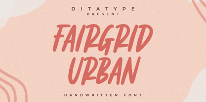 Fairgrid Urban is a modern handwritten font. With a classy and natural handwritten style, it brings a classy and chic typeface. Fairgrid Urban is best used for weddings, branding, logotype, and quotes. Includes: - Fairgrid Urban (OTF) Features: - Beautiful Ligatures - PUA Encoded - Multilingual Support - Numerals and Punctuation
 - Divine Instinct by AkaliDz,
$10.00 Divine Instinct is a cool, bold and authentic blackletter font. Masterfully designed to become a true favorite, this font has the potential to bring each of your creative ideas to the highest level! this font contains : custom upper cases custom lower cases custom numbers default poncuation marks


