10,000 search results
(0.028 seconds)
- Italiko by Luca Bolognese,
$11.00 Italiko is a calligraphic font. The letters have been hand-drawn individually to extract the common strokes. The strokes have then been re-composed to give the font a more unified appearance. It comes in Black, Bold, Regular, and Thin. The Thin version is different as the extreme contrast in the font makes the thinner lines disappear. It is likely best used as a display font. There are ligatures for the combination of letters that can be written more quickly by using a single stroke and letters that are slightly different from the ‘Italic canon.’ You can select which one to use in your application (i.e., Word) using combinations of italic/bold: No selection -> Regular Bold -> Bold Italic -> Thin Bold Italic -> Black If you end up using the font, get in touch at https://github.com/lucabol/Italiko. Feel free to suggest improvements or let me know if you encounter problems.
 - Blanc Groove by Godbless Studio,
$28.00 BLANC GROOVE, a font with a futuristic and experimental concept created with a strong and charismatic character. following the current trend design style. BLANC GROOVE is made experimentally following a futuristic style recipe with alternate characters made with outstanding alternate and display that makes this font more stylish and varied. BLANC GROOVE is a variable font that has 18 Font, 9 weights with 2 Variable from thin to black & Italic. also includes alternates that are more varied with variables. BLANC GROOVE is a versatile font system, designed primarily for display uses with a need of visual impact. Variable : Thin & Italic Light & Italic ExtraLight & Italic Regular & Italic Medium & Italic SemiBold & Italic Bold & Italic ExtraBold & Italic Black & Italic Feature : Alternate Character Ligature Discretionary Ligature Multilingual Support Numeral & Punctuation Symbol etc alihbWish you enjoy our font and if you have a question, don't hesitate to drop message & I'm happy to help.
 - Informative by Latinotype,
$39.00 Informative is a typeface consisting of a whole family of sans fonts and a collection of thematic pictograms. This combination of two different types of communication reflects the current need for using text and images as means of conveying information in a complementary way. The family comes with a text version of 7 weights (with matching italics)—Thin, Light, Regular, Medium, SemiBold, Bold and Black, and includes 7 thematic icons sets which allude to elements related to alimentation, city, energy, people, politics, sports and work. Each set contains 88 glyphs and includes both outline and black versions. The text font contains a set of 423 glyphs that support 207 different languages. Informative is a clean, simple and versatile typeface well-suited for a wide range of graphic design and visual communication projects. This font has especially been designed for infographics, maps and digital applications.
 - High Crush by Namara Creative Studio,
$20.00 A visual reflection of progress and dynamism, Elevate your design projects to the next level with our cutting-edge bold techno display fonts. Suitable for a wide range of applications. Whether you’re designing sports event posters, tech product labels, or esports team branding, these fonts will make your content stand out. Features : Bold, Strong & Techno Display Typeface Versatile & Unique Design Alternates, Ligatures & Multilingual Support with PUA Encoded Capture attention, and make a bold impression with these fonts. Start creating the future today! Note : To be able to access ligatures and the alternate letters, please make sure the software you are using can support opentype features.
 - Pethuk by Twinletter,
$15.00 Pethuk is a bamboo-themed display typeface that was created with attention to provide a distinctive, elegant, and versatile font for your diverse project needs. This display typeface is a lot of fun; get it today to give your project a bombastic flair. This font is perfect for games, sporting events, branding, banners, posters, movie titles, book titles, quotes, logotypes, and more. of course, your various design projects will be perfect and extraordinary if you use this font because this font is equipped with a complimentary font family, both for titles and subtitles and sentence text, start using our fonts for your amazing projects.
 - Neue Haas Grotesk Display by Linotype,
$33.99 The first weights of Neue Haas Grotesk were designed in 1957-1958 by Max Miedinger for the Haas’sche Schriftgiesserei in Switzerland, with art direction by the company’s principal, Eduard Hoffmann. Neue Haas Grotesk was to be the answer to the British and German grotesques that had become hugely popular thanks to the success of functionalist Swiss typography. The typeface was soon revised and released as Helvetica by Linotype AG. As Neue Haas Grotesk had to be adapted to work on Linotype’s hot metal linecasters, Linotype Helvetica was in some ways a radically transformed version of the original. For instance, the matrices for Regular and Bold had to be of equal widths, and therefore the Bold was redrawn at a considerably narrower proportion. During the transition from metal to phototypesetting, Helvetica underwent additional modifications. In the 1980s Neue Helvetica was produced as a rationalized, standardized version. For Christian Schwartz, the assignment to design a digital revival of Neue Haas Grotesk was an occasion to set history straight. “Much of the warm personality of Miedinger’s shapes was lost along the way. So rather than trying to rethink Helvetica or improve on current digital versions, this was more of a restoration project: bringing Miedinger’s original Neue Haas Grotesk back to life with as much fidelity to his original shapes and spacing as possible (albeit with the addition of kerning, an expensive luxury in handset type).” Schwartz’s revival was originally commissioned in 2004 by Mark Porter for the redesign of The Guardian, but not used. Schwartz completed the family in 2010 for Richard Turley at Bloomberg Businessweek. Its thinnest weight was designed by Berton Hasebe.
 - Aldo - Unknown license

- Sunday Artela by Flawlessandco,
$9.00 Introducing "Sunday Artela," a font that effortlessly blends playful script elements with a retro charm, creating a nostalgic yet contemporary feel. This unique typeface doesn't just stop at capturing attention — it transports your designs to a world where every letter tells a story. Sunday Artela doesn't just bring letters to life; it introduces a dynamic trio of styles — regular, solid, and fun — adorned with patterns in fun styles that add an extra layer of delight to your designs. There's some connected letters and some alternates that suitable for any graphic designs such as branding materials, t-shirt, print, business cards, logo, poster, t-shirt, photography, quotes .etc This font support for some multilingual. Also contains uppercase A-Z and lowercase a-z, alternate character, numbers 0-9, and some punctuation. If you need help, just write me! Thanks so much for checking out my shop!
 - Paiute by insigne,
$9.99 Feast your eyes on Paiute, the sultry script that'll have your design looking hotter than a Vegas summer! This font is so seductive, it'll make your audience swoon harder than when Elvis was at the Sands. The exaggerated top stroke and sharply slanted terminals give Paiute a look that's straight out of the vintage Vegas scene. It's like the Rat Pack meets Marilyn Monroe in a smoky casino bar. Whether you're designing a magazine cover, book cover, or movie poster, Paiute is the perfect choice for that extra touch of va-va-voom. It's like sprinkling glitter on your design - except it won't get stuck in your hair. So why settle for boring fonts when you can make your project stand out like a sequined jumpsuit? Let Paiute help you bring that authentic 1960s Vegas vibe to your marketing. Your audience will be shouting "Viva Las Paiute" in no time!
 - Bestyline by MJB Letters,
$20.00 Bestyline is a captivating Bold Script Font that seamlessly blends bold lettering with the artistic elements of calligraphy. Its unique design exudes confidence and energy, creating a striking visual impact. The font features thick, well-defined characters with artistic contours, adding a touch of elegance to each letter. The strong and impressive script style makes Bestyline an ideal choice for projects that require a bold and classy appearance, such as headlines, logos, posters, and other designs. The standout features of Bestyline include the clarity of each letter, ensuring that text using this font effortlessly captures attention. Its boldness and distinctiveness make it well-suited for both print and digital designs. Whether used in headlines or logos, 'Bestyline' brings a modern and sophisticated flair to any project, making it the perfect choice for those seeking a seamless combination of boldness and beauty in their typography.
 - PF Das Grotesk Pro by Parachute,
$79.00 Das Grotesk was inspired by earlier nineteenth-century grotesques, but it is much more related to American gothic designs such as those by M.F. Benton. Due to their pure geometric structure, most grotesque typefaces tend to have a rather monotonous and lifeless appearance, thus failing to express the ideals of the modern creed. Das Grotesk on the other hand is a lively design with several distinguishable characteristics which attract attention when set at large sizes, whilst they become subtle and blend evenly at small sizes, fostering a neutral identity. This is a very legible and space-saving typeface with a narrow structure. It was designed with slanted curved ends and sheared terminals applied on several straight strokes. It has two-storey ‘a’ and ‘g’ but includes single-storey alternates. The family consists of 14 weights ranging from Extra Thin to Black (including true-italics). It provides simultaneous support for Latin, Cyrillic and Greek and is loaded with several advanced typographic features such as small caps. Download its complehensive PDF Specimen Manual for further details.
 - Slate by Monotype,
$34.99 A typeface of grace, power and exceptional versatility, the Slate collection is a truly beautiful design that achieves stellar levels of readability, both in print and on screen. Created by the award winning type designer Rod McDonald, this six-weight sans serif family is a rare example of sublime aesthetics meeting world-class functionality. The typeface’s legible letterforms embody an amalgam of the best traits of both humanistic and grotesque letterforms. “I didn’t want a face with an ‘engineered’ look, or with any noticeable design gimmicks or devices,” admits designer McDonald. “I wanted a pure design. I confess that I was ruthless with any character that wanted to stand out from the rest.” The Slate collection is available in six weights with complementary italics, with slight changes in structure from the light to the black weights. Its light weight is reminiscent of early American sans. Whether for use in display work or in longer-form settings, few typefaces possess the beauty and power of this design, leaving the Slate family an excellent addition to any designer’s typographic quiver.
 - Absurdies by Typephases,
$25.00 Absurdies is a trilogy of pictorial typefaces with lots of mischief, fun, weirdness, black humour and amusement. It includes 143 digitized illustrations. You will find many inexplicable behaviours, madmen, strange occupations, absurd and chaos-loving characters, and general whimsy. This little crowd can be used in many ways, from spot illustration to big illustration work or graphic designs, taking advantage of the vectorial format of the font file. The characters in Absurdies (together with their kin, the Illustries, Whimsies, Ombres, Bizarries and Genteta dingbats) are drawings from the sketchpad of Joan M. Mas, drawn from imagination and with no reference, except in a handful of cases pulled from historical photography. He wanted an easy-to-use format to collect his hundreds of imaginary ink drawings and he realized a digital typeface was an ideal solution. Having the illustrations gathered in a font file means you can use them instantly in any program you like. You may choose to use the images out of the box, or further customize them with colours and textures. The possibilities are endless.
 - Antica by Sudtipos,
$39.00 Antica has sharp triangular serifs, and in 8 weights with true italics, it forms a family that stylistically finds its origins in Latin styles of the nineteenth century. The font incorporates additional swashes, small caps and stylish alternates that advance the aesthetic from its roots and make it appropriate for modern design. Commonly named ‘Latin types’ did not vary in weight, but we decided to create Antica with a range that goes from thin to black and we also added extra curlicues to the letterforms. Antica borrows from the versatility and freedom granted to type founders of the nineteenth century – a time when the meteoric growth of mass-produced consumer goods led to an increased demand for publicity that needed fresh, attention grabbing typefaces. And as an homage to these Latin types we designed Antica to function well with an array of projects from stylized labels and formal editorial design requiring small type sizes to large-scale posters and billboards. The Antica family supports a wide variety of Latin alphabet-based languages.
 - Worthe Numerals by House Industries,
$33.00 Worthe Numerals come out of a time-tested development cycle where House Industries employees ask “What if this could be just a little more…”. After pushing traditional didot forms to the limit, these digits were originally applied to a set of wood blocks. But, who says replenishable Michigan-grown basswood should have all the fun? So we added everything one needs to stylishly set their current currency and credit default swap hedges, while also being able to set the appropriate fractional take from their blog’s micropayment structure. Made to be large, attract attention, and —when needed— drop a shadow, Worthe Numerals brighten the daily drumbeat of numerical gloom. Like all good subversives, House Industries hides in plain sight while amplifying the look, feel and style of the world’s most interesting brands, products and people. Based in Delaware, visually influencing the world.
 - Saratoga Slim AOE by Astigmatic,
$19.95He's rough around the edges, but he's an outlaw from the Old West, what did you expect? He's Saratoga Slim, a playful shaken up dust devil of a typeface. With a shaken appearance and rough hewn letters, he steps onto the scene, yet is clearly legible to read. He's alot like a one of those ruffigans that is crude around the edges, but when he looks at you and says, "Get what I'm saying partner?", you know exactly what he means. Put some rough and tumble type into your designs with Saratoga Slim. He's been through the ringer a few times but keeps coming back for more. Isn't that what you look for when you create a design...durability...? Here it is, Saratoga Slim, looking at you! Get it today! - AJSHA by Fontex,
$49.00 AJSHA font, even though being our newest font, is inspired by ancient Japanese and Chinese culture, eastern style of life of about 5000 years before present day, when honor and a good sword were respected. Japanese special sword Katana is known to be handcrafted to be extremely sharp and deadly. Therefore, the shapes of the AJSHA font accompanies the moves of a Katana master when he uses the power of his sword. The font comes in two styles, light and medium. Medium is a bit bolder style while the exact bold or strong version lacks due to the fact that the font's lines needed to be sharp as a swordsman's cuts. We expect this font to be a great asset tool for top-notch designer companies that put quality before everything else.
 - Barbou by Besnowed,
$19.99 Barbou was originally cut in 1925 by Monotype as a counterpart to Fournier, siblings that were different in design but both based on the work of Pierre-Simon Fournier. Whether by choice, accident or oversight, Fournier was preserved digitally, and Barbou was lost to history. Barbou was notably used by Stanley Morrison, in particular as the face of The Fleuron. I fell in love with Barbou when I saw it, and knew that I wanted to bring it to a new generation of designers and readers. This is a revival of Barbou, a faithful recutting with new weights, characters and many of the best features that modern font technology brings. Particular attention was paid to the original Monotype Barbou 178 specimen sheet. Originally only available in a single weight, Barbou has been recut with a variable weight, providing a large degree of flexibility between Regular and Bold. Barbou excels as a comfortable reading face for books, and the variable weight allows you to fine tune the darkness and texture of the page in a way never before possible. Barbou has a distinctive softness, and this revival of Barbou preserves much of the effect the medium of metal type had on the letterforms. This results in a subtly rounded yet defined type, elegant not worn, with the utmost attention and respect to the smallest of details. Barbou was originally cut with disparate x-heights for roman and italic, and this revival of Barbou features both the original italic, as well as a new italic redesigned at the same height as the roman. In Fournier’s time, roman and italic would not be mixed on the same line, but the type must change to meet the needs of a new generation. Barbou also features unique ligatures and alternates, old style numbers, small caps and a full Greek alphabet. Barbou is perfect for books and anywhere a comfortable reading face is required, and excels in flexibility.
 - AtomBomb - Unknown license

- Shockproof by Haiku Monkey,
$19.00 Shockproof takes its inspiration from 1940s hand lettering. It's a display font that mixes elegance with a touch of informality. Great for use in identity, signage, posters, and anywhere that tall, cool typographic drink would be refreshing.
 - Halleyo by Din Studio,
$29.00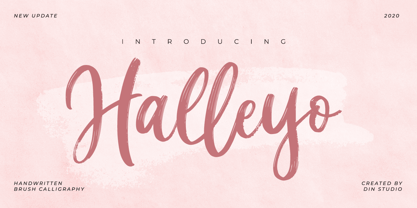 Halleyo is a brush handwritten font. With a classy and natural handwritten style, it brings a classy and beautiful typeface. Halleyo is best used for branding, logotype, and quotes. Features: - Multilingual Support - PUA Encoded - Numerals and Punctuation
 - Hideaway by Pink Broccoli,
$14.00 A light hearted comic flare serif typeface inspired by a 1964 Speedy Gonzalez cartoon title, Hideway celebrates cartoon lettering. Alive with character, this typeface brings an air of familiarity as the retro lettering dances through your designs.
 - Aneska Kids by Ditatype,
$29.00 Aneska Kids is a display font. Made with a playful style, it brings a fun and chic typeface. Chalk Brush is best used for card, branding, logotype, and quotes. Features: - PUA Encoded - Multilingual Support - Numerals and Punctuation
 - Rantliyer by Stringlabs Creative Studio,
$29.00 Rantliyer is an exquisite handwritten font, masterfully designed to become a true favorite. It maintains its classy calligraphic influences while feeling contemporary and fresh. Fall in love with it and bring your projects to the highest levels!
 - Jarida by Stringlabs Creative Studio,
$29.00 Jarida is an exquisite handwritten font, masterfully designed to become a true favorite. It maintains its classy calligraphic influences while feeling contemporary and fresh. Fall in love with it and bring your projects to the highest levels!
 - Fineture by Atom,
$15.00 Fineture is an exquisite handwritten font, masterfully designed to become a true favorite. It maintains its classy calligraphic influences while feeling contemporary and fresh. Fall in love with it and bring your projects to the highest levels!
 - Betterside Handmade by Lucky Type,
$16.00 Betterside Handmade font is a brand new handwritten font that brings a fancy and eye-catching style to modern logos, websites, social media quotes, wedding stationery and more. identity and others. Thank you very much for viewing.
 - Stitching of Children by Wildan Type,
$9.00 Stitching of Children is a fun and quirky handwritten font with a unique style, playful look & feel! embodies fun. Use this gorgeous and unique font to bring any DIY. you also can enjoy many unic alternate style
 - Lankie by Gerald Gallo,
$20.00 Lankie is a clean, contemporary, geometric, condensed sans serif font. The font is ideal for headlines, titles, branding, small blocks of text or wherever a fresh font is desirable.
 - Chamfer Stencil Sans JNL by Jeff Levine,
$29.00 Based on some 1930s-era ‘block chamfer’ gummed paper lettering, Chamfer Stencil Sans JNL is a stenciled treatment of the original design; available in both regular and oblique versions.
 - Latinaires Pro by Sudtipos,
$39.00 Latinaires Pro is a new version of one of the first published Sudtipos typefaces. Now covering more latin languages and extended to 9 fonts, Latinaires is specially designed for modern brand communication and editorial use.
 - Avenue by Funk King,
$10.00 Avenue is a specialty font used to create imitation road signs. This is a very simple concept that can provide some versatile results. With an extensive character set, the possibilities for various signs are endless.
 - Dopis by Tour De Force,
$25.00 Dopis (Допис on Cyrillic) is neo grotesque family available in four weights and in two widths. It is universal and neutral typeface, fully applicable in every situation. Contains extended Latin character set with Cyrillic support.
 - Mooncake by RA Studio,
$10.00 He is round. He is funny. He is Mooncake font. It is perfect for eye-catching signs, posters, headers, product packaging, book cover, logotype, apparel design and etc. Display font Extended latin & cyrillic 600 glifs
 - Ghostly forest by RodrigoTypo,
$29.00 Ghostly Forest, is an entertaining font that has many options such as ligatures, alternatives, layers, it is special for titles related to halloween or informal design, it contains its extended version as a basic one.
 - Angel by Solotype,
$19.95Victorian fonts are a delight to use, but many don¹t have a lowercase. Today, that doesn¹t cut it, so where practicable, we design a harmonizing lowercase to extend the usefulness of the font. - Squint by Hanoded,
$15.00 Squint is a unique typeface, created with just 2 basic forms: a rectangle and a line. Squint is ideal for use in (futuristic) posters, designs and ads. It comes with old fashioned extensive language support.
 - Sign Man JNL by Jeff Levine,
$29.00Sign Man JNL is a reworking of Sign Shop JNL, with a lighter font weight and a number of changed characters (including extended horizontal crossbars on the B,E,F,H,K,P and R). - Trivia Serif 10 by Storm Type Foundry,
$41.00 It’s an extension to the Trivia font system. Serif 10 has been meticulously adapted for sizes of about 10 points, to be used for all kinds of literature: magazines, newspapers, books, including large scientific volumes.
 - Butterfly MF by Masterfont,
$59.00 A practical font family with 3 weights for all your day by day design needs: headlines, web, signage etc. An extended sans serif typeface with rounded endings that provides unique softness appearance without losing legibility.

