9,473 search results
(0.021 seconds)
- Hortensia by Canada Type,
$24.95 Hortensia, designed around 1900 by Emil Gursch for his own Berlin foundry, is a typeface most expressive of the post-Victorian aesthetic that was all the rage in both Europe and America during the second half of the 19th century and up until the Great War. It is a reduced aesthetic of sharp points and natural curves that almost want to apologize for their own elegance, but clearly embody the simple excitement about the blossoming of industry and crafts during the period. This deco script trend would get a re-run for about a decade on either side of the second World War — especially in the entertainment and financial industries — before giving way to art nouveau and big brush faces. Hortensia was Gursch's most popular typeface, used extensively and prominently in many beautiful type catalogs, and a commonly seen design element in Germany for quite a while after its release. This digital version brings plenty of fixes and additions to the original metal Hortensia design, including many alternates sprinkled throughout the character set, and support for a wide range of Latin-based languages (including Central European, Baltic, Turkish and Welsh).
 - Lemon Squish by Mans Greback,
$59.00 Lemon Squish is a fun and funky sans-serif font that is perfect for adding a touch of humor and whimsy to any design. This font is inspired by the 70s hippie culture and has a retro feel that is reminiscent of comic books and graffiti. Lemon Squish comes in ten different styles, including Bold, Bold Italic, Italic, Light, Light Italic, Regular, and four Outline variations. These various styles provide versatility and allow you to create dynamic and eye-catching designs. The playful and lighthearted nature of Lemon Squish makes it ideal for anything from branding and logos to social media posts and advertisements. Its fun and quirky design will add a touch of humor and personality to your projects and bring a smile to your audience's face. The font is built with advanced OpenType functionality and has a guaranteed top-notch quality, containing stylistic and contextual alternates, ligatures and more features; all to give you full control and customizability. It has extensive lingual support, covering all Latin-based languages, from Northern Europe to South Africa, from America to South-East Asia. It contains all characters and symbols you'll ever need, including all punctuation and numbers.
 - Moodboard by Mans Greback,
$59.00 Moodboard is a unique blend of hand-drawn and AI-generated design, bringing a fresh twist to the retro serif font. With bold rounded letterforms and a funky vibe, Moodboard is perfect for young-at-heart audiences. Its combination of sketch and machine learning makes it usable and versatile, while still retaining its cool new-retro feel. Use Moodboard in logotypes, headlines, and graphics for a standout, youthful look. Its designer Mans Greback has created an exceptional mix of vintage and modern design elements in Moodboard font. Choose Moodboard for your next project to add a touch of fun and boldness to your designs! The Moodboard family consists of six high-quality fonts: Regular, Italic, Light, Light Italic, Bold and Bold Italic The font is built with advanced OpenType functionality and has a guaranteed top-notch quality, containing stylistic and contextual alternates, ligatures and more features; all to give you full control and customizability. It has extensive lingual support, covering all Latin-based languages, from Northern Europe to South Africa, from America to South-East Asia. It contains all characters and symbols you'll ever need, including all punctuation and numbers.
 - Mayoras by Create Big Supply,
$15.00 Introducing Mayoras, a captivating handwriting script font that adds a touch of personality and charm to your creative projects. With its flowing lines and authentic handwritten feel, Mayoras brings a unique and artistic touch to any design. Whether you're working on invitations, logos, packaging, or any other creative endeavor, Mayoras offers a versatile and expressive solution. The font features a seamless combination of uppercase and lowercase letters, providing you with a wide range of design possibilities. With its extensive character set, Mayoras includes numbers, punctuations, and multilingual support, enabling you to communicate your message effectively across different languages and cultures. The font also incorporates ligatures, enhancing the natural flow and connectivity of the letterforms, adding an elegant touch to your typography. Mayoras is crafted with PUA (Private Use Area) Encoding, allowing you to access special characters and alternate glyphs effortlessly. This feature-rich font empowers you to create unique and captivating designs that stand out from the crowd. Explore the world of Mayoras at MyFont and unleash your creativity with this captivating handwriting script font. Download Mayoras today and add a personal and artistic touch to your next project.
 - Blindness Graffiti by Colllab Studio,
$14.00 "Hi there, thank you for passing by. Colllab Studio is here. We crafted best collection of typefaces in a variety of styles to keep you covered for any project that comes your way! What if you could have a graffiti font collection? Or a street-inspired font collection? What if you want something clean, legible, yet still playful and fun? Searches online turn up nothing. Those popular sites only provide typical graffiti fonts. Well don't worry. What you’re looking for lies right here. We combine art and technology to bring the most extensive graffiti font collection around to your doorstep easier, faster, and cheaper than anywhere else. Introducing, Blindness Graffiti font is more than just random lettering. Its structured strokes and grungy strokes ooze its strong characteristic, inspired by urban style or cyberpunk design. It’s out of this world yet the balance between action and serenity keeps the font grounded. Blindness Graffiti is available in uppercase, lowercase, numerals, punctuations and lots of variations on each character include OpenType features, alternates, common ligatures and also additional swash to let you customize your designs. A Million Thanks www.colllabstudio.com
 - Yesterday Night by Mans Greback,
$59.00 Yesterday Night is a lively handwriting font that captures the essence of an active and cute brush style. This handmade calligraphy font is perfect for fashion projects, adding a sense of energy and excitement to your designs. The font family's handbrushed appearance brings an authentic, personal touch to your creative work, making it feel warm and approachable. The Yesterday Night font family includes four engaging styles to suit various design needs: Regular: A balanced and energetic style for everyday use Regular Italic: Adds a playful touch and a sense of movement Bold: Offers a bolder, more assertive presence for impactful designs Bold Italic: Combines the strength of bold with the flair of italic Built with advanced OpenType functionality, Yesterday Night ensures top-notch quality and provides you with full control and customizability. It includes stylistic alternates, ligatures, and other features to make your designs truly unique. The font offers extensive lingual support, covering all Latin-based languages, from Northern Europe to South Africa, from America to South-East Asia. It contains all the characters and symbols you'll ever need, including all punctuation and numbers.
 - Ilbit by Typotheticals,
$5.00 A Rough Face Updated in 2022 to include an expanded range of typefaces
 - Shmulik Yael MF by Masterfont,
$59.00 Tender and elegant hand writing font, expanded to add air to your text.
 - Aero Blend by Design A Lot,
$25.00 Meet AeroBlend Display Font, a modern and futuristic typeface that brings a touch of sleekness to your creative projects. With its clean lines, intersecting curves, and contemporary vibe, AeroBlend is the perfect typography solution for bold and innovative projects. Designed with precision, this font strikes the right balance between style and readability. It offers a single weight/style that effortlessly combines elegance with a touch of technological sophistication. This makes it incredibly versatile and suitable for a wide range of design applications. From attention-grabbing headlines to memorable branding projects, AeroBlend Display Font helps you make an impact. Its strong presence adds a sense of modernity to your designs, ensuring that your message stands out from the crowd. With AeroBlend Display Font, you have access to an extensive character set. It includes lowercase and uppercase letters, numerals, special characters, accented characters, and a variety of symbols. This comprehensive collection gives you the freedom to express your creativity and bring your vision to life with clarity and precision. Crafted with meticulous attention to detail, this font is available in the .OTF (OpenType) file format, ensuring compatibility across various design software and platforms. One of the notable features of it is its set of alternates. Certain letters have carefully designed alternatives, adding even more versatility and creative possibilities to your designs. Whether you’re a graphic designer, web developer, or simply a typography enthusiast, AeroBlend Display Font is a must-have in your toolkit. It’s crafted to meet the demands of modern design, offering versatility, legibility, and a hint of futuristic charm. It’s perfect for branding, headlines, posters, packaging, monogram designs and more. Take your projects to the next level with AeroBlend Display Font and unleash your creative potential. Let AeroBlend add a touch of modern sophistication to your designs and create an unforgettable visual experience.
 - Dorniela by Gholib Tammami,
$15.00 Introducing Dorniela, a charming and delightful font that brings a whimsical touch to your creative projects. With a name that evokes the magic of fairy tales and the essence of all things cute, Dorniela is your ticket to a world of adorable design possibilities.
 - Jumbox by Tour De Force,
$25.00 Jumbox is display family containing five weights that are actually layers. Combining them with different colours, Jumbox will bring strong sense of graphicism in your titles, product names, signage, billboards, packaging, web page headings – for wide range of uses. Comes with pack of ligatures.
 - This Man This Monster by Comicraft,
$19.00 Half Man, Half Monster, Comicraft’s latest variable font hybrid is not only your burly, hard-edged, upfront and blunt buddy, it’s also your rough-hewn, tough and grim, rocky-featured pal! Not just Two-in-One, our latest offering brings together Four Fantastic Faces!
 - Assai by Type Matters,
$23.90 A very heavy headline only typeface which should be typeset at rather large type sizes due to its fine counters. It’s the ideal typeface for building a brick-wall out of letters. Surprise is in the details, so play it loud and big! It’s fun.
 - Swiftel by Seventh Imperium,
$25.00 Swiftel is a Layered Script font. Brings an unusual Modern feeling. You can play the Base layer as a Regular then you can add depth font by using Shine, fill and outline layers and shadow solo. Of course the fonts is Equipped with opentype features.
 - Crocante by PintassilgoPrints,
$24.00 Crocante is an energetic and good-humored display font. Although being an all caps alphabet, it counts two versions for each letter, easily accessed through keyboard upper and lower keys. These slightly different letterforms will bring spontaneity and vitality to your designs. Crunching noises guaranteed!
 - Palmergia by Ditatype,
$29.00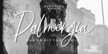 Palmergia is a modern handwritten font. With a classy and natural handwritten style, it brings a classy and chic typeface. Palmergia is best used for branding, logotype, and quotes. Includes: - Palmergia (OTF) Features: - Beautiful Ligatures - Stylistics Set - PUA Encoded - Multilingual Support - Numerals and Punctuation
 - Redmayne by Rillatype,
$15.00 Introducing, my latest font Redmayne! Redmayne is a display font with bold and strong feels that will bring big and strong feel to your design and make your design pop eyecatching even more! Redmayne is perfect for branding, packaging, logo design, headline, and many more.
 - Chalk Brush by Ditatype,
$29.00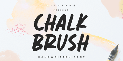 Chalk Brush is a Chalk brush font. With a playful and natural handwritten style, it brings a classy and chic typeface. Chalk Brush is best used for weddings, branding, logotype, and quotes. Includes: - Chalk Brush (OTF) Features: - PUA Encoded - Multilingual Support - Numerals and Punctuation
 - Hi TV by Yebhu,
$15.00 Hi TV is an good-humored and energetic display font. Although being an all caps alphabet, it counts two versions for a letter, easily accessed choose uppercase or lowercase. These slightly different letterforms will bring spontaneity and vitality to your designs. Crunching noises guaranteed!
 - Waykers Amor by Maulana Creative,
$15.00 Introducing Waykers Amor Blackletter Font Waykers Amor Blackletter Font is a handmade Modern Victorian handlettering, which is combining modern and classic typography with some awesome alternates. Yes we back to early 1800s, bring classic touch on this decade. Thanks for use this font. MaulanaCreative.
 - Judo ND by Neufville Digital,
$29.60 Judo ND is a wide-point italic typeface digitized in close collaboration with Helmut Matheis in honor of his long career and loyalty to typographic beauty. It brings spontaneity and elegance to its uses, always maintaining legibility. Judo is a Trademark of BauerTypes SL
 - MC Allaize by Maulana Creative,
$14.00 Introducing Allaize Blackletter Display Font. Allaize Blackletter Font is a handmade Modern Victorian handlettering, which is combining modern and classic typography with some awesome alternates. Yes we back to early 1800s, bring classic touch on this decade. Thanks for use this font. Maulana Creative.
 - Hermosa by sizimon,
$18.00 Beautifly is an elegant and flowing handwritten font. It features a varying baseline, smooth lines, gorgeous glyphs and stunning alternates. It maintains its classy calligraphic influences while feeling contemporary and fresh. Fall in love with this font and bring your projects to the highest levels!
 - Bahud Aroyek by Maulana Creative,
$22.00 Bahud Aroyek Decorative Display Font Blackletter Bahud Aroyek Vintage is a handmade Modern Victorian handlettering, which is combining modern and classic typography with some awesome alternates. Yes we back to early 1800s, bring classic touch on this decade. Thanks for use this font. MaulanaCreative.
 - Slash Signature by Din Studio,
$29.00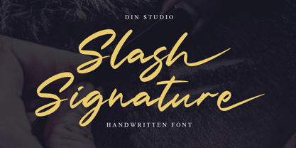 Slash Signature is a modern handwritten font. With a classy and natural handwritten style, it brings a classy and beautiful typeface. Slash signature is best used for branding, logotype, and quotes. Includes: - Slash Signature (OTF) Features: - Multilingual Support - Stylistics Set - PUA Encoded - Numerals and Punctuation
 - Pitchey Bloom by Din Studio,
$29.00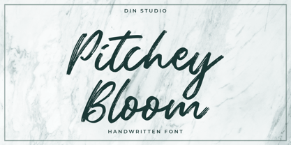 Pitchey Bloom is a modern handwritten font. With a classy and natural handwritten style, it brings a classy and beautiful typeface. Pitchey Bloom is best used for branding, logotype, and quotes. Includes: - Pitchey Bloom (OTF) Features: - Multilingual Support - Stylistics Set - PUA Encoded - Numerals and Punctuation
 - Donsky by Lemonthe,
$14.00 Donsky is a dry brush font. Suitable for any projects such as logos, branding projects, product packaging, mugs, quotes, posters, shopping bags, t-shirts, book covers, labels, photography, watermark, and more. Use this gorgeous and unique handwritten font to bring any DIY project to life!
 - MC Claist by Maulana Creative,
$17.00 Introducing Claist Decorative Display Font. Claist Decorative Display Font is a handmade Modern Victorian handlettering, which is combining modern and classic typography with some awesome alternates. Yes we back to early 1800s, bring classic touch on this decade. Thanks for use this font. Maulana Creative.
 - Mife Althar Font by Maulana Creative,
$22.00 Mife Althar Blackletter Display Font Mife Althar Blackletter Font is a handmade Modern Victorian handlettering, which is combining modern and classic typography with some awesome alternates. Yes we back to early 1800s, bring classic touch on this decade. Thanks for use this font. Maulana Creative.
 - Phone Pro by Tamar Fonts,
$50.00 "Relation Between Typology and Type Design" 'PRISTINE'; this font is—neither beautiful nor ugly, neither vigorous nor weak, neither traditional nor modern, neither serif nor sans serif, neither script nor printable, neither a text font nor a display font—it is rather all of the above, which makes it a more versatile typographic tool—[handwritten] characters that are well-suited for a wide variety of applications—from editorial design, [friendly] greeting cards... to branding, advertising, publicity and digital. Each glyph design combines its unique shapes and stylish ink-traps with parabolic curves. Each glyph design has been treated as an 'individual character'—the way I would treat a breathing, living, vulnerable and courteous human being; looking after each and every character as if it was my only child — bringing to light the authenticity and uniqueness of each individual, as well as my objective to bring about peace and harmony between them all as a whole. Designed with the intention of harmonizing between four scripts — Latin, Cyrillic, Greek and Hebrew; the whole family has a comprehensive set of characters—in addition to the Latin letters, the Phone typeface also has a full set of characters for Vietnamese, partially extended Cyrillic, Greek and Hebrew (sold separately). The t_t ligature is something unique to Phone, as well as the t_z ligature, among others and extras. A distinctive trait of the Phone typeface, is a high x-height combined with relatively short ascenders. The Phone typeface is in a way evoking the feeling of some Gaelic font and of the [Egyptian] Papyrus font (by Chris Costello, though, not being based on neither of those), having an exotic and an exquisite look, under the category of "Soft Fonts & Friendly Faces". Copyright Tamar Fonts/Hillel Glueck 2021 ALL RIGHTS RESERVED Any unauthorized distribution of my work is strictly prohibited, and will be prosecuted; do the right thing, and do not participate in the piracy of my typefaces; if you appreciate my work, then please pay for it and help me prosper — thank you!
 - Phone Pro Hebrew by Tamar Fonts,
$30.00 Note: the 'Phone Pro Hebrew' typeface, includes just the Hebrew characters of the comprehensive "Phone Pro" family font, sold separately [on this MyFonts site], so they are economical for those interested just in the Hebrew Characters. And regarding the “Phone Pro” project in general, this is what I wrote: 'PRISTINE'; this font is—neither beautiful nor ugly, neither vigorous nor weak, neither traditional nor modern, neither serif nor sans serif, neither script nor printable, neither a text font nor a display font—it is rather all of the above, which makes it a more versatile typographic tool—[handwritten] characters that are well-suited for a wide variety of applications—from editorial design, [friendly] greeting cards... to branding, advertising, publicity and digital. Each glyph design combines its unique shapes and stylish ink-traps with parabolic curves. Each glyph design has been treated as an 'individual character'—the way I would treat a breathing, living, vulnerable and courteous human being; looking after each and every character as if it was my only child — bringing to light the authenticity and uniqueness of each individual, as well as my objective to bring about peace and harmony between them all as a whole. Designed with the intention of harmonizing between four scripts — Latin, Cyrillic, Greek and Hebrew; the whole family has a comprehensive set of characters—in addition to the Latin letters, the Phone typeface also has a full set of characters for Vietnamese, partially extended Cyrillic, Greek and Hebrew (sold separately). The t_t ligature is something unique to Phone, as well as the t_z ligature, among others and extras. A distinctive trait of the Phone typeface, is a high x-height combined with relatively short ascenders. The Phone typeface is in a way evoking the feeling of some Gaelic font and of the [Egyptian] Papyrus font (by Chris Costello, though, not being based on neither of those), having an exotic and an exquisite look, under the category of "Soft Fonts & Friendly Faces".
 - Klose Slab by Studio Sun,
$20.00 Introductory Klose Slab Another Vintage Typeface from Studio Sun (SUN014) for your Fonts collection. Klose comes with 4 style (condensed, normal, semi expanded, and expanded) also available in Variable Font format (for customize widths). Perfect for logotype, head text, displayed text, and many more). Klose support more 75 language (Latin pro).
 - DIN Next Arabic by Monotype,
$155.99 DIN Next is a typeface family inspired by the classic industrial German engineering designs, DIN 1451 Engschrift and Mittelschrift. Akira Kobayashi began by revising these two faces-who names just mean ""condensed"" and ""regular"" before expanding them into a new family with seven weights (Light to Black). Each weight ships in three varieties: Regular, Italic, and Condensed, bringing the total number of fonts in the DIN Next family to 21. DIN Next is part of Linotype's Platinum Collection. Linotype has been supplying its customers with the two DIN 1451 fonts since 1980. Recently, they have become more popular than ever, with designers regularly asking for additional weights. The abbreviation ""DIN"" stands for ""Deutsches Institut für Normung e.V."", which is the German Institute for Industrial Standardization. In 1936 the German Standard Committee settled upon DIN 1451 as the standard font for the areas of technology, traffic, administration and business. The design was to be used on German street signs and house numbers. The committee wanted a sans serif, thinking it would be more legible, straightforward, and easy to reproduce. They did not intend for the design to be used for advertisements and other artistically oriented purposes. Nevertheless, because DIN 1451 was seen all over Germany on signs for town names and traffic directions, it became familiar enough to make its way onto the palettes of graphic designers and advertising art directors. The digital version of DIN 1451 would go on to be adopted and used by designers in other countries as well, solidifying its worldwide design reputation. There are many subtle differences in DIN Next's letters when compared with DIN 1451 original. These were added by Kobayashi to make the new family even more versatile in 21st-century media. For instance, although DIN 1451's corners are all pointed angles, DIN Next has rounded them all slightly. Even this softening is a nod to part of DIN 1451's past, however. Many of the signs that use DIN 1451 are cut with routers, which cannot make perfect corners; their rounded heads cut rounded corners best. Linotype's DIN 1451 Engschrift and Mittelschrift are certified by the German DIN Institute for use on official signage projects. Since DIN Next is a new design, these applications within Germany are not possible with it. However, DIN Next may be used for any other project, and it may be used for industrial signage in any other country! DIN Next has been tailored especially for graphic designers, but its industrial heritage makes it surprisingly functional in just about any application. The DIN Next family has been extended with seven Arabic weights and five Devanagari weights. The display of the Devanagari fonts on the website does not show all features of the font and therefore not all language features may be displayed correctly.
 - DIN Next Devanagari by Monotype,
$103.99DIN Next is a typeface family inspired by the classic industrial German engineering designs, DIN 1451 Engschrift and Mittelschrift. Akira Kobayashi began by revising these two faces-who names just mean ""condensed"" and ""regular"" before expanding them into a new family with seven weights (Light to Black). Each weight ships in three varieties: Regular, Italic, and Condensed, bringing the total number of fonts in the DIN Next family to 21. DIN Next is part of Linotype's Platinum Collection. Linotype has been supplying its customers with the two DIN 1451 fonts since 1980. Recently, they have become more popular than ever, with designers regularly asking for additional weights. The abbreviation ""DIN"" stands for ""Deutsches Institut für Normung e.V."", which is the German Institute for Industrial Standardization. In 1936 the German Standard Committee settled upon DIN 1451 as the standard font for the areas of technology, traffic, administration and business. The design was to be used on German street signs and house numbers. The committee wanted a sans serif, thinking it would be more legible, straightforward, and easy to reproduce. They did not intend for the design to be used for advertisements and other artistically oriented purposes. Nevertheless, because DIN 1451 was seen all over Germany on signs for town names and traffic directions, it became familiar enough to make its way onto the palettes of graphic designers and advertising art directors. The digital version of DIN 1451 would go on to be adopted and used by designers in other countries as well, solidifying its worldwide design reputation. There are many subtle differences in DIN Next's letters when compared with DIN 1451 original. These were added by Kobayashi to make the new family even more versatile in 21st-century media. For instance, although DIN 1451's corners are all pointed angles, DIN Next has rounded them all slightly. Even this softening is a nod to part of DIN 1451's past, however. Many of the signs that use DIN 1451 are cut with routers, which cannot make perfect corners; their rounded heads cut rounded corners best. Linotype's DIN 1451 Engschrift and Mittelschrift are certified by the German DIN Institute for use on official signage projects. Since DIN Next is a new design, these applications within Germany are not possible with it. However, DIN Next may be used for any other project, and it may be used for industrial signage in any other country! DIN Next has been tailored especially for graphic designers, but its industrial heritage makes it surprisingly functional in just about any application. The DIN Next family has been extended with seven Arabic weights and five Devanagari weights. The display of the Devanagari fonts on the website does not show all features of the font and therefore not all language features may be displayed correctly. - DIN Next Cyrillic by Monotype,
$65.00DIN Next is a typeface family inspired by the classic industrial German engineering designs, DIN 1451 Engschrift and Mittelschrift. Akira Kobayashi began by revising these two faces-who names just mean ""condensed"" and ""regular"" before expanding them into a new family with seven weights (Light to Black). Each weight ships in three varieties: Regular, Italic, and Condensed, bringing the total number of fonts in the DIN Next family to 21. DIN Next is part of Linotype's Platinum Collection. Linotype has been supplying its customers with the two DIN 1451 fonts since 1980. Recently, they have become more popular than ever, with designers regularly asking for additional weights. The abbreviation ""DIN"" stands for ""Deutsches Institut für Normung e.V."", which is the German Institute for Industrial Standardization. In 1936 the German Standard Committee settled upon DIN 1451 as the standard font for the areas of technology, traffic, administration and business. The design was to be used on German street signs and house numbers. The committee wanted a sans serif, thinking it would be more legible, straightforward, and easy to reproduce. They did not intend for the design to be used for advertisements and other artistically oriented purposes. Nevertheless, because DIN 1451 was seen all over Germany on signs for town names and traffic directions, it became familiar enough to make its way onto the palettes of graphic designers and advertising art directors. The digital version of DIN 1451 would go on to be adopted and used by designers in other countries as well, solidifying its worldwide design reputation. There are many subtle differences in DIN Next's letters when compared with DIN 1451 original. These were added by Kobayashi to make the new family even more versatile in 21st-century media. For instance, although DIN 1451's corners are all pointed angles, DIN Next has rounded them all slightly. Even this softening is a nod to part of DIN 1451's past, however. Many of the signs that use DIN 1451 are cut with routers, which cannot make perfect corners; their rounded heads cut rounded corners best. Linotype's DIN 1451 Engschrift and Mittelschrift are certified by the German DIN Institute for use on official signage projects. Since DIN Next is a new design, these applications within Germany are not possible with it. However, DIN Next may be used for any other project, and it may be used for industrial signage in any other country! DIN Next has been tailored especially for graphic designers, but its industrial heritage makes it surprisingly functional in just about any application. The DIN Next family has been extended with seven Arabic weights and five Devanagari weights. The display of the Devanagari fonts on the website does not show all features of the font and therefore not all language features may be displayed correctly. - DIN Next Paneuropean by Monotype,
$92.99DIN Next is a typeface family inspired by the classic industrial German engineering designs, DIN 1451 Engschrift and Mittelschrift. Akira Kobayashi began by revising these two faces-who names just mean ""condensed"" and ""regular"" before expanding them into a new family with seven weights (Light to Black). Each weight ships in three varieties: Regular, Italic, and Condensed, bringing the total number of fonts in the DIN Next family to 21. DIN Next is part of Linotype's Platinum Collection. Linotype has been supplying its customers with the two DIN 1451 fonts since 1980. Recently, they have become more popular than ever, with designers regularly asking for additional weights. The abbreviation ""DIN"" stands for ""Deutsches Institut für Normung e.V."", which is the German Institute for Industrial Standardization. In 1936 the German Standard Committee settled upon DIN 1451 as the standard font for the areas of technology, traffic, administration and business. The design was to be used on German street signs and house numbers. The committee wanted a sans serif, thinking it would be more legible, straightforward, and easy to reproduce. They did not intend for the design to be used for advertisements and other artistically oriented purposes. Nevertheless, because DIN 1451 was seen all over Germany on signs for town names and traffic directions, it became familiar enough to make its way onto the palettes of graphic designers and advertising art directors. The digital version of DIN 1451 would go on to be adopted and used by designers in other countries as well, solidifying its worldwide design reputation. There are many subtle differences in DIN Next's letters when compared with DIN 1451 original. These were added by Kobayashi to make the new family even more versatile in 21st-century media. For instance, although DIN 1451's corners are all pointed angles, DIN Next has rounded them all slightly. Even this softening is a nod to part of DIN 1451's past, however. Many of the signs that use DIN 1451 are cut with routers, which cannot make perfect corners; their rounded heads cut rounded corners best. Linotype's DIN 1451 Engschrift and Mittelschrift are certified by the German DIN Institute for use on official signage projects. Since DIN Next is a new design, these applications within Germany are not possible with it. However, DIN Next may be used for any other project, and it may be used for industrial signage in any other country! DIN Next has been tailored especially for graphic designers, but its industrial heritage makes it surprisingly functional in just about any application. The DIN Next family has been extended with seven Arabic weights and five Devanagari weights. The display of the Devanagari fonts on the website does not show all features of the font and therefore not all language features may be displayed correctly. - Wayang by Hanoded,
$15.00 Wayang font was named after the beautiful shadow puppets from Indonesia. The font was hand made, using a bamboo pen and Chinese ink on rough, eco-friendly Italian paper. Wayang is spiky, ultra-thin, yet extremely legible. It comes with extensive language support.
 - Jungle Fever NF by Nick's Fonts,
$10.00An adaptation of the font Neuland, designed by Rudolph Koch in 1923. The freeware (TrueType) version has a limited character set. The Pro Set (Postscript) version has a complete character set (Adobe Standard for PC; Macintosh Standard for Mac), and extensive kerning. - Arrus BT by Bitstream,
$29.99Arrus was designed at Bitstream by Richard Lipton and first released in 1991. Arrus is based on Lipton’s own hand-lettered calligraphic alphabets that draw their influence from classic inscriptional forms. Arrus has small cap and extension typographer sets available as well. - Gazeta Slab by Vanarchiv,
$35.00 This humanist slab-serif style is an extension from Gazeta font family, the letterform are more sharp, racional and mechanical. Italics are having small differences from roman letterforms, the characters are slightly more narrow (weight) and the proportions are less open (width).