10,000 search results
(0.034 seconds)
- Gumela by NamelaType,
$17.00 Gumela is a unique-sans family, based on rounded sans serif whose edges end with unique shapes. Gumela consist of 6 styles: Light, Light Italic, Regular, Italic, Bold and Bold Italic.
 - Bodoni Ultra by Wooden Type Fonts,
$15.00 A classic bold face.
 - Gogobig Stencil by Bogusky 2,
$25.00Ultra Bold Condensed Stencil - Gothic Number Sixteen by Wooden Type Fonts,
$15.00 Great bold gothic font
 - Bongo by Bogusky 2,
$15.00Extra bold display font - Black by Intellecta Design,
$16.90a gothic bold typeface - Amfibia by ROHH,
$40.00 Amfibia™ is a soft, flat-sided geometric grotesk family with a lot of character, equipped with tons of ligatures and swashes. Its main function is display use of all kinds, however it is prepared to serve as paragraph text typeface thanks to its 5 widths, giving total amount of 100 fonts. It is crafted for a broad variety design situations - from posters, magazine editorial use, logo design & branding, to web design, user interfaces and mobile applications. Main features: - 5 widths (Narrow, Condensed, Normal, Expanded, Wide), each consisting 20 fonts - 10 weights for each width (from Hairline to Black) - handdrawn, carefully crafted obliques - over 900 glyphs, full of swashes, initial forms, terminals and ligatures - pronounced ink traps and large x-height improving legibility in small sizes as well as adding strong personality to display sizes - flat-sided letter shapes adding vertical rhythm and elegance to narrow widths - extended latin language support - OpenType features (swashes, initials, terminals, standard and discretionary ligatures, stylistic sets, contextual alternates, case sensitive forms, lining, oldstyle and tabular figures, slashed zero, fractions, superscript and subscript, ordinals, currencies and symbols)
 - Recta by Canada Type,
$24.95 Recta was one of Aldo Novarese’s earliest contributions to the massive surge of the European sans serif genre that was booming in the middle of the 20th century. Initially published just one year after Neue Haas Grotesk came out of Switzerland and Univers out of France, and at a time when Akzidenz Grotesk and DIN were riding high in Germany and Gill Sans was making waves in Great Britain, it was intended to compete with all of those foundry faces, and later came to be known as the “Italian Helvetica”. It maintains traditional simplicity as its high point of functionality, while showing minimal infusion of humanistic traits. It shows that the construct of the grotesk does not have to be rigid, and can indeed have a touch of Italian flair. While the original Recta family lacked a proper suite of weights and widths, this digital version comes in five weights, corresponding italics, four condensed fonts, and small caps in four weights. It also includes a wide-ranging character set for extended Latin language support.
 - Sequel Geo by OGJ Type Design,
$35.00 Sequel Geo is a geometric/neo-grotesque hybrid superfamily, influenced by formalized sans-serif typefaces from Germany and Swiss modernist type design—particularly Max Bill’s greek-styled lettering. 8 subfamilies and 120 individual fonts allow for a wide range of typographic expressions. Sequel Geo’s hallmark features, such as the circular “G” and punctuation, simple “t”, and two-story “a” turning one-story in bolder weights, persist throughout all styles. But it’s the formal and functional differences between subfamilies that let you really fine-tune your layouts. The three optical sizes of the core collection, “Body Text”, “Headline”, and “Display”, boast optimized spacing for the intended use. “Extended” packs some extra punch with 18 display-oriented styles. Finally, 48 “Graphic” styles in 4 subfamilies push to the Geometric side, replacing horizontal and vertical stroke endings with angular ones, simplifying letterforms. Sequel Geo is a journey through time and space. From 1920s Germany to 1950s Switzerland. All the while, its archetypal shapes are neutral yet confident, its appearance is classic.
 - Intro Script by Fontfabric,
$19.00 Intro Script carries with it ideas of resurgence, renewal and unconditional freedom. An updated and expanded version of the Intro Rust sub-family, itself developed from the popular Intro type system, Script comes with 8 different weights and a whole slew of goodies and additional features for you to tinker with. These consist of 3 supplementary fonts with ready-made words, patterns and even banners, so you can put the spark back into your project. The set includes a large number of ligatures and contextual alternates, including both lower and upper case versions, as well as positional variations. The latter allow for symbols to connect at different joints, and help you dodge unnecessary voids, resulting in an efficient work process and a more natural flow. With its broad language support and wide range of OpenType features, Intro Script’s friendly, hand-crafted appearance makes it a suitable and flexible choice for any design. Features: • An updated and polished version of the famous multifaceted bundle • 8 refined monoline styles; • Extended language support; • Supplementary goodies - words, patterns, banners; • Additional ligatures and contextual alternates; • Stylistic positional variations;
 - Gunsmoke by FontMesa,
$25.00Gunsmoke is a revival of a James Conner's Sons font that's been listed under different names such as Extended Clarendon Shaded, Original Ornamented and Galena. Dating back to 1888 this font was available with an original lowercase, numbers and punctuation. Today we've expanded the set to include the original shaded version a regular black, open left, open right and a fill font for the two open faced versions. The single Gunsmoke fill font is in alignment with the Gunsmoke Open R version and will also work with Gunsmoke Open L by shifting your fill font layer to align with the Open L version. You will need an application that works in layers in order to use the fill font with the Gunsmoke Open L and R fonts. Make sure you check out the left and right pointing gun hands on the less than and greater than keys, the gun alone is on the left and right brace keys. Remember to check your gun in with the Marshal when entering Dodge City. - Ghola by TypeClassHeroes,
$17.00 Hello I'm really excited to introduce Ghola, masterfully designed to become a stylish and elegant, this font has the potential to bring each of your creative ideas to the highest level. Combine with ligatures and special alternative glyphs so you can create a lots with layouts and compositions. Ghola brings a touch of luxury and bespoke custom typography to logos, websites, social media quotes, wedding branding, and more. Whats Included? Uppercase & Lowercase Number & Symbol International Glyphs Multilingual support Feature UPPERCASE Lowercase Number & Symbol International Glyphs Alternative Ligature Please get in touch if you have any questions!
 - Quwen King by Product Type,
$17.00 Who says design has to be boring? The Quwen King font is the secret key to bringing power, glitz, and gaming style to any of your projects. Quwen King is the perfect solution for projects that require a unique touch. From powerful movie displays to exciting games and stunning streaming events, this font captivates and dominates in a variety of languages. With Quwen King, you don't just get a font, you get the tools to bring creativity, charm, and fun to your designs. Enhance your projects with Quwen King Font now, and enjoy amazing results that will make your designs stand out!
 - Alkenyz by Aliptype,
$10.00 Intoducing Alkenyz, with a blackletter style, brings Alkenyz font more elegant, dense, and gothic. Complete by 2 Variation Family fonts with highly decorated caps. Alkenyz font sets come up with capital, lowercase letters, numerics, punctuation, and Multilingual Support. Alkenyz is perfect and suitable for logotype, Music Events, Tatto, Books title, Branding, Barbershops Lettering logos and many more can be discovered for stunning and gothic feels with this font. I really hope that you can work with this item and bring your design to the next level. Need any information or support about these items, please contact me : Thank you Aliptype
 - La Monte by Letteralle,
$25.00 La monte is a calligraphy font with a classic and natural feel. With natural touches and detailing, La Monte also brings an elegant impression that will bring your designs to a different class. La Monte contains many alternatives to each letter which makes this font attractive and stylish. La Monte also comes with multilingual supports. The classic-elegant style is perfect to be applied in various formal forms such as invitations, labels, restaurant menus, logos, fashion, make up, stationery, novels, magazines, books, greeting / wedding cards, packaging, labels or any type of advertising purpose. Enjoy the Font and Thank You!
 - Alasassy Caps by Leksen Design,
$19.00 Bring some sass to your signage! Alasassy is a font inspired from Sharpie pen drawings, featuring ink ball terminals. The lowercase letters are a mix of uppercase and lowercase letters that share the same cap height and baseline. There are several alternate characters with a mix of high and low crossbars as well as crossbar overhang options and language support for each. This display font will bring some zest to your logo, signage, packaging design or large titles on book covers or advertising. It is a great combination of an organic, hand drawn feel but still clean and crisp enough to look professional.
 - LTC Athena by Lanston Type Co.,
$29.95 LTC Athena brings a somewhat “lost” hot-metal typeface back from obscurity into digital Opentype format. In fall 2012, printing historian Rich Hopkins contacted P22 type foundry regarding some inked type drawings he had just uncovered from his acquisition of the Baltimore-based “Baltotype” company some 20 years ago. It is a rare face whose original matrices were destroyed and thought fully lost. The drawings included a full upper and lower case set, numerals, basic punctuation, and alternate forms of some letters. The design is a narrow deco-flavored design from the 1950s with a curious avoidance of straight lines in the stems and main strokes. The face has been expanded to over 340 characters by Miranda Roth and includes ligatures as well as a full Pan-European character set. It is released through the Lanston division of P22 in consideration of its earlier incarnation as a metal typeface.
 - Vintage Kingdom by Nathatype,
$29.00 Are you ready to make your branding stand out? Do you dream of creating headings that stand out and inspire creativity, imagination, modernity, and endless fun? Looking for an elegant and stylish font? We've got what you want. Vintage Kingdom-A Script Font Vintage Kingdom a gorgeous font designed with strong outlines and fat strokes to bring your branding to life and add a touch of retro and fun. This font features thick and angular letters that easy on the eyes and nice to look while it’s also easy to read. Vintage Kingdom becomes more special with extruding version option. Perfect to create amazing headings, logos, menus, social media graphics, and many more. Our font always includes Multilingual Support to make your branding reach a global audience. Features: Ligatures Stylistic Sets Swashes PUA Encoded Numerals and Punctuation Thank you for downloading premium fonts from Din Studio
 - Trade Gothic Next Rust by Linotype,
$29.00 Trade Gothic Next is Akira Kobayashi's 2008 revision of Jackson Burke's 1948 design. Developed over many years, the original Trade Gothic was filled with many inconsistencies. Under the direction of Akira Kobayashi, Linotype's Type Director, the american type designer Tom Grace, a graduate of the MA Typeface Design in Reading, was commissioned to redesign, revise, and expand the Trade Gothic family. Kobayashi and Grace refined many details such as the terminals and stroke endings, symbols, and the spacing and kerning. Moreover, there are newly added compressed widths and heavy weights perfect for setting even more powerful headlines. The Regular weight has been beefed up making it stronger and more robust in text settings. Trade Gothic is a staple of the advertising and newspaper industries, and now Trade Gothic Next brings more features and better quality for today's astute typographers. In addition several weights are available as soft rounded versions.
 - Glaw by Flavortype,
$15.00 Meets Glaw, A new carefully crafted Fonts from Ilham Herry to bring a new heavy look of Psychedelic Theme. The Ideas of this fonts are from 70s, Psychedelic, Funk, Hippie, Party, Music and Etc. Even though it’s a specific theme for this fonts. It doesn’t ruled out the possibility of creating a new style or themes. Glaw Created with a 3 Weight on the traditional OTF, Condensed, Regular and Expanded. Not Just that, If your software are support for Variable Fonts like Adobe Illustrator or Photoshop, The Weight are going to 100 Weight!. Glaw Best used for a Large Text such as Headline, Poster, Branding, Logos, Concert, Branding and Any other use that needs a Heavy looks for the Title. Our creation on the display to give you a reference what it looks like on your project. It shows that how Glaw will look on your design style.
 - Sinttesy by Sabrcreative,
$25.00 Introducing Sinttesy, a stunning signature monoline font that brings sleekness and style to your designs. With its smooth and consistent lines, Sinttesy is perfect for adding a touch of elegance to logos, branding materials, social media posts, and more. The combination of uppercase and lowercase letters in Sinttesy allows for creative versatility, enabling you to craft unique typographic compositions. From sophisticated business cards to modern website headers, this font delivers a professional and polished look. In addition to its aesthetic appeal, Sinttesy is highly functional. It includes numbers and punctuations, ensuring seamless integration into your projects. The multilingual support further expands its usability, allowing you to communicate your message across different languages and cultures. Sinttesy is PUA encoded, making it effortless to access special characters and ligatures. This feature adds an extra layer of creativity and customization, allowing you to add decorative flourishes and embellishments to your designs.
 - Patrima by Juri Zaech,
$30.00 Patrima is a contemporary typeface with roots in the past. Specifically in the late nineteen hundreds where decorative type applications were en vogue and dimensional aspects and shadings where heavily used. Patrima takes simplified cues from these designs to make the typeface contemporary and versatile. Its base is a squarish Sans which expands through diagonal hatching to a three dimensional body. The hatching is wide enough for screen applications down to 24pt while remaining detailed for decorative purposes in larger sizes. Patrima’s different styles can be layered for chromatic results or used – complementary – alongside. As a decorative typeface it lends itself to display applications and eclectic logo designs, it brings a vintage touch to any branding project and elevates contemporary editorial layouts. Patrima comes with a set of catchwords which enrich its typographic texture even further. They are easily accessible through OpenType’s Discretionary Ligatures feature.
 - Cooker Cake by Sabrcreative,
$25.00 Elevate your design projects with Cooker Cake, a vibrant and playful sans serif display font. With its charismatic style and versatile nature, this font adds a touch of excitement and creativity to any typography-based endeavor. Whether you're designing logos, posters, headers, or website elements, Cooker Cake will captivate your audience and make your text pop. Cooker Cake features all capital letters, giving your designs a bold and impactful appearance. The font also includes a wide range of numbers and punctuation, ensuring that your compositions are complete and functional. Its multilingual support allows you to incorporate various languages seamlessly, making it ideal for global projects. One of the standout features of Cooker Cake is its PUA (Private Use Area) encoding. This means that you have access to additional special characters, glyphs, and ligatures, expanding your creative possibilities and enabling you to add unique flourishes to your designs. Let your imagination run wild as you explore the various alternates and stylistic options available in this font. With its sans-serif style, Cooker Cake strikes the perfect balance between modern aesthetics and a playful vibe. It works harmoniously in both digital and print formats, making it suitable for a wide range of applications. From branding and packaging to social media graphics and advertising campaigns, this font will bring a sense of joy and energy to your projects. Experience the versatility and captivating charm of Cooker Cake Sans Serif Display Font. Let its playful and dynamic personality infuse your typography with excitement.
 - Preto Serif OT Std by DizajnDesign,
$50.00 Preto is an extensive type family, which explores the function of serifs on readability and legibility. Preto consist of three subfamilies: Sans, Semi and Serif. Preto is designed for multilingual typesetting. All of the subfamilies have equal gray value but different texture which can be use to differentiate languages. Preto sub-families have two text weights and two bold styles (Regular -> Bold, Medium -> Black). Every weight has a companion Italic style as well. The serif version has been designed to work best at small point sizes (around 8, 9 points). You will not achieve calm, boring or invisible look of your text with Preto Serif. Its long, spiky and sharp serifs contribute to give the typeface a distinct and energetic character. It is very suitable for magazines, corporate identity, brochures or other print materials where a typeface for continuous reading is required. The ligatures in Preto Serif are very special. You can set them in different tracking values and spacing will increase/decrease consistently in the ligatures as well. Alternative characters in the font files allow you to change the feeling of the text from typical to more special (J, Q, g , &). Each font contains a full set of small caps and many alternative characters for complex typesetting.
 - Preto Serif by DizajnDesign,
$24.00 Preto is an extensive type family, which explores the function of serifs on readability and legibility. Preto consist of three subfamilies: Sans, Semi and Serif. Preto is designed for multilingual typesetting. All of the subfamilies have equal gray value but different texture which can be use to differentiate languages. Preto sub-families have two text weights and two bold styles (Regular -> Bold, Medium -> Black). Every weight has a companion Italic style as well. The serif version has been designed to work best at small point sizes (around 8, 9 points). You will not achieve calm, boring or invisible look of your text with Preto Serif. Its long, spiky and sharp serifs contribute to give the typeface a distinct and energetic character. It is very suitable for magazines, corporate identity, brochures or other print materials where a typeface for continuous reading is required. The ligatures in Preto Serif are very special. You can set them in different tracking values and spacing will increase/decrease consistently in the ligatures as well. Alternative characters in the font files allow you to change the feeling of the text from typical to more special (J, Q, g , &). Each font contains a full set of small caps and many alternative characters for complex typesetting.
 - Oktah by Groteskly Yours,
$15.00 Oktah is a geometric grotesk that comes both as a variable font and 22 static fonts: 11 uprights and 11 matching italics, which make it a great tool for those seeking a versatile font with a strong character and high legibility. Throw in a very pleasing look, elegant curves and a wide range of weights, and you'd get what Oktah aspires to be: a perfect typographic tool for every need.In Oktah, elegant geometric curves meet bold strokes and wide apertures. Round letters are nearly circular, but, to boost readability, slight changes were introduced for optical compensation. Oktah is also equipped with amazing OpenType features: case sensitive punctuation, ligatures, fractions, superscript and subscript figures, two kinds of circular figures, stylistic & contextual alternatives and much more! Oktah supports all major European languages, as well as Vietnamese and some dozens of foreign languages that you may encounter in your designs. We've got all that covered. The glyph count for each of the styles is 800+ characters. Two styles (Extra Light and Bold Italic) are free to try and experiment with. If you need wide language support and more extensive OpenType features, consider taking a look at Oktah Neue, a bigger version of the classic Oktah.
 - Darksame by Alit Design,
$23.00 "DARK SAME" is a unique and versatile font that combines the striking and bold elements of blackletter with the elegant and refined features of a serif font. This font is perfect for anyone looking to add a touch of sophistication and style to their design projects. With over 701 characters, "DARK SAME" offers support for PUA Unicode and multilingual use. Its extensive range of alternate glyphs, ligatures, and swashes allow for endless creative possibilities and customization. The font's classic modern and beauty dark style makes it an excellent choice for various design projects, including branding, logos, invitations, book covers, posters, and more. "DARK SAME" will add a touch of timeless elegance to any project and will make your designs stand out from the crowd. Overall, "DARK SAME" is a must-have font for anyone looking for a versatile and sophisticated typeface that combines the best of both worlds: the boldness of blackletter and the elegance of a serif font. Language Support : Latin, Basic, Western European, Central European, South European,Vietnamese. In order to use the beautiful swashes, you need a program that supports OpenType features such as Adobe Illustrator CS, Adobe Photoshop CC, Adobe Indesign and Corel Draw. but if your software doesn't have Glyphs panel, you can install additional swashes font files.
 - FF Hertz by FontFont,
$68.99 Low stroke contrast, generous spacing, and fine-grained weights from Light to Extra Bold make FF Hertz a workhorse text typeface which holds up well under today’s widely varying output conditions from print to screen. The quite dark Book style works well on e-ink displays which usually tend to thin out letters, as well as in print when you want to evoke the solid letter image of the hot-metal type era. Two sizes of Small Caps are included: A larger size for abbreviations and acronyms, and a smaller size matching the height of the lowercase letters. FF Hertz is a uniwidth design, that means each letter occupies the same space in all weights. This feature allows the user to switch between weights (but not between Roman and Italic styles) without text reflow. Jens Kutilek began work on FF Hertz in 2012. From a drawing exercise on a low-resolution grid (a technique proposed by Tim Ahrens to avoid fiddling with details too early), it soon evolved into a bigger project combining a multitude of influences which up until that point had only been floating around in his head, including his mother’s 1970s typewriter with its wonderful numbers, Hermann Zapf’s Melior as well as his forgotten Mergenthaler Antiqua (an interpretation of the Modern genre), and old German cartographic lettering styles. Jens likes to imagine FF Hertz used in scientific books or for an edition of Lovecraftian horror stories.
 - Boge LP by LetterPerfect,
$39.00 Boge LP is a new font family designed to communicate lucidly in text as well as in headlines and titles. The family consists of Regular, Italic, Bold, Bold Italic & Black. Character sets include a full compliment of multi-language support and fine-tuned kerning to make Boge™ a smart choice for professional quality typography from text to billboard-sized advertising. Regular and Bold styles include designed small caps and old-style numerals accessed as OpenType features. An original serif design, Boge blends traditional aesthetic with contemporary refinement. Its hallmarks are: clarity, readability, geniality, competence. The five related styles provide a strong palette for coloring words, text and ideas with quiet authority. Garrett Boge has been designing type for over 30 years, working with Apple, Microsoft, Adobe, Disney and numerous corporate clients. His background in calligraphy, commercial lettering, graphic design, and typography has been channeled into creating this namesake design. Boge Text joins his other popular faces — Spring, Florens, Bermuda, Spumoni, Longhand, Tomboy, Wendy — under the LetterPerfect Fonts brand, marketed through Monotype and its partners.
 - Konstructa Humana Stencil by TypoGraphicDesign,
$19.00 CONCEPT/ CHARACTERISTICS »Konstrukta Humana Stencil« aka »Hot Cold« is a modern designed sans serif typeface with humanist influences and Stencil character. The partially strong line thickness difference (line contrast) gives the font a touch of elegance and creates tension as fats. The font comes in 3 font styles. From elegant warm tenderness »Thin« to the solid, bold, and robustness cold »Regular«. APPLICATION AREA The »Thin« font weight would probably dig on festive invitations and »Regular« as concise poster font. From headlines in magazines or websites about poster design and flyers to t-shirt design. Just type it. TECHNICAL SPECIFICATIONS Headline Font | Display Font | Sans Serif Stencil Font »Konstructa Humana Stencil« OpenType Font (Mac + Win) with 375 glyphs & 3 styles (regular, light, thin). With alternative letters, ligatures, accents & €.
 - Amaretto by JVB Fonts,
$39.00 AMARETTO, inspired by classic structure of italics, as an original variation of vertical style. Ludovico Arrighi has given us the legacy of classical calligraphic structures that times later lays the foundations of Cancelleresca style and then, the italics as extension of a classic roman serif used in the Renaissance, as main typographic way of expression in Italian printed books. The name Amaretto reminds one of the most representative and delicious liqueur as strong distinctive Italian taste. AMARETTO can be used mainly in titles, long and display texts. Supports East Europe languages. Includes standard and discretionary ligatures, complete small caps, old style numbers, fractions, numerators and denominators and several OpenType features included.
 - Gill Sans Nova by Monotype,
$61.99 The Gill Sans® Nova typeface, by Monotype Studio designer George Ryan, expands the much-loved Gill Sans family from 18 to 43 fonts and features a coordinated range of roman and condensed designs. Several new display fonts are available, including a suite of six inline weights, shadowed outline fonts that were never digitized and Gill Sans Nova Deco that was previously withdrawn from the Monotype library. A variety of OpenType® features are supported that make it possible to include experimental characters from different points in Gill Sans’s long history, including pointed diagonals on ‘A’, ‘V’ and ‘W’ and alternatives for ‘b’, ‘d’, ‘p’ and ‘q.’ Proportional figures are also available as an alternative to the tabular designs. The Gill Sans Nova family has a large character set that supports Latin, Greek and Cyrillic languages. The display weights support Latin only. “Gill Sans was fast to strike a chord with people after its initial 1928 release and quickly became popular,” explains Ryan. “It’s been adapted for every publishing technology, from mechanical typesetting to digital imaging – always receiving the best treatment from Monotype in each iteration. This is especially true with all that we’ve added to the new series, while still retaining the familiarity of Gill Sans. My goal was to ensure clarity across digital environments, add missing weights, and bring more personality to the family with new display fonts, as well as Gill-inspired alternate characters.” The Gill Sans Nova typeface family is part of the new Eric Gill Series, drawing on Monotype's heritage to remaster and expand and revitalize Eric Gill’s body of work, with more weights, more characters and more languages to meet a wide range of design requirements. The Series also brings to life new elements inspired by some of Gill’s unreleased work, recently discovered in Monotype’s archive of original typeface drawings, designer correspondence and documents from the last century.
 - AtomBomb - Unknown license

- Shockproof by Haiku Monkey,
$19.00 Shockproof takes its inspiration from 1940s hand lettering. It's a display font that mixes elegance with a touch of informality. Great for use in identity, signage, posters, and anywhere that tall, cool typographic drink would be refreshing.
 - Halleyo by Din Studio,
$29.00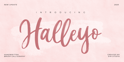 Halleyo is a brush handwritten font. With a classy and natural handwritten style, it brings a classy and beautiful typeface. Halleyo is best used for branding, logotype, and quotes. Features: - Multilingual Support - PUA Encoded - Numerals and Punctuation
 - Hideaway by Pink Broccoli,
$14.00 A light hearted comic flare serif typeface inspired by a 1964 Speedy Gonzalez cartoon title, Hideway celebrates cartoon lettering. Alive with character, this typeface brings an air of familiarity as the retro lettering dances through your designs.
 - Aneska Kids by Ditatype,
$29.00 Aneska Kids is a display font. Made with a playful style, it brings a fun and chic typeface. Chalk Brush is best used for card, branding, logotype, and quotes. Features: - PUA Encoded - Multilingual Support - Numerals and Punctuation
 - Rantliyer by Stringlabs Creative Studio,
$29.00 Rantliyer is an exquisite handwritten font, masterfully designed to become a true favorite. It maintains its classy calligraphic influences while feeling contemporary and fresh. Fall in love with it and bring your projects to the highest levels!
 - Jarida by Stringlabs Creative Studio,
$29.00 Jarida is an exquisite handwritten font, masterfully designed to become a true favorite. It maintains its classy calligraphic influences while feeling contemporary and fresh. Fall in love with it and bring your projects to the highest levels!
 - Fineture by Atom,
$15.00 Fineture is an exquisite handwritten font, masterfully designed to become a true favorite. It maintains its classy calligraphic influences while feeling contemporary and fresh. Fall in love with it and bring your projects to the highest levels!
