10,000 search results
(0.043 seconds)
- Stud by Typodermic,
$11.95 Listen up, partner! If you want to give your message some real grit, you need to saddle up with Stud. This ain’t no wimpy, delicate typeface that’ll have you tip-toeing around your message like a city slicker. No way, pal. Stud is a cowboy typeface with brawny serifs that’ll have you shouting your message from the rooftops. With wide characters and robust letterforms, Stud is the epitome of solid confidence. It’s the kind of typeface that’ll have your audience sitting up straight, paying attention, and hanging on your every word. And let me tell you, there ain’t no other typeface out there that can do that. But that’s not all, folks. Stud comes equipped with some serious firepower. Some character combinations are automatically swapped for custom pairs in OpenType-aware apps. That means your message is going to be more powerful than a bull at a rodeo. So if you want to make a real impact, make sure to turn off your application’s “standard ligatures” function to disable the effect. It’s time to get tough with Stud. Saddle up and let your message ride into the sunset with confidence, power, and a powerful style that’ll leave your competition eatin’ dust. Most Latin-based European writing systems are supported, including the following languages. Afaan Oromo, Afar, Afrikaans, Albanian, Alsatian, Aromanian, Aymara, Bashkir (Latin), Basque, Belarusian (Latin), Bemba, Bikol, Bosnian, Breton, Cape Verdean, Creole, Catalan, Cebuano, Chamorro, Chavacano, Chichewa, Crimean Tatar (Latin), Croatian, Czech, Danish, Dawan, Dholuo, Dutch, English, Estonian, Faroese, Fijian, Filipino, Finnish, French, Frisian, Friulian, Gagauz (Latin), Galician, Ganda, Genoese, German, Greenlandic, Guadeloupean Creole, Haitian Creole, Hawaiian, Hiligaynon, Hungarian, Icelandic, Ilocano, Indonesian, Irish, Italian, Jamaican, Kaqchikel, Karakalpak (Latin), Kashubian, Kikongo, Kinyarwanda, Kirundi, Kurdish (Latin), Latvian, Lithuanian, Lombard, Low Saxon, Luxembourgish, Maasai, Makhuwa, Malay, Maltese, Māori, Moldovan, Montenegrin, Ndebele, Neapolitan, Norwegian, Novial, Occitan, Ossetian (Latin), Papiamento, Piedmontese, Polish, Portuguese, Quechua, Rarotongan, Romanian, Romansh, Sami, Sango, Saramaccan, Sardinian, Scottish Gaelic, Serbian (Latin), Shona, Sicilian, Silesian, Slovak, Slovenian, Somali, Sorbian, Sotho, Spanish, Swahili, Swazi, Swedish, Tagalog, Tahitian, Tetum, Tongan, Tshiluba, Tsonga, Tswana, Tumbuka, Turkish, Turkmen (Latin), Tuvaluan, Uzbek (Latin), Venetian, Vepsian, Võro, Walloon, Waray-Waray, Wayuu, Welsh, Wolof, Xhosa, Yapese, Zapotec Zulu and Zuni.
 - P22 Operina by IHOF,
$24.95 Operina is based on a 16th-century lettering model of the scribe Ludovico degli Arrighi (Vicentino Ludovico degli Arrighi) used in his 1522 instructional lettering book, "La Operina da Imparare di scrivere littera Cancellarescha." This book contains what is considered to be the earliest printed examples of Chancery Cursive. Rather than try to reproduce a perfect, smooth, type-like version of Ludovico's hand, which has been attempted in the past, the designer opted to leave in some rough edges and, thereby, create a look that mimics the endearing artifacts of quill and ink lettering on parchment. When reviving an old style, a designer is faced with many challenging decisions, such as whether to aim for ultimate authenticity or to modify the alphabet for modern use. The decision here was to create a font that resembles the 16th-century Italian hand-lettering master's, but is also useful to the contemporary user. Because the letters U u W w J j and our modern Arabic numerals were not in use during the advent of these original letterforms, these had to be interpolated. To make a complete and useable font set, we also had to fashion many of the extra and diacritical characters to match the look of the alphabet. There are three fonts in this set: Romano(simple), Corsivo(more complex), and Fiore(swash). Romano is the most subdued, it contains Roman looking caps and has lining figures. Corsivo is more elaborate, it has more decorative capital letters and an alternate version of the lowercase with longer ascenders and descenders, and old style figures. Fiore, the swash font, is the most elaborate with the longest ascenders and descenders. You may not wish to use the Fiore version on its own, especially as all caps; it is meant to enhance the other two alphabets because it contains the most elaborate capitals and has many extra ligatures. P22 Operina Pro is an OpenType version that contains over 1200 characters. It features Small Caps, Old Style Figures, full European, Cyrillic and Greek character sets and a new OpenType first with automatic Roman Numerals. Just type any number and with the feature, it will convert to Roman Numerals!
 - Albertina by Monotype,
$29.99Albertina was a typeface ahead of its time. It was in the early 1960s when designer Chris Brand, an accomplished calligrapher, aspired to draw a typeface based on the principles of calligraphy. Unfortunately, typesetting machines of that era put many restrictions on designers. Characters had to be drawn within a very coarse grid, which also defined their spacing. Technological limitations meant that italic designs often had to share the same character widths as the romans. Designers were forced to draw italic faces much wider and with more open spacing than what would be typical in calligraphic lettering or hand-set type. Not surprisingly, production of the first Albertina fonts went very slowly. Brand would submit his character drawings, and the Monotype Drawing Office would modify them to be compatible with the company's typesetting equipment. The new drawings would then be sent back to Brand for approval or rework. Most were reworked. The process took so long, in fact, that by the time the face was completed it was once again out of phase with the times: instead of being released as metal type for the Monotype composing machines it had been tailored for, Albertina debuted as phototype fonts for the Monophoto typesetter. The design's first use was for a catalog of the work of Stanley Morison, exhibited at the Albertina Library in Brussels in 1966. Sales of the design were not remarkable. With the advent of digital type technology, Albertina's story took a far happier turn. Frank E. Blokland, of the Dutch Type Library, used Brand's original, uncompromised drawings as the foundation of a digital revival. The Monophoto version had taken a considerable battering from the limitations of Monotype's unit system," recalls Blokland, "but there was no need for me to incorporate these restrictions in the digital version." With the full backing of Monotype and original designer Brand looking over Blokland's shoulder, a new design for Albertina emerged, displaying all the grace and verve of Brand's original drawings. The basic family drawn by Brand also grew into three weights, each with an italic complement and a suite of small caps and old style figures." - Semilla by Sudtipos,
$79.00 I spend a lot of time following two obsessions: packaging and hand lettering. Alongside a few other minor obsessions, those two have been my major ones for so many years now, I've finally reached the point where I can actually claim them as “obsessions” without getting a dramatic reaction from the little voice in the back of my head. When you spend so much time researching and studying a subject, you become very focused, directionally and objectively. But of course some of the research material you run into turns out to be tangential to whatever your focus happens to be at the time, so you absorb what you can from it, then shelf it — like the celebrity bobblehead that amused you for a while, but is now an almost invisible ornament eating dust and feathers somewhere in your environment. And just like the bobblehead may fall off the shelf one day to remind you of its existence, some of my lettering research material unveiled itself in my head one day for no particular reason. Hand lettering is now mostly perceived as an American art. Someone with my historical knowledge about lettering may be snooty enough to go as far as pointing out the British origins of almost everything American, including lettering — but for the most part, the contemporary perspective associates great lettering with America. The same perspective also associates blackletter, gothics and sans serifs with Germany. So you can imagine my simultaneous surprise and impatience when, in my research for one of my American lettering-based fonts, I ran into a German lettering book from 1953, by an artist called Bentele. It was no use for me because it didn't propel my focus at that particular time, but a few months ago I was marveling at what we take for granted — the sky is blue, blackletter is German, lettering is American — and found myself flipping through the pages of that book again. The lettering in that book is upbeat and casual sign making stuff, but it has a slightly strange and youthful experimentation at its heart. I suppose I find it strange because it deviates a lot from the American stuff I'm used to working with for so long now. To make a long story short, what’s inside that German book served as the semilla, which is Spanish for seed, for the typeface you see all over these pages. With Semilla, my normal routine went out the window. My life for a while was all Bezier all the time. No special analog or digital brushes or pens were used in drawing these forms. They're the product of a true Bezier process, all starting with a point creating a curve to another point, which draws a curve to another point, and so on. It’s a very time-consuming process, but at the end I am satisfied that it can get to pretty much the same results easier and more traditional methods accomplish. And as usual with my fonts, the OpenType is plenty and a lot of fun. Experimenting with substitution and automation is still a great pleasure for me. It is the OpenType that always saves me from the seemingly endless work hours every type designer must inevitably have to face at one point in his career. The artful photos used in this booklet are by French photographer and designer Stéphane Giner. He is very deserving of your patronage, so please keep an eye out for his marvelous work. I hope you like Semilla and enjoy using it. I have a feeling that it marks a transition to a more curious and flexible period in my career, but only time will tell.
 - Grappa by Sudtipos,
$49.00 Grappa, a traditional Italian spirit with a rich history, shares much in common with typefaces - both embody cultural heritage, craftsmanship, and a sensory experience. Grappa is distilled from the skins, pulp, seeds, and stems left over from winemaking, resulting in a strong and aromatic drink that varies in flavor based on the grape and distillation process. Similarly, typefaces are designed characters that convey a unique style, weight, and form, communicating messages and expressing ideas through text. We are thrilled to introduce Grappa, a stunning new font based on the classic "Invitation" typeface by Morris Fuller Benton, a renowned American designer. Grappa features nine weights and a variable font that offers greater customization, with unique triangle serifs that give it a distinct edge. The font also comes with a variety of alternates and swash characters, including a second version with modified alternate characters for even more design flexibility. Like Grappa, typefaces evoke emotions and cultural associations, often associated with specific historical periods, artistic movements, and contexts. Whether used in stationery, packaging, editorial design, or branding, Grappa is a versatile and timeless font that can add elegance and sophistication to any project. In conclusion, Grappa is an excellent addition to any designer's toolkit, offering a perfect blend of tradition and modernity. The font's distinctive personality and cultural connotations make it a beloved drink in Italy, and a font that can effectively communicate messages and ideas through text.
 - Magent by Craft Supply Co,
$20.00 Introducing Magent – Display Typeface A Fusion of Style Magent sets itself apart as a striking Display Typeface that seamlessly merges the timeless elegance of serifs with the contemporary allure of sans serifs. This extraordinary fusion not only shatters monotony but also injects a vibrant energy into your designs. Fun and Playful Typography Magent exudes an unmistakable aura of fun and playfulness. It’s the font to choose when you want to infuse your projects with a touch of whimsy and character. The result is content that not only stands out but also leaves a lasting and memorable impression. Endless Creative Versatility An outstanding attribute of Magent is its sheer versatility. This font effortlessly adapts to a multitude of design contexts, spanning from posters to branding and beyond. Its adaptability makes it a true chameleon in the world of creativity. Memorable and Engaging Magent’s dynamic blend of serif and sans serif elements guarantees that your content remains not only memorable but also engaging. It captivates your audience and leaves them with a vivid and enduring impression, ensuring they keep coming back for more. In Conclusion In summary, Magent – Display Typeface is a font that defies conventions. It’s a design masterpiece that harmoniously combines aesthetics with a playful spirit. Whether it’s branding, posters, or an array of creative projects, Magent is a one-of-a-kind font that captivates your audience and infuses your content with vibrancy and charm.
 - TessieMoreBirds by Ingrimayne Type,
$13.95 A tessellation is a shape that can be used to completely fill the plane. Simple examples are isosceles triangles, squares, and hexagons. Tessellation patterns are eye-catching and visually appealing, which is the reason that they have long been popular in a variety of decorative situations. These Tessie fonts have two family members, a solid style that must have different colors when used and an outline style. They can be used separately or they can be used in layers with the outline style on top of the solid style. For rows to align properly, leading must be the same as point size. To see how patterns can be constructed, see the “Samples” file here. Shapes that tessellate and also resemble real-world objects are often called Escher-like tessellations. This typeface contains Escher-like tessellations of birds. Quite a few of them resemble swimming birds, but there are also some that resemble flying birds or birds in other positions. Most or all of these shapes were discovered/created by the font designer during the past twenty years in the process of designing maze books, coloring books, and a book about tessellations. (Earlier tessellation fonts from IngrimayneType, the TessieDingies fonts, lack a black or filled version so cannot do colored patterns. The addition of a solid style that must be colored makes these new fonts a bit more difficult to use but offers far greater possibilities in getting visually interesting results.)
 - Delagio Script by Mans Greback,
$59.00 Delagio Script is a calligraphic font that combines cursive elegance with a funky, innovative edge. This retro-inspired font is both creative and heavy, making it perfect for designs that require a unique and playful touch. Delagio Script is ideal for projects that seek to convey a sense of fun, humor, and originality. The creation of Delagio Script traces back to a lucky discovery of a vintage magicians' promotional posters. The unique blend of whimsy and elegance in Delagio's lettering were captivating enough to form the base of a typeface that embodied the distinctive charm of entertaining calligraphy strokes. Thus, Delagio Script was born, encapsulating the spirit of serendipity and the magic of a forgotten world. Use underscores _ to make swashes under words. Example: Magician_ The Delagio Script font family features four styles that cater to a wide range of design needs: Thin, Regular, Bold, and their respective Italics. These distinct options allow you to create eye-catching compositions that capture the essence of innovation while remaining rooted in vintage aesthetics. Equipped with advanced OpenType functionality, Delagio Script ensures top-notch quality and provides you with full control and customizability. The font includes stylistic alternates, ligatures, and other features to make your designs truly unique and engaging. Offering extensive lingual support, Delagio Script covers all Latin-based languages, from Northern Europe to South Africa, from America to South-East Asia, and includes all the characters and symbols required for your creative projects, such as punctuation and numbers.
 - Mastolleh by Alit Design,
$17.00 Presenting 🕌Mastolleh Ramadan Typeface🕌 by alitdesign. “Mastolleh” is an Arabic font with a blackletter style and beautiful swashes. It is a highly versatile font that can be used for a variety of design projects. This font is designed specifically for users who require a font that can handle various writing systems and special characters. It comes with support for multiple languages. Mastolleh font includes PUA (Private Use Area) Unicode, making it compatible with various software and applications that support OpenType features. It also features 847 glyphs, including uppercase and lowercase letters, numerals, and punctuation marks. Additionally, there is a special version of Mastolleh font called “Mastolleh Dingbats,” which includes 304 bonus dingbat characters related to Ramadan and Islamic themes. These bonus characters include crescent moons, lanterns, and mosque silhouettes. Overall, Mastolleh and Mastolleh Dingbats are highly versatile fonts that can be used in a wide range of projects. Their unique style, multilingual support, PUA Unicode, extensive glyph set, and beautiful swashes make them a great choice for designers and users who need a font that is both beautiful and functional. Language Support : Latin, Basic, Western European, Central European, South European,Vietnamese. In order to use the beautiful swashes, you need a program that supports OpenType features such as Adobe Illustrator CS, Adobe Photoshop CC, Adobe Indesign and Corel Draw. but if your software doesn’t have Glyphs panel, you can install additional swashes font files.
 - Young RIEHUM by Twinletter,
$17.00 Regards! Say hello to Young Riehum, a superhero-style display font that will bring strength and tension to your projects. If you’re looking for a strong, bold, and bold font, Young Riehum is the perfect choice for creating an electrifying look in the worlds of film, gaming, and design. With a striking presence, Young Riehum grabs attention instantly and delivers an unforgettable message to your audience. Each letter exudes electrifying energy, giving your projects a new dimension and creating an extraordinary experience. In addition to extraordinary styles, Young Riehum is also equipped with features that enrich your creativity. With the available ligatures and alternative characters, you can explore a variety of unique and interesting typography combinations. Apart from that, this font also supports multiple languages, allowing you to reach an international audience with a strong and bold message. Join the forces of Young Riehum and let your every project be an epic adventure. With its stunning superhero style and special features, this font will provide unforgettable strength and tension. Don’t miss the opportunity to own Young Riehum and create extraordinary works that inspire and amaze your audience. What’s Included : File font All glyphs Iso Latin 1 Alternate, Ligature Simple installations We highly recommend using a program that supports OpenType features and Glyphs panels like many Adobe apps and Corel Draw so that you can see and access all Glyph variations. PUA Encoded Characters – Fully accessible without additional design software. Fonts include Multilingual support
 - SAQTAH by Twinletter,
$17.00 Welcome to the world of Saqtah! A display font with a superhero style that will bring strength and courage to your projects. Whether you’re working on a film, game, or design with a strong and bold theme, Saqtah is the perfect solution for you. With a stunning appearance, Saqtah will be the main highlight in every design. Each letter is filled with strength and thickness, creating a powerful and impressive look. However, the advantages of Saqtah do not stop there. This font is also equipped with special features. Alternate ligatures and characters allow you to create unique and creative typographical combinations, providing endless possibilities for the expression of your designs. Apart from that, Saqtah also supports multiple languages, so that your message can be well received by audiences from various countries. Make Saqtah your choice and give your project a hero touch. With the strength and boldness that this font has, you can create a bold and unforgettable look, captivating the heart and eye of every viewer. With its special features, Saqtah provides unlimited flexibility and creativity. Let’s be creative and bring an awesome impression with Saqtah in your project. What’s Included : File font All glyphs Iso Latin 1 Alternate, Ligature Simple installations We highly recommend using a program that supports OpenType features and Glyphs panels like many Adobe apps and Corel Draw so that you can see and access all Glyph variations. PUA Encoded Characters – Fully accessible without additional design software. Fonts include Multilingual support
 - Bidena by Twinletter,
$18.00 Introducing Bidena, the perfect script font for those looking to add a touch of elegance and sophistication to their designs. With its unique and stylish curves on each character, Bidena is perfect for all kinds of projects that require a touch of sophistication and class. This font features stylistic set alternates and ligatures that add an extra element of style and creativity to your work. Its flowing lines and intricate details create a stunning and memorable impression that is sure to leave a lasting impression on your audience. Bidena is perfect for any design project, from wedding invitations to branding and advertising materials. Its unique and versatile style makes it the perfect choice for designers who want to add a touch of personality and character to their work. So whether you’re creating a logo, a product label, or a poster, Bidena is the perfect script font that is sure to help you make a statement and stand out from the crowd. Try it out today and see for yourself just how unique and versatile Bidena can be! What’s Included : - File font - All glyphs Iso Latin 1 - Alternate, Ligature - Simple installations - We highly recommend using a program that supports OpenType features and Glyphs panels like many Adobe apps and Corel Draw so that you can see and access all Glyph variations. - PUA Encoded Characters – Fully accessible without additional design software. - Fonts include Multilingual support
 - Amantea Script by Create Big Supply,
$25.00 Experience the enchanting allure of Amantea Script, a stunning and delicate font that embodies elegance and grace in every stroke. With its thin and flowing style, this script font captures the essence of sophistication, making it the perfect choice for a wide range of design projects. Amantea Script is a true gem for those seeking to create captivating wedding invitations that leave a lasting impression. Its intricate and graceful curves evoke a sense of romance and beauty, adding a touch of magic to any special occasion. The versatility of this font extends beyond weddings, as it effortlessly enhances stationary art, creating stunning pieces that exude refinement and style. In the realm of digital design, Amantea Script shines on social media platforms, effortlessly captivating audiences with its captivating charm. Whether it's engaging posts, inspiring quotes, or eye-catching advertisements, this font adds an element of sophistication and allure that commands attention. With its extensive language support, Amantea Script opens up a world of possibilities. From English to Spanish, French to German, and beyond, you can seamlessly incorporate this font into your projects, ensuring that your message reaches a global audience. Amantea Script comes complete with a wide range of features, including alternate characters and ligatures, allowing you to create unique and personalized designs. The font is PUA encoded, providing easy access to a plethora of stunning glyphs that add depth and flair to your creations.
 - Model by Lián Types,
$49.00 When designing a typeface, one has to be conscious of superfluous details. Although I am always tempted to add little personal touches, experience taught me that the phrase -less is more- is totally true. In Model, the letters (like models do) participated of a contest: An event in which models engage in competition against each other, often for a prize or similar incentive. The prize was staying in the font! yay! Tall, delicate, refined, the right amount of elegancy: These were some of the aspects to be chosen. Typographically speaking, these things were achieved thanks to a tall x-height (which leaded the font to be somehow condensed), a subtle contrast between thicks and thins, and just the right amount of decorative swirls. The result is a nice script that can be used in magazines, invitations, posters, book-covers and works very well when used over photographs. Get Model and let it be the star of the catwalk. STYLES Model Pro and Model Small Pro are the most complete styles of the font. Both have all the ligatures and decorative glyphs seen in posters above (OT programmed). Model Std One, Std Two and Std Three are reduced versions of Pro. This means they have less glyphs inside. TIP If you are planning to print the font in small sizes, it’s highly recommended to purchase Model Small Pro. Its thins are thicker so they will be better printed.
 - Ultraproxi by Typodermic,
$11.95 Looking for a typeface that conveys a technical and austere vibe without sacrificing design flexibility? Look no further than Ultraproxi, the cutting-edge typeface that draws inspiration from the high-speed computer printers of the mid-20th century. Designed with the precision and clarity required for high-speed printing, Ultraproxi captures the essence of the IBM 1403 chain printer, with its metal type slugs linked in a chain that whirled rapidly over an ink ribbon. The result is a typeface that conveys both speed and accuracy, perfect for modern design applications. But Ultraproxi is more than just a nostalgic homage to a bygone era of computing. Its semi-monospaced design is uniquely suited to the needs of modern graphic designers, allowing for a technical demeanor without the drawbacks of traditional monospaced typefaces. With six weights and italics, Ultraproxi offers unparalleled versatility and flexibility. Whether you’re designing a sleek and streamlined UI or a complex data visualization, Ultraproxi is the typeface of choice for designers who demand both style and substance. So why settle for a boring, generic typeface when you can have Ultraproxi? With its unique blend of technical precision and design flexibility, this typeface is sure to impress even the most discerning design enthusiasts. Most Latin-based European, Vietnamese, Greek, and most Cyrillic-based writing systems are supported, including the following languages. Afaan Oromo, Afar, Afrikaans, Albanian, Alsatian, Aromanian, Aymara, Azerbaijani, Bashkir, Bashkir (Latin), Basque, Belarusian, Belarusian (Latin), Bemba, Bikol, Bosnian, Breton, Bulgarian, Buryat, Cape Verdean, Creole, Catalan, Cebuano, Chamorro, Chavacano, Chichewa, Crimean Tatar (Latin), Croatian, Czech, Danish, Dawan, Dholuo, Dungan, Dutch, English, Estonian, Faroese, Fijian, Filipino, Finnish, French, Frisian, Friulian, Gagauz (Latin), Galician, Ganda, Genoese, German, Gikuyu, Greenlandic, Guadeloupean Creole, Haitian Creole, Hawaiian, Hiligaynon, Hungarian, Icelandic, Igbo, Ilocano, Indonesian, Irish, Italian, Jamaican, Kaingang, Khalkha, Kalmyk, Kanuri, Kaqchikel, Karakalpak (Latin), Kashubian, Kazakh, Kikongo, Kinyarwanda, Kirundi, Komi-Permyak, Kurdish, Kurdish (Latin), Kyrgyz, Latvian, Lithuanian, Lombard, Low Saxon, Luxembourgish, Maasai, Macedonian, Makhuwa, Malay, Maltese, Māori, Moldovan, Montenegrin, Nahuatl, Ndebele, Neapolitan, Norwegian, Novial, Occitan, Ossetian, Ossetian (Latin), Papiamento, Piedmontese, Polish, Portuguese, Quechua, Rarotongan, Romanian, Romansh, Russian, Rusyn, Sami, Sango, Saramaccan, Sardinian, Scottish Gaelic, Serbian, Serbian (Latin), Shona, Sicilian, Silesian, Slovak, Slovenian, Somali, Sorbian, Sotho, Spanish, Swahili, Swazi, Swedish, Tagalog, Tahitian, Tajik, Tatar, Tetum, Tongan, Tshiluba, Tsonga, Tswana, Tumbuka, Turkish, Turkmen (Latin), Tuvaluan, Ukrainian, Uzbek, Uzbek (Latin), Venda, Venetian, Vepsian, Vietnamese, Võro, Walloon, Waray-Waray, Wayuu, Welsh, Wolof, Xavante, Xhosa, Yapese, Zapotec, Zarma, Zazaki, Zulu and Zuni.
 - FF Neuwelt by FontFont,
$50.99 FF Neuwelt™, from Jens Gehlhaar, is open, inviting, highly legible, and strikingly handsome. Combining the straightforward clarity of a geometric sans with a welcoming warmth, FF Neuwelt’s eight display and text weights, vast range of alternates and extended character set, make for a family with few limitations. While grounded in a solid geometric sans serif foundation, Gehlhaar has drawn a large suite of alternate characters that infuses FF Neuwelt with softened, and ultimately easy on the eyes, humanistic shapes and proportions. Alternative cursive italic forms and a choice of round or square punctuation are also available at the click of a mouse. FF Neuwelt is spaced for sizes larger than 16 point, while FF Neuwelt Text has more open letterspacing to set perfectly at sizes smaller than 16 point. In addition, five key lowercase characters were drawn with more legible shapes. The result is that FF Neuwelt adapts from text to larger sizes and one stylistic mien to another with ease and grace. FF Neuwelt is a natural for interactive design, performing well on both large digital displays and small screens. Counters are generous and apertures are open, making them a perfect choice when setting text as microcopy or in short blocks where quick and accurate comprehension is the goal. Even the heaviest weights translate well to on-screen reading. FF Neuwelt also speaks with authority in large sizes on big screens. Equally at home in print environments, FF Neuwelt is a perfect choice for long-form text, captions, editorial, packaging, point-of-purchase design – as well as extensive branding projects. Its many choices of alternative characters make for a design that draws the reader in, without overpowering the message. Although he has drawn typefaces in addition to FF Neuwelt, Gehlhaar is primarily a filmmaker. Directing commercials with style and grace, his work includes spots for Nissan, Apple, Emirates Airlines and Microsoft. As a creative director, Gehlhaar has worked on a broad range of projects for Coca-Cola, MTV, EPSN, Volkswagen and more.
 - Oktah Round by Groteskly Yours,
$25.00 Oktah Round Overview: 1600+ characters per font 16 static fonts 1 variable fonts Extensive OpenType features Support for 220+ Languages (Latin & Cyrillic) Special Symbols, Alternate Sets, and Features Free Trial Fonts Available Oktah Round is a rounded version of Oktah Neue. Oktah Round is soft and friendly, modern and warm. It's a typeface that combines human touch with high functionality. Oktah Round comes equipped with 1600+ characters per font and is available in 16 styles (from Thin to Black), and as a variable font that allows you to change weight and slant angle. Oktah Round supports more than 200 Latin languages and has amazing support for Cyrillic languages like Bulgarian, Serbian, Ukrainian, Macedonian, Russian, and others. Relying heavily on the geometric forms and proportions first introduced in Oktah, this rounded version does more than just smooth out a few corners. To make curves sharper and more uniform, some terminals were modified. Other visual features (like curving tails in 'l' and 't') were dropped to create more clear cut look. Oktah Round is perfectly balanced and finely tuned to be the font you'd want to use again and again. The variety or styles and availability of a variable font give Oktah Round a potential to be used across multiple mediums. Oktah Round supports most Latin based languages, it also has support for Extended Cyrillic. The remainder of the extensive 1600+ glyph character set is reserved for punctuation, numbers, special symbols, and all sorts of additional symbols like squared numbers, geometric shapes, etc. All characters are evenly spaced and carefully kerned, so that there are no overlaps or glaring gaps in any language. OpenType features include Legible Alternates, Case Sensitive Punctuation, Fractions, Sub- and Superscript, Black and White Circled Figures, Ligatures, Oldstyle Figures, Tabular Figures and many others. The variable font incorporates both axes (Weight and Slant) and can be used for web and graphic design alike. 16 static font styles can be purchased separately or as part of Oktah Round family. Two fonts can be downloaded free of charge.
 - JAF Lapture by Just Another Foundry,
$59.00 Lapture is based on the Leipziger Antiqua by Albert Kapr, released in 1971 by the East German foundry Typoart. It has been extended and carefully redesigned by Tim Ahrens in 2002-05. The strong calligraphic characteristics are a result of the design process: "The size of the counters and the width of individual characters at small optical sizes were analysed with a steel pen while the letter shapes were designed in larger size with a specially trimmed reed pen. Sometimes the hand is more innovative than the head alone," says Kapr. A unique feature of this font is the introduction of gothic shapes into a latin typeface. "The basic concept is to string together narrow white hexagons as counters and inter-letter spaces, defined by vertical stems and triangular serifs. The interior spaces are at least as important as the strokes that make up the characters." Lapture is an ideal choice if a reference to gothic style is desired, as true black letter types are often too eye-catching and not as legible as latin fonts for unfamiliar readers. "The last few years have seen a number of very elegant typefaces based on the mellow and feminine renaissance model. However, sometimes we require a font that is strong and robust, harmonic yet rigid," says designer Tim Ahrens. JAF Lapture is provided in OpenType format. Each font contains more than 600 glyphs, including true small caps, nine sorts of figures, contextual and stylistic alternates and accented characters. This means that you only need to purchase one font whereas in other families you would have to buy two or three fonts in order to get the same. Technically, they follow the Adobe Pro fonts and provide the same glyph set and OpenType functionality. JAF Lapture Basic is provided in OpenType format. Each font contains the standard sets of both MacOS and Windows. In contrast to JAF Lapture they do not provide any advanced OpenType features and no extended glyph set.
 - Ornatique by VP Creative Shop,
$19.00 Introducing Ornatique: Where Elegance Meets Grace Discover the beauty of Ornatique, a stunning and feminine calligraphy typeface designed to add a touch of sophistication to any project. With its clean lines and delicate curves, Ornatique captures the essence of graceful handwriting. This versatile typeface offers four scripts to choose from: the classic Regular script for a timeless look, the Italic script for added flair and elegance, and the Alternate versions that provide even more variety and creative possibilities. But that's not all! Ornatique is truly a global communicator, supporting a staggering 87 languages. Whether you're designing for English, Spanish, French, or countless others, this typeface has got you covered. Embrace the power of seamless multilingual design. What sets Ornatique apart is its collection of 58 swash endings, crafted as ligatures. These intricate and decorative elements bring an extra layer of beauty and charm to your designs. From elegant flourishes to delicate swirls, each swash ending adds a touch of enchantment, making your typography truly remarkable. Whether you're creating wedding invitations, branding materials, or simply adding a touch of elegance to your personal projects, Ornatique is the perfect choice. It combines clean lines with feminine grace, ensuring that your designs will captivate and inspire. Let your creativity soar with Ornatique and discover the magic of calligraphy that transcends language and culture. Elevate your designs and leave a lasting impression with this exquisite typeface. Embrace the beauty of Ornatique today and let your imagination flow! Language Support : Afrikaans, Albanian, Asu, Basque, Bemba, Bena, Breton, Chiga, Colognian, Cornish, Czech, Danish, Dutch, Embu, English, Estonian, Faroese, Filipino, Finnish, French, Friulian, Galician, Ganda, German, Gusi,i Hungarian, Indonesian, Irish, Italian, Jola-Fonyi, Kabuverdianu, Kalenjin, Kamba, Kikuyu, Kinyarwanda, Latvian, Lithuanian, Lower Sorbian, Luo, Luxembourgish, Luyia, Machame, Makhuwa-Meetto, Makonde, Malagasy, Maltese, Manx, Meru, Morisyen, North Ndebele, Norwegian, Bokmål, Norwegian, Nynorsk, Nyankole, Oromo, Polish, Portuguese, Quechua, Romanian, Romansh, Rombo, Rundi, Rwa, Samburu, Sango, Sangu, Scottish, Gaelic, Sena, Shambala, Shona, Slovak, Soga, Somali, Spanish, Swahili, Swedish, Swiss, German, Taita, Teso, Turkish, Upper, Sorbian, Uzbek (Latin), Volapük, Vunjo, Walser, Welsh, Western Frisian, Zulu How to access flourish ending? Just type from ""aa01"" to ""aa58"" at the end of your word :) How to access alternate glyphs? To access alternate glyphs in Adobe InDesign or Illustrator, choose Window Type & Tables Glyphs In Photoshop, choose Window Glyphs. In the panel that opens, click the Show menu and choose Alternates for Selection. Double-click an alternate's thumbnail to swap them out. Mock ups and backgrounds used are not included. Thank you! Enjoy!
 - Salvation by Device,
$39.00 Rough and ready, bold and urgent. Or playful and fun in bright colours. The original letters were cut from actual potatoes, then scanned in and converted to vector outlines. Lighter and more heavily inked versions were used for the three variants. Using Opentype character-substitution technology, Salvation rotates through three versions of each letter to create a naturally uneven printed effect. Unlike hot metal type, the potatoes were cut the right way around. This produced reversed prints, which were then flipped back in Photoshop. Originally produced for Hughes' Get Lettering activity book, the font was then extended to cover numbers, punctuation and full European language support.
 - DB Frilly Paisley by Illustration Ink,
$3.00DB Frilly Paisley is a collection of paisleys and lace that make a perfect addition to any digital scrapbooking project. - Attendance by TanveerType,
$12.00 Attendance is a bold and playful font that can be used for logos, t-shirts, branding and many other projects.
 - Anthemic by Epiclinez,
$18.00 Anthemic is an timeless bolded script font that is incredibly versatile and will look great on any design or craft.
 - Hunterra by Variatype,
$14.00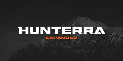 Hunterra is a strong character font that especially designed for identity proeject, very suitable for your branding, and logo design.
 - Merry Mob by Typephases,
$5.99 A gestual drawing of little people that will produce an instant crowd, gang or any combination of folks you need.
 - Flow by Hemphill Type,
$17.99 Flow is a relaxed font family that finds a happy balance between work and play. Its a Caps Only Fonts.
 - Godiva by Suby Studio,
$10.00 Godiva is vintage font family inspired by vintage lettering. It works perfectly for achieving that vintage aesthetic with your designs.
 - Afterthought JNL by Jeff Levine,
$29.00 Afterthought JNL is a light, bouncy and playful typeface . Perfect for any project that exudes a fun or casual theme.
 - Ghost Train by Aerotype,
$29.00 Ghost Train features slightly alternate glyphs A-Z in the lower case that can be used to differentiate consecutive characters
 - Holmes by Typeology,
$5.00Holmes is a font based on Hispanic gang graffiti that is primarily seen on the west coast of the USA. - La Pica Bonus by RodrigoTypo,
$29.00 La Picá bonus is a new version with lower case letters, styles and dingbats that represents the popular lettering style.
 - Frivolous by Typadelic,
$19.00The informal style of Frivolous feature lots of flourishes and swirls that give it a charming and spontaneous handwritten quality. - Czaristane by Typotheticals,
$5.00 A rather light humorous font that can be used for many purposes. Updated in 2022 to add further bold versions
 - Northport by profonts,
$41.99 Northport is a jaunty,casual and non-connecting script that comes with six styles as light, medium, bold plus italics.
 - Design We Like by studiocharlie,
$24.00 Design We Like is a collection of objects: the objects that made history! All the objects are drawn very accurately.
 - Atoney by Forberas Club,
$16.00 Atoney is simple handwritten. Create with careful every single piece. Recommended to apply this font for something that looks memorable.
 - Counterfact by Haiku Monkey,
$10.00Counterfact is a bold, two-pronged, handwritten font that combines informality and neat imprecision. Especially effective at large point sizes. - Blikfang by Bogstav,
$17.00 All caps font that just want to be your friend, and maybe the font you use for your next project! :)
 - Splasher by GRIN3 (Nowak),
$18.00 Splasher is a set of 94 unique ink, paint and coffee splatters that can be quickly used in your design.
 - Dorsal by Wordshape,
$20.00 Dorsal is a display typeface that is based on a rare bit of lettering from a 1910 German lettering book.