10,000 search results
(0.244 seconds)
- JH Oleph by JH Fonts,
$9.00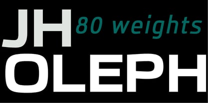 JH Oleph is a modern neo sans humanist Typeface. It includes eight weights and five widths, total of forty weights and another forty italics. JH Oleph may be used as screen display and text type.
 - Sky Sans by AVP,
$29.00Sky Sans is a companion to Sky Serif. The six weights provide extreme variations and great flexibility making it useful for reports and newsletters where a mix of weights can be used to create color. - Côté by Studio Bayley,
$4.00 A modern geometric sans serif that comes in 2 weights with 3 styles for each; Solid, Outline and Stripes. Côté was originally designed as a purely striped typeface but evolved to more weights to create a fun and playful typeface that can be layered and scaled. The solid weight allows for title or body copy while the stripes should be used as large as possible!
 - Galimer by OneSevenPointFive,
$25.00 Galimer is a humanist variable sans serif family. It comes in 18 styles, 9 weights and their corresponding italics. It supports two axis variability - weight and italic. Each of the weights includes support for 80+ languages worldwide. It is packed with powerful opentype features - linked characters, kerning pairs, fractions, superiors, inferiors, etc. Galimer is perfectly suitable for all platforms (desktop, webfont, printing, etc.) Contact - https://forms.gle/VHM7b8FHQiqK8zx9A
 - Brownstone Sans by Sudtipos,
$59.00 One design sparks another. As Alejandro Paul experimented with the strokes and curves of the monoline script Business Penmanship, he discovered interesting new forms and shapes that didn't fit the Spencerian theme of that typeface. These forms simmered in Ale’s subconscious over the next three years, during which time he visited New York City, pored over rare type specimen books in the New York Public Library, and explored Brooklyn’s neighborhoods. Brownstone, the face born from these explorations, is an original 21st-century design, yet one subtly infused with historical and cultural references -- keen observers might spot influences from decorative typefaces of 19th-century foundries. And just as faces from that era were influenced by contemporary architecture, the frames included with Brownstone echo the ornate iron railings of Park Slope’s row houses. (There’s also a slight 1960s vibe to Brownstone, of novelty swash-sans photocompositing faces, that can be played up at your discretion.) Influences aside, Brownstone has broad appeal to modern audiences. A soft, monoline sans-serif, with elements of Swiss geometry (see the ‘k’ and ‘x’), its marriage of highly legible, draftsman-like letterforms with decorative swashes and ornaments reflects the old-meets-new aesthetic of the DIY craft culture seen in Brooklyn and other urban centers. It’s ornamental but unfussy, romantic but understated. Brownstone includes character sets for Latin-based languages, including Western and Eastern European, Baltic, Turkish, Maltese, Celtic and Welsh. Over 1500 glyphs, including small capitals, swash characters, alternates, and ligatures, in both Light and Thin weights. Ornamental frames are also included in both weights. The Brownstone Frames fonts are available as separate fonts in the new Brownstone Slab family.
 - Monotalic by Kostic,
$30.00 Monotalic was created as a fun experiment, exploring better solutions for the monospaced type design. Most monospaced (fixed-width) typefaces have the same main design problem regarding the lowercase – filling the empty space around l, f, i, j and r. That usually brings the addition of slab serifs to those narrow characters, causing many monospaced fonts to look and feel alike. Monotalic solves that problem by adopting the handwritten (or cursive) form for those problematic characters, which allows them to be defined in more strokes, thus getting a better distribution of form in that fixed-width space. On the other hand, cursive writing usually lacks the legibility of a Roman (Regular upright) style, so Monotalic was created to be a hybrid, taking the best of both worlds. Monospaced fonts today are mostly used for coding. Modern code editors use colored text in order to differentiate between different kinds of code. So, in that environment there’s actually no need for traditional text styling by adding Italics, Bold or other styles, because the code lines are overstated as it is. That is why Monotalic focuses on one style only, in three widths and four weights. The weights allow users to choose the perfect contrast of text on screen, depending on their monitor resolution and background color in the editor. Movie scripts are almost exclusively set in 12pt Courier. It became the industry standard because when set in the specific “screenplay format" it helps with the breakdown of the schedule and budgeting process of the film production. Although it looks completely different, text set in Monotalic (Normal width) will take the same amount of space as Courier.
 - Vintage Stages by Ditatype,
$29.00 Vintage Stage is a gracefully designed script font that captures the essence of classic calligraphy with a modern twist. Crafted with a weight that is delicately balanced—not too thick nor too thin—this font offers a subtle elegance and a versatile appearance. The consistent sizing ensures that the font maintains a rhythmic flow, resembling traditional handwriting, but with the clarity and readability required in contemporary design. The relatively low contrast of the strokes further enhances the font’s legibility while maintaining a soft and approachable feel. One of the most captivating characteristics of Vintage Stage is the inclusion of swinging ends on select letters. In addition, enjoy the features here. Features: Ligatures Stylistic Sets Multilingual Supports PUA Encoded Numerals and Punctuations Vintage Stage fits in headlines, logos, posters, flyers, branding materials, greeting cards, print media, editorial layouts, and many more designs. Find out more ways to use this font by taking a look at the font preview. Thanks for purchasing our fonts. Hopefully, you have a great time using our font. Feel free to contact us anytime for further information or when you have trouble with the font. Thanks a lot and happy designing.
 - Brahma by Tall Chai,
$15.00 Brahma V2 is here. The new version has been three years in the making. It has multiple new updates and improvements based on user feedback. The focus for this version has been improved readability while maintaining the unique, modern identity of Brahma type family that has received so much love since V1 was launched in Dec 2020. Brahma is a modern geometric sans-serif font family with weights ranging from Thin (100) to Black (900). Features: Available in 9 weights Over 550 glyphs supporting extended Latin Ideal for display texts: Titles, Logos and Headlines etc. Perfect for branding and rebranding Supports OpenTypes features like Ligatures and Stylistic Alternates Tabular Numerals included Symbols for 10 major currencies including Bitcoin provided in all weights Description: The name comes from Brahmā who is known as the god of creation. And manifesting the same spirit, the Brahma font family focuses on modern creativity. Every character effortlessly integrates with current design standards and interfaces. The fonts are professional yet have a hint of informal personality in them. This makes Brahma perfect for use in modern apps and websites. Brahma is built for the designing and marketing squads. It has a trendy geometric characteristic which is ideal for any branding and rebranding. Brahma has lot of OpenType features (like ligatures and tabular numerals) and the Extended Latin character set supports over a hundred languages. Start Creating!
 - Garino Variable by Julien Fincker,
$185.00 About Garino: Garino is a modern sans-serif typeface family. It gains its expressive character from a dynamic sweep in the curves and high-contrast transitions. The thinner and thicker weights are particularly suitable for strong headlines, while the middle weights can be used for typographic challenges and body text. As a result, it can be used in a reserved as well as an expressive way. Thanks to an extensive character collection, it becomes a real workhorse. A versatile allrounder that is up to all challenges – for Corporate Identity, Editorial, Branding, Orientation and Guidance systems and much more. Variable Font The Variable font contains 2 axes: weight and oblique – all in just one file. Features: With over 1165 characters, it covers over 200 Latin-based languages. It has an extended set of currency symbols and a whole range of Open Type Features. There are alternative characters as stylistic sets, small caps, automatic fractions – just to name a few. Arrows and numbers: In particular, the extensive range of arrows and numbers should be highlighted, which are perfectly suited for use in orientation and guidance systems. Thanks to Open Type Features and an easy system, the various designs of arrows and numbers can also be simply "written" without first having to select them in a glyph palette. Get the static version of the Garino family here: https://www.myfonts.com/fonts/julien-fincker/garino/
 - Lech Sans Pro by Ingo,
$44.00 A modern sans serif – large x-height, lively forms The Lech Sans Pro is businesslike-modern but at the same time present the effect of liveliness and movement. The shapes of the individual characters follow the "humanistic" form language of modern faces. In this way, Lech Sans Pro offers an attractive alternative to most of the sans serif fonts used today. The proportions have been selected to be very legible even as a body type for longer texts. The font is so robust in detail that a title in large capitals is very eye-catching. It can function positively as well as negatively and is also still legible from a great distance. Lech Sans Pro supports West European languages including Scandinavian, Central and Eastern European languages, also including Turkish, Vietnamese as well as Greek and Cyrillic. Along with ligatures for the letter combinations fi, ff, fl, tt and tz the font also includes stylistic alternates for N, R, f, l as well as for the German sharp s and the figure 3. Additionally, Lech Sans Pro offers several sets of figures: proportional standard figures of equal height lining figures in height of the capitals proportional medieval figures with ascenders and descenders disproportional tabular figures of equal width superior and inferior scientific figures and numerators resp. denominators for fractions circled figures
 - Morning Vintage by Din Studio,
$29.00 Have you been looking for a script font? Do you dream of creating headings that stand out and inspire creativity, imagination, modernity, and endless fun? Get ready to transcend to a world of magic, laughter, and butterflies. Your projects will spark delight and engage everyone who sees it! Morning Vintage-A Script Font Morning Vibes is a handcrafted font inspired by designs and illustrations from urban styles. An excellent choice to add the right amount of street and retro vibes. Perfect for social media branding projects, fashion designs, printed quotes, packaging, or even as a stylish text overlay to any background image. Morning Vintage includes Multilingual Support to make your branding reach a global audience. Features: Ligatures Stylistic Set Swashes PUA Encoded Numerals and Punctuation Thank you for downloading premium fonts from Din Studio
 - Jinkay Faux by Twinletter,
$15.00 We’ve created Jinkay, a display typeface with a Japanese style that’s similar to original. Don’t be afraid to use this font in all of your special projects right now; imagine how beautiful and appealing your design will be; your project will instantly captivate all of your audience at first glance; they will easily remember the appearance of your project if you use this font, because it will be unique, different, and stand out from the crowd. Logotypes, food banners, branding, brochure, posters, movie titles, book titles, quotes, and more may all benefit from this font. Of course, using this font in your various design projects will make them excellent and outstanding; many viewers are drawn to the striking and unusual graphic display. Start utilizing this typeface in your projects to make them stand out.
 - Keway by Twinletter,
$15.00 Keway is a graffiti font that prioritizes neatness and harmony while maintaining a distinct personality. There is an option to use capital or lowercase letters, which will make it much easier for you to develop projects that stand out to others. Your project will seem different, elegant, charming, and passionate if you use this font, and everyone who sees it will think it’s a professional, quality, high-quality, and high-class project. This graffiti font is great for product logos, poster titles, headlines, packaging, film titles, logotypes, gorgeous writing, and trendy graffiti designs, among other things. Of course, if you utilize this font in your numerous creative projects, they will be perfect and outstanding. Use this typeface right away for your one-of-a-kind and remarkable projects.
 - Breughel by Linotype,
$29.99Adrian Frutiger came up with this unusually purposeful and strong design in 1981 for Linotype. Early humanistic typefaces of the sixteenth century, especially Jenson, served as models for Breughel. The right sides of the stems are vertical and at right angles to the baseline while the left sides of the stem curve into the serifs, making the typeface look as though it slants to the right, and giving it a sense of movement and liveliness. The ductus of the broad-edged pen is reflected in the flow, rhythm, and texture of text set in Breughel, but at the same time this design has a regularity of form that is typographically solid. Breughel is an ideal typeface for the designer with skill and vision. Use it to create innovative publications, posters, and advertisements. - Koorkin by Monotype,
$29.99 “I originally drew the primary characters with a felt tip marker, scanned them and then proceeded to noodle on the computer,” says George Ryan of his new typeface, Koorkin. “Over the years, I’ve designed many original typefaces, but Koorkin has become one of my favorites. I’ve worked on hundreds of highly structured text faces. For the most part, the roots of all of them can be found in the handwritten letterforms we learn as children. I enjoy going back to these shapes whenever the opportunity presents itself. ”The happy result of Ryan‘s felt tip marker sketches and his love of simple letterforms is a new family of upright and italic scripts in medium and bold weights.
 - M Finance PRC by Monotype HK,
$523.99 M Finance is a design inspired by the popular M Elle. M Finance incorporates features of M Yuen or other rounded Gothic-style typefaces. Crossbars (橫) and stems (豎) have squarish entry and finial points with slight round corners, parallel without flare. Thick-thin contrast of strokes is low and the text is visible. Its extra bold stems (豎) make it suitable for eye-catching display. Even distribution of space, careful positioning, size and proportion of radicals create a slightly expanded, opened and balanced construction. Its features and construction create a feel of subtle sharpness and stiffness with wholesome elegance. It is best suited for casual display text, illustrations, set upright (non-slanted), non-condensed.
 - Lagu Serif by Alessio Laiso Type,
$20.00 Lagu Serif blends a geometric inspiration with warm humanist elements, making it the perfect choice for when you need a fresh, contemporary serif typeface. Alessio Laiso has designed Lagu Serif in 18 styles: 9 weights ranging from Thin to Black, with matching, beautiful italics. The companion Lagu Sans makes the Lagu family a real workhorse for any use, including web, digital, print, branding and signage. Lagu Serif has a large x-height and open counterforms, making it easily readable. It comes with powerful OpenType features, including ligatures, alternative glyphs, small caps, fractions, tabular figures, old-style figures, and more. The Lagu family supports 219 languages, covering 100% of the Latin Plus character set.
 - Cynosure Soft by Device,
$39.00 Cynosure Soft is a rounded, friendly version of Cynosur, a humanist sans with a subtle thick/thin stress. This gives it a clean, sharp elegance and precision that can be missing in some more familiar monoline sans faces. The wide range of weights and the matching reweighed italics make it a versatile solution where a consistent appearance across a broad range of applications is required. Its clear and inarguable design make it suitable for a wide variety of uses, from corporate to entertainment, text to headline, signage, logotypes, magazines and reports. The italics retain the design of the upright across all characters, again ensuring consistency. Includes tabular, lining and old-style numerals.
 - M Finance HK by Monotype HK,
$523.99 M Finance is a design inspired by the popular M Elle. M Finance incorporates features of M Yuen or other rounded Gothic-style typefaces. Crossbars (橫) and stems (豎) have squarish entry and finial points with slight round corners, parallel without flare. Thick-thin contrast of strokes is low and the text is visible. Its extra bold stems (豎) make it suitable for eye-catching display. Even distribution of space, careful positioning, size and proportion of radicals create a slightly expanded, opened and balanced construction. Its features and construction create a feel of subtle sharpness and stiffness with wholesome elegance. It is best suited for casual display text, illustrations, set upright (non-slanted), non-condensed.
 - ITC Whiskey by ITC,
$29.99Jochen Schuss, the Biedenkopf, Germany, designer who was most recently responsible for ITC Vino Bianco, has created in ITC Whiskey a condensed display face that's both angular and soft at the same time. While the letterforms of Whiskey are clearly roman, there's a slight reminiscence of blackletter in the face's narrow proportions, its dark weight, and its persistent internal angle - not quite the 45 degrees common in a classic German textura, but a gentler angle of 25 or 30 degrees. And the counters are all rounded, as are the ends of all the strokes, giving Whiskey a comfortable friendliness despite its severe structure. The character set includes an alternate z" and an "ft" ligature." - Neue June by Matt Chansky,
$21.00 Four years of development imbue Neue June with its uniquely crafted high x-height, enabling designers to literally and figuratively elevate layout designs. In today’s highly competitive brand marketplace, readability across communication platforms and memorability go hand in hand towards target audience retention. Neue June comes in six weights, from elegant thin to full-bodied emphatic bold, plus italics. You’ll find a robust selection of highly refined multilingual glyphs. In addition to a suite of ligatures, there are a number of extra characters, such as the estimated symbol, the number sign, and directional arrows. When the creative direction calls for sophisticated and memorable tactics—leverage the versatile 385 glyph count for big messages and easily consumable body copy.
 - ATF Brush by ATF Collection,
$59.00 Oh, Brush … beloved script emblem of plumbers, mechanics, bodegas, lunch counters, and other low-rent concerns. Since 1942, you have given faceless apartment buildings a name, brought life to the badges and banners of otherwise tedious trade conventions, and lent excitement to the postcards of middle America’s unsung travel destinations. We have seen so much of you … but not enough! We need more weights: how about five, extending beyond humdrum Medium? We want swash alternates, too, plus lively ligatures and sporty underline tails! Give us cleaner curves and smoother connections, but stay true to your frisky self! Like a nail salon that offers cucumber water, the new ATF Brush is one step classier than the rest.
 - Agent Sans by Positype,
$29.00 Agent Sans is an intentional departure. It ignores the cold, unemotional flavor of geometric typefaces and current trends, and instead opts for warmth, personality, movement. In order to stand out, Agent Sans is filled with everything it can—small caps, 6 numeral sets, fractions, super- and subscripts, case-sensitive glyphs, dingbats, expanded language support, and true italics drawn to complement the uprights… not just to skew alongside them. Agent Sans is economical while maintaining its distinctive, expressive look. Perfect for branding for print and screen, and digital usage, the flexible weights available allow for pinpoint selection at whatever size. Simply put, Agent Sans is meant to be used, and used how you see fit.
 - Fortuita by Typographias,
$28.00 Fortuita is a versatile sans fit for text or display. The name carries some of its history as it was born from logo sketches that fortuitously grew into a type family over eight years. It comes with a tall x-height, rendering it readable at smaller sizes. It has sixteen weights, eight regular ones, and their italics, each with small caps, something you may not see very often with sans serifs. It counts with old-style numbers that can switch to its lining, small caps, or tabular versions through open-type features. The family carries a distinct personality in its design that will lend itself to its subject, all the while without becoming distracting or detracting from it.
 - Ms Kitty NB by No Bodoni,
$35.00Some scribbles on a bar napkin, a note from a cute girl passed in history class, what is there to say but why not a typeface? Actually it's that late night, �let's get this typeface done� madness that causes these flights of fancy. Anything to relieve the boredom of doing all those kerning pairs. Or maybe it's sunspots? Ms Kitty is all uppercase letterforms so there are two versions of each letter, one in the cap position, another in the lowercase position. Besides the regular weight and bold, there�s a bolder and much bolder in the works. And perhaps there will be a "too bold to be believed" version. Depends on the sunspots. - Ed's Market by Laura Worthington,
$29.00 It’s like hiring your own professional sign painter with a solid repertoire of styles; each one is distinctive, yet clearly by the same hand. No variants were created on the computer – each weight and version was individually hand-lettered. Ed’s Market lets you evoke the warm, inviting vibe of classic 20th-century grocery posters and showcard lettering right from your type menu. Smart programming ensures that digital perfection doesn't trump human charm: each display face features three variations of each letter, to ensure a natural hand-painted look when characters repeat. Ed’s Market includes three script styles, each with more than 100 alternate characters and swash forms. Seven display faces feature three variations of each letter, to ensure a natural hand-painted look when characters repeat. Design Elements offer expandable arrows, rules and ribbons; along with badges, swashes, scribbles, clouds and snipes. See what’s included! http://bit.ly/1Mzurs3 *NOTE* Basic versions DO NOT include swashes, alternates or ornaments These fonts have been specially coded for access of all the swashes, alternates and ornaments without the need for professional design software! Info and instructions here: http://lauraworthingtontype.com/faqs/
 - Lunanic by Ingrimayne Type,
$9.00 Lunanic is a geometric novelty typeface family with a touch of graffiti. The letters are formed from a circle with a notch or nick taken out, a shape that reminds me of a partial lunar eclipse. Half of the family have the nick on the left and half on the right. The faces are monospaced and so tightly spaced that there is no space between most of the letters so the filled styles cannot be used alone without tweaking. There are several ways to tweak them to make them readable: adjacent letters can be colored differently, the characters spacing can be increased, or an outlined style can be layered on top of the filled letters. The family does not have a true lower case. Most of the characters in the lower-case slots are alternates for those on the upper-case keys and they can be mixed in whatever way the user finds best. The family has twelve members: two orientations with three weights each and each of these six has an outline style to go with it. Lunanic is fun, bizarre, weird, and obviously a decorative display font.
 - Daily Shine by Invasi Studio,
$19.00 Step into the groove with Daily Shine, the ultimate funky retro font that will transport you straight back to the '70s era. Whether you're looking to infuse nostalgic flair into your logo or seek a fresh burst of inspiration for your design ventures, Daily Shine is your go-to choice. With its stylish swash alternates, Daily Shine adds a touch of extra style to your project, creating a dynamic and eye-catching look. Plus, its multilingual support ensures versatility for various language needs. From captivating headings and expressive logotypes to spirited quotes, apparel designs, inviting invitations, lively flyers, dynamic posters, heartfelt greeting cards, captivating product packaging, captivating book covers, empowering printed quotes and even mesmerizing album covers and movie posters, Daily Shine is your versatile companion for any creative endeavor. Get ready to shine bright and groove on with Daily Shine font!
 - Noort by TypeTogether,
$51.60 Juan Bruce’s Noort is not a type family for wayfinding or mapmaking alone, but for clarifying information and engaging readers along their own journey. The information designer’s role is to bring clarity and style to overwhelming amounts of information, which fortunately is Noort’s purpose as well. Hierarchies submit to its will and layering colour only adds more presence to its active posture. Noort’s design uses the proven editorial text features of a large x-height, ample spacing, and low contrast to check all the boxes for paragraph text use. But it’s the long serifs, wide characters, and overall typographic presence that make it resilient and ease the task of reading in small point sizes. These details mean Noort is able to demonstrate importance not only with its five pitch-perfect weights, but with its brindled colour within a layout. Noort’s roman and italic styles play off each other by transplanting their design features. The roman style’s serifs are transferred in substance but expectedly increased in speed in the italic styles. And the italic’s inktraps and separated strokes are echoed amidst the roman’s upright structure. Where digitisation could have removed the influence of the hand, Noort retains the analogue nature of its creation. This antiphonal seeding of details creates a cohesive family that is as fascinating as it is functional. Noort’s axis and serifs have a slightly varying ductus — the directional flow that aids reading and character clarity. Its latent obviousness in text sizes immediately becomes its signature style when bumped up to subhead sizes. And since Noort’s counters are so wide and welcoming, its heavier weights can expand more within themselves than along their exterior edges. Noort’s ten total fonts cover the Latin A Extended glyph set to bring its unbordered, globetrotting sensibilities to your projects. OpenType features include ligatures, fractions, and several figure styles, along with mature-rather-than-overbearing swashes. Aligned with TypeTogether’s commitment to produce high-quality type for the global market, the complete Noort family can set digital and printed works with ease, capitalising on the dual needs of clear information and fascinating textual artistry.
 - Evans by Zetafonts,
$39.00 Evans was named after Walker Evans, an american photojournalist whose photographs often featured unassuming subjects – ordinary people, roadside scenes, and the subtle details of the American landscape. His ability to find beauty in simplicity and appreciate the mundane inspired Cosimo Lorenzo Pancini and Andrea Tartarelli to create this typographic family that aims to convey the ideals of journalistic storytelling: simplicity, clarity, and unpretentious honesty. Looking for a soothing, relaxed visual flow in body text, Evans was designed by gently narrowing classical proportions to answer the designers' need of maximizing the arrangement of lengthy text within confined spaces. Combining the vintage appeal of a semi-condensed old-style structure with a very slight transitional slanted axis resulted in text-oriented typeface with visual charm on both printed and digital pages. Subtly reducing the size of majuscules allowed the effect of an increased x-height, balancing space saving with increased readability at same point size. Using soft, semi-calligraphic shapes and keeping a generous letter spacing, the designers embraced a minimalist approach, aiming at a smooth reading experience. For maximum versatility, Evans provides two distinct variations tailored to different purposes: the Regular and the Narrow subfamilies. While both are fine-tuned for body text applications , the second is suited also for display-oriented contexts, where attention-grabbing headlines take center stage. Each subfamily is developed in a range of 8 weights from Extralight to Heavy, and includes over 700 glyphs with full coverage of language using extened latin glyphs. True italics are designed for all weights, providing additional typographic control through the design of Swash Alternates, available through Open Type features that also include Standard and Discretionary Ligatures, Positional Numerals, Case Sensitive Forms and Stylistic Alternates. The family is complemented also by a rich set of Ornaments, available both as special glyphs or in a separate font. With its retro-inspired design and unwavering commitment to form and function, Evans effortlessly extends its versatility from editorial design to digital interfaces and logo creation, inviting users to appreciate the beauty in simplicity, find joy in the ordinary, and embrace a relaxed and unhurried mindset.
 - Span by Jamie Clarke Type,
$25.00 Span is a modern chiseled style family that flaunts its engraved heritage with sweeping serifs and sculptural forms. Bridging the contemporary and traditional, Span appears exuberant yet dignified. Designed primarily for luxurious headlines and titles, Span’s strong vertical stress is softened by elegant organic curves while its compact height accentuates the deep serifs. The family offers five weights, each with three widths and italics. The condensed styles provide an invaluable advantage when designing within narrow spaces. Span’s italics strike a balance between true italics and oblique letterforms to create a change in rhythm while preserving its chiselled style. A variety of additional features enhance Span's typographic capabilities including restrained swashes and flourishes are available in both roman and italic styles. Span also introduces an additional set of capitals for exceptional typographic control over uppercase settings. ‘Mid Caps’ sit midway between full-height capitals and lowercase letters and extend Span's title setting options to All Capitals, Capitals with Mid Caps and Capitals with Small Caps. Choose Span and take full control over your title settings and produce classic typography with statuesque poise. Overview: 30 styles comprised of 5 weights, 3 widths and accompanying italics Additional features include alternate characters, swashes, Small Caps and Mid Caps 987 glyphs per style See the Specimen Supported Languages: Albanian, Asturian, Basque, Breton, Bosnian, Catalan, Croatian, Czech, Danish, Dutch, English, Estonian, Faroese, Finnish, Filipino, French, Galician, German, Hungarian, Icelandic, Indonesian, Irish, Italian, Kurdish, Latin, Latvian, Lithuanian, Malay, Maltese, Moldavian, Norwegian, Occitan, Polish, Portuguese, Romanian, Samoan, Serbian (Latin), Slovak, Slovenian, Spanish, Swahili, Swedish, Tagalog, Turkish, Walloon, Welsh, Wolof, Zulu
 - Cocomat Pro by Zetafonts,
$39.00 Cocomat has been designed by Francesco Canovaro and Debora Manetti as a development of the Coco Gothic typeface system created by Cosimo Lorenzo Pancini. It shares with all the other subfamilies in the Coco Gothic system a geometric skeleton with open, more humanistic proportions, a sans serif design with slightly rounded corners and low contrast proportions, without optical compensation on the horizontal lines, resulting in a quasi-inverted contrast look in the boldest weights. What differentiates Cocomat from the other subfamilies in Coco Gothic are some slight design touches in the uppercase letters, with a vertical unbalancing reminiscent of art deco design, notably evident in uppercase "E", "A","F","P" and "R" - while lowercase letters have been given some optical compensation on the stems, like in "n","m", "p" and "q". These design choices, evoking the second and third decade of the last century (Cocomat is also referred as Coco 1920 in the Coco Gothic Family) all give Cocomat a slight vintage feeling, making it a perfect choice every time you need to add a period vibe or an historical flair to your design, like in food or luxury branding. The typeface, first published in 2014, has been completely redesigned by the original authors in 2019 as Cocomat PRO to include eight extra weights (thin, medium, black and heavy in both roman and italic form), extra open type features (including alternate forms, positional numerals), and extra glyphs making Cocomat cover over two hundred languages using latin, cyrillic and greek alphabets.
 - Sky Serif by AVP,
$29.00Sky Serif is a clean-cut slab-serif design. The six weights provide extreme variations and great flexibility making it useful for reports and newsletters where a mix of weights can be used to good effect. - ITC Garamond Handtooled by ITC,
$34.99Claude Garamond (ca. 1480-1561) cut types for the Parisian scholar-printer Robert Estienne in the first part of the sixteenth century, basing his romans on the types cut by Francesco Griffo for Venetian printer Aldus Manutius in 1495. Garamond refined his romans in later versions, adding his own concepts as he developed his skills as a punchcutter. After his death in 1561, the Garamond punches made their way to the printing office of Christoph Plantin in Antwerp, where they were used by Plantin for many decades, and still exist in the Plantin-Moretus museum. Other Garamond punches went to the Frankfurt foundry of Egenolff-Berner, who issued a specimen in 1592 that became an important source of information about the Garamond types for later scholars and designers. In 1621, sixty years after Garamond's death, the French printer Jean Jannon (1580-1635) issued a specimen of typefaces that had some characteristics similar to the Garamond designs, though his letters were more asymmetrical and irregular in slope and axis. Jannon's types disappeared from use for about two hundred years, but were re-discovered in the French national printing office in 1825, when they were wrongly attributed to Claude Garamond. Their true origin was not to be revealed until the 1927 research of Beatrice Warde. In the early 1900s, Jannon's types were used to print a history of printing in France, which brought new attention to French typography and the Garamond" types. This sparked the beginning of modern revivals; some based on the mistaken model from Jannon's types, and others on the original Garamond types. Italics for Garamond fonts have sometimes been based on those cut by Robert Granjon (1513-1589), who worked for Plantin and whose types are also on the Egenolff-Berner specimen. Linotype has several versions of the Garamond typefaces. Though they vary in design and model of origin, they are all considered to be distinctive representations of French Renaissance style; easily recognizable by their elegance and readability. ITC Garamond? was designed in 1977 by Tony Stan. Loosely based on the forms of the original sixteenth-century Garamond, this version has a taller x-height and tighter letterspacing. These modern characteristics make it very suitable for advertising or packaging, and it also works well for manuals and handbooks. Legible and versatile, ITC Garamond? has eight regular weights from light to ultra, plus eight condensed weights. Ed Benguiat designed the four stylish handtooled weights in 1992." In 1993 Ed Benguiat has designed Handtooled versions. - SomaSkript by ArtyType,
$29.00 SomaSkript is a natural extension to the basic Somatype font design, adding more variety to the family, all of which have similar features. Basically, by widening the uprights and maintaining the thin cross-bars it takes on more of a script-like quality, hence the name. Slanting the letters reinforces the script illusion and consequently brings a broader application to the font’s original format. When designing the Somatype alphabet originally, I always envisaged maximizing on its potential by creating an incised version. This variation not only emphasizes the implied script qualities within the name but brings out the softer, feminine side of the typeface. This evolutionary process creates a different looking font altogether and in turn the slanted version emphasizes the elegant quality even more so.
 - Berenjena by PampaType,
$40.00 Berenjena is a captivating font family designed by type designer Javier Quintana Godoy in Santiago de Chile. Berenjena has the right combination of comfort in reading and a lyric spirit. This helps keep readers in the delicate atmosphere in which novels and tales can display all their charm. Most typefaces created for books cannot reach this. Either they are too expressive so they tire the eyes of the reader, or they are dull and reading becomes a tedious task. Berenjena was designed for text use bearing in mind this concept of subtle balance. Berenjena (Spanish for aubergine or eggplant) gives your text that spicy environment in which words shapes are easy to read while letterforms maintain their capricious feeling. It comes in roman and cursive declined in four weights: Blanca, Fina, Gris, Negra. All Berenjena character sets include extensive diacritics coverage for more than 200 languages plus the usual contextual features. The Berenjena Pro fonts (available at PampaType.com) include smalls caps, elegant ligatures, cute swashes, every kind of figures, and all contextual sorts. Berenjena will give your design a very individual character. It wears captivating details of calligraphic poetry which link subtlety to vernacular sign painting from Santiago de Chile. See a pdf of Berenjena here http://origin.myfonts.net/s/aw/original/306/0/156716.pdf or visit PampaType.com for more information.
 - Ninova by Fontuma,
$24.00 Ninova is a historical city that was the capital of the Assyrian Kingdom and its ruins are located within the borders of Iraq today. It is also known as the city where Prophet Jonah was sent. Ninova font family consists of fonts with aesthetic forms that appeal to human taste at the maximum level. Ninova font will more than meet the needs and expectations in terms of the glyphs it contains, the weights it has and the number of styles. This font includes two font families: Ninova: A family of fonts containing only the Latin scripts Ninova Pro: A family of fonts including Latin and Arabic scripts The Ninova font can be used for multiple purposes. It can also be used in the internet environment and operating systems along with printing areas.
 - Ring by Ochakov,
$9.00 First of all, Ring font has a little story. It was created as an example for Typography Exhibition in Moscow. And the font was immediately awarded! 10 years later, I decided to continue working on it and improve this font. Ring - really circular typeface. I felt inspired by Bauhaus. I've always wanted to design something similar. Ring is a cool and geometric-styled font. Expertly designed to make your creation look out of this world, this font will look gorgeous on a variety of ideas. This font is ideal for writing web designs, business cards, or pretty much anything else that requires a unique touch. Ring font comes in 8 weights and 16 styles and this is just the beginning. The beginning of a further big font family called Ring!
 - Disc - Personal use only

- Utendo - Personal use only


