10,000 search results
(0.042 seconds)
- Parkson by Rook Supply,
$18.00 Inspired by the grotesque fonts of the 19th century, Parkson is a tall sans serif typeface of 7 weights along with italic and several outline versions. The contemporary typeface aims to be one of the world's best condensed collection of fonts. Designed for optimum legibility, its clean, geometric look is perfect for logotypes, headers, titles and brochures.
 - Rosmitta by Jos Gandos,
$15.00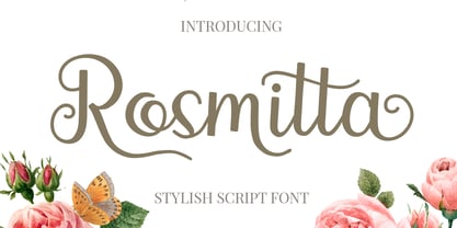 Rosmitta is a new, modern, fresh and upright script . This font will make your design look elegant, natural and stylish. Rosmitta is perfect font for any awesome projects such as photography, watermarks, quote design, social media posts, advertisements, logos and branding, invitations, product designs, labels, stationery, wedding designs, product packaging, special events or any project that need handwriting taste.
 - Arakne by Scriptorium,
$12.00While working on a font based on Spencerian Script (a popular late 19th century handwriting style) we did some experimenting with original designs which created the general feel of Spencerian and brought to mind the spidery handwriting of old ladies and Dickensian clerks. The result was Arakne, a spidery script font with a really striking look. - Schuss News Poster by typic schuss,
$10.00 Schuss News Poster ist the very heavy headline font (titling/display/poster) of Schuss News. (No italic, no additional figures, no tabular figures, no small Caps, slyghtly different heights as the other font of the Schuss superfamily (Sans, Slab, News and Serif). The character set is different to the other styles. It is not developed for small text sizes.)
 - Fuglesans by Björn Berglund Creative Studio,
$25.00 Fuglesans is a homage to the first Swede in space. The sans serif font is inspired by Scandinavian aesthetics, Sci-fi movies and space. Use it for visionary brands or designs that aspire to be high-tech, modern and futuristic. The font is currently available in 3 weights, Light, Regular and Bold, and comes with over 200 glyphs.
 - Rundfunk by ITC,
$29.00Rundfunk is a condensed font which features an unusual lowercase with an extremely low x-height and high tail ascenders that align with the capitals. It is a reworking of the original designed by Adolf Behrmann for the Berthold type foundry in 1928. Rundfunk font is ideal for projecting the look and mood of the 1930s. - Archer Display by SilverStag,
$19.00 Introducing Archer Display – a serif font that bridges the realms of tradition and modernity with effortless finesse. This font carries the weight of a bygone era in its high-contrast design and substantial serifs, but it also boasts a captivating contemporary edge with select letters that have been thoughtfully reimagined for a touch of avant-garde charm.
 - SF Tobba by Sultan Fonts,
$19.99 Tobba is an Arabic typeface for desktop applications, for websites,designed for Newspapers, magazines and cover titles. Tobba font family is Modern style and contains 3 weights: Regular, bold and black. The font includes support for Arabic, Persian, and Urdu. It also includes proportional and tabular numerals for the supported languages. Sultan typeface comes with many opentype features.
 - Razlug by Motif Creatives,
$18.70 Razlug is a modern sans serif typeface. Consists of 6 weights and its italics. it is a clean font featuring a variety of sets from thin to bold making it versatile for use for branding, headlines, digital media, logos, more general text, posters, and print media. Inspired by mid geometric/technology fonts. Founded in 2021 by motif creatives.
 - Ebdus by AdultHumanMale,
$12.00 Ebdus is a thin, modern, lightweight font, occasionally a little gawky and tall, sometimes a little plump and rounded. The font is available in 5 weights from Thin to Heavy but they all lean towards all things anorexia. It looks as good in copy as it does in headlines, it’s perfect for an angry letter to an uppity android.
 - Ramston by Katatrad,
$29.00 Ramston is a humanist sans serif typeface of 20 fonts in total — a normal and a condensed width in 5 weights with matching italics. The condensed version is designed for space-saving typography but with high legibility in mind. Ramston is an ideal font family for display, print, corporate identity, mobile devices, magazine cover, signage, and web design creation.
 - Carin by Nine Font,
$20.00 Carin is a hand-lettered uppercase type family with both sans-serif and serif styles, including ornaments and symbols. Its characters have been drawn by hand to give them a natural and friendly look. Each style has one basic font with two weights and three decorative fonts (A, B, C). Carin is an emotional type family.
 - Alderwood by Hustle Supply Co,
$20.00 Alderwood | A Condensed Hand Drawn Typeface: Alderwood is a hand drawn condensed typeface that comes in multiple styles / weights. Get it in regular, stamp, outlined with oblique versions of each. The subtle imperfection of hand drawn type adds character to projects that require a more grassroots vintage aesthetic. What's Included? → 6 Fonts Files → Western European Characters Included → Web Fonts
 - Trenda by Latinotype,
$29.00 Designed by Daniel Hernández and Paula Nazal. Corrections and review by Alfonso García and Rodrigo Fuenzalida. Trenda is a geometric sans-serif typeface based on the uppercase of Trend —a Latinotype font, released in 2013, that was very well received. This new typeface comes with a wider character set that offers a complete family of uppercase and lowercase in different weights. Trenda is a versatile easy-to-use functional display font with a strong personality, especially its uppercase, which makes the designer’s work easier. Trenda’s lightest and heaviest variants are ideal for display use while its middle weights work well with short and mid-length texts. This typeface has been designed especially for corporate projects, logotypes and publishing. Trenda comes in 8 weights, ranging from Thin to Heavy, and includes matching italics as well as small caps and alternates. The family contains a 634-character set that supports 206 different languages.
 - Cabo Soft by Design A Lot,
$15.00 Cabo Soft is the 2.0 version of our original Cabo Rounded Typeface, created back in 2015. With this new version, Cabo Soft, we have brought multiple upgrades and updates compared with the original version. Some of those consist in the addition of more glyphs and accents, alternate designs for many of the glyphs (including an alternate for @, #, some of the numbers and more), and most importantly, we have done a slight update in the design of the letters, which we'll give more details in the following paragraphs. The main style and thought behind our Cabo fonts has always been the rounded corners and the soft and welcoming vibe that it gives. It's friendly and familiar, but also modern and slightly elegant, especially the Thin and Light styles. With Cabo Soft we have worked on adding an extra touch to the design of the letters by working on the termination edges of each letter. If Cabo Rounded had an exact round termination for each letter, with Cabo Soft we have developed a unique non-equally rounded shape that is applied to all types of terminations for each letter. This new design approach makes it have a more clean style, a more modern and unique look, but it also gives stylish, exclusivist and elegant vibes, while still being friendly and familiar. Thanks to it's variety in weights and styles, you can use Cabo Soft in almost any design project. It works well with headlines and paragraphs, it's a perfect match for logo design and branding, but can also do wonders in videos, signage and many other elements. The typeface covers most likely the entire Latin Alphabet, it comes with multiple design alternates for many of the letters, glyphs and numbers, with accents applied for all of the available alternates. As a finishing note, with the help of our Cabo Soft typeface you can create an friendly and welcoming designs, as well as stylish, elegant and exclusivist. It has all the necessary glyphs and accents for any Latin Alphabet projects, and you can play around with all of the alternates to create unique designs right from the start.
 - Monster Fiesta PB by Pink Broccoli,
$24.00 An offbeat, fun, and frightful serif typeface inspired by the 1969 Rankin Bass animagic classic titled, Mad Monster Party.
 - Endorphin by Tall Chai,
$15.00 Endorphin is a stylish oblique sans-serif font family with weights ranging from Thin (100) to Black (900). Features: Available in 9 weights Over 550 glyphs supporting extended Latin Ideal for display texts: Titles, Logos and Headlines etc. Perfect for branding and rebranding Supports OpenTypes features like Ligatures and Stylistic Alternates Symbols for 10 major currencies including Bitcoin provided in all weights Description: The Endorphin font signifies racing forward. Each oblique character manifests that feeling of achievement and happiness that one gets after a great workout or after a refreshing game. Every character effortlessly integrates with modern design standards and interfaces. The fonts are professional and have a strong personality in them. This makes Endorphin perfect for use in modern apps and websites. Endorphin is built for the designing and marketing squads. It has a trendy geometric characteristic which is ideal for any branding and rebranding. Endorphin has lot of OpenType features (like ligatures and alternates) and the Extended Latin character set supports over a hundred languages. Race Forward!
 - Eurostile LT by Linotype,
$40.99Eurostile® is one of the most important designs from the Italian font designer Aldo Novarese. It was originally produced in 1962 by the Nebiolo foundry as a more complete version of the earlier Microgramma, a caps-only font designed by Novarese and A. Butti. Eurostile reflects the flavor and spirit of the 1950s and 1960s. It has big, squarish shapes with rounded corners that look like television sets from that era. Eurostile has sustained the ability to give text a dynamic, technological aura. It works well for headlines and small bodies of text. The Eurostile font family has 11 weights, from roman to bold and condensed to extended. In 2009 Linotype released a revised version in the Platinum Collection under the name , with three weights in all three different styles. And additionaly there are now new weights for the Eurostile family as , and ." - Meridiana Pro by Unio Creative Solutions,
$3.00 The concept behind Meridiana Pro was to create an amalgamation between a rounded sans and a monospaced font in order to obtain an extensive and usable variable type-system. This typeface encapsulates a symmetrical and balanced rhythm due to the unique blend of different sources of inspiration. Proportions are precisely adjusted with smooth contours and subtle contrasts. These forms give the font an eye-catching look without compromising elegance and minimalism, ensuring that each glyph will work well in any graphic design purpose. The focus was to create a versatile type family with range of alternates, ligatures, and symbols, including the extensive language support of most European languages. Meridiana Pro design space includes two axes, weight and italic and is available as a variable font or as a separate OpenType family, including weights from Thin to Heavy plus their obliques. Specifications: - Version included: Meridiana Pro Variable, Meridiana Pro Static - 8 weights with matching obliques - Multi-language support (Central, Eastern, Western European languages) - OpenType Features (Superscript and Subscript Numerals, Fractions, Ligatures, Alternates) Thanks for reading, Unio.
 - Kross Neue Grotesk by Designova,
$15.00 Kross Neue Grotesk is a minimalist sans-serif typeface family of 16 fonts featuring the finest design made with attention to every detail. Created with a special focus on minimalism and simplicity in typography, this typeface can transform your design projects to another level of visual appeal. Handcrafted and designed with powerful OpenType features in mind, each weight includes extended language support including Western European & Central European sets. A total of 268 glyphs are included. Kross Neue Grotesk is a perfect choice for graphic design, text presentation, web design, print and display use. The typeface can be an amazing option for beautiful branding, logo / logotype design projects, marketing graphics, banners, posters, signage, corporate identities as well as editorial design. Adding extra letter-spacing for the Caps will make this font perfect for minimal headlines and logotypes as shown in promo images here. Kross Neue Grotesk typeface family comes with a total of 12 fonts having 6 weights (Thin / Light / Book / Regular / Bold / Heavy) as well as Italic versions of all weights.
 - Explorer by Fenotype,
$30.00 Explorer - a classy typeface collection. Explorer collection includes following: • 8 Fonts - a clean and textured version of each • Catchwords • Swooshes • Pictures Explorer’s core is a strong script type with straight edges. All the fonts are designed to work nice together. Here’s a short introduction to the styles: •Explorer Script is equipped with Contextual Alternates that make the connections between letters smooth. In addition it has Swash, Stylistic and Titling Alternates for standard characters for more customised look. Explorer Script has three weights. •Explorer Sans is a wide all caps sans-serif that doesn’t shy away from taking it’s own space. Explorer Sans has two weights. •Explorer Condensed is a sturdy all caps condensed sans-serif with rounded edges. Explorer Condensed has two weights. •Explorer Serif is a bulky all caps serif. •Explorer Swoosh is a collection of strokes and swooshes designed to go with the Script. Try adding a connecting one in the end of a word written with Script or place a loose swoosh above or below a word. •Explorer Catchword is a collection of catchwords designed to go with Explorer fonts.
 - Quase Display by DSType,
$40.00 Quase is a very free interpretation of the types found in the “Specimen of Printing Types” by William Caslon from 1785. We didn’t want to follow any of the models introduced in the Specimens, but rather gather a series of typographic aspects that we found useful and interesting from the several sizes and styles available and then give them consistency and new proportions so they could fit our very own purpose. We wanted to start with Caslon and then transform it into an editorial typeface, hence the increase of the x-height and the radical reduction of the ascenders and descenders. Despite the Display, Headline and Text fonts we also wanted to make a single weight Poster version with, inspired by the mechanical script introduced in the Double-Pica Script, to be used in magazines or as a complementary display typeface.
 - Quase Poster by DSType,
$40.00 Quase is a very free interpretation of the types found in the “Specimen of Printing Types” by William Caslon from 1785. We didn’t want to follow any of the models introduced in the Specimens, but rather gather a series of typographic aspects that we found useful and interesting from the several sizes and styles available and then give them consistency and new proportions so they could fit our very own purpose. We wanted to start with Caslon and then transform it into an editorial typeface, hence the increase of the x-height and the radical reduction of the ascenders and descenders. Despite the Display, Headline and Text fonts we also wanted to make a single weight Poster version with, inspired by the mechanical script introduced in the Double-Pica Script, to be used in magazines or as a complementary display typeface.
 - Pais by Latinotype,
$39.00 "País" is a contemporary and modern grotesque sans serif, inspired by the grotesques of the early 20th century, but more geometric and with a wider x-height than its referents; making it ideal for the current times. "País" comes in 2 versions, each with 9 weights, from thin to black, and matching italics, for a total of 36 fonts. The standard sans serif version is fresh, clean, and more ideally neutral. It's a perfect choice for editorial design, branding, headlines, or any other piece of graphic design. The "País Alt" version has more expressive and modern characters, with some giving it a much more playful image. It is ideal for logos, packaging, web and television use. País contains a total of 682 characters that make it possible to write in more than 200 Latin languages and basic Cyrillic.
 - Quase Headline by DSType,
$40.00 Quase is a very free interpretation of the types found in the “Specimen of Printing Types” by William Caslon from 1785. We didn’t want to follow any of the models introduced in the Specimens, but rather gather a series of typographic aspects that we found useful and interesting from the several sizes and styles available and then give them consistency and new proportions so they could fit our very own purpose. We wanted to start with Caslon and then transform it into an editorial typeface, hence the increase of the x-height and the radical reduction of the ascenders and descenders. Despite the Display, Headline and Text fonts we also wanted to make a single weight Poster version with, inspired by the mechanical script introduced in the Double-Pica Script, to be used in magazines or as a complementary display typeface.
 - Acto by DSType,
$40.00 Acto is a type system designed as the sans serif counterpart of the previous released Acta. Both type families were designed in 2010 for the redesign of the Chilean newspaper La Tercera, but unlike some of our previous fonts (i.e., Leitura) Acto doesn't exactly match Acta in terms of structure, so they can live on their own. Acto is our first sans where the uppercase has the same height as the ascenders, so we decided to avoid common problems like the confusion between the I and the l, by drawing a curved l. We kept that spirit by removing the spurs on the b, g and q, resulting on a more warm typeface than Prelo, for instance. In the end it's a very powerful sans family, with eleven weights with matching italics, for editorial and corporate design.
 - Varisse by AVP,
$19.00 Varisse spans over two centuries of type design and draws its inspiration from well-loved classics that are as fresh today as they were when they were created. The range stretches from a quintessential 18th century transitional serif to an uncompromising 20th century sans. Think Baskerville, think Gill. The idea was to create a family that shared similar forms and the same vertical metrics, allowing them to be mixed to provide impact and readability as required. With a generous x-height and a host of options, the Varisse family is ideally suited to branding, packaging, magazines and editorial. It also provides a wealth of opportunity in website presentation. The fonts are divided into five subfamilies by degree of ‘serification’. Varisse Sans Varisse Soft Sans Varisse (normal) Varisse Soft Serif Varisse Serif Each subfamily contains six weights and accompanying italics.
 - Kappa by W Type Foundry,
$25.00 Kappa is a modern sans serif with humanistic and geometric features. Its structure is slightly narrow to fit in a greater range of platforms (moreover if you print it, you may save a lot of paper), and its height is higher allowing a great legibility in small sizes. This family is composed with the display version and the text version providing a broad spectrum of solutions, making this family easier and friendlier to use. Designed with powerful OpenType features in mind. Each weight includes alternate characters, ligatures, fractions, special numbers, arrows, extended language support, small caps and many more… Perfectly suited for graphic design and any display / text use. The 36 fonts are part of the larger Kappa super family. Learn about upcoming releases, work in progress and get to know us better! On Instagram W Foundry On facebook W Foundry wtypefoundry.com
 - Quase Text by DSType,
$40.00 Quase is a very free interpretation of the types found in the “Specimen of Printing Types” by William Caslon from 1785. We didn’t want to follow any of the models introduced in the Specimens, but rather gather a series of typographic aspects that we found useful and interesting from the several sizes and styles available and then give them consistency and new proportions so they could fit our very own purpose. We wanted to start with Caslon and then transform it into an editorial typeface, hence the increase of the x-height and the radical reduction of the ascenders and descenders. Despite the Display, Headline and Text fonts we also wanted to make a single weight Poster version with, inspired by the mechanical script introduced in the Double-Pica Script, to be used in magazines or as a complementary display typeface.
 - Gothica by Type Innovations,
$39.00 Say hello to Gothica. It’s a display geometric sans designed with Stencil-like elements and letter cutouts specifically created for visual impact—ideal for logo, branding and advertising purposes. The font includes capitals and capital alternatives in the lower case keystroke positions—it’s like having 2 display fonts in one. In addition, Gothica includes various opentype features that allow graphic designers to tailor the type for custom needs. The development of Gothica started in 1997, inspired by Alex Kaczun’s best selling grotesque font family called Contax Pro. An experimental design, Gothica is specifically introduced as a bold weight, but Alex plans to expand the design to include many weights, styles and alternative design treatments. Stay tuned! If you like Gothica—check out similar gothic alternates like Decrypt 01, Decrypt 02, Decrypt H1 and all of Type Innovations fonts from Alex Kaczun.
 - Bronex Pro by Alit Design,
$15.00 "BRONEX Pro Typeface" is a modern sans serif font that comes in a variety of weights, ranging from Thin to Heavy. It has a high body, making it easy to read even in small sizes. The font includes 494 glyphs, which allow for a wide range of typographic possibilities. In addition to the regular weight, "BRONEX Pro Typeface" also includes a condensed version, which is ideal for situations where space is limited. The font supports Private Use Area (PUA) encoding, allowing you to access special characters and symbols that are not available in standard character sets. Overall, "BRONEX Pro Typeface" is a versatile font family that can be used in a variety of design contexts, from branding and advertising to editorial and web design. Its clean and modern aesthetic make it a popular choice for designers looking for a fresh and contemporary look.
 - Sonrisa by CastleType,
$59.00 Sonrisa is a design that evolved from my sketches of the skeletal structure of Jakob Erbar’s Koloss, trying to discover its underlying essence without all the contrast and bulkiness of the original design. Sonrisa Thin was the resulting font, from which the other weights of the family were developed. Gentle curves, open counters, generous x-height, and sleekly tapered terminals give Sonrisa a very legible, modern, elegant appearance. When she saw the first draft of this typeface, the smile on my friend Jennifer’s face gave me the idea to call it “Sonrisa” (Spanish for “smile”). Jennifer, a clinical psychologist, described Sonrisa’s personality as: "happy, clean, clear, open, joyful, spacious, playful, calm. I can see it being used for body product lines such as oils and lotions. Can see it being used in home/travel magazines or even Architectural Digest. Yoga magazine, definitely." Sonrisa is what some foundries call a “Pro” typeface family with all the bells and whistles that provide typographic versatility: true small caps, oldstyle numerals, arbitrary fractions, discretionary ligatures, and other powerful OpenType features. All fonts in the family, except Sonrisa Titling, support most European languages, including modern Greek and languages that use the Cyrillic Alphabet. (Cyrillic glyphs designed in consultation with Ukrainian type designer, Sergiy S. Tkachenko.) Sonrisa is available in the original Thin, monoline version as well as six weights (Light, Regular, Medium, Bold, Extra Bold, Black), and a Titling font that is essentially a display font construction kit. If you enjoy using Sonrisa even half as much as I enjoyed creating it, then I know you will have a “sonrisa” (smile) on your face!
 - Optien - Personal use only

- Botanink - Personal use only

- Ringer - Personal use only

- Characteristic - Personal use only

- BPpong - Unknown license

- Quimbie - 100% free

- Maskalin - Unknown license

- Akshar Unicode - Unknown license


