200 search results
(0.006 seconds)
- DdaftT-lowercase - Unknown license

- dDAFTt-UPPERcase - Unknown license

- FLOWER GARDEN - Unknown license

- Middle Ages - Unknown license

- County Clerk JNL by Jeff Levine,
$29.00 County Clerk JNL was modeled after the vintage Hamilton wood type design Gothic Special, and is available in both regular and oblique versions. An early grotesk font, this condensed sans serif lends itself well to short headlines and brief body copy.
 - Mene One Mexicali by Handselecta,
$38.00This style mimics the flare or upward fade that comes with the use of a spray paint can, as the tops of the letters flare, and become wider. An original font style, named after the border town of Mexicali, this font style falls under the larger umbrella of what is called Cholo-graffiti style. Originally from New Jersey, MENE has made his home in, New York City. He had a brief albeit satisfying career of street bombing in the late 90s that saw its end with a brief encounter with the Vandal Squad. Now a family man, Mene has dedicated himself to the preservation and education of style in its many forms. - Uncial by Monotype,
$29.99Victor Hammer created many faces based on uncial handwriting of which American Uncial, released commercially by the Stempel foundry in 1952, is the source for this version. Uncial is an ideal choice for historical or church pieces, provided that the length of the copy is brief. - Scurvy Dog by Hanoded,
$15.00 Aye, me lovelies, this be Scurvy Dog, a grand font! The letters were etched into a dead man's chest with a blunt rapier, pickled in brine and covered in spew. Ye could be using this crafty penmanship for yer logs or writing yer dear ol' mothers a letter.
 - Kimura Sans by Plau,
$30.00 Created by Carlos Mignot, designer and partner at Plau, who was inspired by Marcelo Kimura's work to create a versatile humanist typeface capable of easily adapting to different design situations. With Kimura Sans, you will be able to create impactful headlines, translate briefings into efficient and stylish visual identities.
 - Tomboy LP by LetterPerfect,
$39.00 Tomboy is a type design based on informal handwriting. Its presence on the page is friendly and easy to read, suitable for correspondence, brief text, and for display use in titles and headlines. Three weights -- Light, Medium & Bold -- allow Tomboy to speak in a wide range of voices.
 - YT metaphor Latin by Yangtype,
$9.00This font is artistic. The shape of the letters was taken from the dot art that I worked on consistently. Letters are read by habit and feeling. Sometimes I also think for a moment about what this letter is. But, you soon find out. A brief pause and continuation is refreshing. - Xenois Serif by Linotype,
$29.99“Drawing letters is my passion,” says Erik Faulhaber, the designer of the Xenois typeface family. Pronounced “zeeno-is,” the design distills character shapes into what Faulhaber believes are their purest forms. “I studied many typefaces, carefully examining their structure, before I began drawing Xenois. Then I actually wrote out a detailed design brief establishing the goals for my design.” - Angela Love Sans by Fargun Studio,
$12.00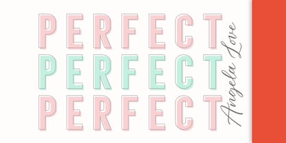 Introducing Angela Love Sans, a modern combination of 4 fonts, each carefully designed to naturally complement one another. With 4 clean sans styles, Angela Love Sans gives you a hugely versatile collection of fonts - ideal for experimenting with striking & modern typographic designs in any modern design brief. It is so beautiful and classy for your projects.
 - LTC Hess Monoblack by Lanston Type Co.,
$24.95 A very rare metal face made a brief appearance in Lanston Specimen books and has all but vanished from use. In fact no examples of the font in use seem to exist. It shares some of the hand-rendered casual feel of Nicholas Cochin, but much heavier and well suited for bold headlines and package design.
 - Xenois Semi by Linotype,
$29.99“Drawing letters is my passion,” says Erik Faulhaber, the designer of the Xenois typeface family. Pronounced “zeeno-is,” the design distills character shapes into what Faulhaber believes are their purest forms. “I studied many typefaces, carefully examining their structure, before I began drawing Xenois. Then I actually wrote out a detailed design brief establishing the goals for my design.” - Xenois Sans by Linotype,
$29.99 “Drawing letters is my passion,” says Erik Faulhaber, the designer of the Xenois typeface family. Pronounced “zeeno-is,” the design distills character shapes into what Faulhaber believes are their purest forms. “I studied many typefaces, carefully examining their structure, before I began drawing Xenois. Then I actually wrote out a detailed design brief establishing the goals for my design.”
 - Montarsi by insigne,
$32.00 Montarsi is a typeface designed by Jeremy Dooley, inspired by Arabic calligraphy and contemporary design trends. The letters are fluid and graceful, inspired by the curves and swirls of Arabic script. Montarsi is a bold, contemporary calligraphic face with broad strokes and high contrast. It has a variety of styles and weights to give you an extensive range of design options. This font family, which includes eight weights, is ideal for producing brief texts for editorial, fashion, branding, magazine, television, window displays, and other media applications. Small caps, old-style figures, and width variations are also included. It's ideal for writing brief sentences because of the increased x-height. Montarsi is a classic spirit reinvented in a modern language, influenced by the delicate curves of letters and the way ink glides across paper. We especially thank Lucas Azevedo and ikern.
 - Turtellini NF by Nick's Fonts,
$10.00This quirky little number is based on a typeface originally named Turtle, which made a very brief appearance in Letraset's product line catalog in the 1970s. Admittedly, its uses are limited, but its cryptic and playful nature will reward those with imagination. Both versions of this font include the complete Latin 1252, Central European 1250 and Turkish 1254 character sets. - Song Stylist JNL by Jeff Levine,
$29.00 The 1907 novelty song "Since Arrah Wanna Married Barney Carney" (about an Irishman taking an Indian maiden as his bride) had its title hand-lettered in a sans serif style that reflected both the Art Nouveau flavor of the time and a hint of what was to come during the Art Deco movement. This is now Song Stylist JNL and it's oblique counterpart.
 - Genica Pro by Ndiscover,
$35.00 This is the design that was always on the drawer. I designed it when I was bored of designing other typefaces, there was no briefing, I just wildly played with the bezier tool. It was something to relax from more serious work, so it feels like a very funny and smiling design. Genica mixes various styles creating a display type with lots of personality.
 - Poster Casual JNL by Jeff Levine,
$29.00 Poster Casual JNL is based on the hand lettered title on the cover of the 1929 sheet music for the song "Give Yourself a Pat on the Back"; touted at the time as being "the cheer-up song of England". Available in both regular and oblique versions, the font is perfect for applications where a less-formal look is desired in headlines or brief text.
 - Zeebonk by Hanoded,
$15.00 Zeebonk (literally 'Sea Chunk') is Dutch for a sailor - in particular, a large, pickled and brined, seven-seas-been-there-done-that specimen. The font itself brings back memories of the outrageous tattoos those same 'zeebonken' used to have. Zeebonk comes with extensive language support, alternates for the upper case (and some lower case letters as well) and a healthy dose of good old fashioned sea dog humor!
 - Substance by FaceType,
$24.00 The grotesque workhorse: Substance fulfills the primary role of emphasizing content. Containing 8 weights + italics (800+ glyphs each) Substance is a workhorse with loads of subtle OpenType features (small caps, a choice of lining, tabular and old style figures, numerators, denominators, tabular figures and signs, fractions, ligatures), 21 currency signs and a diversity of symbols and arrows. Substance provides everything you need for demanding briefs like signage or corporate design.
 - Gatlinburg Gossamer NF by Nick's Fonts,
$10.00 The original characters, and now-rarely-seen alternate characters, for Memphis, designed by Emil Rudolf Weiss for American Type Founders in 1930, provided the pattern for this wispy, ultralight typeface. Although intended primarily for headlines, this typeface can also be used for brief blocks of text, if set 18 pt. or larger. Both versions of the font include 1252 Latin, 1250 CE (with localization for Romanian and Moldovan).
 - Flood by Adobe,
$35.00Flood was designed by Joachim M�ller-Lanc� and is not just another handwritten face. At smaller point sizes it exhibits the natural, dynamic, and spontaneous flow of felt tip marker writing. At larger sizes Flood is immediate, urgent, and provocative in its stylized detailing, without being overly dramatic. Flood�s energetic rhythm is well suited for informal menus, logos, and brief ad copy, as well as personal correspondence. - Brie Light, as its name suggests, is a font that embodies a blend of lightness and elegance. This typeface falls into a sophisticated category of fonts that balance between formality and a touch of p...
- PreussischeIV44Ausgabe3 - 100% free

- Carmay by Hoftype,
$49.00 Carmay was conceived as a charming, gently flowing member of the didonesque family. The roman weights present some hybrid characteristics, which results in an appearance of informality and adds a dash of brio. Carmay, nonetheless, remains restrained and committed to a classical ethos. All weights contain standard and optional ligatures, superior characters, proportional lining figures, tabular lining figures, proportional old style figures, lining old style figures, matching currency symbols, fraction- and scientific numerals, matching arrows.
 - Beynkales by Scriptorium,
$18.00Now here's a font with an unusual backstory. You may recall that a while ago we discovered that Tim Burton was using an outdated version of one of our fonts for the interior titles in his The Corpse Bride. Well, our quest to get hold of him didn't bear any immediate fruit, but in a totally unrelated event we were contacted by the graphic arts company working with the overseas distributors for The Corpse Bride and it turned out that they needed a font based on the main title of the movie so they could keep the same style when they retitled it into other languages. The original title was either hand lettered or a heavily modified font, bearing some resemblance to our Ligeia and Tuscarora fonts, so we had to create a whole font more or less from scratch and extrapolate most of the letters from the very limited sample in the original title by identifying certain consistent characteristics and building new characters around them. It was a lot of work, but the good news is that they didn't want exclusivity, so we've got the font to add to our collection. We ended up calling it Beynkales which means 'Bone Bride' in Yiddish, which makes sense given the context of the movie. So here it is, in all its tattered glory, and bound to end up in our Halloween font selection later this year as well. Beynkales Alternate is a companion font that includes a full set of alternative upper and lower case characters which can be used on their own or in combination with the characters from Beynkales to create a more varied and handwritten look. - Vintage Wedding by Edyta Demurat,
$40.00 Vintage Wedding is a collection of 432 icons, divided into 4 categories. These symbols were selected and created in order to bring to mind the past times, yet at the same time, to retain the modern design. You can find here such rare and beautiful objects as phonograph or cult eyeglasses. The font includes many diverse elements, which will help you create compositions out of flowers, to choose commemorative vases, and even to dress the bride and groom!
 - TGL 31034-1 - Unknown license

- TGL 31034-2 - 100% free

- Buche by Factory738,
$15.00 Buche - a brief introduction Buche is a contemporary serif font designed for logo and brand design. It exudes an air of affluence and sophistication, despite its curvy appearance. The ligature fonts will come in handy for whatever your imagination can think up! 6 Weights & 2 Styles (Regular & Italic) Basic Latin A-Z and a-z Numerals & Punctuation Stylistic Ligatures Multilingual Support for ä ö ü Ä Ö Ü ... Free updates and feature additions Thanks for looking, and I hope you enjoy it.
 - Bungehuis by Hanoded,
$15.00 Bungehuis font was modeled on the lettering found on an Amsterdam art deco building from 1931. This building on the Spuistraat, also called "Het Bungehuis", used to house offices, but is now part of the University of Amsterdam. In 2015 it had its brief moment of fame, when students, demanding more democracy at the University, occupied it. Bungehuis is a heavy art deco font and would look great on posters and in headlines. It comes with a rather democratic range of diacritics.
 - Rostock Kaligraph - 100% free

- moebius - 100% free

- Polke by ArtyType,
$29.00 Polke is a single weight display face brimming with style and charm but simultaneously exuding impressive core strength and a vibrant personality. Floating ball terminals rub shoulders with contrasting sharp and rounded letterforms to produce a distinctively decorative headline font built on robust foundations. Polke's name is derived from the striking terminal dots which dominate the character set, creating a Polka-Dot effect throughout. I also had the artist Sigmar Polke in mind which explains the spelling, and so the two ideas simply morphed together.
 - DF Riga by Dutchfonts,
$33.00 DF Riga is a minimal bitmap typeface which works very well in small sizes both on your screen and on paper. But... if you want to express its deep beauty, use it in display sizes and the smell of ink is there. These typefaces (DF-A BIT, DF-Riga and DF-Dudok) owe their existence to the excellent letterpress printing of Hanneke Briër at the Grafisch Centrum Groningen. Beyond ‘the perfect’ there is a lot to get, it is made, you can see that.
 - Wiegel Latein Medium - 100% free

- Quirkus - 100% free


