10,000 search results
(0.025 seconds)
- Crosstown JNL by Jeff Levine,
$29.00Crosstown JNL is a serif treatment of Midtown JNL, an Art Deco typeface displayed in the pages of an old 'how to' lettering book. - Pukupuku by yamayama,
$20.00 Pukupuku is a cute round font. This font is designed based on the shape of clouds and beans, which looks somewhat like handwritten letters.
 - Sew What JNL by Jeff Levine,
$29.00Sew What JNL is a little novelty font that gives the appearance of letters stitched into fabric. This font contains a limited character set. - Ramshackle JNL by Jeff Levine,
$29.00Ramshackle JNL was modeled from a 1940s lettering stencil and takes its place amongst the many vintage stencil font designs redrawn by Jeff Levine. - Pompelmus by PizzaDude.dk,
$15.00 Crispy: ALL CAPS crispy letters Nutricious: "clean" version of Crispy Fiber: The messy inside of Crispy Healthy: Rough serif font Sweet: Handwritten and crunchy
 - PaperCutAlmondDark by PineStreet,
$25.00 This is the 'dark' version of our font PaperCut Almond. It has all of its openings closed to enhance the effect of handcut lettering.
 - Port Of Call JNL by Jeff Levine,
$29.00 The hand lettered titling on a vintage piece of sheet music for the song "Sweet Siamese" is the basis for Port of Call JNL.
 - Sheet Music JNL by Jeff Levine,
$29.00 Sheet Music JNL was based on lettering found on an old piece of 1930s-era sheet music being sold at a local rummage sale.
 - Pandemizing by Morganismi,
$9.00 Pandemizing is a decorative font with microbe-like letters and additional medical figures. It reminds you of the importance of healthcare. Supports multiple languages.
 - FeggoliteDancing by Ingrimayne Type,
$7.95 FeggoliteDancing has monospaced, wobbly letters. It is a variation of FeggoliteMono. For other fonts that have the same tipsy look, see NoPain and Seasick.
 - Splurx by PizzaDude.dk,
$20.00 A crunchy scripty and curly font. Comes with ligatures for double letters. You will need to use OpenType supporting applications to use the autoligatures.
 - Sini by Hiekka Graphics,
$39.00 Sini is a warm and delicious hand-lettered fontface in two styles: bold and ornaments. Sini is recommended for use as a display typeface.
 - Manita Px by Letradora,
$10.00 Manita is a quirky, humorous unicase face, reminiscent of comic lettering. Supports most Central and Western European scripts. Includes ligatures and several fun dingbats!
 - Komentator by Arendxstudio,
$13.00 Komentator is a monoline vintage script typeface which is created based on manual hand lettering with many features such as, stylistic set alternate, swashes.
 - Romantic Chicago by Haksen,
$14.00 A hand lettered font with modern calligraphy style Specifics: Cute and pretty style with alternates in lowercase Numerical, Punctuation, Multi language included Happy Designing!
 - Rice Bowl JNL by Jeff Levine,
$29.00Rice Bowl JNL is an Oriental-style typeface with a decidedly casual appearance - foregoing traditional structure for that of the look of hand-lettering. - FS Lucas by Fontsmith,
$80.00 Pure and not-so-simple Maybe it’s the air of purity, openness and transparency that they transmit, but geometric typefaces are more popular than ever among leading brands. Based on near-perfect circles, triangles and squares, geometric letterforms look uncomplicated, even though making them readable is anything but – something the designers of the first wave of geometric fonts discovered nearly a century ago. Many of the world’s most recognisable brands in technology, retail, travel, food, manufacturing and other industries continue to be drawn to the straightforward, honest character that geometric fonts convey. Fontsmith set out in 2015 to develop a typeface in the same tradition, but optimised for the demands of modern brands – online and offline usage, readability and accessibility. And, of course, with the all-important Fontsmith x-factor built in. FS Lucas is the bold and deceptively simple result. Handle with care The letterforms of FS Lucas are round and generous, along the lines of Trajan Column lettering stripped of its serifs. But beware their thorns. Their designer, Stuart de Rozario, who also crafted the award-winning FS Millbank, wanted a contrast between spiky and soft, giving sharp apexes to the more angular letterforms, such as A, M, N, v, w and z. Among his inspirations were the colourful, geometric compositions of Frank Stella, the 1920s art deco poster designs of AM Cassandre, and the triangular cosmic element symbol, which led him to tackle the capital A first, instead of the usual H. The proportions and angles of the triangular form would set the template for many of the other characters. It was this form, and the light-scattering effects of triangular prisms, that lit the path to a name for the typeface: Lucas is derived from lux, the Latin word for light. Recommended reading Early geometric typefaces were accused of putting mathematical integrity before readability. FS Lucas achieves the trick of appearing geometric, while taking the edge off elements that make reading difficult. Perfectly circlular shapes don’t read well. The way around that is to slightly thicken the vertical strokes, and pull out the curves at the corners to compensate; the O and o of FS Lucas are optical illusions. Pointed apexes aren’t as sharp as they look; the flattened tips are an essential design feature. And distinctive details such as the open terminals of the c, e, f, g, j, r and s, and the x-height bar on the i and j, aid legibility, especially on-screen. These and many other features, the product of sketching the letterforms in the first instance by hand rather than mapping them out mechanically by computer, give FS Lucas the built-in humanity and character that make it a better, easier read all-round. Marks of distinction Unlike some of its more buttoned-up geometric bedfellows, FS Lucas can’t contain its natural personality and quirks: the flick of the foot of the l, for example, and the flattish tail on the g and j. The unusual bar on the J improves character recognition, and the G is circular, without a straight stem. There’s a touch of Fontsmith about the t, too, with the curve across the left cross section in the lighter weights, and the ampersand is one of a kind. There’s a lot to like about Lucas. With its 9 weights, perfect proportions and soft but spiky take on the classic geometric font, it’s a typeface that could light up any brand.
 - FS Lucas Paneureopean by Fontsmith,
$90.00Pure and not-so-simple Maybe it’s the air of purity, openness and transparency that they transmit, but geometric typefaces are more popular than ever among leading brands. Based on near-perfect circles, triangles and squares, geometric letterforms look uncomplicated, even though making them readable is anything but – something the designers of the first wave of geometric fonts discovered nearly a century ago. Many of the world’s most recognisable brands in technology, retail, travel, food, manufacturing and other industries continue to be drawn to the straightforward, honest character that geometric fonts convey. Fontsmith set out in 2015 to develop a typeface in the same tradition, but optimised for the demands of modern brands – online and offline usage, readability and accessibility. And, of course, with the all-important Fontsmith x-factor built in. FS Lucas is the bold and deceptively simple result. Handle with care The letterforms of FS Lucas are round and generous, along the lines of Trajan Column lettering stripped of its serifs. But beware their thorns. Their designer, Stuart de Rozario, who also crafted the award-winning FS Millbank, wanted a contrast between spiky and soft, giving sharp apexes to the more angular letterforms, such as A, M, N, v, w and z. Among his inspirations were the colourful, geometric compositions of Frank Stella, the 1920s art deco poster designs of AM Cassandre, and the triangular cosmic element symbol, which led him to tackle the capital A first, instead of the usual H. The proportions and angles of the triangular form would set the template for many of the other characters. It was this form, and the light-scattering effects of triangular prisms, that lit the path to a name for the typeface: Lucas is derived from lux, the Latin word for light. Recommended reading Early geometric typefaces were accused of putting mathematical integrity before readability. FS Lucas achieves the trick of appearing geometric, while taking the edge off elements that make reading difficult. Perfectly circlular shapes don’t read well. The way around that is to slightly thicken the vertical strokes, and pull out the curves at the corners to compensate; the O and o of FS Lucas are optical illusions. Pointed apexes aren’t as sharp as they look; the flattened tips are an essential design feature. And distinctive details such as the open terminals of the c, e, f, g, j, r and s, and the x-height bar on the i and j, aid legibility, especially on-screen. These and many other features, the product of sketching the letterforms in the first instance by hand rather than mapping them out mechanically by computer, give FS Lucas the built-in humanity and character that make it a better, easier read all-round. Marks of distinction Unlike some of its more buttoned-up geometric bedfellows, FS Lucas can’t contain its natural personality and quirks: the flick of the foot of the l, for example, and the flattish tail on the g and j. The unusual bar on the J improves character recognition, and the G is circular, without a straight stem. There’s a touch of Fontsmith about the t, too, with the curve across the left cross section in the lighter weights, and the ampersand is one of a kind. There’s a lot to like about Lucas. With its 9 weights, perfect proportions and soft but spiky take on the classic geometric font, it’s a typeface that could light up any brand. - Meyola by Stripes Studio,
$20.00 Hi, Introducing the latest styles Meyola with the kind of modern hand scratches, I hope you are interested in this font, if you want to use for your work this font can be used easily and simply because there are a lot of features in it to contain a complete set of letters lower and uppercase letters, assorted punctuation, numbers, and multilingual support. font also contains several ligatures and alternate style Stylistic.
 - Shardie Brush by Stripes Studio,
$20.00 Hi, Introducing the latest styles Shardie Brush with the kind of modern hand scratches, I hope you are interested in this font, if you want to use for your work this font can be used easily and simply because there are a lot of features in it to contain a complete set of letters lower and uppercase letters, assorted punctuation, numbers, and multilingual support. font also contains several ligatures and alternate style Stylistic.
 - SF Change Pro by Sultan Fonts,
$19.99 Change is An Arabic and Latin text typeface for desktop applications. This Font Family development and extension of the Old sultan font "change" Here you will find a change in many letters, along with two types of regular and bold fonts, as well as a change in all Latin letters. The font includes a matching Latin design and support for Arabic, Persian, Kurdish, and Urdu. Designer: Sultan Maqtari Design date: 2020 Publisher: Sultan Fonts
 - Abigail Script by Roland Hüse Design,
$15.00 Abigail Script is a handwritten, monoline cursive font. All the uppercase letters has stylistic alternates and some lowercase letters as well, ligatures and positional forms. Also have a few ornaments in place of numbers 1-9 best fit under words up to 5-6 characters long. See the gallery for preview. It contains Eastern and Western European accented characters. I hope you like this font, good luck with your project and let the creativity flow!
 - Jukotha by Twinletter,
$10.00 Jukotha is a casual retro from the san serif font family that carries a vintage theme, this font is designed with care so that it can produce a blend of letters and become a sweet and elegant word but still natural. by using this font, your work will become stronger and more extraordinary. This font is suitable for various graphic promotion media, banners, posters, logos, typography, hand lettering, packaging, t-shirts, labels, and much more.
 - Skunkling by Jason Mark Jones,
$15.00 Skunkling was born out of a contest, where its initial design won first place. It was inspired by a real-life encounter between a spraying skunk and a defenseless designer. Skunkling is carefully designed to be playful and even awkward. Unique letter forms and ligatures allow the letters to fit snugly together. The two "weights" can be used individually or they have the unique capability to be overlaid to create a two-color font.
 - Big Band JNL by Jeff Levine,
$29.00 Big Band JNL is a classic Art Deco typeface in every sense of the word. Large, bold and innovative in its sectional construction, the font is based on a lettering example found in a 1941 Speedball® Lettering Pen instruction book. The basic alphabet was used for the model, with a new set of numbers and additional characters created by Jeff Levine in order to make this font fully functional in today’s digital designs.
 - Delicia Pro by Wiescher Design,
$69.50 Delicia Pro Script is a versatile fat script designed with delicatessen shops in mind, it has lots of variations. There are for example seven different versions for the uppercase letters that can be accessed with opentype savy software. different ampersands, @-signs, Th combinations, lots of different lowercase letters and so on. The font can be used in all of Europe, Turkey and the Baltic countries (sorry no Greek and Cyrillic). Yours very versatile Gert Wiescher
 - Merfidost Brush by Stripes Studio,
$20.00 Hi, Introducing the latest styles Merfidost Brush Font Duo with the kind of modern hand scratches, I hope you are interested in this font, if you want to use for your work this font can be used easily and simply because there are a lot of features in it to contain a complete set of letters lower and uppercase letters, assorted punctuation, numbers, and multilingual support. font also contains several ligatures and alternate style Stylistic.
 - Celtia Script by Stripes Studio,
$20.00 Hi, Introducing the latest styles Celtia Script with the kind of modern hand scratches, I hope you are interested in this font, if you want to use for your work this font can be used easily and simply because there are a lot of features in it to contain a complete set of letters lower and uppercase letters, assorted punctuation, numbers, and multilingual support. font also contains several ligatures and alternate style Stylistic.
 - Articulated by Studio Upartig,
$12.90 Articulated is a sans serif font with a focus on soft, rounded corners. The concept is that the Capital letters have the characteristics of lowercase letters, in order to create unique experiences. Articulated is a perfect choice for headlines, unique branding, logo design, posters, marketing, banners, logotype, user interface and editorial design. Handcrafted by Laurens Art Ramsenthaler, each weight supports most Central European & Eastern European languages. A total of 298 glyphs are included.
 - Poptis by Abbasy Studio,
$10.00 The combination of two different font styles 'script and sans' . Poptis font available in Regular, Bold, and Rough version as a choice to mix and match your design. This script font comes with multiple alternates that will make your words look like a custom lettering. With additional Serif font you will be able to create the beautiful combination. Both of these font is great for Logos, Lettering, Clothing Design, Poster, Label, Quotes, etc.
 - Strong Brush by Stripes Studio,
$20.00 Hi, Introducing the latest styles Strong Brush with the kind of modern hand scratches, I hope you are interested in this font, if you want to use for your work this font can be used easily and simply because there are a lot of features in it to contain a complete set of letters lower and uppercase letters, assorted punctuation, numbers, and multilingual support. font also contains several ligatures and alternate style Stylistic.
 - Gmbh Sans by EchadType,
$9.99 GMBH SANS The architectural sans-serif in sharp junctions silhouette. Designed as a display typeface for headline sizes. Typeface maintains it's unique identity even in all lowercase letters due to 21 degrees slanted stems (vertical strokes of letters). Variable typefaces provides subtle gradation of 6 weights. Each weight retains the same character width (except character i and l). Typeface supports: Latin characters with diacritical marks; Cyrillic characters (Ukrainian, Russian); Hebrew; Contains additional monetary symbols (₿Ξ₴₹₪)
 - Dom Casual by URW Type Foundry,
$89.99 Dom Casual is a very condensed script, almost monotone, with irregular vertical strokes ending at different heights, and which suggests a freehand effect. It was designed by Pete Dom in 1951 for American Type Founders. As its name suggests, the Dom Casual font gives the appearance of a quick brush-like lettering and is suitable for setting titles, subheadings and short copy. There is some variations of stress in the rounded letters.
 - Anstolina by Stripes Studio,
$20.00 Hi, Introducing the latest styles Anstolina with the kind of modern hand scratches, I hope you are interested in this font, if you want to use for your work this font can be used easily and simply because there are a lot of features in it to contain a complete set of letters lower and uppercase letters, assorted punctuation, numbers, and multilingual support. font also contains several ligatures and alternate style Stylistic.
 - Winter Story by Stripes Studio,
$20.00 Hi, Introducing the latest styles Winter Story with the kind of modern hand scratches, I hope you are interested in this font, if you want to use for your work this font can be used easily and simply because there are a lot of features in it to contain a complete set of letters lower and uppercase letters, assorted punctuation, numbers, and multilingual support. font also contains several ligatures and alternate style Stylistic.
 - Orden by ParaType,
$30.00 PT Orden™ was designed by Oleg Karpinsky in 2000-2001 and licensed by ParaType. Orden is a genuine Cyrillic typeface, it contains antique Cyrillic letter forms such as d, z, N with a diagonal stroke, symmetrical Y ,× and Ù, rare in modern typography. Another specialties: one alphabet and old style figures. Lower case consists of upper case letters except for some alternative variants of the capitals. For use in advertising and display typography.
 - Young Style by Stripes Studio,
$20.00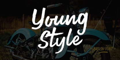 Hi, Introducing the latest styles Young Style with the kind of modern hand scratches, I hope you are interested in this font, if you want to use for your work this font can be used easily and simply because there are a lot of features in it to contain a complete set of letters lower and uppercase letters, assorted punctuation, numbers, and multilingual support. font also contains several ligatures and alternate style Stylistic.
 - Australis Pro Swash by Latinotype,
$29.00 Australis Swash is a new variant that adds to the family of Australis Pro and it brings a touch of whimsy and mannerism to the shape of the cursive letters. Its purpose is purely playful because Australis Swash has some useful Opentype features as standard ligatures, discretionary ligatures and contextual alternates to use them in headlines or as a base for brands and lettering in general. Designed by Francisco Gálvez Pizarro in 2013.
 - PAG Novembris by Prop-a-ganda,
$19.99Prop-a-ganda offers retro-flavored fonts inspired by lettering on retro propaganda posters, retro advertising posters, retro packages all the world over. This is perfect font for your retrospective project. PAG Novembris is narrow and serif font with art deco look. “A”, “G”, “H” and “M” have different letter form in uppercase and lowercase, and they give decorative accents on your typography. PAG Novembris is perfect font for your retrospective project. - Bilibin by Scriptorium,
$12.00Ivan Bilibin was one of the best artists and designers of the Russian folk art movement of the early 1900s. His posters and his illustrative work are exceptional, and like many of the artists of the period he did a lot of hand lettering in various old-fashioned and modernistic interpretations of traditional Russian folk calligraphy. Our first Bilibin font is based on his lettering from an illustrated folk story by Alexander Pushkin.