1,104 search results
(0.014 seconds)
- Spooky Stars by Scratch Design,
$12.00 Meet Spooky Stars! This font is inspired by spooky, horror and scary characters. It has a natural, rough, yet legible handwriting feel. Suitable for use in Halloween-themed designs, band or music events, branding, posters, packaging, labels, invitations, logos, stores and more. This font has features such as ligatures and swashes. So, enjoy this font and feel the creepiness in your design!
 - Mood by Device,
$39.00 A sleek and elegant high-contrast sans with a hint of high fashion and a touch of tomorrow. Available in two versions that can be freely mixed for effect, each with alternatives for the M, P, Q, R and W that are available via the Stylistic Alternates feature in Adobe Illustrator, as a Stylistic Set in Indesign, or direct from the Glyphs palette
 - Giotto Handwriting - Personal use only

- Grut Stuph by PizzaDude.dk,
$20.00Grut Stuph is a weird breed between serif and graffiti, and on top of that a good portion of comic! Comes in Open Type with different alternate letters and is full of fun! Note: you will need to use OpenType supporting applications to use the autoligatures. - Felek by Mili + Wise,
$12.00 Introducing Felek - hand-drawn sans serif font with a lot of character. Playful, bouncy & cute. Perfect for creating logos, greeting cards, posters, packaging and so much more! Suitable also for longer paragraphs, for example in children's books. Its charming and warm character will help you give your project a truly unique feel. Designed and kerned with care and love to make using it a breeze. What you will get - a hand-drawn font with lots of stylistic alternates and ligatures - a dingbat font with 53 illustrations and icons - multilingual support with accented characters for international designers Happy creating!
 - California Party by Create Big Supply,
$15.00 Introducing California Party, our newly released Handwritten Signature Script Font. With its natural handwritten style, this font is perfect for adding a personal touch to your projects. Whether you're looking to create a stylish signature or add a playful vibe to your designs, California Party has you covered. It features both uppercase and lowercase letters, numbers, and punctuations, providing versatility in your creations. This multilingual font allows you to communicate your message globally, while ligatures and PUA encoding make accessing unique glyphs and special characters a breeze. Explore the full character set of California Party and bring an effortless charm to your designs.
 - Doedel by Majestype,
$39.00 Doedel is a strong script font that comes with over 800+ glyphs and is equipped with a host of OpenType features, works well at large size and making it a breeze to customize the feel of your design. Doedel is suitable for t-shirt design, retro design, vintage design, headline, website title, logo, sport, package or etc. To access the alternate glyph you need a program that supports OpenType features such as Adobe Illustrator CS & CorelDraw X6-X7 or you can install the multiple font for Photoshop CS. OTF & TTF font format is also available for use on both PCs and Macs.
 - Fiolex Mephisto - 100% free

- Automoto by Device,
$39.00 Automoto is built from a limited number of curved and straight segments that have been flipped and rotated. It has an extensive set of two- and three-letter ligatures that form a triple ribbon resembling a model car racetrack. For clarity, some character combinations were excluded as they proved to be ambiguous in context. The upper- and lowercase characters can be freely intermixed according to taste.
 - Ailre Heleris by Tanincreate,
$17.00 Ailre Heleris is an elegant script font with an expression of natural handwritten style that flows freely. Perfect for titling, long texts that need handwritten feel, branding projects, social media, wedding invitations, greeting cards, elegant packaging, headlines, posters. It features multi language support (for most of Western Europe), contains glyphs with some OpenType features – some standard ligatures, alternates for lowercase letters (beginning and ending swashes).
 - Scrawny Cat by Hanoded,
$15.00 Scrawny Cat is a bit of an unusual font: it was made with a brush and some China ink and has no real baseline. It is messy yet legible and in a strange way beautiful. The font is all caps, but upper and lower case differ and can be freely interchanged. Comes with a litter of diacritics and some cool end-ligatures to boot.
 - Wormwood Gothic by Device,
$39.00 Retaining all the imperfections and irregularities of wood type, Wormwood Gothic is a gothic sans with all the naive and uneven character shapes typical of the period. The ‘capitals’ feature extended characters, while the ‘lower case ’ features capitals of squarer proportions. Freely mix the two in word settings or colour in red and black for a Dada collage, billposter, urban grit or antique Americana atmosphere.
 - Slughals by PizzaDude.dk,
$18.00 Slughals is danish for someone who eats to much in a kind of greedy way. It came to my mind that "slug" ("swallow" in danish) is snail in English. It lead my mind to the brushtraces of the font, could look like traces from a snail/slug. Slughals has ligatures for most double letters and two fancy swashes for the letters r and k.
 - Lovely Madness by Mirco Zett,
$18.00 Lovely Madness“ is a modern calligraphy font, which is a hybrid out of various types of calligraphy - based fonts. Lovely Madness“ is elegant and at the same time playful, as well as rough and maybe a little bit creepy. That is why there is a wide application possibility for this font and "Lovely Madness“ allows you to give your calligraphy – based creations a new touch.
 - Champloo by One Fonty Day,
$10.00 Champloo is very unique typeface which combines serif features and brush stroke. Some letters have serif, but some don’t. Serif to be found on left side of stem only. It gives a quirky impression on short text. However the larger the text become, the more consistent look it gets as a whole. These two versatile weights let you play with the typeface freely and beautifully.
 - Dark Shade by Letterhend,
$16.00 Meet Dark Shade, the font that dares you to venture into the shadows where creepy and fascination intertwine. This font an aura of spine-tingling dread, perfect for instilling suspense but playful too in your designs. Whether you're channeling classic horror or crafting a display masterpiece, Nights Side versatility is your creative companion. Features : Uppercase & lowercase Numbers and punctuation Alternates & Ligatures Multilingual PUA encoded
 - Hob Gob NF by Nick's Fonts,
$10.00Although not credited, the inspiration for this typeface, originally called "Dancer", has all the earmarks of the work of legendary lettering artist Alf Becker. Creepy and kooky, mysterious and spooky, but not in the least ooky, this monocase face is just what the doctor ordered; Dr Frankenstein, that is. Both versions of this font include the complete Unicode Latin 1252 and Central European 1250 character sets. - Interweave by K-Type,
$20.00 Interweave is a square display face with rounded corners, inspired by beefy fonts from the 60s and 70s such as Bullion and Deutsch Black. An alternating criss-cross effect is borrowed from Hunyady Gothic, the opposing lowercase a, e and s providing a basket weave or parquet floor appearance.
 - Senohraby by Spurnej Type Foundry,
$19.00 Senohraby is an uppercase display typeface inspired by the old sign at Senohraby train station that is now slowly chipping away. Senohraby is available in three interconnected styles that freely various ages of the sign. “Paint” is a more or less preserved font written with a flat brush and featuring slight scratches and errors. The other styles, “Dirt” and “Trash”, follow up on this style and are increasingly marked by age, damage and erosion... In each style one can use simple alternation with lowercase letters, context-based alternation to eliminate repetition of adjacent characters, and a broad range of language support. As a result, each letter offers six variations that can be combined. These can be used as another alternation within a single word or as different bold weights. As a bonus, a fourth, additional style named “Crap” is freely available and as the name implies, it contains a wide array of various impurities.
 - KG Tribeca Stamp by Kimberly Geswein,
$5.00 A chunky stamped font with lots of texture. Best used at large sizes for detail. "This font is heavy to load and may freeze or crash in some programs. Windows Users: You should avoid previewing it before installing it (do not double-click on the font file, but right-click > Install)"
 - Chunky Chicken by Hanoded,
$15.00 Chunky Chicken is a fat, weird, funny and unique font. It was named in honor of my five chickens, who, despite the snow and freezing temperatures, keep laying eggs every day. Chunky Chicken is a headline font, ideal for books and posters and comes with a full range of diacritics.
 - Black Bamboo by Hanoded,
$15.00 Black Bamboo is a beautiful plant. My father in law, who recently passed away, loved it and had a prized specimen growing in his garden. This font was named in his honour. Black Bamboo font is a bold typeface, created using a good brush and quality paint. It is all caps, but upper and lower case differ and can be freely interchanged. Of course, Black Bamboo comes with all diacritics.
 - Matteo scary by Scratch Design,
$14.00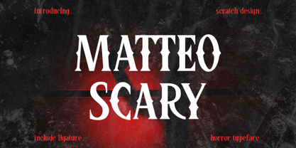 Please Welcome Matteo Scary. Matteo Scary is a horror and creepy font inspired by classic horror movie posters. It gives us the spirit of horror, spooky, frightening and suitable for poster movies, especially Halloween-themed, horror or thriller. This font is perfect also for branding, book cover, magazine header, and others which has horror or spooky vibes. What’s included? Uppercase & lowercase Number & Punctuation Ligatures Multilingual support Enjoy this font!
 - Unblocker by IKIIKOWRK,
$17.00 Proudly present Unblocker - Headline Type Unblocker emanates a bold personality that draws the eye and demands attention. Each letter strikes a perfect blend of boldness and finesse. The finely weighted strokes offer a sense of stability, making it an excellent choice for imposing headlines, titles, and banners that need to make an impact. Get a good offer & FREEBIE at www.ikiiko.com if you have any questions, you can contact us ikiikowrk@gmail.com
 - Under Terror by Sarid Ezra,
$15.00 Under Terror is a rough handwritten font with creepy vibes that will suitable for your next halloween poster. You can use this font for any project especially horror movie poster. With unique lowercase and uppercase, you can combine both to get more handwritten looks. You can access the underline from ligatures, just type underline + number(1-6) in the middle of the text. For example: TeR_2roR. This font also support multilingual.
 - Chi Town NF by Nick's Fonts,
$10.00A 1931 poster for the film The Man from Chicago provided the pattern for this quirky Deco delight. Although the fonts is all uppercase, tasty variants have been added in the lowercase positions, and all possible letter combinations have been kerned, so you can mix the forms freely. This font contains the complete Latin language character set (Unicode 1252) plus support for Central European (Unicode 1250) languages as well. - Brewski by Kaligra.co,
$19.00 Brewski is a vintage rustic typeface, with touch of many beautiful alternates character and ornament makes this font look stylist. Inspired by vintage Brewery packaging and Beer advertising from the early 20th century. It is perfect for vintage logo design, headlines or packaging design. Brewski designed with Stylistic Alternates and Contextual Alternate in some characters that allows you to mix and match pairs of letters to fit your design.
 - P22 Schumann Pro by IHOF,
$29.95 Schumann Pro is the very first issue of a long lost early 1960s typeface project done by Heinz Schumann while he was at the University of Graphics and Book Design in Leipzig, where he studied under German type design giants Albert Kapr and Herbert Thannhaeuser. This alphabet was never published as a typeface, but Schumann went on to design Stentor for Typoart a couple of years after graduating. Albert Kapr’s influence is unmistakable in this playful upright script, especially in the wide and breezy capital forms. Unique exit strokes and serif placement work together to define the bouncy rhythm of this face. This is an expressive original alphabet that successfully bridges the gap between expert calligraphy and everyday sign lettering. P22 Schumann Pro comes with over 500 glyphs, which include plenty of alternates, quite a few ligatures, and extended Latin language support. It is a very effective font when used sparingly in packaging, signage, posters and things designed to catch the eye.
 - Neatly Said by Mili + Wise,
$12.00 Introducing Neatly Said - sweet & versatile font family. Packed with hand-drawn letters, stylistic alternatives, and ligatures. Perfect for writing out uplifting quotes for instagram posts, wall art or greeting cards. It will also be there for you if you need to design some charming packaging or branding. Suitable for short and sweet quotes, as well as longer meaningful paragraphs. Designed and kerned with care and love to make using it a breeze. Neatly Said is packed with lovely features: many stylistic alternates for uppercase and lowercase ligatures multilingual support with accented characters for international designers Contact me with your order number to receive the illustrations: monika.torun@gmail.com
 - Cartia by Letterara,
$24.00 Indulge in the timeless allure of Cartia, a captivating serif typeface that effortlessly combines modernity with classic charm. With its unique style and contemporary look, this font is the perfect choice for a wide range of projects. From modern designs to retro vintage aesthetics, from branding to crafting, from wedding invitations to fashion and advertising, this font adds a touch of elegance to every creative endeavor. Let yourself be enchanted by its incredibly stylish and glamorous vibe, and unleash your creativity to create truly spectacular designs! With its PUA encoding, accessing all the enchanting glyphs is a breeze, allowing you to unlock endless possibilities for your artistic expression.
 - Romios by Letterara,
$21.00 Introducing "Romios", a modern serif and elegant font family with 10 unique styles. Each style features distinctive serifs and clean lines, resulting in a modern yet classic look. This font family is perfect for any project that requires a touch of sophistication, from editorial design to branding and advertising. The versatility of Romios font makes it an excellent choice for both digital and print media. With its PUA encoding, accessing the various glyphs and swashes is a breeze. Each style is carefully crafted to ensure legibility, making it an excellent choice for international audiences. Make your designs stand out with Romios font - the perfect balance of modern and classic typography.
 - Notes from Paris by PeachCreme,
$18.00 "Notes from Paris" will make your letters look très chic while still maintaining its functionality with easy-to-read letterforms. Furthermore, the comforting vibe of this font brings a touch of relaxation to your typography. The words flow with ease and grace, like a gentle breeze on a summer day in the city of love. So, whether you're crafting a logo design or wedding invite, "Notes from Paris" is a font that you must have for a chic and legible typographic journey. With 59 Opentype ligatures, this font blurs the line between script and handwriting, allowing for a seamless transition between letters and creating a truly genuine sensation.
 - Heater Bellamore by Create Big Supply,
$15.00 Introducing Heater Bellamore, a stunning Script Signature Handwriting Font that adds a touch of elegance to your designs. With its graceful curves and fluid strokes, this font captures the beauty of handwritten script. Whether you're creating a signature, logo, or any other project that requires a personalized touch, Heater Bellamore is here to impress. It features both uppercase and lowercase letters, numbers, and punctuations, offering versatility in your designs. This multilingual font ensures your message can reach a global audience, while ligatures and PUA encoding make accessing unique glyphs a breeze. Explore the full character set of Heater Bellamore and infuse your projects with a touch of sophistication.
 - DdaftT-lowercase - Unknown license

- dDAFTt-UPPERcase - Unknown license

- Loose Caboose NF by Nick's Fonts,
$10.00Break out the love beads and fire up the lava lamp! Here’s a fresh take on the Artone alphabet, designed by Seymour Chwast in the 1960s. Beefy, bodacious and bottom-heavy, this typeface keeps on truckin' along. Both versions of this font include the complete Unicode Latin 1252 and Central European 1250 character sets. - Terminator Cyr - 100% free

- akaDora - 100% free

- Hophus Roghus by Bombastype,
$35.00 Hophus Roghus is a Display Serif font, inspired by vintage brewery logos. This font family comes with a layer system: Regular, Inset and Shadow. You need to unlock the uppercase alternative character for the main course. This font will be suitable for your any design needs. Like branding, logo, sign, header, etc. So final question: what are you waiting for just looking around like that ? Buy this font asap so your urge will be fulfilled.
 - Hounslow by Device,
$29.00 Hounslow is closely related to Acton in structure, and takes the latter’s simple block construction into the third dimension. Three variants – open, solid and shadow – can be freely mixed in one setting for effect. Originally designed solely in the italic variant, an upright was added by request. A further unreleased set with a range of line weights was later commissioned by the New York Times magazine, and used extensively in their television supplement.


