3,461 search results
(0.019 seconds)
- Goldbarre by Greater Albion Typefounders,
$19.95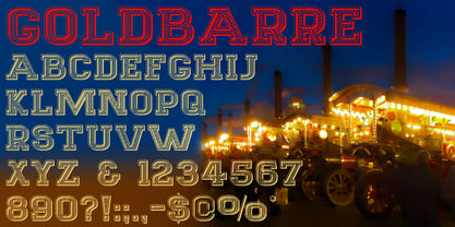 Goldbarre is a finely engraved slab serif face in the spirit of ‘between the wars’ commercial confidence. It’s a solid and dependable face of distinction for use on certificates and posters which need to convey an emphatic yet refined message. The letterforms of Goldbarre combine finely hatched shading with and embossed, three-dimensional, quality. The utility of the family is further enhanced with Goldbarre No 2 - a solid shaded face, Goldebarre No 3 - an open embossed face, and Goldbarre No 4 - a basic black slab-serif face.
 - Whomp by Sudtipos,
$59.00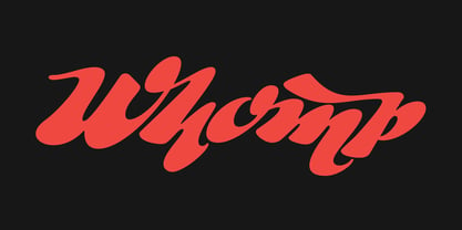 Whomp takes its inspiration from the work of an American master in sign painting and alphabet manipulation: Alf Becker . In 1932, Becker began designing a series of alphabets to be published in Signs of the Times magazine at the rate of one alphabet per month. Nine years later, 100 of those alphabets were compiled in one book that became an enormous success among sign painters. In the late 1990s and early 2000s, many Alf Becker alphabets were digitized with blurbs that falsely credit an “Alf Becker typeface”. Alf Becker was not really a typeface kind of guy. He was more of a calligrapher and sign painter. His alphabets were either incomplete or full of variations on different letters, and didn't become typefaces until the digital era. This particular Becker alphabet was quite incomplete. In fact, it wasn't a showing of an alphabet, but words on a poster. Alejandro Paul took the challenge of drawing, digitizing, restructuring, and finally building a complete usable typeface from that partial alphabet. He then extended his pleasure by once again playing with the wonderful possibilities of OpenType. Whomp comes with more than 100 alternates, tons of swashy endings and ligatures, all built into the font and accessible through OpenType palettes in programs that support such features. This is the in-your-face kind of font that stands among other Becker-based alphabets as paying most homage to the vision of this great American artist who saw letters as live ever-changing beings. Whomp is right at home when used on packaging, signage, posters, and entertainment related products.
 - Bigfoot by K-Type,
$20.00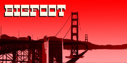 Bigfoot K-Type is a whole font based on the slab capitals used by Victor Moscoso in his 1960s psychedelic rock posters. Capital A alternatives can be found at keystrokes ± and §.
 - Cherrywood JNL by Jeff Levine,
$29.00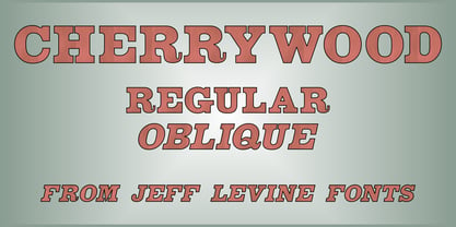 Based on the classic “Columbian” from the William H. Page Wood Type Company (circa 1870), Cherrywood JNL is a bold slab serif type design available in both regular and oblique versions.
 - Nought by Fype Co,
$16.00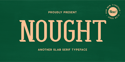 Nought is another slab serif typeface, It is a display font with vintage and condensed look that perfect for branding projects, advertisements, product packaging, product designs, label, header, and any projects.
 - Fibonacci Heap by ErlosDesign,
$15.00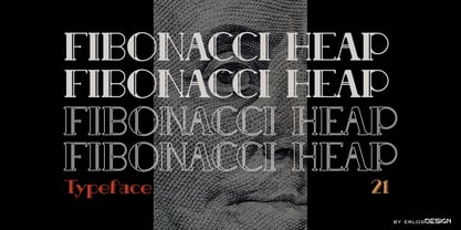 Fibonacci Heap font is a decorative slab serif, inspired typeface in modern performance. This font includes 2 style Reguler and Outline. It is perfect for logos, posters, headlines, apparel and more.
 - Rockwell WGL by Monotype,
$92.99Rockwell font appeared with Monotype Design Studio in 1934, a time which saw the return to popularity of slab serif fonts. Rockwell's strong and harmonious characters make this font particularly flexible. - Antique Central by Aboutype,
$24.99A linear slab serif design consisting of fifteen styles. The design has a large x-height with short descenders and ascenders. Antique Central requires subjective text and display kerning and compensation. - Filmmaker by Vertigo,
$20.00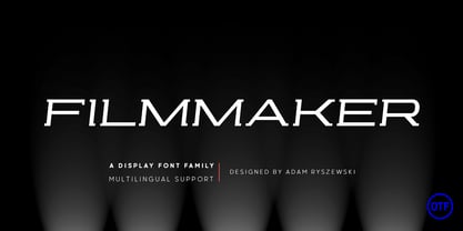 The Filmmaker is a wide, slab serif, display font with four varieties. It works well for modern, dynamic projects, logotypes, films, posters, billboards, press advertisements, websites, packaging. It provides multilingual support.
 - Revers by GRIN3 (Nowak),
$19.00Revers is a rough, grunge slab serif based on newspaper headlines from the 1950s. Language support includes Western, Central and Eastern European character sets, as well as Baltic and Turkish languages. - National Champion Line Series by Kyle Wayne Benson,
$4.00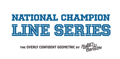 National Champion is the overly confident geometric slab that comes in four weights and twelve line styles. He's got a 3/4 cap lowercase, lots of language options, and opentype fractions!
 - Trolltunga by High Peak,
$25.00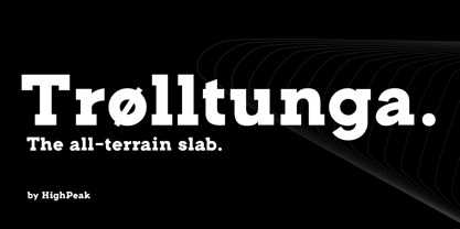 A unique slab serif with strong shapes give it an unmistakable character and charm. Every letter has been designed with passion and the family comes with lots of opentype features. Enjoy!
 - Moving Van JNL by Jeff Levine,
$29.00Moving Van JNL is a classic sign painter's block Roman with angled [instead of rounded] corners and slab serifs. This style of lettering was most popular in the 1920s and 1930s. - Apollo13Condensed - Unknown license

- Too Late - Unknown license

- Bonnet - Unknown license

- Neige - Unknown license

- Dekalb by Design is Culture,
$35.00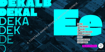 The idea for the typeface Dekalb was born in 2013 after a day of photographing signage, murals and graffiti around Dekalb and Wyckoff avenues in Bushwick, Brooklyn. The initial drafts of the letterforms were first made into a single ultra-weight font that I used while working as the Creative Director for Sneaker News Magazine. After having made its first appearance in Sneaker News, I decided to expanded Dekalb to an eight style family.
 - Courier New OS by Monotype,
$50.99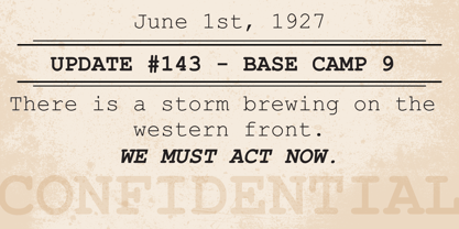 Designed as a typewriter face for IBM, Courier New was re drawn by Adrian Frutiger for IBM Selectric series. A typical fixed pitch design, monotone in weight and slab serif in concept.
 - Thinly Disguised JNL by Jeff Levine,
$29.00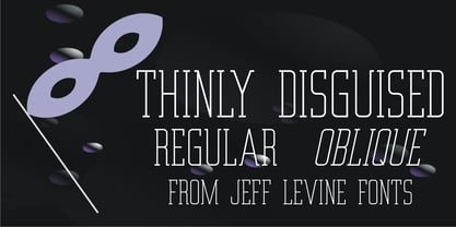 The hand lettered thin, variable width slab serif text appearing on the cover of a souvenir photo book for the 1933 Chicago World's Fair Exposition is the basis for Thinly Disguised JNL.
 - Martini by Katatrad,
$29.00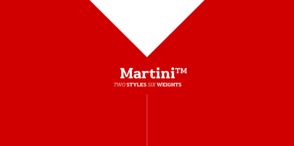 Martini™ typeface is a slab-serif based typeface that included six weights, two styles from ExtraLight to Black with advance typographical support with features such as discretionary ligatures and alternate characters.
 - Pipe Dream by Callout,
$14.00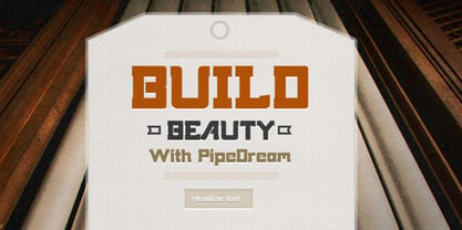 PipeDream is a thick, slab-serif typeface. It is perfect for short, attention grabbing headlines. Inspired by 1990's computer games this bold face is a force that refuses to be ignored.
 - Magistan by Letterena Studios,
$9.00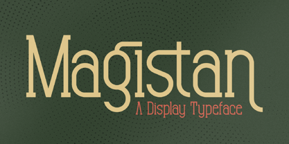 Magistan is a distinct and vintage styled slab serif font. It will create elegant & luxurious logos, books or movie title designs, fashion brands, magazine covers, clothes, lettering, quotes, and so much more.
 - Rima by K-Type,
$20.00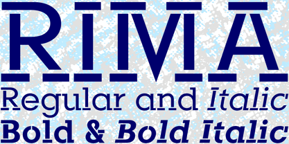 Rima is a stencil display face with imposing slab serifs, designed to suggest strength, confidence, expertise and efficiency. Regular and Bold weights are included along with two handy italics (optically corrected obliques).
 - Amoba by Linecreative,
$16.00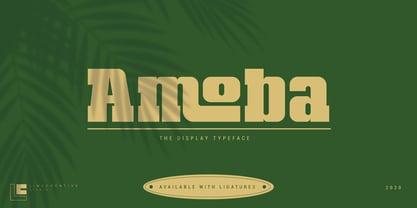 Amoba is a very thick slab-serif font type. This font has supported supporting languages: Latin Western Europe and also comes with uppercase, lowercase, and ligature, So it gives design without limits
 - Serifa by Linotype,
$29.99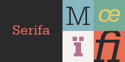 This slab serif font of Adrian Frutiger is extremely legible and robust, making it suitable for most any use. Based on the forms of Univers, Serifa makes a harmonious and timeless impression.
 - After 5 by Our House Graphics,
$17.00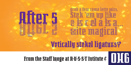 From the basement labs and after hours lounge of R?U?S?S?T Institute, we present After 5. With a somewhat formal (ha ha) yet warm, friendly feel, its normally calm, even tempered and sensible rhythm takes on the syncopated, jazzy beat that goes along with too many martinis when discretionary ligatures are turned on. A friend once asked, was I trying to design a font that looked sort of �Korean?� I said no, I was trying to mess up the Latin alphabet. So, here it is: After 5, a bold, upright condensed slab-serif display typeface with a mixed-up attitude. Complete with bold roman and matching italics. This attention getting font is ideal for Posters, headlines, Packaging and logos.
 - Passeig B - Unknown license

- Passeig A - Unknown license

- ChunkFive Roman - 100% free

- BigMummy - 100% free

- Geometric Slabserif 712 by ParaType,
$30.00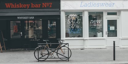 The Bitstream version of Monotype Rockwell, 1934. Twentieth-century design influence is revealed in strokes of more even weight than in the original nineteenth-century Egyptians or Slab Serifs. Rockwell is a prime example of this twentieth-century approach. It seems to be a simple Constructivist geometric sans with strong square slab serifs added to. Angular terminals make its sturdy design particular sparkling. It is a strong face for headlines and posters, and is legible in very short text blocks. Cyrillic version was developed at ParaType in 2000 by Isay Slutsker and Manvel Shmavonyan.
 - Wartech by Linecreative,
$16.00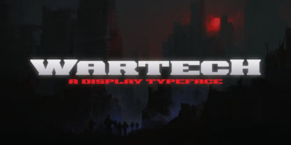 Wartech slab serif inspired by vintage style with a touch of classic style. This font is built with solid foundations, strong visuals, old-school movement, and a modern minimalist style. Wartech is perfect for Jersey , athletic, poster, branding projects, Logo design, Clothing Branding, product packaging, for magazine titles. for something with the theme of sports, album title, etc What you get dear, you will get : Wartech- A clean Slab serif font including Upper & Lowercase characters(ALL CAPS), Ligatures Character Supports Multi linguage (Latin Western Europe), Numbers and Punctuation
 - Kettering 105 by Talbot Type,
$12.99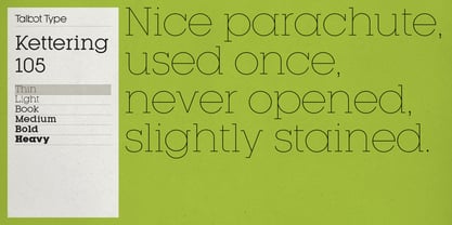 Kettering 105 is inspired by the classic, geometric slab-serifs such as Lubalin, but has shallower ascenders and descenders for a more compact look. It's a versatile, modern slab-serif, highly legible as a text font and with a clean, elegant look as a display font at larger sizes. It includes old style non-aligning (lower case) numbers, both proportional and tabular, as well as accented characters for Central European languages. The Kettering 105 family comprises of six weights and is closely related to Kettering 205, its more intensely Deco flavoured cousin.
 - Home Track by Illushvara,
$15.00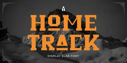 Hello, Home Track is a display slab font. More explore the basic slab font speciality the uppercase mix with a vintage adventure style and make an unique alternates line. Will make your design strong, bold and stand out. With playful line this font perfects for headline, poster film, banner product, website, logo labels or any type of advertising purpose. This font support Multilingual Languages. FEATURES : Uppercase Number Punctuation Multilingual PUA Encode Opentype Character Alternates FILES INCLUDED : Home Track. Otf If you have any question, don’t hesitate to contact me. Happy Designing !!! Thank You, Illushvara Design
 - Kyhota by Ingrimayne Type,
$14.95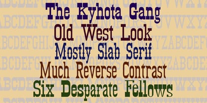 The six typefaces of the Kyhota group all have an “Old West” look to them. KyhotaOne has very thick slab serifs compared to KyhotaTwo. KyhotaBarbed is more condensed than either and has little barbs on the verticals, something that was a feature of a number of nineteenth century typefaces in this style. KyhotaFezdaz is condensed, without barbs, and with the slab serifs replaced with a flare serif. KyhotaBigBottom and KyhotaBigTop play with the weighting of the serifs, with one (either top or bottom) very thin and the other very thick.
 - Sutro by Parkinson,
$25.00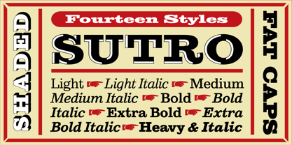 My affection for Slab Serifs began in the early 1960s in Kansas City with Rob Roy Kelly and his fabulous collection of wood type. In the 1970s tried to re-create a Nebiolo Egiziano for Roger Black. Again for Roger, in the 1980s I designed a Slab Serif logo for Newsweek Magazine. Finally, in 2003, designed the Sutro Family. There were things I didn't like about it, so when I did Version 2 for Open Type, I changed it around a little, making it a much nicer Sutro.
 - Jutlandia Pro by David Engelby Foundry,
$12.00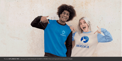 Jutlandia Pro is a redesign of Jutlandia Slab. About the Jutlandia font family: made for straightforward and functional typographic design. Its design is rooted in clarity and legibility which is the slab serif tradition. The unpretentious, yet sturdy and functional visual expression of the regular form, and the subtle bold and italic forms is an homage to Jutland – the Cimbrian Peninsula of Denmark and my birthplace. It's suitable for package design, logotype, poster design, editorial design and anything you can dream of! Great for tons of text copy as well. Enjoy!
 - Schuss Serif Pro by typic schuss,
$42.56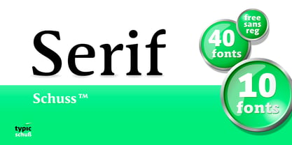 I was working about 10 years exclusively for a type company. Based on my experiences, I built this superfamily. Schuss™ Sans PCG is a humanistic sans-serif with a little contrast. Small Caps, greek and cyrillic are included. Also tab, prop, lining, old style and small cap figures. It's a typeface with clear and open characters. All complicated shapes are cleaned and simplified with a bit elegance. Schuss™ Slab Pro is a slab serif, based on the Schuss™ Sans. Schuss™ News Pro is the modeled style between Schuss™ Slab Pro and Schuss™ Serif Pro. Schuss™ Serif Pro is the antiqua shape. Additionally all serifs are cleaned up. There is just one-side-serif in the "n" for example. Tab figures (except small caps), mathematical signs and currency symbols have a width system accross all styles and weights.
 - Desmo by Craft Supply Co,
$20.00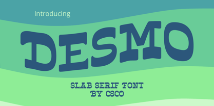 Introducing Desmo Reversed Contrast Slab Serif Font Unique Design Meet Desmo Reversed Contrast Slab Serif Font. Its reversed contrast sets it apart. Thick horizontal lines and thin verticals create a striking look. This design choice grabs attention, perfect for impactful displays Versatile Display Font Desmo shines in display settings. Whether for headlines, posters, or advertising, it stands out. Its bold features ensure readability from a distance. Moreover, its unique style makes every design engaging. Engaging Typography Desmo’s typography is designed to captivate. Its slab serifs add a touch of elegance. The font’s balanced spacing ensures clarity in every word. Therefore, it’s ideal for brands aiming to make a statement. Accessibility and Ease of Use This font is accessible to a wide range of users. Its simplicity avoids complex vocabulary. Easy to install and use, Desmo suits various design projects. Additionally, its compatibility with multiple software enhances its versatility.


