6,021 search results
(0.031 seconds)
- Gumboots by Hanoded,
$15.00 I bought a pair of green gumboots (or Wellingtons) the other day. I have a little wilderness outside and it is quite muddy, so I thought a pair of boots would be a good buy. Gumboots is a handmade comic font. It comes in a regular and a fat style and you can use it for just about anything that needs a bit of comic relief.
 - The Mordent by Ironbird Creative,
$15.00 The Mordent is a hand drawn display typeface with organic and vintage feel. Comes with regular, stamp and dingbats styles. Suitable for any graphic designs such as branding materials, t-shirt, print, logo, poster, t-shirt, quotes .etc We hope you enjoy the font, please feel free to comment if you have any thoughts or feedback. Thanks for purchasing and have fun! Regards, Ironbird Creative
 - Skeleton Slab by Studio K,
$45.00 Skeleton Slab brings a new elegance to a classic form. I was thinking of calling it Ozymanidias, after Shelley’s poem, because it evokes memories of ancient runic inscriptions, but then I thought that was maybe a bit pretentious, and I decided I'd keep it simple and descriptive. Besides, I wasn't sure how to spell Ozymandias! Skeleton Slab has small caps in place of lower case.
 - Frankest by Letterhend,
$14.00 Frankest is a vintage styled font duo. It's perfect for logotype, headlines, apparel, and poster with a vintage feel. Features: Uppercase Lowercase Numerals & Punctuations Ligatures, stylistic alternate, etc Multilingual We hope you enjoy the font, please feel free to comment if you have any thoughts or feedback. Or simply send me a PM or email me at letterhend@gmail.com. Thanks for purchasing and have fun!
 - Ruina One by RodrigoTypo,
$25.00 Ruina One is a Rough and distressed font, but at the same time very gestural. It is especially great for youth and child graphics, but can be applied in many other domains too. Ruina One contains various ligatures.
 - Anise Seeds by Gleb Guralnyk,
$13.00 This vintage font set named Anise Seeds includes two versions — textured rough and smooth clean. This capital decorative typeface is perfect for label design and lettering compositions. West European languages support is available. Thank you and have fun!
 - Brumder by Trustha,
$17.00 Brumder is a condensed sans serif typeface. Inspired by Industrial style. Comes in several styles namely regular, round, rounded, rough, and stamp, with matching oblique, making it 10 styles. Brumder is perfect for branding, headlines, and many more.
 - Header Marker by Garisman Studio,
$19.00 Header Maker combines rough and bold curves with a fresh urban edge; delivering a stylish script which is guaranteed to add an eye-catching appeal to your logo designs, brand imagery, quotes, product packaging, merchandise & social media posts.
 - Rit Graph by Stawix,
$25.00 Rit Graph has been revived from old style font template often used by architects or engineers. The design of Rit Graph is casual yet sophisticate with a slanted proportion and little details of rough edges from writing tools.
 - Mortadella by Josh Grzybowski,
$19.99 Mortadella is a hand drawn, burly looking OpenType sans-serif font with just the right rough edges and simple stylistic alternatives . Designed as a display font Mortadella works great for identity design and publication headers and sub-headers.
 - Brotherland by Dikas Studio,
$12.00 Brotherland is a handdrawn serif typeface wit a rough and vintage character inspired from American Vintage typography. Brotherland comes with 4 styles: Regular, Italic, Aged, Italic Aged. Perfect for logos, badges and any project needing a vintage touch.
 - Ikuta Sans by Leo Kuroshita,
$10.00 This is a geometric font suitable for modern designs. designed according to strict geometry. It's geometric, but it has also humanly rough styles. and added various alternative glyphs. includes ligatures and alternate characters inspired by famous geometric fonts.
 - Rockies by Subectype,
$17.00 Rockies is a Rough display font. It comes in a Regular and an italic version, so take your pick! This enchanting font is quirkiness and authenticity and will turn any creative idea into a true standout. Multilingual support.
 - Giambattista by Wiescher Design,
$39.50 Giambattista is a long-time project of mine finally come to an end. After redesigning all of Giambattista Bodoni's work and then some additional cuts I started a long time ago with this Non-Bodoni Bodoni. The idea came to me while redesigning the original Chancellerosa (chancery). I thought Bodoni just didn't have the right approach to a chancery, this was just not his cup of tea! Maybe that is why he never used the Chancellerosa very much for his own printshop in Parma. So I thought someone has to design a script, that looks like Bodoni could have designed it but is more lively than his. Over the years I have been working on and off on the face and it turned out to become three typefaces which can be freely mixed. Here is my modern version of a script in the style of Giambattista, meant as an hommage, I called it Giambattista. Your modern scribe Gert Wiescher
 - Mighty Star by Typefactory,
$14.00 Mighty Star is a fun and rough serif font useful for a wide variety of designs, its charming look will definitely make your crafts more fabulous! Great for your personal needs, promotional projects, gifts, scrapbooks, printing, and much more.
 - Henceforth by Hanoded,
$15.00 Henceforth is a hand-drawn, all caps didone-style typeface. It is a little rough, a little uneven, but lively and elegant as well. Comes with an abundance of diacritics and, lo and behold, some end-ligatures as well.
 - Fire Sauce by Vozzy,
$10.00 Introducing a vintage look label font named "Fire Sauce". This layered family includes six styles - Base, Rough, Outline, Fill, Shadow and Shine. This font will be great on any retro design like posters, t-shirts, labels, logos, and more.
 - Midnight Sun by Hanoded,
$15.00 Midnight Sun, despite its rough look, was carefully painted. I used a very cheap brush with stuck-together bristles to get that ‘eroded’ look. Midnight Sun comes with double letter ligatures and some really cool stylistic alternates as well.
 - Quatrain by Hanoded,
$15.00 Quatrain is a hand-drawn, all caps typeface based on Bodoni. It is a little rough, a little uneven, but lively and elegant as well. Quatrain looks good on packaging, or in headlines. Comes with an abundance of diacritics.
 - Shavano by Dan Cotton Lettering,
$12.00 Shavano is a bold, smooth-flowing typeface based on pointed brush script. It comes in a clean-edged and a rough style. It is ideal for branding, packaging, headlines, and apparel. This font comes with ligatures, swashes, and alternates.
 - Riana by Autographis,
$39.50 Riana is handwritten, scanned and then carefully worked over to keep the rough touch and the typical "fountainpen" look. The result is a very lively, expressive font. To me it has an Existentialist touch, but don't ask me why.
 - The FD Deer Deer font, crafted by Font Duster, is an artistic typeface that beautifully captures the essence of spontaneity and creativity. Its design is characterized by free-flowing and loosely str...
- Neue Frutiger Paneuropean by Linotype,
$79.00During planning for the new Roissy Charles de Gaulle airport in Paris at the beginning of the 1970s, it was determined that the airport's signage system had to include the clearest and most legible lettering possible. The development of all signage was put into the hands of Adrian Frutiger and his studio. The team carried out their task so effectively that a huge demand for their typeface soon arose from customers who wanted to employ it in other signage systems, and in printed materials as well. The Frutiger® typeface not only established new standards for signage, but also for a range of other areas in which a clear and legible design would be required, especially for small point sizes and bread-and-butter type. The typeface family that which emerged as a result of this demand was added into the Linotype library as "Frutiger" in 1977. Frutiger Next, created in 1999, is a further development of Frutiger, not necessarily a rethinking of the design itself. It was based on a new concept, the most obvious visual characteristics of which is the larger x-height, as well as a more pronounced ascender height and descender depth for lower case letters in relation to capitals. This new design created a balanced image and included considerably narrower letterspacing. Frutiger Next meets the demand for a space-saving, modern humanist sans. 2009's Neue Frutiger is a rethink of the 1977 Frutiger family, now revised and improved by Akira Kobayashi in close collaboration with Adrian Frutiger. Despite the various changes, this "New Frutiger" still fits perfectly with the original Frutiger family, and serves to harmoniously enhance the weights and styles already in existence. The perfect mix, guaranteed Neue Frutiger has the same character height as Frutiger. As a result of this, already existing Frutiger styles can be mixed with Neue Frutiger where necessary. Likewise, Neue Frutiger is perfect for use alongside Frutiger Serif. Newly added are the "Neue Frutiger 1450" weights. Especially for the requirements of the newly released German DIN 1450 norm we have built together with Adrian Frutiger specific weights of the Neue Frutiger. The lowercase l" is curved at the baseline to better differentiate between the cap "I", additionally the number "0" has a dot inside to better differentiate between the cap "O", and the number "1" is now a serifed 1. The font contains additionally the origin letterforms from the regular Neue Frutiger font which can be accessed through an Opentype feature." - Neue Frutiger Cyrillic by Linotype,
$89.00During planning for the new Roissy Charles de Gaulle airport in Paris at the beginning of the 1970s, it was determined that the airport's signage system had to include the clearest and most legible lettering possible. The development of all signage was put into the hands of Adrian Frutiger and his studio. The team carried out their task so effectively that a huge demand for their typeface soon arose from customers who wanted to employ it in other signage systems, and in printed materials as well. The Frutiger® typeface not only established new standards for signage, but also for a range of other areas in which a clear and legible design would be required, especially for small point sizes and bread-and-butter type. The typeface family that which emerged as a result of this demand was added into the Linotype library as "Frutiger" in 1977. Frutiger Next, created in 1999, is a further development of Frutiger, not necessarily a rethinking of the design itself. It was based on a new concept, the most obvious visual characteristics of which is the larger x-height, as well as a more pronounced ascender height and descender depth for lower case letters in relation to capitals. This new design created a balanced image and included considerably narrower letterspacing. Frutiger Next meets the demand for a space-saving, modern humanist sans. 2009's Neue Frutiger is a rethink of the 1977 Frutiger family, now revised and improved by Akira Kobayashi in close collaboration with Adrian Frutiger. Despite the various changes, this "New Frutiger" still fits perfectly with the original Frutiger family, and serves to harmoniously enhance the weights and styles already in existence. The perfect mix, guaranteed Neue Frutiger has the same character height as Frutiger. As a result of this, already existing Frutiger styles can be mixed with Neue Frutiger where necessary. Likewise, Neue Frutiger is perfect for use alongside Frutiger Serif. Newly added are the "Neue Frutiger 1450" weights. Especially for the requirements of the newly released German DIN 1450 norm we have built together with Adrian Frutiger specific weights of the Neue Frutiger. The lowercase l" is curved at the baseline to better differentiate between the cap "I", additionally the number "0" has a dot inside to better differentiate between the cap "O", and the number "1" is now a serifed 1. The font contains additionally the origin letterforms from the regular Neue Frutiger font which can be accessed through an Opentype feature." - Neue Frutiger 1450 by Linotype,
$71.99 During planning for the new Roissy Charles de Gaulle airport in Paris at the beginning of the 1970s, it was determined that the airport's signage system had to include the clearest and most legible lettering possible. The development of all signage was put into the hands of Adrian Frutiger and his studio. The team carried out their task so effectively that a huge demand for their typeface soon arose from customers who wanted to employ it in other signage systems, and in printed materials as well. The Frutiger® typeface not only established new standards for signage, but also for a range of other areas in which a clear and legible design would be required, especially for small point sizes and bread-and-butter type. The typeface family that which emerged as a result of this demand was added into the Linotype library as "Frutiger" in 1977. Frutiger Next, created in 1999, is a further development of Frutiger, not necessarily a rethinking of the design itself. It was based on a new concept, the most obvious visual characteristics of which is the larger x-height, as well as a more pronounced ascender height and descender depth for lower case letters in relation to capitals. This new design created a balanced image and included considerably narrower letterspacing. Frutiger Next meets the demand for a space-saving, modern humanist sans. 2009's Neue Frutiger is a rethink of the 1977 Frutiger family, now revised and improved by Akira Kobayashi in close collaboration with Adrian Frutiger. Despite the various changes, this "New Frutiger" still fits perfectly with the original Frutiger family, and serves to harmoniously enhance the weights and styles already in existence. The perfect mix, guaranteed Neue Frutiger has the same character height as Frutiger. As a result of this, already existing Frutiger styles can be mixed with Neue Frutiger where necessary. Likewise, Neue Frutiger is perfect for use alongside Frutiger Serif. Newly added are the "Neue Frutiger 1450" weights. Especially for the requirements of the newly released German DIN 1450 norm we have built together with Adrian Frutiger specific weights of the Neue Frutiger. The lowercase l" is curved at the baseline to better differentiate between the cap "I", additionally the number "0" has a dot inside to better differentiate between the cap "O", and the number "1" is now a serifed 1. The font contains additionally the origin letterforms from the regular Neue Frutiger font which can be accessed through an Opentype feature."
 - Fidelma by Patricia Lillie,
$29.00Can't decide whether you're feeling archaic or modern today? Try Fidelma. Fidelma is drawn entirely with straight lines, no curves, giving it a rough but still readable look.Includes four fonts: Regular, Bold, ExtraBold, and a nifty set of Drop Caps. - Bohemian Hunter by Hustle Supply Co,
$14.00 Bohemian Hunter Bohemian Hunter is an All-Caps contemporary display / spur serif typeface. It comes packed with 9 different font files including 3 weights. What's included? 9 Font Files Light, Regular, Bold Clean, Rough, Stamp Versions Western European Characters Included
 - Childos Arabic by NamelaType,
$29.00 The sibling of Childos, with with additional Arabic glyphs for more international fun. Handwritten rough sans serifs style, as well as the development of free and attractive ligature to fill the space between letters and make playful children feel designs.
 - Roamer by Loreley Design,
$56.00 The Roamer is big, bold and ready to be used by designers all over the globe. The appearance is quite rough and used like weathered wood or paint on concrete. It is perfect for big headlines or bold text passages.
 - Dolce Caffe 3D by Resistenza,
$39.00 Dolce Caffe was a handwritten font designed in the 2011 inspired in some berliner menu. Now we developed a 3D, 3D Rough and a Shadow version. They are very legible and high in style and carefully constructed all-uppercase letters.
 - Rockstyle by Letterafandi Studio,
$16.00 Rockstyle is a natural, dry brush display font. It is a tough-looking font with a strong brush touch, ready to rock every design you are willing to create. It’s perfect for logos, quotes, posters, clothing, and so much more!
 - Matrole by Viaction Type.Co,
$15.00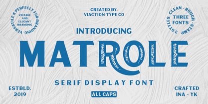 Matrole is a Display Serif with 3 styles: clean, rough and stamp, nice applied in various products. Complete with multilingual characters and stylistic alternates. It is suitable for quote, clothing design, vintage logo, label, poster, packaging design and other designs.
 - Buttercell Script by Wacaksara co,
$16.00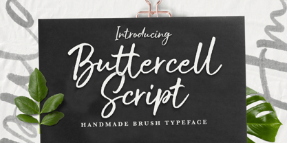 Buttercell Script is a hand brush script available in clean and rough edge versions. This font is great for your next creative project such as Logotype, printed quotes, invitations, cards, product packaging, headers, Letterhead, Poster, Apparel Design, Label, and etc.
 - Treadstone by Rook Supply,
$14.00 Treadstone gives a modern twist on the athletic, college style font. This font family includes versions with rounded edges, rough edges and grunge effects, each of which has its own character and charm. Treadstone works great for headlines, titles and logos.
 - Pacific Northwest Letters by Cultivated Mind,
$29.00 Pacific Northwest Letters is a fun, handwritten font by Cultivated Mind. Pacific Northwest has been carefully hand painted and comes in two styles (Regular/Rough). This font includes a set of lower case letters and Pacific Northwest hand painted Labels B.
 - CaliCholo by Graffiti Fonts,
$19.99The CaliCholo font is inspired by the wide array of Chicano styles seen on the bay area and southern California streets. This simple representation is natural & rough in emulation of hand written letters using spray paint. Two alphabets, numbers, symbols. - South Montana by Rillatype,
$13.00 Introducing, South Montana. South Montana is a bold slab serif that comes with regular and rough style. this font is perfect for every project. suitable for branding logo, badge design, or apparel design. this font also comes with multilingual support.
 - TOMO Bossa by TOMO Fonts,
$12.00 TOMO Bossa is a cartoon inspired sans serif, ideal for kids related stuff, in print or digital, like posters, video, websites or books! This beauty also speak Cyrillic! The complete family comes with a Black and Black Rough style. Enjoy!
 - Stavol by DonyaDesign,
$19.00 Stavol is a rough brush script font with a clear style and dramatic movement. This font is great for your next creative project such as logos, printed quotes, invitations, cards, product packaging, headers, Logotype, Letterhead, Poster, Apparel Design, Label, and etc.
 - Shadowlawn JNL by Jeff Levine,
$29.00 If you like a rough-hewn, rugged and vintage typeface, then Shadowlawn JNL will certainly please you. Re-drawn from vintage examples of a hand-cut wood type, the rustic charm of this typeface brings a reminiscence of Old West themes.