10,000 search results
(0.032 seconds)
- Marlivane by Keristyper Studio,
$14.00 Marlivane has a strong characteristic sports display font that is suitable for Esports or sports activity. This font is good for logo design, Social media, Movie Titles, Books Titles, short text even long text letters, and good for your secondary text font with sans or serif. Featured: Standard Uppercase & Lowercase Numeral & Punctuation Multilingual : ä ö ü Ä Ö Ü ß ¿ ¡ Alternate & Ligature PUA encoded We recommend programs that support the OpenType feature and the Glyphs panel such as Adobe applications or Corel Draw. so you can use all the variations of the glyphs. Hope you enjoy our fonts!
 - Quwen King by Product Type,
$17.00 Who says design has to be boring? The Quwen King font is the secret key to bringing power, glitz, and gaming style to any of your projects. Quwen King is the perfect solution for projects that require a unique touch. From powerful movie displays to exciting games and stunning streaming events, this font captivates and dominates in a variety of languages. With Quwen King, you don't just get a font, you get the tools to bring creativity, charm, and fun to your designs. Enhance your projects with Quwen King Font now, and enjoy amazing results that will make your designs stand out!
 - Vigofam by Keristyper Studio,
$14.00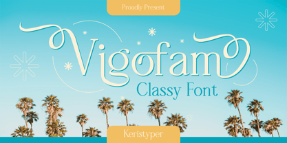 Vigofam serif typeface is an elegantly themed font that has a dynamic serif style. This font is good for logo design, Social media, Movie Titles, Books Titles, short text even long text letters, and good for your secondary text font with sans or serif. **Featured:** * Standard Uppercase & Lowercase * Numeral & Punctuation * Multilingual : ä ö ü Ä Ö Ü ß ¿ ¡ * Alternate & Ligature * PUA encoded We recommend programs that support the OpenType feature and the Glyphs panel such as Adobe applications or Corel Draw. so you can use all the variations of the glyphs. Hope you enjoy our fonts!
 - Iki Mono by CAST,
$45.00 Iki Mono is a multifaceted monospaced typeface designed for publishing and coding. Its sans serif structure displays some letterforms (as well as a degree of contrast) that are reminiscent of 19th-century grotesques, while in the non-oblique versions the letters have been very slightly slanted leftwards. Like typewriter typefaces Iki Mono has to cope with the limitations of a width system that forces shapes into a specific space. This extensive type family of forty weights and styles – from Compressed Thin to ExtraExpanded Bold, including their slanted versions – takes its name ‘Iki’ from the Japanese word for breath.
 - Roadie PB by Pink Broccoli,
$16.00 Roadie was inspired by a 1981 Hallmark card with lettering that was full of frolicking fun. Filled with a childish persona and a playful bounce, this Roadie has a lot to offer. As with some of my previous type designs, it is a typographic dance, wonderfully skipping across designs, surprising with each letter typed. With an extensive character set, and clean sharpie marker-like look, Roadie is a joy to typeset with, and it comes with a stylistic alternates feature that shuffles the Capitals and lowercase that share similar unicase forms that add to the quirky playfulness.
 - CamingoSlab by Jan Fromm,
$45.00 A sturdy and solid presence, CamingoSlab is defined by its heavy serifs, low stroke contrast and elliptic curves. Yet it retains a light touch, and feels vivid and friendly, thanks to the humanistic tone that derives more from handwriting than from strict construction. Special attention has been paid to compatibility with the other members of the Camingo series — With their consistent line heights, an equal grey value and the same formal language it can be seamlessly combined with CamingoDos and CamingoMono. CamingoSlab comes with a Pro version that contains small caps, ligatures, 10 different figure sets, stylistic alternates and two sets of arrows.
 - Valeson by insigne,
$34.00 Feel the funk with the retro-inspired Valeson. This groovy mix of the ‘70s and ‘80s has an upbeat rhythm of its own that will make your project boogie. It’s loads of fun with its swashy, calligraphic twist. Push it to the max with plenty of weights. Denser weights are brawny and robust, fantastic for headlines, while medium weights are swell for short bits of text. With all its options, this fun, throwback personality is still streamlined and plenty useful for today’s jobs. It’s loads of fun with its swashy, calligraphic twist. Production assistance by Lucas Azevedo and ikern.
 - Trimo by Khoir,
$15.00 Introducing, Trimo, the clean and simple Modern Serif. This font has an attractive, clean and simple alternative and several ligatures that enhance it, making your font / logo even more attractive. This font has a thick and thin shape, making this font look unique but doesn't leave an elegant impression. This font is especially suitable for logos, invitations, novels, books, magazines, labels, greeting / wedding cards. So what are you waiting for! What's included? Uppercase Characters Lowercase Characters Support 75+ Language So what are you waiting for? immediately purchase this font, feel free to comment, or send me my PM. Thank you for seeing
 - Seizieme by URW Type Foundry,
$49.99 In 1905 the Parisian typefounders Peignot & Cie. issued their Série 16. This clear roman with a large x-height and an italics soon enjoyed a great popularity. Coen Hofmann’s drawings made for the Seizième follow the original Peignot Série 16 as close as possible. The regular font has the original small caps, while all members of the family are enhanced, next to the ranging ones, with old style figures. Also superior and inferior figures are available. The original series did not have a bold version. This was, however, carefully drawn for this digital rendition. The Série 16 and its versions for the composing machines were much used for the type setting of scientific publications. That is why a comprehensive set of mathematical and sundry characters are added to the Seizième fonts. Next to the accented characters for the several West and East European languages the Seizième was also enhanced with a Cyrillic, also available in regular, italic and bold versions.
 - Bright Star Script by Sulthan Studio,
$8.00 Bright Star is a signature that comes in a natural style, and it also comes with the usual script style, plus beautiful swashes on the lowercase characters at the beginning and end. this will create many choices to use according to your wishes. Bright Star, The alternative characters were divided into several Open Type features such as Stylistic Alternates, and Ligature. The Open Type features can be accessed by using Open Type savvy programs such as Adobe Illustrator, Adobe InDesign, Adobe Photoshop Corel Draw X version, And Microsoft Word. And this Font has given PUA unicode (specially coded fonts). so that all the alternate characters can easily be accessed in full by a craftsman or designer. Bright Star Features : Uppercase & Lowercase International Languange & Symbols Support Punctuation & Number PUA Unicode Range Standard Ligatures Discretionary Ligatures Stylistic Alternates Stylistic Set 01 Character
 - Mr Palker by Letterhead Studio-YG,
$35.00 A slab serif Mr Palker and grotesque Mr Palkerson build one superfamily together. These are blank types. In a way even the display ones. Typefaces for newspapers, announcements, cheap advertising and police posters. Mr Palker and Mr Palkerson will turn every language into a fence. And due to six types of faces one can choose what material should the fence be made from — from Thin steel rods to the Black stone blocks. In their simplest appearance Mrs P&P are intended for the solid blank composition in victorian or industrial style. They are quite decent, a bit old-fashioned slab serif and grotesque with closed aperture. All my types have layers. Walker and Palkerson also do. Besides the standard set of symbols, they have 4 add-ons. 1. Alternate glyphs, including unicase ones. 2. Ligatures with A letter. 3. Extra tall small caps. 4. Two-storey ligatures. All this options are intended for the complex composition. The additional letters are rather eccentric as their main function here is to imitate the victorian oddities. Imitate, parody, just not repeat. There are lower-case As and Es in the set in height of small caps and uppercases. They can turn every writing into the unicase. The lower-case A (as well as uppercase and small caps version of it) has deliberately by my taste grown a ludicrous tail. To compensate it I’ve built all the possible ligatures - ад, ал, ая. There are 35 of this ligatures all together. Take a closer look at the Russian letters D, L, K, Ya from the main set as well as their alternates. The additional glyphs are one more comic than the other — on purpose to imitate (not to repeat!) the victorian set. This sets have lowercase numbers. And small caps numbers as well. What a modern typeface without them. They also have an У-letter with a generously curvy tail. As if before the WWI. The Latin of course has alternates as well. It has letters to make the perfect French sound more like the russian provincial version of it. The tails of Js and Ts can be made a little bit more open — or a little bit closed. My favorite feature here, an invention of a kind - extra tall small caps. It allows to compose logos with the small caped uppercases directly from the keyboard. The small caps of this typefaces are usually much taller than the customary ones. This is the kind of small caps that Palker and Palkerson have. More to that, the strokes’ weight and the letters width are corresponded to the uppercases. Just a ready set for making a logo a la 1913 style. With a unicase, one has to mind! One more trick with the tall small caps is a possibility to make them work like lower uppercases. Their height is just in between of lower- and uppercases. Isn’t it great to have an additional set of uppercase working ponies in stock for the case of emergency. And finally — the trademark of Palkers family, two-storey ligatures. They are made in the height of uppercases and turn every writing into an ornament or a puzzle of a kind, while at the same time making them much shorter. Each face has 90 of them. Mainly those are twins: CC, BB, DD and so on. ll this things are for the unhasty compositing, even for lettering. Which means that for the things which are not there you always should have Command+Option+O and some patience. Also — among the two storey ligatures one also can find some belvedere villas. All my types are glasses from the one kaleidoscope. The P&Ps family was preliminary part of the victorian set, which already has 1 Cents and Clarendorf - optionally one can add Costro, Gordoni, Handy, Guardy, Surplus, Red Ring, Red Square, Babaev to the list. And also Sklad, Odessa, Dreamland, Romb, Platinum - here, at Letterhead’s, every second one is victorian. All together our typefaces can allow one to set advertisement of any kind, even the trickiest one, and compose everything, from the coffee place’s menu to the antiquarian magazine.
 - Mr Palkerson by Letterhead Studio-YG,
$35.00 A grotesque Mr Palkerson and slab serif Mr Palker build one superfamily together. These are blank types. In a way even the display ones. Typefaces for newspapers, announcements, cheap advertising and police posters. Mr Palker and Mr Palkerson will turn every language into a fence. And due to six types of faces one can choose what material should the fence be made from — from Thin steel rods to the Black stone blocks. In their simplest appearance Mrs P&P are intended for the solid blank composition in victorian or industrial style. They are quite decent, a bit old-fashioned slab serif and grotesque with closed aperture. All my types have layers. Walker and Palkerson also do. Besides the standard set of symbols, they have 4 add-ons. 1. Alternate glyphs, including unicase ones. 2. Ligatures with A letter. 3. Extra tall small caps. 4. Two-storey ligatures. All this options are intended for the complex composition. The additional letters are rather eccentric as their main function here is to imitate the victorian oddities. Imitate, parody, just not repeat. There are lower-case As and Es in the set in height of small caps and uppercases. They can turn every writing into the unicase. The lower-case A (as well as uppercase and small caps version of it) has deliberately by my taste grown a ludicrous tail. To compensate it I’ve built all the possible ligatures - ад, ал, ая. There are 35 of this ligatures all together. Take a closer look at the Russian letters D, L, K, Ya from the main set as well as their alternates. The additional glyphs are one more comic than the other — on purpose to imitate (not to repeat!) the victorian set. This sets have lowercase numbers. And small caps numbers as well. What a modern typeface without them. They also have an У-letter with a generously curvy tail. As if before the WWI. The Latin of course has alternates as well. It has letters to make the perfect French sound more like the russian provincial version of it. The tails of Js and Ts can be made a little bit more open — or a little bit closed. My favorite feature here, an invention of a kind - extra tall small caps. It allows to compose logos with the small caped uppercases directly from the keyboard. The small caps of this typefaces are usually much taller than the customary ones. This is the kind of small caps that Palker and Palkerson have. More to that, the strokes’ weight and the letters width are corresponded to the uppercases. Just a ready set for making a logo a la 1913 style. With a unicase, one has to mind! One more trick with the tall small caps is a possibility to make them work like lower uppercases. Their height is just in between of lower- and uppercases. Isn’t it great to have an additional set of uppercase working ponies in stock for the case of emergency. And finally — the trademark of Palkerson family, two-storey ligatures. They are made in the height of uppercases and turn every writing into an ornament or a puzzle of a kind, while at the same time making them much shorter. Each face has 90 of them. Mainly those are twins: CC, BB, DD and so on. ll this things are for the unhasty compositing, even for lettering. Which means that for the things which are not there you always should have Command+Option+O and some patience. Also — among the two storey ligatures one also can find some belvedere villas. All my types are glasses from the one kaleidoscope. The P&Ps family was preliminary part of the victorian set, which already has 21 Cents and Clarendorf - optionally one can add Costro, Gordoni, Handy, Guardy, Surplus, Red Ring, Red Square, Babaev to the list. And also Sklad, Odessa, Dreamland, Romb, Platinum - here, at Letterhead’s, every second one is victorian. All together our typefaces can allow one to set advertisement of any kind, even the trickiest one, and compose everything, from the coffee place’s menu to the antiquarian magazine.
 - Psychofun by Alit Design,
$15.00 Introducing Psychofun Typeface Psychofun Typeface is designed with a retro style concept that has a unique and cool shape. It is suitable for header text fonts, book covers and designs that have a retro and groovy concept, besides that Psychofun Typeface is also very good when used for body text. Psychofun Typeface has 5 families from Regular to Heavy. Display Serif typefaces such as “Psychofun Typeface” are very easy to apply to any design, especially those with an retro, groovy and classic concept, besides that this font is very easy to use both in design and non-design programs because everything changes and glyphs are supported by Unicode (PUA). The Psychofun Typeface contains 530 glyphs with many unique and interesting alternative options. Plus, there's a cool display serif font family for header and description text from regular to heavy. In the poster preview all the letters are in the Psychofun Typeface.
 - Aprek Febux by Twinletter,
$15.00 "Welcome to the vibrant and bold world of typography!" Aprek Febux is a display typeface that adds sharpness, aggressiveness, and excitement to your projects. Aprek Febux, with its unequaled capacity to generate spectacular displays, is the ideal answer for your diverse variety of visual creations. Aprek Febux offers more than simply lovely letters. This font enables maximum versatility and creativity in every step of your design with excellent features such as ligature and alternate. You may quickly construct one-of-a-kind letter combinations to add a personal touch to your projects. We also recognize the significance of engaging with a worldwide audience. As a result, Aprek Febux supports numerous languages, guaranteeing that your communications are clearly received by everyone on the planet. Enhance your projects with the powerful visual appeal of Aprek Febux. Get this font right away and see how your every design becomes more impressive and stylish!
 - Gunplay by Typodermic,
$11.95 Are you tired of weak, flimsy fonts that can’t handle the heat? Look no further than Gunplay—the tenacious stencil typeface that will make your message stand out from the pack. Inspired by the iconic 1972 film The Getaway, Gunplay exudes a gritty, rugged aesthetic that demands attention. With three different special effect styles, this font brings a bold and authoritative voice to your designs. Whether you’re looking to make a statement with a bold headline or add a touch of grit to your body text, Gunplay has got you covered. With its rugged design, this typeface can handle anything you throw its way. So if you’re ready to take your designs to the next level, give Gunplay a try. With its tough voice of authority, this font is sure to leave a lasting impression. Some Latin-based European writing systems are supported, including the following languages. Afaan Oromo, Afar, Afrikaans, Albanian, Alsatian, Aymara, Basque, Bemba, Bikol, Breton, Cape Verdean, Creole, Catalan, Cebuano, Chamorro, Chavacano, Danish, Dawan, Dholuo, Dutch, English, Estonian, Faroese, Fijian, Filipino, Finnish, French, Frisian, Friulian, Galician, Genoese, German, Guadeloupean Creole, Haitian Creole, Hiligaynon, Icelandic, Ilocano, Indonesian, Irish, Italian, Jamaican, Kaqchikel, Kikongo, Kinyarwanda, Kirundi, Lombard, Low Saxon, Luxembourgish, Makhuwa, Malay, Ndebele, Neapolitan, Norwegian, Novial, Occitan, Papiamento, Piedmontese, Portuguese, Quechua, Rarotongan, Romansh, Sango, Saramaccan, Sardinian, Scottish Gaelic, Shona, Sicilian, Silesian, Slovak, Slovenian, Somali, Sotho, Spanish, Swahili, Swazi, Swedish, Tagalog, Tetum, Tshiluba, Tsonga, Tswana, Tumbuka, Uzbek (Latin), Venetian, Võro, Walloon, Waray-Waray, Wayuu, Xhosa, Yapese, Zapotec Zulu and Zuni.
 - Fightever by Ditatype,
$29.00 Fightever is an expressive script font that embodies the boldness and energy of a brushstroke. With its interconnected letters and dynamic design, this typeface brings a sense of movement and liveliness to your projects. The defining feature of Fightever lies in its connected brush style, where each letter flows seamlessly into the next. This interconnectedness creates a sense of continuity and fluidity, resembling the strokes of a brush gliding effortlessly across the canvas. The result is a script font that feels organic and natural, with each letter forming a harmonious composition. Fightever captures the essence of artistic expression. The font exudes a sense of raw energy and passion, as if every letter is infused with the brushstroke's vibrant movement. This dynamic style adds a touch of personality and uniqueness to your designs. Enjoy the various features available in this font. Features: Alternates Multilingual Supports PUA Encoded Numerals and Punctuations Fightever perfect for logos, branding materials, invitations, or any design project that calls for a touch of handcrafted charm. This font will also work on designs related to art, fashion, hand-lettering, or any project that requires a personal touch, this font will bring an authentic and expressive feel. Find out more ways to use this font by taking a look at the font preview. Thanks for purchasing our fonts. Hopefully, you have a great time using our font. Feel free to contact us anytime for further information or when you have trouble with the font. Thanks a lot and happy designing.
 - P22 Brass Script by IHOF,
$39.95 P22 Brass Script is a new font from an old source. This script font was discovered in a booklet from Dornemann & Co. of Magdeburg Germany, circa 1910. The book was titled Messingschriften fur Handvergoldung, which roughly translates to “Brass types for hand foil stamping.” The mini catalog called this type simply “Script.” It has not been previously digitized or seen in standard metal type form. The antique specimen book featured most of the characters needed for a full alphabet, but a number of letters were not shown. Since no other examples of this style could be found, P22 enlisted the assistance of master calligrapher Michael Clark to draw the missing characters in the same style as the original. The style is very loosely based on the secretarial hands and reminiscent of “French Hand” with a very early 20th century, pre-modern feel. It has an unusual flow that is neither too casual nor too formal. The font would be useful for wedding invitations or packaging and advertising. P22 Brass Script Pro features include: automatic ligatures for common pairs such as ll, tt, qu and a variety of f ligatures, full CE language support including Turkish and Romanian and a variety of swash underscores for different length words that can be added manually in OpenType ready applications with the glyph palette or with the contextual alternates. The length of the word will automatically select the best length of swash for the work.
 - Mantika Book Paneuropean by Linotype,
$67.99Mantika Book expands the Mantika super family: a contemporary serif font with a soft, yet robust character and a classic lookMantika Book, an Antiqua, is the third member of the Mantika super family, which consists of the Mantika Sans and Mantika Informal. Designer Jürgen Weltin has gone back to the roots of his font, which he had originally derived from a Renaissance Antiqua. These origins are recognizable in the first member of the Mantika family, Mantika Sans, in the form of carefully suggested line use and a contrast in the weights that recalls the Antiqua. This solid sans serif, optimized for use in text, also has a particularly energetic and dynamically designed italic. Mantika Informal also brings to mind a cursive font at first glance; ultimately, however, it is not easily categorized. Its light, organic shapes combine the informally flowing style of cursive handwriting with the open and airy form and contrast of a humanist sans serif. The shapes in the serif Mantika Book are also based on the Renaissance Antiqua, just like the other members of the Mantika super family. However, the contrast in the weights is somewhat stronger than is conventional for this genre, and the serifs are characteristically asymmetrical, with slanted ends. Lightly grooved stems with an implied curvature in the lower-case letters as well as dots whose shape flirts with a fountain pen lend the Mantika Book a dynamic and particularly friendly character. Details like the open "g" or the contoured foot of the "k" emphasize this dynamism. The letters of Mantika Book have the same large x-height as the other members of the super family, but are equipped with somewhat longer ascenders and descenders. - Arkham by Harvester Type,
$16.00 Arkham - a font that was created from the title of the cover of the comic book "Batman Absolution". The font conveys the Gothic and darkness that is inherent in this comic. The font is perfect for headlines, texts, posters, covers, merch, prints and more. Great language support. If you find an error in the font or kerning, write to: bunineugene@gmail.com, for a quick fix!
 - Just Realize by Kimberly Geswein,
$5.00 This messy, natural handwriting font is a mix of cursive and print. It seems that the busier my life is, the messier my handwriting gets- and this is based on my real-life scribbled notes to myself and shopping lists.
 - NIghtvandals by Sipanji21,
$15.00 Night Vandal is an awesome graffiti font that features the street art vibe. This font is suitable for designs like logos, advertising, apparel, jerseys, sportswear, skateboard designs and more. Take your concepts to the next level with this stunning font!
 - Flared by Graphicfresh,
$25.00 A groovy, bold typeface that transports you back to the 70s and 80s. Its sleek curves and sharp angles evoke the spirit of neon signs and vintage design. Get ready to captivate with this striking font that exudes nostalgic coolness.
 - Banquet by Solotype,
$19.95In our early days of type hunting, we considered this to be the prize of our collection. Fonts of this late Victorian period seem to have less ruffles and flourishes than the earlier ones, which makes them easier to read. - Yugoslavia - Personal use only

- Pagoda International by Poole,
$18.50Imagine there's an explosion in a comic book, the exclamation that follows is set in PAGODA INTERNATIONAL. This font is inspired by the graphics on one of Honolulu's 1950's skyscrapers - The Pagoda Hotel with the International Ballroom. Created by former wine label designer, Wesley Poole, Pagoda is the opposite of sophisticated elegance. "Big, fat, and horsy, that's what I was after. It's the wacky juxtaposition of these familiar shapes that makes it work. Just try a couple words. You'll be surprised! I'm glad this one's behind me. It's my first pancake." - 99 Names of ALLAH Kids by Islamic Calligraphy75,
$12.00 We have transformed the “99 names of ALLAH” into a font. That means each key on your keyboard represents 1 of the 99 names of ALLAH Aaza Wajal. The fonts work with both the English and Arabic Keyboards. We call this Calligraphy "Kids" because it looks as if a child is writing the names. The first "Alef" has a "hamzit wasel", this indicates that the name can be pronounced both as "AR-RAHMAAN" or "R-RAHMAN" (in the zip file you will find a pdf file explaining the differences in the "harakat", pronunciation and spelling according to the Holy Quran). Some of the letters in the calligraphy are unusually big, they look as a child is writing them. No decorative letters are used in this calligraphy. Purpose & use: - Writers: Highlight the names in your texts in beautiful Islamic calligraphy. - Editors: Use with kinetic typography templates (AE) & editing software. - Designers: The very small details in the names does not affect the quality. Rest assured it is flawless. The MOST IMPORTANT THING about this list is that all the names are 100% ERROR FREE, and you can USE THEM WITH YOUR EYES CLOSED. All the “Tachkilat” are 100% ERROR FREE, all the "Spelling" is 100% ERROR FREE, and they all have been written in accordance with the Holy Quran. No names are missing and no names are duplicated. The list is complete "99 names +1". The +1 is the name “ALLAH” 'Aza wajal. Another important thing is how we use the decorative letters. In every font you will see small decorative letters, these letters are used only in accordance with their respective letters to indicate pronunciation & we don't include them randomly. That means "mim" on top or below the letter "mim", "sin" on top or below the letter "sin", and so on and so forth. Included: Pdf file telling you which key is associated with which name. In that same file we have included the transliteration and explication of all 99 names. Pdf file explaining the differences in the harakat and pronunciation according to the Holy Quran.
 - Brugenfield by Zamjump,
$21.00 Brugenfield is a modern serif display with a unique ligature. This typeface has been crafted with care to ensure a premium quality and luxurious feel. The binders make this typeface unique and stand out from regular serif fonts. It is suitable for logos, headlines, titles and various other formal forms such as invitations, labels, logos, magazines, books, greeting / wedding cards, packaging, fashion, make up, stationery, novels, labels or any kind of advertising purposes. We highly recommend using a program that supports the OpenType feature and the Glyphs panel such as many Adobe and Corel Draw applications, so that you can view and access all variations of Glyphs. Email us to zamjump@gmail.com if you need anything! Happy Designing!
 - Ghora by Twinletter,
$18.00 Do you need a cyberpunk theme? Introducing our newest font called Ghora. A futuristic font that will mark your business as the most unique on the market. Designed with every detail in mind, this typeface has a very futuristic look. You can use this typeface for sci-fi-themed logos, games, movies, posters, designs, and promotional publications. What’s Included : - File font - All glyphs Iso Latin 1 - Alternate, Ligature - Simple installations - We highly recommend using a program that supports OpenType features and Glyphs panels like many Adobe apps and Corel Draw so that you can see and access all Glyph variations. - PUA Encoded Characters – Fully accessible without additional design software. - Fonts include Multilingual support
 - Golden Partline by MJB Letters,
$17.00 Golden Partline is a modern handwritten font with strong characters in each letter. This font also has several alternatives, ligatures, and swashes as a compliment that will make the design you create look more elegant and professional. This font is very suitable for branding, packaging, fashion design, logo design, wedding invites, wedding invitations, posters, and more. To use the beautiful swashes, you need a program that supports OpenType features such as Adobe Illustrator CS, Adobe Photoshop CC, Adobe Indesign, and Corel Draw. but if your software doesn't have Glyphs panel, you can install additional swash font files: if you have questions about the latest fonts, please provide a short message to us Thank You! MJB Letters
 - Linden by Journey's End,
$12.00I hope that you enjoy the "Linden" font. The basis for this new font is my Leaf font. As much as I love the Leaf font, however, I felt (and still feel) the desire to have a larger font, for three reasons: 1. I enjoy customizing my internet browser to show different fonts. The original "Leaf" font was a bit too small for that. The new "Linden" font is perfect for this function. 2. Some of the fonts that I use in writing e-mails look their best at sizes 24 or 36. That’s fine for me, but unless I want to go to the trouble each time of changing the size, then the recipients oft my e-mails get wolloped with an enormous-sized font. When I use "Linden" for my e-mails, it’s automatically a perfect size at 12 or 14, solving this problem. 3. I also enjoy customizing the font in which I read my e-mails. Unfortunately, there are only a few which are legible in the tiny size in which this is configured. Again, "Linden" is configured to be large enough automatically so that it can easily be read by anyone. I am pleased to offer a pleasant font for use in any or all of the scenarios; I love fun solutions and hope that you will enjoy the "Linden" font. (Just a tip: when printing out documents using the "Linden" font, I love it best in font size 11!) - Aziga by Eclectotype,
$40.00 In a typeface category that has been sorely under-represented until now, Aziga is a high (occasionally reversed) contrast, postmodern, deconstructed-reconstructed, serifless (mostly), fashion didone! Aziga lends itself to being set loud and proud, and the consistent angles throughout the glyphs make it a good candidate for more abstract typographic compositions. For the really graphically inclined (excuse the pun) a rotation of 66° will make the main diagonals in the font horizontal and vertical. Cool right? Features include stylistic and contextual alternates, ligatures and case sensitive forms. This is an unusual font, that’s for sure, but give it a try and you'll be rewarded with layouts that really stand out from the crowd.
 - Founder by Serebryakov,
$19.00 Founder is a neutral sans-serif font family consisting of 6 weight categories. The font was created for use on his own website, but eventually the account went on public sale. The original purpose of the font was not intended to be a multi-tool. However, now everything necessary has been added to it so that it can be safely used in projects. Founder supports more than 50 Latin-based languages, as well as Belarusian, Russian and Ukrainian Cyrillic. Gothic sans aesthetics give Founder a natural and relaxed feel that business fonts lack today. The font is perfect for cases when you need to dilute the silence of modern digital environment or just to complement the author's illustrations.
 - Melania by Letterhend,
$12.00 Melania is a script font that is created by natural hand writing and gives you the feminine touch that you've been looking for. The irregular spacing brings the personal and unique feels which is very suitable for signatures, wedding invitations, fashions, headlines, quotes, and more. It also comes in uppercase, lowercase, punctuations, symbols & numerals, stylistic set alternates, ligatures, and more, as well as including multi-lingual support. This font have 2 styles: Script and Monoline. The Script version gives you feel the brush stroke with thin and thick. The Monoline version gives you the consistency feel on every stroke, so it only has one weight from start to end, no weight difference.
 - Neonrec by Ditatype,
$29.00 Neonrec is an innovative display font that merges futuristic aesthetics with the mesmerizing allure of neon lights. With its bold uppercase letterforms and a luminous neon backlight, this typeface commands attention, creating a visually stunning and forward-thinking experience. The special characteristic of this font lies in the sleek and cutting-edge design, embodying the essence of a futuristic world. Each letter is meticulously crafted with precision and sharp lines, exuding a sense of technological advancement and modernity. The neon backlight adds a striking visual element that elevates the font to new heights. Inspired by the captivating glow of neon lights, Neonrec infuses a sense of energy and innovation into each character. The luminous backlight creates a radiant glow that casts a captivating hue, reminiscent of the neon signs that adorn the streets of a futuristic metropolis. This futuristic neon effect adds depth and dimension to the font, creating an eye-catching visual impact. Features: Ligatures Multilingual Supports PUA Encoded Numerals and Punctuations Neonrec is perfect for attention-grabbing headlines, logos, and sleek branding applications that require a touch of futuristic sophistication. It is thrives in designs that embrace a forward-thinking and cutting-edge style. Whether you're creating posters, digital interfaces, sci-fi themed artwork, or anything in between, this font will add a captivating futuristic element that sets your project apart. It shines particularly bright in applications related to technology, gaming, science, and futuristic-themed designs. Find out more ways to use this font by taking a look at the font preview. Thanks for purchasing our fonts. Hopefully, you have a great time using our font. Feel free to contact us anytime for further information or when you have trouble with the font. Thanks a lot and happy designing.
 - Mynaruse Flare by insigne,
$39.99 Mynaruse Flare is a new version of the Mynaruse superfamily. This version eliminates the elongated serifs of the original, and instead stems end with a flare. You will find that the thinner weights are delicate and beautiful, while the heavier weights provide impact and strength. Mynaruse is inspired by the elegant and regal Roman inscriptional types. The face shines in environments that require elegance and splendor. The eight weights of Mynaruse flare range from a subtle, delicate thin to a heavy and powerful Black weight. Mynaruse Flare includes many useful OpenType features, including a set of swash alternates, alternate titling forms, ligatures and miscellaneous alternates. OpenType-capable applications such as Quark or the Adobe suite can take full advantage of the automatically replacing ligatures and alternates. This family also includes the glyphs to support a wide range of languages. This is a titling font that is ideal for logotypes, posters or other high-end luxury applications.
 - Patihan Variable by Jehoo Creative,
$119.00 Introducing Patihan Variable, a variant that makes it easy for you to access fonts with sharp, strong, bold characters. Patihan Variable is a combination of three different styles – Sans, Slab, and Serif – which are united into 2 Axes weight axes and serif axes, where weight axes have instances: Thin, Extra Light, Light, Regular, Medium, Semibold, Bold , Extrabold, and Black. This font has beautiful Ligature and Stylistic Alternate settings, Patihan font is also equipped with the Smallcaps feature which gives more control over typography, allowing you to create elegant and unique typography. The sans version of this typeface is versatile and easy to read, with a minimalist but impactful aesthetic. The Slab version is characterized by its solid and powerful strokes, while the Serif style has that extra classic flair with elegant curves and a stark contrast to the look. Patihan Variable is optimized to make it easier to access each variation, all you have to do is slide the slide in the software, and then you can access the style you want. Without sacrificing easy readability, this makes it a great choice for headlines, titles, and any long-form content. Ligature settings and discretionary styling add an extra layer of sophistication, making this font a great choice for magazines, branding and advertising. Overall, this font is a great choice for those looking to make a lasting impression. Its versatility, readability and unique features make it an excellent choice for any project.
 - Gin by Bykineks,
$12.00 Gin is a futuristic decorative font that combines calligraphy, graffiti and typography. This font is inspired by the street art called calligraffiti where it is abstract and elegant. This font is suitable for those who are anti mainstream and out of the zone, this is a new face in the world of fonts, for those who are against this font it will be considered broken but for those who are from the future, this font is an answer to futuristic design needs
 - Linotype Mindline by Linotype,
$29.00Linotype Mindline is part of the Take Type Library, chosen from the entries of the Linotype-sponsored International Digital Type Design Contests of 1994 and 1997. With Mindline, the German designer Critzler plays with geometry and typefaces. Each character is basically a rectangle with a geometric form etched in it which happens to be a member of the alphabet. This formal style comes from the advertisement typefaces of the 1920s and is reminiscent of the constructivist posters of this time. The appearance of the characters take priority over the funcitonality and the eye can hardly recognize the forms of letters and numerals which meet it everyday. Linotype Mindline makes us take another look at forms which we see so often that we hardly notice them, only reading them for the information which they impart, and the font is therefore best used when the content of the text less important is than the impression its forms make. - Cooraline by Scratch Design,
$9.00 Introducing to you, Cooraline! Comes with 2 fonts style! Cooraline it's retro, psychedelic, bold, playful, and really unity together in your design to give it that retro feel. This font has an authentic groovy style that is perfect for making any project like a header, logo, quote, layout magazine, poster, packaging and label design, etc. Better which is use it on the 60s until 80s design project, this font will give some old-school touch to your design projects. Back in the psychedelia era Cooraline came with open-type features such as ligatures and extra clip art, and the other alternative Cooraline Shadow consists of underwater elements that suit with underwater atmosphere, so you can combine these two fonts to make an amazing retro, psychedelic with undersea vibes in your project designs.
 - Karatone by Letterhend,
$19.00 Introducing, Karatone, An Elegant Serif. This typeface has many alternates with swashes that can make your lettering / logotype become more interesting. The clean and neat of a serif combined with the swirl swashes makes this font one of a kind! This font perfectly made to be applied especially in logo, and the other various formal forms such as invitations, labels, logos, magazines, books, greeting / wedding cards, packaging, fashion, make up, stationery, novels, labels or any type of advertising purpose. Features : uppercase & lowercase numbers and punctuation multilingual ligatures alternates swashes PUA encoded We highly recommend using a program that supports OpenType features and Glyphs panels like many of Adobe apps and Corel Draw, so you can see and access all Glyph variations. Email us to letterhend@gmail.com if you need something! Happy Designing!
