10,000 search results
(0.111 seconds)
- AT Bountys Rounded by Alandya TypeFoundry,
$18.00 AT Bountys Rounded is stylish and beautiful sans serif font with variable file. It will look perfect in photography designs, watermarks, social media posts, advertisements, logos, branding, and various other projects. The main strokes contain small breaks simulating modulated variations on the letterforms, these details are more present on large body sizes. All font versions contain Latin and Cyrillic encoding characters and also ligatures, case-sensitive forms, fractions, oldstyle and finally tabular figures.
 - AT Bountys by Alandya TypeFoundry,
$18.00 AT Bountys is stylish and beautiful sans serif font with variable file. It will look perfect in photography designs, watermarks, social media posts, advertisements, logos, branding, and various other projects. The main strokes contain small breaks simulating modulated variations on the letterforms, these details are more present on large body sizes. All font versions contain Latin and Cyrillic encoding characters and also ligatures, case-sensitive forms, fractions, oldstyle and finally tabular figures.
 - Quebra Ex Condensed by Vanarchiv,
$55.00 Quebra Ex Cn (Extra Condensed) is an extend display sans-serif font family, available with four widths (Extra Condensed, Condensed, Normal and Expanded) and ten weights, italics versions are available. The main strokes contain small breaks simulating modulated variations on the letterforms, these details are more present on large body sizes. All font versions contain Latin and Cyrillic encoding characters and also ligatures, case-sensitive forms, fractions, oldstyle and finally tabular figures.
 - Bs Monofaked by Feliciano,
$37.92Monospaced become very popular among graphic designers. Nevertheless, I’ve noticed that in most cases that designers use monospaced typefaces is not because of their particular features caused by the strict rules of design — all characters share the same advanced width — rather because of it’s ‘electronic derived’ appearance. So, I decided to create a typeface that keeps the characteristics that, in my opinion attract designers to this particular sort of types, but deliberately break the main rule: characters do not share the same width — but they they look like they do! Characters are better balanced compared to truly monospaced types, giving more even typographic color while used in text setting. One weight might enough to please electronic type lovers. Designed in 2000. - Wild Title Sans by Caron twice,
$39.00 Wild Title Sans is ideal for projects that are intended to be leisurely and relaxed. The font deliberately destroys the principles of restrained fonts, emphasizing unbridled individuality. The distinct notches in the font are enlarged ink traps, which are used for typesetting in small sizes and usually copy the structure of the character. In this case, the ink trap becomes part of the structure of the character, giving the font a strong and original feature. The weight of individual styles is also distinct: the emphasis on the vertical breaks with traditional approaches to posture. This font literally draws attention to itself. Individual styles are suited to a variety of uses, from small-point texts to bold, distinctive headings. Specimen: http://carontwice.com/files/specimen_Wild_Title_Sans.pdf
 - Crepe Paper JNL by Jeff Levine,
$29.00 Crepe Paper JNL is an alphabet-only novelty font that creates a wavy ribbon headline with a vintage wood type alphabet that somewhat resembles an unfurled stretch of crepe paper. The upper case A-Z keys will produce a white ribbon banner with black letters, while the lower case a-z keys are white letters on a black background. The end caps for the white banner are on the left and right parenthesis keys, while the end caps for the black banner are on the bracket keys. A blank space is located on the period key for the white banner and on the comma key for the black banner. This will allow for a continuous text banner without an open break due to using the space key.
 - Bodoni Classic Deco by Wiescher Design,
$39.50 Bodoni Classic Deco is against all rules. Giambattista Bodoni himself would probably hate me for doing it; he was a real purist. The whole idea of the Bodoni typeface is no embellishments and here I go and decorate those nice clear letters. Shame on me! But I find this is a very nice and useful typeface for all kinds of cards and certificates. So I just did it for all of you out there that are not born purists, but want a little embellishment to their lives. And to make things worse, I added a Small Caps cut. I even decorated it. Enjoy! Yours, breaking all the rules, Gert Wiescher
 - Complements by Ingrimayne Type,
$9.00 In the typeface family "Complements" two sets of characters complement each other, so much so that they work together much better than they work separately. The two sets are designed to alternate and this alternating is done automatically in applications that support the OpenType feature Contextual Alternatives. Complements is purely for show and display; it is a horrible choice for text. The spacing is very tight, which works well for very large point sizes. At smaller point sizes the user may want to increase character spacing. The typeface is monospaced. If the spacing between words is too large, substitute the non-breaking space (or the underscore) for the space character. Complements is geometric, bizarre, and hard to read, all characteristics that catch the reader's attention. Complements comes in two styles, regular and outline. The outline style was designed to be used in a layer over the regular style.
 - Monster Scheme by PizzaDude.dk,
$24.00 What's that creaking sound from the cellar? Is that just a cat, or a slimy creature crawling in the dark? No need to worry, there's nothing there! It's just a font, mimicking the typical letters found on retro horror posters. And now you can create your own scary headlines, using my Monster Scheme font. You can even do it in different languages, because Monster Scheme has multilingual support - and even 4 different versions of each letter! Now that's scary! :)
 - ND Kronenberg by NeueDeutsche,
$9.00 Moooorrrttyyyy, stop drooling over Jessica, the ND Kronenberg is a font family based on the connection found in the letter ю and extrapolated across a whole geometric sans serif, beeerp. A mutant freak futura of some kind. Excuse me. You can find these artifacts all over 3 scripts (Latin, Greek, and Cyrillic). That and set of various additional glyphs. Enjoy.
 - Factor by John Moore Type Foundry,
$25.00 Factor is a letter that breaks with convention, providing an attractive geometric look. Fits perfectly sober rigor contemporary editorial design, and for the creation of logos, labels or advertising, just fits both vintage designs spirit as the simple graphic humor. Factor comes with a wide variety of alternative shapes for a more versatile use. As display font readability features that allow use as an innovative text font. Usage recommendations: Due to its linear simplicity of construction, handy for creating 3D characters. In terms of its form, is related to mechanization, the industrial and metallurgical. The black form may be combined with the inline to create colorful typographic uses.
 - Lauderdale JNL by Jeff Levine,
$29.00 It was a series of three different forts on various spots on the New River built during the Second Seminole War [in Florida] named for Major William Lauderdale. It was launched as the college students' spring break destination for many years thanks to the film "Where the Boys Are". It's the major city 23 miles North of Miami. But wait! There's more! Now it's an eclectic Art Deco-inspired typeface. Lauderdale JNL is based on vintage source material with many unusual letter shapes and angles.
 - Ribeye Pro by Stiggy & Sands,
$29.00 The Ribeye Pro Family is reminiscent of a cartoon tattoo style of lettering, but exhibits a playfulness that breaks traditional weight distribution across its letterforms. An edgy attitude, friendly syncopation, and highly legible letterforms makes these fonts a real pair of charmers. The SmallCaps and extensive figure sets give the Ribeye Pro Family a more diverse design voice, ranging from slightly serious to downright ludicrous. Opentype features include: - SmallCaps. - Full set of Inferiors and Superiors for limitless fractions. - Tabular, Proportional, and Oldstyle figure sets (along with SmallCaps versions of the figures). - Stylistic Alternates for Caps to SmallCaps conversion.
 - Ludwig Sans by Hyber Type,
$40.00 Ludwig Sans is a modern Sans Serif Font Family inspired by american Gothics. It also contains many Alternates that are inspired by Ludwig Sütterlin’s Latin Script from 1911. All those Alternates can be combined seamlessly within the neutral Sans Serif Typeface, so you get both: a bread-and-butter type and a display font.
 - Deco Sans by Alan Ronn,
$30.00This font was created while looking at the various shapes my handwriting consistently took, especially in the ways that letters would have breaks in them. Over the course of a few months I continually tweaked the letter forms and shapes, and lo and behold, I developed Deco Sans. This family currently only includes a thin weight, as I'm only one person, and very busy with college. I'm continuing work on a regular, bold, and possibly a future italic weight, but these may not be released for many months to come. As this is a very thin font, it should be used at sizes no smaller than around 16 or 18pt as it tends to get lost in whitespace, and looks best at large sizes. As such, this weight should be considered more of a display font than a text font, however, I predict a regular weight to be very readable and much more useable for the everyday. - Spotlight by ITC,
$29.99Spotlight was created by British designer Tony Geddes in the tradition of the bold serif fonts of early 19th century England. It too is a robust alphabet exhibiting extreme stroke contrasts, however, Geddes gave his font a more relaxed feel by not filling in the strokes completely. Long white rays break up the otherwise dark black strokes, following the form of the outer contours and giving the figures a three dimensional look. Spotlight is also reminiscent of the decorative advertisements of the 1930s and of the glamorous revues and shows of this time. Spotlight is perfect for headlines and display in larger point sizes. - Ghino by Fontmachine,
$3.00 The Ghino family of "modern geometric sans" consists of 20 fonts. All the family's fonts contain 370 glyphs and are equipped with many typographic features. Ghino Text is designed for those who prefer to use single-coded fonts not only in coding but also in many different environments of graphic design. The idea came from creating a font with single-spaced aesthetics, without breaking the single-spaced fonts. Ghino is a geometric sans single-spaced font with all typographic features except spacing and character spacing.
 - Sugarloaf by Hanoded,
$15.00 A sugarloaf was a conical lump in which refined sugar was sold until the late 19th century. In Fryslân you can buy sûkerbôle - a yeasty white bread containing large chunks of sugar. I must have been dreaming about the latter when I named this font! Sugarloaf is a versatile, happy, handmade display font. It comes in an inline and a black style.
 - Soulfinger PB by Pink Broccoli,
$16.00 Soulfinger PB is a another frisky offbeat typeface from Pink Broccoli, this time inspired by a vintage paperback cover of Patricia Highsmith's "A Pleno Sol". Soulfinger is a flare serif with just enough visual dance to it without going off the rails. It's simply a celebration of the original vintage paperback titling, letting it's freak flag fly, so to speak.
 - HT Cafe by Dharma Type,
$19.99 This connected and brush script is very impressive, but is also legible, so it is the best for package of sweets or breads, shop card, shop front and so on. Holiday Type Project offers retro hand drawing scripts. Inspired by retro script on shopfront lettering, wall paint advertisements in Italy around 1950s. Check out the script fonts from Holiday Type!
 - Dash Wisher by PizzaDude.dk,
$15.00 The name Dash Wisher is a wordplay. The letters of the font are also quite playful - you never know what comes next, when typing. There is no exact x-heigh, the baseline is jumpy, the descender and ascender are messed up...there are no real rules for Dash Wisher! But with all that in mind, it comes out surprisingly legible, which means it does have a wide range of use. Let your fantasy and imagination break the boundaries and Dash Wisher do the rest - or maybe the other way around! :) I've added both ligatures to substitute double letters and a set of alternate letters as well.
 - Space Asia by Scoothtype,
$5.00 SPACE ASIA was born in the modern era which was inspired by the letters found in various print and digital media. Comes with a modern and futuristic style that will rock your great design! It is suitable for you to use in logotype designs, games, posters, movies, typography, t-shirts, tickets, and other modern designs. This is a very technical typeface and is great for use in projects related to sci-fi, science, and electronic music. This tech-savvy but fun-looking font will break between technology, science, fiction, and boundary art. The alternative characters in this font were divided into several OpenType features such as Stylistic Alternates, Stylistic Sets, and Ligature. The OpenType features can be accessed by using the OpenType program such as Adobe Illustrator, Adobe Photoshop, and Adobe InDesign.
 - News Copy JNL by Jeff Levine,
$29.00 Found within the pages of the 1934 edition of the American Type Foundry’s “Book of American Type” is a sans serif design with rounded terminals that emulates a typewriter face. “Jumbo Typewriter” is reminiscent of the type of lettering formerly found on teletype news copy. “Teletype” was a division of Western Electric (part of AT&T), and the machines utilized telephone lines to electronically type and send (as well as receive) messages worldwide. Many folks will remember the sound of teletype machines in the background when radio stations had their news breaks. Now available digitally as News Copy JNL, it is available in both regular and oblique versions.
 - Space Up Yer Life - Unknown license

- Plinc Flourish by House Industries,
$33.00 Flourish breaks the mold of traditional typography. Part italic, part roman, this iconoclastic font is all style. William Millstein casts the contours of formal pen strokes in a taut upright framework to create a typeface that nods back to its origins while looking defiantly forward. The neat and light semi-serif flaunts crisp geometric touches without conceding warmth or personality. A sophisticated design solution that isn’t stuck up, Millstein Flourish makes invitations, identities, and editorial settings thrive. Originally offered by Photo-Lettering in the early 1940s, Millstein Flourish was digitally updated by Jeremy Mickel in 2011. Like all good subversives, House Industries hides in plain sight while amplifying the look, feel and style of the world’s most interesting brands, products and people. Based in Delaware, visually influencing the world.
 - Zigzag by Volcano Type,
$60.00 ZIGZAG is a funny font family whose letters have four varieties each in order to multiply expressions and attract the eye by breaking the rhythm of reading. There are two styles available Rounded and Not Rounded. The variations oscillate between a hand-drawn design and a geometric or imaginative drawing. Opentype’s function lets you choose between different variations of each glyph and contextual variables allow to mix the styles. Benoît Bodhuin designed ZIGZAG Rounded in 2011/12 for the theatre Vivat. In 2013 ZIGZAG Rounded was supplemented by ZIGZAG Not Rounded.
 - Brutalista by Latinotype,
$29.00 Brutalista is a typeface inspired by the architectural brutalist style, which seeks to use the expression of raw or raw material. In graphic design it has been used to break rules and attract attention. His drawing has its roots in grotesque and neo-grotesque sources from the early twentieth century, but with a current style. It has a medium x height, clear counterforms, low contrast, which give it versatility and functionality. Peculiar cuts and drawings are also used in some characters, which give them personality It is an ideal font for headlines and brands, but also for when you need to present simple and clear information.
 - Valenteena by Ingrimayne Type,
$9.95 Valenteena is in the spirit of the 19th century, but there are no other typefaces quite like it. It is geometric, using distorted hearts to form the letters. The lower-case letters are smaller versions of the upper-case letters. The overlay variant is derived by breaking ValentinaContour into its parts: the inner letter, the white inner border, and the black outer border. To use them one must have a program that allows layers of letters. Type in and format the inside variant to get the message you want. Also select the color you want this layer to have. Copy this layer twice, formatting one to the medium and and the other to outside. Color each of them in the colors you want and them combine the three layers, placing them so the letters exactly align. You will get letters with three colors.
 - Fashion History by Timurtype,
$14.00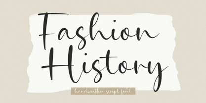 Introducing by Timur type Proudly Present, Fashion History Fashion History A Handwritten Script Font Fashion History is perfect for product packaging, branding project, megazine, social media, wedding, or just used to express words above the background. This Bread Forest font includes: -Full Set of standard alphabet and punctuation & symbol -Extra set Alternate ending lowercase -multilingual support. Embelish your designs with our original fonts.Enjoy the font,Thank you!
 - Darling Butter by Timurtype,
$14.00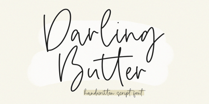 Introducing by Timur type Proudly Present, Darling Butter Darling Butter A Handwritten Script Font Darling Butter is perfect for product packaging, branding project, megazine, social media, wedding, or just used to express words above the background. This Bread Forest font includes: -Full Set of standard alphabet and punctuation & symbol -Extra set Alternate ending lowercase -multilingual support. Embelish your designs with our original fonts.Enjoy the font,Thank you!
 - Amadi by Craft Supply Co,
$20.00 Amadi - Quirky Serif Font is a delightful typeface that dances to its own beat, infusing a dash of whimsy and charm into your designs. With its quirky serifs and playful letterforms, Amadi takes the traditional serif style and gives it a whimsical twist. This font is the perfect choice for projects that aim to stand out and make a statement with a touch of quirkiness. Whether you're working on invitations, posters, or any creative endeavor, Amadi adds a distinctive and charismatic touch. Its irregular flows and unique character shapes inject a sense of fun and individuality into your designs. Amadi is like a joyful dance in the world of typography, making it an excellent choice for projects that want to break free from convention and embrace a playful, quirky spirit.
 - Berkin by Craft Supply Co,
$20.00 Berkin – Display Font is a captivating sans-serif typeface that breaks free from monotony with its playful and eye-catching design. Its stems and letterforms carry a dynamic and non-uniform style that instantly grabs attention, making it perfect for display purposes. Berkin’s unique design adds a sense of energy and spontaneity to your projects, ensuring that they stand out in a crowd. Whether you’re creating eye-catching headlines, signage, or branding materials, Berkin injects a distinctive and lively personality. This font is like a burst of creativity in the world of typography, making it an exceptional choice for projects that demand a playful and attention-grabbing aesthetic. Berkin’s playful and non-conformist approach ensures your designs are unforgettable and exude an enthusiastic and dynamic vibe.
 - Moho Script by John Moore Type Foundry,
$24.95 Moho Script introduces a decorative modern geometric of Japanese, sometimes german flavor for an unconventional script. It breaks the mold of the usual fonts to create a new visual impact of absolute contemporaneity with a retro touch. Moho Script, as all typefaces of this extended family, comes in five weights and an inline style, and it's been provided with a complete set of glyphs for languages of the Eastern and Western Europe. With the OpenType feature Swash you can make words with letter "t" that overlap to achieve what no meet in others typefaces. Moho Script is a perfect font for headlines display, menus, deals, logos, labels, outdoor advertising and publishing design, great for architecture, fashion, music, aviation and social affairs.
 - Godwit by yasireknc,
$19.00 Godwit is an experimental high-contrast serif font. The piece screams creative freedom and exploration, as the color literally breaks through the boundaries of the original type. The final piece is really fluid as each letter links smoothly into the next and you can feel the real natural ink paths. This is a benefit of Godwit and the most powerful-distinguishable feature, as most standard fonts wouldn’t allow for this fluidity, especially a serif font. The Aphorism: The main idea comes from being fluent and smooth-spoken natural ink shapes. As we go into the details, the organic shape of the body makes the font a unique piece. The collection lends itself to the design, packaging, and advertising of everything with a romantic feel like liquid love potion; weddings, greetings, cosmetics, lingerie, book covers, and too many more to mention! This font is a great place to begin getting that tone.
 - Sing Along by Hanoded,
$15.00 We just had the Eurovision Song Contest here in Holland. I quite like to watch it, as it is usually a freak show of kitsch, political incorrectness and often really bad music. But it is a laugh and this year was no different. It inspired me to create this particular font with this particular name. Sing Along is a happy, wobbly, kitschy font that comes with a bit of ‘over-the-topness’, a few personality issues and an unsteady gait. Needless to say, it is politically incorrect, but that, my friends, is not necessarily a bad thing.
 - Home Style by FontMesa,
$25.00 Home Style is a revival of a very old font previously thought to have been designed by Joseph Gillé in or around the year 1820, however recent evidence from France suggests that an artist by the name of Silvestre from the same time period may be the true designer of this font. You may have seen this font in the past under the names of Circus, Roma, Madame and Gillé Classic. Originally designed in France, this very decorative font was only available in uppercase including numbers. Today this font has been re-mastered and updated with the addition of a newly designed lowercase set of letters. Home Style with its diagonal or cast shadow lines breaks away from the original design which has squared off shadows. If you're looking for the original version of this font please refer to the FontMesa version named Maison Luxe. New in 2016 for Home Style is an uppercase German Double S (versal eszett), opentype features including case sensitive forms and old style numerals.
 - Gigasper by Konstantine Studio,
$19.00 Step into the digital realm with Gigasper, where cutting-edge design meets futuristic vibes in a spellbinding dance of pixels and perfection. Immerse yourself in the extraordinary fusion of techno fonts and a dystopian visual concept that redefine the boundaries of creativity. Gigasper is not confined to boundaries; it thrives in breaking them. From sleek tech interfaces to gritty cyberpunk posters, Gigasper adapts effortlessly, ensuring your designs are always ahead of the curve. Its versatility is your canvas, and the possibilities are limitless. Picture a world where pixels pulse with the heartbeat of innovation, and Gigasper is your guide. Embrace the distopian visual concept that weaves a narrative of rebellion and avant-garde aesthetics. This isn’t just a font; it’s a statement – a rebellion against the mundane, an uprising of creativity. Unlock the Future, Embrace Gigasper – Where Techno Meets Tomorrow!
 - Mochaik by Say Studio,
$15.00 Mochaik - Psychedelic Display Font Here's a lettering style that just might be exactly on your wavelength. Add just the right dose of vintage freak-a-delia to your retro graphics with this original psychedelic-style design. Great for music posters, album graphics, book titles, etc. Evoke a warpy, wavy, whimsical vibe that harks back to the carefree 1960s or early 1970s era with Sixties Flashback; it's pure hippie, trippy fun! Whats Includes : - Mochaik Regular, Outline, Italic - Multilingual Support If you want any Question, let me know Have a wonderful Day, Saystudio
 - Shmulkas by Fontsoon,
$9.00 Nu?! Vhat else vould you font?! Introduction to the first kosher vant...er...font! Yes, our Board certified rabbis made all the proper blessings so you can use this font guilt free. Just kidding, what's Jewish without a schmear of guilt. This font borrows its style from the 2nd. Avenue Deli all the way down to Guss Pickles on Essex street. If pastrami on white bread with ketchup is for you, this font is NOT. Its strictly pastrami on rye with mustard and slaw on the side.
 - Panettone by Hanoded,
$15.00 After I created my font Montello, I decided to continue with the classic connected font look. Meet Panettone. Panettone is a sweet bread loaf, originally from Milan, which is usually served during Christmas. Of course, you could use my Panettone script for your Christmas cards, but Panettone won’t look bad on invitations, book covers and products that need a classy look. Comes with ligatures for letters that just don’t connect well.
