10,000 search results
(0.045 seconds)
- STP Stencil Cyrillic by Sete Std,
$30.00 Developed from the STP Display Cyrillic, the STP Stencil Cyrillic Typeface follows the same characteristic premise as its sister, in addition to composing the same number of Cyrillic and Latin characters. What distinguishes them it’s that the STP Stencil Cyrillic can be applied more easily anytime, anywhere, increasing the possibility of being used in a more craft and artistic way. Since it has characteristics of a stencil font, it brings a more urban and contemporary look, which makes ideal to use it in public spaces with large circulation of people. In addition, wayfinding, architectural, advertising, packaging, posters, among others projects, are a good request for STP Stencil Cyrillic show its vigor and all its beauty. The STP Stencil Cyrillic is a modular feature source, perfect to use it in major event signaling projects or similar. It can also be useful in any demands that requires improvisation and quick solutions. The STP Stencil has very expressive forms and counterforms, but still counts with the practicality of a stencil source and its infinite possibilities of use.
 - CA Yoshiro by Cape Arcona Type Foundry,
$30.00 Tomorrow’s Typeface Today Are you ready to take your science fiction, action, military films, shows or video games to the next level? Our family of fonts brings a touch of nostalgia and a dash of modernity to your titles and typography. The CA YOSHIRO “Wide” style bears a striking resemblance to the iconic Eurostile typefaces of the 1960s. It has an immediate sense of familiarity. But what sets it apart is its contemporary, fresh sci-fi design. It’s the perfect blend of classic and cutting-edge, delivering an unprecedented, unconsumed style that promises to captivate audiences like never before. The CA YOSHIRO “Normal” style can also be used for a variety of other projects that require a normal width and just need to show a light technical touch without immediately suggesting a sci-fi reference. In addition, CA Yoshiro has subtle similarities to the monospace fonts commonly used on computer displays and screens. These fonts are the foundation of written programming code and sequences, lending a distinctive character to the digital realm.
 - JUSTICE LEAGUE - Personal use only

- Swift by Linotype,
$30.99 Gerard Unger developed this newspaper font between 1984 and 1987 for Dr.-Ing. Rudolf Hell GmbH, Kiel. He was mainly influenced by William A. Dwiggins (1880-1956), the typographic consultant of Mergenthaler Linotype, who started to develop more legible, alternative fonts for newspaper printing as early as 1930. Swift was named after the fast flying bird. Austere and concise, firm and original, Swift is suited for almost any purpose. Swift has been specially developed to sustain a maximum of quality and readability when used in unfavorable print and display processes, e.g. newspapers, laser printing and low resolution screens. Its robust, yet elegant serifs and its large x-height provide an undeniable distinction to the typeface, making it suitable for corporate ID and advertising purposes as well. Swift 2.0 family was designed in 1995. It's an improved version with technical and aesthetic enhancements and new family members. The Cyrillic version was developed for ParaType in 2003 by Tagir Safayev. Please note that this family includes only basic latin characters; it does not include accented characters required for western and central Europe.
 - Agnesia by Masinong Studio,
$15.00 Agnesia Script is a modern script in handmade calligraphy style, with decorative characters and a dancing baseline! So beautiful on greeting cards, branding materials, business cards, quotes, posters, and more. Agnesia Script come with 492+ glyphs. The alternative characters were divided into several OpenType features such as Swash, Stylistic Sets, Stylistic Alternates, and Ligature. The OpenType features can be accessed by using Open Type savvy programs such as Adobe Illustrator, Adobe InDesign, Adobe Photoshop Corel Draw X version, and Microsoft Word. And this font has given PUA unicode (specially coded fonts) so that all the alternate characters can easily be accessed in full by a craftsman or designer. Agnesia Script Features: Uppercase & Lowercase International Languange & Symbols Support Punctuation & Number PUA Unicode Range Standard Ligatures Discretionary Ligatures Stylistic Alternates Stylistic Set 1-13. If you don't have a program that supports OpenType features such as Adobe Illustrator and CorelDraw X Versions, you can access all the alternate glyphs using Font Book (Mac) or Character Map (Windows). If you have any question, don't hesitate to contact me by email masinong.studio@gmail.com Thanks and happy designing.
 - Aquatix by ryan creative,
$10.00 Aquatix which has a simple and minimalist design. In this font, there are no serifs or extra lines that stand out at the ends of the letters, making them appear more defined and easier to read. Aquatix can be used in both modern and contemporary designs, and is suitable for use on a variety of media such as computer screens, display posters, magazines, typography and other digital media. so it is suitable for use in designs that require clarity and firmness in each letter. FEATURES; -Uppercase, -Support Foreign, Numbers and Punctuation -Regular, Italic. -Input Otf, ttf & Woff Files. -Works on PC. -Simple installation. -Accessible in Adobe Illustrator, Adobe Photoshop. Adobe InDesign, it even works in Microsoft Word. -Fully accessible without additional design software. Aquatix is coded with Unicode PUA, which allows full access to all additional characters without having to design any special software. Mac users can use the Font book, and Windows users can use the Character map to view and copy any extra characters to paste into your favorite text editor/app. Thank you for visiting ;)
 - Swift 2.0 Cyrillic by ParaType,
$100.00 Gerard Unger developed this newspaper font between 1984 and 1987 for Dr.-Ing. Rudolf Hell GmbH, Kiel. He was mainly influenced by William A. Dwiggins (1880-1956), the typographic consultant of Mergenthaler Linotype, who started to develop more legible, alternative fonts for newspaper printing as early as 1930. Swift was named after the fast flying bird. Austere and concise, firm and original, Swift is suited for almost any purpose. Swift has been specially developed to sustain a maximum of quality and readability when used in unfavorable print and display processes, e.g. newspapers, laser printing and low resolution screens. Its robust, yet elegant serifs and its large x-height provide an undeniable distinction to the typeface, making it suitable for corporate ID and advertising purposes as well. Swift 2.0 family was designed in 1995. It's an improved version with technical and aesthetic enhancements and new family members. The Cyrillic version was developed for ParaType in 2003 by Tagir Safayev. Please note that this family includes only basic latin characters; it does not include accented characters required for western and central Europe.
 - Kidwriting Pro by Corradine Fonts,
$20.00 Kidwriting is a hand-drawn font, originally released in 2007. Now, we are proud to present a totally redrawn and improved font: Kidwriting Pro, which include not just a softer appearance but also an extended set of characters and new typographic features that makes it a professional tool. The childlike appearance of Kidwriting Pro allows to apply it to any child related project like teaching material or games. It effectively recreate the charming and somehow bumbling qualities of a child’s handwriting, but is balanced enough for comfortable reading. Kidwriting Pro has many Open Type features such as Old Style figures, discretionary ligatures, ordinals and fractions. Composed of more than 500 glyphs, Kidwriting Pro supports Western European, Central/Eastern European, Baltic, Turkish and Romanian Languages. Kidwriting Pro is complemented with a set of 62 selected dingbats which evoque the children world. And the best: it comes also in the same five weights to match completely with each one of the fonts.
 - Fishwrapper by E-phemera,
$25.00 Fishwrapper is a three-member font family (Regular, Bold, and Italic) designed to replicate the look of authentic vintage newspaper typography. The fonts are rough and are meant to be used at newspaper sizes. All three fonts have a complete alternate alphabet built in: using the contextual alternates feature will automatically substitute alternate versions of most glyphs, so that identical characters do not appear side by side, thus helping to create the look of metal type. Fishwrapper Regular has a complete set of small caps built in. Each font features assorted rule lines and other decorative material, many accessible through the discretionary ligature OpenType feature (three em dashes in a row, for example, will become a rule line), as well as fractions and a full international character set. Used in conjunction with some of E-phemera's vintage headline fonts, the Fishwrapper family is intended as a complete vintage newspaper and job-printing type solution.
 - Englebert Pro by Stiggy & Sands,
$29.00 Our Englebert Pro draws inspiration from the title screen of the 1930's film entitled, "Der Blaue Engel", starring Marlene Dietrich. Playful but subdued, yet striking enough to catch the eye, this casual sans has a distinct signature look to it. The offbeat letterforms engage the reader, while the SmallCaps and extensive figure sets lend a wider versatility to the typeface. Opentype features include: - SmallCaps. - Full set of Inferiors and Superiors for limitless fractions. - Tabular, Proportional, and Oldstyle figure sets (along with SmallCaps versions of the figures). - Stylistic Alternates for Caps to SmallCaps conversion.
 - Franklin Gothic by URW Type Foundry,
$39.99 By 1915, all the major foundries offered families of sans serifs, sometimes called Gothic in the USA. Franklin was a response suitable for countries in the vanguard of the machine age. Designed by Morris Benton in 1903-1912, Franklin has preserved its own personality ever since. The ITC Franklin Gothic font family is a redrawing by ITC that keeps the original strength intact, meeting the demand for a strong typeface. ITC Franklin Gothic is better read in display sizes and considered a standard in the newspaper and advertising fields.
 - Aries by FontHaus,
$19.00 In 1995, FontHaus came upon a rare opportunity to create a revival of Aries, a little known and previously unavailable typeface designed by the legendary Eric Gill in 1931. Discovering a lost typeface by one of the major designers of the 20th Century, was the discovery of a buried treasure, and being the first type company to release it in a digital format was an honor. Aries® is now in the fonts catalog of GroupType who owns the the registered trademark and has licensed this historical typeface exclusively to FontHaus as distributor.
 - Aries by GroupType,
$19.00 In 1995, FontHaus came upon a rare opportunity to create a revival of Aries, a little known and previously unavailable typeface designed by the legendary Eric Gill in 1931. Discovering a lost typeface by one of the major designers of the 20th Century, was like the discovery of buried treasure, and being the first type company to release it in a digital format was an honor. Aries® is now in the fonts catalog of GroupType who owns the the registered trademark and has licensed this historical typeface to FontHaus as distributor.
 - Arquitecta Office by Latinotype,
$16.00 We have adapted the version of our Arquitecta font for use in Microsoft Office™. It only has 4 variants: regular, italic, bold and bold italic. Font weights have been named in a way that can be clearly shown up in the font list in Office™ programs for the sake of a good hierarchy (the bold variant is quite bold and does not look the same as the original font). Arquitecta Office update: Improvements of proportions and drawing. The set was extended to the current one of Latinotype.
 - Phat Chance by Scholtz Fonts,
$21.00Phat Chance is a funky, in-your-face font that has strong overtones of modern rap and hip-hop culture. Its broad, fluid line evokes the beat of modern music, the rhythm of contemporary dance, and the power of videogame computer graphics. It is essential for marketing companies targeting: ⁃ the music scene: CD covers, posters, music videos, presentations ⁃ the movie scene: posters, ads, promotion material, copy, movie titles ⁃ the theatre scene: posters, programs, ads, promotions ⁃ the fashion scene: hangtags, posters, brochures, signage, ads ⁃ the fast food market: packaging, promotions, menus, signage ⁃ general packaging ⁃ general advertising - Bordonaro Script by Estudio Calderon,
$35.00 Bordonaro Script - Bordonaro Spur’s partner - is an interpretation of the “English Roundhand” style with a strong influence by the logos of American basketball and baseball teams. It is designed from simple shapes ideal to be used in long titles and fits perfectly into the branding design. Psss...Check out the NEW Bordonaro Script with Rounded corners , same version but soft! Bordonaro has a complete set of special and original characters: Stylistic Ligatures, Discretionary Ligatures, Swashes, Contextual Alternates, Titling, ss01,ss02, ss03 & apostrophes' ligatures that work as complements to enrich the text composition. Bordonaro Script and Bordonaro Spur are two typographic styles that were designed under the same characteristic features with the idea of combining them to obtain better results, for that reason, we recommend merging them in a creative way and you will realize everything you can design with them. The banners designs are based on old brands of beer labels, coffee packaging, sports logos and in some cases we use Copperplate Gothic but only as a complementary font in order to harmonize the layout of the elements in each banner.
 - Beethink by Gassstype,
$25.00 Bee Think This is a Rough Brush Typeface that is written casually and quickly. comes in two mode Standart this font are made with brushes on Procreate. Then crafted carefully drawn into vector format. That is why Bee Think has Rough and strong characteristic more natural look to your text with a more modern look to your text. You can activate Ligature OpenType panel to make these two styles. Bee Think is perfect for homeware designs,branding projects, Logo design, Quotes product packaging, especially with horror and scary themes Bee Think a natural Hand Drawn feel. This handmade font will make your design has a beautiful natural touch for each details. It is perfect for any design project as Invitation,logo, book cover, craft or any design purposes,photos, photography overlays, signs, window art, scrapbooking, tags and so much more! That is has charming, authentic and relaxed characteristic more natural look to your text.
 - Rodley by Fettle Foundry,
$10.00 Rodley is a geometric sans-serif typeface and a ground-up redrawing of Bairne – the first ever typeface from Fettle Foundry – with a completely new character set that closer resembles the original vision for the typeface. The changes are so substantial that Rodley has taken on a life of its own, becoming a brand new typeface. Inspired by low-contrast Swiss and Modernist grotesque typefaces, with the addition of characterful geometric shapes, Rodley aims to be a more disruptive choice for brands, while retaining the appeal of those popular styles. Based upon a Latin S character set with additional glyphs, Rodley supports many latin-based languages, with a focus on pan-European and South American languages. Thorough kerning has been applied to uppercase/lowercase, uppercase/uppercase, lowercase/lowercase and CamelCase character combinations, with thorough attention paid to an incredibly large number of diacritical combinations. Available in 5 weights, from thin to bold, with matching italics, Rodley has been designed with a wide range of uses and sizes in mind.
 - Sellotia Signature by ijemrockart,
$15.00 Sellotia Signature a new fresh & modern script with a handmade calligraphy style, decorative characters and a dancing baseline! So beautiful on invitation like greeting cards, branding materials, business cards, quotes, posters, and more!! Sellotia Signature come with 250 glyphs+. The alternative characters were divided into several Open Type features such as Swash, Stylistic Sets, Stylistic Alternates, and Ligature. The Open Type features can be accessed by using Open Type savvy programs such as Adobe Illustrator, Adobe InDesign, Adobe Photoshop Corel Draw X version, And Microsoft Word. And this Font has given PUA unicode (specially coded fonts). so that all the alternate characters can easily be accessed in full by a craftsman or designer. Sellotia Signature Features : Uppercase & Lowercase International Languange & Symbols Support Punctuation & Number PUA Unicode Range Standard Ligatures Discretionary Ligatures Stylistic Alternates Stylistic Set 01-02 Character The ZIP file are include the following.
 - ITC Flora by ITC,
$40.99ITC Flora is the work of Dutch designer Gerard Unger, and is named for his daughter. He started by doing calligraphy experiments with felt-tip and ballpoint pens, and developed these drawings into a formalized script typeface. Swiss typographer Max Caflisch advised the Dr.-Ing Rudolf Hell GmbH technology firm to add a new round-nibbed script face to their Digiset type library, and in 1984, Flora was released by Hell. Unger used a chancery cursive skeleton in this design, which imparts grace and movement. Flora was also intentionally designed to be simple and sturdy, and with its minimal variation in thick/thin stroke ratio, it worked well on the early digital typesetting machines. In 1989, the International Typeface Corporation released the font. ITC Flora continues to work well on current printers and typesetters, and it has an enduring popularity for uses that range from short text passages to display headlines. - ITC Malstock by ITC,
$29.99ITC Malstock is the work of Czech designer Frantisek Storm. The idea is based on a sign painting technique that uses a flat brush and a Maalstok, a long bar with soft padding which is used as a rest for the painter's hand and a guide for vertical lines. The strokes of this font end with a split stem which recalls the traces of the writer's brush. ITC Malstock is a narrow typeface which is ideal for headlines, invitations and advertisements. The designer recommends combining his typeface with others, to create harmony with sans serif typefaces in text sizes or contrast with serif typefaces. - Old Labels JNL by Jeff Levine,
$29.00 Old Labels JNL was inspired by the red and white gummed labels that were used for shipping parcels long before self-adhesive materials and desktop publishing rendered the older labels obsolete. The fifty-two glyphs include a generous supply of phrases such as ‘Air Mail’, ‘Do Not Bend’, ‘Rush’, etc. along with a number of blank label backgrounds and decorative frames. NOTE: Commercial replication of the images within this font for any resale purposes (including, but not limited to labels, t-shirts, stock designs, et al) requires a separate license which may be obtained by contacting the designer via the email address found within the End User License Agreement.
 - Bentwood by Paragraph,
$22.00 This font takes its name and the overall shape from modern bentwood furniture, namely Scandinavian designs since the 1940s. The curved corners of the letterforms are practically hyperbolic, to convey the tension and strength of the bent plywood. These curves are meant to appear more dynamic than circular or elliptical segments of traditional sans serif fonts. The letterforms are simplified, without extra corners, stems, connections or hooks, yet remain legible at any size. Now at version 2, Bentwood contains Central/Eastern European, Baltic and Turkish character sets and more ligatures with Open Type functionality. Some minor corrections were made to letter shapes and positions, as well as to kerning and spacing.
 - Vagary JNL by Jeff Levine,
$29.00 For many decades, the fashion magazine “Vogue” featured superbly illustrated covers before photography became more commonplace. During the 1930s and 1940s those illustrations were accompanied by many creative styles of hand lettering for its monthly issues. The January, 1930 cover had the magazine’s name lettered in an Art Deco geometric monoline, which became the inspiration for Vagary JNL, which is available in both regular and oblique versions. A vagary [in a simple sense] is when something or someone changes in an erratic or unexpected way (as the wind’s direction or in a person’s mood or whim)… and thus seemed the fitting name for this type style.
 - Sandena by Polyglyphic,
$40.00 Sandena began as an attempt at a harmonic convergence between the classic lines of Palatino and the curved flair of Optima - both favorites of mine from the great Hermann Zapf. As I’ve always loved the Swash characters of the 50’s and 60’s letterforms, I incorporated these alternatives to offer the more complete package that you see here - a humanist font in the truest calligraphic sense. This OpenType font family comes in four weights and includes condensed and Swash Cap alternates. Sandena offers multiple-character foreign language support and is being offered in a number of packages best-tailored for your unique application.
 - 1790 Royal Printing by GLC,
$38.00 From 1702 to 1811 the French "Royal", then "Imperial", Printers, neglected Garamond and Fournier's designs and used only the font called "Romain du Roy", carved (1693 to 1723) by Philippe Grandjean by order of the king Louis XIV. 1790 Royal Printing was inspired by various variants of Romain du Roy that were in use during this period. Our sources were mainly official and legal documents printed in the late royal period, and in the beginning of the French revolution. There was no bold style. The 1790 Royal Printing Caps fonts contain small caps, plus titling caps for headlines as 1790 Royal Printing capitals are intended to be used preferably for text.
 - Lajoya by Keristyper Studio,
$12.00 Lajoya is a unique and natural handwritten script. The appearance of the strokes is in the form of light, free-flowing brush strokes. This font is good for logo design, Social media, Movie Titles, Books Titles, short text even long text letters, and good for your secondary text font with sans or serif. Featured: Standard Uppercase & Lowercase Numeral & Punctuation Multilingual : ä ö ü Ä Ö Ü ß ¿ ¡ Alternate & Ligature PUA encoded We recommend programs that support the OpenType feature and the Glyphs panel such as Adobe applications or Corel Draw. so you can use all the variations of the glyphs. Hope you enjoy our fonts!
 - Frank Ruehl BT by Bitstream,
$29.99Frank-Rühl (or Ruehl) is the ubiquitous Hebrew text font style. There are many fonts that belong to this style, and all are based on an early 20th-century design by Raphael Frank. Some of the fonts are actually called Frank-Rühl (or Ruehl) and some are not. It was originally designed in a single weight. Bitstream developed Frank Ruehl for the Microsoft Windows operating system. The font is encoded with a Microsoft defined Hebrew character set, Hebrew Code Page 1255. Within the TrueType fonts, the characters are assigned Unicode character IDs. The font includes Hebrew characters, and Latin glyphs from Dutch 801 bold. - Campeno by Craft Supply Co,
$20.00 Geometric Precision Let’s step into the world of Campeno, a Geometric Sans Serif font that embodies precision and order. This font is the epitome of geometric perfection, making it an ideal choice for various editorial applications. Editorial Excellence Campeno’s geometric form is what sets it apart and makes it a top choice for editorial needs. Whether you’re working on magazines, long-form text, or other editorial projects, its geometric precision enhances readability and offers editorial excellence. Versatile Typography What makes Campeno even more exceptional is its versatility. It seamlessly adapts to diverse design contexts, ensuring that it can be used for a wide range of projects, from magazines to websites and beyond. Engaging Readability Beyond its geometric aesthetics, Campeno excels in providing engaging readability. It guides the reader through the content, focusing on the message while maintaining a visually appealing design. In Conclusion In summary, Campeno – Geometric Sans Serif is the font that brings precision and clarity to your editorial projects. Its geometric form ensures that your content is not only engaging but also visually appealing, catering to a broad readership while maintaining a high standard of clarity. Whether you’re working on magazines, websites, or other editorial endeavors, Campeno stands out as a font that combines aesthetics with functionality, offering editorial excellence for your projects.
 - Sisters by Type-Ø-Tones,
$40.00 Sisters is a lively set of stencil display typefaces designed by Type-Ø-Tones’ co-founder Laura Meseguer. The family features four fresh fonts that share foundational principles of construction yet complement each other—as sisters do—by celebrating their differences. Variations in contrast, weight, and design characteristics result in four distinct styles dubbed One through Four. This cool quartet contains no lowercase, asserting the family’s rightful place in the titling typography space. Like many Type-Ø-Tones typefaces, Sisters was conceived as a custom lettering project—in this case, the design was crafted for the identity of an art exhibition. Laura initially drew only the limited character set the show required, but from the outset, she saw great potential for a fully developed type family based on her lettering concept. The first member of Laura’s new family was, naturally, Sisters One. She later added contrast to produce Sisters Two, then equalized the weight of Sisters Two to create Sisters Three. To round out the group, Laura added a deco touch to Sisters Two, resulting in the festive but retro-elegant Sisters Four. Each Sister shares DNA with the other members of the family, just as human siblings do :). Credit for the Sisters name goes to Eider Corral and we couldn’t imagine a more fitting moniker for this little family.
 - FF Bauer Grotesk Paneuropean by FontFont,
$40.99FF Bauer Grotesk is a revival of the metal type Friedrich Bauer Grotesk, released between 1933 and 1934 by the foundry Trennert & Sohn in Hamburg Altona, Germany. The geometric construction of the typeface, infused with the art deco zeitgeist of that era, is closely related to such famous German designs as Futura, Erbar, Kabel and Super Grotesk that debuted a few years earlier. However, FF Bauer Grotesk stands out for being less dogmatic with the geometry, lending the design a warmer, more homogenous feeling. The oval “O” is a good example of that, as well as characteristic shapes like the capital M or the unconventionally differing endings of “c” and “s” which make for a less constructed look. The design was started by Thomas Ackermann, and he collaborated with Felix Bonge to evolve his original ideas into this fresh, modern geometric typeface family. FF Bauer Grotesk contains 6 weights with accompanying italics, and a wide range of OpenType typographic features including small caps, figure styles, fractions and contextual alternates. NEW: the new FF Bauer Grotesk W1G versions features a pan-European character set for international communications. The W1G character set supports almost all the popular languages/writing systems in western, eastern, and central Europe based on the Latin alphabet including Vietnamese, and also several based on Cyrillic and Greek alphabets. - ThreeDee by URW Type Foundry,
$99.99The idea for this completely new font design with overlapping characters came when Axel Stoltenberg, longtime IKARUS program developer at URW + +, visited a restaurant. As it can be seen quite often , the daily specials were offered handwritten with chalk on a blackboard applying a writing technique never been available before for digital fonts: each character is partly covered by its predecessor creating a three-dimensional effect. The implementation of this unusual notation for digital setting required a lot of programming and testing until all necessary character variants were produced and set properly always using the correct form. In order to achieve this, the OpenType Pro font ThreeDee contains about 12,400 characters and all the necessary OpenType features (GSUB ) for the automatic setting in OTF savvy application programs. The slightly playful basic design for ThreeDee was created by Anna Stoltenberg , the daughter of Axel, specially devised for the innovative representation and support of its special nature. The shadow generated with IKARUS even intensifies the 3D effect. As is well-known, making use of the embedded OTF features, i.e. the automatic access to all the 12,400 character variants , a corresponding text / layout program ( InDesign, Quark Xpress, current Open / LibreOffice or MS Word etc. ) is required. ThreeDee is a headline font that will unveil all its charisma and exceptional quality at appropriate, larger sizes. - Sodra by Harvester Type,
$20.00 Sodra is a wide-accented antiqua with sharp serifs and hints of futuristic forms. This typeface emerged from a passage in the Manifesto del Futurismo by Filippo Tommaso Marinetti. One short word was the inspiration and the guidance for the creation of this font. An attempt to create something unique and distinctive, an attempt to add a bit of futurism to something historical. The special aesthetics and expressiveness the type conveys will make you look closely at each letter and draw attention to your design. The font has been in development for a long time and painstaking work has been done on it. Large language support, about 470 characters and almost 4,000 kerning pairs. Hinting and testing the font itself in business and in a wide variety of applications. The uses of the type are very wide. Whether it's a branding, logo, identity or merch, a headline or product design. The nature of typeface is not limited to something rough and gloomy, on the contrary, it all depends on how you look at it. I've shown you my point of view, you in turn will see yours!
 - Shabby Patty by Scratch Design,
$12.00 Shabby Patty is a playful, cheerful and cute font that is ready to accompany your design projects. This font also has retro and vintage characteristics that are perfect for 90s design. This font will be perfect for quotes, cover designs, merchandise, posters, creative posts, birthday cards, packaging, logos, labels and more. What you'll get: Uppercase and lowercase Numbers and punctuation Multilingual support Ligatures We highly recommend using a program that supports OpenType features and Glyphs panels like many Adobe apps, so you can see and access all Glyph variations. We hope you enjoy our font!
 - Altair by Zetafonts,
$39.00 Altair is a sans serif type family derived from Zetafonts's Digitalino typeface. The original bold design by Francesco Canovaro has been expanded in a seven weights family, suitable for a wide range of design uses, from body copy to display text and ranging from a thin weight to the ultra one. Altair's main originality lies in the calligraphic roots of its design, that gives it a friendly, confident look that is perfect for corporate voices, new technology startups, news blogs and any other case where a solid design must be given an emotional context.
 - JollyGood Proper by Letradora,
$18.00 JollyGood Proper is a fun, friendly typeface that is clean enough to use for longer texts. It is a complete family with 7 weights in regular and italic for a total of 16 fonts. It has an amazing character set, with support for most European languages, as well as alternates and ligatures. JollyGood Proper works well for packaging, children’s books, or wherever you need an informal text without being too cartoony.It is also an excellent replacement for The Comic Font that Must Not Be Named. Check out the other members of the JollyGood family
 - Hello Sunshine by Romie Creative,
$13.00 Hello Sunshine - elegant Calligraphy font is a romantic and sweet calligraphy typeface with characters that dance along the baseline. It has a casual and yet elegant touch. It can be used for various purposes such as logos, wedding invitations, headings, t-shirts, letterhead, signage, lables, news, posters, badges etc. The fonts include OpenType features with stylistic alternates, ligatures and multiple language support. To enable the OpenType Stylistic alternates, you need a program that supports OpenType features such as Adobe Illustrator CS, Adobe Indesign & CorelDraw X6-X7, Microsoft Word 2010 or later versions
 - Seiston by Skinny Type,
$19.00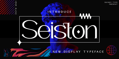 Seiston is the New Modern Typeface. This other Serif collection is perfect for your next branding project, great for your business. Gallient has smooth edges, so this font gives this style an authentically handcrafted feel. Seiston also features: - Lowercase - Uppercase - Numbers and punctuation marks - Multilingual Seiston is the perfect choice for people looking for a clean, modern, minimalist, elegant and beautiful design style. Suitable for almost any graphic design such as logos, branding materials, business cards, gift cards, t-shirts, covers, thumbnails, prints, posters, photography, quotes .etc Happy Designing
 - Smooth Brushings by Hanoded,
$20.00 When I was painting this font, I suddenly had the movie Cool Runnings (1993, directed by Jon Turteltaub) in my head. I had to name the font, so I came up with Smooth Brushings. Of course, this font has nothing to do with the movie. Smooth Brushings is an all caps brush font, which was made with a stiff brush and some China Ink. Upper and lower case glyphs can be mixed. It is a very legible and clear font, ideally suited for posters, product packaging and book covers.
 - Copyman by Roman Pavliuk,
$20.00 Copyman is an experimental one for the creative ones. Monumental & minimalistic, great for the contemporary & urban design, this font is a good choice for confident branding & logotypes as well as for brutal or futuristic interfaces. Copyman’s title is an anagram for a Company. First of all, this font was created for branding purposes of businesses, who want something as practical as a little bit different from what they already get used to. This chamfered typeface contains 8 styles, Regular & Italic, both Cyrylic & Latin, 287 glyphs, 8256 pairs, 119 groups, has well–balanced kerning & clever spacing.

PreviousPage 250 of 250