10,000 search results
(0.085 seconds)
- Bargain by Arkalandara,
$115.00 Handwriting is a unique and personal expression of language created by individuals using a pen, pencil, or other writing instrument. It encompasses various styles, characteristics, and nuances that make each person's writing distinctive. Pointed shapes and characters refer to the specific forms and angles of the letters and symbols in a written script. Pointed shapes in handwriting typically involve the presence of sharp angles or well-defined points in the formation of letters. This can contribute to a more angular and edgy appearance in the overall writing style.
 - Sebastian Goen by Gian Studio,
$12.00 Sebastian Goen is my new elegant serif font that will give your projects a touch of luxury and style. It's perfect for logotypes, branding, monograms and wedding invitations, blog headlines, and more. Browse through all the previews and get as inspired as I was when creating this font. Important information: To access the alternatives, you must have access to an older version of Photoshop to copy/paste the glyphs from the included PSD, OR the Glyphs Panel, which can be found in Photoshop CC or any Version of Adobe Illustrator. Thanks.
 - ITC Binary by ITC,
$29.99ITC Binary was designed by Mauricio Reyes in 1997 as a semiserif font with a pronounced stroke contrast. A distinguishing characteristic of this font is that many of the lower case letters seem to be missing a small piece of their forms, either at the base line or x-height. Setting the letters together makes an impression of waviness which draws the attention of the reader. Binary is a reserved, elegant font which should be used in point sizes of 10 or larger and only in headlines and short to middle length texts. - Architype Vierkant by The Foundry,
$50.00 Architype Crouwel is a collection of typefaces created in collaboration with Wim Crouwel, following his agreement with The Foundry, to recreate his experimental alphabets as digital fonts. Crouwel's most recognized work was for the Van Abbe and Stedelijk museums (1954 –72) where he established his reputation for radical, grid-based design. Architype Vierkant was developed from the few letterforms that Crouwel created for an opening spread in a 1972 Drupa catalogue, on the theme ‘typo vision international’ – this single reference showed an interesting interplay of the experimental ideas underpinning his controversial ‘new alphabet’ and Fodor.
 - Parking Lot Sale JNL by Jeff Levine,
$29.00 Here’s a novelty font emulating the plastic pennant streamers that were popular in the 1950s and 1960s used to decorate a store parking lot or used car lot for a sales event. The typeface inside the individual pennants is Manufacturer JNL, which can be used for body copy associated with titles made by this font. Parking Lot Sale JNL is available in regular (black letters on white pennants) and black (with white letters). A blank pennant for word spacing or end caps is available on the backslash key.
 - Arabico by Nathatype,
$29.00 Unveiling Arabico, a captivating typeface that bridges cultures and aesthetics with its exquisite design. Arabico is a tribute to the elegance and fluidity of Arabic script. Its letterforms are carefully crafted to echo the aesthetic beauty and expressive nature of Arabic writing. Every stroke and curve of its letters pays homage to the graceful artistry of the flow of Arabic calligraphy. Arabico fits in headlines, logos, posters, flyers, branding materials, print media, editorial layouts, and many more designs. Find out more ways to use this font by taking a look at the font preview.
 - Mockejoe Font by Tebaltipis Studio,
$13.00 MOCKEJOE FONT was born in the modern era which was inspired by the letters found in various print and digital media. Comes with a modern and futuristic style that will rock your great design! It is suitable for you to use in logotype designs, posters, typography, t-shirts, tickets, and other modern designs. The alternative characters in this font were divided into several OpenType features such as Stylistic Alternates, Stylistic Sets, and Ligature. The OpenType features can be accessed by using the OpenType program such as Adobe Illustrator, Adobe Photoshop, and Adobe InDesign.
 - Oddee by Informal Type,
$25.00 Construction period of Anafor deeply inspired by the pioneer of geometric abstract art and the creator of the avant-garde suprematist movement Kazimir Severinovic, Malevich’s suprematist compositions. Anafor typeface is separated from the basic Latin letters in terms of character and letter structure. Furthermore, The forms and main structure are designed together with alternatives by taking into account the relationships between the defined angles.Anafor contains certain aspects of a display typeface, due to the structure of the letter forms that are open to abstract connotations. Typeface family includes 2 styles; Anafor Basic and Anafor Crash. Each individual style has 235 glyphs and it has OpenType encoding. Due to the diversity of three styles, Anafor is providing a wide range of possibilities for the user.
 - Anafor by Informal Type,
$25.00 Construction period of Anafor deeply inspired by the pioneer of geometric abstract art and the creator of the avant-garde suprematist movement Kazimir Severinovic, Malevich’s suprematist compositions. Anafor typeface is separated from the basic Latin letters in terms of character and letter structure. Furthermore, The forms and main structure are designed together with alternatives by taking into account the relationships between the defined angles.Anafor contains certain aspects of a display typeface, due to the structure of the letter forms that are open to abstract connotations. Typeface family includes 2 styles; Anafor Basic and Anafor Crash. Each individual style has 235 glyphs and it has OpenType encoding. Due to the diversity of three styles, Anafor is providing a wide range of possibilities for the user.
 - Thirsty Cream by PizzaDude.dk,
$20.00 Thirsty Cream is my handmade and slightly curly font. I had birthday greeting cards, invitations and products for kids. But I guess that it is useful for a good handful of other things. While the lowercase has it's curly moments, the UPPERCASE is quite steady and super legible
 - Hugedelia by Invasi Studio,
$19.00 This modern handwritten brush script is stylish and fresh. Featuring a touch of class and a fabulous brush style. It has a huge and sophisticated look, so we named it Hugedelia. The font offers tons of ligatures and multi-language support, which adds more naturalness to the application.
 - Mistook by Arendxstudio,
$15.00 Mistook - Street Art Graffiti Font is a free style font that has the characteristics of street art that shows freedom and is filled with unique characters Features : • Character Set A-Z • Numerals & Punctuations (OpenType Standard) • Accents (Multilingual characters) • Ligature • Alternate There it is! I really hope you enjoy it !
 - Hooley by Etewut,
$20.00 Here is the party script 'Hooley'. It's created for decoration, advertisement, product design, signing cards and whatever you can imagine. The font is PUA encoded, that allows you to use special characters with glyphs panel. Hooley script has multi language support, alternative symbols, swashes and swooshes with charisma.
 - Fette Kanzlei by RMU,
$30.00 Fette Kanzlei is a beautiful mid-19th century blackletter font with a touch of calligraphy which has been brought back into life again. The long s can be reached by typing alt plus b or by activating the OT feature historical forms. This font also contains oldstyle numerals.
 - Demon Say Hi by Gassstype,
$27.00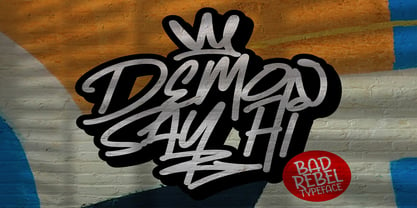 Hello Everyone, introduce our new product Demon Say Hi is Rebel Typeface Font with a natural feel. This handmade font will make your design has a beautiful natural touch for each details. This font is PUA encoded which means you can access all of the magical glyphs with ease!
 - Athafia by Arkrist Letter,
$14.00 Athafia font is the newest font from Arkrist Letter studio. a work that is made with all my heart and produces a font that is elegant, stylish, beautiful, and very beautiful. has a luxurious and festive impression, very suitable for logo fonts, design fonts, greeting cards, posters, etc.
 - Aloyesia by Eotype,
$16.00 Aloyesia is a condensed serif display font that has beautiful curves. This unique font is perfect for creating beautiful logotypes, stunning magazine designs and more. Aloyesia provides a collection of glyphs with unique shapes. With alternative styles and ligature features, this font is perfect for complementing various projects.
 - Parkour King by Hatftype,
$15.00 Parkour King - Graffiti Font is a free style font that has the characteristics of street art that shows freedom and is filled with unique characters. Features : • Character Set A-Z • Numerals & Punctuations (OpenType Standard) • Accents (Multilingual characters) • Ligature • Alternate There it is. I really hope you enjoy it.
 - Grist Mill JNL by Jeff Levine,
$29.00Grist Mill JNL was modeled from an old wood type design and has all of the wonderful quirks that made wood type so appealing for many projects. There is minimal kerning because of the unique letter shapes, so you may wish to adjust your layout to fit your needs. - Galexica Mono by Ingrimayne Type,
$6.00 GalexicaMono is an attempt to create a futuristic typewriter font, which may be an oxymoron. Unlike most typewriter fonts, it is sans-serif. The family has two weights, plain and bold, each with an oblique style. For a variant of the design that is not monospaced, see Galexica.
 - Graydents by Bale Type,
$15.00 Graydents is a stylish and elegant sans serif that will make your project even more stunning and stand out! This font has a bunch of alternates that you can use to make various design looks great, such as for logo, branding, invitation, magazine, etc. Graydents also support Multi Language.
 - Midnight Story by Orenari,
$17.00 Midnight Story font is specially designed for spooky yet horror occasion. This font has rough texture, so it will bring the creepy atmosphere in every glyphs. It's really horror when your project didn't meet the perfect font. So let Midnight Story be friends with your design and craft projects.
 - Slim Kim by Wiescher Design,
$39.50 Slim Kim is the sister font of Julienne. It mixes perfectly with Julienn. So whenever you need an especially slim serif font this is it! Slim Kim has very spiky serifs, so I did not want to make an extra-slim version. Enjoy this spiky font, your Gert Wiescher.
 - Maritha by MJB Letters,
$17.00 Maritha is a classy handwritten script, it has beautiful beginning and ending swashes, this font is perfect for branding design, packaging, logo design, watermark, fashion design, wedding invites, and more. this font includes the full set of lowercase and uppercase letters, numeral, punctuation, multilanguage support, titling, and ending swashes.
 - Hells by 4RM Font,
$19.00 Hells font is made with ultra condensed width and has a strong aesthetic value when used in the right design. Having a regular style and a compressed width adds to the aesthetic of this font. It is suitable for use in graphic designs for posters, flyers, or large designs.
 - Oh Livey by Angele Kamp,
$28.00 Oh Livey is a casual brush script that has a fun, modern vibe. Put it on everything from quotes and websites, and use the extra clipart to make designing so much easier and fun. Oh Livey contains lots of ligatures which will give it that authentic handwritten feel.
 - Obsession by Autographis,
$39.50Obsession has taken me completely in its spell. I could go on forever creating new forms for this script. But I have other fonts to do, so this is as far as my obsession goes for the moment. There are six different cuts and all letters can be mixed. - Cyan Neue by Wilton Foundry,
$29.00 Cyan Neue is a substantial update variation to the original Cyan we launched in 2006. Most notably the contrast has decreased making it more contemporary. Many glyphs have been improved especially in the italics. The design of Cyan Neue was inspired by features found in classic Roman. It shows a preference for geometric Roman proportions while incorporating open centers (B,P,R) and compact serifs. The characters stay true to the same features as the capitals, resulting in an unusually distinctive style. There are many subtle details in Cyan Neue that become more interesting in display sizes, for instance the subtle curves in the serifs and the overall smoothness. Cyan Neue is a robust font that will exceed your expectations. Cyan Neue is clearly ideal for headlines, inscriptions, publications, annual reports, corporate identities, packaging.
 - Croft by Stiggy & Sands,
$24.00 Historical typography makes a comeback. A revival of one of the most popular of a number of rugged typefaces used around the turn of the century, Croft revives the creation of Lewis Buddy III, known as "Roycroft" in 1912 ATF catalogs. It also, according to ATF, was designed "partly" by Morris Benton, around 1898. The original typeface might be considered an early form of grunge fonts. This typestyle maintains historical flavor, while also being relevant today. It has been expanded to have more discretionary ligatures and numerals sets for versatility, and maintains the original stylistic alternates and standard ligatures. See the 5th graphic for a comprehensive character map preview. Opentype features include: Full set of Inferiors and Superiors for limitless fractions. Tabular, Proportional, and Oldstyle figure sets. A small collection of Discretionary & Standard Ligatures. Stylistic Alternates for variations of several characters such as R, u, t, etc. Approx. 482 Character Glyph Set: Croft comes with a glyphset that includes standard & punctuation, international language support, and additional features.
 - Perva by Eller Type,
$30.00 Perva is a suite of three eye-catching fonts inspired by display types from the 19th century. This unconventional family has three different font styles that can be used individually or combined to build a playfulness multi-typeface design system. It is suitable for titling, posters headlines, book covers, packaging, social media, and branding. Perva brings together a Slab serif font, a.k.a Antique or Egyptian; a Reverse-contrast or Italian; and an Old English Blackletter. The design is inspired by the display types listed as “Typographic monstrosities” in Thomas C. Hansard’s book Typographia (1825). What he found absurd was understood here as interesting and enjoyable to introduce a contemporary approach of the types widely sold by foundries such as Bruce’s New York Type-Foundry and Caslon Foundry. Each of the three fonts holds around 400 glyphs, covering the languages of Northern, Western, Central, and Southern Europe. Opentype features include case-sensitive forms and a couple of alternates for the Blackletter style.
 - Proper by Scholtz Fonts,
$17.00Proper was based on handwritten characters (of my own) that I scanned and then digitally touched up. I kept the digital editing to a minimum so as to preserve the freshness of the original. I did, however, want to convey a sense of propriety and regularity and so my original handwriting was done with quite a lot of control. I kept the size of the lower case characters quite large and this makes the font very readable, even at quite small point sizes. Proper may be used when you need clean, legible text, with a natural look, e.g.: -- magazines aimed at the natural health market -- "natural look" fashion pages -- "natural look" decor pages -- natural food products -- natural beauty products -- children's books -- packaging for children's toys, games etc. -- educational material -- comics Proper contains a full character set with all upper and lower case characters, numerals, symbols, accented characters and it has been carefully spaced and kerned. - H-AND-S by AND,
$89.00 A common creation: (to pass from one hand to the other): For the first time, various hand-signs from diverse sources are unified into one single visual style. This compendium is the result of 15 years of incubation and 7 years of creation. In his travels throughout the world, graphic designer Jean-Benoit Levy, principal of the visual studio AND, has collected pictures of multiple hand signage. Uncertain what to do with those signs, he kept them year after year until the idea came to unify almost 200 handsigns into one single family. In accordance with this entire collection, the name of the typeface is a mix: "h-and-s". A global collection: (To put in good hands): We all have one thing in common: Hand-signs are an international language, they are meant to be understood by all of us. Each of us regularly comes in contact with modern hieroglyphs such as the hand-sign-codes that are so prevalent in our daily life. This way of communication belongs to no one in particular and to all of us in general. Even if the sense of certain signs varies from one culture to the other, there is a common hand-sign language. We are surrounded by this language of handsigns each time we step in a store, we eat, open a container of milk, we clean up, use package of wash-powder, by shaving, when we work, use tools, at home, by tearing the envelope of a condom, by traveling, etc. When we encounter these signs, we all understand them easily. A visual connection: (To go hand in hand): This typeface is a global visual statement. Collecting, ordering, redrawing, unifying. Reconstructed and assembled into one original alphabet, H-AND-S is a unique and complex signs program. Our choice is based on daily gestures and global hand-codes. Logically this typeface starts with the "American Sign Language" and expands on two type-variations, each on two levels of keyboard. The international team of H-AND-S would like to send his special thanks to all of the anonymous graphic designers throughout the world who designed different hand-signage and who influenced and inspired to create such a sign collection into one unified family. We, the global nomad team of AND, hope that you will enjoy our H-AND-S. Additional Credits Production: Studio AND. www.and.ch. Concept, Idea & Creative Direction: Jean-Benoît Lévy, Switzerland / USA. Research & Sketches: Eva Schubert, Germany. Illustration, Graphic Design & Visual Fusion: Diana Stoen, USA. Transfer, Adaptation & Refining: Moonkyung Choi, Korea. Finalization & Checking: Sylvestre Lucia, Switzerland. Coaching & Technical Advice: Mike Kohnke, USA. Creative Energy & Implementation: Joachim Müller-Lancé, Germany / USA.
 - Redtab by MKGD,
$13.00 With Redtab I tried to create a typeface that could be used equally well in either in body copy, or in headline form. I like to think that, although it has a more traditional look to it, it still possesses a bit of a creative flourish that sets it apart from similarly designed fonts. Whether used sparingly or in paragraph form, Redtab has the ability to not only read well, but stand out while doing so.
 - Bemore Serif by Asenbayu,
$15.00 Bemore Serif is a decorative serif font that has a distinctive serif shape. This font has sleek and tall condensed letter proportions so it can give an attractive and elegant impression. You can use this font in both modern and vintage designs. This font is suitable for attractive packaging label designs, unique desired logos, trendy poster designs, fashion and many more. Bemore Serif font features: standard glyphs, stylistic alternates, stylistic ligatures, symbol, punctuation and multiple languages supported.
 - Bauen by Tipo Pèpel,
$22.00 Bauen (worker in German) is a tribute to the Bauhaus school that has just completed its first centenary and whose ideas are still relevant. It is a geometric typeface inspired by the sans serif typefaces prevailing in those years, and whose cradle resides in the Bauhaus school. It has a wide language coverage, and a generous range of OpenType functionalities, to make it an all-rounder for our day to day, and especially for corporate use.
 - Bokar by Pelavin Fonts,
$25.00 I am inspired by imagery that technology has rendered obsolete. I treasure anachronistic packaging and design which has somehow evaded obliteration by focus groups.I especially admire the packaging for A&P coffee brands Eight O'Clock, Red Circle and Bokar whose eccentric yet elegant typography harkens back to an earlier, less complicated era. The font Bokar is my nod of appreciation to those robust and full-bodied blends spared from the bland, tasteless scourge of corporate branding.
 - Skullbats by Canada Type,
$24.95Patrick Griffin's sister is a really annoying individual sometimes. Not only is she into theater, but she thinks everyone else in the universe is into it as well. So once in a while tickets to local or provincial Shakespearean plays get delivered to the mailbox or dropped off on the living room's table. And once in a while the tickets just cannot be "lost" or ignored. Three or four times a year, Patrick must be subjected to Olde Englishe Speake, umbrella dresses and squeezetops, featherhats and men in leggings, rhyme and treason, mortality and immorality, drama inflicted by some mama, and it never ends. Last June it was Hamlet. Again. Someone's (wink wink) idea of a good time. There he goes, the Prince of Denmark, holding that skull with the tips of his fingers like it's an alien egg. Alas, poor Yorick! Yadda yadda boop-bop-a-loo-bop. And so the idea of a font made of skulls was born. And what can we possibly be but conduits for such abhorring ideas? Where be our gibes, our songs, our flashes of merriment? Skullbats has more skulls than you'll ever see in your lifetime. At least we hope so. Scary skulls, funny skulls, evil skulls, strange skulls, pixel skulls, fiery skulls, surprised skulls, happy skulls, sad skulls, cow skulls, sketched skulls, profiled skulls, light bulb skulls, cartoon skulls, techno skulls, alien skulls, expressionist skulls, pirate skulls, horned skulls, and skulls with whacky headgear. You name it, it's there. There's even a disco skull there for you. We lost count at 90 skulls, but there's a few more in there. For a complete showing of the skulls in the font, consult the image in the MyFonts gallery. Patrick's sister didn't turn out to be so bad after all. After making this font, he couldn't help but notice that her skull was a bit small compared to his. So now he takes every opportunity to remind her that the size of the cranium is relative to what it houses. Her upcoming halloween present will be a shirt with guess-what on it. Shirts, now there's putting Skullbats to good use! - Victorian Orchid by Dharma Type,
$19.99 Victorian Orchid is a gorgeous vintage flower. Victorian Orchid is a beautiful, organic serif font family available for both text and display. Its bizarre serifs for A and other diagonal letterforms came from decorative types and letterings in old Victorian era. These unusual serifs support and enhance the horizontal flow of the eyes and vertical alignments. Very eye-catching lowercase g also came from the Victorian era and this is one of the most dramatic letterform of this font. Lowercase such like n and d also have horizontal serifs which designed in the same theory. Victorian Orchid is somewhat organic, humanistic and soft-impression font like Transitional Serif as typified by Times New Roman. But at the same time, this font has horizontal serif and vertical stressed letterform like Modern Serif. They make this font sharp, handsome and neat. In addition, Victorian Orchid has low contrast and the serifs are not too flat and not too coved. By them, Victorian Orchid create strong and casual impression like Slab Serif fonts. Victorian Orchid family consist of 5 weights from Light to Bold including about 500 glyphs, international accented letters, some OpenType features. Italics are "True" italics which designed very carefully to match Romans.
 - Frescito by Mans Greback,
$49.00 Frescito is a modern sans-serif typeface that embodies a fresh, cool, and street-smart aesthetic. Designed to be both balanced and versatile, its clear and legible monoline style is designed for branding and advertising in editorial and digital design. The Frescito font family comes in the five classic weights: Thin, Light, Medium, Bold, and Black, along with a Variable font for ultimate flexibility and customization, as well as Italics. Inspired by the energetic spirit of the city and its vibration, Mans Greback set out to create a typeface that would stand out against vivid moment; a type that would work in a traditional café just as well as for contemporary merchandise. The result is a font that combines the best of both worlds: an air of freshness and modernity with an unpretentious, timeless and classy appeal. The font is built with advanced OpenType functionality and has a guaranteed top-notch quality, containing stylistic and contextual alternates, ligatures, and more features; all to give you full control and customizability. It has extensive lingual support, covering all Latin-based languages, from Northern Europe to South Africa, from America to South-East Asia. It contains all characters and symbols you'll ever need, including all punctuation and numbers.
 - Savigny by insigne,
$22.00 Savigny began as an offshoot of Le Havre. Le Havre met my design objective of a geometric sans serif with a strong art deco touch. Le Havre’s primary inspiration came from the art deco titling of the 1930’s, and the lower case was just icing. The art of the 1930’s is of particular interest to me, and I love the art deco era and its art, and the simplicity of geometric shapes. I am mostly interested in designing display typefaces. In many ways Le Havre was the exact opposite of another popular insigne offering, Aviano Sans. Le Havre has very high ascenders, a lower case and is very condensed. Aviano Sans has no lowercase and extremely extended capitals. With the rise of webfonts I began to see Le Havre being used frequently online. It’s short x-height and very tall ascenders made it difficult to read in on screen text settings as it was intended as display type. With this observation, I felt that there is more room for a geometric sans in the insigne catalog. So I set about to design a new geometric sans using the successful skeleton of the Le Havre family. Although I planned to extend the Le Havre line, the new family is so drastically different I decided on a new name: Savigny. The face evolved and began to take on a few humanist touches. Designed from the very beginning as a webfont, the design is open and pleasing to the eye, with a tall x-height. To optimize it for onscreen settings, the spacing is generous. In addition, it includes extended and condensed members, making it insigne’s first superfamily. The family includes over 100 OpenType alternate characters. These include several style sets. Some are stemless, others are purely geometric, and in a nod to Savigny’s origins, Art Deco titling alternates. Please see the informative .pdf brochure to see these features in action. OpenType capable applications such as Quark or the Adobe suite can take full advantage of the automatically replacing ligatures and alternates. This family also includes the glyphs to support a wide range of languages. Savigny is a great choice for a professional designer who wants a well rounded typeface family that is ready for the web.