10,000 search results
(0.05 seconds)
- Magus by Artisticandunique,
$30.00 Magus - Serif font family - 6 Styles - Multilingual supports. Magus is a stylistic and powerful serif font family with different alternative character designs. You will have the opportunity to enrich the content of your projects with alternative characters.This font comes with Multilingual options, 6 styles and rich glyph options. It has a stylist structure that can be effective in the development of your projects. While you can easily use standard characters in plain texts, you can also create aesthetic styles with alternative characters. According to the purpose of use in the typographic compositions you will create; you can also create stylish looks for your titles in books or magazines in creating a brand identity. This font provides flexibility in all your projects with the alternatives it offers. Especially for editorials, magazines, books, branding, identity, packaging, logo design, web design, headlines, movie titles etc. If you're looking for a font with stylistic alternatives, Magus serif font might meet your needs. With this font you can create your unique designs. Have a good time.
 - Lapidaria by SIAS,
$34.90 Lapidaria is a typeface that may be described as a ‘geometric sans with humanist qualities’. Its mood is smart and sober, its appeal is calm, cool and classical. Though quite well performing even in longer text bodies, a particular strength of Lapidaria lies in display typography. The most peculiar aspect of Lapidaria is its new family concept: for the very first time ever a tricameral alphabet model has been realized as a general-use sans: uppercase, lowercase and middlecase letters blending smoothly into one typographic tone, thus offering entirely new typographic possibilities. – The middlecase (or uncial) sorts being accommodated in the lowercase positions of the Medior fonts. All nine fonts equally offer full character coverage for all Euro-Latin languages – and for Greek. There are a lots of special characters and ligatures. Last but not least, a set of ten ornament characters (in each font) will let you make sparkling designs which will thrill your clients. Each font contains about 500 characters, that makes over 4,500 in total for the complete Lapidaria family package. __________________________________________________________________________________________
 - Madison Ave. by Funk King,
$10.00 The Madison Ave. family started from Madison Ave. at Fontstruct.com. As my most downloaded font, this was an easy, although not necessarily logical choice to make – regarding taking an existing free font and attempting to offer it for purchase. The font is very basic and simple in its layout, but has achieved popularity over at Dafont with almost 80,000 downloads with its cool, understated nature and inherent sophistication. The original Madison Ave. is now 95 Madison Ave. A couple of glyphs have changed from the original, but mostly the set is the same. The big news here is the availability of multiple variations on the original. Ninety-five refers to the filter settings used to achieve the faint cross lines in the font. The sequence 95-100 provides a gradual fade to solid effect when used together. The other versions use variations on the filter settings that allow each its own distinctive flavor, while at the same time maintaining inherent characteristics of the original. Ninety-five is now joined by 55, 75, 97, 99, 100, 102, 105, 155, 175, 201, 202, and 275. 100 is the solid version which doesn’t contain the trademark lines found in 95. In 95-99, the line width varies to achieve subtle effects. 50 and 85 are distorted by reducing the filter settings in a somewhat minimizing fashion. In 102-205, these are distorted by increasing the filter settings above the normal which is what 100 represents. While some of the effects are extreme and challenge the legibility of text, these can be fun or edgy. They offer a cohesion that can be used to advantage for different projects that require the use of a modern font family.
 - Sunblock Pro by Grype,
$19.00 Clean and geometric deco sans typefaces have been used in a range of scientific publications, corporate logotypes, and beauty products over the years. However, a typeface of this style has yet to have an expansive range of widths and weights to become a design workhorse, until now. The Sunblock family finds its origin of inspiration in the Coppertone sunscreen company logo, and from there expands to type megafamily. Sunblock celebrates the rounded geometric forms of deco and bauhaus lettering through a compressed lens, transcending its brand inspired origin to give birth to a font family that pulls on modern and historical styles. It inherited its soothing tone from the limited character logotype that inspired it, and goes on to include a lowercase, small caps, and a comprehensive range of widths and weights, creating a straightforward, uncompromising collection of typefaces that lend a solid foundation and a broad range of expression for designers. Here's what's included with the Sunblock Collection bundle: 643 glyphs per style - including Capitals, Lowercase, Numerals, Punctuation and an extensive character set that covers multilingual support of latin based languages. (see the 7th graphic for a preview of the characters included) 21 fonts in 5 width subfamilies: Ultra Condensed, Extra Condensed, Condensed, Semi Condensed, & Standard. 5 weights per subfamily (except Ultra Condensed): Thin, Light, Regular, Bold, & Black. Fonts are provided in both TTF & OTF formats. The TTF format is the standard go to for most users, although the OTF and TTF function exactly the same. Here's why the Sunblock Collection is for you: You're in need of a deco geometric font family with a big range of weights and widths You're love that Coppertone letter styling, and want to design anything within that genre You're looking for an alternative to Chalet Comprime with a more versatile range of styles You're looking to start up your own derivative Sunscreen product line You just like to collect quality fonts to add to your design arsenal
 - Continuo by Delve Fonts,
$39.00 Continuo is a fascinating, all-uppercase display typeface wherein the contour of each letterform is described with a single, continuous line. The challenges presented by that simple idea are similar to constructing letterforms with neon tubing. For example, when the strokes of a letterform need to be heavier than the width of the neon tube, two tubes are employed to create the outer contours, effectively leaving an unfilled void inside the stroke. Also, since neon tubes cannot be broken apart as they trace the contours, they must follow a path that, for reasons of economy and to avoid optical massing (or bright spots in neon), the tubes are not crossed. So too, the construction of Continuo follows. The newly updated Continuo now has alternate forms of letters A-Z available in the lowercase a-z and by extension those alternates are also present in the lowercase diacritics. The new Latin Plus glyph repertoire of Continuo contains almost 900 glyphs, supporting 224 languages, including Vietnamese and multiple African languages. A handy set of arrows and additional international currency symbols were added as well. The name is derived from the musical term “Basso Continuo” meaning an almost constant bass line, an integral part of most musical melodies. As an in-line display type, Continuo is ideal for headlines and most oversized applications and its unique appearance commands attention from viewers.
 - Sassoon Handwriting Starter by Sassoon-Williams,
$45.99 Sassoon fonts package for handwriting starters The three upright "infant" fonts developed to meet the demand for letters to produce pupil material for handwriting as well as for reading. Letters have extended ascenders and descenders ideal on screen and print. They facilitate word recognition. The exit strokes link words together visually, also crucially, they space the letters for improved legibility. The "joined" font puts the skills gained into practice producing joined-up handwriting. Together these typefaces provide a valuable resource for Teachers to create consistent material across the curriculum. Sassoon Infant Tracker B font: This font with its direction arrows helps pupils to start in the correct place. Motor movements can be refined by keeping inside the line. When starting and direction is no problem, the arrow font can be dropped and the Dotted font used. Sassoon Infant Dotted B font: Writing over the dots of this font refines motor skills. The aim here is to give confidence by reinforcing starting points, exits and to now encourage fluidity. Sassoon Infant font: With some words in this font and a baseline beneath to copy onto, pupils can use their learned starting points and exit strokes to write freely along the baseline - still unjoined. Once learned, this leads to spontaneous joins along the baseline leading logically to a joined-up hand. Sassoon Joined font: Having learned to write letters with correct starts and exits, this is when the joined font for teaching handwriting can be used. With some words in this font and a baseline beneath to copy onto, pupils can use their learned starting points and simply extend their exit strokes to make joined-up writing. The default joins the font provides are recommended, however there are alternative letterforms that are so important for some Teachers which can be accessed. Create ‘pen lifts’ anytime too! NOTE: Fonts display unjoined by default on this website and are delivered that way - joining is controlled by your text editing application such as Word or TextEdit, read more for instructions… Free to download PDF resources: Stylistic Sets and how to access the alternative letters feature in these OpenType fonts. Using the separate letter fonts Using the joined font Teachers copybooks using these fonts: How to teach pre-cursive Copybook How to teach cursive handwriting Copybook
 - Isabelle Pro by Canada Type,
$39.95 Isabelle is the closest thing to a metal type revival Jim Rimmer ever did. The original metal face was designed and cut in late 1930s Germany, but its propspects were cut short by the arrival of the war. This was one of Jim's favourite faces, most likely because of the refined art deco elements that reminded him of his youthful enthusiasm about everything press-related, and the face's intricately thought balance between calligraphy and typography. Not to mention one of the most beautiful italics ever made. Jim's early 2000s digitization included mathematical corrections to the original metal cut, as well as some functional improvements for digital use. In 2013, during the remastering of the entire Rimmer collection, Isabelle underwent a considerable rethinking/expansion and was rechristened Isabelle Pro. The new revisions include small caps, ligatures, seven types of figures, automatic fractions, extended Latin language support, stylistic alternates that include lowercase serif angle options in the roman and looped ascenders/descenders in the italic, and plenty of extra OpenType features like caps-to-small-caps substitution, case-sensitive positioning, ordinals, and extended class-based kerning. Now each of the Isabelle Pro fonts includes over 680 glyphs. 20% of this font's revenues will be donated to the Canada Type Scholarship Fund, supporting higher typography education in Canada.
 - Pirouette by Linotype,
$40.99Pirouette is based on a logo that Japanese designer Ryuichi Tateno created for a packaging design project in 1999 (a shampoo container!). Tateno's logo experimented with complex, overlapped swash letterforms. He continued to develop these outside of the initial packaging project, until they took on a life of their own. Eventually, Tateno designed a full typeface out of the logo, Pirouette, which was the first place display face in Linotype's 2003 International Type Design Contest. The Pirouette typeface contains six different fonts. The basic font is Pirouette Regular. This is an engraver's italic lowercase paired with elaborate swash capitals. The swash capitals have two visual elements in their forms: thick strokes and thin strokes. Pirouette Text includes the same lowercase as Pirouette Regular, but the uppercase letters are much shorter and simpler. This "text" font can be used to set longer amounts of copy. Pirouette Alternate contains different lowercase glyphs and additional ligatures, which can be used as substitutes for the lowercase forms in the Pirouette Regular and Pirouette Text fonts. Pirouette Ornaments contains swashes and other knick-knacks that can either be added onto the end of a letter, or used as separate decorative elements or swooshes (accolades) on a page. Pirouette Separate 1 and Pirouette Separate 2 are two fonts that can be layered over top of one another in software applications that support layering (e.g., most Adobe and Macromedia applications, as well as QuarkXPress). Pirouette Separate 1 contains the thick stroke elements from Pirouette Regular's uppercase letters, as well as the same lowercase glyphs that can be found in Pirouette Regular and Pirouette Text. Pirouette Separate 2 contains only the thin stroke elements from Pirouette Regular's uppercase letters. By layering Pirouette Separate 1 and Pirouette Separate 2 over one another, you can give the uppercase letter's thick and thin stroke elements different colors and create unique, more calligraphic designs. The Pirouette family, Tanteno's first commercial typeface, was greatly influenced by the calligraphic and typographic work of the master German designer, Prof. Hermann Zapf, especially his Zapfino typeface. - Zombie Brush by Ditatype,
$29.00 Zombie Brush is a haunting script font that brings the undead to life with its eerie charm and brush-style appearance. Designed intentionally in large letters, this typeface commands attention and exudes a sense of horror and intrigue. Each letter is meticulously crafted with brush-like strokes, adding a touch of handcrafted artistry to the font. The brush-style appearance of this font evokes a sense of chaos and unpredictability, as if the letters were created by an unsteady hand under the influence of dark forces. The large size of the letters enhances the font's imposing presence, making it impossible to ignore. For the best legibility you can use this font in the bigger text sizes. Enjoy the available features here. Features: Multilingual Supports PUA Encoded Numerals and Punctuations Zombie Brush fits in headlines, logos, movie posters, flyers, branding materials, print media, editorial layouts, headers, and zombie-themed projects. Find out more ways to use this font by taking a look at the font preview. Thanks for purchasing our fonts. Hopefully, you have a great time using our font. Feel free to contact us anytime for further information or when you have trouble with the font. Thanks a lot and happy designing.
 - Gangnam by Ditatype,
$29.00 Gangnam is a captivating display font that dances to its own rhythm, embodying the spirit of the vibrant Gangnam district. Gangnam strikes the perfect balance between subtlety and impact, with a weight that is not bold, allowing the Korean-inspired letterforms to take center stage. The characters in Gangnam showcase a unique Korean touch, capturing the essence of the dynamic and stylish district. The large letters, while not bold, maintain a visible presence, creating an overall design that is both graceful and attention-grabbing. Gangnam is not just a font; it's a visual journey through the eclectic streets of Gangnam. In addition, enjoy the features here. Features: Alternates Ligature Multilingual Supports PUA Encoded Numerals and Punctuations The Korean-inspired design ensures that Gangnam infuses a sense of style and cultural authenticity into any project. Gangnam fits in headlines, logos, posters, flyers, branding materials, greeting cards, print media, editorial layouts, and many more designs. Find out more ways to use this font by taking a look at the font preview. Thanks for purchasing our fonts. Hopefully, you have a great time using our font. Feel free to contact us anytime for further information or when you have trouble with the font. Thanks a lot and happy designing.
 - Robert Moore by Harvester Type,
$15.00 Robert Moore is a font that was specially designed for comics. A lot of work has been done. At first, glyphs were drawn manually using different markers, then they were transferred to the font. The font was tested on real printing and digital comics. The world of fonts for comics is big and I wanted to create even more variability for authors with one family, which is why a variable version was created containing two axes: weight and italics. This gives you more options. A large number of glyphs, multilingualism, ligatures, and a capital give even more scope for work and creativity. The name was created from the names of the authors of the comics Robert Kirkman and Alana Moore, so the Robert Moore font turned out. Although the font was made for comics, it is not limited to them. Posters, logos, covers, text, headings, prints, product design, web, interfaces are not all options for using the font.
 - Orchid Key by Missy Meyer,
$12.00 I built the Orchid Key font family from the ground up with the idea that there would be several different styles; the Inline Spurs style was the first to be built, which let me then subtract the spurs, inline slices, or both to make the other styles. I've never made a font quite like this before, which shows in the time it took - it's been over 5 months since I started construction! Each style contains the same character set, with 700 total glyphs. Each has the usual basics: letters, numbers, and punctuation; plus over 300 extended Latin characters for language support, and almost 200 alternates for tons of variety! There's a swash alternate for every uppercase letter, at least 6 alternates for every single lowercase letter, and a set of 10 extra swashes and flourishes so you can customize! Whether you're looking for a western or country look, a retro look, or a modern hipster look for your project, check out Orchid Key!
 - Cheorcy by Ergibi Studio,
$18.00 Cheorcy, This font inspired by the famous logo is simple but classy perfect for logotype, apparel, branding, packaging, very good for combining your design work with a clear line with several different weights that are very comfortable in the design area you are easy to read and as title, magazine, label, advertising and anything elegant. This typeface is comes in uppercase, lowercase, punctuations, symbols & numerals, ligature. Also support multilingual What's Included : STANDAR GLYPSH LIGATURES Ergibi Studio
 - Snuggle Punk by PizzaDude.dk,
$17.00 To snuggle is "settle or move into a warm, comfortable position" - that is exactly what I did with making this chunky seriffed font. Well, maybe not a position, but a comfortable mood! I tried to mix some gentle grafitti moves and comic letters, and then a touch of the classic goofy pizzadude style - and the result is this cheeky font called Snuggle Punk. Full of round corners and fat lines - sounds like a nice cup of coffee! :)
 - Zoltana by Typogama,
$19.00 Zoltana is a lively decorative typeface family designed for elaborate titling or text layouts, with an elaborate form and filled with delicate details, this font aims to grab attention and fill the viewer with a sense of wonder. Thanks to an extensive glyph palette, this single typeface offers a range of letterforms through alternate letters, small capitals, ligatures or swash letters and includes a selection of typographic fleurons that can be used in the layouts or individually.
 - Bragley by Arterfak Project,
$22.00 Bragley is a playful font, with the bouncy letter shapes, inspired by children's themes and cute handwritten. Bragley font is fun to combine the uppercase & lowercase randomly. There are some ligatures to give your design looks more joyfully! This cute font is perfect for toys, picture books, t-shirts, posters, logos, short body text, book covers, and anything that requires fun and friendly looks! Great choice to customize your design with this font. Thank you. Ramz.
 - Dino by Blankids,
$18.00 Hello, Are you looking for a SVG font? Do you want of creating Something that stand out and inspire creativity, imagination, and endless fun? Wait no more, we will give you the best choice. Dino a SVG Color Font Inspiring from Playful typography. This font is perfect for a design that makes it more attractive and playful. made with a very good level of aesthetics making this font suitable for book cover, poster, packging, merchandise, logotype and much more.
 - Scrawl Cursive by Scrowleyfonts,
$45.00 Scrawl Cursive pushes the boundaries of OpenType contextual alternates to present a font which emulates natural, modern, casual handwriting. It includes 2006 glyphs, many of these lower case alternates so that there are minimal compromises when it comes to forming and joining letters naturally. Another unusual feature is that many capital letters also join when preceding lower case letters, which creates a much more realistic flow than is normally achieved. Please view with the contextual alternates option turned on.
 - Central Vintage by Putracetol,
$28.00 Central Vintage - Display Font is a striking font that seamlessly blends the boldness of a display style with the groovy charm of vintage aesthetics. This font exudes a perfect balance of retro nostalgia and modern appeal, making it a versatile choice for a variety of design projects. With its bold and groovy serif style, Central Vintage is ideal for logos, quotes, posters, titles, product branding, invitation cards, printing materials, and any design that requires a bold and impactful font.
 - Mosaic by Paul O'Connell,
$9.95 This innovative styled Mosaic font was created to suit various design applications within the typeface market and is aimed at people looking for a modern styled brush script typeface that doesn't fit in with the regular trends of script fonts. Designed and produced by Paul O'Connell of POCT, it is a slick and light hearted script typeface that reflects many irregularities, but still manages to retain a very balanced and modern feel with just a touch of fun too.
 - Deconstructed JNL by Jeff Levine,
$29.00 Deconstructed JNL is another set of rubber stamp alphabet letters and numbers from a 1930s toy printing set. The original typeface of this set is Cheltenham Open. The stamps were printed out and scanned, creating this limited-character font with dual characteristics. At small point sizes it replicates inked rubber stamp impressions, but in larger format it shows angular lines and erratic character shapes as if made from cut paper or lettering that was intentionally made to look damaged.
 - Victoria Rogers by Rillatype,
$20.00 Proudly introducing, Victoria Rogers! Victoria Rogers is a special font that crafted carefully with heart and aimed to achieve the purpose of this font to be used as an elegant editorial font, but you can use it for anything you want! This font is special because the uppercase and lowercase have different style, uppercase with feminine feel with swash, and lowercase with thin and crips elegant display serif, mix them both and voila, you have an elegant design instantly!
 - Lighters by Sarid Ezra,
$15.00 Lighters is a light and minimalist logo font family with unique lowercase that will make your logo and design looks more clean and simple. With three weight styles that you can use together will make your design more cool . You can use this font for any purpose, especially to make logotype and poster design. You can mix and match the uppercase and lowercase to make your logo more advanced. This font also comes with number, symbol, and multilingual support!
 - Jeenull by Twinletter,
$15.00 Jeenull is a distinctively appealing typeface with a thick character that gives a distinct impression ideal for a variety of serious and casual applications. What are you waiting for? Get this font and enjoy the beauty of letter combinations in words that you may use in a variety of projects. This font is perfect for games, sporting events, branding, banners, posters, movie titles, book titles, quotes, logotypes, and more. Start using our fonts for your amazing projects.
 - Galber by Craft Supply Co,
$20.00 Introducing Galber - Compressed Sans Serif: A commanding typeface that captures the eye with its bold, condensed design. With its impactful lines and modern allure, Galber adds a strong touch to your projects. Elevate your designs with Galber's assertive style, making a striking statement that simply can't be ignored. This typeface is ideal for greeting card, packaging, brand identity, poster, or any purpose to make your design project look eye catching and trendy. Feel free to play with this typeface!
 - Eternity by Senekaligrafika,
$12.00 "Eternity" is a font with hard strokes and a signature style that instantly evokes a romantic sensation. With this font, you can take your creative projects to the next level. Whether it's for everyday use or special occasions such as weddings, Valentine's Day, greeting cards, headings, flyers, product packaging, book covers, printed quotes, logos, and more, "Eternity" will help you create unique and touching typographical designs. It's a versatile and modern font that offers endless possibilities to the user.
 - Amallinda Script by Ardian Nuvianto,
$23.00 Amallinda's script offers a seamless and natural flow, creating a handwritten feel that adds a personal touch to your work. The font's versatility shines in various contexts, from fashion and beauty to lifestyle and beyond. Embrace the enchanting allure of Amallinda script font and elevate your designs with a harmonious blend of classic and contemporary. This font invites you to infuse your projects with sophistication and artistic expression, creating a lasting impression that resonates with style and grace.
 - Urbane Adscript by Device,
$39.00 Urbane Adscript is a script companion to Urbane. A monoline semi-linking sans, it has the same number of weights and the same cap height and x-height as the Urbane family, meaning the two can be used together harmoniously. It features swash capitals that can be toggled on or off in the Opentype panel, or chosen individually from the Glyphs menu according to taste. Almost every capital has a swash alternate, and many have two. In Adobe Illustrator, the more decorative swash can be found under “swash”, the less decorative as an alternate. Also includes lining, tabular and old-style numerals.
 - Golden Moment by MJB Letters,
$17.00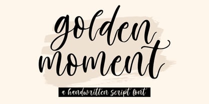 ‘Golden Moment’ a handwritten script font that has multilanguage and PUA encoded, this font is perfect for t-shirt designs, quotes, logos, display, branding, wedding invitations, and more.
 - Rotis Semi Sans by Monotype,
$40.99 Rotis¿ is a comprehensive family group with Sans Serif, Semi Sans, Serif, and Semi Serif styles, for a total of 17 weights including italics. The four families have similar weights, heights and proportions; though the Sans is primarily monotone, the Semi Sans has swelling strokes, the Semi Serif has just a few serifs, and the Serif has serifs and strokes with mostly vertical axes. Designed by Otl Aicher for Agfa in 1989, Rotis has become something of a European zeitgeist. This highly rationalized yet intriguing type is seen everywhere, from book text to billboards. The blending of sans with serif was almost revolutionary when Aicher first started working on the idea. Traditionalists felt that discarding serifs from some forms and giving unusual curves and edges to others might be something new, but not something better. But Rotis was based on those principles, and has proven itself not only highly legible, but also remarkably successful on a wide scale. Rotis is easily identifiable in all its styles by the cap C and lowercase c and e: note the hooked tops, serifless bottoms, and underslung body curves. Aicher is a long-time teacher of design and has many years of practical experience as a graphic designer. He named Rotis after the small village in southern German where he lives. Rotis¿ is suitable for just about any use: book text, documentation, business reports, business correspondence, magazines, newspapers, posters, advertisements, multimedia, and corporate design.Today Rotis ia also available with pan european caracter set.
 - Rotis Semi Sans Paneuropean by Monotype,
$92.99Rotis¿ is a comprehensive family group with Sans Serif, Semi Sans, Serif, and Semi Serif styles, for a total of 17 weights including italics. The four families have similar weights, heights and proportions; though the Sans is primarily monotone, the Semi Sans has swelling strokes, the Semi Serif has just a few serifs, and the Serif has serifs and strokes with mostly vertical axes. Designed by Otl Aicher for Agfa in 1989, Rotis has become something of a European zeitgeist. This highly rationalized yet intriguing type is seen everywhere, from book text to billboards. The blending of sans with serif was almost revolutionary when Aicher first started working on the idea. Traditionalists felt that discarding serifs from some forms and giving unusual curves and edges to others might be something new, but not something better. But Rotis was based on those principles, and has proven itself not only highly legible, but also remarkably successful on a wide scale. Rotis is easily identifiable in all its styles by the cap C and lowercase c and e: note the hooked tops, serifless bottoms, and underslung body curves. Aicher is a long-time teacher of design and has many years of practical experience as a graphic designer. He named Rotis after the small village in southern German where he lives. Rotis¿ is suitable for just about any use: book text, documentation, business reports, business correspondence, magazines, newspapers, posters, advertisements, multimedia, and corporate design.Today Rotis ia also available with pan european caracter set. - Rotis Semi Serif Paneuropean by Monotype,
$92.99Rotis¿ is a comprehensive family group with Sans Serif, Semi Sans, Serif, and Semi Serif styles, for a total of 17 weights including italics. The four families have similar weights, heights and proportions; though the Sans is primarily monotone, the Semi Sans has swelling strokes, the Semi Serif has just a few serifs, and the Serif has serifs and strokes with mostly vertical axes. Designed by Otl Aicher for Agfa in 1989, Rotis has become something of a European zeitgeist. This highly rationalized yet intriguing type is seen everywhere, from book text to billboards. The blending of sans with serif was almost revolutionary when Aicher first started working on the idea. Traditionalists felt that discarding serifs from some forms and giving unusual curves and edges to others might be something new, but not something better. But Rotis was based on those principles, and has proven itself not only highly legible, but also remarkably successful on a wide scale. Rotis is easily identifiable in all its styles by the cap C and lowercase c and e: note the hooked tops, serifless bottoms, and underslung body curves. Aicher is a long-time teacher of design and has many years of practical experience as a graphic designer. He named Rotis after the small village in southern German where he lives. Rotis¿ is suitable for just about any use: book text, documentation, business reports, business correspondence, magazines, newspapers, posters, advertisements, multimedia, and corporate design. Today Rotis ia also available with paneuropean caracter set. - Rotis Semi Serif by Monotype,
$40.99 Rotis¿ is a comprehensive family group with Sans Serif, Semi Sans, Serif, and Semi Serif styles, for a total of 17 weights including italics. The four families have similar weights, heights and proportions; though the Sans is primarily monotone, the Semi Sans has swelling strokes, the Semi Serif has just a few serifs, and the Serif has serifs and strokes with mostly vertical axes. Designed by Otl Aicher for Agfa in 1989, Rotis has become something of a European zeitgeist. This highly rationalized yet intriguing type is seen everywhere, from book text to billboards. The blending of sans with serif was almost revolutionary when Aicher first started working on the idea. Traditionalists felt that discarding serifs from some forms and giving unusual curves and edges to others might be something new, but not something better. But Rotis was based on those principles, and has proven itself not only highly legible, but also remarkably successful on a wide scale. Rotis is easily identifiable in all its styles by the cap C and lowercase c and e: note the hooked tops, serifless bottoms, and underslung body curves. Aicher is a long-time teacher of design and has many years of practical experience as a graphic designer. He named Rotis after the small village in southern German where he lives. Rotis¿ is suitable for just about any use: book text, documentation, business reports, business correspondence, magazines, newspapers, posters, advertisements, multimedia, and corporate design. Today Rotis ia also available with paneuropean caracter set.
 - Colossal Love by Create Big Supply,
$17.00 Experience the beauty and authenticity of Colossal Love, a mesmerizing handwritten font that will captivate your audience. With its natural feel and resemblance to real handwriting, Colossal Love adds a personal touch to your designs. Whether you're creating wedding invitations, stationery art, or eye-catching social media posts, this font will infuse your projects with elegance and charm. Colossal Love features a comprehensive set of uppercase and lowercase letters, allowing you to create versatile typography that suits your creative vision. The font also includes numbers and punctuation, ensuring seamless integration into your designs. Its multilingual support allows you to communicate your message effectively across different languages, making it accessible to a global audience. What sets Colossal Love apart is its extensive collection of ligatures. These ligatures enhance the natural flow of the font, creating seamless connections between letters and giving your text a handcrafted appearance. The result is a unique and authentic look that captures the essence of handwritten elegance. With PUA encoding, accessing the amazing glyphs and ligatures of Colossal Love is effortless. This feature ensures that you can fully explore the font's potential and unlock its hidden treasures with ease. Let your creativity soar as you experiment with different combinations and give your designs a personal and heartfelt touch. Discover the beauty of Colossal Love and bring a touch of handwritten elegance to your projects. Add a personal and intimate feel to your designs and make a lasting impression on your audience.
 - Avris by Miosis,
$30.00 This is Avris, an exceptional and feminine stencil font. The base was designed in 2015. The word ‘avris’ derives from the latin rara avis, which means “rare bird”. Stencil fonts were initially designed for mass production and transportation companies. Unlike this one, Avris’ curvy and minimalistic design feels and looks like the wings of birds, flying above the quiet ocean. It also has a roman, calligraphic and cryptographic touch to it. It can be used for editorial (fashion) magazines and poster designs. Looks great in headlines! Also the numerals are a must see when you put it in use.
 - P22 Pooper Black Pro by IHOF,
$39.95 Pooper Black Pro is based on a brush ethic and has an extreme axis that lends a certain amount of speed to the font while the lack of connectors slows it down. The pro version expands on the original and popular Pooper Black with the addition of full Central and Eastern European character sets and plenty of alternate characters for those who have applications that support Opentype features. Almost all of the lower case characters now include an in stroke and out stroke version for greater design flexibility. A wonderful face for packaging, titling, and short bursts of text.
 - Copperplate Gothic by Linotype,
$40.99This American original was designed in 1901 by Frederic W. Goudy for the American Type Founders in Jersey City. Copperplate Gothic is an all caps font which looks like a sans serif at first glance. But closer examination reveals tiny, pointy serifs which almost seem to round off the letters. Designers rely on this font’s lofty and sublime impression and it is often seen in advertisements, but it has also made a place for itself in private and business correspondence and corporate design. The AB and BC designations in the style names refer to the relative sizes of the capitals and small capitals. - Melister by Cooldesignlab,
$10.00 Melister font is the new elegant font! This font is specially made for those of you who need an elegant touch to design your next project with perfect and stunning results. Melister is equipped with lines such as hand strokes which are very suitable for various purposes. Such as title, signature, logo, correspondence, wedding invitation, letterhead, nameplate, label, newsletter, poster, badge, Branding, Greeting Card, etc. So beautiful on invitations like greeting cards, and more!!! Melister includes alternate glyphs and beautifully renders fonts including set styles, ligatures, etc. The Open Type feature can be accessed using intelligent Open Type programs such as Adobe Illustrator CS, Adobe Indesign & CorelDraw X6-X7 and Microsoft Word. And this font has provided PUA unicode (custom code font). so that all alternative characters can be easily accessed in full by craftsmen or designers. If you don't have a program that supports OpenType features such as Adobe Illustrator and CorelDraw X Version, you can access all the alternative glyphs using Font Book (Mac) or Character Map (Windows). Thanks and love designing :-)
 - ADs Comics For All by Letters by Amal Desai,
$10.00 AD's Comics For All has everything you need from a professional comic book font but with a light, accessible price tag. The key to digitally lettering comics is mimicking the style and natural imperfections of hand lettering. This font was handmade and programmed (with nifty tricks) keeping exactly that in mind. The functionality of hand lettered comic book fonts definitely doesn't end at comic books. It can give an energetic and natural feel to just about any design. They can be especially handy when a bit of contrast is needed in a type-heavy layout. If you need an exceptional and affordable font to letter your indie comic book/manga/graphic novel, AD's Comics For All is an excellent choice. If you're a seasoned letterer, this versatile font is worth adding to your dialogue arsenal. If you're a designer and have never looked twice at a comic book, you'll find that comic book fonts are a category of their own and a useful tool in your utility belt.
 - South Time by Mercurial,
$17.00 South time an enchanting handwritten script typeface with exquisite accents, casual-chic, perfect for you who want a perfect and fabulous font! Suitable for many design projects such as logo design, branding, packaging, blog graphics, stylizing quotes, wedding stationery, art prints, collateral design, packaging, social media, and so on. I’ve truly enjoyed the process of creating this font collection and hope that it will bring some magic into your projects! Whats Includes: Regular Script, Uppercase and lowercase, Numbers and punctuation, Ligatures, multilingual languages support, symbols and more. It's highly recommended to use it in opentype capable software - there are plenty out there nowadays as technology catches up with design. The Open Type features can be accessed by using Open Type savvy programs such as Adobe Illustrator, Adobe InDesign, Adobe Photoshop Corel Draw X version, And Microsoft Word. And this Font has given PUA unicode (specially coded fonts). so that all the alternate characters can easily be accessed in full by a craftsman or designer and also equipped with Multilingual support. So, let's get it! Thanks and enjoy your day ...!. :)