10,000 search results
(0.037 seconds)
- Klepsydra by Hellig,
$12.00 When creating the font, I was inspired by the various names of musical groups and sci-fi movies. I took the hourglass shape as a basis and added various serifs to it, hence the name of my font appeared - Klepsydra, as in the Greek hourglass. This style has an abbreviation - "Z". I will develop this font family and will add new styles, as well as characters.
 - They Live Brush by Alphabet Agency,
$14.00 They Live Brush font is inspired by the 80's cult classic movie They Live logo. The font is ideal for use in designs that you include a bold brush font in a cool way. The font has a graffiti feel that can allow you to express yourself with some attitude. The font is an all capital letters font. The font contains 128 characters.
 - Lust Slim by Positype,
$50.00 Check out the new Lust Pro & Lust Pro Didone to see how the series has grown and evolved. Confident and versatile, Lust is an exercise in indulgence—an attempt to create something over the top and vastly useful. If Lust Slim seems both new and familiar, that’s because it is. The series unapologetically channels Herb Lubalin, but produced with a deliberate, contemporary twist. There is an intentional slyness infused in the letterforms—the extreme thick and thin lines flow effortlessly without becoming gratuitous. It’s always just enough, not too much. What makes the type series so appealing? The curves. When asked to describe the letterforms, most people unwittingly allude to the human form, using adjectives usually reserved for describing physical traits… creating all-too-familiar comparisons. Summerour has grown to accept this as unavoidable and reasonable given his acknowledgement of its influences and has provided nuances within the letterforms to accentuate that. Intended to be set large, the typeface has both Standard (Lust, Lust Didone and a single unified Italic) and Display variants making it perfect for editorial use and a flexible solution for any display need.
 - TX Manifesto by Typebox,
$39.00Manifesto was designed for an article written in response to opinions that philosophy and personal expression have been wiped clean from today's design profession. Contemporary design is sterile and sublime. Enter Ken Garland's revision of the original 1964 Manifesto. The publishing of the "First Things First" manifesto 2000 is exhibit A that a trend for social belief systems is growing. Or is it? Many comfortably accept that designers are indeed "engaged in nothing less than the manufacture of contemporary reality". The four 'voices' of the TX Manifesto Family (Regular, Slant, Stout and Stencil) is intended for your typographical response, and push for conscientious design. - Aerodyne by Mysterylab,
$10.00 Introducing Aerodyne, a highly versatile font family with seven weights and italics. While both modern and sleek in its line quality and flow, the fundamentals of this font set takes many of its design cues from more antiquated typestyles of the Roman era, especially in the capital letter set. Pair that up with the influence of mid-20th century humanist letterforms, and you have a type that is full of individual character, but with a smooth uniformity that conjures great beauty and individuality without drawing too much undue attention to itself. The subtle serifs give the font a unique character at both text and display sizes.
 - Overseas by Hanoded,
$15.00 I traveled a lot: in the beginning on my own, later as a tour guide. I always used the English word ‘abroad’ to describe a trip to a foreign country, but I noticed that the English, Australians and New Zealanders preferred the word ‘overseas’. I then realised that they all lived on an island, so most of the foreign countries for them were across the sea. I had to think of that when I made this font! Overseas is a brush font with a certain rough elegance to it. I made it using poster paint and a brush. Use if for posters, product packaging and book covers.
 - Ammer Handwriting by Schriftlabor,
$18.99 Austrian Cartoonist Wolfgang Ammer lent his handwriting to this font, which was produced by Miriam Surányi. Wolfgang already uses the font in his daily routine: It facilitates corrections and translations of his cartoons for international newspapers. Rich in contextual alternates, Ammer contains about 1800 glyphs. Each character has multiple alternates. And a complex OpenType substitution feature makes sure that the same variant does not appear twice in a line. As a special gimmick, the font contains a Tic Tac Toe game: To activate it, type a # and turn on stylistic set 20. Then use digits 1–9 for setting the naughts and crosses on their places. The enclosed TT variant has a reduced glyph set and therefore a smaller file size, hence it is better suited for use on the web.
 - Excelsor Script by Storm Type Foundry,
$32.00Excelsor Script is inspired by lithographically produced scripts. It is softer and simpler than, for example, engraved Splendid Script, because its designer used pens and lithographic needles. The graver for steel is held in a quite different way and this has an influence on the shape of the letter. Similar type faces were in use from Neo-Classicism until the beginning of Art Nouveau, when they were pushed aside by a completely different view of festive typography. It has, in contradistinction to other scripts, slightly narrowed letters, which signifies a distinctive elegance without wasting space on the line. For practical reasons it was not possible to encircle the bottle with too long a label. It is, therefore, a suitable type face for labels. Its two optical grades cover a wide range of sizes. - Glaciar by TripleHely,
$16.00 Glaciar is a script typeface based on brush handwriting and inspired by old-style bas-reliefs. All contours were carefully cleaned of brush roughness, but at the same time, minor imperfections were left to create the unique character of this font Glaciar has a built-in auto replacement for lowercase letters without connecting strokes (in the case of word ends) and for ligatures (in the case of letter pairs that do not fit well together). In addition, there are alternates glyphs with starting and ending swashes - the last ones can be used with any OpenType software. And finally, the font has wide multilingual support and can be used in texts in 195 languages Glaciar is a good choice for branding and design projects as well as a cute text overlay to any background image
 - DT Skiart Serif Leaf by Dragon Tongue Foundry,
$10.00 ‘Skiart Serif Leaf’ has been on a long growing path getting to where it is now. Originally inspired by the san serif font ‘Skia’ by Mathew Carter for Apple. ‘Skiart’ was designed to feel more like a serifed font, but without any serifs. It took a step between sans serif and serif fonts. Next on the path towards a serif font came Skiart Serif Mini, with tiny serifs added. This was a true serif font, although they were subtle. This font ‘Skiart Serif Leaf’ is the next in the series. After many reiterations, ‘Skiart Serif Leaf’ was built and rebuilt many times until finally, this version deserved to be presented to the world. Style and flow had been added to this font. It remained fully readable and feels as clean and normal as any of the best body copy serifs, and yet has an original modern flair to it. The font feels strong and solid while having a subtle organic flow in its form. If compared to one of the more commonly used serifs like ‘Times New Roman’, the ‘Skiart Serif Leaf’ lowercase is more open with a taller x-height, increasing its readability and friendliness. The serifs are smaller and less distracting. They are not pretending to be ligatures. This font may be organic but is not in anyway script like. Where ‘Times’ makes its p q b d forms out of a barely touching oval and stem, the ‘Serif Leaf’ forms are much more firmly attached, appearing clearly as single letters. The standard setting for the a’s and g’s are round single story, feeling warmer and more inviting in the ‘Serif Leaf’ font. Much more friendly than the stuffy double storied versions in fonts like ‘Times’ etc. ‘Skiart Serif Font’ comes with a somewhat organic italic.
 - Totally Terrific by Set Sail Studios,
$12.00 I love Tea. Do you love Tea? Good. Because there's a whole load of T's in the Totally Terrific Typeface! Bursting with fun and bouncy brush-strokes, this typeface will undoubtedly add a dash of cheeky playfulness to your text - ideal for greeting cards, branding, merchandise, invitations & hand-made quotes. The awesome thing about this typeface is that it's so easy to mix up the various font styles and create totally unique, hand-made looking words each time. The lowercase characters can be connected (Totally Terrific Regular) or un-connected (Totally Terrific Two), and will work in any combination of these two versions. Not only does it also look great in all-caps, but the uppercase letters will fit in with the lowercase at any location - I'm serious! Just throw one in the middle of a word, I dare you ;). Your download will contain 2 font files: Totally Terrific Regular • Contains a full set of connected lowercase letters, uppercase letters, a large range of punctuation, numerals, and multilingual support. Totally Terrific Two • A second version of the Totally Terrific Typeface, with a completely new set of un-connected lowercase characters. These are designed to work in perfect harmony with the connected set from the other font file. Just keep switching between the two fonts to create unique word layouts!
 - Comply Slab by Arkitype,
$12.00 Comply Slab is inspired by action and extreme sports, Comply gets it's name from the well known skate trick the “No Comply”. This type family doesn't mess about! With 9 weights from thin to black, Comply Slab will give you some great options to use. This font family will “kill it” in both print and digital, in headlines for editorial, posters, banners, websites, apparel, packaging, logos or magazines just to name a few. If you want to make a statement that gets the message across in a slick way with some cool looking glyphs Comply Slab is the font! There is an alternate R and S so you can choose to go with the cool default sharp glyphs or swap them for a more traditional chamfered corner version. Each of the 9 weights has an italic version to add even more action.
 - Lamar Pen by Three Islands Press,
$39.00 Mirabeau Buonaparte Lamar had an exotic name for a historic Texan, but he left his mark beginning in 1836, the year of Texas independence and the first year that pioneers other than mountain men made their way West. Lamar went on to become the young republic’s first elected vice-president (to President Houston) and second president -- and to author a number of interesting letters in his elegant, stylish hand. (Mirabeau B. Lamar grew up a well-to-do southerner from Georgia, and his penmanship shows it.) One of the most interesting aspects of designing old handwriting fonts, to me, is pausing to reflect on the actual moment that the letter-writer is sitting at his or her desk or table, pen in hand, putting thoughts to words -- 150 to 200 years ago. Has a complete character set, and plenty more.
 - Marvis by Larin Type Co,
$15.00 Marvis is a vintage collection of fonts that includes serif, true italic, script, sans serif and slab serif each of them has two style - Clean and Rough style. Also for the script includes Alternates and Swashes. This collection was inspired by vintage signage, logos and this fonts are perfectly suitable for any vintage project and will make it at a high level. This fonts is easy to use has OpenType features. Font collection includes: Full Capital alphabet A-Z for Sans and Slab Full alphabet Uppercase and Lowercase A-z for Serif, Italic, Script Numbers, fractions for Serif, Italic, Script, Sans and Slab Punctuation and symbols for Serif, Italic, Script, Sans and Slab Alternates for Uppercase for Serif and Script Alternates for Lowercase for Script Swashes for Script Ligatures for Serif and Italic "Tb, Th, Tk, Tl, ct, fb, ff, ffi, fi, fh, fk, fl, st"
 - Hostrange by Ditatype,
$29.00 Hostrange is a captivating handwritten font that brings a touch of authenticity and personality to your designs. With its brush-style letterforms and varying brush stroke thicknesses, this typeface captures the essence of handcrafted charm. The special feature of this handwriting lies in its dynamic brush stroke variations, where each letter showcases a range of thicknesses. This adds a sense of organic movement and visual interest to the font, mimicking the natural variations found in hand-drawn brush calligraphy. The result is a font that feels alive and full of character. The brush strokes create a natural and flowing appearance, as if they were crafted by hand with a brush. The varying thicknesses add depth and dimension, enhancing the font's authenticity and handcrafted feel. The letterforms of Hostrange strike a balance between legibility and artistic expression. While each letter maintains its distinctive shape, the varying brush stroke thicknesses bring a sense of uniqueness to each character. Features: Alternates Ligatures Multilingual Supports PUA Encoded Numerals and Punctuations Hostrange fits in headlines, logos, posters, invitations, packaging, branding materials, or any project that calls for a handwritten aesthetic. Find out more ways to use this font by taking a look at the font preview. Thanks for purchasing our fonts. Hopefully, you have a great time using our font. Feel free to contact us anytime for further information or when you have trouble with the font. Thanks a lot and happy designing.
 - Sukothai by Linotype,
$155.99Sukothai is a traditional Thai design based on early metal type. The classic and distinct forms make it excellent for setting text at small sizes or in large passages. Originally released by Linotype for digital photocomposition, now both the Light and Bold weights are available in OpenType format. This makes it possible to dynamically and precisely position the various levels of superscript and subscript vowel signs and tonal marks. In addition to this, the complete Unicode page range for Thai is covered to ensure flawless conversion between other OpenType fonts using Unicode. The accompanying Latin design matches well in scale and texture and supports most Western European languages making it ideal for setting bilingual texts. - Mutalis Fashion by Mans Greback,
$59.00 Mutalis Fashion is the epitome of contemporary elegance. This font is the perfect blend of modernity and tradition, featuring a sleek design with delicate serifs that add a touch of sophistication. This font is clean and versatile, making it the ideal choice for fashion-forward projects. With its innovative and inventive style, Mutalis Fashion is perfect for everything from high-end fashion campaigns to stylish websites and advertisements. Whether you're looking to add a touch of glamour to your designs or simply want to create a clean and sophisticated look, Mutalis Fashion is the perfect font for the job. The Mutalis Fashion family consists of Regular and Italic. The font is built with advanced OpenType functionality and has a guaranteed top-notch quality, containing stylistic and contextual alternates, ligatures and more features; all to give you full control and customizability. It has extensive lingual support, covering all Latin-based languages, from Northern Europe to South Africa, from America to South-East Asia. It contains all characters and symbols you'll ever need, including all punctuation and numbers.
 - Eva Antiqua SG by Spiece Graphics,
$39.00 Based on the 1922 Klingspor model by German designer Rudolf Koch, this hand-drawn quill roman has an informal and curiously delicate appearance. The typeface was known in Germany as Koch Antiqua and in the rest of Europe as Locarno. Eve, as it was called in the United States, continues to enjoy great popularity in advertising and book publishing circles. This deluxe version includes display light, display heavy, and display black as well as the hard-to-find display light and heavy (Koch Kursiv) italics. Eva-Paramount, which is based on Morris Benton's 1928 ATF Paramount, has also been included. It contains a set of alternates characters that are in keeping with the light and heavy display letter styles. Eva-Antiqua is also available in the OpenType Std format. Alternates are now merged together into each style as stylistic alternates or as swashes. These advanced features currently work in Adobe Creative Suite InDesign, Creative Suite Illustrator, and Quark XPress 7. Check for OpenType advanced feature support in other applications as it gradually becomes available with upgrades.
 - Destine by Ef Studio,
$15.00 Destine is a modern display typeface that has high contrast and hairline serif. The typeface inspired by Didot and Bodoni. Destine typeface has opentype features like stylistic ligatures and stylistic alternate to beautify any design project. This typeface is compatible for branding, logo, book magazine, headline, wedding invitation, and so on. You will get : Destine Regular font with full set of lowercase and uppercase letters, numerals and punctuation, multilingual characters, ligatures & alternates.
 - Bottle Fork by PizzaDude.dk,
$15.00 Here is my font with carved out letters, like a really bad stamp. Each lowercase letter has 3 different versions, and that makes your text more natural, organic and handmade. Normally I kern my fonts throughout, but this time there is no kerning at all...and that's odd, when we're not talking about monospaced fonts. Anyway, Bottle Fork has its flaws and jumpy x-height...but that's exactly the charm of it all! :)
 - Krul by Re-Type,
$99.00 ‘Krul’ is a typographic interpretation of the lettering style created by Dutch letter painter Jan Willem Joseph Visser at the end of the 1940s, which decorated the traditional brown bars of Amsterdam. In the beginning, these letters were strongly associated with the pubs connected to the Amstel brewery, given that Visser was the company’s official painter. As the years passed, the style became increasingly popular, and various business owners in Amsterdam and other Dutch and Belgian cities also commissioned its use. In the 1970s and 1980s, Leo Beukeboom, another talented letter painter, continued and expanded this lettering tradition while employed under the Heineken brand. Much of his work can still be found in the Jordaan and De Pijp neighborhoods in Amsterdam. The Amsterdamse Krulletter, or Amsterdam’s curly letter, is strongly inspired by the calligraphic works of the 17th century Dutch writing masters, of which Jan van den Velde was a central figure. However, distinct characteristics of this style, for example, its unusual and beautiful ‘g’, originate from a model that was published by Johannes Heuvelman in 1659, which J. W. J. Visser referenced. Typographic circles have somehow overlooked the Amsterdamse Krulletter and its heritage. The Dutch calligraphic hands preceded and influenced the formal English penmanship which has inspired numerous typefaces in the Copperplate style. In contrast, the models from van den Velde, Heuvelman, and Jean de la Chambre, among others, are a missing chapter in Dutch typographic history, and had never been turned into typefaces until now. Conscious of the cultural and identity issues that arise in reviving a unique style, and concerned about the speed with which the lettering style was disappearing, Ramiro Espinoza focused the project of designing ‘Krul’ on digitally recreating the calligraphic complexity of these beautiful letters. Created through several years of research, ‘Krul’ is not a direct digitization of the Amsterdamse Krulletter, but instead, an interpretation that incorporates numerous alternative characters absent in the original model, and improves upon details where necessary, resulting in an optimal performance on the printed page. The typeface is presented in Open Type format, with an abundance of intricate ligatures, fleurons, and swashes, which permit the creation of numerous calligraphic effects. The very high contrast and rhythm of the strokes in this typeface make it especially suited for media applications conveying a sense of elegance and sophistication. Designers of feminine magazines, advertisements, and corporate identities within the fragrance and fashion industries will find in this typeface to be an extremely useful and appropriate resource.The great Amsterdamse Krulletter is finally back, and we are proud to make it available to you.
 - Strokes by Favorite Fonts,
$17.00 The "Strokes" font family presented here has several styles: regular, italic, bold and bold italic. The font supports the alphabet consisting of Latin letters and symbols, Cyrillic, Tatar. The composition of the font "Strokes" includes graphemes from uppercase and lowercase letters, numbers, standard characters. The originality of the font lies in its name. The "Strokes" font is made up of many intersecting lines, forming rounded sans-serif letters, but at the same time smooth and easy to read, which will fit perfectly into your composition. The unusualness and attractiveness of the font makes it noticeable among the texts that surround us everywhere. This property is convenient to use on signs, logos, corporate identity, product packaging. The decorativeness of the font is eye-catching and will add important accents to your work.
 - Tempest - Unknown license

- High Society NF by Nick's Fonts,
$10.00 Blandford Press strikes again, with a delightful, delicious, de-lovely offering from their 1946 tome, Lettering for the Commercial Artist. The editor, A. H. Hunter, called this one simply "The Elegant Alphabet" and cautioned that it, "being neither quick nor easy, needs to be used with discrimination." Or not...
 - Red Dog Saloon by FontMesa,
$25.00Red Dog Saloon is an old classic western looking type font and one that never goes out of style. A fill font is included with this font, you will need an application that works in layers in order to use the fill fonts that come with FontMesa fonts. - Ongunkan Gothenburg Futhark Swe by Runic World Tamgacı,
$40.00 Sweden Gothenburg Futhark In Sweden you have another set called the Bohuslän runes, which are used specifically in the west coast area (Bohuslän) north of (and including) Gothenburg city (my hometown, incidentally). Interestingly, this is a string of 26 letters, not 16; 2 more than the original Elder Futhark
 - Ramones by Namistudio,
$15.00 Rebel, Energy, Punk, Power... Ramones, jagged interlock letter with bold line. This font will bring that IN YOUR FACE attitude in your design. No more soft side. It's all about the energy ! Either choosing the auto-generate interlocking letters, or keep it original, Ramones still brings you the power.
 - Little Sooner by Dumadi,
$25.00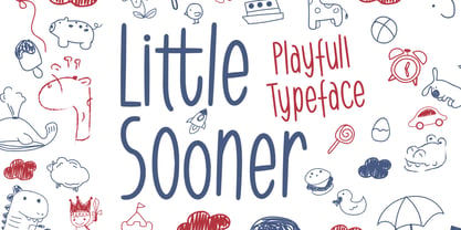 Little Sooner is a special handmade font using the Brush tool. This font is specially designed for children with a full-color style that will enhance the quality of your designs. very suitable for the design of children’s t-shirts, children’s youtube titles, children’s quotes, children’s web, and others.
 - Workbench by Graphicfresh,
$14.00 This font is great for magazine headlines, business cards, social media posts, and a variety of other applications. The text size is very flexible, with multiple font styles and sizing options that allow you to create the look you want without altering the overall design of your text.
 - Formal Dance JNL by Jeff Levine,
$29.00 A vintage Canadian-published music book circa the 1940s had the title "Strauss Waltzes" hand lettered in a bold Art Deco sans serif that featured block style letters with rounded corners. This was the working model for Formal Dance JNL, which is available in both regular and oblique versions.
 - Snooty Fox NF by Nick's Fonts,
$10.00This casually elegant typeface is based on an unnamed offering from Pen & Brush Lettering and Practical Alphabets, published by Blandford Press, Ltd., London, in 1929. Good taste dictates that, because of the ornate and unusual letterforms of the uppercase letters, the font never be used as all caps. - Bravecho by ahweproject,
$10.00 Bravecho is a highly detailed and distinct display font. Use this serif display font to add any design idea you can think of! Masterfully designed to become a true favorite, this font has the potential to bring each of your creative ideas to the highest level! This font is PUA encoded which means you can access all of the glyphs and swashes with ease!
 - Putney Junction NF by Nick's Fonts,
$10.00This elegant offering is based on a typeface originally called "Design", from Barnhart Brothers & Spindler’s Specimen Catalog Number 9, published in the first decade of the twentieth century. This version has been fine-tuned to set tight, and is suitable for headlines, subheads, and limited amounts of body copy. Both versions of this font include the complete Unicode Latin 1252 and Central European 1250 character sets. - Bridle Path by Cititype,
$19.00 ‘Bridle Path’ is a captivating font that embodies the graceful beauty of natural ink strokes. With its unique blend of thick and light strokes, it exudes a tranquil and soulful writing style that is both relaxed and inviting. The font's distinctive character makes it an excellent choice for various applications, including brands, logos, photography logo watermarks, headers, titles, weddings, cards, and website banners. The fluidity of Bridle Path’s design creates an enchanting visual experience, as if each letter was crafted by an artist's brush. The thick strokes provide a sense of boldness and strength, while the light strokes add delicacy and elegance to the overall appearance. This combination results in a font that captures attention and leaves a lasting impression. Bridle Path’s versatility extends beyond its aesthetic appeal. It has been meticulously crafted to support multilanguage usage, ensuring that it can seamlessly adapt to various linguistic needs. Whether your content is in English, Spanish, French, German, or any other language, Bridle Path will faithfully represent your words with clarity and beauty. Whether you're seeking a font that embodies a serene atmosphere or one that adds a touch of sophistication, Bridle Path is the perfect choice. Its soothing and expressive nature elevates any design, making it a valuable asset for both professional and personal projects. Embrace the allure of ‘Bridle Path’ and bring a sense of natural elegance to your creations.
 - Glance Slab by Identity Letters,
$29.00 Dynamic and sportive. A well-balanced experiment for sparkling headlines. Glance Slab is an experimental design that plays on the tension between connection and detachment. In this typeface, serifs may be detached and some strokes may not connect to their stems. This creates a dynamic impression of balance and movement. The elegance of an ice skater and the determination of a quarterback: Glance Sans has it all. Where a curve meets a stem and where serifs seem to “hover” near their respective letters, the nonjoining elements create an impression similar to a stencil typeface. But here, the function of the gaps differs from strictly stencil designs: while the gaps provide a “sparkling” effect in Glance Slab that’s clearly visible in large sizes, they take on the role of ink traps when set smaller, making for surprisingly legible body copy. With its strong visual character, this font family is quickly recognizable, making it perfectly suitable for branding and any large-scale application, such as posters, billboards, and event signage. Glance Slab consists of seven weights from Thin to Black. Each style has a character set of about 570 glyphs, which includes circled numbers and arrows (positive and negative versions), ligatures, extended language support, and many other features.
 - Drop Cap One by Outside the Line,
$19.00 Drop Cap One is a drop cap or an initial cap font. Even though it has all the letters of the alphabet it is not an alphabet font to be used for headlines or body copy. It has no kerning or punctuation except a period. It does not have accent marks. There are basically 2 alphabets in this font. The lighter letters are lower case and the darker letters are upper case. The light and dark letters are interchangeable. While a fun desktop font the real inspiration for this font was my need for a webfont for initial caps for blogging. It could also make a great scrapbooking font too. Lots of uses for this quirky little font.
 - Toma Sans by JAM Type Design,
$- Toma Sans is a sans serif type family of seven weights plus matching italics. Influenced by the geometric-style sans serif faces that were popular during the 1920s and 30s, the fonts are based on geometric forms that have been optically corrected for better legibility. Toma Sans has a functional look with a friendly open touch. While the ExtraLight and the black weights are great performers in display sizes the light, regular and medium weights are well suited to longer texts. The small x-height and the restrained forms lend it a distinctive elegance. The typeface has an extended character set to support most European languages.
 - Amagusi by Miracledsign,
$15.00 Amagusi is a font that is inspired by Japanese culture with all its uniqueness and beauty that makes the bamboo curtain country very loved by many people, as well as in the art of writing kanji which has its own aesthetic value. The amagasi font is formed and made by combining the contours and anatomy of kanji letters so that it has a very beautiful value when used in a sentence and is very attractive to readers who see it and of course it will make your product more elegant and appreciated by everyone who sees it.
 - Trango by Juraj Chrastina,
$29.00 A funny childish handwritten font, with a spirit. This typeface can tell fairy tales. Trango is a sans serif that goes well with the slab serif Besley Hand.
 - TXT Long Hand by Illustration Ink,
$3.00The letters of this cursive font connect together to create script lettering that will add a unique touch to your special occasion announcements, invitations, scrapbook layouts, and programs.
