7,283 search results
(0.014 seconds)
- Dead Meat by wearecolt,
$8.00 DEAD MEAT - a bold, uppercase display font. Give your titles and logo types a hand made lettering look Features All uppercase font (use lower case key strokes for alternative character). Each glyph is unique from hand drawn originals. – Web font format included. The zip package contains both an opentype (.oft) and web font (.woff), DEAT MEAT has been created with all Western European characters.
 - Matria by Pedroglifos,
$12.00 Matria brings the feminine energy from a strong and heavy perspective. These letterforms are inspired by the balancing nature of the yin and yang forces, resulting in a dynamic stencil that evokes the qualities of a thorny rose. This decorative stencil-display typeface is meant to be used in combination with simpler fonts that let it stand out and spur a lot of energy into your project.
 - Bronzino by Greater Albion Typefounders,
$8.95 Bronzino’s roots lie in the Arts and Crafts movement, and in the traditions of letterpress printed fine quality books. It’s ideal for legible headings which have just that hint of charm and difference outside of the normal and mundane. It’s formal enough to go anywhere yet it has a spirit of fun, it brings a world of bygone care and quality to the modern age.
 - Cuizy by Twinletter,
$13.00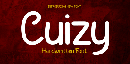 Introducing "Cuizy Font" - Where Handwriting Meets Distinctive Design. Cuizy Font is your key to adding a touch of personal charm and uniqueness to your projects. Crafted with precision, it effortlessly blends the warmth of handwritten text with contemporary style. What’s Included : File font All glyphs Iso Latin 1 Alternate, Ligature Simple installations PUA Encoded Characters – Fully accessible without additional design software. Fonts include Multilingual support
 - Schreibmeister by RMU,
$30.00 Schreibmeister is my interpretation of Arno Drescher’s design for Ludwig Wagner, Leipzig, completed in 1958. The letters X and x were improved as well as some ligatures. The letter E has an alternative, and the small d comes with two alternatives, of which one form can be reached by typing the partial different key. Generally it is recommended to activate both Standard and Discretionary ligatures.
 - FB Titling Gothic by Font Bureau,
$40.00Titling Gothic FB is an immense series of nearly fifty styles inspired by that century-old favorite ATF Railroad Gothic. Led by the Los Angeles Times and Gentleman’s Quarterly, U.S. publications are using David Berlow’s series to unify the structure of headlines from its wide spectrum of options. Titling Gothic FB started as a relative of Berlow’s Rhode family, but took its own direction; FB 2005 - Delko by Minor Praxis,
$20.00 Inspired by a scrolling banner led lamp display and monospace fonts like OCR-A/B. A modular typeface that come from an arranged octagonal shape module, with 45 degrees sides slope which can gives it a casual digital-look font. Designed for headlines, posters, and medium size body copy. Delko come with 2 styles, regular and lined. Languages support, ligatures, stylistic alternates, and symbols are available.
 - Deco Banner JNL by Jeff Levine,
$29.00 Deco Banner JNL is composed of reverse lettering on a black background with Art Deco end caps. To create a banner, first type the plus sign for the left end cap, then your text. To add a space between words, use the bar on the shift position of the backslash key then continue on. To add the right end cap, type the equal sign.
 - Kehunix by Twinletter,
$15.00 Introducing New font KEHUNIX This Halloween Font is the perfect way to create a fun Halloween invitation, party poster, or another type. Simply download and add it to your design using simple instructions and let your imagination go! Of course with this font your various design projects will be perfect and amazing, get a beautiful title and start using our font for your special project.
 - Champloo by One Fonty Day,
$10.00 Champloo is very unique typeface which combines serif features and brush stroke. Some letters have serif, but some don’t. Serif to be found on left side of stem only. It gives a quirky impression on short text. However the larger the text become, the more consistent look it gets as a whole. These two versatile weights let you play with the typeface freely and beautifully.
 - Cinta Adhesiva by Wordshape,
$20.00 Cinta Adhesiva began as a typeface designed for the masthead of a graffiti fanzine called Free Copy. The monumental letters painted by L.A.-based graffiti writers Crae and Hael greatly influenced the feel of the typeface. The availability and ease-of-use of tape as a medium to write with is apparent on a multitude of surfaces, and this approach led to the creation of Cinta Adhesiva.
 - Persian Ruby by Si47ash Fonts,
$10.00 It's not fragile, it's delicate! :D A Arabic font (Persian typeface), as a gift for you type lovers! This font does not support any Latin characters. Just Persian and Arabic. You can get this font for free by buying another Si47ash Font: https://www.myfonts.com/foundry/si47ash-fonts/ Let me know when you did it and I will send you a promo-code: shahabsiavash [at] gmail [dot] com
 - Rollinkland by Almarkha Type,
$29.00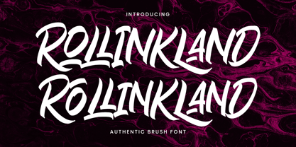 Rollinkland is a Authentic brush font with a clear style and dramatic movement this font is great for your next creative project such as logos, printed quotes, invitations, cards, product packaging, headers, Logotype, Letterhead, Poster, Apparel Design, Label, and etc. Rollinkland comes with uppercase, lowercase, numerals, accents (Multilingual characters), punctuations and so many variations on each character include OpenType alternates, swash to let you customize your design
 - Lomatic by Rochart,
$25.00 Lomatic Celtic typeface is a captivating font inspired by the enchanting world of Celtic art and symbols. With its beautifully crafted knots and intricate patterns, this font brings a touch of ancient mysticism to your designs. Perfect for projects related to mythology, folklore, or any Celtic-inspired theme. Embrace the magic of Lomatic Celtic typeface and let your creativity weave mesmerizing tales of the Celtic heritage.
 - LTC Ornamental Initials by Lanston Type Co.,
$24.95 Little is known of the origin of these decorative Initial Caps. Series 448 at 24 point were a different design from the 36 point on which this digital version is based. In addition to the basic 26 characters, there is a negative version contained in the lower case position and a fill character (for two color caps) option in the number and punctuation key positions.
 - Quote Note by PizzaDude.dk,
$16.00 With Quote Note I did my best to make a simple and unsophisticated font. I wanted the letters to come out as if they were made with a fat marker on a note. Well, I'll let you be the judge on how I succeeded. I've added 4 different versions of each lowercase letter and even did a simple complimentary dingbat. And of course there is multilingual support!
 - Samsara by W Type Foundry,
$15.00 Samsara is a cursive typeface inspired by calligraphy tools. Its shapes and gestures convey an organic-modern style which generates the texture of a brush tip. Samsara not only has a great versatility, but also is suitably to create short texts such as branding and short messages. It comes with OpenType features, stylistic sets, special ligatures, and swashes, which were designed specially to let your imagination fly.
 - Occulista by VersusTwin,
$39.00 Occulista began as a modern take on a vintage tri-line style of typeface, but quickly evolved into something quite different. This heavyweight optically-stimulating family features nine weights, with alternate uppercase letters in place of lowercase. This typeface works best in eye-catching headlines or short bursts of text, and the variant styles can applied to accent key wordings in many interesting combinations.
 - Morton by Deltatype,
$59.00 Morton, another modern grotesque typeface which deliver a extraordinary unique within typeface with the style of condensed let you create more impact with your design. Morton Type Family available in nine weights, the Thin weight deliver you a simple hair line stem until you reach the bold weight, you will get more dynamic with three stem weights which give you a modern, old school look and feel.
 - Queensila by Zamjump,
$23.00 Queensila is a comely styled serif font with beautiful ligatures, lots of custom alternative glyphs, and multilingual support. This is a very versatile font that works well in large and small sizes. Queensila is a perfect fit for your project and lets you create beautiful designs, headlines, posters, logos, badges, t-shirts and more. It's also best used for posts, logos, posters, certificates, labels and more.
 - VLNL TpLlum by VetteLetters,
$35.00 TpLlum is a typeface designed by TwoPoints for a festival in Barcelona called ‘Montjuïc de Nit’. Llum means light in Catalan. In the Montjuïc de Nit project the font was used in white over a dark grey background, letting the light of a backlit poster shine through. For this purpose the typeface had to be very bright, which was made possible by its heavy cut.
 - Serifa by Bitstream,
$29.99 Developed by Adrian Frutiger for Bauer in 1966, Serifa is a slabserif based on the principles that led to the success of Frutiger’s 1956 sanserif, Univers. Glypha, designed by Frutiger for Stempel in 1979, is a version of Serifa with a moderately larger x-height; Stempel has paid royalties on Glypha to Neufville since 1984. Serifa® font field guide including best practices, font pairings and alternatives.
 - Janda Stylish Script by Kimberly Geswein,
$5.00 I love the trends in handwritten calligraphy and wanted to play with playful lettering. I've heard from many of my customers that they don't use Open Type software and feel limited in the cool features of OT scripts because of this, so I've replaced the | (bar key) with a left-sided tail to start the lowercase r and s in words that begin with those letters.
 - Qoronfull Arabic by Boharat Cairo,
$20.00 Qoronfull is an exuberant industrial display typeface, full of curves that create neat alignments. and it's our second collaboration with Hey Porter! Qoronfull means clove, (a dried flower buds spice tree native to Indonesia), Qoronfull's esthetics, curves, and lines are representing the flowers, leaves, and stems of clove, applied on a strong base of Arabic Kufi calligraphy style, with a big group of type compositions and ligatures.
 - Ritz Stencil JNL by Jeff Levine,
$29.00Browsing online auctions and other webs sites often unearths wonderful examples of lettering from the past. A perfect example is Ritz Stencil JNL, modeled after a page from a 1930s-era lettering book. Although this font has similar characteristics to other better-known designs, there are enough unique differences to let it stand on its own as a great example of the Art Deco era. - Sweetgum by Daily Studio,
$15.00 Sweetgum is an elegant and modern curved font with beautiful alternates. It is easy to use and suitable for headlines, invitations, quotes, business card, posters, etc. You can have fun combining each letter with the alternates. Let yourself explore and use it to create something wonderful. This font includes full uppercase, lowercase, punctuation, and standard multilingual support. With 289 glyphs and in OTF file.
 - Titling Gothic FB by Font Bureau,
$40.00 Titling Gothic FB is an immense series of nearly fifty styles inspired by that century-old favorite ATF Railroad Gothic. Led by the Los Angeles Times and Gentleman’s Quarterly, U.S. publications are using David Berlow’s series to unify the structure of headlines from its wide spectrum of options. Titling Gothic FB started as a relative of Berlow’s Rhode family, but took its own direction; FB 2005
 - Halloween Tales by Voysla,
$13.00 Hey Boo! HALLOWEEN TALES FONT - a fun and spooky Halloween font with webs, spiders, ghosts, pumpkins and more. Perfect for Halloween designs, logos, branding, packaging, cards, stickers, posters, quotes, social media posts and much more! You could make me happy if rated my work! Feel free to contact me, if you have any questions. Happy creating and have a Boo day! 💀 👻 🎃
 - Bernhard Blackletter by RMU,
$25.00 Bernhard Blackletter can be compared to a tuba, adding its deep bass sound to the orchestra of blackletter fonts. This font contains a bunch of useful ligatures, and to access all, it is recommended to activate both Standard and Discretionary Ligatures. You find the round s on the # key, and typing the combination N-o-period and activating the OT feature Ordinals gets you the numero sign.
 - Minou by Hanoded,
$15.00 Minou is a French cat’s name. There are more: you could name your cat Léo, Fripouille, Orion, Orphée or Tigrou, but I kind of like Minou. Minou font is a very cute, handmade affair, that started from some doodles I had drawn. Use it for children’s book covers, pyjama party posters, toy packaging and inspirational quotes. I am sure it’ll do the job purrfectly!
 - Bugatine by Typebae,
$15.00Bugatine is a captivating handwritten monoline signature script font. With its graceful curves and fluid strokes, this font exudes an air of elegance and sophistication. Bugatine perfect for branding, logos, invitations, and more. Let your words dance across the page with this mesmerizing font that effortlessly captures the essence of hand-drawn beauty.Handwritten, Handwriting, Script, Monoline, Signature, Vintage, Stylish, Calligraphy, Wedding, Logo, Fashion, Feminine, Magazine, Branding, Elegant - Green Narcu by Graphicfresh,
$8.00 Hey Guys! My new typeface Green Narcu is a playful and elegant display font, perfect for branding projects, headlines, posters and packaging!. I make this font to remind you that freshness is needed in this life. So, greenery must be cool to be seen. Therefore, we make a natural font, beauty, freshness and coolness. We hope you will feel excited when using this font.
 - Backover by Alit Design,
$19.00 Introducing “Backover Typeface” – Unleash the Power of Words with a Heroic Twist! 🔥 Immerse yourself in the epic realm of typography with our latest creation, the “Backover Typeface.” Inspired by the valor of superheroes and the chivalry of knights, this font is a visual journey into the heart of heroic tales. 🗡️ Strike with Power: Channel the strength of legendary warriors as each letter in “Backover Typeface” is meticulously crafted to embody the essence of a hero’s decisive strike. The sharp angles and bold lines evoke the precision of a superhero’s punch or a knight’s swordplay. 🛡️ Defend with Style: The font doesn’t just pack a punch; it defends with flair! Each curve and contour replicate the resilience of a shield, offering a typographic fortress that stands strong against the ordinary. Let your words be the armor that shields your message with distinction. 👤 Unleash Your Inner Hero: “Backover Typeface” isn’t just a font; it’s a transformation. Feel the power surge as you type words that resonate with the bravery of classic heroes. This font empowers your message to become a beacon of courage, ready to take on any adventure. ⚔️ Warrior’s Arsenal: Immerse your audience in the visual feast of classic warrior illustrations included with “Backover Typeface.” Swords clash, shields protect, and helmets gleam with the promise of valor. These meticulously designed elements seamlessly integrate into your typography, allowing you to create a visual narrative that echoes the grandeur of heroism. 🎮** Level Up Your Designs:** Whether you’re working on a superhero movie poster, a knight-themed game interface, or any project that demands a touch of legendary charm, “Backover Typeface” is your ultimate companion. Elevate your designs, captivate your audience, and let the font be the hero of your creative journey. 🌟 Key Features: Heroic Typography Superhero and Knight Theme Sword, Shield, and Helmet Illustrations Perfect for Movie Posters, Game Graphics, and more 🚀 Elevate your design game with “Backover Typeface” – where every word becomes a heroic adventure! Download now and embark on a typographic journey like never before. Unleash the hero within your words! ⚡️
 - Zena by Arabetics,
$39.00 Zena is an Arabetic typeface design with visually connected glyphs, named for designer’s younger daughter, Zena, for her twelfth birthday. Zena follows the guidelines of the Mutamathil Taqlidi type style with one glyph for every basic Arabic Unicode character or letter, as defined in Unicode Standards, and one additional final form glyph for each Arabic letter that can connect with other letters from both sides in traditional cursive Arabic strings. Zena employs variable x-height values. It includes all required Lam-Alif ligatures and selected marks. Tatweel (or Kashida) glyph is a zero width space. Keying it before any glyph will display that glyph isolated form, if desired. Keying Tatweel before Alif Lam Lam Ha will display the Allah ligature. The Zena typeface family includes both Arabic and Arabic-Indic numerals; all required diacritic marks, in addition to Standard English keyboard punctuations and major currency symbols. Zena is available in regular and italic (slated to the left) styles.
 - Sales Pitch JNL by Jeff Levine,
$29.00 Have you ever wanted to set a headline within a burst, but found the drawing of all of those angles was a bit too tedious? Sales Pitch JNL solves that problem by setting letters, numbers and punctuation inside individual sections which, when typed out, generates an extended burst pattern. For a flat sided pair of end caps, use the left or right bracket keys. For burst ends, use the left or right brace keys. A blank space is located on the equal sign keystroke, and a wider blank space is on the plus sign. Keep in mind the optical illusion in some program that shows line gaps between characters on the screen. All characters have equal sidebar settings, and are flush with each other. Sales Pitch JNL contains the basic A-Z and 0-9 characters as well as numerous punctuation. For a companion font with a more complete character set, use Prankster JNL, the same type design, but without the burst pattern.
 - Lahab by Arabetics,
$39.00 A connected typeface design with a calligraphic flavor. The Lahab (Arabic for flame) font family employs visual features from the Arabic Diwani Calligraphy. It has six members, normal, bold, and light, all of which come in two styles, regular and left-slanted italic styles. This font family design follows the guidelines of Mutamathil Taqlidi type style with one glyph for every basic Arabic Unicode character or letter, as defined in the latest Unicode Standards, and one additional final form glyph, for the freely-connecting letters in traditional Arabic cursive text. Lahab employs variable x-height values. It includes only the Lam-Alif ligatures. Soft-vowel diacritic marks, harakat, are selectively positioned. Most of them appear by default on the same level, following a letter, to ensure that they would not interfere visually with letters. Tatweel is a zero-width glyph. Keying the tatweel key before Alif-Lam-Lam-Ha will display the Allah ligature. Lahab includes both Arabic and Arabic-Indic numerals, in addition to standard punctuations.
 - Fallujah by Arabetics,
$39.00 A typeface design with extra isolated scattered letters and random careless look. It has six members, normal, bold, and medium, all of which come in two styles, regular and left-slanted italic styles. This font family design follows the guidelines of Mutamathil Taqlidi type style with one glyph for every basic Arabic Unicode character or letter, as defined by the Unicode Standards, and one additional final form glyph, for the freely-connecting letters in traditional Arabic cursive text. Fallujah employs variable x-height values. It includes only the Lam-Alif ligatures. Soft-vowel diacritic marks, harakat, are selectively positioned. Most of them appear by default on the same level, following a letter, to ensure that they would not interfere visually with letters. Tatweel is a zero-width glyph. Keying the tatweel key before Alif-Lam-Lam-Ha will display the Allah ligature. Fallujah includes both Arabic and Arabic-Indic numerals, in addition to standard punctuations.
 - PR Vanaheim by PR Fonts,
$10.00 This is a perfect font for historical or fantasy titles. It is influenced by ancient Nordic runes. the strokes flare slightly, to a concave terminal for a finely carved appearance. There are two sets of capitals in PR-Vanaheim-DC (Dual Capitals); one set of narrow letters, more closely related to Runic forms, and one set which includes wider and circular letters, which can be freely combined with the narrow letters for the variety associated with hand lettering. There is one version with dots placed in the centre of large counters and one version without the dots. The broad caps character set includes characters which allow for tight spacing; a dropped L, and a tall T. There are also two different lowercase sets, one modern, and one archaic, all of which can be freely mixed to fine tune the appearance of your text. Here is the brief description of the available faces: PR-Vanaheim-Med-DC-01 Duplex Caps PR-Vanaheim-Med-DC-02 Duplex Caps, Dotted counters and dot space PR-Vanaheim-Med-DC-03 Duplex Caps, Dotted counters PR-Vanaheim-Med-LC-04 Broad Caps, with modern style lower case. PR-Vanaheim-Med-LC-05 Narrow Caps, with modern style lower case. PR-Vanaheim-Med-LC-06 Broad Caps, with archaic lower case. PR-Vanaheim-Med-LC-07 Narrow Caps, with archaic lower case.
 - Blank Manuscript by Aah Yes,
$14.95Blank Manuscript allows you to produce sophisticated musical scoresheets even on basic Word Processors - anything from simple plain staves to complex full-page orchestral scores of your own design, to write in the notation yourself. The basic stuff is really easy and straightforward, but there's some quite advanced things you can do as well. So Copy and Save these Instructions. • The main stuff is simple and tends to follow the initial letter. Treble, Bass and Alto clefs are on upper case T B A (there are more clefs, below). The 5 Lines for the clefs are on L or l. • A small v will give a small vertical line (like a bar line) and a Big U will give a Big Upright - these can start or end a line or piece. • Time Signatures - type the following letters: Think of W for Waltz and it's easy to remember that 3/4 time is on W. Then from that they go up or down together like this: V=2/4 W=3/4 X=4/4 Y=5/4 Z=6/4 Compound Times are on H I J K like this: H=3/8 I=6/8 J=9/8 K=12/8 Common Time and Cut Common symbols can be found on semi-colon and colon respectively (all begin with Co- ). 2/2 3/2 are on lower case a and b, 7/4 and 7/8 are on lower case c and d, 5/8 is on small k (think POL-k-A) • Flat signs are on the numbers. Flat signs on LINES 1 to 5 are on numbers 1 to 5. Flat signs on SPACES 1 to 5 are on numbers 6 to 0 (space 1 being above line 1, space 5 being above the top line of the stave). Sharp signs are on the letters BELOW the long-row numbers. Which is q w e r t for the sharp signs on Lines 1 to 5, and y u i o p for sharp signs on spaces 1 to 5. Doing it this way means it works the same for all clefs, whether Treble, Bass, Alto, Tenor or any other. Sharp and Flat Signs always go in this order, depending on how many sharps or flats your key signature requires: Treble Clef Sharps t i p r u o e Flats 3 9 7 4 2 8 6 Bass Clef Sharps r u o e t i w Flats 2 8 6 3 1 7 = Alto Clef Sharps o e t i w r u Flats 7 4 2 8 6 3 1 • Guitar Chord Boxes are on G and g (G for Guitar) Upper Case G has a thick line across the top Lower case g has an open top, for chords up the fretboard TAB symbols are available: Six-string Tablature is on s & S for Six. Four-string Tablature is on f & F for Four. (Lower case has the "TAB" symbol on it, Upper Case has just the lines to continue.) Five-string tablature, is on lower case "j" (as in BAN-j-O) and of course L or l will continue the 5 lines. •RARE CLEF SIGNS including Tenor Clef, are on various punctuation marks, i.e. dollar, percent, circumflex, ampersand & asterisk, above the numbers 4 to 8. NOTE: The important symbols were kept on the letter and number keys, which are fairly standard all over, but some of the less important symbols are on various punctuation keys, which in different countries are not the same as on my keyboard. If it comes out wrong on your system, all I can say is it's right on the systems we've tried, and they'll be in here somewhere, probably on a different key. CLOSING THE ENDS OF THE LINES and BAR-LINES is done with the 3 varieties of brackets - brackets, brace and parentheses - Left/Right for the Left/Right end of the line. Parentheses L/R () which are above 9, 0 give a clef with a small vertical upright (the same as a bar line). Brace L/R and Brackets L/R (both on the 2 keys to the right of P on my keyboard) will close off a staff line with tall upright bars. Brace gives a double upright - one thick, one thin. Brackets give a single tall upright. A Big Upright is on Big U, (Big U for Big Upright) and a small vertical line is on small v (small v for small vertical). The Big Upright is the maximum height, and the small vertical is exactly the same height as a stave. And there's a tall upright Bar, on Bar (which is to the left of z on my keyboard, with Shift,) which is the same height as the bar on upper case U but twice as broad. • There's a staff intended for writing melodies, which is a little bit higher up than an ordinary treble clef giving a space underneath to put lyrics in - on m and M for Melody line. Lower case has the Treble Clef on, Upper case M has just the higher-up staff lines with no clef. (Use mMMMMMMM etc.) However this clef will be in the wrong place to put in sharp and flat signs, key signatures and so on, so if you use this clef you'll have to write the sharps, flats and key signature yourself. There's also a clef that's smaller (less tall) than the ordinary clef, but with the same horizontal spacing so it will align with other standard-sized clefs - on slash (a plain clef) and backslash (with a Treble Clef). • There are some large brackets for enclosing groups of staves, such as you'd use on large orchestral scores, on Upper Case N O P Q R, which can aid clarity. N and O on the left, Q and R on the right. P is a Perpendicular line to be used on both sides to increase the height of the enclosure, in this way but with the staff lines in between: N Q P P P P P P O R OTHERS —————————————— • Repeat marks are on comma (left) and period/full stop (right). • Hyphen is left as a sort of hyphen - it's a thin line like a single staff line, with the same horizontal spacing as ordinary staff lines - in case you want to draw a line across for a Percussion Instrument, or a Title or Lyric Line. • Space is a Space, but with HALF the width or horizontal spacing as ordinary staff lines, so 2 space symbols will be the same width as a clef symbol or line. • Grave (to the left of 1 on the long row, or hold down Alt and type 0096 then let go) gives a staff line that is one eighth the width of an ordinary staff line. • If you want manuscript in a clef and key which requires a flat or sharp sign in the space underneath the 5 lines, they’re on = equals and + plus . SYMBOLS • Many of these symbols will only be useful if you have worked out in advance which bars will need them, but they are here in case you've done that and wish to include them. • Symbols for p and f (piano and forte) are on 'less than' and 'greater than' < > (above comma and full stop) and m for mezzo is on Question, next to them. They can be combined to make mp, mf, ff, pp, etc. These signs -- and other signs and symbols like Pedal Sign, Coda Sign and so on -- can be found on various punctuation mark keys, including above 1, 2, 3 in the long row, and others around the keyboard. There's a sort of logic to their layout, but in different countries the keys are likely to give different results to what is stated here, so it's probably best to just try the punctuation and see if there's any you might want to use. (But on my keyboard a Coda sign is on circumflex - because of the visual similarity. Pedal sign is on underscore. A "Sign" symbol is on exclamation mark.) They were only included in case you really need them to be printed rather than handwritten. • However, a Copyright symbol is deemed necessary, and also included are a "Registered" symbol and a TradeMark symbol. They are found in the conventional places, and can be accessed by holding down ALT and typing 0169, 0174 or 0153 respectively in the numberpad section and letting go. • Staff lines with arco and pizz. above are on capital C and D respectively ---C for ar-C-o. • An empty circle above a staff line (to indicate sections by writing letters A, B, C or 1,2,3 inside for rehearsal marks) is on n. The actual signs for an A, B, C and D in a circle above the staff line can be produced by holding down ALT and typing 0188, 0189, 0190 and 0191 respectively and letting go. • The word "Page", for indicating page numbers, is on the numbersign key. • The two quotes keys, (quote single and quote double) have symbols representing "Tempo is", and "play as triplets", respectively. • INSTRUMENT NAMES There's a whole lot of Instrument Names built in (over a hundred) which can be printed out above the clef, and you do it like this. Hold down Alt and type in the given number in the numberpad section, then let go. For Piccolo it's 0130, for Flute it's 0131, Cornet is on 0154, Violin is on 0193, and the numbers go up to over 0250, it's a fairly complete set. There's also a blank which is used to align un-named clefs on 0096. Put them at the very beginning of the line for the best results. Here they are: WOODWIND Piccolo 0130 Flute 0131 Oboe 0132 Clarinet 0133 Eng Horn 0134 Bassoon 0135 Soprano Sax 0137 Alto Sax 0138 Tenor Sax 0139 Baritone Sax 0140 Saxophone 0142 Contrabassoon 0145 Recorder 0146 Alto Flute 0147 Bass Flute 0148 Oboe d'Amore 0149 Cor anglais 0152 Pipes 0241 Whistle 0242 BRASS Cornet 0154 Trumpet 0155 Flugelhorn 0156 Trombone 0158 Euphonium 0159 Tuba 0161 French Horn 0162 Horn 0163 Tenor Trombone 0164 Bass Trombone 0165 Alto Trombone 0166 Piccolo Cornet 0167 Piccolo Trumpet 0168 Bass Trumpet 0170 Bass Tuba 0171 Brass 0172 VOICES Vocal 0175 Melody 0176 Solo 0177 Harmony 0178 Soprano 0179 Alto 0180 Tenor 0181 Baritone 0182 Treble 0183 Bass 0197 (see also PLUCKED STRINGS) Descant 0184 Mezzo Soprano 0185 Contralto 0186 Counter Tenor 0187 Lead 0206 BOWED STRINGS Strings 0192 Violin 0193 Viola 0194 Cello 0195 Contrabass 0196 Bass 0197 Double Bass 0198 Violoncello 0199 Violin 1 0200 Violin 2 0201 Fiddle 0252 PLUCKED STRINGS Harp 0202 Guitar 0203 Ac. Gtr 0204 El. Gtr 0205 Lead 0206 Bass 0197 Ac. Bass 0207 El. Bass 0208 Slide Gtr 0209 Mandolin 0210 Banjo 0211 Ukelele 0212 Zither 0213 Sitar 0214 Lute 0215 Pedal Steel 0216 Nylon Gtr. 0238 Koto 0239 Fretless 0244 KEYBOARDS + ORGAN Piano 0217 El. Piano 0218 Organ 0219 El. Organ 0220 Harpsichord 0221 Celesta 0222 Accordion 0223 Clavinet 0224 Harmonium 0225 Synth 0226 Synth Bass 0227 Keyboards 0228 Sampler 0249 PERCUSSION and TUNED PERCUSSION Percussion 0229 Drums 0230 Vibes 0231 Marimba 0232 Glockenspiel 0233 Xylophone 0234 Bass marimba 0235 Tubular Bells 0236 Steel Drums 0237 Kalimba 0240 OTHERS Harmonica 0246 Mouth Organ 0247 FX 0251 Intro 0243 Verse 0245 Refrain 0248 Chorus 0250 un-named 0096 (this is a small spacer stave for aligning clefs without a name) ALSO copyright 0169 registered 0174 TradeMark 0153 Rehearsal marks 0188-0191 (giving A, B, C, D in a circle, an empty circle is on n ) Clef signs for Treble Bass Alto without any staff lines 0253-0255 An Alphabetic List of all signs: a 2/2 time b 3/2 time c 7/4 time d 7/8 time e sharp sign, centre line f Tab sign for 4-string tab g Guitar Chord Box, no nut h half-width stave I sharp sign, third space up j Tab sign for 5-string tab k 5/8 time l Lines - 5 horizontal lines for a stave m Melody Clef - a standard clef but placed higher up, with Treble sign n Stave with an empty circle above o sharp sign, fourth space up p sharp sign, space above stave q sharp sign, bottom line r sharp sign, fourth line up s Tab sign for 6-string tab t sharp sign, top line (fifth line up) u sharp sign, second space up v vertical line (bar-line) w sharp sign, second line up x Fretboard, four strings y sharp sign, first space up z Fretboard, five strings A Alto Clef B Bass Clef C “arco” above stave D “pizz.” above stave E Double Vertical Lines F Four Horizontal lines (for 4-string tab) G Guitar Chord Box with nut H 3/8 time I 6/8 time J 9/8 time K 12/8 time L Lines - 5 horizontal lines for a stave M Melody Clef - a standard clef but placed higher up, plain N Bounding Line for grouping clefs - top left O Bounding Line for grouping clefs - bottom left P Bounding Line for grouping clefs - Perpendicular Q Bounding Line for grouping clefs - top right R Bounding Line for grouping clefs - bottom right S Six Horizontal lines (for 6-string tab) T Treble Clef U tall, thin Upright line V 2/4 time W 3 / 4 time X 4/4 time Y 5/4 time Z 6/4 time 1 flat sign, first line up (the lowest line) 2 flat sign, second line up 3 flat sign, third line up 4 flat sign, fourth line up 5 flat sign, fifth line up (the top line) 6 flat sign, first space up (the lowest space) 7 flat sign, second space up 8 flat sign, third space up 9 flat sign, fourth space up 0 flat sign, space above stave - Food Doodles Too by Outside the Line,
$19.00 Food Doodles Too is a 31-picture clipart font of food. Use them as dingbats or enlarge the small pictures and use them as clipart. Lots to choose from… from soup to nuts OK no nuts. But there is pizza, pasta, soup, eggs, sushi, sandwich, hot dog, hamburger, fish, kabobs, toast, breads, cheese, pickles, shrimp, soufflé, and desserts galore… cake, pie, cookie, cupcake, trifle, sundae, banana split, milk, tea and more. Food Doodles Too works nicely with Coffee & Tea Doodles. If you need some fancy cakes check out Party Doodles. All in the same line drawing style to mix and match.