5,682 search results
(0.06 seconds)
- Miscellany JNL by Jeff Levine,
$29.00 Miscellany JNL collects numerous images of various genres into one dingbat font. There are vintage stencil patterns, old-time ad cuts and decorations, line spacers [number keys 1 through 7], conversation balloons, parking lot symbols and other assorted goodies.
 - Stencil Gothic BE - Unknown license

- Domingo by Sudtipos,
$25.00 The smooth curves and big wondrous eyes of the Tango dancer in all her charm. Domingo expresses the sensual mysteries of South America like no other typeface ever could. Fragile yet firm, loving yet proud, Domingo conveys an eternal sense of care and beauty, depth and poetry.
 - Prebuga Signature by Balevgraph Studio,
$12.00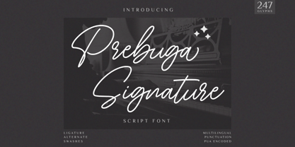 Prebuga Signature is a fragile, elegant and versatile script font. Fall for its ravishing style and use it to create gorgeous wedding invitations, beautiful stationary art, eye-catching social media posts, and much more! What's Included? Uppercase & Lowercase Numbers & Punctuation Alternate & Ligature Multilingual Support PUA Encoded
 - Magical Unicorn - 100% free

- Moonlight Shadow - Personal use only

- JI Color Crayons - Unknown license

- Union by Alias Collection,
$60.00 A softer, streamlined and more elegant development of the ideas originally explored in Jude. Incised letterforms are now rounder and more intuitive, less geometric. Union is a modern classic‚ typeface, avoiding quirky idiosyncrasies to produce a useable and highly contemporary type.
 - Banana and Sun by Justyna Sokolowska,
$15.00 Banana and Sun is light handwritten font. It’s very suitable for the fashion industry and culinary. This font is crazy but readable, so it can be used for large amounts of text.
 - Kelson by Armasen,
$- The Kelson font family is a Armasen project completed for a graphic design agency in Brazil. The agency had a typeface, but the kerning, spacing, and related features were corrupted or otherwise not working very well. The Armasen team improved the qualities, refined the shapes, and enhanced the font features. Armasen is a group of hard-working, young Brazilian students and type designers focused on creating and developing professional quality typefaces with a distinctive and unique personality. The team is very pleased with the final result and is happy to share the efforts of their work as a FREE FONT for you to enjoy! [edited by John Alexander (jga30328 at gmail dot com) a very appreciative user and admirer of the Armasen team]
 - HandMade by Misprinted Type,
$39.00 Handmade is based on my own handmade lettering, which is inspired by vernacular and ornamental type. It has the naive personality from street hand-painted signs from Brazil and that charm and elegance of vintage ornamental fonts. Each letter has its own style and the font comes with 2 uppercase variations, meaning you can mix them in order to write words without repeating the same character. The font has a handmade warmth feel to it, which is ideal for projects that demand the craftsmanship look or just that modern, grunge, fun type that goes well with tons of different styles. If that was not all, Handmade also comes with an EPS vector set with 16 vector and hand-drawn ornaments! Enjoy!
 - Macahe by Rômulo Gobira,
$10.00 Macahe is a modern slab serif with dynamic and irregular shapes. It comes with 7 weights, 3 widths and matching (true) italics. The typeface was inspired and name after the city I was born (Macaé-RJ, Brazil), turning the mixture between nature/beach life and the chaotic urban growth into typography. The options (weight, width and true italics) make the font useful both for web and print in multiple occasions; think websites, posters, logos, signage, packaging and etc. Macahe covers multiple languages, including a wide range of Latin and some Cyrillic languages. It also includes a full range of numerals (included old style figures, numerators, denominators), small caps, standard & discretionary ligatures and stylistic alternates. Those features and variations make Macahe a useful tool for any graphic designer.
 - IMA ISO GPS Frame by Iain Macleod Associates Ltd,
$27.00 ISO GPS framed font for producing geometrical tolerances and other ISO GPS specifications in different documents types such as CAD, word processor documents, spreadsheets or slideshow presentations. Full set of symbols and modifiers from ISO 1101:2017, ISO 1660:2017 and ISO 17863:2013. Includes recently added symbols such intersection plane indicators and collection plane indicators. Fully compliant with ISO 3098 series and ISO 7083. Use this in conjunction with the IMA ISO GPS No Frame font to cover all ISO GPS specification indications. Single user licence is provided with this font. Contact Iain Macleod Associates Ltd (www.macleod.co.uk) for multiuser licences, site-licences or corporate licences.
 - Cadora Woods by Hanoded,
$15.00 Last year I walked half of Offa’s Dyke path, a long distance trail on the Welsh/English border. Walking the trail, I came across a beautiful stretch of forest with a lovely name: Cadora Woods. Cadora Woods font was made with a Japanese brush pen. It sort of looks medieval and a friend of mine suggested it would be the font of choice for maps of ‘The Shire’. I guess that is true, but I am convinced you can come up with some innovative uses for this font!
 - Azarosa by Trifásica Studio,
$9.00 Azarosa (a.sa.ˈɾo.sa) is a display font inspired by the work of the urban artist Arkano in Bogotá (Colombia). The orthogonal shapes of a continuos line adapt themselves pretty well to the architecture of the city, and the not common ductus of the letters gives a very attractive visual texture, which is always seen before read. Visually, Azarosa is related to the graffiti movement pichação in Brasil and with some nordic runes; this is why this visually "encrypted" font is not easy to read, ideal for underground purposes.
 - Manic Mood PB by Pink Broccoli,
$14.00 An offbeat alternate caps typestyle inspired by the cover of a vintage LP titled, Organ Moods by Jerry Thomas. A playful and childish font from a sexy cheesecake album! Go figure. Switching on Contextual Alternates enables automatic alternations between caps and alt caps like AlTeRnAtIoNs to create a more randomized look.
 - Quite Animated JNL by Jeff Levine,
$29.00 Quite Animated JNL is based on hand-lettered Art Deco titling for a 1930 advertisement promoting a group of Columbia Pictures cartoons featuring George Herriman's "Krazy Kat". Available in regular and oblique versions.
 - Brushcrazy by Hanoded,
$15.00 Brushcrazy is a crazy brush font. Yes, you read that right! It comes with a lot of attitude, serious brush strokes, nice detail and a handful of alternate glyphs and ligatures as well!
 - #NAME? by OtherwhereCollective,
$29.00 -OC Format Sans is the third incarnation of this geometric grotesk sans serif which fuses the style of Futura with the rhythm and proportions of Akzidenz. It comes in two styles, standard and a new Print family where crisp sharp edges have been made blunt in reference to the ink spread that occurs when printing on uncoated paper stock. It can give digital media a softer more approachable analog aesthetic. Typical of both grotesk and geometric styles the design has an even weight with minimal stroke contrast and the slanted form is an oblique rather than a true italic. The default double-story �a� and �g� give an academic touch, the single story versions of Set 1 are more friendly and approachable while Set 2 changes the look into something more scientific. Made with tireless attention to detail and kerning it's perfect for logotypes and extensive text, supports multiple languages and comes with a plethora of OpenType features including standard and discretionary ligatures, social icons, symbols, and multiple figure styles including roman numerals.
 - SlabFace 2010 is a font that elegantly bridges the gap between the traditional and the contemporary, making it a versatile choice for various design projects. As its name suggests, SlabFace is a slab...
- IngoFont1 - Personal use only

- IngoFontduenn - Personal use only

- Rum Sans by Trine Rask,
$30.00 Rum Sans is designed inside out based on modular counters. Rum Sans is a text & display family suitable for any purpose, any media, any size. A humanistic modular sans serif in five weights containing small caps, italic, swashes, alternative characters, old style, lining, tabular & proportional figures. Design date: 2001-2014 The complete family consists of Sans Serif & Serif in both sharp and soft version + the display fonts Rum Plakat & Rum Silhouette.
 - Fatum by ParaType,
$25.00 Fatum™ is a new original ultrablack slab serif typeface that was initiated by the impression of the TDC 2011 exhibition. Redundant stem thickness and closed character shapes make a feeling that counterspaces are the narrow slits cut in massive character bodies. Fatum can be used in large sizes in placards, playbills, in the headings of magazines, newspapers and Web-pages, as initials in book setting, for typographic illustrations and compositions. Ultrablack weight also gives a possibility to insert pictures, ornaments or other decorations into the contours of letters. This typeface was designed by Sveta Morozova and released by ParaType in 2013.
 - FF Suhmo by FontFont,
$68.99 German type designer Alex Rütten created this serif and slab FontFont in 2010. The family has 8 weights, ranging from Light to Black (including italics) and is ideally suited for advertising and packaging, film and tv, editorial and publishing, logo, branding and creative industries as well as web and screen design. FF Suhmo provides advanced typographical support with features such as ligatures, small capitals, alternate characters, case-sensitive forms, fractions, and super- and subscript characters. It comes with a complete range of figure set options – oldstyle and lining figures, each in tabular and proportional widths. In 2011, FF Suhmo received the TDC2 award.
 - Intimo by Alias Collection,
$60.00 A two version type family, Intimo One is a serif dot matrix typeface, letterforms made up of grid-based dots. Intimo Two is also made up of dots, but in this case the lines are curved, giving a softer, more organic feel.
 - Koralle Rounded NF by Nick's Fonts,
$10.00Here's a new, softer take on the classic typeface Koralle, released by Schelter und Geisecke in 1913, and as fresh today as it was then. Both versions of this font support the Latin 1252, Central European 1250, Turkish 1254 and Baltic 1257 codepages. - Scribe by Wiescher Design,
$49.50 Scribe is an elaborate typeface somewhere in between Bodoni and an English script. It has interwoven capitals and joining lowercase letters. I have tried to make something new that has this old, settled touch. I think I like it. Yours sincerely, Gert Wiescher
 - Raw Street Wall by Volcano Type,
$25.00 The typeface Raw Street Wall is designed for the Typo Graphic Design font foundry from 2011–2017 by Manuel Viergutz. A playful display type for headlines with a street-art graffiti-style by hand. Rough-look plus state-of-the-art automatic generated OpenType-features (like contextual alternates (calt)). 567 glyphs with extras like emoticons/icons, arrows, dingbats, symbols, geomatric shapes, catchwords and many alternative letters. Multilingual support with 27 languages. Have fun with this font & try the DEMO-FONT (with reduced glyph-set) FOR FREE! Example of use It’s your turn … for example everywhere where it makes sense. Maybe for use in magazines, posters, headlines and advertisement, plus as webfont for decorative headlines. Technical Specifications ■ Font Name: Raw Street Wall ■ Font Weights: Regular + DEMO (with reduced glyph-set) ■ Font Category: Display for headline size ■ Font Format: .otf (OpenType Font for Mac + Win) + .ttf (TrueType Font) ■ Glyph Set: 567 glyphs ■ Language Support: 27: Afrikaans, Albanian, Catalan, Croatian, Czech, Danish, Dutch, English, Estonian, Finnish, French, German, Hungarian, Italian, Latvian, Lithuanian, Maltese, Norwegian, Polish, Portugese, Romanian, Slovak, Slovenian, Spanisch, Swedish, Turkish, Zulu ■ Specials: Extras like emoticons/icons, arrows, dingbats, symbols, geomatric shapes, catchwords and many alternative letters plus OpenType-Features. ■ Design Date: 2011–2017 ■ Type Designer: Manuel Viergutz ■ License: Desktop license, Web license, App license, eBook license, Server license
 - Nova SOLID - Personal use only

- Dans Le Jardin by Latinotype,
$29.00 Dans Le Jardin is a continuation of Dan Le Cuisine dingbat. Their wild and crazy curves give a very special vintage language. Can be used to create patterns or compositions for posters,websites, etc..
 - Retiro Std by Typofonderie,
$59.00 Full of life Hispanic Didot in 2 optical sizes Retiro is a daring interpretation of Spanish typography. Severe, austere and yet, full of life, Retiro is a vernacular version of Castilian and Andalusian in a typical Didot. Named after a lovely park in Madrid, Retiro started life as a a bespoke typeface designed to give a unique voice to the magazine Madriz. In 2006, the founder of Madriz was looking for a Didot for his new magazine. The Didot is the archetypal typeface used in high-end magazines. Retiro is a synthesis of these high contrast styles mixed with an Hispanic mind. Result is then, after 2-3 years of work, a typeface with countless variations to establish typographic shades adapted to different sections and pages of the Madriz. In 2014, it was necessary to further revise the typeface before its launch at Typofonderie. In order to keep its originality, the unique weight was retained, but complemented with optical size variants to set highly contrasted headlines into various sizes, visually balanced. How to use Retiro optical sizes? Each font provided in Retiro family is named according to the scale of body size: 24 pt and 64 pt. Of course, these names are referring to the body sizes used in typographic design. In the “glorious old days,” the letterpress period, it was customary to cut punches directly to the size at which typefaces would be used. The punchcutter had to visually adapt his design to the engraving size. The aim was to optimize the best contrast and general weight, but also to respect both design’s and reader’s needs. In Retiro’s case, intended for large titling sizes, it’s an adaptation of this ancient practice for our contemporary uses. Although each font is named by a typographic point size, do not feel obliged to use this font at this precise size, but why not, in larger or smaller. It’s rather the concept of gradients that must be preserved in layouts, rather than strictly size numbers. It’s up to the designer to select the right font size for his own designs. Granshan Awards 2012 Creative Review Type Annual 2011 Designpreis 2011 Club des directeurs artistiques, 41e palmarès Type Directors Club 2010 Certificate of Type design Excellence
 - Strikers Script by Mans Greback,
$59.00 Strikers Script is a vintage baseball font. In a cool retro look, this calligraphic family has an optimistic attitude and the genuine appearance of a sport jersey or a club logotype. The Strikers Script family consists of 14 professional styles, such as Thin, Bold, Outlined and Swashes, plus more variations and combinations, complimenting each other for ultimate usability. Use underscore _ to make a swash. Example: Letter_ Use multiple underscores to make longer swashes. Example: Baltimore____ For the outlined version, use symbols < > around the word to make beginning and end. Example: The font is built with advanced OpenType functionality and has a guaranteed top-notch quality, containing stylistic and contextual alternates, ligatures and more features; all to give you full control and customizability. It has extensive lingual support, covering all Latin-based languages, from Northern Europe to South Africa, from America to South-East Asia. It contains all characters and symbols you'll ever need, including all punctuation and numbers.
 - AmpleSoft by Soneri Type,
$50.00 AmpleSoft is a softer version derived from Ample type family. AmpleSoft is a display type family, optical mono linear and a bit squarish in nature. It has smooth curve instead of sharp angle formed by the junction of two strokes, which is a prominent feature of its design. It is designed to be a little eye-catching yet legible. It has clear and distinguishable letterforms, which helps to elaborate and emphasis the message. It is graphically strong and command viewerís attention. The overall appearance of type is suitable in setting it as heading, title, headline, etc. The type family consists of six weights viz. Thin, ExLight, Light, Regular, Medium and Bold. Considering the nature of this type family, italics have been excluded. AmpleSoft is designed by Aakash Soneri in the year 2014.
 - Yourz Truly by Outside the Line,
$19.00Yourz Truly is a happy little serif font that doesn't take itself too seriously. It is a headline font with a full character set. Yourz Truly is second in the Love Letters Series following Dearest John . It was in the 2011 Typodarium Page-A-Day Calendar on 10-16-2011. - LiebeKitty by LiebeFonts,
$19.90 Do you like cats? We love them! Cats do so many crazy things, we thought it was time to design a font for cat lovers and their cat-loving friends. LiebeKitty is just right for greeting cards, birthday invitations and to add pretty details to your photo album. We have spent much time on cat-watching research and included over 50 cats and kittens for a wide range of creative applications. Happy cats, mad cats, bad cats, hungry cats, egyptian walk cats, and more. Plus‚ cats love fish, just like we do. Check out LiebeFish, one of our other popular fonts. And if you're looking for a typeface that perfectly fits the hand-drawn looks of LiebeKitty, check out LiebeErika, #1 Hot New Font in October 2010!
 - Coffee and Danish JNL by Jeff Levine,
$29.00 In the collection of vintage and historic images available online from the Library of Congress is one of the exterior of the Town Talk Diner in Minneapolis, Minnesota. Regrettably, on May 28, 2020, the Town Talk Diner was damaged by vandalism, and subsequently destroyed by a fire that engulfed the building early on the morning of May 29th due to civil unrest following the death of George Floyd. The restaurant first opened in 1946, closed in 2011 and subsequently re-opened under new ownership in 2014 with French cuisine, then from 2016 until its demise as an American bistro. While this was not known at the time of selecting the image for a typographic model, subsequent research on the diner turned up these facts. The large vintage sign above the entrance was in big, bold Art Deco letters with rows and rows of bulbs for illuminating the name at night. Coffee and Danish JNL, modeled from the image of that sign, is available in both regular and oblique versions. Perhaps, in a way, the type design will serve as a bit of historic recognition for a popular eating spot.
 - Galix Mono by Eclectotype,
$25.00 This monospaced version of Galix was commissioned in 2037 by the space exploration company Earth2, as part of a major overhaul of their branding, which had used, since 2021, a generic sans serif (much like every other company). Many specialists in both design and space exploration suggested that this very rebrand started a chain of events that concluded with the invention of time travel in 2041. Contrary to the perceived notion put forward in popular Science Fiction, time travel is only (as of now) possible in the digital realm. It was considered fitting that included among the first files sent back in time should be the Galix Mono typeface, which was remade in OTF format to ensure that it would work with the technology available in 2019. Earth2, for all their insight, did not foresee that the release of the typeface in September of 2019, would lessen the impact of their rebrand. What kind idiots would rebrand a forward looking company with a font that was, by then, almost 18 years old? The subsequent lacklustre response to the redesign didn’t inspire the tidal wave of R&D funding Earth2 had anticipated, and the company went into administration in the summer of 2039, having never invented the time travel which made the release of Galix Mono in 2019 possible. Experts believe that the files sent back in time, although their very sending made it impossible for them to be sent, remained as “time relics” of the future that might have been.
 - Sauce Grotesk by Creative Sauce,
$36.00 Sauce Grotesk is a compact typeface much like the classic unassuming sans serif grotesques but with softer features that shows fluidity and a sense of easiness. We wanted a typeface that can relate to a broader audience for maximum message clarity while maintaining aesthetic qualities.
 - Ink In The Meat - Personal use only


