10,000 search results
(0.015 seconds)
- Channelley Script by dotHK Studio,
$25.00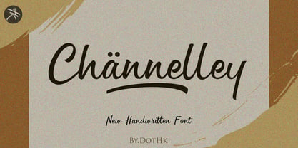 Channelley is a casual and clean brush script font. It has a trendy style and it will be a tremendous hit for each of your branding, product packaging, invitations, quotes, t-shirts, label, poster, logos or anything else that you wish to design.
 - Agoda by Rezastudio,
$9.00 Agoda is a stylish, classy and delicate script font. It has a clean, thin and smooth vibe and it will be a hit for any design that you want to add it to. Agoda is PUA encoded which means you can access all of the glyphs and swashes with ease!
 - Yustine Signature by Lemonthe,
$14.00 Yustine Signature is a signature script font, featuring a lovely flow. It has a clean and smooth vibe and it will be a hit for any design that you want to add it to. Is perfect for many different project such as logos & branding, invitation, product designs, label, photography, and more.
 - Satampra by Scriptorium,
$24.00Satampra evokes the spirit of Arabic calligraphy with a hint of something strange and magical. It is an unusual calligraphic font based on an obscure hand lettered style with unique overlapping character strokes. It fits the theme of oriental fantasy and would work well with the fonts in our Arabian Nights Fonts and Art package. Satampra is an upper-case only font, but the lower case positions have alternative versions of the upper case character set. - Seraphon by Lemonthe,
$15.00 Seraphon is a stylish and delicate handwritten font. It has a gentle and beautiful flow and it will be a hit for any design that you want to add it to. is perfect for many different project such as logos & branding, invitation, stationery, wedding designs, signature, product designs, label, photography, and more!
 - The Destiny by Lemonthe,
$15.00 The Destiny is a monoline handwritten font. It has a clean, thin and smooth vibe and it will be a hit for any design that you want to add it to. Suitable for any projects such as logos & branding, signature, invitation, stationery, wedding designs, social media posts, product designs, label, photography, and more!
 - Steampipe by Just My Type,
$25.00 Jules Verne. Wild, Wild West. Tomorrowland. The Past’s extrapolation of the Future. So it was wrong, it’s still romantic. Steampipe is a font constructed of bits and pieces, reminiscent of the ironwork construction of the Crystal Palace or the inner workings of The Time Machine. Although it works fine as is, it comes alive with some Photoshop Layer Styles. Steampipe has the most extensive kerning of any font I've designed, just so (most) letters fit together as if they were constructed as a unit; use them in a program that supports special kerning.
 - Night Clown by Putracetol,
$20.00 Night Clown - Quirky Clown Font. With its quirky, decorative, and playful design, this font captures the essence of clowns, parties, and April Fools' festivities. Offering a delightful range of seven variations - regular, clown hat, mask, surprise, laughter, decorative, and funny face - Night Clown is a perfect fit for children-oriented projects, kids' events, posters, greeting cards, birthday invitations, and even logos.
 - Ribjoint by Chank,
$39.95 Created by Chank in 1992, Ribjoint was Chank’s first attempt at creating a Egyptian, cursive font on the computer. Writing cursive with a pencil sure is easy, but getting all the letters to link up correctly in computerized font format is a bit tricky. Not the most graceful script in the world, but it works good enough for a BBQ pit.
 - Zhang QA - Unknown license

- Eurostile Unicase by Linotype,
$29.99 Akira Kobayashi modified his Eurostile Next design into a fun unicase version. Ascenders and descenders have been traded in for alternates of letters that all share the same height. The effect is similar to using all caps, although this is quite a bit more quirky. For example, letters like the lowercase a and e are now the same height as their capital versions and the lowercase y has been raised to fit between the baseline and top height. Odd relationships such as these give Eurostile Unicase a fresh and funky feeling. Try using it for headlines and titles, then use Eurostile Next for the body text!
 - Bylander by Mans Greback,
$59.00 Bylander is a stateful serif typeface. With robust, heavy letterforms reminiscent of a foundry's hammer hitting molten metal, and an unpaired weight, Bylander's characters seem forged from the core of the Earth. Its rounded corners whisper tales of smoothened river stones, and its gentle curves combined with its industrial mass makes Bylander a paradox; both intimidating in its boldness and welcoming in its approach.
 - Sarion by Lemonthe,
$17.00 Sarion is an elegant signature font with a monoline style, featuring a lovely flow. It has a clean, thin and smooth vibe and it will be a hit for any design that you want to add it to. It’s perfect for many different projects such as logos and branding, invitations, signature, labels, photography, and more!
 - Astronauts In Trouble by Comicraft,
$49.00 AiT/Planet Lar publisher and writer, Larry Young loves The Space Program. Next time you see him at a comic convention just ask him about any one of the Moon Landings and you'll see.
 - Ahoy, typography aficionados and design deckhands! Hoist the main sail and set course for the adventurous seas of fontography with the Captain Kidd Demo by The Scriptorium — a font so dashing and dar...
- Guillermo by Homelessfonts,
$49.00 Homelessfonts is an initiative by the Arrels foundation to support, raise awareness and bring some dignity to the life of homeless people in Barcelona Spain. Each of the fonts was carefully digitized from the handwriting of different homeless people who agreed to participate in this initiative. Please Note: these fonts include only the latin alphabet; no accented characters, no numbers or punctuation. MyFonts is pleased to donate all revenue from the sales of Homelessfonts to the Arrels foundation in support of their mission to provide the homeless people in Barcelona with a path to independence with accommodations, food, social and health care. Guillermo was born in Argentina. And after crossing four continents and travelling in more than twenty countries, he still has his accent. His luck ran out on the streets of Barcelona. But despite his circumstances, he hasn’t lost a bit of his wit or articulacy. “The worst thing about the street is something that touches your heart, your brain. Not being able to have sex, not having any privacy until it leaves you empty.” On the street he follows his passion for art and writing as best he can, using old cardboard when he can’t find paper and listening to the music that comes to him. His way of thinking and expressing himself leaves people wide-eyed and open-mouthed, but even so he admits he’s a solitary man. “Solitude is an individual word. A solitary type like me can’t bring the word solitude to the whole world.”
 - Jon - Unknown license

- Pointone by Lemonthe,
$15.00 Pointone is a stylish and well balanced monoline script font. It has a clean, thin and smooth vibe and it will be a hit for any design that you want to add it to. Is perfect for many different project such as logos & branding, invitation, stationery, wedding designs, social media posts, product designs, label, photography, and more!
 - RV Park by Komet & Flicker,
$10.00 Hit the open road with RV Park! This font was inspired by the typography seen on the signage for quirky roadside attractions. Use it anywhere you’re looking to inject a little fun and whimsy.
 - Poynter Old Style by Font Bureau,
$40.00 In the 1670s, Christopher Plantin was the largest publisher of his day. Hendrik van den Keere cut for him an astounding series of romans. As Stanley Morison once observed, such types adopted features of Flemish blackletter to strengthen elegant French romans. Large on the body, strong in color, economical in fit, widely (if anonymously) distributed, they established effective standards for all that followed; FB 1997–2000
 - Morning Cookie by Bogstav,
$17.00 Yet again, a font inspired by my work as a kindergarten teacher! The other day, I had a conversation with some of the kids, about what they ate for breakfast. Some had oatmeal, some bread and others yogurt. But this kid - he insisted that every morning, his mother would serve him cookies, “morning cookies”. It sounded too good to be true, and when I asked his mother, it turned out that “cookies” were actually bread, but to make it sound more appetising, they called it cookies! The letters are rounded and in some way quite naive, but still clear and legible. With an extreme ascender and descender, the font stands out with its oddities. I’ve added 3 different versions of each lowercase letter!
 - Brouwerij by Hanoded,
$15.00 Brouwerij means Brewery in Dutch. I just liked the name and it seemed to fit the font quite well. As for me, believe it or not, I’m not a beer drinker! I can’t understand why people go nuts when the word beer is mentioned. Like it is something special (after all, it is the third most consumed beverage after water and tea). Like you are not a man when you don’t drink beer! Brouwerij is a pleasant all caps font that comes with interesting swashes for the upper class letters. You can (obviously) use it to promote your home made brew, but any other drink can use a bit of Brouwerij as well.
 - Zulia Pro by Sudtipos,
$59.00 Zulia is located in the west of Venezuela and it is the state in where Joluvian grew up. It is a region of sunshine, high temperatures, oil and cheerful people, although we choose the name to honor his mother who is from there (zuliana) and who is proud of her land and everything that it represents the area. Zulia is also his first typographic project. It is based on two of his favourite calligraphic styles: italic and brush pen. He started with simple and contrasted strokes on paper with brush and marker. After that he developed the full alphabet and its various options for each letter, starting from a set of handmade forms that could be connected in different ways according to the user needs. What motivates him to involve this style was to create a differentiation with his daily work by generating a heavier type, contrasted and low rise. Zulia finally got life of its own with the participation of Alejandro Paul and a feedback of techniques and skills that were generated with the duo work. Zulia is not just a typeface, Zulia is his love of letters.
 - Fontoddler by CozyFonts,
$20.00 Fontoddler Font Family, This font was created with the personality, in mind, of my two-and-a-half-year-old granddaughter Chloe Bella. I believe strongly that fonts have personalities that’s why we refer to their members as ‘characters’ or to be more accurate, ‘glyphs’. This font is playful, bold, colorful in form and design, a bit irregular, a bit informal, a bit irreverent, a bit humorous, a bit sassy, and a bit independent just like my little one. When used in color Fontoddler sings. She’ll be writing and creating visual words in just the nick of time. At 2 she started recognizing many colors and identifying people, places, animals, and objects and now she’s recognizing letters. I can’t wait for her to understand that this font was designed and named after her. Fontoddler currently exists in 3 styles, Medium, Heavy, and Heavy Outline. Naturally Heavy and Heavy Outline are congruous, ie. They are fitting together. I hope you enjoy and use this 24th font family from Cozyfonts Foundry. It will fit well with greeting cards, signage, birthday parties, holiday occasions, invites, stationary, headlines, logos, posters, cartoons, animation titles, movie titles and even sports events and sports logos. Have fun with this one. Tom Nikosey
 - Rice Wine JNL by Jeff Levine,
$29.00 A piece of sheet music from Richard Rodgers and Oscar Hammerstein II's 1958 hit "Flower Drum Song" had the play's name lettered in its iconic Anglo-Japanese style. This became the basis for Rice Wine JNL.
 - Bulgatty Signature by Balevgraph Studio,
$12.00 Bulgatty Signature is an elegant script font with a contemporary atmosphere and impeccable form, inspired by timeless classic calligraphy. It has a clean, thin and smooth vibe and it will be a hit for any design that you want to add it to.. What's Included : - Uppercase, Lowercase, Numerals & Punctuations - Ligature - Works on PC & Mac - Simple installations - Multilingual support - PUA Encoded
 - Rachetty by Balevgraph Studio,
$12.00 Rachetty is a stylish and delicate script font. It has a clean, thin and smooth vibe and it will be a hit for any design that you want to add it to. This font is PUA encoded which means you can access all of the glyphs with ease! What's Included? Uppercase & Lowercase Numbers & Punctuation Ligature, Alternate & Swashes Multilingual Support PUA Encoded
 - Eckhardt Poster Board JNL by Jeff Levine,
$29.00 Eckhardt Poster Board JNL further continues Jeff Levine's series of sign painter-oriented fonts, named in honor of his good friend Albert Eckhardt, Jr. (who ran Allied signs in Miami, Florida from 1959 until his passing). The typeface is a casual brush style, modeled from an image of a do-it-yourself sign making kit comprised of stencils, paint and brush spotted for sale through an online auction.
 - Formular by Brownfox,
$44.99 If you were a grotesque in mid-20th-century Switzerland, you were expected to be serious and proper, if a little dull. Unlike its dogmatic Modernist predecessors, Formular is a hip Swiss sans serif of the new generation. Inspired by the utilitarian 19th-century grotesques, its precision and and versatility are combined with a slightly eccentric character. A child of its time, it scoffs at the ideology of ‟ideal” forms, yet it is every bit as functional for all its idiosyncrasies, as any self-respecting Swiss sans. Formular comes in five weights with corresponding italics and a monospace companion to the regular weight. Each weight includes special extra-light punctuation, lining tabular and old style figures, case-sensitive punctuation, and stylistic alternates.
 - Enn'agrammaton by Proportional Lime,
$1.99 Trithemius, a 15th century Abbott, and influential counselor to Emperor Maximilian I, was also an author who wrote both histories and the first printed work on cryptography which gained him much adverse notoriety. He has been long regarded as a mystic and some of his works were therefore banned. However, it may have been his intention to cloak his cryptology essays in mystical writing to keep people from easily grasping the subject matter, which it has been recently demonstrated, at heart was really cryptological methodology. This font is based on a printed version of the Polygraphiae a text that included many methods of encryption.
 - Chimpsdale by Maculinc,
$15.00 Chimpsdale name was inspired by the Fairly Odd Parents cartoon series, which tells about the parody world of Planet Of The Apes. Chimpsdale is an alternate version of Dimsdale from the ape-dominated world created by Bippy the Monkey’s wish, after he bit into a magic muffin that allowed him one rule-free wish in Abra-Catastrophe. Chimpsdale is a font that is inspired by the theme of past kingdoms, we wrap it in such a way to make it look suitable for many jobs Especially.You can use it as a logo, badge, insignia, packaging, headline, poster, t-shirt/apparel, greeting card, business card, and wedding invitation and more. The flowing characters are ideal to make an attractive messages to your taste. mix and match with a bunch of alternative characters to fit your project.It will be more interesting if you add swash / alternative swash. The alternative characters in this font were divided into several OpenType features such as Stylistic Alternates, Ligature and Ligature Alternates. Mail support : maculinc@gmail.com Thank you! Maculinc
 - Mentor by Ultramarin,
$40.00 Mentor is a font made for professor Bruno K. Wiese 85th birthday. I made it especially for the birthday card I sent him as friendly comment to his always present ideas on clarity, purity, exactness and "less is more". He taught us the importance of carefully managing the spaces between elements in typography.
 - Spice by BA Graphics,
$45.00An elegant new design with just a slight bit of flare. A face which will work for both headlines and text. Its delicate serif gives a bit of class while its swash 's' adds a touch of fun. - Orion by Linotype,
$29.99 Hermann Zapf made his first scetches for Orion in 1963. Zapf's aim was to create a neutral textface which can be ideally used as a newspaper face. Its strokethickness and open letterforms also fits well for book and magazine production. The final two weights of Orion were released in 1974 for the Linofilm photocomposing machine.
 - PF Playskool Pro by Parachute,
$69.00 A great fun typeface with a straightforward childlike simplicity. It really hits home with kids, but if you want to add this extra playful personality to your designs this is the one to use. It has a strong, easy to read structure, which makes it ideal for children’s books, toys and other fun applications. Designer Alexandros Papalexis has discover the kid within. You can too!
 - Sign Maker JNL by Jeff Levine,
$29.00In 1948, Joseph Struhl pioneered an innovative do-it-yourself sign kit for retail merchants. Die-cut letters and numbers made from flexible sheets of vinyl with the ability to adhere to smooth surfaces by static electricity; his "Magic Master Interchangeable Sign Kits" became a great success. Jeff Levine has paid tribute to this innovative method of in-store advertising with Sign Maker JNL. Because of their die-cut shapes, the design style of the static cling letters have unique characteristics. Companion fonts (based on other Struhl sign kits) are Cling Vinyl JNL and Cling Vinyl Clear JNL. - **The Enigmatic Elegance of Xiparos Lombard: A Font Review by Yours Truly, the Artistic Oracle** In the grand parade of typographies where fonts like Arial and Helvetica march with their heads held...
- Far Space AT by Andrew Tomson,
$10.00 Hi, friends! Sitting under the starry sky, I thought about extraterrestrial life and was inspired. I imagined if there was extraterrestrial life and their means of communication. The outline of this font popped up in my mind and I quickly sketched it out so I wouldn't forget it! This font is great for logos, quotes, space-themed inscriptions, it's also just pleasing to the eye and makes you think about the extraterrestrial!
 - Blazing Furnace by Kitchen Table Type Foundry,
$16.00 At home we have a wood stove. Last year, I bought a whole bunch of tree trunks, which I cut up with a chainsaw and then chopped with my Swedish axe. In Holland we have a saying that firewood keeps you warm three times: when you cut the tree, when you chop the wood and when you burn it in the stove. Our stove is rather small, so it is not exactly a blazing furnace, but I liked the name because it seems to fit this font. Blazing Furnace was made with ink and a brush. It is a bit messy and rough, but it comes with multilingual support and a nice set of alternates for the lower case letters.
 - ITC Johnston by ITC,
$29.00ITC Johnston is the result of the combined talents of Dave Farey and Richard Dawson, based on the work of Edward Johnston. In developing ITC Johnston, says London type designer Dave Farey, he did “lots of research on not only the face but the man.” Edward Johnston was something of an eccentric, “famous for sitting in a deck chair and carrying toast in his pockets.” (The deck chair was his preferred furniture in his own living room; the toast was so that he’d always have sustenance near at hand.) Johnston was also almost single-handedly responsible, early in this century, for the revival in Britain of the Renaissance calligraphic tradition of the chancery italic. His book Writing & Illuminating, & Lettering (with its peculiar extraneous comma in the title) is a classic on its subject, and his influence on his contemporaries was tremendous. He is perhaps best remembered, however, for the alphabet that he designed in 1916 for the London Underground Railway (now London Transport), which was based on his original “block letter” model. Johnston’s letters were constructed very carefully, based on his study of historical writing techniques at the British Museum. His capital letters took their form from the best classical Roman inscriptions. “He had serious rules for his sans serif style,” says Farey, “particularly the height-to-weight ratio of 1:7 for the construction of line weight, and therefore horizontals and verticals were to be the same thickness. Johnston’s O’s and C’s and G’s and even his S’s were constructions of perfect circles. This was a bit of a problem as far as text sizes were concerned, or in reality sizes smaller than half an inch. It also precluded any other weight but medium ‘ any weight lighter or heavier than his 1:7 relationship.” Johnston was famously slow at any project he undertook, says Farey. “He did eventually, under protest, create a bolder weight, in capitals only ‘ which took twenty years to complete.” Farey and his colleague Richard Dawson have based ITC Johnston on Edward Johnston’s original block letters, expanding them into a three-weight type family. Johnston himself never called his Underground lettering a typeface, according to Farey. It was an alphabet meant for signage and other display purposes, designed to be legible at a glance rather than readable in passages of text. Farey and Dawson’s adaptation retains the sparkling starkness of Johnston’s letters while combining comfortably into text. Johnston’s block letter bears an obvious resemblance to Gill Sans, the highly successful type family developed by Monotype in the 1920s. The young Eric Gill had studied under Johnston at the London College of Printing, worked on the Underground project with him, and followed many of the same principles in developing his own sans serif typeface. The Johnston letters gave a characteristic look to London’s transport system after the First World War, but it was Gill Sans that became the emblematic letter form of British graphic design for decades. (Johnston’s sans serif continued in use in the Underground until the early ‘80s, when a revised and modernized version, with a tighter fit and a larger x-height, was designed by the London design firm Banks and Miles.) Farey and Dawson, working from their studio in London’s Clerkenwell, wanted to create a type family that was neither a museum piece nor a bastardization, and that would “provide an alternative of the same school” to the omnipresent Gill Sans. “These alphabets,” says Farey, referring to the Johnston letters, “have never been developed as contemporary styles.” He and Dawson not only devised three weights of ITC Johnston but gave it a full set of small capitals in each weight ‘ something that neither the original Johnston face nor the Gill faces have ‘ as well as old-style figures and several alternate characters.

