10,000 search results
(0.039 seconds)
- JH Mabel by JH Fonts,
$40.00 JH Mabel is a modern cursive typeface; it has three weights: light, medium and bold. It is a smart type and consists of extra characters to simulate real handwriting. Typical use: branding, greeting cards, long runing text.
 - Katigert by Oleg Gert,
$20.00 Katigert – is a rather friendly italic with a touch of measured severity, combines very sharp angles and bold shapes. The font works best for display. The font includes extended Cyrillic and Latin alphabets, punctuation marks and currencies.
 - Galeb by Tour De Force,
$25.00 Galeb is simple geometric sans font family in 4 weights - Light, Regular, Bold and Black, ideal for corporate and editorial projects. With angled stem endings, Galeb gives enough impression to be used as display font as well.
 - Mahgin by Letterena Studios,
$10.00 Mahgin is a bold and thick lettered serif font. Fall for its assertive style and use it to create distinct designs. This font is PUA encoded which means you can access all glyphs and swashes with ease!
 - Scalar Biform NF by Nick's Fonts,
$10.00 Here's a trip back to the Disco Age, based on a font called Gemini Biform from Fotostar. Big, bold, brassy and sassy. Both versions support the Latin 1252, Central European 1250, Turkish 1254 and Baltic 1257 codepages.
 - Toley Hand by Mans Greback,
$59.00 Toley Hand is a bold handwritten typeface, created by Måns Grebäck in 2019. The comic-style script is light-hearted while being quick and energetic. It contains all necessary symbols and supports a wide range of languages.
 - Public Safety JNL by Jeff Levine,
$29.00 Public Safety JNL was inspired by a 1940s-era health poster issued through the WPA (Works Progress Administration). The font’s bold, blockish sans lettering commands attention and has been made available in both regular and oblique versions.
 - Abdo Screen by Abdo Fonts,
$49.50 Abdo Screen is a very simple Naskh font for satellite channels, presentations, videos and advertisements. it comes in sixth weights Thin, Light, Regular, Medium, Bold and Black. This font also contains some of Stylistic Sets and Ligatures.
 - Lawabo by Schriftlabor,
$30.99 The original Lawabo was started many years ago by Rainer Scheichelbauer. Its minimalistic and rounded shapes are reminiscent of bathroom ceramics, hence the name. Schriftlabor designer Miriam Surányi added bold and italic shapes, and produced the family.
 - Basdela by Letterena Studios,
$9.00 Basdela is a bold and stylish serif font. It is PUA encoded which means you can access all of the glyphs and swashes with ease! Add it confidently to your projects, and you will love the results.
 - Outsize by Sanyukt Foundry,
$12.00 Bold Future is an extremely heavy font. It has numerous interesting characters, with the counter and aperture giving it a unique personality. Ideal for enormous titles, publicizing, naming, bundling and anything that needs a major, significant typeface.
 - Keep Calm by K-Type,
$20.00 Keep Calm is a family of fonts developed from the now famous World War 2 poster that was designed in 1939 but never issued, then rediscovered in 2000. As well as the original Keep Calm font, the medium weight of the poster, new weights are now available – Keep Calm Book (regular weight), Heavy and Light – and each weight comes with a complimentary italic. Version 2.0 (2017) is a comprehensive update which consists of numerous refinements and improvements across all weights. The family now contains a full complement of Latin Extended-A characters, Welsh diacritics and Irish dotted consonants. The four italics have been optically corrected with revised, ‘true italic’ forms of a and f. The crown motif from the top of the Keep Calm poster is located at the plus minus ± and section § keystrokes (Alt 0177 and Alt 0167 on Windows). The lowercase g follows the Gill/Johnston eyeglass model, but also included is an alternative, single-story g at the Alt G keystroke (Alt 0169 on a Windows keyboard), the normal location of the copyright symbol which has been relocated elsewhere in the fonts. An alternative lowercase t, without the curved wedge cutaway, is provided at the Alt T (dagger) keystroke (Alt 0134 on Windows). When I first saw the Keep Calm and Carry On poster, I wrongly assumed the letters to be Gill Sans. Recent research at the National Archive by Dr. Bex Lewis of Manchester Metropolitan University has revealed that the original poster was hand drawn by the illustrator and painter, Ernest Wallcousins. The Gill Sans influence is apparent, in the R particularly, the M’s perfectly pointed vertex is redolent of Johnston’s Underground, and the most anomalous character, the C, resembles the ‘basic lettering’ of engineers that provided the vernacular sources for the Gotham typeface. Developing the Keep Calm typeface has been an exercise in extrapolation; an intriguing challenge to build a whole, high quality font family based on the twelve available capitals of the Keep Calm poster, and on similar lettering from the other two posters in the original series. This has required the creation of new lowercase letters that are believably 1939; that maintain the influence of Gill and Johnston while also hinting at the functional imperative of a wartime drawing office. Wallcousins’s lettering balanced intuitive human qualities and the pure pleasure of drawing elegant contemporary characters, against an underlying geometry of ruled lines, perfect circles, 45° terminals, and a requirement for no-nonsense clarity.
 - Freitag Display by Zetafonts,
$39.00 Probably as a reaction to the pragmatism of modernist design, the seventies saw an explosion of buoyant, vivacious typography. Psychedelia fueled a return to the melting, lush shapes of Art Nouveau while Pop culture embraced the usage of funky, joyful lettering for advertising, product design and tv titling. New low-cost technologies like photo-lettering and rub-on transfer required new fonts to be expressive rather than legible, pushing designers to produce, bubbly, high-spirited masterpieces, where geometric excess and calligraphic inventions melted joyfully. Freitag is Cosimo Lorenzo Pancini's homage to this era and its typography. His starting point was the design of a heavy sans serif with humanist condensed proportions, flared stems and reverse contrast, that generated both the main family, and a variant display subfamily. The main typeface family slowly builds the tension and design exuberance along the weight axis - a bit like our desire for the weekend increases during the week. In Light and Medium weights the font shows a more controlled, medium-contrast design, tightly spaced for maximum display effect. The Book weight follows the same design but uses a more relaxed letter spacing to allow usage in smaller sizes and short body copy. As weight increases in the Bold weight the style becomes more expressive, with a visible reverse contrast building up and culminating in the Heavy weight with his clearly visible "bell bottoms" feel. In the display sub-family the design is pushed further by introducing variant letterforms that have a stronger connection to calligraphy and lettering. Also, the weight range becomes a optical one, with weights marked as Medium, Large, XLarge, as bringing the contrast and the boldness to the extreme creates smaller counterspaces that require bigger usage sizes. Another important addition of the display sub-family is the connected italics that sport swash capitals and cursive letterforms, developed with logo design and ultra-expressive editorial design in mind. To balance the extreme contrast in the XL weight, contrast of punctuation is reduced, creating a rich, highly-dynamic texture wherever diacritics and marks are used in the text. The full family includes 16 styles + 4 variable fonts, allowing full control of the design over its tree-hugging design space. All 20 fonts share an extended latin charset with open type features including case sensitive forms, single and double story variants and alternate glyphs. According to its creator, "Freitag is the typeface that sounds like an imaginary Woodstock where on the stage with Jimi Hendrix with Novarese, Motter, Excoffon and Benguiat playing onstage with Jimi Hendrix". Jeepers creepers!
 - Catalina by Kimmy Design,
$10.00 Earlier this year I visited a bakery in Newport Beach, CA and fell in love with the organic design and typography of the place. Hand-drawn menus, table cards, chalkboards, and wall quotes surrounded the charming spot. It inspired me to create a new font family based on the combination of hand drawn fonts. Included in this package are 5 font families, with 2 graphic ornament fonts. Each font family contains at least a light, medium and bold. Here is a breakdown of what's cookin' at Catalina's Bakery: Catalina Anacapa: Tall and skinny, this font comes in 3 weights for both sans and slab serif styles. It includes contextual alternatives (giving 3 versions of each letter), stylistic alternatives for select letters (A, K, P, Q, R, Y) and also includes Small Caps. Catalina Avalon: Based off Anacapa, this sub family has a high contrasting line weight. It comes in light, regular and bold as well as an inline alternative for both sans and slab serif styles. Avalon also includes opentype features such as contextual alternatives (giving 3 versions of each letter), stylistic alternatives for select letters (A, K, P, Q, R, Y) and small caps for each letter. Catalina Clemente: In a more standard width, Clemente is one of the two sub families that can be used for paragraph text as well as headlines. It's organically geometric in style and comes in ALL CAPS and lowercase, includes upright and custom italics, and has the opentype feature giving 3 versions of each letter. Catalina Script: A great compliment with the display sub-families, Catalina Script rounds out the package with a hand-drawn cursive flair. It includes contextual alternatives (giving 2 variations to each letter) as well as stylistic alternatives for many of the capital and lowercase letters. It has special ligatures for some letter combinations, and titling alternatives for all the capital letters. Catalina Typewriter: The second of the paragraph text sub-families, this typewriter inspired hand-drawn font family works great as either a display or paragraph text. It has contextual alternatives with 3 versions of each letter, and comes in both upright and custom italics versions. Catalina Extras! These two fonts go perfectly with the Catalina Family. They includes borders, frames, arrows, banners, flourishes and more. Catalina Flourish has all of it's options in a light and bold style, to use the light version type all lowercase letters, then to make something bold, used it's uppercase (or shift+) characters. For a breakdown of graphic/letter correlation, see the breakdown PDF. All of Catalina was drawn by the same hand, using the same ink and technique. While they contrast in their type styles, they work together perfectly to create one cohesive font family.
 - Entropic Brush by Mans Greback,
$59.00 Entropic Brush is a striking fat brush font that boasts a wild and rustic charm. Its decorative display style makes it perfect for logotypes, headlines, and other eye-catching design elements. The font's heavy, oak-like strokes and thick brush texture give it a bold and distinctive character. Ideal for projects that require a strong, natural presence, Entropic Brush is a versatile font that adds a sense of raw energy and untamed beauty to your designs. Its unique aesthetic makes it a great choice for branding materials that need to convey a sense of rugged, organic elegance. With hundreds of swashy and decorative alternates, Entropic brush is sure to give you a customized appearance – like a truly hand-drawn paintbrush design. Use characters _ ¤ # after any word to make a swash. Example: Spline_ Sonic¤ Brush# Use multiple _ ¤ # to make swashes of different lengths. Example: Superhuman______ (Download required.) The Entropic Brush font family includes four high-quality styles to suit various design needs: Regular: A bold statement with a natural, rustic appearance Bold: An even heavier presence for more impactful designs Italic: Adds an expressive, dynamic touch to your text Bold Italic: Combines the assertiveness of bold with the energy of italic Built with advanced OpenType functionality, Entropic Brush ensures top-notch quality and provides you with full control and customizability. It includes stylistic alternates, ligatures, and other features to make your designs truly unique. The font is built with advanced OpenType functionality and has a guaranteed top-notch quality, containing stylistic and contextual alternates, ligatures and more features; all to give you full control and customizability. It has extensive lingual support, covering all Latin-based languages, from Northern Europe to South Africa, from America to South-East Asia. It contains all characters and symbols you'll ever need, including all punctuation and numbers.
 - Hero fire by Alit Design,
$23.00 Hero Fire is a dynamic and bold typeface that embodies the essence of a powerful superhero. The characters are meticulously crafted with strong serifs, exuding strength and resilience. The design seamlessly blends classic typography with iconic superhero elements, making it a distinctive and impactful choice for display purposes. Illustrations: The typeface is adorned with illustrations inspired by the superhero universe. Each character is meticulously detailed, featuring elements such as: Fire: Flame motifs gracefully intertwine with certain characters, adding a touch of intensity and energy. Swords: Sharp and sleek sword illustrations are incorporated into select characters, symbolizing heroism and the strength to overcome challenges. Skulls: Subtle skull designs enhance the edginess of the typeface, capturing the essence of a fearless and bold superhero. Shields: Protective shields are cleverly integrated into specific characters, emphasizing the font's ability to safeguard and endure. Wings: Majestic wing illustrations accompany certain characters, representing the freedom and soaring spirit of a superhero. Characteristics: Bold and Strong: Hero Fire commands attention with its bold and robust characters, making it perfect for headlines and attention-grabbing text. Serif Display: The typeface features classic serifs that add a touch of sophistication, making it suitable for both modern and traditional designs. Versatile Usage: Hero Fire is designed for versatility, lending itself well to various design applications such as posters, comic books, branding, and more. Usage Recommendations: Hero Fire is particularly well-suited for projects that require a strong and impactful display font. Its superhero-themed illustrations make it a perfect choice for comic book titles, movie posters, gaming graphics, and any design where a bold and dynamic aesthetic is desired. Embrace the power of Hero Fire to infuse your designs with a heroic and captivating spirit!
 - FF Hertz by FontFont,
$68.99 Low stroke contrast, generous spacing, and fine-grained weights from Light to Extra Bold make FF Hertz a workhorse text typeface which holds up well under today’s widely varying output conditions from print to screen. The quite dark Book style works well on e-ink displays which usually tend to thin out letters, as well as in print when you want to evoke the solid letter image of the hot-metal type era. Two sizes of Small Caps are included: A larger size for abbreviations and acronyms, and a smaller size matching the height of the lowercase letters. FF Hertz is a uniwidth design, that means each letter occupies the same space in all weights. This feature allows the user to switch between weights (but not between Roman and Italic styles) without text reflow. Jens Kutilek began work on FF Hertz in 2012. From a drawing exercise on a low-resolution grid (a technique proposed by Tim Ahrens to avoid fiddling with details too early), it soon evolved into a bigger project combining a multitude of influences which up until that point had only been floating around in his head, including his mother’s 1970s typewriter with its wonderful numbers, Hermann Zapf’s Melior as well as his forgotten Mergenthaler Antiqua (an interpretation of the Modern genre), and old German cartographic lettering styles. Jens likes to imagine FF Hertz used in scientific books or for an edition of Lovecraftian horror stories.
 - Vernaccia by Eurotypo,
$32.00 Last year I went to visit a friend in Tuscany. One day he took me to meet his neighbor, a nice old man; Mr. Giulio. After giving us a tour of his small vineyard, he insisted us to try his production: a delicious Vernaccia! When his wife left the bottle containing the gold liquid on the table, I fell in love with the label: it was handwritten by herself, as if to highlight the "homemade" feature. As a tribute to this beautiful and hardworking couple, I asked permission to be inspired to make a typeface ... and here goes! The family Font Vernaccia... Vernaccia is a type family of four fonts: Regular, Bold, Condensed and Condensed Italic. Is a modern and casual calligraphy family font. As an exclusively Open Type release, with 759 glyphs and 45 ornaments, it has several special alternatives for all letters with lots of possibility and an infinity of combinations. Most of the ornaments can be used alone, but really were especially designed to combine with the different glyphs. There are plenty of options to allow you to create something unique and special: standard and discretionary ligatures, several swashes and stylistics alternates for each letter, catchwords, tails that can be added to the beginning or end of each letter, ornaments, and much more. These lovely fonts have already an extended character set to support Western European languages. Vernaccia was made to make your project more beautiful and attractive! Have fun with it!
 - Radium J - Unknown license

- Autovia by Santi Rey,
$25.99 Autovia is a condensed sans-serif based on the typeface created for the US Highway signs in the 50s. Autovia comes in 6 weights. Has more than 350 glyphs and 8 stylistic sets, and supports all the Latin based languages. A new and more casual addition for the Highway fonts sub-genre ideal for big headlines.
 - Grota Sans Rounded by Latinotype,
$26.00 Grota is back in its new Sans and Rounded versions. The complete family consists of 40 fonts, 10 different weights, cursives and an alt version. Grota Sans Rounded, designed by Eli Hernández and Daniel Hernández, is a grotesque font with Latin spirit. This type accompanies Grota Sans and Grota Unicase. It’s ideal for logos, brands, books, headlines, etc.
 - BR Sonoma by Brink,
$30.00 BR Sonoma is a new geometric grotesque built for the 21st century with a finely tuned modern aesthetic. BR Sonoma builds on the foundations laid by the classic Swiss grotesques such as Helvetica and Univers but combines their features with a stronger geometric base usually found in other early classics such as Avant Garde, Futura and Avenir.
 - Churchward Conserif by BluHead Studio,
$25.00BluHead Studio LLC is pleased to announce the release of 4 fonts from the Churchward Conserif family designed by New Zealand typeface designer Joseph Churchward. BluHead Studio is in the process of digitizing many of the fonts in Churchward's extensive library of exciting and unique designs and will be releasing them in OpenType format on a regular basis. - Art Exhibit JNL by Jeff Levine,
$29.00 In the 1930s the WPA (Works Progress Administration) was involved with getting a number of Americans back to work during the Great Depression. One faction of the WPA's efforts was the Federal Art Project. Thin, condensed hand lettering on a poster for an Art Exhibition at the New Bedford Free Public Library is the inspiration for Art Exhibit JNL.
 - Solidaritha Script by Great Studio,
$15.00 Solidaritha Script is a stylish calligraphy font that features a varying baseline, smooth line, classic and elegant touch. Can be used for various purposes.such as headings, signature, logos, wedding invitation, t-shirt, letterhead, signage, lable, news, posters, badges etc. Solidaritha Script features 389+ glyphs and 194 alternate characters. including initial and terminal letters, alternates, ligatures and multiple language support.
 - Hypercrack by Invasi Studio,
$19.00 Introduction of our new collection of playful doodle font styles. The Hypercrack Handwritten all-caps Font with scribbles styles font. Also, Hypercrack has a unique stylistic alternates character. So you can create a combination of whatever you want! This font is perfect for your display project for headlines, quotes, editorial design, print posters, and much more.
 - Hideas by Scratch Design,
$9.00 Introducing our new font "Hideas", a gorgeous hand brushed font and modern script that is made to create stunning logos, quotes, wedding invites, blog posts, Instagram, signatures, poster, postcard, and more! This font includes ligatures and swashes to make everything look perfectly natural, handwritten, smooth and dynamic. Hideas also contains Numbers and Punctuation and International language support.
 - Lillianesque by Bean & Morris,
$35.00 A new romantic serif typeface with Baroque initial caps that can be incorporated to complement the standard set or be set together. Inspired by European architecture of the seventeenth century, the decorative initials fit comfortably with today’s illustrative typographic trends. The standard set offers classic tradition with contemporary touches that can stand alone in display or text sizes.
 - Neon by Superfried,
$32.50 Neon is an experimental, retro display typeface designed by Superfried. Neon features two styles which can be toggled via shift. As the name suggests styling for the typeface started with classic neon signage, but quickly took a new direction of its own leading to a very distinct and versatile display face. Neon has been featured in Computer Arts magazine.
 - PT Medievil by Paupe Type,
$10.00 PT MEDIEVIL is a new display font inspired by artefacts of the dark middle-ages with a contemporary twist. It contains 195+ meticulously crafted glyphs characterized by: -Upper part indented inward to be true to imperfect handwritten medieval typography -Smooth curve shapes -Rounded intersections between shape sections -Rounded serif Easily create headlines, display titles, subheadings, body copy.
 - WIP Macho Man by WIP Fonts,
$49.00WIP Macho Man depicts the handwriting of man with a strong need for independence combined with spontaneity and high potential. The (lower case) characters are joined as it is usual in German speaking countries. Originally designed in 1995 the font has been extended by a lot of new characters such as accented characters, punctuation, symbols and currency symbols. - Allerton by Jeff Levine,
$29.00 Presenting a condensed Art Deco sans serif font with rounded corners and squared inner lines, based on the hand lettered title on the cover of the sheet music for 1944’s “Just A Little Fond Affection”. Allerton JNL is available in both regular and oblique versions, and was named after a neighborhood in the Bronx, New York.
 - UNY by TEKNIKE,
$45.00 UNY is a display slab serif font. UNY is a distinct all caps geometric typeface inspired by varsity, college and university sports as well as the military. The UNY name was derived as a new styled acronym from the word university. UNY is great for sports, sports teams, schools, fantasy, display work, invitations, writing, quotes, posters, acronyms and headings.
 - Spandau by Hanoded,
$15.00 Spandau is one of the 12 boroughs of Berlin and, if you add Ballet, a New Romantic British band. It is also a very nice all caps art deco font. Not too soft, not too angular, just about right! Some upper case letters differ from their lower case kin. Comes with all the diacritics you'll need.
 - Wolfriend by Letterafandi Studio,
$9.00 Wolfriend is a refined and graceful calligraphy typeface with characters that dance along the baseline. It can be used for various purposes such as logos, wedding invitations, headings, t-shirts, letterhead, signage, labels, news, posters, badges and so much more. Wolfriend is PUA encoded which means you can access all of the glyphs and swashes with ease!
 - TE Dr. Mohammed by Tharwat Emara,
$50.00 Dr. Mohamed Font Combines the originality and modernity characterized by the strength of the letters and settings of theModulation marks used in the writing of newspapers, magazines, books, children's books and billboards easy to read and also features new combinations of letters make it was handwritten and this font contains the letters (Arabic - Farsi - Urdu - Latin).
 - Scarlett Mackenzie by Letterhanna Studio,
$19.00 Introducing our new modern handwriting signature font Scarlett Mackenzie. A sophisticated signature-style handwriting script with an uppercase swash alternatives for each letter and 7 sets of alternate for each lowercase letter. Scarlett Mackenzie handwriting font was created to look as close to a natural handwritten script as possible by including over 35 natural-looking opentype ligatures
 - Maghrib by Ergibi Studio,
$15.00 Maghrib Calligraphy typeface is the new font in our collection. This font contains two versions, one clean and textured style and is having a lot of additional swashes. Maghrib is ideal for logos, badges, clothing, product packaging, headlines, T-shirt/apparel, posters, or anything which needs a calligraphic touch. If you have any questions, don't hesitate to contact us.
 - Tentangku by SimpleType Studios,
$15.00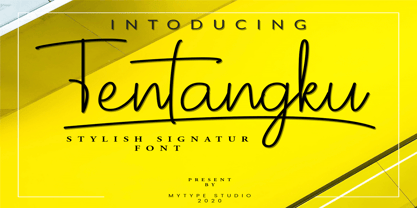 Tentangku Font is a new modern & fresh script with a handwritten and script style make this font looks elegant, natural, stylish and perfect for any awesome projects that need handwriting taste . would perfect for photography, watermark, social media posts, advertisements, logos & branding, invitation, product designs, label, stationery, wedding designs, product packaging, special events or anything that need handwriting taste.
 - Columnist JNL by Jeff Levine,
$29.00 “News Gothic” has been a reliable workhorse of a font since it was created by Morris Fuller Benton and first offered for sale in 1908 by American Type Founders. A clean, legible design used for text copy, it can also double as a light headline face. This reinterpretation (named Columnist JNL) is available in both regular and oblique versions.
