3,427 search results
(0.022 seconds)
- New September by Nk Studio,
$19.00 New September is a whimsical and fun display font. Looks great on a variety of design ideas that need a trendy touch. Whatever the topic, New September will be a great asset to your font library, as it has the potential to enhance any creation. The New September is also made with the crafter in mind: there are no closed counters in either type, meaning they can easily be used for stencils and electronic cutters like the Cricut and Silhouette lines. Enjoy and thank you.
 - Compacta MT by Monotype,
$29.00 Compacta is the work of Fred Lambert and is reminiscent of the extremely narrow, sans serif stencilled fonts of the 1920s, then intended as titles or headlines for magazines and posters. The characters of all cuts are narrow and the space between letters is very small. The white spaces between strokes are perceived almost as only small white stripes and dots which stand out from the black bands of the lines of text. Compacta is not meant for longer texts but is impressive in titles and headlines.
 - Starlikes by Say Studio,
$15.00 Starlikes - classic duo typeface with stencil serif and regular typeface, which can be adapted to your needs and desires Starlikes is a beautiful, nostalgic lowercase and uppercase typeface that works best as focus display text (think logos, headers, pretty quotes, calls to action, etc.) think logos, headers, pretty quotes, calls to action, etc.). Upper and lower case give it great versatility, but I honestly can't get over all the crumpled uppercase letters. This is too good. Including: Numbers & punctuation Foreign language support Have a wonderful day SayStudio :-)
 - Wolfgang Krauss by IKIIKOWRK,
$17.00 Introducing Wolfgang Krauss - Modern Fraktur Typeface, created by ikiiko. A simple blackletter type with mood of modern fraktur style. This typeface is perfect for an poster event, stencil, hipster magazine, fashion stuff, T-shirt design, tote bag design, quotes, and so much more. What's included? Uppercase & Lowercase Number & Punctuation Multilingual Support Format File : TTF & OTF Works on PC & Mac Get also a good offer & FREEBIE at our site : www.ikiiko.com Enjoy our font and if you have any questions, you can contact us by email : ikiikowrk@gmail.com
 - Nihil by Dawnland,
$13.00 Inspired by classic serif fonts such as (adobe) Garamond, this pencil drawn typeface give your designs a unique and elegant, yet distressed look.
 - Unremitting by Kraken,
$20.00This was created during experimentation with thin pencil lines and thus unremitting was created. This font works well with illustrations and gentle photography. - Fenimore SRF by Stella Roberts Fonts,
$25.00 Fenimore SRF is a variation of Jeff Levine's Theater District JNL with added highlights, created especially by Jeff for Stella Roberts fonts. This Art Deco-influenced typeface typifies the streamlined style of 1930s era-influenced modernism and streamline. The net profits from my font sales help defer medical expenses for my siblings, who both suffer with Cystic Fibrosis and diabetes. Thank you.
 - pencilPete by JOEBOB graphics,
$19.00 Just a straight and simple font with a character of its own: written with a HB pencil which is very recognizable in its appearance.
 - Melbylon - 100% free

- Barbed Wire by Monotype,
$29.99Andrew Smith played with his pencil and scetched an alphabet with several strokes. and as he made come cross strokes it lokes like barbed wire. - Marvello by Keristyper Studio,
$14.00 Marvello a classy elegant stencil serif font is perfect for any project. This font is good for logo design, Social media, Movie Titles, Books Titles, short text even long text letters, and good for your secondary text font with sans or serif. **Featured:** * Standard Uppercase & Lowercase * Numeral & Punctuation * Multilingual : ä ö ü Ä Ö Ü ß ¿ ¡ * Alternate & Ligature * PUA encoded We recommend programs that support the OpenType feature and the Glyphs panel such as Adobe applications or Corel Draw. so you can use all the variations of the glyphs. Hope you enjoy our fonts!
 - Architype Albers by The Foundry,
$50.00 Architype Konstrukt is a collection of avant-garde typefaces deriving mainly from the work of artists/designers of the inter-war years, whose ideals have helped to shape the design philosophies of the modernist movement in Europe. Due to their experimental nature character sets may be limited. Architype Albers draws on early grid-based attempts by Josef Albers, in 1926, to design an alphabet by reducing the forms to purely geometric elements – the square, triangle and parts of a circle – and in the process creating an unusual stencil effect typeface.
 - Salom by Schriftlabor,
$44.00 Salom was designed by Austrian type designer Igor Labudovic during his year at Reading University. Besides Latin, it originally included Arabic and Hebrew. The peaceful coexistence of both writing systems in his fonts led him to combine the words Salaam and Shalom to the font family name. Salom’s sibling, Salom Sans, features the same letter proportions and therefore allows a rich spectrum of diverse typography, yet keeping the harmony between all styles. The sans has an additional light weight, while the serif comes with an expressive stencil style.
 - Kau by Scholtz Fonts,
$21.00 Kau is a quirky, sans serif display font in two weights. Its funky, stencilled outline bursts onto the page with in-your-face energy, just demanding to be noticed. Kau Black is big and bold, specially crafted for posters, headlines, ads and logotypes. Kau Light forms a perfect foil - clear, skinny and edgy. Use the two together, in a contrasting explosion of form, to create exciting contrasts and vibrant designs The font has all the features of a fully professional typeface. Language support includes all European character sets.
 - FF Oxide Solid by FontFont,
$62.99 American type designer Christian Schwartz created this display and sans FontFont in 2005. The family contains 3 weights: Light, Regular, and Bold and is ideally suited for advertising and packaging, music and nightlife, poster and billboards, software and gaming as well as sports. FF Oxide Solid provides advanced typographical support with features such as ligatures, titling alternates, case-sensitive forms, fractions, and super- and subscript characters. It comes with tabular lining and proportional lining figures. This FontFont is a member of the FF Oxide super family, which also includes FF Oxide Stencil.
 - Oceanshore by Los Andes,
$29.00 Oceanshore is a modern display sans typeface with stencil characteristics and based on geometric shapes. That when combined gives the font a retro-futuristic look and makes it ideal for big and catchy editorial headlines. The family includes 6 styles, from Thin to Bold, each of them in a wide variety of alternates and ligatures that provides the users with a number of choices when composing. Each font comprises more than 550 characters and supports over 200 Latin languages. Seashore is well-suited for headlines, short text, posters, flyers and so on.
 - Monera by Skypia,
$15.00 Monera is a new elegant stencil & modern serif font featuring a regular,outline & italic version. Its luxurious lines will work perfectly for any sophisticated design project. Perfect for luxury product packaging, labels, branding, advertising & much more. Monera includes all standard glyphs plus a few essential ligatures as well as multilingual characters. Unique, playful and versatile serif family with 69 ligatures and 94alternates to beautify the design you like. This font is perfect for branding projects, Logo design, Clothing Branding, packaging, magazine headings, advertising, T-shirts, postcards and much more. Thank you, Skypia
 - Burgs by Putracetol,
$16.00 Burgs - Multistyle Font is a versatile typeface that starts as a modern sans-serif font and expands into a diverse collection of eight alternative font styles. These variations include slab, stencil, display, sport, classic, serif, and decorative, offering a wide range of design options. Each font style can be combined with others or used individually, making it adaptable for a multitude of design purposes. Whether it's for logos, posters, packaging, branding, business names, stickers, headlines, or any creative endeavor, Burgs provides a wealth of options for your projects.
 - Architype Van der Leck by The Foundry,
$50.00 Architype Konstrukt is a collection of avant-garde typefaces deriving mainly from the work of artists/designers of the inter-war years, whose ideals have helped to shape the design philosophies of the modernist movement in Europe. Due to their experimental nature character sets may be limited. Architype Van der Leck originates from the lettering that Bart Van der Leck created for ‘Flax’ magazine in 1941. The letterforms‘ restricted shapes and abstract, stencil-like forms reflect the strong geometric language of De Stijl and show influence from his abstract paintings.
 - Karben 205 by Talbot Type,
$19.50 Karben 205 is inspired by the classic, no nonsense DIN, and has a form that follows its highly legible function. Based on a lozenge, it has a clean and pure geometry with even stroke weights. Karben 205 is available in a family of five weights, and is also available with character variations as Karben 105. There are also monospaced variants of both Karben 105 and Karben 205 and a stencil version. All of the Karben fonts feature an extended character set, including accented characters for Central European languages.
 - Towards by Almarkha Type,
$29.00 Towards Minimalis Stencil Our latest product inspired by the famous logo is simple but classy, made with precision and measured. very good for combining your design work with a clear line and a circle with several different weights that are very comfortable in the design area you are easy to read and as a title on a blog or magazine page Towards Elegant Sans Family has symbols and punctuation and unique alternative letters perfect for logos & branding, photography, invitation, watermark, advertisements,product designs, stationery, wedding designs,label ,product packaging.
 - Militia Sans by Canada Type,
$24.95Militia Sans is the sans-serif version of Militia. A heavy sans serif with very distinct stenciling, Militia Sans is ideal for strong designs that settle for nothing less than total obedience. A few alternates are sprinkled throughout the character set. Militia Sans comes in all popular font formats, and offers a full range of Latin support, including Western, Eastern and Central European languages, as well as Baltic, Celtic/Welsh, Cyrillic, Esperanto, Greek, Maltese, Turkish, and Vietnamese. The Open Type font is entitled Militia Sans Pro, and contains class-based kerning. - Encoder by District,
$20.00 This is not a stencil font. At least it isn't intended to be. The foundation for the entire font comes from a progression in experimental rules on stroke intersections (pinching, separating) while maintaining proportions and elements from a more conventional typeface. More latitude was given to the unicase "Fat" face but still retains the overall flavor of the original. The end result is a typeface that's hard to categorize as any one personality. Most likely a good candidate for logo, display, or headline work, the applications for Encoder are yet undeciphered.
 - Karben 105 Mono by Talbot Type,
$19.50 Karben 105 Mono is a monospaced variation of Karben 105. The clean and pure geometry of Karben 105 makes it highly suitable for adaptation to this monospaced variant. It has an even look and retains its legibility at very small sizes. Karben 105 Mono is available in a family of five weights and includes an extended character set to include accents for Central European languages. Karben 205 Mono is also available as a monospaced variant of Karben 205. There is also a stencil version of Karben 105 available.
 - Reed by ParaType,
$30.00 Reed is a refined calligraphic font based on humanist italic. It contains two weights and a high-contrast Display style for extra large point sizes. Two unusual stencil styles add zest to the type family. The character set includes lots of swashes and contextual alternates. This makes text set in Reed look very close to live calligraphy. Reed works perfectly in labels and packaging of confectionery, cosmetics, perfumery and sparkling wines, as well as greeting cards and event design. Reed was designed by Isabella Chaeva and released by Paratype in 2020.
 - VLNL Kimchi by VetteLetters,
$35.00 The Kimchi font had its starting point in the making of the film "Cloud Atlas", based on the novel by David Mitchell and directed by Lana & Andy Wachowski and Tom Tykwer. A first version of Kimchi was created for "Papa Song" – an underground fast food restaurant in a futuristic Neo Seoul in the year 2144. It was used for the menus, advertisement and packaging. Kimchi was later further developed to become a useable typeface: it works for headlines, street art stencils and of course as logo font for korean fast food restaurants.
 - Remopid by Keristyper Studio,
$14.00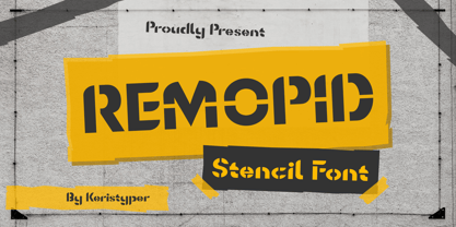 Introducing Remopid typeface, stencil display font with a strong personality. This font is good for logo design, Social media, Movie Titles, Books Titles, short text even long text letters, and good for your secondary text font with sans or serif. **Featured:** * Standard Uppercase & Lowercase * Numeral & Punctuation * Multilingual : ä ö ü Ä Ö Ü ß ¿ ¡ * Alternate & Ligature * PUA encoded We recommend programs that support the OpenType feature and the Glyphs panel such as Adobe applications or Corel Draw. so you can use all the variations of the glyphs. Hope you enjoy our fonts!
 - Havelock by XO Type Co,
$40.00 Four interchangeable all-caps typefaces, made specifically for designers to layer and play with. Here’s more at the designer’s site. It combines hard and soft, geometry and pattern. Layer and mix styles within a single word, retaining coherent visual tone. Havelock Solid operates as a background layer, Multiline sits nicely atop it, Inline frames Multiline’s center strokes, and Stencil lets details peek through. If you’re working with translucent color, the blending can be gorgeous. Please note, if you're also looking at Havelock Titling: both collections are included in Havelock Complete for a lower price.
 - Goldana by Seventh Imperium,
$10.00 Goldana is a display layered font inspired by art deco. The base layer is regular; add an extrude and extrude shadow to create a dimensional look. Several of the styles can be mixed and matched together to create different style details. There are several fonts with a stand-alone style and script. The Script fonts are also equipped with OpenType features. (The shadow, drop shadow, drop stripe and stencil styles are not meant to be layered.) Play with the extras collection to create badges with a vintage feel and an art deco style.
 - Foundry Fabriek by The Foundry,
$99.00 Foundry Fabriek was inspired by the concepts behind industrial fabrication, where and how parts of materials or structures are united. The systematic grid, formed by stencil shapes, is indicative of the work of Wim Crouwel, consultant on the development of this typeface. The compact character widths of Foundry Fabriek are consistent over the five weight progression, giving flexibility for a variety of applications. The characteristic letterforms have an extra dynamic in large scale, perhaps in cast concrete or laser cut metal, to form integrated components in architectural or signage projects.
 - Caché by ArtyType,
$29.00 Caché is a stylish, condensed sans serif font family in 3 versatile weights (Light, Medium & Bold) with an extended Latin character set. The typeface features economical letterforms with distinctively sheared terminals and occasional stencil characteristics. Designed as a practical all-rounder, it really does live up to its name, providing legibility along with added panache to any heading or copy. In practice, its surprisingly adaptable to most projects; and as usual with ‘ArtyType’ fonts, there are several alternate characters available via the glyph palette, providing that extra dimension when personalising your design projects.
 - Karben 105 by Talbot Type,
$19.50 Karben 105 is inspired by the classic, no nonsense DIN, and has a form that follows its highly legible function. Based on a lozenge, it has a clean and pure geometry with even stroke weights. Karben 105 is available in a family of five weights, and is also available with character variations as Karben 205. There are also monospaced variants of both Karben 105 and Karben 205 and a stencil version. All of the Karben fonts feature an extended character set, including accented characters for Central European languages.
 - Dirty Bakers Dozen by Typodermic,
$- Dirty Baker’s Dozen, was released in 1998 and has since become the gold standard in raunchy stencil fonts. This version of Dirty Baker’s Dozen is pants-full of handy symbols, fractions, accents and what not. Need numeric ordinals? Probably not, but if you do, Dirty Baker’s Dozen will be there with boots on and numeric ordinals a-blazing. Two new styles were introduced in 2009: Scorch & Spraypaint. When you're using Scorch or Spraypaint styles in an OpenType savvy application, common letter pairs will be automatically replaced by custom pairs for a more realistic, filthy effect.
 - Karben 205 Mono by Talbot Type,
$19.50 Karben 205 Mono is a monospaced variation of Karben 205. The clean and pure geometry of Karben 105 makes it highly suitable for adaptation to this monospaced variant. It has an even look and retains its legibility at very small sizes. Karben 205 Mono is available in a family of five weights and includes an extended character set to include accents for Central European languages. Karben 105 Mono is also available as a monospaced variant of Karben 105. There is also a stencil version of Karben 105 available.
 - Armalite Rifle Pro by CheapProFonts,
$10.00 Military style stencil type, badly bruised by shotgun fire, wear and tear. Now ready for action in more languages! Vic Fieger says: "The original letterforms were not the famous military stencil, but were drawn freehand then scanned into Photoshop. Next, they were altered using a series of brushes before being imported into a font. This font has been used in the Flash games Pandemic and Artillery." ALL fonts from CheapProFonts have very extensive language support: They contain some unusual diacritic letters (some of which are contained in the Latin Extended-B Unicode block) supporting: Cornish, Filipino (Tagalog), Guarani, Luxembourgian, Malagasy, Romanian, Ulithian and Welsh. They also contain all glyphs in the Latin Extended-A Unicode block (which among others cover the Central European and Baltic areas) supporting: Afrikaans, Belarusian (Lacinka), Bosnian, Catalan, Chichewa, Croatian, Czech, Dutch, Esperanto, Greenlandic, Hungarian, Kashubian, Kurdish (Kurmanji), Latvian, Lithuanian, Maltese, Maori, Polish, Saami (Inari), Saami (North), Serbian (latin), Slovak(ian), Slovene, Sorbian (Lower), Sorbian (Upper), Turkish and Turkmen. And they of course contain all the usual "Western" glyphs supporting: Albanian, Basque, Breton, Chamorro, Danish, Estonian, Faroese, Finnish, French, Frisian, Galican, German, Icelandic, Indonesian, Irish (Gaelic), Italian, Northern Sotho, Norwegian, Occitan, Portuguese, Rhaeto-Romance, Sami (Lule), Sami (South), Scots (Gaelic), Spanish, Swedish, Tswana, Walloon and Yapese.
 - Anuschka by Anomali Creative,
$10.00 Introducing **ANUSCHKA** - Faux Cyrillic Display Font Faux Cyrillic, pseudo-Cyrillic, pseudo-Russian or faux Russian typography is the use of Cyrillic letters in Latin text, usually to evoke the Soviet Union or Russia, though it may be used in other contexts as well. It is a common Western trope used in book covers, film titles, comic book lettering, artwork for computer games, or product packaging which are set in or wish to evoke Eastern Europe, the Soviet Union, or Russia. A typeface designed to emulate Cyrillic is classed as an ethnic typeface. **ANUSCHKA** came with that protest and propaganda vibe. It's contain a complete Simple Latin Glyphs, with extra ligatures, D-Ligature, Stylistic set for the main character to make it stencil look and distressed look. --- This font can be used with all software that can read standard fonts. Check out my instagram: https://www.instagram.com/anomalicreatype/ Thanks so much for checking out my shop! All the best, **Krisna Teja** Anomali Creatype #typeface #Stencil #FauxCyrillic #Cyrillic #Military #Protest #Poster #vintage #Extreme #design #Vintage #graphic #calligraphy #Retro #typography #propaganda #Poster #blackletter #retrostyle #illustration #Russian #socialist #character #set #uppercase #decorative #black #classic #Uppercase #handmade #capital #bold #number #modern #tattoo #english #art #label #logo #middle #typographic #antique #sign #letterhead #fashion #filmtitles #russia #comicbooklettering #videogames #computergames
 - Glance Slab by Identity Letters,
$29.00 Dynamic and sportive. A well-balanced experiment for sparkling headlines. Glance Slab is an experimental design that plays on the tension between connection and detachment. In this typeface, serifs may be detached and some strokes may not connect to their stems. This creates a dynamic impression of balance and movement. The elegance of an ice skater and the determination of a quarterback: Glance Sans has it all. Where a curve meets a stem and where serifs seem to “hover” near their respective letters, the nonjoining elements create an impression similar to a stencil typeface. But here, the function of the gaps differs from strictly stencil designs: while the gaps provide a “sparkling” effect in Glance Slab that’s clearly visible in large sizes, they take on the role of ink traps when set smaller, making for surprisingly legible body copy. With its strong visual character, this font family is quickly recognizable, making it perfectly suitable for branding and any large-scale application, such as posters, billboards, and event signage. Glance Slab consists of seven weights from Thin to Black. Each style has a character set of about 570 glyphs, which includes circled numbers and arrows (positive and negative versions), ligatures, extended language support, and many other features.
 - Sabotage by PintassilgoPrints,
$24.00 Sabotage is inspired by the iconic Vertigo movie poster by Saul Bass. It is a bold all-caps font that fits a wide range of eye-catching design projects surprisingly well. Check it out! Sabotage offers two versions for each letter, stored in upper- and lower-case slots. When turned on, its contextual alternates feature will instantly alternate these glyphs, preventing double letters from displaying the same letterform while boosting the nice handlettered feel of the typeface. The font is also loaded with a set of stylistic alternates and a couple of discretionary ligatures for even more flexibility. Sabotage is available in 2 flavours, solid and not-that-solid. The family also counts a cool complementary picture font which sort of draws inspiration from the minimalistic - but always striking - book-cover illustrations of Dick Bruna.
 - TT Phobos by TypeType,
$35.00 TT Phobos useful links: Specimen | Graphic presentation | Customization options TT Phobos is a pliable display serif with a soft and gentle character. The features of the typeface are the moderate contrast between bold and thin strokes, pliable visual compensators, and the counter-clockwise bend of internal ovals. In addition to 6 weights and 6 italic, TT Phobos also includes two original decorative fonts, inline and stencil. Despite its pliability and display character, TT Phobos is dynamic enough and is well suited for text arrays even in large text blocks. The serifs of letters are completely asymmetrical and bring in dynamics when reading the text from left to right. Thanks to the harmonious contrast of black and white forms and internal negative spaces of the letters, as well as its broad letter spacing, the typeface is well read in small sizes. In this case, the character of the letters is completely preserved, partially thanks to the exaggerated elegant visual compensators. The ornamental pattern used in TT Phobos Inline varies for capital and lowercase letters. Capital letters implement a more complex double inline with a rhombic element in the middle, and in the lower case features a simplified form of the inline, made in a single movement. Thanks to the original cutting, TT Phobos Stencil stands out for its expression, and the rounded cuts add even more visual style to the font. TT Phobos consists of 14 faces: 6 weights (Light, Regular, DemiBold, Bold, ExtraBold, Black), 6 Italics, inline and stencil. There are 17 ligatures in TT Phobos, including several Cyrillic ones. The typeface has stylistic alternates, which adds an italic effect to the upright fonts, and a little solemnity of the upright version to the italics. In addition, we have not forgotten about the old-style figures and other useful OpenType features, such as ordn, sups, sinf, dnom, numr, onum, tnum, pnum, liga, dlig, salt (ss01), frac, case.
 - FS Alvar by Fontsmith,
$80.00 The classic modernist FS Alvar grew out of a library of pure modular shapes gathered by Fontsmith’s master of the abstract starting point, Mr Phil Garnham. “It was a collection that just had to be explored and brought to life in a typographic voice. “We debated long and hard about this. It was big decision to make a shift away from the typefaces that people knew us for. And we didn’t want to compromise our reputation of well crafted typographic quality”. Modular forms A headline font that’s both graphic and functional, in the modernist tradition, FS Alvar focused Fontsmith’s eyes on the bigger issue of what makes a font show its age. “Looking at those fonts from the 1980s that were supposed to represent the ‘future’,” says Phil, “they looked so dated now. With Alvar, we weren’t concerned with creating future-thinking typography but with exploring form for form’s sake, and how that can evolve to create letterforms. Modular forms with a typographic eye.” Stencilled The concept for Alvar first materialised back in 2001 with some sketches Phil made while still at Middlesex University. Eight years later, something made him dig them out again. “There was something really nice about the proportions of that first design. Working on it again, I thought about it properly, but it still needed something to give it that edge. “Jason stood up in the studio and supplied the missing link: ‘Why don’t we make it stencilled?’ He didn’t mean in an obvious way, but by building a kind of architectural stencil into the form. It worked and the idea of using an architect’s name (Alvar Aalto) to describe the font felt perfect.” Featured in... The three weights of FS Alvar are made for standout headlines in advertising campaigns and magazines. Alvar has had a starring role in campaigns for brands from Nike to Amnesty International, as well as on CD covers, record labels and packaging.
