10,000 search results
(0.048 seconds)
- Brasley by Nicolas Deslé,
$6.00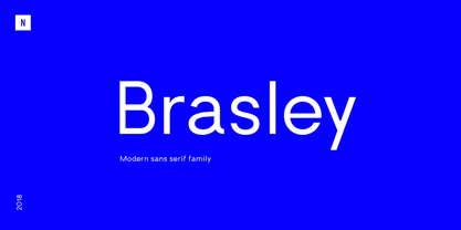 Here's Brasley, a geometric sans. Brasley is available in six weights - bold, semibold, medium, regular, light and thin - each with matching italics. It also includes contextual alternates, ligatures, fractions, arrows and shapes.
 - Recruitment JNL by Jeff Levine,
$29.00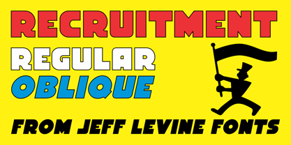 A 1916 recruitment poster from World War I seeking men to join the Army’s Signal Corps provided the lettering inspiration for Recruitment JNL, which is available in both regular and oblique versions.
 - Dioxide by Fype Co,
$16.00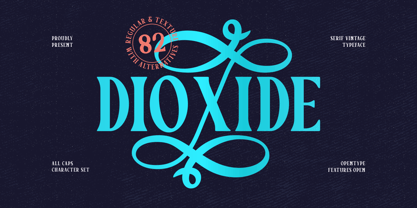 Dioxide typeface classic taste including two styles regular and texture, its authentic and very interesting to make a memorable vintage logo, packaging, poster or title design with a serif and victorian style.
 - Pleasant Evening JNL by Jeff Levine,
$29.00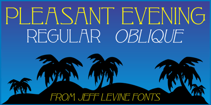 Pleasant Evening JNL was modeled after an Art Nouveau serif typeface named ‘Racine’ [found in the 1881 Barnhart Bros. & Spindler type specimen book] and is available in both regular and oblique versions.
 - Nouveau Elegance JNL by Jeff Levine,
$29.00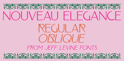 The gently spurred serif hand lettering found on an advertisement for Berkshire Stockings (circa the 1920s) was the inspiration for Nouveau Elegance JNL, which is available in both regular and oblique versions.
 - Killernuts by Dharma Type,
$14.99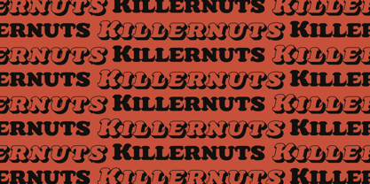 Wood type for display. Serifs like brush strokes are associated with Japanese calligraphy ‘Shodo’. East meets West. There are two styles, Regular for ordinary use and 3D for more eye-catchy part.
 - Personal Note JNL by Jeff Levine,
$29.00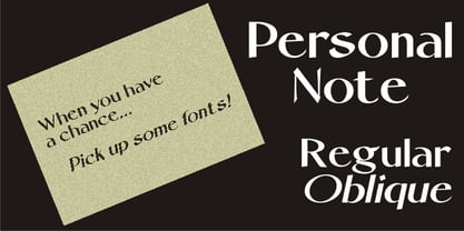 Personal Note JNL gets its inspiration from a semi-calligraphic pen alphabet found in the 1960 edition of the Speedball® lettering textbook and is offered in both regular and oblique versions.
 - Local Jeweler JNL by Jeff Levine,
$29.00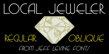 Local Jeweler JNL was inspired by an online image of a vintage 1940s-era store sign. This type design features a thin Art Deco sans serif in both regular and oblique versions.
 - Gluck by Etewut,
$30.00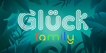 Gluck family is based on sans serif font. It fits to product design, any commercial and decorations. Glück family supports european languages. It includes 5 styles: • regular • stroked • bold • bold stroked • stripes
 - Moonlit Night JNL by Jeff Levine,
$29.00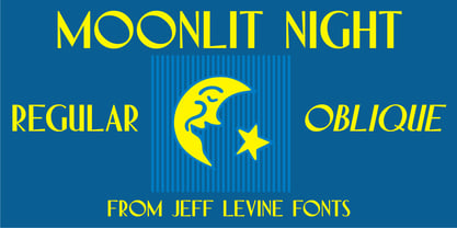 The simple, hand lettered sans serif title on the 1935 sheet music for "Campus Moon" was the design model for Moonlit Night JNL, which is available in both regular and oblique versions.
 - Movie Screen JNL by Jeff Levine,
$29.00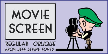 The hand lettered opening titles from the 1944 Laurel and Hardy comedy “The Big Noise” served as the inspiration for Movie Screen JNL, which is available in both regular and oblique versions.
 - Himalaya by Arendxstudio,
$18.00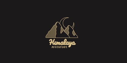 Introducing Himalaya Typeface a rounded vintage monoline. Himalaya is clean modern-vintage display font which inspired from old school letterpress 1.Uppercase,lowercase, numeral,punctuation & Symbol 2.Regular 3.Multilanguage 4.Alternate
 - Labrador by Typesketchbook,
$40.00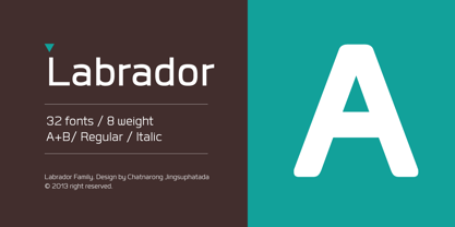 Labrador is a sans-serif and proportional font designed in 2013 by Chatnarong Jingsuphatada. A regular member of the Labrador font family, this is a elegant, modern, thin, rounded and clean typeface.
 - Catalog JNL by Jeff Levine,
$29.00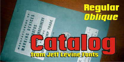 Catalog JNL is based on a set of vintage wood type. Its uniform, block-style appearance is perfect for projects where bold, readable titling will apply. Available in regular and oblique styles.
 - Chubbet Distended by Emboss,
$25.00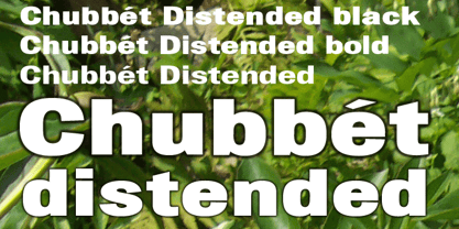 Chubbét (pr. Chub-bay) Distended is the extended version of Chubbét. The regular weight starts off plumper than plump, then it expands inward until there is a minimal amount of positive space.
 - Rima by K-Type,
$20.00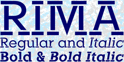 Rima is a stencil display face with imposing slab serifs, designed to suggest strength, confidence, expertise and efficiency. Regular and Bold weights are included along with two handy italics (optically corrected obliques).
 - Narrow Nouveau JNL by Jeff Levine,
$29.00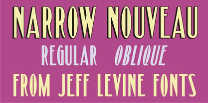 Narrow Nouveau JNL come from the hand lettered title on a 1907 song folio for George M. Cohan's "The Talk of New York", and is available in both regular and oblique versions.
 - Rail Service JNL by Jeff Levine,
$29.00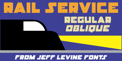 The extra bold, squared Art Deco sans hand lettering found on a 1940s travel poster for the Pennsylvania Railroad inspired Rail Service JNL, which is available in both regular and oblique versions.
 - Overnight JNL by Jeff Levine,
$29.00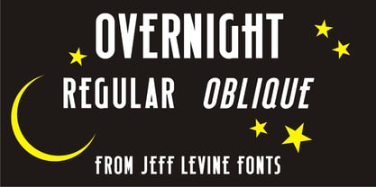 Hand lettering on the cover of the 1932 sheet music for "Sleep, Come On and Take Me" was the basis for Overnight JNL, which is available in both regular and oblique versions.
 - Homerun by madeDeduk,
$14.00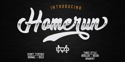 Homerun script typeface font with three alternative reguler, stamp and gradient. Homerun perfect for poster design, book covers, merchandise, fashion campaigns, newsletters, branding, advertising, magazines, greeting cards, album covers, and quote designs and more. Whats Included? - Homerun Reguler.otf - Homerun Stamp.otf - Homerun Gradient.otf - Homerun Reguler Bold.otf - Homerun Stamp Bold.otf - Homerun Gradient Bold.otf Feature - UPPERCASE - lowercase - Number & Symbol - International Glyphs - Alternative UPPERCASE - Alternative lowercase - Ligature - Swash If you need anything else just shoot me on email at: dedukvic@gmail.com Hope you enjoy it.
 - Supa Mega Fantastic by Nicky Laatz,
$28.00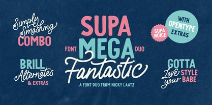 Say hello to Supa Mega Fantastic! A casual font duo consisting of a hand-lettered inky script and a casual inked all caps font. The Script comes with a multitude of additional characters as Opentype Alternates, to add a fancy flair to your words as you require. All uppercase characters have a fancy alternate, and all lowercase letters have a selection of alternates for you to select from to suit your wording best. You can have it plain, or fancy shmancy :) The Script comes in two variants - Regular and slightly thinner. The slightly thinner version is best suited to lighter type on darker backgrounds, and the slightly thicker version is better suited to darker type on lighter backgrounds. Perfect for typography based branding, quotes, packaging design, greeting cards, recipe books, cosmetic brands, retro vintage badge design, creative headers and so much more.
 - Balgena by Gold Type,
$10.00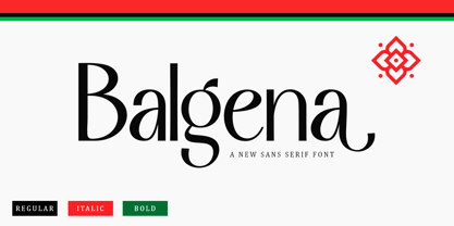 Balgena is a versatile, high-contrast sans serif font family. Qualux comes from the words Quality and Luxury. This font has a distinctive serif style with a luxurious style in a light form, but also has a friendly and playful style in a bold font. Balgena has an extra glyph to give the crafter more options in designing. These extras will make a design look more classy, elegant, unique and edgy. Balgena is a font suitable for many projects, for modern or even retro vintage designs, branding, logos, crafts, stickers, sublimation, wedding invitations, and more. This font is suitable for a variety of projects such as logos, branding, magazines, signage, fashion, and many more. You will get : 3 type fonts -Regular -Bold -Italic mail features: Uppercase and lowercase letters Numbers and punctuation Multilingual support PUA encoded fonts Alternative styles and ligatures Thank You
 - Looqie by Gilar Studio,
$16.00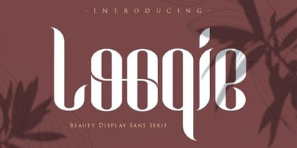 Looqie - Beauty Display Sans Serif Is my new elegant with Regular and Italic serif font that will bring in your projects a touch of Beauty Looqie - Beauty Display Sans Serif will work perfectly for fashion, e-commerce brands, trend blogs, wedding boutiques or any business that wants to appear upscale. Flip through all the previews and get inspired like I was while creating this font Looqie also Suitable for Logo, greeting cards, quotes, posters, branding, name card, stationary, design title, blog header, art quote, modern envelope, book design any DIY project to make your art/design project look pretty and trendy. Features : Uppercase & Lowercase Numerals & Punctuations (OpenType Standard) Accents/Multilingual characters PUA Encoded 29 Ligature Check my other Font here : https://gilarstudio.com/ Give it a try! You will surely love it! Thanks and have a wonderful day, Gilar :)
 - Boston Angel by Great Studio,
$18.00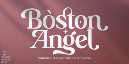 Boston Angel Serif is a modern vintage serif font packaged in a modern and classy style, complete with access to your OpenType features to access a large selection of alternates letters and ligatures, the choice of letters you like from variations of uppercase and lowercase letters to get a display luxurious and elegant. Unique, playful and versatile serif family with 35 ligatures and 114 alternatives to beautify the design you like. This font is perfect for branding projects, Logo design, Clothing Branding, packaging, magazine headings, advertising, T-shirts, postcards and much more. What is included: Boston Angel Thin Boston Angel Light Boston Angel Regular Boston Angel Medium Boston Angel Bold Features • All Uppercase and Lowercase • Number & Symbol • Supported Languages • Alternates and Ligatures • PUA Encoded If you have any questions, don't hesitate to contact me. Thank you, Great Studio
 - Glorify SH by Sohel Studio,
$12.00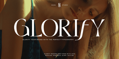 Glorify SH is a Modern vintage serif typeface with Unique alternative , multilingual support with perfect kerning. This typeface is perfect for an elegant & luxury logo , classy editorial design, women's magazine, fashion brand , cosmetic brand, fashion promotion , modern advertising design, invitation card, art quote, home decoration , book/cover titles, special events, Tote bag, T-shirt, Advertising and much more. Glorify SH Features: · 4 Weights font (Regular, Italic, Outline, Semi Bold) · Uppercase And Lowercase · Alternates · Numerals & Punctuation · Accented characters · Multilingual Support · Unicode PUA Encoded If you need another format of this font, such as TTF, WOFF and WOFF2, please contact me. While using this product, if you encounter any problem or spot something we may have missed, please don't hesitate to drop us a message. We'd love to hear your feedbacks in order to further fine-tune our products. Thanks and have a wonderful day .
 - Cottorway Pro by FoxType,
$25.00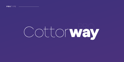 Cottorway Display Pro is a Brand New Elegant Typeface From a powerful font family of cottorway with 54 Varients. It has a dependable and uncompromising style, with controlled letterforms and modern touches. It looks amazing in logos, magazines, and movies. Cottorway Font would be perfect for branding, headlines, Captions, paragraphs, and posters. The various weights allow you to experiment with a wide range of applications. It's created to make an impression without sacrificing its beauty and readability. It's shown a clean, minimalist, warmth, quirky, yet still purposed to be versatile The Typeface includes Nine Weights -Thin, ExtraLight, Light, Regular, Medium, SemiBold, Bold, ExtraBold and Black. Numerals and extended punctuation (200+ Glyphs). Updated and reworked Glyphs Expert kerning and quality crafting. Normal, Italic, Condensed and Outline Varients are Included. Thank you for taking the time to look into the font.
 - TT Marxiana by TypeType,
$59.00 TT Marxiana useful links: Specimen | History of creation | Graphic presentation | Customization options Please note! If you need OTF versions of the fonts, just email us at commercial@typetype.org About TT Marxiana: TT Marxiana is a project to reconstruct a set of pre-revolutionary fonts that were used in the layout of the "Niva" magazine, published by the St. Petersburg publishing house A.F. Marx. In our project, we decided to focus on a specific set of fonts that were used in the preparation and printing of the "Niva" magazine in 1887, namely its Antiqua and Italic, Grotesque and Elzevir. As part of the TT Marxiana project, we sought to adhere to strict historicity and maintain maximum proximity to the paper source. We tried to avoid any “modernization” of fonts, unless of course we consider this to be kerning work, the introduction of OpenType features and creation of manual hinting. As a result, with the TT Marxiana font family, a modern designer gets a full-fledged and functional set of different fonts, which allows using modern methods and using modern software to create, for example, a magazine in a design typical of the late 19th century. The TT Marxiana project started in the late summer of 2018 and from the very beginning went beyond the traditional projects of TypeType because of the importance of preserving the historical identity. Since up to this point, we had never before reconstructed the font from historical paper sources and with such a level of elaboration and attention to detail, it took us two years to implement this project. You can read more about all stages of the project in our blog, and here we will briefly talk about the result. As it turned out, drawing a font following the scanned pages of a century-old magazine is a very difficult task. In fact, such a font reconstruction very much resembles archaeological excavations or solving a complex cipher, and all these efforts are needed only in order to finally understand what steps need to be taken so that the resulting font is not just an antiqua, but the specific and accurate antiqua from "Niva" magazine. In addition, due to the specifics of printing, same characters in the old magazine setting looked completely different, which greatly complicated the task. In one place, there was less ink than needed, and the letter in the reference was not well-printed and thin, in some other place there was more ink and the letter had flooded. An important task was to preserve and convey this feeling of typographic printing, but at the same time it was important to identify the common logic and character of the dot gains so that the font would form a harmonious, single, but at the same time lively picture. Since the "Niva" magazine was historically published in Russian, the magazine had no shortage of references for the reconstruction of Cyrillic characters, but there were not many Latin letters in the magazine at all. In addition, the paper source lacked a part of punctuation, diacritics, there were no currency signs nor ligatures at all—we developed all these characters based on font catalogs of the 19–20 centuries, trying to reflect characteristic details from the main character composition to the max. So, for example, the Germandbls character, which is not in the original "Niva" set, we first found in one of the font catalogs, but still significantly redesigned it. We decided that in such a voluminous project, only graphic similarities with the original source are not enough and we came up with a feature that can be used to exchange modern Russian spelling for pre-revolutionary spelling. When this feature is turned on, yat and yer appear in the necessary places (i, ѣ, b, ѳ and ѵ), the endings of the words change, and so appears a complete sensation of the historical text. This feature works in all fonts of the TT Marxiana font family. TT Marxiana Antiqua is a scotch style serif, the drawing of which carefully preserved some of the artifacts obtained by printing, namely dot gain, a slight deformation of the letters and other visual nuances. TT Marxiana Antiqua has an interesting stylistic set that imitates the old setting and in which some of the signs are made with deliberate sticking or roughness. Using this set will provide an opportunity to further simulate the setting of that great time. TT Marxiana Grotesque is a rather thick and bold old grotesk. Its drawing also maximally preserved the defects obtained during printing and characteristic of its paper reference. In addition to pre-revolutionary spelling, TT Marxiana Grotesque has a decorative set with an inversion. This is a set of uppercase characters, numbers and punctuation, which allows you to type inverse headers, i.e. print white on black. As a result of using this set, you get the text against black bars—this way of displaying was very characteristic for print advertising at the turn of the century. In addition, about 30 decorative indicator stubs were drawn for this set: arrows, hands, clubs, etc. TT Marxiana Elzevir is a title or header font and is a compilation of monastic Elzevir that were actively used in the "Niva" magazine for all its prints. Unlike the antiqua, TT Marxiana Elzevir has sharper forms, and the influence of deformations from typographic printing is not as noticeable in the forms of its signs. This is primarily due to the specifics of its drawing and the fact that it was usually used as a heading font and was printed in large sizes. The height of the lowercase and uppercase characters of Elsevier is the same as the heights of the antiqua, but the font is more contrasting and lighter, it has a lot of white and, unlike the antiqua and the grotesque, there are a lot of sharp corners. An exclusive feature of the TT Marxiana Elzevir is an alternative set of uppercase characters with swash. • TT Marxiana Antiqua consist of 625 glyphs each and and it has 23 OpenType features, such as: aalt, ccmp, locl, subs, sinf, sups, numr, dnom, frac, ordn, lnum, pnum, tnum, onum, salt, calt, liga, ss01, ss02, ss03, ss04, ss05, case. • TT Marxiana Antiqua Italic consist of 586 glyphs each and and it has 22 OpenType features, such as: aalt, ccmp, locl, subs, sinf, sups, numr, dnom, frac, ordn, lnum, pnum, tnum, onum, salt, calt, liga, ss01, ss02, ss03, ss04, case. • TT Marxiana Grotesque consists of 708 glyphs and it has 22 OT features, such as: aalt, ccmp, locl, subs, sinf, sups, numr, dnom, frac, ordn, lnum, pnum, tnum, onum, salt, calt, liga, ss01, ss02, ss03, ss04, case. • TT Marxiana Elzevir consists of 780 glyphs and it has 21 OT features, such as: aalt, ccmp, locl, ordn, frac, tnum, onum, lnum, pnum, calt, ss01, ss02, ss03, ss04, ss05, ss06, salt, c2sc, smcp, case, liga. FOLLOW US: Instagram | Facebook | Website TT Marxiana language support: Acehnese, Afar, Albanian, Alsatian, Aragonese, Asu, Aymara, Banjar, Basque, Belarusian (cyr), Bemba, Bena, Betawi, Bislama, Boholano, Bosnian (cyr), Breton, Bulgarian (cyr), Catalan, Cebuano, Chamorro, Chiga, Cornish, Corsican, Cree, Danish, Dutch, Embu, English, Erzya, Estonian, Faroese, Fijian, Filipino, Finnish, French, Friulian, Gaelic, Galician, German, Gusii, Haitian Creole, Hiri Motu, Hungarian, Icelandic, Ilocano, Indonesian, Interlingua, Irish, Italian, Javanese, Judaeo-Spanish, Kabuverdianu, Kalenjin, Karachay-Balkar (cyr), Kashubian, Khasi, Khvarshi, Kinyarwanda, Kirundi, Kongo, Kumyk, Ladin, Leonese, Luganda, Luo, Luxembourgish, Luyia, Macedonian, Machame, Makhuwa-Meetto, Makonde, Malagasy, Malay, Manx, Mauritian Creole, Minangkabau, Montenegrin (cyr), Mordvin-moksha, Morisyen, Nauruan, Ndebele, Nias, Nogai, Norwegian, Nyankole, Occitan, Oromo, Palauan, Polish, Portuguese, Rheto-Romance, Rohingya, Romansh, Rombo, Rundi, Russian, Rusyn, Rwa, Samburu, Sango, Sangu, Scots, Sena, Serbian (cyr), Seychellois Creole, Shambala, Shona, Soga, Somali, Sotho, Spanish, Sundanese, Swahili, Swazi, Swedish, Swiss German, Tagalog, Taita, Tetum, Tok Pisin, Tsonga, Tswana, Ukrainian, Uyghur, Valencian, Volapük, Võro, Vunjo, Walloon, Xhosa, Zulu.
 - "Exquisite Corpse" by Chad Savage is an evocative font that stands out due to its unique inspiration and design, encapsulating a sense of artistic collaboration and creativity tied to its namesake. T...
- Hercílio by Sea Types,
$25.00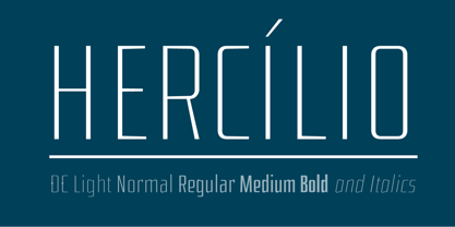 Hercílio is a typographic family without condensed serif, modern and geometric inspired by the architectural forms of the Hercílio Luz Bridge in Florianopolis | Brazi Comprising eleven (11), weights of which ten (10) business are: Five weights Romans: Light, Normal, Regular, Medium and Bold Five Italics weights: Light, Normal, Regular, Medium and Bold And a weight (FREE) Hercílio Decorative Comprising 430 glyphs in each source, brings support for 56 languages (Latin and West, Central and East European) still has features Open Type, ligatures and tabular figures. http://www.cort9.com/wp-content/uploads/2016/05/Specimen_Hercilio.pdf
 - Arcaro JNL by Jeff Levine,
$29.00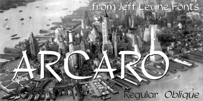 There are times when a typeface is used so consistently that it becomes somewhat synonymous with the subject it's used in. The opening and end titles for the ABC-TV series "Naked City" (1958-1963) were set in a bold version of a popular font emulating the look of calligraphic hand lettering. Arcaro JNL is a somewhat lighter and slightly modified version of this typeface and is offered in both regular and oblique versions. The name Arcaro comes from one of the regular characters in this superbly-written police drama, Detective Frank Arcaro.
 - Atrium by Alex Jacque,
$20.00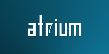 Atrium, designed by Alex Jacque, is a strong, linear, geometric sans-serif display typeface based off century-old pen art by W.E. Dennis. Atrium's stubbornly geometric letterforms are set off with a few softening flourishes on a few glyphs. It's sharp corners, straight verticals and horizontals make Atrium pack some punch when used in headlines, pull quotes, and logotypes. Atrium was released in 2012 in OpenType format and comes in three different weights: light, regular, and bold, with a regular and oblique version of each for a total of 6 styles in the family.
 - Sello by Alex Jacque,
$15.00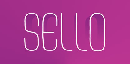 Sello is a hand-drawn, geometric sans-serif with a touch of retro style. It's a unicase typeface inspired by hand-engraved, mid-1960s Spanish postage stamps, hence the name "Sello" – Spanish for "stamp". This font comes in three different weights – light, regular, and bold – with a regular and oblique version of each for a total of 6 styles. Vowels have a special third alternate glyph. Sello also contains the necessary diacritics and special characters to support several different languages. Looks great at the slightly larger point sizes, when used in header or display purposes.
 - Under Storm 3d Graffiti by Sipanji21,
$15.00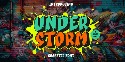 "Under Storm" is a graffiti font with three unique layers: regular, inner shadow, and outer shadow. This font is designed to add depth and dimension to your typography, creating a captivating and dynamic look. The regular layer provides a bold and impactful appearance, while the inner and outer shadow layers add a 3D effect, giving your designs an edgy and urban vibe. With its layered style, "Under Storm" is perfect for creating eye-catching street art, posters, and other urban-themed projects. Embrace the storm of creativity with this versatile and dynamic graffiti font.
 - Manuscript Felice by Kaer,
$24.00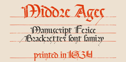 Manuscript Felice blackletter font family with 2 styles. This font family based on vintage Italian Processional manuscript. The book block has disintegrated, and I don’t know who is the author. Luckily I found the last owner, Felice Osio and the last date 1634. That's all) I manually redesign original and regular style fonts from this folio. Also, I’ve added some modern symbols. With this set, you can precisely imitate medieval style text. You’ll get: * Initials & Regular styles * Uppercase and lowercase * Multilingual support * Numbers * Symbols * Punctuation * Ligatures Best, Roman. Thank you!
 - Rock It by Fenotype,
$29.95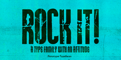 Rock it! is a type family that let's you create instant graphic design for any ROCK, PUNK, HARDCORE, HORROR and so on -gig, poster, logo, and whatever you need. Just type your texts and combine all the tree versions for authentic look! Rock It! includes three ultra condensed sans fonts with different eroded textures and partially different letter shapes. Different versions of Rock It! are set as "Light," "Regular," and "Bold", where Light and Regular have eroded holes in them whereas Bold has "dirty print stains" all over the characters.
 - Gogosquat by Bogusky 2,
$34.50Usually, the condensed version of a face comes after the regular design. Not with gogo squat. After gogo big, I thought how strong a regular version would be. A nice clean gutsy face. A "today" Franklin Gothic Extra Bold. I find it ideal for contemporary headlines as well as for logo solutions. As with gogo big, in my terms and conditions, I permit the modification of up to ten of the letter forms for logos and monograms, but logos and monograms only, not the typeface in normal usage. - Hypop by Factory738,
$15.00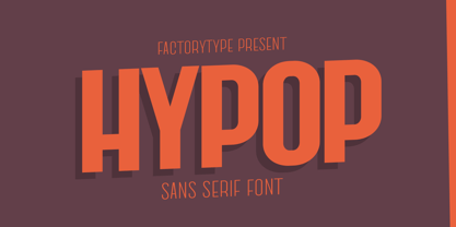 HYPOP is a strong and condensed sans serif font family with a nostalgic vibe. Combining retro and minimalist elements resulted in an elegant design. The different weights give you a lot of options when it comes to choosing the right typographic color for your project. 5 Weights (Thin, Light, Regular, Medium, Bold, Black) 2 Styles (Regular and Italic) Basic Latin A-Z and a-z Numerals & Punctuation Stylistic Ligatures glyphs Multilingual Support for ä ö ü Ä Ö Ü ... Free updates and feature additions Thanks for looking, and I hope you enjoy it.
 - Vingard by Ergibi Studio,
$20.00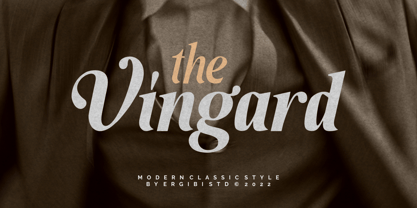 Vingard is a sophisticated serif, The many alternate character swash on serif makes this typeface unique and stands out rather than the regular serif font, perfectly for headlines, logos, posters, packaging, T-shirts,coffee shops, restaurants, magazine's headers, signs or gift/post cards,cafe's and weddings or any type of advertising purpose. comes with 2 versions namely Regular and bold What's Included : Standard glyphs Ligatures Alternate Characters International Accent Works on PC & Mac Simple installations If there is a problem, question, or anything about my fonts, don't hesitate to ask! Big Thanks ~ Ergibi Studio
 - GHEA Granshan by Edik Ghabuzyan,
$40.00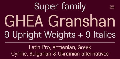 GHEA Granshan is a super font family. It has 9 upright weights and their Italics. It supports Latin Pro, Armenian, Greek, Cyrillic, Bulgarian & Ukrainian alternatives alphabet systems. The weights from Regular to Bold and their Italics can be used as text fonts. The weights thinner than Regular and thicker than Bold can be used as Display fonts. It is an easily readable fond and the eyes don't get tired while reading. GHEA Granshan has a slight contrast style and at the same time is quite bright and clear.
 - Le Blanc by Factory738,
$15.00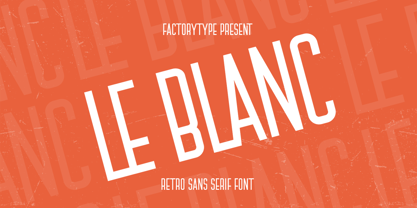 Le Blanc is a strong and condensed sans serif font family with a retro vibe. Combining vintage and minimalist elements resulted in an elegant design. The different weights give you a lot of options when it comes to choosing the right typographic color for your project. 5 Weights (Thin, Light, Regular, Medium, Bold, Black) 2 Styles (Regular and Italic) Basic Latin A-Z and a-z Numerals & Punctuation Stylistic Ligatures glyphs Multilingual Support for ä ö ü Ä Ö Ü ... Free updates and feature additions Thanks for looking, and I hope you enjoy it.