10,000 search results
(0.056 seconds)
- Serenity Font Duo by Nicky Laatz,
$18.00 An elegant duo of fonts and floral illustration extras - designed to work together in harmony, to produce a plethora of beautiful, sophisticated & feminine designs. The luxurious modern calligraphy script works perfectly together with the delicate hand-drawn florals - ideal for elegant branding projects, greeting cards, packaging, social media, logo design and of course, wedding invitations. Also included is Serenity Serif, a rustic serif font, with a touch of imperfection as you'd find in old printed press inks - to contrast with and therefore compliment the more refined luxurious contemporary flow of the script font . Serenity Script includes handy OpenType features that makes the font look more natural - it includes a universal beginning swash for lowercase letters , a full set of lowercase letters with ending swashes, a beginning swash that can be added via OpenType Ligatures by typing either { } or ( ), and a full set of alternate lowercase letters , as well as 70 beautifully crafted ligatures . A more slanted, and heavier version of the script is also included for you. OpenType capable software is required to access these features - The most popular of which is and Photoshop CC, any version of Illustrator, Indesign, Word (new versions). The Serif font comes in 4 versions: Regular, Bold, Heavy and Italic - when used together with different tracking settings and weights, they produce beautiful looking type designs to compliment the Script.
 - Satimah by Attype Studio,
$13.00 Satimah is a stunning Arabic style typeface that brings an elegant and professional look to any design. With its simple yet refined design, this font is perfect for a wide range of projects, from branding to editorial and beyond. The font also comes with stylistic set 1 and 2, as well as stylistic alternates for some characters, giving you even more creative options. Satimah is particularly well-suited for Islamic design and Islamic theme events, thanks to its beautiful calligraphic flourishes and timeless elegance. With both regular and italic versions, this font is versatile enough to be used in a wide range of design applications. And with multilingual support, you can be sure that your message will be communicated clearly and effectively no matter where your audience is located. Features : - Satimah Family Font - Stylistic Alternates - Stylistic Set - Multilingual, US Roman, Latin 1 Support --- This Font Support Language: Afrikaans, Albanian,Asu, Basque, Bemba, Bena, Breton, Catalan, Chiga, Cornish, Danish, Dutch, English, Estonian, Faroese, Filipino, Finnish, French, Friulian, Galician, German, Gusii, Indonesian, Irish, Italian, Kabuverdianu, Kalenjin, Kinyarwanda, Luo, Luxembourgish, Luyia, Machame, Makhuwa-Meetto, Makonde, Malagasy, ManxMorisyen, North Ndebele, Norwegian Bokmål, Norwegian Nynorsk, Nyankole, Oromo, Portuguese, Quechua, Romansh, Rombo, Rundi, Rwa, Samburu, Sango, Sangu, Scottish Gaelic, Sena, Shambala, Shona, Soga, Somali, Spanish, Swahili, Swedish, Swiss German, Taita, Teso, Uzbek (Latin), Volapük, Vunjo, Zulu, Hope you enjoy with our font! Attype Studio
 - Sebastian Bobby by Set Sail Studios,
$16.00 Sebastian Bobby is an authentic & organic hand-drawn script font, crafted using a real fountain pen. This font has been carefully designed to re-create natural handwritten text, and includes 78 custom ligatures to achieve those free flowing pen strokes. Sebastian Bobby lends itself perfectly to handwritten quotes, signature-style logos, stylish branding projects, and hand-crafted product & stationery designs. This product includes 4 fonts; Sebastian Bobby • A handwritten script font containing upper & lowercase characters, numerals, and a large range of punctuation. Sebastian Bobby Alt • This is a second version of Sebastian Bobby, with a completely new set of both upper and lowercase characters. If you wanted to avoid letters looking the same each time to recreate a custom-made style, or try a different word shape, simply switch to this font for an additional layout option. Regular & Alt Slanted Versions • These can be used for a more italicised, fast-hand flow to your text. FAQs; Accessing Ligatures • Ligatures are supported by most desktop graphics & text software (not just the fancy ones!), including Photoshop, Illustrator, InDesign, Word, Pages & Keynote. Many programs will automatically have this feature switched on for you. Language Support • Sebastian Bobby supports the following languages; English, French, Italian, Spanish, Portuguese, German, Swedish, Norwegian, Danish, Dutch, Finnish, Indonesian, Malay, Hungarian, Polish, Croatian, Turkish, Romanian, Czech, Latvian, Lithuanian, Slovak, Slovenian
 - Raigatta Script by Colllab Studio,
$17.00 Presenting Raigatta Script! An authentic script font with Alternates and Extra. This font made with the perfect combination of each character. You can combine with aLternates and extra to get a unique combination. It looks original and can be used for all your project needs. Each glyph has its own uniqueness and when meeting with others will provide dynamic and pleasing proximity. This font can be used at any time and in any project. You can see in the presentation picture above, Raigatta Script looks unique and so flow style on design projects. So, Raigatta Script Font can't wait to give its touch to all your design projects such as quotes, weddings, Japanese theme design, poster design, personal branding, promotional materials, website, logotype, product packaging, etc. WHAT'S INCLUDED? Raigatta Regular • It comes with uppercase, lowercase, ligatures, numeral, punctuation, symbols, Many Ligatures, Alternates, and Standard Latin Multilingual Support (Afrikaans, Albanian, Catalan, Danish, Dutch, English, French, German, Icelandic, Indonesian, Italian, Malay, Norwegian, Portuguese, Spanisch, Swedish, Zulu, and More). Raigatta Stylish Alternate • It comes with uppercase and lowercase. Just access using Opentype Feature or Characters Map Tool. Raigatta Alternate Ending Swash • It comes with lowercase only. Just access using Opentype Feature or Characters Map Tool. Extra Swashes • Included 12 Underline Swashes. You can feature all with typing c_1 until c_12. Just access using Opentype Feature or Characters Map Tool. A Million Thanks Colllab Studio
 - Warm Curves by Nathatype,
$29.00 Most traditional display fonts are old-fashioned and hard to read in small sizes and are not applicable for any contexts in which you need to deliver messages to the audience clearly. Therefore, think about a beautiful, clean, legible modern font which is multipurpose and applicable anywhere along with the pretty serif style. Warm Curves is a display serif font to meet your needs. This elegant, modern, legible display serif font is perfectly applicable to formal, serious contents. It looks more stylish and has its own protruding characters to strengthen the points delivered. Furthermore, this display serif font is legible due to the thick, regular serif to ease readers to recognize every letter accurately. For that reason, you can use this font for any text length and size due to its great legibility. Also enjoy interesting features available in this font. Features: Alternates Multilingual Supports PUA Encoded Numerals and Punctuations Warm Curves fits best for various design projects, such as brandings, posters, banners, logos, magazine covers, quotes, headings, printed products, invitations, name cards, merchandise, social media, etc. Find out more ways to use this font by taking a look at the font preview. Thanks for purchasing our fonts. Hopefully, you have a great time using our font. Feel free to contact us anytime for further information or when you have trouble with the font. Thanks a lot and happy designing.
 - Luckiest by Krismagraph,
$19.00 Luckiest is a Stylish Ligature Serif Font. Its soft curves mixed with high-contrast glyphs, give it a feminine and masculine quality. Come in two versions, namely Regular & Italic. It comes with beauty ligatures. Great in layout design for quotes or body copy, best used as a display for headings, logos, branding, magazines, product packaging, and invitations. Accessible in Adobe Illustrator, Adobe Photoshop, Adobe InDesign, and even work on Microsoft Word. PUA Encoded Characters – Fully accessible without additional design software. Fonts include multilingual support: Afrikaans, Albanian, Asu, Basque, Bemba, Bena, Breton, Catalan, Chiga, Colognian, Cornish, Croatian, Czech, Danish, Dutch, Embu, English, Esperanto, Estonian, Faroese, Filipino, Finnish, French, Friulian, Galician, German, Gusii, Hungarian, Indonesian, Irish, Italian, Kabuverdianu, Kalenjin Kamba, Kikuyu, Kinyarwanda, Latvian, Lithuanian, Lower, Sorbian, Luo, Luxembourgish, Luyia, Machame, Makhuwa-Meetto, Makonde, Malagasy, Maltese, Manx, Meru, Morisyen, North, Ndebele, Norwegian, Bokmål, Norwegian, Nynorsk, Nyankole, Oromo, Polish Portuguese, Quechua, Romanian, Romansh, Rombo, Rundi, Rwa, Samburu, Sango, Sangu, Scottish, Gaelic, Sena, Serbian, Shambala, Shona, Slovak, Soga, Somali, Spanish, Swahili, Swedish, Swiss German, Taita, Teso, Turkish, Upper, Sorbian, Uzbek (Latin), Volapük, Vunjo, Walser, Welsh, Western, Frisian, Zulu. Image used: All photographs/pictures/vectors used in the preview are not included, they are intended for illustration only. Feel free to follow, like, and share. Thanks so much for checking out my shop!
 - Mister Lindquist by Mans Greback,
$59.00 Mister Lindquist is a calligraphic font that blends the artistry of vintage sign painting and the expressive movement found in bold signatures. This font captures the essence of an era of craft while infusing your designs with a cool, contemporary flair that is perfect for branding, advertising, and creative projects that require a professional touch of nostalgia. The Mister Lindquist font family features multiple styles to suit your design needs: Regular and Bold, and their respective Italics. These versatile options allow you to create compositions that remains fresh while retaining the authentic quality. Use underscore _ to make a underline. Example: Scr_ipt Use multiple underscores for longer swashes. Example: Extr___eme Equipped with advanced OpenType functionality, Mister Lindquist ensures top-notch quality and provides you with full control and customizability. The font includes stylistic alternates, ligatures, and other features to make your designs truly unique and captivating. Offering extensive lingual support, Mister Lindquist covers all Latin-based languages, from Northern Europe to South Africa, from America to South-East Asia, and includes all the characters and symbols required for your creative projects, such as punctuation and numbers. Mans Greback, a Swedish typeface designer known for crafting high-quality fonts with a focus on versatility and aesthetics, created the Mister Lindquist font to provide designers with a true sign painter's font.
 - Factually Handwriting by Mans Greback,
$69.00 Factually Handwriting is a stunning signature-style font that conveys a sense of expressive hand-lettering with a genuine touch. Its effortless strokes and wild curves make it perfect for adding a personal touch to your projects. Designed with a focus on authenticity, Factually Handwriting captures the beauty of natural handwriting, and consists of eight styles, including Regular, Italic, Bold, Alternate, Alternate Italic. Each style of Factually Handwriting offers a unique aesthetic, giving you the freedom to experiment with different looks and create truly personalized designs. This font is perfect for everything from logos and branding to social media posts and invitations. With its natural charm and expressive strokes, Factually Handwriting adds a touch of warmth and personality to any project. Use undercore _ anywhere in a to make a swash. Example: Hand_Signature Use multiple underscores to make different swashes. Example: Candy___Bars Use * to make flowers! Beautiful*Spring Blue***Roses The font is built with advanced OpenType functionality and has a guaranteed top-notch quality, containing stylistic and contextual alternates, ligatures and more features; all to give you full control and customizability. It has extensive lingual support, covering all Latin-based languages, from Northern Europe to South Africa, from America to South-East Asia. It contains all characters and symbols you'll ever need, including all punctuation and numbers.
 - VLNL Thueringer by VetteLetters,
$30.00 We cannot imagine anyone not liking beer. Especially on a warm summer night there is simply little that can top an ice cold brewski. And with the current wave of home-brewed ales and lagers, Vette Letters decided to not stay behind and brew its own brand. Just so we can design our own beer bottle label using our own font. VLNL Thueringer comes from the drawing board of Jacques Le Bailly (a.k.a. Baron von Fonthausen), the German-French specialist in the fields of both beer and type design. One day Jacques got inspired by Albrecht Dürers 15th century Fraktur (blackletter) alphabet, and decided to design a contemporary rounded version of it. Although the historic context is clearly visible, Thueringer definitely stands its own ground. It's a modern techno-style blackletter with a (beer)truckload of interesting design details. Thueringer contains a number of ligatures and an alternate set of numbers. Apart from the regular uses like logos, posters, flyers and headlines we definitely would like to see our Thueringer used on beer bottle labels and crates, but also cafés and hipster bars would do well with this modern-day blackletter. Hell, even wine or liquor labels, football team jerseys, Oktoberfest flyers, it's just too much to mention. As long as it is accompanied by a cold beer.
 - Drummer by Harvester Type,
$20.00 Drummer is a large futuristic font family inspired by the Expansion TV series, old science fiction book covers and Honda Prelude and Porsche logos. The family contains a large number of styles and a lot of language support. 54 styles, 6 in width (Ultra Condensed, Condensed, Normal, Expanded, Extra Expanded, Ultra Expanded) and 9 in weight (Thin, Extra Light, Light, Regular, Medium, Semi Bold, Bold, ExtraBold, Black). The font also has a variable version. 573 glyphs, including 40 alternate characters. A lot of work has been done on the font. The fillets on the symbols have been well worked out and tested for a better visual and practical experience. The font combines the monospacing of many characters combined with kerning, which makes it very convenient for many purposes, such as vertical typography. The font is good in all sizes, both small and large, which makes it possible to use it anywhere. Branding, logos, titles, posters, texts, covers, merch, prints, web, titles, banners, games and design in games and much more. In the near future, it is planned to add another axis of variability - the slant. Consequently, the family itself will increase. It is also planned to add a small case (capital). If you want to say something about the font or get a font in other formats, then write to the mail: bunineugene@gmail.com .
 - Rusty Forest by Mans Greback,
$69.00 Rusty Forest is a typeface that takes you back to the days of golden design, when travel and adventure were celebrated in striking posters. This font's rustic appearance, created by its brush-style strokes, evokes images of a cabin in the woods, surrounded by the beauty of nature. It's as if you can smell the campfire smoke and hear the rustling of leaves in the wind. This font is perfect for designers looking to add a touch of vintage charm to their projects, whether it be a poster for a national park or a logo for a wilderness-themed brand. Its 1950s-inspired style will transport viewers back in time to a simpler era, where the call of the wild was all one needed to feel free. The Rusty Forest family includes Bold, Italic, Bold Italic, and Regular, offer a range of options to suit different design needs. The font is built with advanced OpenType functionality and has a guaranteed top-notch quality, containing stylistic and contextual alternates, ligatures and more features; all to give you full control and customizability. It has extensive lingual support, covering all Latin-based languages, from Northern Europe to South Africa, from America to South-East Asia. It contains all characters and symbols you'll ever need, including all punctuation and numbers.
 - San Giuseppe by Mans Greback,
$59.00 San Giuseppe is a serif font with finesse and unique charm. Inspired by the romantic, ornate style of the Victorian era and the bold, captivating geometry of Art Deco, San Giuseppe is the perfect blend of neo-classic and vintage aesthetics. This serif font family is designed to infuse your work with an air of grace and refinement that is sure to leave a lasting impression. Ideal for wine labels, luxury branding and high-end packaging, San Giuseppe is an all-capitals font, featuring a stunning array of alternate characters that allow you to create a truly bespoke typographical experience. With its fine, intricate serifs and delicate, artistic letterforms, this font is a testament to the beauty and craftsmanship of yesteryear, created for a modern setting. The San Giuseppe font family consists of six high-quality styles: In addition to the Regular font, it is provided in both Bold and Light, and each of the weights as Italic. The font is built with advanced OpenType functionality and has a guaranteed top-notch quality, containing stylistic and contextual alternates, ligatures and more features; all to give you full control and customizability. It has extensive lingual support, covering all Latin-based languages, from Northern Europe to South Africa, from America to South-East Asia. It contains all characters and symbols you'll ever need, including all punctuation and numbers.
 - Wanderlust Collection by Cultivated Mind,
$32.00 Wanderlust Letters has returned, but now offered in a beautiful collection of hand painted scripts. New versions include Wanderlust Letters Pro, Decorative, Boho, Chic, Shine, Gold, Caps, and Ornaments. Wanderlust Letters Pro is an extended version of the immensely popular Wanderlust Letters. This latest version includes three sets of basic alternates, one set of decorative alternates, and one set of ligatures. Wanderlust Decorative Pro offers a magnificent updated flow from the initial Wanderlust Letters release. Decorative Pro includes two sets of decorative alternates, two sets of basic alternates, and one set of ligatures. Decorative Regular comes with one set of decorative alternates. Boho, Chic, Shine and Gold are an updated spin off of Wanderlust Letters. These fonts offer new letter styles that blend seamlessly with all Wanderlust fonts. Pro versions of Chic, Shine and Gold comes with three sets of basic alternates and one set of decorative alternates. Boho Pro comes with with two sets of basic alternates and two sets of decorative alternates. Caps is a perfect choice for headline use since it’s an all uppercase font. But don't be afraid to mix it up with all the other Wanderlust fonts. The entire Wanderlust Collection works impeccably to enhance your magazine, packaging, advertising, branding, posters, websites, and films. Combine all Wanderlust fonts with Ornaments to create unique hand painted typography art.
 - Danube Pro by CheapProFonts,
$10.00 This cool techno font is easily recognizable with its quite unique stroke endings. I have increased the ascenders and descenders slightly (so they would work better with the new diacritic letters) and introduced a few alternate letterforms in addition to generally expanding the character set. A totally enjoyable reworking of an original design. Now also with a Bold and a brand new Light variant! Please note that these variants are made by adding/removing from the regular shape, so the letters no longer sits on the baseline. ALL fonts from CheapProFonts have very extensive language support: They contain some unusual diacritic letters (some of which are contained in the Latin Extended-B Unicode block) supporting: Cornish, Filipino (Tagalog), Guarani, Luxembourgian, Malagasy, Romanian, Ulithian and Welsh. They also contain all glyphs in the Latin Extended-A Unicode block (which among others cover the Central European and Baltic areas) supporting: Afrikaans, Belarusian (Lacinka), Bosnian, Catalan, Chichewa, Croatian, Czech, Dutch, Esperanto, Greenlandic, Hungarian, Kashubian, Kurdish (Kurmanji), Latvian, Lithuanian, Maltese, Maori, Polish, Saami (Inari), Saami (North), Serbian (latin), Slovak(ian), Slovene, Sorbian (Lower), Sorbian (Upper), Turkish and Turkmen. And they of course contain all the usual "western" glyphs supporting: Albanian, Basque, Breton, Chamorro, Danish, Estonian, Faroese, Finnish, French, Frisian, Galican, German, Icelandic, Indonesian, Irish (Gaelic), Italian, Northern Sotho, Norwegian, Occitan, Portuguese, Rhaeto-Romance, Sami (Lule), Sami (South), Scots (Gaelic), Spanish, Swedish, Tswana, Walloon and Yapese.
 - Kangoro by Shakira Studio,
$15.00 Say hello to new Modern Luxury Serif Font, Kangoro! Introducing Kangoro, an exquisite modern luxury serif font that embodies timeless elegance and aesthetic appeal. This typeface is designed to elevate your designs with a touch of sophistication, making it the perfect choice for projects that require a blend of contemporary luxury and classic charm. Kangoro features gracefully crafted letterforms with clean lines and delicate serifs, exuding a sense of refinement and opulence. Its sleek design captures the essence of modern luxury, while the carefully designed serifs add a touch of traditional beauty, creating a harmonious and captivating visual experience. Versatility is another hallmark of Kangoro, as it complements a wide range of design applications. Whether you're working on high-end branding, editorial layouts, invitations, or any project that requires an aura of luxury, Kangoro will deliver unparalleled elegance. Here's what you get: Kangoro Regular Kangoro Italic All Multilingual symbol Opentype features ( ligature, alternate ) Accessible in the Adobe Illustrator, Adobe Photoshop, Adobe InDesign, even work on Microsoft Word. PUA Encoded Characters - Fully accessible without additional design software. Multilingual character supports : (Afrikaans, Albanian, Catalan, Croatian, Czech, Danish, Dutch, English, Estonian, Finnish, French, German, Hungarian, Icelandic, Italian, Lithuanian, Maltese, Norwegian, Polish, Portuguese, Slovenian, Spanish, Swedish, Turkish, Zulu) Follow my shop for upcoming updates, and for more of my work, Thank you!
 - Axiforma by Kastelov,
$55.00 Axiforma was designed with the single idea of creating a font that starts with the letter A, because let's face it, this is the best letter. For those of you who didn't see it coming, Axiforma is a /drum roll/ geometric sans in 20 weights. If you are thinking "Oh boy, another geometric sans", you clearly know your stuff. Yet, Axiforma is different in at least three crucial ways: 1) It's made by me 2) It's not free 3) It's polite and humble Additionally, Axiforma is packed with Opentype such as oldstyle numbers, fractions, case sensitive alternates, localized forms, stylistic sets, cyrillic alphabets (Bulgarian & Russian) and many more. Basically it's quite extensive and kinda great. Upon using Axiforma, clients will start to behave differently around you and may even start paying you. Your spouse will start working out again just to gain your attention and your kid will become instantly popular at school. After all you are using Axiforma and rumors do spread quickly. That's what we are talking about - raw font power. With Axiforma regular typed text is suddently transformed into first class design. That includes branding, posters, headlines, display, presentation materials, websites, logotypes, etc. The world will now be your playground. To sum it up, Axiforma is badass, thus you should have it and use it everywhere.
 - Nova Quinta by Mans Greback,
$69.00 Nova Quinta is a breathtaking, enchanting formal script font that weaves an air of magic and sophistication into your designs. With its delightful swirls and exquisite swashes, this font radiates a lovely charm, perfect for adorning wine labels, farm produce packaging, and luxury branding. Imagine your design coming to life with the genuine elegance of Nova Quinta, transforming your work into an enchanting piece of art. The font's irresistible beauty and decorative allure make it a dreamy choice for projects that require a touch of refinement and grace. The Nova Quinta font family includes four mesmerizing styles to suit various design needs: Regular: A gracefully balanced, enchanting style Bold: A more assertive and captivating presence Italic: A whimsical dance of flourishes and movement Bold Italic: The perfect blend of boldness and flair Unleash your creativity with the advanced OpenType functionality of Nova Quinta. This font family ensures top-notch quality and provides you with full control and customizability. It includes stylistic and contextual alternates, ligatures, and other features to make your designs a vibrant, one-of-a-kind masterpiece. Nova Quinta embraces an extensive lingual support, covering all Latin-based languages, from Northern Europe to South Africa, from America to South-East Asia. It contains all the characters and symbols you'll ever need, including all punctuation and numbers.
 - Jumper by Mans Greback,
$49.00 Jumper is an optimistic sans-serif typeface family. Drawn and created by Mans Greback between 2019 and 2021, Jumper is a speedy, naive type for logotypes, headlines and body text. The geometric components merge seamlessly with the organic shapes, resulting in a professional but genuine lettering. With a sport character reminiscent of typography in famous brands such as Nike and Adidas, this type is active, happy and has great velocity. The twelve complementing styles gives great variety to your design: Thin, Light, Regular, Bold, Extra-Bold, Black, and each weight as Italic. Also includes a variable font! Only one font file, but the file contains multiple styles. Use the sliders in Illustrator, Photoshop or InDesign to manually set any weight and slant. This gives you not only the 16 predefined styles, but instead more than a thousand ways to customize the type to the exact look your project requires. More info about Variable Fonts: https://www.mansgreback.com/variable-fonts The font is built with advanced OpenType functionality and has a guaranteed top-notch quality, containing stylistic and contextual alternates, ligatures and more features; all to give you full control and customizability. It has extensive lingual support, covering all Latin-based languages, from North Europe to South Africa. It contains all characters and symbols you'll ever need, including all punctuation and numbers.
 - Etelka by Storm Type Foundry,
$49.00 Etelka was designed for purposes of corporate identities, branding, product package design and outside lettering. It works anywhere an extremely legible typeface is needed. Package and label design often requires a wide choice of weights and widths: light and narrowed fonts to fit huge amount of mandatory informations onto a small box, or to squeeze text lines around a bottle, fat and wide styles to emphasize information on a poster or vehicle. The regular styles will serve well for business card, small texts and for your website. Etelka’s design idea is wide, open rounded square. Some details are extremely minimized: lower-case “a, n” or “u” lack their typical spur. The typeface has a distinctive industrial expression with all diagonals slightly softened, and her overall strict mono-linear principle is exceptionally broken only for fine optical adjustments in joints. Cyrillic and Greek scripts are present for international business, as well as rich latin diacritics. Etelka is actually very well suited for all kinds of visual communication, especially orientation systems in modern architecture. The first drawing of the font, which was later named “Etelka”, was submitted in 2004 for the Czech Television identity competition and was rejected by the jury. We later concluded that the design was worth extending to the current superfamily of 42 fonts. It is a reliable typeface for corporate identities and websites.
 - Cas Pixalatte by Casloop Studio,
$10.00 Cas Pixalatte Typeface - Dive into Y2K Nostalgia with Pixel Perfection Unleash the power of pixelated aesthetics with Cas Pixalatte Typeface, a cutting-edge font inspired by the iconic Y2K era. This unique typeface is a masterful blend of typography, graphic design, and pixel art, crafted to infuse your projects with a distinct visual style that's both nostalgic and contemporary. Two Distinct Pixel Font Styles Tailor your designs with precision by choosing between the 'Regular' and 'Rounded' styles, allowing you to achieve the perfect balance between retro charm and modern aesthetics. Multi-Language Support Cas Pixalatte goes beyond borders, offering comprehensive support for Latin-based languages across Western Europe, Central Europe, South Eastern Europe, South America, Oceania, and Esperanto. Why Cas Pixalatte? Here's what sets it apart: Visual Versatility: Whether you're working on a gaming interface, website design, or branding project, Cas Pixalatte adds a unique visual flair, making your creations truly stand out. Easy Integration: With a range of file formats, seamless integration into your design workflow is guaranteed, ensuring a hassle-free creative process. Global Appeal: Break language barriers with multi-language support, allowing you to reach audiences around the world without compromise. Elevate your design, embrace nostalgia, and make a lasting impression with Cas Pixalatte Typeface. Discover the possibilities, unlock creativity, and transform your projects into unforgettable visual experiences.
 - Nomadic Dreams by Shakira Studio,
$19.00 Nomadic Dreams: Modern Serif Elegance with Infinite Possibilities Nomadic Dreams is meticulously crafted with sleek, well-defined letterforms that convey a contemporary charm. The serifs are thoughtfully designed to bring a touch of class and readability to every character, making it suitable for a variety of design applications. What sets Nomadic Dreams apart is its diverse range of alternates and ligatures. These design elements offer a playground for creativity, allowing you to customize and tailor your text to evoke different moods and styles. Whether you're looking for a classic look or something more whimsical, Nomadic Dreams provides the tools to bring your vision to life. This font is not just a static typeface; it's a dynamic expression of your design narrative. Nomadic Dreams is perfect for editorial design, branding, invitations, or any project where the seamless integration of modernity and classic elegance is paramount. Here's what you get: Regular & Italic All Multilingual symbol Opentype features ( ligature, alternate ) Accessible in the Adobe Illustrator, Adobe Photoshop, Adobe InDesign, even work on Microsoft Word. PUA Encoded Characters - Fully accessible without additional design software. Multilingual character supports : (Afrikaans, Albanian, Catalan, Croatian, Czech, Danish, Dutch, English, Estonian, Finnish, French, German, Hungarian, Icelandic, Italian, Lithuanian, Maltese, Norwegian, Polish, Portuguese, Slovenian, Spanish, Swedish, Turkish, Zulu) Follow my shop for upcoming updates, and for more of my work, Thank you!
 - Baldufa Cyrillic by Letterjuice,
$66.00 Baldufa is a charming typeface with strong personality, which looks very comfortable in text. There is a search to obtain complicated curves and detailed features, which gives the typeface a touch of beauty and elegance. However, this is also a self-conscious design that claims through the rounded serifs and irregular vertical stems appreciation for quirkiness and human imperfection. The letterforms are inspired by the slight distortions and idiosyncrasies that came with old printing methods. It has distinct, features such as rounded serifs, irregular vertical streams, ink traps and extremely thin junctions. In the Italic, serifs have been removed to enhance movement and expressivity. These experiments in form have not come at the cost of legibility: The typeface remains suitable for both small and display text.
 - Baldufa Greek by Letterjuice,
$47.00 Baldufa is a charming typeface with strong personality, which looks very comfortable in text. There is a search to obtain complicated curves and detailed features, which gives the typeface a touch of beauty and elegance. However, this is also a self-conscious design that claims through the rounded serifs and irregular vertical stems appreciation for quirkiness and human imperfection. The letterforms are inspired by the slight distortions and idiosyncrasies that came with old printing methods. It has distinct, features such as rounded serifs, irregular vertical streams, ink traps and extremely thin junctions. In the Italic, serifs have been removed to enhance movement and expressivity. These experiments in form have not come at the cost of legibility: The typeface remains suitable for both small and display text.
 - Grungy Old Typewriter by FontFuel,
$14.00 Grungy Old Typewriter is based on two typed letters, each on two pages and dated 1901. The results are eroded, rough, irregular and grungy. The final results are a vintage look. As a designer, I wanted as much flexibility as possible, so there are six versions that are designed to work together. Additionally, I decided to keep the grunge and irregularities within the shape and not include surrounding typewriter or paper marks. I leave it to the design to add those elements as desired. One note, the letter spacing is much tighter than an old typewriter. I felt that readability for modern readers suffered from the added space. Of course, you can get that same look by increasing the letter spacing in your favorite design program.
 - Los Lana Pro by Latinotype,
$39.00 Los Lana Pro is a handmade display typeface. Unlike other font families, this type has not a modular structure, that is, each character has been individually designed. The coherence of structure elements across different characters is given by irregular strokes. This curveless typeface is perceived as being curved because of its straight lines, which form different-size angles. Los Lana Pro is a rustic typeface that captures the stereotypical “Andean hippie” handmade aesthetics. Irregular shapes and broken lines give it a distinct personality. Los Lana Pro looks better in larger sizes. Includes many ligatures, two groups of alternate characters, and titling caps characters. Languages include: Basic Latin, Western European, Euro, Catalan, Baltic, Turkish, Central European, Romanian and Pan Africa Latin. Photos by Sergio Recabarren.
 - Schism One by Alias,
$55.00 Schism is a modulated sans-serif, originally developed from our Alias Didot typeface, as a serif-less version of the same design. It was expanded to three sub-families, with the thin stroke getting progressively heavier from Schism One to Schism Three. The different versions explore how this change in contrast between thick and thin strokes changes the character of the letterforms. The shape is maintained, but the emphasis shifts from rounded to angular, elegant to incised. Schism One has high contrast, and the same weight of thin stroke from Light to Black. Letter endings are at horizontal or vertical, giving a pinched, constricted shape for characters such as a, c, e and s. The h, m, n and u have a sharp connection between curve and vertical, and are high shouldered, giving a slightly square shape. The r and y have a thick stress at their horizontal endings, which makes them impactful and striking at bolder weights. Though derived from an elegant, classic form, Schism feels austere rather than flowery. It doesn’t have the flourishes of other modulated sans typefaces, its aesthetic more a kind of graphic-tinged utility. While in Schism Two and Three the thin stroke gets progressively heavier, the connections between vertical and curves — in a, b, n etc — remain cut to an incised point throughout. The effect is that Schism looks chiselled and textural across all weights. Forms maintain a clear, defined shape even in Bold and Black, and don’t have the bloated, wide and heavy appearance heavy weights can have. The change in the thickness of the thin stroke in different versions of the same weight of a typeface is called grading. This is often used when the types are to used in problematic print surfaces such as newsprint, or at small sizes — where thin strokes might bleed, and counters fill in and lose clarity, or detail might be lost or be too thin to register. The different gradings are incremental and can be quite subtle. In Schism it is extreme, and used as a design device, giving three connected but separate styles, from Sans-Didot to almost-Grotesk. The name Schism suggests the differences in shape and style in Schism One, Two and Three. Three styles with distinct differences, from the same start point.
 - Schism Three by Alias,
$55.00 Schism is a modulated sans-serif, originally developed from our Alias Didot typeface, as a serif-less version of the same design. It was expanded to three sub-families, with the thin stroke getting progressively heavier from Schism One to Schism Three. The different versions explore how this change in contrast between thick and thin strokes changes the character of the letterforms. The shape is maintained, but the emphasis shifts from rounded to angular, elegant to incised. Schism One has high contrast, and the same weight of thin stroke from Light to Black. Letter endings are at horizontal or vertical, giving a pinched, constricted shape for characters such as a, c, e and s. The h, m, n and u have a sharp connection between curve and vertical, and are high shouldered, giving a slightly square shape. The r and y have a thick stress at their horizontal endings, which makes them impactful and striking at bolder weights. Though derived from an elegant, classic form, Schism feels austere rather than flowery. It doesn’t have the flourishes of other modulated sans typefaces, its aesthetic more a kind of graphic-tinged utility. While in Schism Two and Three the thin stroke gets progressively heavier, the connections between vertical and curves — in a, b, n etc — remain cut to an incised point throughout. The effect is that Schism looks chiselled and textural across all weights. Forms maintain a clear, defined shape even in Bold and Black, and don’t have the bloated, wide and heavy appearance heavy weights can have. The change in the thickness of the thin stroke in different versions of the same weight of a typeface is called grading. This is often used when the types are to used in problematic print surfaces such as newsprint, or at small sizes — where thin strokes might bleed, and counters fill in and lose clarity, or detail might be lost or be too thin to register. The different gradings are incremental and can be quite subtle. In Schism it is extreme, and used as a design device, giving three connected but separate styles, from Sans-Didot to almost-Grotesk. The name Schism suggests the differences in shape and style in Schism One, Two and Three. Three styles with distinct differences, from the same start point.
 - Schism Two by Alias,
$55.00 Schism is a modulated sans-serif, originally developed from our Alias Didot typeface, as a serif-less version of the same design. It was expanded to three sub-families, with the thin stroke getting progressively heavier from Schism One to Schism Three. The different versions explore how this change in contrast between thick and thin strokes changes the character of the letterforms. The shape is maintained, but the emphasis shifts from rounded to angular, elegant to incised. Schism One has high contrast, and the same weight of thin stroke from Light to Black. Letter endings are at horizontal or vertical, giving a pinched, constricted shape for characters such as a, c, e and s. The h, m, n and u have a sharp connection between curve and vertical, and are high shouldered, giving a slightly square shape. The r and y have a thick stress at their horizontal endings, which makes them impactful and striking at bolder weights. Though derived from an elegant, classic form, Schism feels austere rather than flowery. It doesn’t have the flourishes of other modulated sans typefaces, its aesthetic more a kind of graphic-tinged utility. While in Schism Two and Three the thin stroke gets progressively heavier, the connections between vertical and curves — in a, b, n etc — remain cut to an incised point throughout. The effect is that Schism looks chiselled and textural across all weights. Forms maintain a clear, defined shape even in Bold and Black, and don’t have the bloated, wide and heavy appearance heavy weights can have. The change in the thickness of the thin stroke in different versions of the same weight of a typeface is called grading. This is often used when the types are to used in problematic print surfaces such as newsprint, or at small sizes — where thin strokes might bleed, and counters fill in and lose clarity, or detail might be lost or be too thin to register. The different gradings are incremental and can be quite subtle. In Schism it is extreme, and used as a design device, giving three connected but separate styles, from Sans-Didot to almost-Grotesk. The name Schism suggests the differences in shape and style in Schism One, Two and Three. Three styles with distinct differences, from the same start point.
 - Sea Angel by Zane Studio,
$18.00 Sea Angel - Elegant Beauty Expressive Serif Font - Fashion Classy Luxury Font Sea Angel comes with several binders, so you can combine them to create the perfect typographic design. The Sea Angel Elegant Serif font is perfect for your upcoming project. Such as luxury logo and branding, classy editorial design, women's magazine, cosmetic brand, fashion promotion, art gallery branding, museum, architectural history, boutique branding, stationery design, blog design, modern advertising design, invitation card, art quote, home decoration , book titles/covers, special events, and more. Hope you enjoy my fonts and if you have any questions feel free to message & I'm happy to help :) Zane Studio
 - Original SS by Sensatype Studio,
$15.00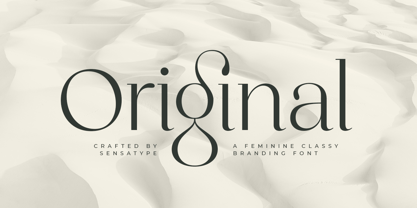 Original is a Feminine Classy Branding Font A new font that we created special for branding needs, with extra ligature in unique characters add value of your brand. It so nice to leverage designer or product owner that need solutions to make their design look more stylish and modern. And specially for satisfy font, We prepared any ligatures, and any alternate characters to help you create unlimited variations for your creative needs. Original Branding font ready with: Any options to get creative variations (combination of Alternate and Ligatures) Preview as a inspirations that you can do with Original font Ready with Lowercase and Uppercase characters Wish you enjoy our font. :)
 - Sweet Kitten by Yumna Type,
$16.00 Sweet Kitten is a elegant handwritten font. Made for any professional project branding. It is the best for logos, branding and quotes. Every letter has a unique and beautiful touch. Features: Standard Ligatures PUA Encoded Multilingual Support Numerals and Punctuation by Yumnatype
 - Birstein by Ilhamtaro,
$32.00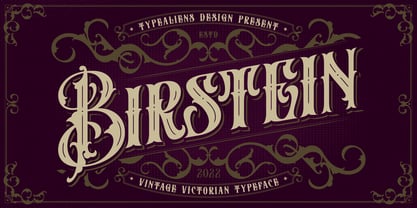 BIRSTEIN is a vintage decorative font, Victorian style. Perfect for vintage designs, vintage branding, liquor labels/brands. To enable the OpenType Stylistic alternates, you need a program that supports OpenType features such as Adobe Illustrator CS, Adobe Indesign & CorelDraw X6-X7. Cheers!
 - Football Attack by PandAE86,
$10.00 Football Attack is a display font inspired by and created for sports designers and their teams/organizations. With a strong focus on the sports branding industry, Football Attack works great in any branding, logos, magazines, films, sport poster, soccer shirt and many more.
 - Delvey Modern Serif Font by BeckMcCormick,
$16.00 Delvey is best for: – logos + branding, especially cosmetics, fashion, & clothing brands – website design + website accents – think travel blogs, fashion blogs, & more – clean print design, like magazines + flyers – header elements that need a clean, modern look – quote graphics for social media – chic graphic tees
 - Bandit Crime by Yoga Letter,
$20.00 "Bandit Crime" is an elegant and professional graffiti font. This font is equipped with uppercase, lowercase, numerals, punctuation, and multilingual support. Very suitable for logos, stickers, banners, branding, tattoos, Christmas, urban art, street art, wall art, film titles, business branding, and others.
 - Sarfokats by Maulana Creative,
$15.00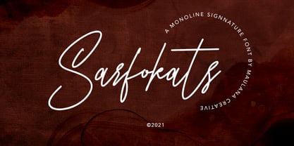 Sarfokats Monoline Signature Font Give your designs an authentic handcrafted feel. Sarfokats Monoline SIgnature Font is perfectly suited to logo, stationery, branding, typography quotes, magazine or book cover, website header, clothing, branding, packaging design, restaurant and more. Thanks for use this font ~ Maulana
 - Love Sweets by Goodigital13,
$20.00 perfectly suited to signature, stationery, logo, typography quotes, magazine or book cover, website header, clothing, branding, packaging design and more.With the script style this modern font will be perfect for many different projects: watermarks, posters, weddings, branding, logos, fashion, clothes, letters, invitations.
 - Whillys by Maulana Creative,
$15.00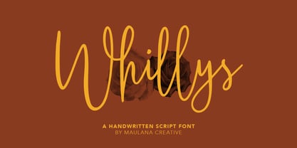 Whillys Handwritten Script Font Give your designs an authentic handcrafted feel. Whillys Handwritten Script Font is perfectly suited to logo, stationery, branding, typography quotes, magazine or book cover, website header, clothing, branding, packaging design, restaurant and more. Thanks for use this font ~ Maulana
 - RTCO Vorlich by Roams Type Co,
$14.00 Classy Serif condensed display typeface with & rounded corner. Inspired by vintage sign and logotype of advertising branding. This font is suitable for graphic designs such as logotypes, merchandise, printed stickers, and other branding needs. Include: Uppercase & Lowercase | Numerals & Punctuation | Ligatures | Multilanguage support
 - Ving Smith by Stringlabs Creative Studio,
$25.00 Ving Smith is a Script Font with Handwritten Style. The Ving Smith font made with digital brush pen strokes that making this font look authentic. This font is perfect for fashion brand, wedding invitation, business card, logo brand, signature, and then calligraphy.