10,000 search results
(0.051 seconds)
- Expression Exchange by Seemly Fonts,
$14.00 Expression Exchange is a brand new handwritten font. Expression Exchange is perfectly suited for stationery, logos, t-shirt, paper, print design, website headers, photo frames, flyers, music covers, posters, image sliders, and much more.
 - King Malik by Typefactory,
$14.00 King Malik is an interesting display font inspired by the style and feel of the Turkish font. This font is suitable for branding logos, Turkish themes, and any other projects you can think of.
 - Rockstone by Rockboys Studio,
$20.00 Rockstone is a new modern brush font, incredibly adaptable to all sorts of designs. It is suitable for any branding, product packaging, invitation, quote, t-shirt, label, poster, logo that you wish to create.
 - Equalizer by Negara Studio,
$17.00 EQUALIZER is a bold font. The capitals have a set of alternates that can be used to give more personality when needed. EQUALIZER is great for display projects such as packaging, posters and branding.
 - Mauritha by Selvia Design,
$15.00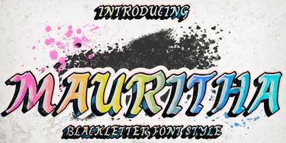 "Mauritha" is an elegant and professional blackletter font. This font is equipped with uppercase, lowercase, numerals, punctuation, and multilingual support. Very suitable for logos, banners, posters, tattoos, branding, stickers, Christmas, Halloween, Valentine's, and others.
 - Keanu by Soares,
$25.99 Keanu is a display sans serif square typeface, with a strong visual impact. Defined by its dramatic squaring with curved strokes, this typeface is perfect for headings, signage systems, interface designs, branding and more.
 - Astylooms by Maulana Creative,
$14.00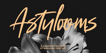 Give your designs an authentic brush handcrafted feel. "Astylooms Handwritten Brush Font" is perfectly suited to signature, stationery, logo, typography quotes, magazine or book cover, website header, flyer, clothing, branding, packaging design and more.
 - Magemin by Sealoung,
$25.00 Magemin is an elegant and bold serif font. It is defined by smooth curves and is perfect for fashion branding or editorial designs. Add it confidently to your projects, and you won’t be disappointed.
 - Summer Fable by Seemly Fonts,
$14.00 Summer Fable is a brand new display font. Summer Fable is perfectly suited for stationery, logos, t-shirt, paper, print design, website headers, photo frames, flyers, music covers, posters, image sliders, and much more.
 - Aliya Jayner by Liartgraphic,
$15.00 Aliya Jayner was created by Liartgraphic Studio and is a modern script concept with many alternative, multi-lingual choices. This typeface is good for use on product brands, magazines, book covers, packaging, and others.
 - Meilesha by Selvia Design,
$13.00 "Meilesha" is a unique and beautiful handwritten font. This font is equipped with uppercase, lowercase, numerals, punctuations, and multilingual support. It is suitable for invitations, weddings, ornaments, logos, banners, posters, prints, branding, and others.
 - Madyra by Forberas Club,
$16.00 Introduce Madyra a lovely Script Handwritten Font, with attractive single line this font very ready for any crafter in making any branding product design, greeting card, invitation card, surprise gift, or some decorative craft.
 - Orange Melon by Motokiwo,
$15.00 Orange Melon, a bold script font that is suitable for headline, logotype, apparel, invitation, branding, packaging, advertising etc. This typeface is comes in uppercase, lowercase, large range of punctuation, symbols & numerals, also support multilingual.
 - Boughies by Rochart,
$18.00 Boughies is modern bold display font. Boughies is great for branding, logo design, lettering, clothing, posters, magazine and other design project and also provides some Stylistic Alternates, Ligatures, Multilingual support and already PUA encoded.
 - Aahill by Khurasan,
$10.00 Introducing Aahill Typeface - a font that is very fresh and unique style handmade. Aahill Signature Typeface is perfectly suited to logo, stationery, poster, apparel, branding, wedding invitation, card, tagline, layout design, and much more !!
 - Shine Glitter by Skinny Type,
$15.00 Shine Glitter is a handwritten font with a modern calligraphy feel. Shine Glitter is perfect for modern projects, titles, blogs, logos, branding, invitations and more! Accent characters are included at this time. Thank you!
 - Malkiya by IM Studio,
$19.00 Malkiya is a strange font that stands out for its versatility. His personality develops through his particular modulation, which grows with load; making it a rather jovial typeface that doesn't abandon the more whimsical characteristics of the classic. With five styles available: Regular, italic, distort, bold, outline as well as a variety of exquisite variations, this font offers incredible flexibility for your designs.
 - Anarchists Stencil by Dimka Fonts,
$15.00 Anarchists' Stencil is Stencil a font with support for all European languages. A total of 556 glyphs are spread across Latin, Greek, and Cyrillic scripts. Clearly distinguishable from a distance, it provides a high contrast and readability. Anarchist slogans graphite was inspired by abandoned highway billboards in Arizona, because the design was looking very bold and was very easy to read.
 - Collogue by Heyfonts,
$25.00 Collogue - Variable Font is a cutting-edge and versatile typeface that brings a new level of adaptability to display typography. Unlike traditional fonts with fixed styles, a variable font allows designers to manipulate various aspects of the typeface, such as weight, width, and slant, along a continuous spectrum. Here's a comprehensive explanation of the features and functions of the Display Variable Font: Key Features: -Adaptive Design Elements: The primary feature of the Display Variable Font is its adaptability. -Designers can seamlessly vary specific attributes of the font, including weight, width, slant, and more. -This flexibility empowers designers to fine-tune the typography to suit the visual aesthetics of their projects. -Single Font File, Multiple Styles: Display Variable Fonts consolidate multiple styles into a single font file. This eliminates the need for separate files for different styles, providing a streamlined and efficient solution for designers. -Smooth Transitions: Changes in the font attributes occur smoothly and continuously. Unlike traditional fonts that switch abruptly between styles, a Display Variable Font ensures a fluid transition, allowing for a more harmonious and visually pleasing typographic experience. -Precision Control: Designers have precise control over the variation axis, enabling them to adjust the font's appearance with granular precision. This level of control enhances the typographic customization possibilities and allows for fine-tuning based on specific design requirements. -Responsive Typography: Display Variable Fonts excel in responsive design. They adapt gracefully to various screen sizes and resolutions, ensuring optimal readability and aesthetics across different devices. Functions: -Dynamic Branding: For brands looking to establish a dynamic and adaptable visual identity, Display Variable Fonts offer the perfect solution. The font's ability to adjust seamlessly allows for a versatile and cohesive branding experience across diverse applications. -Editorial Freedom: In editorial design, Display Variable Fonts provide editorial teams with the freedom to experiment with typography. The font can be adjusted to suit different sections or emphasis points within publications, enhancing the overall visual appeal. -Web Design Innovation: Display Variable Fonts are at the forefront of innovation in web design. They enable designers to create dynamic and interactive typographic elements that respond to user interactions, contributing to a modern and engaging web experience. -Attention-Grabbing Displays: Whether used in signage, banners, or large-scale displays, Display Variable Fonts stand out with their adaptability. Designers can experiment with different styles within a single font to create attention-grabbing and visually dynamic displays. -Customizable Interfaces: In digital interfaces, Display Variable Fonts provide a customizable typographic experience. Designers can optimize text elements for different device sizes and orientations, ensuring a seamless and visually pleasing user interface. -Innovative Advertising: Display Variable Fonts offer a fresh approach to advertising typography. Brands and advertisers can leverage the font's adaptability to create visually striking and memorable campaigns across various media channels. In summary, Display Variable Fonts represent a groundbreaking evolution in typographic design, providing designers with unprecedented flexibility and control
 - Goulong Bold is a charismatic and visually captivating typeface that does more than merely fill space; it brings its unique energy and personality into any design project. As suggested by its name, G...
- Nuixyber Next, designed by ffeeaarr, is a compelling font that captivates the essence of contemporary typography while nodding to the evolution of digital aesthetics. This font distinguishes itself b...
- Zhang QA - Unknown license

- Kudry by ParaType,
$40.00 Kudry is an elegant and noble typeface for extra large sizes. It looks good in cultural projects and exhibitions, logos, book covers, theater posters, wedding invitations, cosmetic and cake packaging,— basically any case in need of a beautiful typeface. It is a type family that consists of the modern serif and the contrasting sans serif, the weird serif and the stencil type. Both serif and sans have three options for different point sizes: Display for extra large sizes (from 72 pt or 96 px), Headline for large sizes (from 36 pt or 48 px) and Text for medium sizes (from 14 pt or from 24 px). Each style has a variety of alternate characters, swashes and ligatures, linear and old style figures, arrows and case-sensitive punctuation. The typeface supports major all European Latin and Cyrillic-based languages and all European Latin scripts. The authors of the typeface are Isabella Chaeva, Alexandra Korolkova and Nikolay Nedashkovsky. The character design of Kudry, details of the letters and alternates are an original contemporary solution based on the proportions and construction of the sans serif by N. N. Kudryashev. Digital versions of this typeface are Kudryashev and Petersburg, which can work in pair with Kudry in case you need a combination of a text serif and a display typeface. ITC Franklin Gothic, PT Root or Ida suit well as a paired text sans serif.
 - Meier Kapitalis by Elsner+Flake,
$39.00 As a late work the “Meier Kapitalis” forms an arch within the typographic creations of the Swiss type designer Hans Meier who died in 2014. The first sketches of this typeface can be found in the teaching manual “The Development of Script and Type” (German: “Die Schriftentwicklung”; French “Le développement des caractères”) which was published in 1994, however, under the title “Roman Lapidary, 1st Century”. The booklet was first published by the Syntax Press, Cham, Switzerland and contains an introduction by Max Caflisch in which he writes: „The present work, „The Development of Script and Type“ is a concise, authoritative textbook, concentrating on the essentials in a wide survey from ancient Greek inscriptions to the printer’s typefaces of the present day. His (Meier’s) 72 varieties of letterforms enable the student or general reader to understand the history of script and type, while more than 60 of his own calligraphic specimens provide excellent models for all who practice this art.“ Unfortunately, the “Meier Kapitalis” is one of the few typeface families in this publication which has been digitized. It was to be the last type project fully realized by Meier. In cooperation with Elsner+Flake, the typeface family was developed and expanded and now contains the four cuts: Roman, Medium, Demi Bold and Bold with either a complement of characters for 78 Latin-based languages (EL=EuropaPlus) or in West-Layout.
 - Aromatron by Adam Jagosz,
$29.00 Aromatron is a friendly yet striking display typeface with a balanced and consistent rhythm. Drawing inspiration from the shapes of nature, unique solutions were employed to achieve a rich, dark, creamy texture. The font is equipped with numerous OpenType features: lining and old-style numerals, automatic fractions, small caps, petite caps, and “medium caps” sized between capitals and small caps, subscript and two sets of superscript characters (one aligned with the ascender and one exceeding it), contextual swash capitals. Petite cap glyphs compose well with regular lowercase and are employed by stylistic sets for a unicase effect or compact typesetting. Aromatron offers support for most Latin-based languages, including: Afrikaans, Aghem, Aja, Akan, Albanian, Alsatian, Asturian, Azeri, Basaa, Breton, Catalan, Central Yambasa, Chinese Pinyin, Croatian, Czech, Dagbani, Danish, Dinka, Duala, Dutch, English, Esperanto, Estonian, Ewe, Ewondo, Finnish, Fon, French, Fula, Gagauz, German, Guarani, Hausa, Hungarian, Icelandic, Igbo, Indonesian, Irish, Italian, Jula, Kabyle, Khoekhoe, Koyra Chiini, Koyraboro Senni, Latin, Latvian, Lingala, Lithuanian, Livonian, Maasai, Maltese, Mapudungun, Marshallese, Mundang, Navajo, Ngiemboon, Ngomba, Northern Sami, Norwegian, Polish, Portuguese, Riffian, Romanian, Scottish Gaelic, Serbian, Shawiya, Shilha, Slovak, Slovenian, Spanish, Swedish, Tagalog, Tlapanec, Turkish, Uzbek, Uzbek (planned reform), Vai, Vietnamese, Walser German, Welsh, West Frisian, Yoruba, Zarma, Zazaki, Zulu. The International Phonetic Alphabet with mark attachment is supported too. A selection of symbols and ornaments completes the vast character set.
 - Fragua Pro by deFharo,
$14.00 Fragua Pro is a family of 14 fonts (Latin Extended-A and the Cyrillic alphabet) Condensed Sans Serif of geometric construction inspired by the Russian constructivism of the mid-20th century; the typography has a rounded finish in all corners to avoid the coldness of the rectilinear fonts and providing warmth and docility, the ascending and descending short and a high height of the x make it very compact, all this results in a unique typeface with maximum readability due to the careful configuration of metrics and Kerning. The cursive styles have an inclination of 8 degrees and a narrower proportion than the regular ones, they also have their own letters and meticulous optical corrections to compensate for the deformations produced by the inclination. Fragua Sans has Advanced Open Type functions, several alternative letters, full support for numbers, monetary symbols and crypto currencies and more. 681 glyphs. This typography is specially designed for advertising and editorial composition, behaving correctly in both short and medium texts and headlines where horizontal space saving is needed, being an ideal typographic system for signage, editorial or corporate design. This typography is dedicated to the memory of my grandfather C·ndido (Pa), the blacksmith of my town. THE COMPLETE 14 FONTS PACKAGE INCLUDES THE REGULAR VERSION IN "VARIABLE FONT" FORMAT, compatible with Adobe CC 2018.
 - Cubio Mono by R9 Type+Design,
$38.00 Cubio™ Mono is a new monospaced geometric sans serif inspired by the hexagonal silhouette of isometric cubes. We applied this angular form through all aspects of Cubio™ type design from the overall look of letters and icons down to the small details such as the end of each letter stem and hexagonal dotted lines. This font family comes in 3 weights/styles: 300 (Regular), 500 (Medium), and 700 (Bold). With over 1,500 glyphs, Cubio™ Mono not only supports most Latin-based languages, but also features an extensive set of UX/UI icons, and patterns. Cubio™ Mono is a versatile typeface for both digital and traditional designs. Perfect for packaging design, logo design, print design, store signages, UX/UI web & apps designs. Cubio™ Mono packed with features such as case-sensitive marks, punctuations and math symbols. It also comes with an extensive set of box/compartment drawing glyphs to help you create a unique modern design without even using the line tools. We designed the Cubio™ Mono font system with your convenience in mind. It comes with two sets of hexagonal dotted line and icon positions (Mid Cap Height and Mid X-Height ), so you don’t have to use the baseline shift command to set them to the perfect spots. To find out more about Cubio™ Mono Opentype features and type specimen, please visit www.r9typedesign.com
 - FS Benjamin by Fontsmith,
$80.00 Stone and steel FS Benjamin is a flared serif typeface designed by Stuart de Rozario. Consisting of 12 styles ranging from Light, Book, Regular, Medium, SemiBold and Bold with Italics it has clear, delicate letterforms, punctuated with brutal chiselled angles. With a pure and crafted feel to the forms the typeface has traditional roots but has been designed to work in a contemporary setting. Archetypal proportions in terms of x-height to cap height and ascender to descender ratio, allow the typeface to feel familiar and be legible in all platforms. Delicate brutalism Inspired by the contrasts of London and named after Big Ben, FS Benjamin was designed by Stuart de Rozario and founder, Jason Smith. Walking around London Jason was inspired by the juxtaposition of the old and the new. Glass and steel architecture can often be found amongst traditional signage and coats of arms seen around the City. These surroundings sparked an idea to create a modern design based on an alphabet that would traditionally be carved from stone. “Much of the typography we see today is so similar. I thought what if we created a typeface with traditional roots but modernised it to sit amongst the punk and noise of the streets of London? Old with new. Business with busyness. This is what London is all about.” Jason Smith
 - OkayCursive by Okaycat,
$24.50 OkayCursive began over coffee, in a local flower shop, where my wife takes a floral arrangement class. I discovered a book there, with old photographs from Paris of flower shop displays. What caught my eye in the background of one of these photos, was the hand-painted lettering on a sign. Inspired, I quickly sketched some of the letters on a napkin and stuck it in my pocket. I began to sketch more over the next few days, looking to construct a full-out cursive font with this distinct French look. I wanted my design to be creative & free flowing, but I also wanted it to be at least somewhat proper. So, I consulted some schoolbooks for reference on the correct cursive forms. After more drawing, I began to create the final vector art. Gradually, these ideas -- plus many hours of careful kerning and metrics -- came together to form OkayCursive. Use OkayCursive any time you want fancy, legible, and luxurious text. Works great if you are designing a logo, or use it to create some beautiful titling. Use it for advertisement copy, or even for short to medium-length bodies of text -- go ahead and have fun with it. OkayCursive is extended, containing the full West European diacritics & a full set of ligatures, making it suitable for multilingual environments & publications.
 - Axial cut by deFharo,
$21.00 Axial Cut is a sans serif typeface (Latin Extended-A), a contemporary and rounded evolution of geometric fonts for screen, but this time the letters are built on an axial axis that results in trapezoidal counter-shapes, joints with reduced antlers and rounded corners that correct optical effects in small sizes to make the typography more legible, and at the same time, in large sizes it shows its original shapes. The Axial Cut typeface family is made up of four weights: Light, Regular, Medium and Bold, each with 785 characters. I have taken particular care with the metrics and dimensions of each letter or sign, with a very careful and precise kerning configuration to achieve the For maximum readability, these are fonts with slightly higher ascenders than capitals and short descenders to make it more compact. The editing possibilities and unique designs with these complex typefaces are very wide, the fonts have a complete set of uppercase letters and a lowercase set with alternative characters as well as lowercase letters and numbers in different positions (lowercase, denominators, numerals, and uppercase) that They also work as automatic fractions, they also incorporate small capital letters and three sets of alternative numbers (Normal, Old style numbers, Square numbers), etc. Discover other alternative signs, characters and Open Type functions in the PDF: Specimen & The Cheat Sheet.
 - Woodford Bourne PRO by Monotype,
$25.99 Woodford Bourne PRO is the evolution of my original Woodford Bourne typeface that was inspired by the iconic stone cast letters on the façades of the 19th century Woodford, Bourne & Co. buildings in Cork City, Ireland. Woodford Bourne PRO has matured with numerous improvements to make it an even more versatile font family. The fonts have been completely redrawn and spaced, there are now an additional 500 glyphs for you to use across 9 stylistic sets. The additions include underlined caps, small caps, petite caps, catchwords, discretionary ligatures and more. Please view the specification sheet before you purchase to see all the glyphs and features. Key features: • Woodford Bourne PRO is a vintage geometric sans, optically adjusted for improved aesthetics and legibility 2 FONTS IN 1 – Use the default contemporary character set, or switch to vintage style with stylistic sets 9 Weights in Roman and Italic Thin | ExtraLight | Light | Regular | Medium | SemiBold | Bold | Black | Ultra Underlined Caps, Small Caps, Petite Caps, Catchwords, Discretionary Ligatures Full European character set 1000+ glyphs per font UPDATED JULY 2021 (v.3) Woodford Bourne PRO v.3 update includes numerous improvements including rebalanced /S/s/ glyphs to make them less ‘top heavy’. Italics have been redrawn to smoothe out irregularities. Improvements have been made to diacritics and glyph coverage now supports all Latin European languages.
 - Varygraphie by Mans Greback,
$39.00 Varygraphie is a modern Art Deco sans-serif family. This expressive typeface is provided as a variable font, and was designed by Mans Greback between 2019 and 2023. It gives any project a modernist appearance, as a reinvention of the hundred-year-old style of design, adapted and adjusted to fit in present-time purposes and technology. The Varygraphie family contains 12 high-quality styles: Thin, Light, Regular, Medium, Bold and Black, and each weight as Italic. Mix the weights to see how they balance perfectly against each other. Or use the variable font and set any weight between Thin and Black: Only one font file, but the file contains multiple styles. Use the sliders in Illustrator, Photoshop or InDesign to manually set any weight and width. This gives you not only the predefined styles, but instead more than a thousand ways to customize the type to the exact look your project requires. More info about variable fonts: https://mansgreback.com/variable-fonts The font is built with advanced OpenType functionality and has a guaranteed top-notch quality, containing stylistic and contextual alternates, ligatures and more features; all to give you full control and customizability. It has extensive language support, covering all Latin-based languages, from Northern Europe to South Africa, from America to South-East Asia. It contains all characters and symbols you’ll ever need, including all punctuation and numbers.
 - Ferguson by Arterfak Project,
$14.00 Ferguson is a geometric slab serif which made with a mono-line concept and versatile style. Inspired by old western and magazine designs. Ferguson has a straight and consistent line to give neat looks. Ferguson is made for editorial and formal purposes. but still flexible to use it in other typographic projects. This font family has 6 weights and 2 widths that gives you many options on your designs projects. - Regular versions: Comes from Light, Normal, Medium, Bold, Black, and Ultra Black. Very recommended for editorial use such as body text, sub-headline, and tagline. The bolder weights are goods for headline too. Strong and geometric! Suitable for sports themes, social movement, masculine and logotypes. - Condensed versions: Available in Light, Normal and Bold. Great choice for a headline, and display. This condensed designed a bit minimalist than regular version to keep the readability. Also, there is Bold Shadow style to complete the vintage movement which happening now. Suitable for a poster, magazines, and clothing project. Ferguson font family has up to 28 accents: Afrikaans, Albanian, Catalan, Croatian, Czech, Danish, Dutch, English, Estonian, Finnish, French, German, Hungarian, Icelandic, Italian, Latvian, Lithuanian, Maltese, Norwegian, Polish, Portuguese, Romanian, Slovak, Spanish, Swedish, Turkish, Zulu. Fonts featured : - Uppercase - Lowercase - Numerals - Some symbols - Diacritics Thank you. Hope you like it and enjoy!
 - Entendre Rough by Wordshape,
$30.00 Entendre Rough defies the conventions of most distressed typefaces, as it is an actual text typeface family. Sure, you can use it for your big display type, but you can also use it for body text. Entendre Rough is a stately, commanding and handsome distressed sans serif typeface family that pulls reference from Trajan capitals, the history of English calligraphy, and a variety of other sources to summon a sense of warmth, consideration, trust and authority. Entendre Rough spans 22 weights and styles including Regular and Condensed versions. The large x-height and refined characteristics of the family lend the family a sober and sophisticated appearance that is suitable for both print design and on-screen use. Entendre Rough includes Central and Eastern European language support as well as Western European language support, including Greek and Cyrillic. Entendre Rough’s generous x-height and medium-length ascenders and descenders offer pronounced readability, making the family useful for text typesetting both in print and on screen. Within, humanist elements are tempered with monumental construction, making the heavier weights go-tos for display design work. All of the Entendre Rough family of typefaces feature Western, Eastern and Central European language support alongside nuanced Greek and Cyrillic. Entendre Rough pairs well with our non-distressed Entendre family and our rounded sans serif family Elpy, sharing similar proportions and spacing.
 - ITC Tyke by ITC,
$29.99Tomi Haaparanta got the idea for the Tyke typeface family after using Cooper Black for a design project. He liked Cooper's chubby design, but longed for a wider range of weights. “I wanted a typeface that was cuddly and friendly,” recalls Haaparanta, “but also one that was readable at text sizes.” He started tinkering with the idea, and Tyke began to emerge. Even though Haaparanta knew his boldest weight would equal the heft of Cooper Black, he began drawing the Tyke family with the medium. His goal was to refine the characteristics of the design at this moderate weight, and then build on it to create the light and bold extremes. Haaparanta got the spark to design type in 1990, when he attended a workshop held by Phil Baines at the National College of Art and Design in Dublin. “I've been working and playing with type ever since,” Haaparanta recalls. He released his first commercial font in 1996, while working as an Art Director in Helsinki. After about two dozen more releases, he founded his own type studio, Suomi Type Foundry, early in 2004. At five weights plus corresponding italics, Tyke easily fulfills Haaparanta's goal of creating a wide range of distinctive, completely usable designs. The light through bold weights perform well at both large and small sizes, while the Black is an outstanding alternative to Cooper for display copy. - Geminian by Sudtipos,
$49.00 Geminian is a set of fonts that started as a simple idea based on a theoretical level and developed during a long time, to be able to take shape under a creative impulse inspired by the need to communicate, today more than ever. From an astrological point of view, it celebrates and contributes to this practice, the study of stars position and movement and their influence on people's destiny. As a good Gemini, this set revives the main features of the opposite twins sign. Gemini is associated with thoughts, creativity, and communication. Its ruler Mercury (Hermes for the ancient Greeks), messenger of the Gods, and spokesman of the divine word, gives the natives of this sign intelligence, wit, eloquence and poetry. Geminian aims to be a medium to carry different messages from one end to the other. And this is because when using words, Geminis always surprise. Thanks to this gitf (and language and communication), they are able to bring up the most ingenious ideas, to solve any problem and to contribute new perspectives. These qualities may be the secret of its magnetism. The Geminian set comes in 5 styles including a script with multiple ligatures and alternates, 3 sets of caps and dingbats. In addition the complete font family supports a wide variety of Latin alphabet-based languages.
 - Kubrick by Quadrat,
$25.00 Kubrick is an experiment in extremes. The Light font is very tall and slender, the Black font is very massive, and Kubrick's slender counters push some of its glyphs to the edge of recognition. The thin counters and negative spaces also give text set in Kubrick a definite visual sparkle, especially in all-uppercase settings. Because of its extreme letterforms, Kubrick is recommended only for large display use. The default letterspacing is set fairly wide to keep text legible. Kubrick was a double-experiment. One part of it was to see how heavy and massive a typeface I could make while still keeping it legible. The other part was to develop a Multiple Master font. Multiple Master fonts were a format developed by Adobe that allowed the user to change things like the weight and width of a typeface. Monollith started as just such a Multiple Master typeface, but when Adobe discontinued the Multiple Master format, I stopped work on the typeface. Later I decided to continue work on it, but as five separate font weights: Light, Medium, Bold, ExtraBold and Black. Very rectilinear letterforms with extremely narrow counters and negative spaces. The five fonts go from very thin and condensed to very heavy and extended. Use in large display settings where unornamented high visual impact is desired.
 - Amorie by Kimmy Design,
$12.00 Amorie is a tall and skinny hand drawn font. It comes in various weight and styles, and with an array of opentype options. Built to appear completely hand crafted, different designers could produce completely different results, selecting either Modella (classic and chic), Nova (fun and fancy) or SC (Small Caps and all business.) Each style comes in light, medium and bold and has an accompanying italics version. Opentype for this font includes Contextual Alternatives, which produces three versions of each character, making sure no two identical letters appear next to each other thus giving your design a fully authentic look. There are also stylistic alternatives, which offer different style to a select few characters, including capital letters: A, K, R, Q, Y and lowercase letters: a, e, k, t, y. Lastly, is a large set of swashes, 3 for each letter they accompany. For the most part this includes the whole uppercase alphabet as well as lower case letters with an ascender or descender. Amorie includes a large set of graphic extras, including stylish frames, arrows, line breaks, corners, flourishes and more. The complete package gives you one unbeatable font family. If you do not use Opentype but are using a program that includes a full glyph panel, you will be able to access each of the style variations you want.
 - Evanston Tavern by Kimmy Design,
$10.00 Evanston Tavern is a square typeface and the sans-serif version to Evanston Alehouse. Inspired by the years that prefaced the ratification of the American Prohibition, this typeface mimics the signage commonly seen outside of saloons, taverns and alehouses during that time. Back to the modern era, Evanston Tavern is more than just a vintage inspired typeface. It works in modern and futuristic settings with multiple styles, opentype alternatives and ornamentation. The family provides a robust 61 total fonts, within it's 3 styles of regular, stencil and inline. Each sub family includes 4 weights and 5 widths. It has special features that add depth to the typeface, with discretionary ligatures and stylistic alternatives. It also includes a complimentary set of ornaments, including a vintage graphic set from the era, as well as modern frames, borders and icons. This typeface works great at logos, packaging, and other display settings. Pair this font with Evanston Alehouse and have a great combination of serif and sans-serif square letterforms and a large array of ornaments! Here’s a snapshot of what you get with Evanston Tavern: - 3 Styles: Regular, Stencil and Inline - 4 Weights: Light, Regular, Medium and Black - 5 Widths: 1826 (condensed), 1846 ( narrow) 1858 (regular), 1893 (wide) and 1919 (expanded) - 2 capital Heights: Capitals and small caps - 2 Alternatives: Discretionary Ligatures and Stylistic Alternatives - 1 Ornaments font with over 100 graphic extras
 - Callisto by Groteskly Yours,
$8.00 Callisto is a classic serif stencil fonts that is a stencil font like no others. Elegant curves are paired with great legibility and wide range of available glyphs. While stencil fonts are generally thought of as too masculine and rough, Callisto is very feminine and soft, which makes it perfect as a logo font for those who seek to further emphasise their brand's identity. Despite being a display font, Callisto looks great at smaller sizes, so short headlines and headers will look natural and email legible even in smaller sizes. Callisto comes in two styles —Regular and Half —which can easily be combined within the same body of text. Regular is a more minimal style, with wider and more open apertures, while Half is a hybrid between a serif and stencil font that still has longer strokes and stems. Each style consists of 415 glyphs, ranging from fractions to diacritics. There are a number of glyphs with cool stylistic alternatives (which is awesome for branding), lots of punctuation and OpenType features. Callisto is a great font for designers and artists who need a feminine font with a really strong character.
