10,000 search results
(0.046 seconds)
- Dobi Hand by Tugrul Peker,
$5.00 Dobi Hand is a fat, bold, fun, cartoon like and has variable contrast handmade typeface. Dobi Hand that can be used for graphic design like food packaging, children books, birthday invitations, greeting cards etc. Dobi means in Turkish "fat, fatty" (in street language)
 - Almost Heaven NF by Nick's Fonts,
$10.00This charming little number is based on a rubber-stamp alphabet set, sold in the early 1900s under the name "Perfection", which suits it well. Both versions of this font include the complete Unicode 1252 Latin and Unicode 1250 Central European character sets. - Sunny South JNL by Jeff Levine,
$29.00 Sunny South JNL is a cheerful, simple sans lettering design with rounded terminals. Stripping away the drop shadow of the limited character set Shadowland JNL (which was originally inspired by examples of wood type), Sunny South JNL now offers a complete character set.
 - Admira by FontForum,
$19.99 Coen Hofmann revives an original design by Germany type foundry Schriftguss from 1940: His digital Admira is expanded with an extensive open type character set and even provides full Cyrillic. The face is set to best use at point sizes above 24.
 - Hawkes by Kimmy Design,
$15.00 Hawkes is an extensive handmade typeface family that comes with a bundle of weights, widths and styles, all designed to work cohesively. Here is a breakdown of the Hawkes family. Hawkes Sans: The primary subfamily is a sans-serif typeface that includes nine fonts: three weights (light, medium and bold) and three widths (narrow, regular and wide). Within this set are an array of stylistic features; including small capitals, character style alternatives, discretionary ligatures and contextual alternatives. See details below for more information on OpenType Features. Hawkes Variable Width Sans: The secondary subfamily is the same base sans-serif fonts but combined in variating widths. Essentially, it takes all three widths of each weight and randomly mixes them together. This creates a funky and creative alternative to the more traditional sans-serif set. The variations are for the uppercase, lowercase, small capitals, ligatures and numbers. Hawkes Script: The last subfamily is the script typeface. It’s a quirky script with variations of its own, including ligatures, swashes and contextual alternatives (again, see below for further details.) The script font works great as a complimentary style to the sans-serif, or on it’s own. FEATURES Alright, let’s get into all the extra goodies this typeface has to offer. Small Capitals: Small caps are short capital letters designed to blend with lowercase text. These aren’t just capital letters just scaled down but designed to fit with the weight of both the lowercase and capitals. With Hawkes, small caps can either sit on the baseline (in line with the base of the capital and lowercase) or to be lifted to match the height of the capital letters by applying the discretionary ligature setting in the OpenType panel. These small capitals have a dot underlining them that sit along the baseline. The feature offers a unique display affect that is great for logos, titles and other headline needs. Discretionary Ligatures: A discretionary ligature is more decorative and unique combination than a standard ligature and can be applied at the users discretion (as the name indicates.) The specific styling for these ligatures varies for different fonts. With Hawkes, they are used as an all capital styling feature, or to lift the small capitals to align with the height of the capitals. In the former setting, both lowercase and uppercase letters are first changed to all capitals, then a specialized set of letter combinations are transitioned so small characters are positioned within a main capital letter. These combinations only happen with main characters that include an applicable stem, such as C F K L R T Y. Some of these combinations include two or three characters. When Small Caps is turned ‘on’, this feature will lift the small caps to the height of the capital letter. For more information, please check out the user guide! Stylistic Alternatives: Stylistic alternates are a secondary form of a character, often used to enhance the look or style of a font. For Hawkes, these alternatives provide a slightly more handmade feel. A - the capital and small capital A will lose its pointed apex and become rounded. Think of it more as an upside-down U than an up-side-down V ;-) Oo, G, Ss, Cc- these characters’ topmost terminal becomes a loop. The O is applied automatically, the G S and C need to be turn on individually. Titling Alternatives: This feature does sort of the opposite of what it intends. Instead of being used for titling purposes, this feature makes the text look better in paragraph text settings. Kk Rr h n m - curved terminals on the are straightened e - the counter stroke also gets straightened from a more looping motion y - the shape of y is changed from a rounded character to a sharper apex (think more like a ‘v’ than ‘u’) Contextual Alternatives: Contextual alternates are glyphs designed to work within context of other adjacent glyphs. With Hawkes Sans, there are three slightly different variations per character. The feature rotates the application of each variation. This helps with organic authenticity, so if you have two e’s next to each other, they won’t look identical (reflecting the natural variations in handwriting and lettering.) With Hawkes Variable width fonts, I have created a contextual pattern that randomizes the widths of each character. So, when the feature is turned ‘on’ in the OpenType panel, the widths would alternate in a pattern such as: Narrow, Wide, Regular, Narrow, Regular Wide, Narrow, etc. It happens automatically so the user doesn’t have to think or worry about getting a random seed. With Hawkes Script, contextual alternates allow strokes to connect properly from one character to the next while maintaining a believable, natural flow. Connecting strokes are present for two letters next to each other but are replaced by a shorter stroke when located at the end of a word or sentence. Some characters have in-strokes when located at the start of a word. When a character is preceded by a capital letter that doesn’t connect, it too needs an in-stroke or altered spacing. This feature is complicated and messy, but luckily you don’t really have to think about it! I’ve done all the coding so all you have to do is turn ‘on’ the feature in the OpenType panel and you are off to the races! I’m just letting you know what’s happening behind the scenes. Swashes: These are just for Hawkes Script and provide tail swashes to the start and ends of letters. There are three different options. You can pick the basic option by turning ‘on’ the swash feature in the OpenType panel, or you can pick using the Glyph panel. Stylistic Sets: This feature work in new versions of Illustrator CC and InDesign CC. You can pick specific styling sets instead of turning on an entire feature. For example, let’s say you want to have a loopy S, but not a loopy C or O, you can just turn on the S in the Style Set. It also helps create the little drop box that pops up when you hover over a character, showing you the alternates associated with that character. This makes it easy to pick and choose specific styles you want in a word or headline. ---------- And there it is folks! That’s all the basic info on Hawkes, I know it’s been a lot and I appreciate you hanging on. If you are like me and need more of a visual reference to accessing all these goodies, I’ve made a user guide to help navigate Hawkes and everything it has to offer. Altogether this extensive family boasts 14 total fonts in a wide array of styles, weights and widths, making it a great addition to any handmade type collection. Enjoy!
 - Idiom by Reserves,
$39.99 Idiom is an extra-condensed, tightly spaced display face with congruent forms exuding a strong sense of rhythm and elevation. The basic stenciled geometric shapes are reminiscent of the decorative style found with P22 Albers and Futura Black. Careful consideration of each letter's construction, relative to all characters, lends Idiom a decided sense of cohesion and sophistication. The included non-traditional 'weights' (Medium and Bold) are completely blacked out, creating entirely new letterforms that exhibit a very stark, contemporary sense. Increasing the versatility of the Idiom family, a selection of OpenType features allow access to a set of contrasting linear punctuation forms, unconventional ligatures, case-sensitive punctuation and more. Features include: Basic Ligature set including 'f' ligatures (ae, oe, fi, fl, ff, fh, fj, ft, fa, ct, st, rt, ot, ta, sa, mi, si, vi, su, oc, oo, ru, ib) Alternate characters (M, W, T, ß, _, $, @, (), {}, [], /, \, |, -, –, —, +, -, ±, ≤, ≥, , «, », and more) Case forms (shifts various punctuation marks vertically to a position that works better with all-capital sequences, in this case the numerals or letters with ascenders) Slashed zero Full set of numerators/denominators and superscript/subscript Automatic fraction feature (supports any fraction combination) Extended language support (Latin-1 and Latin Extended-A) *Requires an application with OpenType and/or Unicode support.
 - WetPaint - Unknown license

- Shlop - Unknown license

- Current-Black - Unknown license

- Quinine - Unknown license

- Otostrada MF by Masterfont,
$59.00 Legible yet elegant font family with a variety of weights.
 - Dov Yam MF by Masterfont,
$59.00 Classic yet intimate hand writing with energetic flow and class!
 - Circle BA by Bannigan Artworks,
$19.95 Each character of this display font fits into a circle.
 - Beeranit MF by Masterfont,
$59.00 Such a beauty calligraphic headline, so funny yet so cute.
 - Aklimat MF by Masterfont,
$59.00 Elegant font family with a technical twist, formal yet elegant.
 - Throw My Hands Up In The Air by Kimberly Geswein,
$5.00 Cute, messy (yet still legible) teen girl handwriting with flair.
 - Blobbing by Wooden Type Fonts,
$15.00 One of a few quirky display types by this designer.
 - Pillow Talk by Elemeno,
$10.00Please note that this font has a limited character set. - Homer by Autographis,
$39.50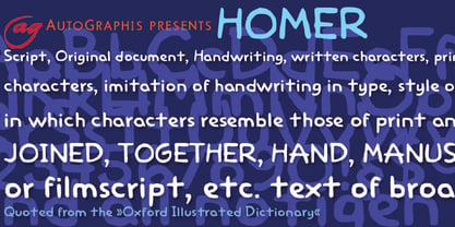 Homer is a very useful handwritten set of comic characters.
 - Donut by Vladvertising,
$20.00 Yummy dönut ya? Does this type make me look fat?
 - San Jose by Graffiti Fonts,
$19.99 The San Jose type family provides an array of variants representing a simplified, bay area slant on traditional Chicano American street scripts. The styles in this set can be used in all caps for the most authentic appearance or in a more typographically traditional small caps format. This set also includes latin supplement support and a robust character set in six styles. 3 Stroke variants: Regular, Rough & Bold each have a leaned back, traditional slant variant.
 - Badr by Linotype,
$187.99Badr is a traditional-style Arabic text typeface with two weights: Badr Light and Badr Bold, and include Latin glyphs (Cochin Roman and Bold), allowing a single font to set text in both most Western European and Arabic languages. The two Badr fonts incorporate the Basic Latin and the Arabic character sets, which support Arabic, Persian, and Urdu. They include tabular and proportional Arabic, Persian, and Urdu numerals, as well as a set of tabular European (Latin) numerals. - Beautiful Summit by HRDR,
$16.00 Beautiful Summit is a modern calligraphy font with handwritten. It is full of hearts and glyphs, suitable for branding, wedding invitations, and other romantic projects. Beautiful Summit includes a full set of lovely uppercase and lowercase letters, multilingual symbols, numerals, punctuation and ligatures. Beautiful Summit coming with open type features like stylistic set 01- stylistic set 02 and support PUA Encoded font files for use with software that doesn't support OpenType features such as Silhouette, Inkscape, etc.
 - LTC Goudy Extras by Lanston Type Co.,
$24.95 A set of over 50 ornaments, connecting borders, flourishes and decorative motifs originally designed by Frederic Goudy throughout his career. Many of these designs were used by Goudy at his Village Press and offered by his Village Foundry in the 1920s. The styles range from complex title page illustrations to simple linking borders, but all have the unique Goudy style. This set is completely different from the Goudy Ornaments found in the P22 Goudy Aries Set.
 - Deconstructed JNL by Jeff Levine,
$29.00 Deconstructed JNL is another set of rubber stamp alphabet letters and numbers from a 1930s toy printing set. The original typeface of this set is Cheltenham Open. The stamps were printed out and scanned, creating this limited-character font with dual characteristics. At small point sizes it replicates inked rubber stamp impressions, but in larger format it shows angular lines and erratic character shapes as if made from cut paper or lettering that was intentionally made to look damaged.
 - Auge Unicase by Eliezer Grawe,
$5.00 Auge Unicase is a sans serif display font, extra-condensed, with a unicase style. It is a geometric and very modular font that has a "modern-vintage" feeling. It is good for titles and short texts. Auge Unicase has a set of alternates, accessible by contextual alternates and stylistic set. It was designed following the Underware Latin Plus character set, supporting 219 Latin based languages (see https://underware.nl/latin_plus/languages/). Version 1.1 now has Cyrillic support and 757 glyphs.
 - Kalyna by 2D Typo,
$36.00 The Kalyna font is interesting with its stylistic implementation through asymmetrical serif. Such design is characteristic for the Ukrainian style. The drawing of the font is based on the sketches of a famous Ukrainian graphic artist of early 20th century Heorhiy Narbut. His work set the whole school in the Ukrainian graphic art and is still very influential nowadays. The font is capital and also includes a set of ornaments in addition the standard set of symbols.
 - Reliquaire AOE by Astigmatic,
$24.95 Historical elegance finds its place in the digital era with Reliquaire AOE. Reliquaire AOE is the historical revival and elaboration of the "Memorial" typeface created by Boston Type Foundry in January of 1881. What began as a basic character set of Capitals, lowercase, numerals, and a small handful of punctuation characters has been expanded to a full character set including unlimited fractionals, superiors & inferiors, ordinals, tabular & proportional figures, and an expanded language glyph set. History has found new life.
 - Calla Script by Great Lakes Lettering,
$30.00 Calla is a scripted typeface with an interesting personality. Each letter was created many times so you can get a truly distinctive look to your designs. Notice when you type with open type feature switched on, your letters will bounce around and change as you type? This feature ensures you get a new version of each letter throughout the words you use! Want to get even more custom? Pair all caps words with your lowercase words to create hierarchy!
 - Piel Script by Sudtipos,
$89.00 Over the past couple of years I received quite a number of unusual and surprising requests to modify my type designs to suit projects of personal nature, but none top the ones that asked me to typeset and modify tattoos using Burgues Script or Adios. At first the whole idea was amusing to me, kind of like an inside joke. I had worked in corporate branding for a few years before becoming a type designer, and suddenly I was being asked to get involved in personal branding, as literally “personal” and “branding” as the expression can get. After a few such requests I began pondering the whole thing from a professional perspective. It was typography, after all, no matter how unusual the method or medium. A very personal kind of typography, too. The messages being typeset were commemorating friends, family, births, deaths, loves, principles, and things that influenced people in a deep and direct way, so much so that they chose to etch that influence on their bodies and wear it forever. And when you decide to wear something forever, style is of the essence. After digging into the tattooing scene, I have a whole new respect for tattoo artists. Wielding that machine is not easy, and driving pigment into people’s skin is an enormous responsibility. Not to mention that they're some of the very few who still use a crafty, hands-on process that is all but obsolete in other ornamentation methods. Some artists go the extra mile and take the time to develop their own lettering for tattooing purposes, and some are inventive enough to create letters based on the tattoo’s concept. But they are not the norm. Generally speaking, most tattoo artists use generic type designs to typeset words. Even the popular blackletter designs have become quite generic over the past few decades. I still cringe when I see something like Bank Script embedded into people’s skin, turning them into breathing, walking shareholder invitations or government bonds. There’s been quite a few attempts at making fonts out of whatever original tattoo designer typefaces can be found out there - wavy pseudo-comical letters, or rough thick brush scripts, but as far as I could tell a stylish skin script was never attempted in the digital age. And that’s why I decided to design Piel Script. Piel is Spanish for skin. In a way, Piel Script is a removed cousin of Burgues Script. Although the initial sketches were infused with some 1930s showcard lettering ideas (particularly those of B. Boley, whose amazing work was shown in Sign of the Times magazine), most of the important decisions about letter shapes and connectivity were reached by observing whatever strengths and weaknesses can be seen in tattoos using Burgues. Tattoos using Adios also provided some minor input. In retrospect, I suppose Affair exercised some influence as well, albeit in a minor way. I guess what I'm trying to say is there is as much of me in Piel Script as there is in any of the other major scripts I designed, even though the driving vision for it is entirely different from anything else I have ever done. I hope you like Piel Script. If you decide it to use it on your skin, I'll be very flattered. If you decide to use it on your skateboard or book cover, I'll be just as happy. Scripts can't get any more personal than this. Piel Script received the Letter2 award, where they selected the best 53 typefaces of the last decade, organised by ATypI.
 - Romper by DearType,
$29.00 Romper is a slightly narrow handwritten sans in four weights and it is perfect if you want to convey a casual and friendly feel. It was designed with the idea to be used on comic books, mobile applications and children’s books, thus it has a Dancing Baseline version (Romper DB) and a Slanted version (each of them in four weights as well). The family is equipped with 450+ glyphs, has Latin Extended and Cyrillic Support (both Russian and Bulgarian) and a lovely set of extras. The family includes a lot of discretionary ligatures and alternate letters for more variety in the design. Overall, Romper is cute, amiable and really versatile, so it will fit most applications - think greeting cards, menus, merchandise, books, packaging, websites, etc.
 - Protest by Society of Fonts,
$29.00 Protest is inspired by protest posters and the power of the people! Each glyph is written by hand with a Sharpie® Magnum marker on big sheets of paper. It is designed to fit more into the poster and still be legible for the media from a block away. It's bold, slightly condensed, and neatly drawn with love and conviction, with the warm imperfection that comes from being hand drawn. Protest consists of over 1,430 glyphs. This includes 300 alphanumeric glyphs with 3 contextual alternates each, 20 stylistic alternate glyphs, and 20 protest themed dingbats. Contextual alternates will rotate through automatically when OpenType features are enabled, giving it more human irregularity. Protest supports 219 latin-based languages, using Underware’s Latin Plus glyph set.
 - Alastyca by Forberas Club,
$16.00 Introducing Alastyca by Forberas Club Alastyca is a Handwritten Script font that will make your designs look classic, Farmhouse, Boho, and Feminine. It is a great font for events, Wedding Project, fashion, apparel projects, signature, album covers, logos, branding, magazines, social media posts, advertisements, but it also works great for other projects. Add it to your fonts’ library, and it will enhance your creativity! Alastyca is best for: - logos, branding, & Signatures. - Flyers, Album cover, Magazine, & Advertisements. - Website design , design blogs, & fashion. - Quote graphics for social media. - and also it works great for other projects. Whats included : - Character Set - Numerals and Punctuation (OpenType Standard) - Accents (Multilingual characters) If you have any questions, before or after purchase, please feel free to get in touch.
 - Wetzilla by Forberas Club,
$16.00 Introducing Wetzilla by Forberas Club Wetzilla is a Handwritten Script font that will make your designs look classic, Farmhouse, Boho, and Feminine. It is a great font for events, Wedding Project, fashion, apparel projects, signature, album covers, logos, branding, magazines, social media posts, advertisements, but it also works great for other projects. Add it to your fonts’ library, and it will enhance your creativity! Wetzilla is best for: - logos, branding, & Signatures. - Flyers, Album cover, Magazine, & Advertisements. - Website design , design blogs, & fashion. - Quote graphics for social media. - and also it works great for other projects. Whats included : - Character Set - Numerals and Punctuation (OpenType Standard) - Accents (Multilingual characters) If you have any questions, before or after purchase, please feel free to get in touch.
 - Type Dream by Forberas Club,
$16.00 Introducing Type Dream by Forberas Club Type Dream is a Handwritten Script font that will make your designs look classic, Farmhouse, Boho, and Feminine. It is a great font for events, Wedding Project, fashion, apparel projects, signature, album covers, logos, branding, magazines, social media posts, advertisements, but it also works great for other projects. Add it to your fonts’ library, and it will enhance your creativity! Type Dream is best for: - logos, branding, & Signatures. - Flyers, Album cover, Magazine, & Advertisements. - Website design , design blogs, & fashion. - Quote graphics for social media. - and also it works great for other projects. Whats included : - Character Set - Numerals and Punctuation (OpenType Standard) - Accents (Multilingual characters) If you have any questions, before or after purchase, please feel free to get in touch.
 - Judicious by Create Big Supply,
$15.00 Judicious is perfect for making a bold statement and grabbing attention with its strong and commanding style. With its uppercase and lowercase letterforms, Judicious offers versatility and creativity for your design projects. Whether you're creating impactful headlines, striking logos, or eye-catching posters, this font will ensure your message is delivered with confidence. Featuring a comprehensive character set, Judicious includes numbers, punctuation marks, and supports multiple languages, making it suitable for various design applications. Additionally, the font is PUA encoded, allowing easy access to all glyphs and swashes, expanding your design possibilities. Let Judicious be the foundation of your next design project. Whether you're working on branding, advertising, packaging, or any other creative endeavor, this bold display font will command attention and leave a lasting impression.
 - The Malgena by Gold Type,
$15.00 The Malgena is a modern script font featuring a classic and elegant touch. Malgena is attractive because it is sleek, clean, feminine, sensual, glamorous, simple and very easy to read, thanks to its many beautiful letter joints. I also offer a number of decent stylistic alternatives for some of the letters. Classic style is very suitable to be applied in various formal forms such as invitations, labels, restaurant menus, logos, fashion, make up, stationery, novels, magazines, books, greeting cards / weddings, packaging, labels or all kinds of advertising needs. . . . . . Files included: -The Malgena Contains full set: -Uppercase -Lowercase -Alternative -Ligature -Punctuation -Number -Multilingual support. Need help or have questions let me know. I'm happy to help. Thank you & Congratulations on the Design!
 - Vintage Feeling by Nathatype,
$29.00 Looking for a font that’ll make your branding radiate elegance? Something that’s versatile, stylish, and eternal? Get ready to transcend to a world of magic, laughter, and butterflies. Your branding will spark delight and engage everyone who sees it! Vintage Feeling-A Script Font A beautifully script font that’ll make your guests sing and elevate your projects! Every stroke, and curve was created to entice happiness and elegance. Use it to create standout headings, promote your online sales, Instagram quotes, and even printed materials like business cards, t-shirts, or invitations. Vintage Feeling includes Multilingual Options to make your branding globally acceptable. Features: Alternates Ligatures Stylistic Sets Bonus Ornament PUA Encoded Numerals and Punctuation Thank you for downloading premium fonts from Nathatype
 - Elegist by Nathatype,
$29.00 It’s the ultimate way to be you. Elegist is a sans serif font that match your every design projects. Through this font, it creates simple, clean yet versatile looks. It is also cleanly designed font that’s easy to read and will look great in a variety of sizes. Features: Alternates Lower and uppercases Numerals and Punctuations This font is perfectly used for many design projects, such as poster, logo, book cover, branding, heading, printed product, merchandise, quotes, social media campaign, etc. Get more inspiration about how to use it by seeing the font preview. Thank you for purchasing our fonts. Please don’t hesitate to contact us, if you have any further question or issues. We’re happy to help. Happy Designing. Tags
 - Glenthya Habithan by Bungletter,
$10.00 Glenthya Habithan is a modern script font that features a classic and elegant touch. Glenthya Habithan is attractive because it is sleek, clean, feminine, sensual, glamorous, simple and very easy to read, thanks to its many beautiful letter connections. I also offer a number of decent stylistic alternatives for some of the letters. Classic style is very suitable to be applied in various formal forms such as invitations, labels, restaurant menus, logos, fashion, make up, stationery, novels, magazines, books, greeting/wedding cards, packaging, labels or all kinds of advertising purposes. . . . . . . . . Files include: Contains full set: -Uppercase -Lowercase -Alternative -Style -Ligatures -Punctuation -Number -Multilingual support. need help or have questions let me know. I'm happy to help. Thanks & Congratulations on the Design!


