10,000 search results
(0.075 seconds)
- Zapped - Unknown license

- War Eagle - Personal use only

- 50's Headline DSG - Unknown license

- !MISQOT - 100% free

- Dirty Ames - Unknown license

- Fabrizio by ARTypes,
$60.00 The new Fabrizio™ types, designed by Ari Rafaeli, have made their first appearance in Saggi di Letteratura Italiana: Da Dante per Pirandello a Orazio Costa, by Lucilla Bonavita, printed at Pisa in March 2016 by Fabrizio Serra Editore for whom the type was specially designed. The types are now offered for general sale. Each style (roman, small capitals, italic, semi-bold, bold) contains Cyrillic and ‘polytonic’ Greek letters and letters for many European languages (Czech, Hungarian, Icelandic, Lettish, Polish, Romanian, Serbian, Ukrainian, Welsh etc.), non-kerning fs, long ſ, ligatures and fractions. Alternative forms are supplied in ‘B’ versions of each style. A set of swash letters and sets of superiors, inferiors, fractions and phonetic letters are also offered. Two ‘Special’ fonts (roman and italic) containing special accents, letters for transliteration, Vietnamese letters, mathematics signs and symbols, arrows, commercial signs, pictograms, figures in circles, scansion marks, braces & benzene rings and the Rafaeli-Meruba Hebrew letters, as well as Latin, Cyrillic and Greek letters, are included in the Fabrizio family.
 - Gibon by Juraj Chrastina,
$29.00 Gibon draws inspiration from the fascinating comic book universe, inhabited not only by many legendary superheroes, monsters and superbadass antiheroes, but also by its own legendary typefaces. Every cartoonist and hand letterer needs a pencil, a T-square and on and on. For digital lettering, books Gibon is an option. This handy toolkit helps you easily letter your comic strips, but even if you have nothing to do with cartooning, this bundle can simply add some comic book feel to your design or make some noise with layered sound effects. The basic font for speech balloon inking is Gibon Lettering, while Gibon Bold and Heavy let you emphasize certain text. Gibon Bold is further developed as a multilayer type where different styles are designed to be overlaid on top of each other, letting you work with built-in shadows, 3D effects and outlines to create striking SFX. Gibon Balloons offers different types of layered speech balloons and a few halftone patterns. The OpenType contextual alternate feature is set to automatically apply the random effect using two sets of glyphs. Traditionally, comic books are lettered in caps only, which explains why Gibon is an all caps font. To easily access alternate characters they are encoded as lowercase letters. For example, type the uppercase “I” to access the crossbar “I” and the lowercase “i” to access the crossbar-less “I”. Turn on stylistic set number one to use only crossbar-less “I”.
 - Impressive by Ghuroba Studio,
$11.00 Impressive is a light and charming handwritten font with incredible style, and comes in two styles: Regular and Italic. Get inspired by its modern simplicity. It's perfect for logos, branding, photography, invitations, watermarks, advertisements, product designs, stationery, labels, product packaging, special events or anything that need a hand-written style.
 - Omarbig by Dhan Studio,
$27.00 Omarbig is a beautiful hand-painted font that looks more natural, fun and combines a mixture of small and large letters, making it look attractive and unique. This fonts can be used for various purposes such as headings, signature, logos, wedding invitations, t-shirts, letterhead, signage, labels, news, posters, badges etc.
 - Mousseline Pro by fontcastle,
$100.00 Mousseline Pro is hand drawn font a fresh, sans serif font family. Simple and adaptable, this font will make each of your designs look great. Have fun with this beautiful font and explore its endless variations. The typeface is versatile and can be successfully used in Magazines, Posters, Branding, Websites etc.
 - Vadelma by Melvastype,
$29.00 Vadelma is a script type family of four fonts. It is inspired by brush lettering and has soft and friendly looks. Vadelma can be used for branding, packaging and where ever you need a legible and smooth script font. Vadelma has lots of ligatures, swashes and alternative characters that will make your design unique and beautiful. You can also buy Vadelma as Variable Font and adjust the weight of Vadelma smoothly between Light and Bold weights. Notice that you need design software that supports Variable Fonts.
 - FF Engine by FontFont,
$47.99 Dutch type designer Alex Scholing created this display and sans FontFont in 1995. The family has 6 weights, ranging from Light to Bold (including italics) and is ideally suited for book text, editorial and publishing as well as software and gaming. FF Engine provides advanced typographical support with features such as small capitals, alternate characters, case-sensitive forms, fractions, super- and subscript characters, and stylistic alternates. It comes with a complete range of figure set options – oldstyle and lining figures, each in tabular and proportional widths.
 - Primed by Set Sail Studios,
$14.00 It's bold, chunky, and ready to make a big impression - Primed is an authentic, hand-drawn brush font made with real marker pens. Perfect for unmissable display text, logos, handwritten quotes, product packaging and more! As well as a full alternate set of upper & lowercase characters, Primed also includes a set of 18 swashes, ideal for underlining your lettering and adding that extra 'custom' style. The alternates and swashes are included as their own separate fonts. Primed also includes 47 ligatures, these double and triple letter combinations will help letters connect and flow more naturally. The ligatures will automatically generate when using the Primed fonts with most software. The Primed fonts contain language support for; English, French, Italian, Spanish, Portuguese, German, Swedish, Norwegian, Danish, Dutch, Finnish, Indonesian, Malay, Hungarian, Polish, Croatian, Turkish, Romanian, Czech, Latvian, Lithuanian, Slovak, Slovenian.
 - banister by One Fonty Day,
$15.00 Banister looks both contemporary and vintage. It contains a total of 12 styles including two main styles (Normal and Loaded), and for each style it comes with two widths (Semi-condensed and Semi-Expanded) and three weights (Light, Regular and Bold). The 40’s inspired style is subtle in banister, so it comes across more contemporary. Also, slightly curved strokes can be found on some letters, which gives a more organic feeling overall. To gain full advantage of banister, you can toggle “Fill” and “Stroke” on any editable applications to experiment the style, also layering normal and loaded styles let you discover something unexpected. Banister is versatile, simple and organic looking typeface, and good for headlines, logos, tiles and any large texts.
 - Artifex CF by Connary Fagen,
$35.00 Designed for easy reading of long passages, Artifex CF's smoothed-off serifs help the flow of text without unnecessary visual noise. Artifex's even rhythm and mellow tone make it an excellent option for books, magazines, articles, blogs, captions, and longform texts. A near-upright italic adds emphasis and urgency with elegance. Artifex also doubles as a handsome display typeface, scaling gracefully with charming details revealing themselves at large sizes. Artifex CF pairs nicely with bold, clean sans-serifs, such as Greycliff CF and Visby CF. Artifex also has a sibling typeface, Artifex Hand CF, cut from the same cloth, but with subtle flares in place of the serifs. All typefaces from Connary Fagen include free updates, including new features, and free technical support.
 - Glot by Wordshape,
$20.00 Glot is a ten-member flared terminal sans serif family of typefaces based on a mix of proportions of Roman square capitals and hyper-readable sans serifs. Glot comes in five weights with matching true italics: Light, Regular, Medium, Bold and Black. The Glot family has a wide range and is incredibly functional, working well for longer texts as well as display typography. After designing the house typefaces for a handful of the most predominant multi-player online games out there, we decided that it was time to bring the battlefield to the people. Glot comes armed with ample language support (Central, Eastern, and Western European) and OpenType ornamental spiked alternate characters for when one needs a hint of danger.
 - Glot Round by Wordshape,
$20.00 Glot Round is a ten-member flared terminal sans serif family of typefaces based on a mix of proportions of Roman square capitals and hyper-readable sans serifs with slightly rounded corners. Glot Round comes in five weights with matching true italics: Light, Regular, Medium, Bold and Black. The Glot family has a wide range and is incredibly functional, working well for longer texts as well as display typography. After designing the house typefaces for a handful of the most predominant multi-player online games out there, we decided that it was time to bring the battlefield to the people. Glot Round comes armed with ample language support (Central, Eastern, and Western European) and OpenType ornamental spiked alternate characters for when one needs a hint of danger.
 - Big by Walking Fearless,
$20.00 BIG is an elegant condensed display font created for strong and impactful headlines. It comes from a series of hand printed specimens taken from wood type found in Andrew Howard’s Studio in Porto (Portugal). A wooden type that reassembles the industrial victorian style which has now been expanded to 20 cuts, ranging from ExtraLight to Bold, with Italics and a stencil version, covering all your needs for a striking visual effect just with plain type with distinctive features and personality, standing out from the crowded world of display sans serif. The font was engineered with essential OpenType features, that allows the user to compose the headlines in two different heights, with case-sensitive punctuation, symbols and special ligatures such as “the”, “of” and “le”.
 - Abigail Adams by Three Islands Press,
$39.00 “My Dearest Friend” is how she began nearly all her letters to her husband, John. I refer, of course, to Abigail Smith Adams, first Second Lady and second First Lady of the United States. Her famous correspondence with John Adams produced nearly 1,200 letters over a span of some 40 years, leaving us with a priceless record of early American life — from household routines to war and politics to expressions of personal worry and devotion. Although Abigail’s was not the loveliest hand, I found it sure and expressive, as befitting her extraordinary sway and intelligence; it also carries a genuine flavor of the period. In making the font I focused chiefly on her handwriting from the 1780s and ’90s, when she’d taken to using a disconnected cursive, which struck me as distinctive and alluring. The OpenType release of Abigail Adams has scores of ligatures, standard and contextual alternates, lining and old-style figures, cross-outs, ink blots, and full Latin language support.
 - Squiborn by Letterhend,
$14.00 Squiborn is a hand drawn display font with bold and strong feel. This font perfectly made to be applied especially in logo, and the other various formal forms such as invitations, labels, magazines, books, greeting / wedding cards, packaging, fashion, make up, stationery, novels, labels or any type of advertising purpose. We highly recommend using a program that supports OpenType features and Glyphs panels like many of Adobe apps and Corel Draw, so you can see and access all Glyph variations.
 - Fd Sunnyside by Fortunes Co,
$14.00 Sunnyside is groovy retro concept typographic come with duo combined, regular and extrude, bring if the old west and the 70s had a lovechild with not a unformal usage, it's the perfect typeface for adding sophisticated playfulness to any design project. fit to logo, brand, apparel, etc
 - CF Nixt by CozyFonts,
$20.00 The Nixt Font Family is a new font with currently seven styles. As an alternative to Helvetica, Arial, Gill Sans, Futura, & Gotham, Nixt has a similar design aesthetic to those aforementioned in that its design, structure, and feel crosses decades of appeal. From Mid-Century, through the stark '60s, decades of succeeding modern architecture through the turn of the 21st Century, Nixt's glyphs are timeless, clear, ultra-legible in all styles and weights. Best use in Advertising, Branding, Signage, Architecture, Fashion, Posters, Headlines, and By-Lines, Print & Digital, and of course Labels. There are currently, at first release, 7 Styles: Extra Light, Light, Regular, Italic, Book, Bold, & Extra Bold. There are more in process and will be added when completed. The inspiration behind the Nixt Fonts is the Bauhaus, Mid Century Industrial Design, Art Deco through Moderne Era Architecture, American Pottery and American Design of The Twentieth Century.
 - Burchelli by Putracetol,
$22.00 Burchelli - Bold Display Sans Font. Burchelli font makes for more fun, trendy and more lively. Burchelli is inspired by the extra bold font style and display sans. Burchelli has a surprise from alternate of sans serif that will make your work even more beautiful. Burchelli is perfect for a professional touch which makes it even more unique display and classic themes. But burchelli is also suitable for logos, branding, greeting cards, invitation cards, advertisements, titles, healines, book titles, stickers, packaging, quotes, posters, t-shirts/apparel, billboards and others. The alternative characters were divided into several Open Type features such as Swash, Stylistic Sets, Stylistic Alternates, Contextual Alternates, and Ligature. The Open Type features can be accessed by using Open Type savvy programs such as Adobe Illustrator, Adobe InDesign, Adobe Photoshop Corel Draw X version, And Microsoft Word. This font is also support multi language.
 - Monotype Goudy by Monotype,
$40.99Over the course of 50 years, the charismatic and enterprising Frederic W. Goudy designed more than 100 typefaces; he was the American master of type design in the first half of the twentieth century. Goudy Old Style, designed for American Type Founders in 1915-1916, is the best known of his designs, and forms the basis for a large family of variants. Goudy said he was initially inspired by the cap lettering on a Renaissance painting, but most of the flavor of this design reflects Goudy's own individualistic style. Recognizable Goudy-isms include the upward pointing ear of the g, the diamond-shaped dots over the i and j, and the roundish upward swelling of the horizontal strokes at the base of the E and L. The italic was completed by Goudy in 1918, and is notable for its minimal slope. Goudy Bold (1916-1919) and Goudy Extra Bold (1927) were drawn not by Goudy, but by Morris Fuller Benton, who was ATF's skillful in-house designer. Goudy Catalogue was drawn by Benton in 1919-1921 and was meant to be a medium weight of Goudy Old Style. Goudy Heavyface was designed by Goudy for Monotype in 1925, and was intended to be a rival to the successful Cooper Black. Goudy Modern was designed by Goudy in 1918; its small x-height, tall ascenders and shorter caps impart a spacious and elegant feeling. Benton designed Goudy Handtooled, the shaded version that has just a hairline of white through its bold strokes. The Goudy faces, especially the bolder weights, have long been popular for display and advertising design. They continue to pop up all over the world, and still look reassuring to our modern eyes." - Goudy Ornate MT by Monotype,
$29.99Over the course of 50 years, the charismatic and enterprising Frederic W. Goudy designed more than 100 typefaces; he was the American master of type design in the first half of the twentieth century. Goudy Old Style, designed for American Type Founders in 1915-1916, is the best known of his designs, and forms the basis for a large family of variants. Goudy said he was initially inspired by the cap lettering on a Renaissance painting, but most of the flavor of this design reflects Goudy's own individualistic style. Recognizable Goudy-isms include the upward pointing ear of the g, the diamond-shaped dots over the i and j, and the roundish upward swelling of the horizontal strokes at the base of the E and L. The italic was completed by Goudy in 1918, and is notable for its minimal slope. Goudy Bold (1916-1919) and Goudy Extra Bold (1927) were drawn not by Goudy, but by Morris Fuller Benton, who was ATF's skillful in-house designer. Goudy Catalogue was drawn by Benton in 1919-1921 and was meant to be a medium weight of Goudy Old Style. Goudy Heavyface was designed by Goudy for Monotype in 1925, and was intended to be a rival to the successful Cooper Black. Goudy Modern was designed by Goudy in 1918; its small x-height, tall ascenders and shorter caps impart a spacious and elegant feeling. Benton designed Goudy Handtooled, the shaded version that has just a hairline of white through its bold strokes. The Goudy faces, especially the bolder weights, have long been popular for display and advertising design. They continue to pop up all over the world, and still look reassuring to our modern eyes." - Goudy Handtooled by Monotype,
$40.99Over the course of 50 years, the charismatic and enterprising Frederic W. Goudy designed more than 100 typefaces; he was the American master of type design in the first half of the twentieth century. Goudy Old Style, designed for American Type Founders in 1915-1916, is the best known of his designs, and forms the basis for a large family of variants. Goudy said he was initially inspired by the cap lettering on a Renaissance painting, but most of the flavor of this design reflects Goudy's own individualistic style. Recognizable Goudy-isms include the upward pointing ear of the g, the diamond-shaped dots over the i and j, and the roundish upward swelling of the horizontal strokes at the base of the E and L. The italic was completed by Goudy in 1918, and is notable for its minimal slope. Goudy Bold (1916-1919) and Goudy Extra Bold (1927) were drawn not by Goudy, but by Morris Fuller Benton, who was ATF's skillful in-house designer. Goudy Catalogue was drawn by Benton in 1919-1921 and was meant to be a medium weight of Goudy Old Style. Goudy Heavyface was designed by Goudy for Monotype in 1925, and was intended to be a rival to the successful Cooper Black. Goudy Modern was designed by Goudy in 1918; its small x-height, tall ascenders and shorter caps impart a spacious and elegant feeling. Benton designed Goudy Handtooled, the shaded version that has just a hairline of white through its bold strokes. The Goudy faces, especially the bolder weights, have long been popular for display and advertising design. They continue to pop up all over the world, and still look reassuring to our modern eyes." - Goudy by Linotype,
$39.00Over the course of 50 years, the charismatic and enterprising Frederic W. Goudy designed more than 100 typefaces; he was the American master of type design in the first half of the twentieth century. Goudy Old Style, designed for American Type Founders in 1915-1916, is the best known of his designs, and forms the basis for a large family of variants. Goudy said he was initially inspired by the cap lettering on a Renaissance painting, but most of the flavor of this design reflects Goudy's own individualistic style. Recognizable Goudy-isms include the upward pointing ear of the g, the diamond-shaped dots over the i and j, and the roundish upward swelling of the horizontal strokes at the base of the E and L. The italic was completed by Goudy in 1918, and is notable for its minimal slope. Goudy Bold (1916-1919) and Goudy Extra Bold (1927) were drawn not by Goudy, but by Morris Fuller Benton, who was ATF's skillful in-house designer. Goudy Catalogue was drawn by Benton in 1919-1921 and was meant to be a medium weight of Goudy Old Style. Goudy Heavyface was designed by Goudy for Monotype in 1925, and was intended to be a rival to the successful Cooper Black. Goudy Modern was designed by Goudy in 1918; its small x-height, tall ascenders and shorter caps impart a spacious and elegant feeling. Benton designed Goudy Handtooled, the shaded version that has just a hairline of white through its bold strokes. The Goudy faces, especially the bolder weights, have long been popular for display and advertising design. They continue to pop up all over the world, and still look reassuring to our modern eyes." - Belluga by Nicky Laatz,
$20.00 Slip into something a little more sophisticated with Belluga - A stylish, fresh new handwritten brush script. Oozing with Opentype Features, this script comes to life as if you are hand-brushing it yourself. Belluga Script was created to look as close to a natural handwritten script as possible by including over 80 natural-looking opentype ligatures, and a full set of lowercase alternates. From the Glyph Palette you’ll also find 11 swashes that can be used as underlines and for emphasis. Perfect for bold statements and sophisticated branding , Belluga helps set your designs apart by adding a custom-lettered look. A smooth , solid version of the font is also available for those who require a less textured look.
 - Playvictim by Gassstype,
$22.00 Here comes a New font,Introducing Playvictim is Bad Brush Font ,This Authentic Style and classy style, Cute Cartoon Font,Bold Display , Inspired from Modern logos of brands that have very strong characteristics, this font is great for your creative projects such as watermark on photography, and perfect for logos & branding, invitation,advertisements,product designs, stationery, wedding designs,label ,product packaging, special events or anything that need handwritting taste. Playvictim a natural Hand Drawn feel. This handmade font will make your design has a beautiful natural touch for each details. It is perfect for any design project as Invitation,logo, book cover, craft or any design purposes,photos, photography overlays, signs, window art, scrapbooking, tags and so much more!
 - Gatteway Signature by Bluestype Studio,
$16.00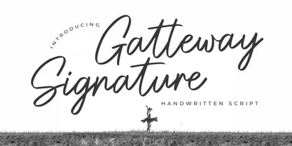 Hello ! This is our newest product font called Gatteway Signature. Gatteway Signature is a stunning script with a bold vibe. Get inspired by its cool feel. This font is suitable for use on photography, business cards, weddings, t-shirt designs, logos, magazines, quotes, fashion, watermarks, invitations, signatures. What's include: - Gatteway Signature Thank you, and don't forget to check out our other products.
 - Metropolis CT by CastleType,
$29.00 Metropolis Bold was commissioned by Publish magazine for their 1990 redesign. Although other digital versions exist, I think this was the first one and is characterized by extremely pointy serifs. It is well to remember in laying out copy for Metropolis to allow plenty of white space in the layout. Metropolis is based on the 1932 Stempel cut as designed by W. Schwerdtner.
 - Grantig by Julien Fincker,
$19.99 Grantig is a bold serif display typeface. Inspired by the opening titles of old western movies, the genre of western slab serifs has been translated into a modern context and adapted to today's needs. As a result, it breaks free from the chains of its genre and opens up to many themes. Grantig is the german word for grumpy. With its massive serifs and strictly rounded curves, it comes particularly close in character to the grumpy Western heroes of days gone by, always in the presence of his two leaning companions, Slant and Backslant. With Grantig, it is particularly easy to create eye-catching and type-accentuated headlines. Its expressive nature makes it particularly suitable for editorial, packaging and advertising. With its 482 characters, Grantig covers the language usage for many Latin-based languages. At the same time, it has the most important open type features, such as lining and oldstyle figures, alternate characters, and arrows.
 - Boule Plus by Ingo,
$33.00 CAPITALIZED, geometric, bold and round. If the typographer sees a font like that, it's enough to make his toes curl. But sometimes it just has to be that way. Geometrically constructed fonts do not necessarily have to be pointed and angular; It also works consistently around. And if I say it consistently, then in this case, that's done consistently. The basis for the BOULE is the circle. The letters are drawn with constant line width, the “corners“ and endings all have the same radius, the lines are all the same thickness. The BOULE consists only of capitals. There is only one difference in the use of uppercase and lowercase letters: in the uppercase letters, the round letters are circular, while the lowercase letters are narrow. The character set of the Boule contains all letters and accents to support the Western, Northern, Central and Eastern European languages with Latin alphabet. The BOULE is not only very fat, it also runs very tight; that is, the glyphs are very close to each other. To avoid "holes" due to unfortunate letter combinations, the BOULE contains ligatures for FT, ST, TT and TZ. There are also other versions of the font: BOULE Brillant on the one hand. In this version, simple highlights simulate a light incidence from the top right. These light edges give the font a decorative effect that makes it easy to think of wet sausages or balloons in some shapes. And finally the BOULE Contour. As the name implies, it is the outer contour of the letters, combined with a shadow at the bottom left. The name BOULE (French for ball) says it already: this font is globated. Therefore, it is also very suitable for all three-dimensional alienation effects. With simple light and shadow you can achieve a very convincing 3D effect with little effort.
 - Dept by Clevus,
$17.00 Proudly present Dept display typeface With a Unique and dynamic Display typeface style, Dept is a font that brings a bold and modern impression. The geometric and bold letter characteristics provide a unique and strong look to every design. Suitable for use in branding and advertising projects, Dept will make every design more attractive and effective. Font Features : Dept includes Lettres, numbers, symbols, punctuation, alternates, and ligatures No special software is required they may be used even in canvas, any basic program /website apps that allow standard fonts That's it, folks! Multilingual Support Language Support: Danish, English, Estonian, Filipino, Finnish, French, Friulian, Galician, German, Gusii, Indonesian, Irish, Italian, Luxembourgish, Norwegian Bokmål, Norwegian Nynorsk, Nyankole, Oromo, Portuguese, Romansh, Rombo, Spanish, Swedish, Swiss-German, Uzbek (Latin) Follow My Shop For Upcoming Updates Including Additional Glyphs And Language Support. And Please Message Me If You Want Your Language Included or If There Are Any Features or Glyph Requests, Feel Free to Send me A Message. Have a Good Day!
 - Chubiy by RGB Studio,
$19.00 Chubiy is a retro bold script style font, come with clean and rough font version. Inspired from retro typography and lettering in the 60's and 70's combine with bold typography style. This font perfect for vintage and retro design, badge, logos,t-shirt, poster, branding, packaging, signage, book coverand so much more! it has an extensive lingual support, covering European and Asian Latin scripts. The font contains all characters you'll ever need, including all punctuation and numbers. What you get, darling? Files Include : Basic Latin A-Z and a-z Numbers Symbols PUA Encode Multi-language Support In order to use the beautiful swashes, you need a program that supports OpenType features such as Adobe Illustrator CS, Adobe Photoshop CC, Adobe Indesign and Corel Draw. but if your software doesn't have Glyphs panel, you can install additional swashes font files: Thanks and have a wonderful day, If you have any questions, please get in touch with us Don't forget to check out our other products.
 - Anboug by ahweproject,
$14.00 Anboug is a gorgeous and bold handwritten font, crafted to give your headlines and logotype projects a retro touch. This font reads as strong, confident, and dynamic and can add tons of nostalgic character to your designs.
 - Senlot Didone by insigne,
$35.00 Senlot Didone enchants with this fresh and cutting-edge sequel. It’s a modern interpretation of Senlot that says glamor and seduction. The typeface adds to the original high contrast sans serif with it’s modern high contrast shape, and features a new beauty with the distinctive sinuosity of contrasting forms. Senlot Didone is the sleek, serifed, high contrast follow-up to Senlot, and it's low contrast sequel, Senlot Sans. A serif typeface suitable for text and display work joined in 2019. Senlot Didone includes a wide range of OpenType features, including titling capitals, superscripts and subscripts, and oldstyle figures. Senlot Didone is composed of 3 widths: Condensed, Normal, and Extended, with 9 weights and their italics for a total of 54 fonts with more than 800 glyphs. Senlot Didone is a great display typeface for logos, branding, packaging, and advertising. With its broad palate of options, the font covers over 72 Latin-based languages. Dress your text in any of nine separate styles from Thin to Bold. With Senlot Didone, there's no need to compromise on another font with fewer features. Simple, elegant, and versatile, Senlot Didone now makes perfect more possible. Take the show by storm with this high contrast serif. The seductive figure of Senlot Didone is here to entice your viewer.
 - Lovers Clouds by Anastasia Kuznetsova,
$18.00 Say Hello to Lovers Clouds! A set of three delightfully bold and sensual cloud-style fonts! Perfect for in-game quotes, packaging, branding, invitations, greeting cards and more. Super easy to use! Font Features: A-Z; a-z character set; 1 language (English); numbers and punctuation marks, symbols. Fonts can be opened and used in any software that can read standard fonts, even in MS Word. No special software is required to get started. It is recommended to use it in Adobe Illustrator or Adobe Photoshop. Made with love and magic ♡ Thank you for reading it, and do not hesitate to send me a message if you have any questions! ~ Anastasia
 - Calafati Soft by Wannatype,
$24.00 Basilio Calafati (1800–1878) worked as a magician under the name of Salamucci in the Wiener Prater. Later he obtained the license for a roundabout and other amusement facilities in the Wiener Prater. Calafati typeface family is characterised by little contrast and strong emphasis on the horizontals. It is a robust font that has many applications. Its character shapes are simple and relatively unembellished. With regard to metrics and proportions it combines perfectly with the Wien Pro and the Liebelei Pro. Calafati is available in weights light, regular, medium, bold and black. In 2022, Calafati received a major update. The recent family, Calafati Soft, is an 100% offspring of sharp-edged Original Calafati.
 - Annonce by Canada Type,
$24.95 Annonce is a digitization and expansion of a 1912 Johannes Wagner Foundry classic called Aurora Grotesk, which also circulated later on in metal under the name Annonce. Bold, extended and clear as a bell, Annonce stood out as the definite big sign font long before the Helveticas of the world. With angled cuts on some of the letters, it also shows humanistic traits that make it more appealing than any other face in its genre. The Annonce set comes in two fonts, a regular and an italic, and includes a very large character set that accommodates almost all Latin-based languages, including Turkish, Baltic, Celtic, Maltese, Esperanto, and the languages of Central and Eastern Europe.


