10,000 search results
(0.232 seconds)
- No Liming by chicken,
$17.00 A chunky, laid-back typeface inspired by a hand-painted notice on the doors of a mechanic's workshop in Plymouth, Tobago. Two different mostly-uppercase alphabets in one font help to keep things loose. 'Liming'? hanging out, drinking rum, shooting the breeze...
 - HK Requisite by Hanken Design Co.,
$- HK Requisite™ is a sans serif typeface inspired by the compactness of Neue Haas Grotesk and the strong character of Akzidenz Grotesk. The name came from the fact that fonts are elements that are necessary for the achievement of a specified end.
 - Esenka by Differentialtype,
$10.00 Esenka is a family sans that comes with 9 weights, 9 italics and 2 outlines. Esenka has an expanded uppercase alternate, with a choice of 2x and 3x width options. Esenka is PUA encoded which mean you can access alternate with ease.
 - Dance Routine by Jeff Levine,
$29.00 The hand lettered title on the cover of the 1932 sheet music for “I Wish We Could Dance Forever” was the inspiration for Dance Routine JNL. This bold Art Deco sans serif design is now available in both regular and oblique versions.
 - Wavy Rounded BT by Bitstream,
$50.99Wavy Rounded is a stylized sans serif display typeface by Japanese designer Hajime Kawakami. Some of the characters possess quirky features that randomly create fun visual “waves”. There is a handful of alternate characters including an old style figure set. Catch the Wave. - Carltine by Muksal Creatives,
$10.00 Carltine is a unique and modern family of Sans serif fonts. Simply Conception has 18 families Regular and italic font, starting from the small thin to the largest black. This typeface is versatile and can be used successfully in magazines, posters, branding, websites.
 - Radio Show JNL by Jeff Levine,
$29.00 The 1933 sheet music compilation entitled "Kate Smith Memories Song Book" had the singer's name hand lettered in a bold, spurred serif typeface. This lettering design became the basis for Radio Show JNL, which is available in both regular and oblique versions.
 - Shackle One by Christoph Reichelt,
$18.00 Shackle One is a geometric Sans Serif with a twist. As a modern classic that does not wear out visually it is suitable, for example, for luxury items, leather goods, watches and jewelry, high-class sports, documentation of historical technology or graphics in the field of art and design. It works excellently for huge headlines, but can also show particular strengths in continuous text – its gray value is almost flawlessly uniform. All line connections and terminations are perpendicular, which means that slopes or curves have a light bend at their ends, similar to the lordosis of the cervical spine. This makes the font look upright and straight and at the same time agile and dynamic, like an athlete with good posture – a typeface that is powerful and confident without appearing steely or violent. Shackle One is a classic but casual looking font with sophisticated details. It has a classy appearance without being pretentious. It can appear stern and serious as well as playful and humorous. Its strong character also makes it an excellent corporate font for certain branches. You will love it.
 - Karme by PeachCreme,
$18.00 Say hello to our new classy font duo "Karme"- a combination of all-caps serif and stylish handwritten script! Karme Serif - Due to its extraordinary and eccentric characters, the serif can be more suitable for displays, headers, and short logos rather than body or long texts. Not all but some of the letters have alternatives in stunning lowercase forms. You can play with 92 different fascinating ligatures with the Karma Serif. While using the serif, we would recommend turning off the automatic ligatures and accessing them manually through the Glyphs panel (or copy/paste) so that from several options you can choose the one that fits your text best. Karme Script - a modern and realistic handwritten font with a natural flow. Featuring 112 playful and groovy ligatures, the font can be well paired with serif, sans serif, and display fonts. Works great for stationery, websites, packaging, and many other handwritten style designs.
 - Gleams Serif Display by Alandya TypeFoundry,
$15.00 The Gleams serif display is unique, this font and is equipped with multilingual to be able to handle most typographic applications ranging. will be perfect and look luxurious for many projects such as fashion, magazines, logos, branding, photography, invitations, quotes, blog headings, posters, advertisements, postcards, etc. The Gleams serif include ligatures, capital letters and lowercase alternate letters. You need a program that supports OpenType features like Adobe Illustrator, Adobe Photoshop CC, Adobe Indesign and Corel Draw. and you can also access alternative flying machines via Font Book (Mac users) or Windows Character Map (Windows users). For sans style please check at https://www.myfonts.com/fonts/alandya-typefoundry/gleams-sans-display For serif playful style please check at https://www.myfonts.com/fonts/alandya-typefoundry/gleams-serif-playful Happy Designing . . .
 - Sambelethok by RGB Studio,
$19.00 Sambelethok an excellent font for modern hand-lettered logo designs. Sambelethok is a font intended for logotype creation. But with almost 500 glyphs inside the font, you can also create many of other typography designs. Stylistic Alternates, Swashes, Contectual Alternate and Ligatures is a list of features from OpenType which you can use to pairing the letters each other powerfully. This font is great for your next creative project such as Logotype, printed quotes, invitations, cards, product packaging, headers, Letterhead, Poster, Apparel Design, Label, and etc. Files Include : Basic Latin A-Z and a-z Numbers Symbols PUA Encode Multilanguage Support Thanks and have a wonderful day, If you have any questions, please get in touch with us Don't forget to check out our other products.
 - Khews by Invasi Studio,
$15.00 Are you ready to add some fun to your designs? Khews is the perfect font for you! It has a modern and playful vibe with its unique cutoff letterform and inspiration from graffiti tagging. You'll love the casual and bubbly twist that Khews brings to any project. And here's the best part: Khews comes in two styles - regular color and outline - so you can mix and match to create the perfect design. Give it a try and see the magic for yourself! Ideal for posters, flyers, logos, and headlines. It pairs well with sans-serif and serif fonts. Despite its imperfections, it is casual yet legible and has a good blend of modern and casual styles.
 - Plau Redonda by Plau,
$249.00 Humanist on one hand, geometric wannabe on the other Born from the need of having a custom font for our own branding, Redonda became too big to keep just for us. Like that, came to light Plau's 10th retail font, the first one designed by Carlos Mignot. The font's personality is a result of a search for extreme impact. Having started out as a exclusively Black geometric face, it became a full, versatile humanist sans. While it maintains the impact that inspired it, it also offers performance for both UI and body copy. This balance reflects the font's creative process: at first it referenced historic examples, but we also made sure it worked as a contemporary face.
 - Mr Eaves Modern by Emigre,
$59.00 Mr Eaves is the often requested and finally finished sans-serif companion to Mrs Eaves, one of Emigre’s classic typeface designs. Created by Zuzana Licko, this 2009 addition to the Emigre Type Library expands the versatility of the original Mrs Eaves with two complimentary families: Mr Eaves Sans and Mr Eaves Modern. Mr Eaves was based on the proportions of Mrs Eaves, but Licko took some liberty with its design. One of the main concerns was to avoid creating a typeface that looked like it simply had its serifs cut off. And while it matches Mrs Eaves in weight, color, and armature, Mr Eaves stands as its own typeface with many unique characteristics. The Sans version relates most directly to the original serif version, noticeably in the roman lower case letters a, e, and g, as well as in subtle details such as the angled lead in strokes, the counter forms of the b, d, p, and q, and the flared leg of the capital R, the tail of the Q. The distinctly loose-fitting letter spacing of Mrs Eaves was applied also to the Sans version. This, together with generous built-in line spacing due to a small x-height and extended ascenders and descenders, renders the same kind of lightness and airiness when setting text that is so characteristic of Mrs Eaves. Deviations from the original Mrs Eaves are evident in the overall decrease of contrast, as well as in details such as the flag and tail of the f and j, and the finial of the t, which were shortened to maintain a cleaner, sans serif look. And the lower case c had to be balanced out differently after it lost its top ball terminal. And with the loss of serifs, Mr Eaves set width is slightly narrower. Mr Eaves Italic also carries over many forms from its Mrs Eaves model, most notably the v, w, and z, which are unusually flamboyant for a sans italic design. It also utilizes lead in and terminal tails that are reminiscent of the serif italic. The biggest departure here is the width of the characters. The extra narrow gauge and delicate features seemed more appropriate for the Serif than the Sans. To allow for a comfortable fit, Mr Eaves Italic has a more robust design and wider character width. Meanwhile, the Modern family provides an overall less humanistic look, with simpler and more geometric-looking shapes, most noticeably in the squared-off terminals and symmetric lower case counters. This family has moved furthest from its roots, yet still contains some of Mrs Eaves’ DNA. The Modern Italic is free of tails, and overall the Modern exhibits more repetition of forms, projecting a cleaner look. This provides stronger differentiation from the serif version whenever a more contrasting look is desired. Each version (Sans and Modern) contains its own set of alternates providing unique options for applications such as headlines, word logos, letterheads, pull quotes, and other short text settings. Both the Sans and Modern come in six weights. The simpler forms of a sans-serif provide the opportunity of more weights than do serif letter forms, which are more complex in structure, making it difficult to accommodate additional weight without distortions. Regular and Bold match the original Mrs Eaves weights, while the Heavy provides an additional weight for extra emphasis.
 - Stuph by Tail Spin Studio,
$25.00Stuph Light is a collection of drawings pulled from one of the many sketch books Steve Zafarana is always doodling in. Because they are in a font, the drawings can be used in font format or opened and manipulated in vector programs like Freehand or Illustrator. Stuph Light continues to inflict upon an unsuspecting public Steves’ cockeyed outlook on the world that was started with ITC Fontoonies, ITC Gargoonies and ITC Backyard Beasties. Will this lunacy ever end? - Reservation Wide by TypeTrust,
$30.00Reservation Wide is intended for headlines with its relatively snug letterspacing and extended forms. Its simplicity will accommodate smaller sizes and lower resolution displays. OpenType Stylistic Alternates for characters 'a', 'g' and 't' lend an even simpler finish. The hand-drawn curves and angled stroke endings temper the otherwise rigid proportions of the family. This painterly tendency becomes more apparent in the heavier weights keeping them from looking too imposing. The design first took shape as a custom font named Majestos for the cable channel The Food Network . It can be found in their growing online and printed presence in addition to their broadcast identity for which it was developed. - Song Merchant JNL by Jeff Levine,
$29.00 Although the early 1900s through the 1920s seemed to be the "Golden Age" of ridiculously long novelty song titles, it appears that even the decade of the 1940s had its fair share as well. Song Merchant JNL was modeled from the hand lettered [but exhausting] title of the sheet music for "Princess Poo-Poo-Ly Has Plenty Pa-Pa-Ya (and she Loves to Give it Away)". Despite the obvious double-entendre inferences of the title, the square block letters with rounded corners make for a useful headline font (even if the source material it was drawn from is quite forgettable). Available in regular and oblique versions.
 - Jantur Type by Lemon Studio Type,
$12.00 Jantur Type is a simple geometric sans family with charming curves and natural flow. variable font technology, and its axis weight range spreads from thin to black forms. Flexible and adaptable, it is 100% Latin Plus, Supporting 219 Latin-based languages, which are spoken in different 212 countries. This font is suitable for any project. Great for graphic design and any display use. It can easily work for web, signage, corporate as well as editorial designs. Jantur Type has 9 weights with a total of 9 styles. and legibility makes it suitable for any kind of text application, from brand design to extensive text layouts.
 - Telepath by Coniglio Type,
$19.95 TELEPATH Telepath by Coniglio Type, first appeared in 1998. It is now in opentype .otf as of 2021. Telepath is a master sampling of a Royal office typewriter of industrial strength provided by the Miller Furniture store, of Dunkirk, New York. It had a baseline set of numbers to make accounting practices easy and line up nicely on the statements. (No gentile old fashioned numerical ascenders and descenders.) Yet, for a a rather old and stolid machine, it was very luxurious and built to definitely take the test of time. Cudo's for Royal Typewriter Company, is all I can say. The set of images were very carefully gathered and has fallen into the preferred category for a typewriter font that has it all. The font has exceptional value as a text font -and- a display font. It contains a great deal of graphic information and doesn't spike at higher sizes. Telepath presents a strikingly handsome typewriter font with a uniquely intuitive difference. Unlike the original source material—scans of monospaced typewriter copy, every font is painstakingly hand kerned for your most demanding copy fitting work in justified or casually ragged settings for print or the web. All Coniglio Type fonts are 100% embeddable. It will get you there.
 - Sassoon Infant Pro by Sassoon-Williams,
$66.00 An upright typeface family developed to meet the demand for letters to produce pupil material for handwriting as well as for reading. Upright letters with extended ascenders and descenders are ideal on screen. They facilitate word recognition. The exit strokes link words together visually, and in handwriting they lead to spontaneous joins along the baseline leading logically to a joined-up hand. Teachers can print desk strips, charts of letter families and alphabet friezes, as well as consistent material across the curriculum. Together these typefaces provide a valuable resource for special needs teachers. Typefaces developed to meet demand for letters that can be used to produce pupil material for reading as well as handwriting. Regular and Bold typefaces covering pan-European languages: 9 Latin, 6 Cyrillic, Greek, Turkish, 13 Baltic, 8 Rusyn, 6 Nordic, Vietnamese. How to access Stylistic Sets of alternative letters in these fonts Cyrillic Stylistic Sets examples Greek Stylistic Sets examples Vietnamese Stylistic Sets examples
 - NorB ARCHITECT LINE by NorFonts,
$35.00 NorB Architect Line architectural fonts will add a beautiful architectural hand-lettering style to all your CAD project drawings. Architects have always wanted their CAD drawings to look more like they were drawn by hand, rather than by a CAD program. These AutoCAD fonts are the first step in bringing back that “artistic hand-drawn” feel to your CAD drawings or any graphic design project that can use true type fonts. They even can be used with any word processing program for text and display use, print and web projects, apps and ePub, comic books, graphic identities, branding, editorial, advertising, scrapbooking, cards and invitations and any casual lettering purpose… or even just for fun! NorB Architect Line is a retracing from scratch of my "NorB Architect" font coming in a sharp and round look, featuring small caps with some long stems of the following letters: b, d, f, h, k, l so resulting in more dynamic lettering font. It comes with 8 weights: Regular Italic Bold Bold Italic Round Round Italic Bold Round Bold Italic Round Note: The Italic versions are intentionally set to 20° rather to 12° for more dynamic lettering look.
 - BrushtipTerrence by JOEBOB graphics,
$19.00 A spontaneous, fresh, honest and non-doctored brush script font with an almost complete set of extra characters. Excellent for people that want to put their statement on the wall, but don't have the hand for it, but it's also great for use in poster design, bookcovers and scrapbooking.
 - Lost City by Tigade Std,
$15.00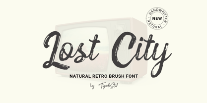 Lost City is a Natural Retro Brush Font. It is a handwritten which can beautifully enhance your design and product with the feel of retro. It's perfect for creating quotes, greeting cards, branding, promotion, advertisements (hello creative people!). This is a complete set comes with the International Characters. Enjoy!
 - Throll by Skiiller Studio,
$18.00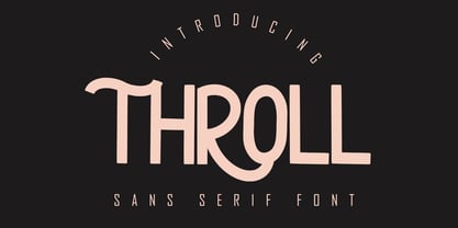 THROLL Modern sans serif font. It has a elegant, classy look and modern. It’s a great font for fashion, apparel projects, signature, album cover, logo, branding, magazine, social media, & advertisements. What's include: Stylistic alternate PUA Encoded Characters - Fully accessible without additional design software. Basic Latin Language Support (AÀÁÂÃÄÅCÇDÐEÈÉÊËIÌÍÎÏÑOØÒÓÔÕÖUÙÜÚÛWYÝŸÆß )
 - Ningrat by Bejeletter,
$20.00 Ningrat is a mix of classic with modern serif font family. It’s weight cover regular. The black weight of Ningrat Display font offers very strong impression. As a great choice for title and headers, it pairs well with most of the popular sans serif fonts for body text.
 - Lunar by Etewut,
$20.00 Lunar is a handwritten sans serif typeface that was created for the opera Pierrot Lunaire during Diaghilev festival 2018 in Perm. There are 3 fonts in the family of LUNAR: light, regular and bold. It supports all EUROPEAN languages, basic CYRILLIC and GREECE language. It's enough to make sensation!
 - Wishful Gloria by Invasi Studio,
$17.00 With its loop, curly, & playful strokes, Wishful Gloria creates a display font. The font comes in uppercase all caps with OpenType features. Alternate characters and ligatures can be used to give the composition a unique feel. Suitable for display needs such as quotes, branding, logo, poster, cover design, etc
 - Pauline by insigne,
$24.99 Pauline is a sans serif with a strong influence from retro scripts. Pauline is a geometric face formed with slow and deliberate rounded brush strokes. The tall ascenders give it a useful touch of naïveté. It’s a face suitable for some interesting titling and short bits of copy.
 - LT Panneaux - 100% free

- Aron Grotesque - Personal use only

- xscale - Unknown license

- Negotiate Free - Unknown license

- Gill Sonos - Unknown license

- junction regular - 100% free

- Tuffy - 100% free

- spaceman - Unknown license

- Ash - Unknown license

- Armor Piercing - Personal use only

- Strasua - Unknown license

- Sergeant SixPack - Personal use only


