10,000 search results
(0.031 seconds)
- 1890 Notice by GLC,
$38.00 We have created this family inspired from the hand-drawn letters used from the late 1800s until beginning of 1900s for notices, advertising, posters and also early comic titles. It is a hand-made font, with little imperfections that give it its special poetic note. It can be used together with 1906 French News, 1906 Titrage and 1820 Modern.
 - Carmelia by Stringlabs Creative Studio,
$25.00 Carmelia is a gorgeous script with a unique style. Fall in love with its modern approach to design! It’s perfect for logos, wedding invitations, signatures, advertising and much more! Carmelia is a flowing and elegant handwritten font, created with the help of a brush pen. Get inspired by its unique and beautiful style and add it to your favorite designs!
 - Flatfoot by Brave Lion Fonts,
$9.00 Flatfoot has it's very own style and is surely unique, crafted to shine with individuality. The straight letter endings are giving it a flat look and the tiny serifs are referring to classical types. It has a high contrast and high uppercase letters & many details are waiting for you to be discovered. Take Flatfoots personality and let it influence your designs.
 - HS Rahaf by Hiba Studio,
$60.00Rahaf is my little daughter's name; the word 'Rahaf' means kindness, sensitive and loving in Arabic. Thus, HS Rahaf is an Arabic display and text typeface. It is useful for headlines, books cover and other graphic projects. It gives the feeling and impression of hand-lettering. So it can be used for text when hand writing is needed, like in caricature texts and children stories and books. HS Rahaf is characterized by simplicity, clarity of reading and beautiful flaunt. It contains many ligatures which increase and modify its beauty. The font supports Arabic, Persian, Urdu, Kurdish and Pashto languages. - Loose by Zeptonn,
$20.00 Loose is a hand-drawn font with a slightly sloppy yet relaxed look. All glyphs have been handcrafted by illustrative designer Zeptonn. It contains lots of Open Type goodness to ensure you'll be able to give your entire text that random and handcrafted feeling. It's great for setting fun text for headers, posters or cards. Or hey, you could use it as a nice alternative for something that starts with "Comic" and ends with "Sans"! The typeface contains nice takes on traditional standard ligatures, a few discretionary ligatures and even provides contextual and stylistic alternates. This is all provided to ensure your text can have that awesome loose feeling!
 - Beverly Hills by Monotype,
$29.99Beverly Hills is an all-caps display face in the Art Deco style. Its design features dramatically low crossbars, and each letter has a fine inline highlight. The most prominent letters in this typeface are clearly the E, F, G, and K, while the elegantly narrow S is sure to delight. A classy offering like Beverly Hills should only be set very large, either as a magazine headline, a store sign, or on the cover of a fine invitation. If you like Beverly Hills, you make enjoy other high-contrast Art Deco designs in Linotype's library, including ITC Anna, Avenida, Broadway, Jazz, and ITC Manhattan. - Danilla by Arendxstudio,
$12.00 Danilla Signature Modern script is very suitable for your design project because it is very elegant and you you can apply it on business cards, posters, branding names, logos, your products and others. It's a handwritten font. This font includes all upper and lower case standard characters, punctuation, numerals and ligatures.
 - Sportfield Varsity by Rvandtype,
$9.00 Sportfield Varsity is a Sport Font Family. It’s perfect for all your athletic and sports-related designs. With its strong and angular letters, this font conveys a sense of power and motion, making it the ideal choice for logos, headlines, and other graphic elements that need to make a big impact.
 - Simaro by Larin Type Co,
$14.00 Simaro this is a beautiful upper-case handwritten font with ligatures, alternates, and swashs. playful and relaxed, it will fit perfectly into any project, whether it's children's cards or fashion magazines and logos, it will look great everywhere. This font is easy to use has OpenType features and supported PUA encoded.
 - Wolpe Fanfare by Monotype,
$50.99 “Fanfare is such a fun typeface,” says Toshi Omagari, who revived the design for The Wolpe Collection. “It was my happiest discovery when I was digging through the Monotype archive. I came across it and had to check the designer’s name.” No wonder: Fanfare is modern, light and playful – not what you’d expect from an 80-year old design. From the original, very heavy weight design, Omagari started by creating a black weight, followed by four lighter weights for Wolpe Fanfare, preserving the character of the letterforms all the way down to a thin version. “I wanted to do more than digitize the original weight,” he says. “It’s surprisingly modern, and its skeleton, its basic structure, is so beautiful.” The new design packs more into a small space than most typefaces. It’s a natural for publication and advertising design. With displays capable of revealing fine details such as Fanfare’s subtly slanted baseline, its lovely forms will easily translate to mobile devices. With an extended European character set that includes Greek and Cyrillic language support, Wolpe Fanfare can speak in many languages.
 - Bapalopa by Okaycat,
$24.50 Bapalopa is inspired by classic graffiti "blockbuster" letter forms. These letters are made to look as big and as wide as possible. Bapalopa's linework is kept very loose & relaxed, mostly smooth with some distressed edges. Viewed up-close, there is lots of texture from the individual pen strokes which gives Bapalopa it's cool freehand drawn look. Use "Bapalopa" and "Bapalopa Pa" together to create eye catching designs. To make it extra fun, a handful of the largely useless alternates, (like that dumb "currency" symbol) were replaced with big blocky hearts, stars, and arrows. Check it out! Bapalopa is extended, containing the full West European diacritics & a full set of ligatures, making it suitable for multilingual environments & publications.
 - Artenoir Display by FoxType,
$15.00 Artenoir Display is a Brand New Elegant Typeface with 4 Variants. It has a dependable and uncompromising style, with controlled letterforms and modern touches. It looks amazing in logos, magazines, and movies. Artenoir Font would be perfect for branding, headlines, Captions, paragraphs, and posters. The various weights allow you to experiment with a wide range of applications. It's created to make an impression without sacrificing its beauty and readability. It's shown a clean, warmth, quirky, yet still purposed to be versatile. The Typeface includes Four Weights -Regular, Medium, SemiBold and Bold. Numerals and Extended Punctuation (248 Glyphs). Clean and Modern Glyphs Expert Kerning and Quality Crafting. Thank you for taking the time to look into the font.
 - Roclette Pro by FoxType,
$25.00 Roclette Pro Display is a Brand Elegant Typeface from Roclette powerful font family. It has a dependable and uncompromising style, with controlled letterforms and modern touches. It looks amazing in logos, magazines, and movies. Roclette Font would be perfect for branding, headlines, Captions, paragraphs, and posters. The various weights allow you to experiment with a wide range of applications. It's created to make an impression without sacrificing its beauty and readability. It's shown a clean, minimalist, warmth, quirky, yet still purposed to be versatile The Typeface includes Eight Weights - Thin, ExtraLight, Light, Regular, Medium, SemiBold, Bold and ExtraBold Numerals and extended punctuation (200+ Glyphs). Expert kerning and quality crafting. Normal, Italics, Outline and Outline Italics Included.
 - Artegra Slab by Artegra,
$29.00 Artegra Slab is the latest addition to the Artegra superfamily. It contains 54 fonts with over 1000 glyphs per font in condensed, normal and extended widths. With Cyrillic and Greek sets it supports more than a hundred languages. It’s based on the perfectionist geometric shapes of Artegra Sans, which makes it beautiful to look at and easy to read.
 - Pocket Swash Px by Letradora,
$18.00 Check out other members of the Pocket family: Pocket and Pocket Serif This hand drawn font has a subtle rough texture, and lots of alternate swash characters to start and end words. It is perfect to give an extravagant but whimsical look to your projects. It has support for most western and central European languages, and has alternates for most letterforms accessible through Opentype features, allowing for variations that make it look authentically hand-drawn. It also has extra ligatures, swashes, and catchwords.
 - Rockabilly Romance by Wing's Art Studio,
$16.00 Rockabilly Romance - A 1950s Rock ’n’ Roll Inspired Retro Script Font Rockabilly Romance is a rebellious script font from Wingsart Studio inspired by 1950s Americana. It’s designed to evoke the feel of bustling retro diners, drive-in movies and a Rock ’n’ Roll attitude. It features fast curves with a hand-made free-flowing style, plus an alternative version with added lipstick gloss. Standard features include unique uppercase and lowercase characters, punctuation, language support and numerals. It also includes underlines and lots of special ligatures and alternative characters to experiment with. The Rockabilly Romance font is particularly suited to bold displays such as menu headers, posters, movie titles and album covers. Check out the visuals for more usage ideas.
 - Dunhill Script by Lipton Letter Design,
$29.00 A bit of happenstance and accident are always full of possibility — Richard Lipton’s Dunhill Script is based on observations of the work of his left-handed calligraphy students and then from a small detail generated by his own freehand sketching. Like his other script typefaces, Dunhill was born from the desire to achieve a certain visual drama. Many details show the pen at work, like the terminal shapes and the caps and ascenders. Dunhill also has a range of alternate stylistic glyphs and contextual features that can transform it into a connected script. It’s a great choice for editorial display or advertising and branding settings on its own or paired with a Roman sans or serif.
 - Kurkuma by Hanoded,
$15.00 Kurkuma (Turmeric in Dutch) is a spice I use in all of my curries. And I love curry! It's not more than fair to name a font after my favorite ingredient, so here you have it: Kurkuma. It is a unique and somewhat bizarre font with both an angelic and a diabolical side. I wouldn't set a whole text in it, but it does look great in headlines, posters and websites.
 - Barking Frenzy by PizzaDude.dk,
$18.00 Barking Frenzy may look as if it was cut out of paper or cardboard, but it's not! It was drawn with a rugged pen, leaving rough edges here and there. It's great for children's books and toys or maybe handcraft or other handcrafted activities. I've added 5 different versions of each lowercase letter and these appear randomly as you type. That way your text looks really natural and organic, because the letters rarely repeat themselves. Also the font has multilingual support!
 - Boardwalk Avenue by Fenotype,
$30.00 Boardwalk Avenue is an elegant type collection of three styles and two weights of each. It’s divided into Boardwalk Pen, Boardwalk Antiqua and Boardwalk Serif. Boardwalk Avenue’s core is a connected mono linear script that works fantastic when paired with either of the impressive serif styles. All the fonts work great on their own but try putting them all together for a complete display font setup for a project. Here’s a short introduction on what’s included: Boardwalk Avenue Pen is a connected Script. It’s great for headlines, quotes or in packaging. It has a casual hand drawn vibe to it but it’s clean and legible. It’s equipped with automatic Contextual Alternates that keep the connections smooth and versatile. For instance when you type double letter another of them will automatically change to add variation. Or if you type “i” for example, as a first letter after space or after capital letter the code will add starting point to the letter to keep the letterforms more balanced. If you need more ambitious letterforms you can try Swash or Titling Alternates -there’s alternates for every standard letter and seek for even more alternates from the glyph palette. Boardwalk Avenue Antiqua is a high contrast serif with strong character. It’s great for glamorous headlines or as a logotype. Boardwalk Avenue Serif is a low contrast serif with bulky character. It’s great for strong and sturdy headlines or as a logotype.
 - Snacko by Eko Bimantara,
$22.00 Snacko is one dope display font. It’s got that casual vibe mixed with some 70s soft serif styles, and a playful italic angle that’ll make your designs move and groove! This font is perfect for titling, branding, logos, and all kinds of digital or printed materials. It’s fun and playful, so it’s perfect for designs that are targeted at a younger crowd or need a fresh and modern feel. Snacko’s funky, soft, and cool design makes it the bomb for all kinds of design fields, from advertising to packaging to social media graphics. It’s got a style that’s all its own and can make your designs pop and stand out from the crowd. This font only comes in one style, but don’t trip, it’s versatile and can be used in all kinds of ways. It’s approachable and friendly with a softness that’s off the hook, but also funky and expressive with a unique personality that can take your designs to the next level. Bottom line, Snacko is one creative and versatile font that’ll bring a playful and fun energy to all your designs. It’s got a unique style that’s perfect for any designer’s font collection, so don’t sleep on this one!
 - Chocolate Chipped by Vintage Type Company,
$9.00 VTC Chocolate Chipped is a modern and minimalist homage to exaggerated woodblock typefaces of the past. It's the perfect little font collection for loud and in-your-face messaging, with 3 different weights in standard and oblique flavours. Adobe Latin 1 & Basic Cyrillic language support are also included.
 - Lakshmi by Océane Moutot,
$32.90 Lakshmi is an elegant and friendly script font. Inspired by brushed typography, it adds elegance, tension and typographic rigour to traditional script fonts. It's identified by its dynamic curves and the softness of its design. Lakshmi is ideal for display use, logotype, headline, packaging and advertising. Lakshmi is designed with extended language support, alternative characters as well as various ligatures and old-style numbers.
 - Satchell by Lemonthe,
$13.00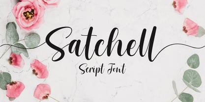 Satchell is a lovely and relaxed handwritten font. It is PUA encoded which means you can access all of the glyphs and swashes with ease! it has a gentle and beautiful flow, and as a result it will elevate each of the designs you wish to create!. It’s the perfect font for wedding invitations, stationery, photography, social media posts, product packaging, greeting cards, and much more!
 - Wofferine by Sipanji21,
$8.00 Wofferine is a Serif Handwritten Font with Playfull touch. it offers support of English Language. Standard punctuation glyphs are included and multilingual support also. Great for crafters and graphics artist alike. Compatible with all opration system. its playfulness make it great for creative projects, be inspirational wall posters, logo, brand etc.
 - Bakersville by TypeFaith Fonts,
$6.00 Bakersville is a package of 2 hand drawn sketch serif fonts by TypeFaith Fonts. The fonts are very useable for food packaging, menu's, etc and gives your product the authentic hand made look.
 - Landscape by Rochart,
$10.00 Landscape is a modern hand writing script. It's great for logotype, Branding Design, Logo Design, Digital Lettering Arts, T-Shirt/Apparel, Poster, Magazine, Signs, Advertising Design, wedding invitation and any hand lettered needs.
 - Too Much by Comicraft,
$19.00If you've had too much coffee but not enough of Too Much Coffee Man you can now indulge in an excess of characters created by the hand of Too Much Coffee Man's creator, Mister Shannon Wheeler. Don't worry, in our efforts to ensure clean and confident lettering samples, we kept Shannon on decaf until he was done. Dip this font in your system folder and your hard drive will get a caffeine and sugar rush guaranteed to increase its memory partition and bring the images on your monitor into sharper focus. - Realstin by Ajibatype,
$19.00 Realstin is a luxurious serif with an elegant style. It seduces your eyes with its curves yet still manages to maintain its classy serenity, it’s perfect for branding, logos, invitations, long texts, and many more of your other needs.
 - Blank Manuscript by Aah Yes,
$14.95Blank Manuscript allows you to produce sophisticated musical scoresheets even on basic Word Processors - anything from simple plain staves to complex full-page orchestral scores of your own design, to write in the notation yourself. The basic stuff is really easy and straightforward, but there's some quite advanced things you can do as well. So Copy and Save these Instructions. • The main stuff is simple and tends to follow the initial letter. Treble, Bass and Alto clefs are on upper case T B A (there are more clefs, below). The 5 Lines for the clefs are on L or l. • A small v will give a small vertical line (like a bar line) and a Big U will give a Big Upright - these can start or end a line or piece. • Time Signatures - type the following letters: Think of W for Waltz and it's easy to remember that 3/4 time is on W. Then from that they go up or down together like this: V=2/4 W=3/4 X=4/4 Y=5/4 Z=6/4 Compound Times are on H I J K like this: H=3/8 I=6/8 J=9/8 K=12/8 Common Time and Cut Common symbols can be found on semi-colon and colon respectively (all begin with Co- ). 2/2 3/2 are on lower case a and b, 7/4 and 7/8 are on lower case c and d, 5/8 is on small k (think POL-k-A) • Flat signs are on the numbers. Flat signs on LINES 1 to 5 are on numbers 1 to 5. Flat signs on SPACES 1 to 5 are on numbers 6 to 0 (space 1 being above line 1, space 5 being above the top line of the stave). Sharp signs are on the letters BELOW the long-row numbers. Which is q w e r t for the sharp signs on Lines 1 to 5, and y u i o p for sharp signs on spaces 1 to 5. Doing it this way means it works the same for all clefs, whether Treble, Bass, Alto, Tenor or any other. Sharp and Flat Signs always go in this order, depending on how many sharps or flats your key signature requires: Treble Clef Sharps t i p r u o e Flats 3 9 7 4 2 8 6 Bass Clef Sharps r u o e t i w Flats 2 8 6 3 1 7 = Alto Clef Sharps o e t i w r u Flats 7 4 2 8 6 3 1 • Guitar Chord Boxes are on G and g (G for Guitar) Upper Case G has a thick line across the top Lower case g has an open top, for chords up the fretboard TAB symbols are available: Six-string Tablature is on s & S for Six. Four-string Tablature is on f & F for Four. (Lower case has the "TAB" symbol on it, Upper Case has just the lines to continue.) Five-string tablature, is on lower case "j" (as in BAN-j-O) and of course L or l will continue the 5 lines. •RARE CLEF SIGNS including Tenor Clef, are on various punctuation marks, i.e. dollar, percent, circumflex, ampersand & asterisk, above the numbers 4 to 8. NOTE: The important symbols were kept on the letter and number keys, which are fairly standard all over, but some of the less important symbols are on various punctuation keys, which in different countries are not the same as on my keyboard. If it comes out wrong on your system, all I can say is it's right on the systems we've tried, and they'll be in here somewhere, probably on a different key. CLOSING THE ENDS OF THE LINES and BAR-LINES is done with the 3 varieties of brackets - brackets, brace and parentheses - Left/Right for the Left/Right end of the line. Parentheses L/R () which are above 9, 0 give a clef with a small vertical upright (the same as a bar line). Brace L/R and Brackets L/R (both on the 2 keys to the right of P on my keyboard) will close off a staff line with tall upright bars. Brace gives a double upright - one thick, one thin. Brackets give a single tall upright. A Big Upright is on Big U, (Big U for Big Upright) and a small vertical line is on small v (small v for small vertical). The Big Upright is the maximum height, and the small vertical is exactly the same height as a stave. And there's a tall upright Bar, on Bar (which is to the left of z on my keyboard, with Shift,) which is the same height as the bar on upper case U but twice as broad. • There's a staff intended for writing melodies, which is a little bit higher up than an ordinary treble clef giving a space underneath to put lyrics in - on m and M for Melody line. Lower case has the Treble Clef on, Upper case M has just the higher-up staff lines with no clef. (Use mMMMMMMM etc.) However this clef will be in the wrong place to put in sharp and flat signs, key signatures and so on, so if you use this clef you'll have to write the sharps, flats and key signature yourself. There's also a clef that's smaller (less tall) than the ordinary clef, but with the same horizontal spacing so it will align with other standard-sized clefs - on slash (a plain clef) and backslash (with a Treble Clef). • There are some large brackets for enclosing groups of staves, such as you'd use on large orchestral scores, on Upper Case N O P Q R, which can aid clarity. N and O on the left, Q and R on the right. P is a Perpendicular line to be used on both sides to increase the height of the enclosure, in this way but with the staff lines in between: N Q P P P P P P O R OTHERS —————————————— • Repeat marks are on comma (left) and period/full stop (right). • Hyphen is left as a sort of hyphen - it's a thin line like a single staff line, with the same horizontal spacing as ordinary staff lines - in case you want to draw a line across for a Percussion Instrument, or a Title or Lyric Line. • Space is a Space, but with HALF the width or horizontal spacing as ordinary staff lines, so 2 space symbols will be the same width as a clef symbol or line. • Grave (to the left of 1 on the long row, or hold down Alt and type 0096 then let go) gives a staff line that is one eighth the width of an ordinary staff line. • If you want manuscript in a clef and key which requires a flat or sharp sign in the space underneath the 5 lines, they’re on = equals and + plus . SYMBOLS • Many of these symbols will only be useful if you have worked out in advance which bars will need them, but they are here in case you've done that and wish to include them. • Symbols for p and f (piano and forte) are on 'less than' and 'greater than' < > (above comma and full stop) and m for mezzo is on Question, next to them. They can be combined to make mp, mf, ff, pp, etc. These signs -- and other signs and symbols like Pedal Sign, Coda Sign and so on -- can be found on various punctuation mark keys, including above 1, 2, 3 in the long row, and others around the keyboard. There's a sort of logic to their layout, but in different countries the keys are likely to give different results to what is stated here, so it's probably best to just try the punctuation and see if there's any you might want to use. (But on my keyboard a Coda sign is on circumflex - because of the visual similarity. Pedal sign is on underscore. A "Sign" symbol is on exclamation mark.) They were only included in case you really need them to be printed rather than handwritten. • However, a Copyright symbol is deemed necessary, and also included are a "Registered" symbol and a TradeMark symbol. They are found in the conventional places, and can be accessed by holding down ALT and typing 0169, 0174 or 0153 respectively in the numberpad section and letting go. • Staff lines with arco and pizz. above are on capital C and D respectively ---C for ar-C-o. • An empty circle above a staff line (to indicate sections by writing letters A, B, C or 1,2,3 inside for rehearsal marks) is on n. The actual signs for an A, B, C and D in a circle above the staff line can be produced by holding down ALT and typing 0188, 0189, 0190 and 0191 respectively and letting go. • The word "Page", for indicating page numbers, is on the numbersign key. • The two quotes keys, (quote single and quote double) have symbols representing "Tempo is", and "play as triplets", respectively. • INSTRUMENT NAMES There's a whole lot of Instrument Names built in (over a hundred) which can be printed out above the clef, and you do it like this. Hold down Alt and type in the given number in the numberpad section, then let go. For Piccolo it's 0130, for Flute it's 0131, Cornet is on 0154, Violin is on 0193, and the numbers go up to over 0250, it's a fairly complete set. There's also a blank which is used to align un-named clefs on 0096. Put them at the very beginning of the line for the best results. Here they are: WOODWIND Piccolo 0130 Flute 0131 Oboe 0132 Clarinet 0133 Eng Horn 0134 Bassoon 0135 Soprano Sax 0137 Alto Sax 0138 Tenor Sax 0139 Baritone Sax 0140 Saxophone 0142 Contrabassoon 0145 Recorder 0146 Alto Flute 0147 Bass Flute 0148 Oboe d'Amore 0149 Cor anglais 0152 Pipes 0241 Whistle 0242 BRASS Cornet 0154 Trumpet 0155 Flugelhorn 0156 Trombone 0158 Euphonium 0159 Tuba 0161 French Horn 0162 Horn 0163 Tenor Trombone 0164 Bass Trombone 0165 Alto Trombone 0166 Piccolo Cornet 0167 Piccolo Trumpet 0168 Bass Trumpet 0170 Bass Tuba 0171 Brass 0172 VOICES Vocal 0175 Melody 0176 Solo 0177 Harmony 0178 Soprano 0179 Alto 0180 Tenor 0181 Baritone 0182 Treble 0183 Bass 0197 (see also PLUCKED STRINGS) Descant 0184 Mezzo Soprano 0185 Contralto 0186 Counter Tenor 0187 Lead 0206 BOWED STRINGS Strings 0192 Violin 0193 Viola 0194 Cello 0195 Contrabass 0196 Bass 0197 Double Bass 0198 Violoncello 0199 Violin 1 0200 Violin 2 0201 Fiddle 0252 PLUCKED STRINGS Harp 0202 Guitar 0203 Ac. Gtr 0204 El. Gtr 0205 Lead 0206 Bass 0197 Ac. Bass 0207 El. Bass 0208 Slide Gtr 0209 Mandolin 0210 Banjo 0211 Ukelele 0212 Zither 0213 Sitar 0214 Lute 0215 Pedal Steel 0216 Nylon Gtr. 0238 Koto 0239 Fretless 0244 KEYBOARDS + ORGAN Piano 0217 El. Piano 0218 Organ 0219 El. Organ 0220 Harpsichord 0221 Celesta 0222 Accordion 0223 Clavinet 0224 Harmonium 0225 Synth 0226 Synth Bass 0227 Keyboards 0228 Sampler 0249 PERCUSSION and TUNED PERCUSSION Percussion 0229 Drums 0230 Vibes 0231 Marimba 0232 Glockenspiel 0233 Xylophone 0234 Bass marimba 0235 Tubular Bells 0236 Steel Drums 0237 Kalimba 0240 OTHERS Harmonica 0246 Mouth Organ 0247 FX 0251 Intro 0243 Verse 0245 Refrain 0248 Chorus 0250 un-named 0096 (this is a small spacer stave for aligning clefs without a name) ALSO copyright 0169 registered 0174 TradeMark 0153 Rehearsal marks 0188-0191 (giving A, B, C, D in a circle, an empty circle is on n ) Clef signs for Treble Bass Alto without any staff lines 0253-0255 An Alphabetic List of all signs: a 2/2 time b 3/2 time c 7/4 time d 7/8 time e sharp sign, centre line f Tab sign for 4-string tab g Guitar Chord Box, no nut h half-width stave I sharp sign, third space up j Tab sign for 5-string tab k 5/8 time l Lines - 5 horizontal lines for a stave m Melody Clef - a standard clef but placed higher up, with Treble sign n Stave with an empty circle above o sharp sign, fourth space up p sharp sign, space above stave q sharp sign, bottom line r sharp sign, fourth line up s Tab sign for 6-string tab t sharp sign, top line (fifth line up) u sharp sign, second space up v vertical line (bar-line) w sharp sign, second line up x Fretboard, four strings y sharp sign, first space up z Fretboard, five strings A Alto Clef B Bass Clef C “arco” above stave D “pizz.” above stave E Double Vertical Lines F Four Horizontal lines (for 4-string tab) G Guitar Chord Box with nut H 3/8 time I 6/8 time J 9/8 time K 12/8 time L Lines - 5 horizontal lines for a stave M Melody Clef - a standard clef but placed higher up, plain N Bounding Line for grouping clefs - top left O Bounding Line for grouping clefs - bottom left P Bounding Line for grouping clefs - Perpendicular Q Bounding Line for grouping clefs - top right R Bounding Line for grouping clefs - bottom right S Six Horizontal lines (for 6-string tab) T Treble Clef U tall, thin Upright line V 2/4 time W 3 / 4 time X 4/4 time Y 5/4 time Z 6/4 time 1 flat sign, first line up (the lowest line) 2 flat sign, second line up 3 flat sign, third line up 4 flat sign, fourth line up 5 flat sign, fifth line up (the top line) 6 flat sign, first space up (the lowest space) 7 flat sign, second space up 8 flat sign, third space up 9 flat sign, fourth space up 0 flat sign, space above stave - Dreamfoster by Balpirick,
$15.00 Dreamfoster is a cute and sweet handwritten font. Its casual charm makes it appear wonderfully down-to-earth, readable and, ultimately, incredibly versatile. Dreamfoster will look outstanding in any context, whether it’s being used on busy backgrounds or as a standalone headline!
 - Wolf Fangs Graffiti by Sipanji21,
$15.00 Wolf Fangs is an incredibly unique and chunky lettered display font with graffiti basic feel, its suitable for logotype, design grafics, e-sport, apparel, wall art, etc. Add this font to your favorite creative ideas and notice how it makes them come alive!
 - Hello Melky by Good Java Studio,
$20.00 Welcome to: Hello Melky - a Kids Display Font It's smooth, it's funny, it's fun, and it's very nice: it's Hello Melky - a Kids Display Font Mixed fonts with many possible combinations. Everything is made with the same brush, and everything is the same size as Hello Melky, so you can be sure they will work well together! It is suitable for you to use in making t-shirt design, quote, label, packaging, logo type, or long writing. Because we have compiled kerning and matrices that are tailored to your needs.
 - Farringdon by Solotype,
$19.95An old wood type we picked up in London from the Fredrick Ullmer Company. It's not marked, and we've never seen it in a catalog, so we don't know who made it. We like it for antique-looking western posters and playbills. We added the lowercase. We have seen it used on British music hall bills. - SK Skrynka by Shriftovik,
$10.00 SK Skrynka™ is a strict monospaced geometric accidental typeface. He absorbed both industrialism and simplicity, and futurism along with modernism. It is imbued with the spirit of the distant future and refers to the culture of cyberpunk. With its features, it resembles a computer's electrical circuit and fits perfectly into a futuristic design. SK Skrynka font supports many languages: extended Latin (Western European, Eastern European and Central European, etc.), extended Cyrillic (Russian, Ukrainian, Belarusian, Serbian, etc.), Greek and even Hebrew. This allows you to use it in absolutely any direction and style of design. Also, this font has many stylistic alternatives that bring variety to the monospaced typeface, further expanding its expressive capabilities. The SK Skrynka typeface will look great in headlines, or in stylized text and will become a functional addition to design work or game design.
 - Vonder Hills by Letterhend,
$17.00 Vonder Hills Layered Font Introducing, Vonder Hills . A layered typeface which is inspired by vintage lettering sign and art. While this font has a victorian touch, it still looks bold and solid. Very suitable for for headline, logotype, apparel, invitation, branding, packaging, advertising etc. It also comes in uppercase, lowercase, punctuations, symbols & numerals, stylistic set alternate, ligatures, etc also support multilingual and already PUA encoded. We highly recommend using a program that supports OpenType features and Glyphs panels like many of Adobe apps and Corel Draw, so you can see and access all Glyph variations.
 - Nacho Script Pro by Vástago Studio,
$19.99 Nacho Script is a classic and casual typeface ideal for give to your design a confortable touch of traditional feeling, casual style and luxury looks. Is a script system of glyphs with a subtle modulations in it strokes, because it's inspired on the classic advertising from the golden age of ads in 1950; promptly in 1957. Was so amazing design it and create it for multiple uses like ads for food, drinks, traveling, commercial products, and personal things, and thats it. Enjoy it like we enjoy it creating it. Thanks for your buy.
 - Singo Sans by Ferry Ardana Putra,
$10.00 Singo Sans is a valiant font family and extraordinary sans serif. Singo itself literally means Lion in Indonesia, which is the the strong and gallant animal just like this typeface. It has proportion of hard lines and smooth curves. Singo works great in any branding, logos, magazines, films, posters, websites, etc. Singo features: A full set of uppercase characters Numbers & punctuation Multilingual language support PUA Encoded Characters 2360 Total glyphs
 - Designer RD by Kostic,
$40.00 Designer RD was created in 1999, at the same time as Just Square and Why Square typefaces, and envisioned to be their rounded alternative. Zoran based the font on the logotype his son Nikola made and its primary purpose is to be used in logotypes, headlines, fliers, websites, etc. that are going for a hard geometric look. Designer RD’s character set supports Western European languages, as well as the Cyrillic script.
 - Moonspace by Jafar07,
$17.00 Moonspace is a unique display sans-serif font with a captivating wave-like character on each letter. Despite its slightly taller height, this font remains highly legible and suitable for a wide range of designs. With its distinctive design that sets it apart from other sans-serif fonts, Moonspace adds an artistic touch to your designs. It's perfect for use on posters, magazines, brochures, and other creative projects. Crafted with precision and balanced letter proportions, Moonspace delivers a professional and eye-catching look. It's suitable for use in a variety of designs, from modern to classic.