10,000 search results
(0.024 seconds)
- Quam by Typogama,
$29.00 Quam is a contemporary sans serif typeface, designed to be used as either a display or text font. With a range of alternates, true small capitals and variable numerals, this design aims to be versatile and functional. An added function is the inclusion of the full Cyrillic encoding to allow the application of a wide range of scripts.
 - Just Deine by URW Type Foundry,
$39.99 The idea was to create a fully equipped handwriting script. Thus equipped with all kinds of typographic features like for example true small caps, lots of special characters, different sets of figures, real underlining, all characters as sub- and subscripts, the cap variations, OpenType-features for controlled character string modulations ... In a nutshell: a fully equipped handwriting script.
 - Holier Than Thou by Comicraft,
$19.00 Look well, Fontlovers, we wouldst have words with thee! By Odin's beard, let the naysayers beware, for 'tis true, Thor doth speak --and shouldst speak -- Mighty Words! Yay there shall be a "Thee" and a "Thou" and a "Thy" and a "Smite!" Verily, 'tis understood that Elizabethan English dost suit the Gods of Asgard, mortals can never get enow.
 - Theater Lights JNL by Jeff Levine,
$29.00 Vintage sheet music for the title song from the film "Forty Second Street" was the inspiration for Theater Lights JNL. While the idea of letters comprised of circles (to simulate bulbs) can be both vintage [as in marquee lights] or modern [simulating dot matrix printers], it is always a fun approach to a tried-and-true style.
 - HK Guise by Hanken Design Co.,
$30.00 HK Guise is a typeface with legible characters for maximum readability and legibility—perfect for interface and signage design projects. Inspired by Swiss Typographic design, HK Guise aims to be a standard go-to typeface for the adventurous graphic designer. Guise, defined literally; is an external form, appearance, or manner of presentation, typically concealing the true nature of something.
 - Beauty Green by BonjourType,
$13.00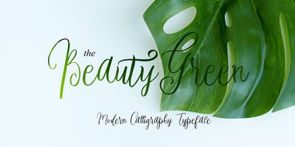 Proudly Present, BeautyGreen Font. BeautyGreen is a modern script font, masterfully designed to become a true favorite. It maintains its classy calligraphic influences while feeling contemporary and fresh. Fall in love with it and bring your projects to the highest levels! Fonts featured : Uppercase, Lowercase, Numbers, Symbols, Accents, Stylistic, Swash, and Ligatures. BeautyGreen also multilingual support
 - Gromvies by ahweproject,
$10.00 Gromvies feels playfully nostalgic and delivers an incredible vintage retro aesthetic. Inspired by unique retro themes, this fun typeface is suitable for any vintage theme concept, Illustration posters, stickers, fun graphics, and more. Masterfully designed to become a true favorite, this font has the potential to bring each of your creative ideas to the highest level!
 - Hanalei Pro by Stiggy & Sands,
$29.00 For the Polynesian Fan Inspired by the bamboo lettering of the iconic Mai Kai restaurant logo, Hanalei Pro has all the flavor of the genre without compromise. Great for titling and larger typesetting, and the added true SmallCaps & Lining/Tabular figures and limitless fractions give more range of use. The Hanalei Pro family contains 628 characters per font.
 - Gravura by ITC,
$29.99 Noted British designer Phill Grimshaw designed Gravura in 1995. Gravura is a classic copperplate script with perfect strokes and proportions. The intricacy of its initial capitals blend beautifully with the simple elegance of its lowercase, whose letters have been designed to link together in the style of true handwriting. Text set in Gravura feels very personalized.
 - Ladislav by Suitcase Type Foundry,
$39.00 The Ladislav font revitalises Sutnar’s legacy, while not explicitly copying any of his original fonts. It however keeps true to their technicist character and initial principles of character creation - a simple modular system of combined geometrical segments. This approach affects all round shapes of capital and lowercase letters, as well as the shapes of the majority of numbers.
 - Still Love by Creaditive Design,
$10.00 Still Love is an exquisite handwritten font, masterfully designed to become a true favorite. Smooth, modern and strong characters at the same time looks stunning on wedding invitations, cards, books, quotes, logos, and business. Special Characters are available for lowercase letters with added beginning & end swashes, also Ligatures that can make your design more smooth and looks natural.
 - Brighting Lovelyta by Letterena Studios,
$9.00 Brighting Lovelyta is a magical script font carefully created with a touch of elegance. Whether you’re looking for fonts for Instagram or calligraphy scripts for DIY projects, this font will turn any creative idea into a true piece of art! This font is PUA encoded which means you can access all of the glyphs and swashes with ease!
 - Ridley Grotesk by Radomir Tinkov,
$25.00 Ridley Grotesk is a modern sans-serif. It comes in nine weights with matching italics, designed with powerful opentype features in mind. Each weight includes true small capitals, alternate characters, extended language support, ligatures and more. Perfectly suited for graphic design and any display use. It could easily work for web, signage, corporate as well as for editorial design.
 - Windlass - Unknown license

- Dolenzo J - Unknown license

- Interdimensional - 100% free

- Altivo by Kostic,
$40.00 Altivo is a proper workhorse sans serif. Sixteen OpenType fonts in eight weights (with true Italics) range from Thin to Ultra. Meticulous care was taken to ensure high legibility in text sizes on the screen. The typeface is designed to have wide proportions, generous x-height, loose spacing, ink traps, large apertures and low stroke contrast. Altivo’s ink traps are not only a functional design feature, they also look interesting and lend character to the typeface in headlines. True Italics, small caps and multiple sets of figures, as well as a complete set of lowercase superscript were all included in the family to accommodate high typographic standards. If you need to pair it with a serif font, you can’t go wrong with Chiavettieri, since both typefaces were made with the same basic proportions, and their tabular figures are the same width.
 - Hellenic Typewriter by Polytype,
$20.00 Hellenic Typewriter is a slab serif for text and display, combining the typewriter aesthetic's balance of elegance and pragmatism with some of the extended western flavour of Hellenic Wide. Rounded strokes, some unorthodox slab details and playful, looping tails all add to Hellenic Typewriter’s warmth and approachability, while its typewriter-inspired proportions and clean forms provide rythym and an honest, confident voice. The lightest weights, laying bare the simple, partly-geometric and optically-monolinear construction, embody an assertive elegance. Ball terminals feature extensively throughout the design, in both lower and uppercase. This miroring of details creates a greater harmony between the cases and ensures that the true character of Hellenic Typewriter is not lost when setting in all-caps. Expressive true italics elaborate upon and emphasise some of the freer, more decorative elements of the roman styles.
 - one8seven - Unknown license

- Apricot by Canada Type,
$24.95 A. R. Bosco made Romany for ATF in 1934, when there was much demand for script types in advertising and publishing. It was the high times of Speedball lettering, and a casual script in that fashion was naturally very welcome. It became an instant hit and was used widely for a good part of the 1930s and 1940s. Apricot is not only a revival of Bosco's work, but also a major expansion of it. It contains very effective solutions to the many problems presented by the original metal type, which had to always be tracked too wide because of the forms of some of its letters. Solving these problems was not an easy task. A comprehensive set of alternates was designed to give the user the ability to replace some forms in certain uses, and a large set of two-, three-, and even four-letter ligatures was added to solve the awkwardness of some of the more common letter pairings. The resulting work is quite delightful, especially for those who like to take advantage of OpenType technology. Apricot is the rarest kind of script in digital type these days, the kind that is upright, round, bold, feminine, and distinctly young in appearance. A birthday cake for a teenage girl can certainly benefit from these letters. So can greeting cards, family show posters, diary covers, party invitations, women's shirts, toy packaging, celebration literature, and almost anything that needs that special touch of shiny happy youth. Apricot is available in all common font formats. The Postscript and True Type versions come in 4 fonts, which include one for alternates and two for ligatures alongside the main font. The OpenType version is one font that contains more than 380 glyphs and all the necessary programming for the palettes of OpenType-supporting applications. If you liked Canada Type's hugely popular font Dominique, you will love Apricot.
 - Eastside Motel - Unknown license

- Bembo MT by Monotype,
$45.99 The origins of Bembo go back to one of the most famous printers of the Italian Renaissance, Aldus Manutius. In 1496, he used a new roman typeface to print the book de Aetna, a travelogue by the popular writer Pietro Bembo. This type was designed by Francesco Griffo, a prolific punchcutter who was one of the first to depart from the heavier pen-drawn look of humanist calligraphy to develop the more stylized look we associate with roman types today. In 1929, Stanley Morison and the design staff at the Monotype Corporation used Griffo's roman as the model for a revival type design named Bembo. They made a number of changes to the fifteenth-century letters to make the font more adaptable to machine composition. The italic is based on letters cut by the Renaissance scribe Giovanni Tagliente. Because of their quiet presence and graceful stability, the lighter weights of Bembo are popular for book typography. The heavier weights impart a look of conservative dependability to advertising and packaging projects. With 31 weights, including small caps, Old style figures, expert characters, and an alternate cap R, Bembo makes an excellent all-purpose font family.
 - Bembo Infant by Monotype,
$45.99The origins of Bembo go back to one of the most famous printers of the Italian Renaissance, Aldus Manutius. In 1496, he used a new roman typeface to print the book de Aetna, a travelogue by the popular writer Pietro Bembo. This type was designed by Francesco Griffo, a prolific punchcutter who was one of the first to depart from the heavier pen-drawn look of humanist calligraphy to develop the more stylized look we associate with roman types today. In 1929, Stanley Morison and the design staff at the Monotype Corporation used Griffo's roman as the model for a revival type design named Bembo. They made a number of changes to the fifteenth-century letters to make the font more adaptable to machine composition. The italic is based on letters cut by the Renaissance scribe Giovanni Tagliente. Because of their quiet presence and graceful stability, the lighter weights of Bembo are popular for book typography. The heavier weights impart a look of conservative dependability to advertising and packaging projects. With 31 weights, including small caps, Old style figures, expert characters, and an alternate cap R, Bembo makes an excellent all-purpose font family. - ITC Legacy Serif by ITC,
$40.99 ITC Legacy¿ was designed by American Ronald Arnholm, who was first inspired to develop the typeface when he was a graduate student at Yale. In a type history class, he studied the 1470 book by Eusebius that was printed in the roman type of Nicolas Jenson. Arnholm worked for years to create his own interpretation of the Jenson roman, and he succeeded in capturing much of its beauty and character. As Jenson did not include a companion italic, Arnholm turned to the sixteenth-century types of Claude Garamond for inspiration for the italics of ITC Legacy. Arnholm was so taken by the strength and integrity of these oldstyle seriffed forms that he used their essential skeletal structures to develop a full set of sans serif faces. ITC Legacy includes a complete family of weights from book to ultra, with Old style Figures and small caps, making this a good choice for detailed book typography or multi-faceted graphic design projects. In 1458, Charles VII sent the Frenchman Nicolas Jenson to learn the craft of movable type in Mainz, the city where Gutenberg was working. Jenson was supposed to return to France with his newly learned skills, but instead he traveled to Italy, as did other itinerant printers of the time. From 1468 on, he was in Venice, where he flourished as a punchcutter, printer and publisher. He was probably the first non-German printer of movable type, and he produced about 150 editions. Though his punches have vanished, his books have not, and those produced from about 1470 until his death in 1480 have served as a source of inspiration for type designers over centuries. His Roman type is often called the first true Roman." Notable in almost all Jensonian Romans is the angled crossbar on the lowercase e, which is known as the "Venetian Oldstyle e."" Featured in: Best Fonts for Logos
 - ITC Legacy Sans by ITC,
$40.99 ITC Legacy¿ was designed by American Ronald Arnholm, who was first inspired to develop the typeface when he was a graduate student at Yale. In a type history class, he studied the 1470 book by Eusebius that was printed in the roman type of Nicolas Jenson. Arnholm worked for years to create his own interpretation of the Jenson roman, and he succeeded in capturing much of its beauty and character. As Jenson did not include a companion italic, Arnholm turned to the sixteenth-century types of Claude Garamond for inspiration for the italics of ITC Legacy. Arnholm was so taken by the strength and integrity of these oldstyle seriffed forms that he used their essential skeletal structures to develop a full set of sans serif faces. ITC Legacy includes a complete family of weights from book to ultra, with Old style Figures and small caps, making this a good choice for detailed book typography or multi-faceted graphic design projects. In 1458, Charles VII sent the Frenchman Nicolas Jenson to learn the craft of movable type in Mainz, the city where Gutenberg was working. Jenson was supposed to return to France with his newly learned skills, but instead he traveled to Italy, as did other itinerant printers of the time. From 1468 on, he was in Venice, where he flourished as a punchcutter, printer and publisher. He was probably the first non-German printer of movable type, and he produced about 150 editions. Though his punches have vanished, his books have not, and those produced from about 1470 until his death in 1480 have served as a source of inspiration for type designers over centuries. His Roman type is often called the first true Roman." Notable in almost all Jensonian Romans is the angled crossbar on the lowercase e, which is known as the "Venetian Oldstyle e."" ITC Legacy® Sans font field guide including best practices, font pairings and alternatives.
 - Impacted - Unknown license

- Butterfly Chromosome - Unknown license

- Schrill AOE - Unknown license

- AntiChrist SuperstarSW - Unknown license

- Scrawn AOE - Unknown license

- FATTIP - Unknown license

- ID SupernovaSW - Unknown license

- Rusted MachineSW - Unknown license

- Dip Pen JNL by Jeff Levine,
$29.00 Answer Songs have been around for [probably] just as long as there have been songs. 1917's "If I Catch the Guy Who Wrote Poor Butterfly" was the answer to the 1916 hit "Poor Butterfly" [by Raymond Hubbell and John Golden], which in turn was inspired by the Puccini opera "Madame Butterfly". "Poor Butterfly" was so popular that this "answer" tune had as part of its lyrics "That melody haunts me in my sleep; it seems to creep." Nonetheless, the sheet music for William Jerome and Arthur Green's comic lament had the title hand lettered with an oval nib lettering pen and is now availably as a digital type face called Dip Pen JNL.
 - FF Letter Gothic Text by FontFont,
$62.99 Italian type designer Albert Pinggera created this sans FontFont between 1996 and 1998. The family has 6 weights, ranging from Light to Bold (including italics) and is ideally suited for advertising and packaging, editorial and publishing, logo, branding and creative industries, software and gaming as well as sports. FF Letter Gothic Text provides advanced typographical support with features such as ligatures, alternate characters, case-sensitive forms, fractions, super- and subscript characters, and stylistic alternates. It comes with a complete range of figure set options – oldstyle and lining figures, each in tabular and proportional widths. This FontFont is a member of the FF Letter Gothic super family, which also includes FF Letter Gothic Mono and FF Letter Gothic Slang.
 - ITC Holistics by ITC,
$29.99Some words from the designer... Like a tree rooted in ancient philosophy with branches reaching into the new age, ITC Holistics encompasses 82 pictographs of astrology, healing, magic, nature and spirituality. In an illustration style that originates from hand-carved rubber stamps, west coast designer Teri Kahan shines new light on these timeless symbols. ITC Holistics is functional collectively and individually for graphics and logos. As with Teri's companion font ITC Connectivities, ITC Holistics can also be used as a divining tool. Just type your name in caps and lower case and see what the images tell you! - Line Art Eclectrice Aligned by DJ THINK,
$95.00 Thanks for checking out LineArt ECLECTRICE (pronounced EHCK-LEHCK-TREES) Light Aligned font by Rene Toussaint (otherwise known as DJ THINK) of LineArt Foundry and Brand. This font is designed in the vein of graffiti art with stylings of hip-hop and hieroglyphic appearance. Try it in a preview window and check out if it will meet your needs for something cool and hip for your next flyer design or other type of graphic art image. Keep in mind that this is a light design and may require extra thickening in your vector program of choice with outline thickness options.
 - Jakarta Culture by Black Studio,
$19.00 Introducing Jakarta Culture, Thank you for visiting Jakarta Culture! A very fun yet elegant script font with lots of energy, it lets you create beautiful handcrafted typography in an instant. With extra curves & twists, Jakarta Culture is guaranteed to make your text stand out - perfect for logos, printed quotes, invitations, cards, product packaging, headers, weddings and anything else you can imagine. What's really awesome is that Jakarta Culture comes with a full set of lowercase alternatives, which allow you to create more authentic custom-feel texts. This type has become the work of true love, making it as easy and fun as possible. I can't wait to see what you do with Jakarta Culture! Feel free to use the #Black Studio tag and the #Jakarta Culture font to show what you've been up to, I really hope you enjoy it! Thank you!
 - Maister by Dora Typefoundry,
$19.00 Maister is a contemporary look serif typeface with sharp and dynamic strokes, strong contrasts that are subtle. Giving traditional serif design elements a modern feel, this is a graceful and confident set of timeless simple, easy-to-read typefaces that can easily become a staple in your font library perfect for branding, logos, invitations, magazines, product packaging, and more. Features: All Caps Font with different uppercase and lowercase Number & Symbol Supported Languages Alternates and Ligatures PUA Encoded We highly recommend using a program that supports OpenType features and Glyphs panels like Adobe apps and Corel Draw, so you can see and access all Glyph variations. This type of family has become the work of true love, making it as easy and fun as possible.I really hope you enjoy it! Thank you Enjoy the font and go get creative :)
 - Sun Beautiful by Black Studio,
$15.00 Introducing Sun Beautiful, Thanks for checking out Sun Beautiful! A very fun yet elegant Signature font with lots of energy, it lets you create beautiful handcrafted typography in an instant. With extra curves & twists, Sun Beautiful is guaranteed to make your text stand out - perfect for logos, printed quotes, invitations, cards, product packaging, headers, weddings and anything else you can imagine. What's really awesome is that Sun Beautiful comes with a full set of lowercase alternatives, which allow you to create more authentic custom-feel text. This type has become the work of true love, making it as easy and fun as possible. I can't wait to see what you do with Sun Beautiful! Feel free to use the #Black Studio tag and the #Sun Beautiful font to show what you've been up to, I really hope you enjoy it! Thank you!


