10,000 search results
(0.032 seconds)
- Doc Holliday by Type Innovations,
$39.00 Doc Holliday is an original design by Alex Kaczun. It's a classic revival of a Western-style slab serif font extended to include Eastern European Latin and Baltic languages. Doc Holliday has a mid to late 1800s wood type feel, and one can envision a sign over the O.K. Corral in Tombstone, Arizona, and the legendary Gunfight between the three Earp brothers and "Doc" Holliday and the Claytons and McLaurys. This font can be applied to sports team promotions and other nostalgic projects. "Howdy pardiner!"
 - Dot Grid by Essqué Productions,
$35.00 A font that can be used to simulate old dot-matrix style printing, older receipts, or even as marquee light lettering. Includes extended Latin diacritics, Roman Numerals, and Greek, Hebrew, and Cyrillic Alphabets.
 - Mon Voir by Great Lakes Lettering,
$30.00 New to the Great Lakes Lettering library is Mon Voir. Mon Voir is the signature lettering style from Jenna Rainey a talented calligrapher and illustrator and the artist behind Mon Voir studio.
 - Dog Heaven by Letters by Wordsworth,
$10.00 'dog heaven' is a sweet font featuring lower case, symbols, numerals & diacritics. channel your e. e. cummings and forgo those cumbersome caps! perfect for any occasion where fun is required.
 - Bon Ami by Fontop,
$12.00 Bon Ami is a hand lettered condensed font perfect to add a fun feel and individual look to everything you create including cards & invites, logos, souvenirs, stationary, and so on. It also works perfectly when pairing with other fonts, f.e. with my Paramaribo font (as in the image with the cupcake). The font consists of Latin multilingual support as well as uppercase letters, lowercase letters, numbers and basic punctuations.
 - Bon Foyage by Ahmad Jamaludin,
$15.00 Start new year for new font! present to you, Bon Foyage! Bon Foyage is a Vintage modern serif typeface with unique letterforms, beautiful alternative glyphs, and complete multilingual support. Every letter has a subtle uniqueness to it, from the alternate letterforms of "g, j, y", these glyphs are memorable! This font is perfect for editorial projects, logo design, clothing branding, product packaging, magazine headers, or simply as a stylish text overlay to any background image. Features : Unique letterforms Works on PC & Mac Simple Installations Accessible in the Adobe Illustrator, Adobe Photoshop, Adobe InDesign, even work on Microsoft Word. PUA Encoded Characters Fully accessible without additional design software. Follow my shop for upcoming updates including additional glyphs and language support.
 - DIN Next by Monotype,
$56.99 DIN has always been the typeface you root for—the one you wanted to use but just couldn’t bring yourself to because it was limited in its range of weights and widths, rendering it less useful than it could be. The century-old design has proven to be timeless, but modern use cases demanded an update, which resulted in DIN Next—a versatile sans serif family that will never go out of style. This classic design turned modern must-have includes seven weights that range from light to black, each of which has a complementary italic and condensed counterpart. The family also included four rounded designs, stretching the original concept’s range and core usability. DIN Next also boasts a suite of small capitals, old style figures, subscript, superscript and several alternate characters. A quintessential 20th-century design, its predecessor DIN was based on geometric shapes and was intended for use on traffic signs and technical documentation. Akira Kobayashi’s update made slight changes to the design, rounding the formerly squared-off corner angles to humanize the family. Rooted in over 100-years of history, it’s safe to say that there will always be a demand for the DIN design, and thanks to DIN Next, now it’s as usable as it is desired. Wondering what will pair with it perfectly? Check out Agmena™, Bembo® Book, Cardamon™, Joanna® Nova, FF Quadraat® and Quitador™. Featured in: Best Fonts for Logos, Best Fonts for Websites, Best Fonts for Tattoos
 - Laser Dots by Etewut,
$17.00 Laser dots display font is based on sans serif. Use it in your design be it cards, outside commercial, web or product adds and laser cuts. It has foreign characters so you may use your mother language.
 - Bark Dones by Zamjump,
$19.00 Bark Dones is a powerful and visually stunning font that reflects the sharpness, ferocity and horror of your soul. Bark Dones is ideal for use in various projects, from logo design, music, events, branding to web design and other printed materials. With its bold and impressive appearance, Bark Dones is the perfect choice for your work.
 - Dog Days by Fenotype,
$45.00 Dog Days is an American hand lettering style brush script family. Dog Days is swift, strong and full of bursting energy. Due to its clean features it’s legible even in small sizes. Dog Days is great for any display use -from poster to packaging and logo to t-shirt. Dog Days is also great for lettering works. Dog Days Brush boasts with more than 700 glyphs and plenty of OpenType features: Keep Standard Ligatures on - it adds variety in hand lettering style and keeps the flow steady. If you need more action try turning on Swash, Stylistic or Titling Alternates in any OpenType savvy software. Dog Days Brush is also equipped with Old Style Numerals if you need your numbers to fit more into text. Dog Days Brush uppercase letters are designed to work as initials so if you need to write all caps you might want to use Dog Days Caps or Dog Days Small Caps. Dog Days Caps can also be used as uppercase letters for the script. Dog Days Extras is a set of badges, swashes and swirls designed to play with the font. Dog Days is inspired by a hand lettering sample in a vintage American swimsuit advertisement.
 - ION C by Setup,
$19.95 ION C is a part of the ION superfamily, which consists of 3 families: condensed (ION A), normal (ION B) and wide (ION C), each having a compelling range of 10 weights. Styles Thin to Black have 436 glyphs supporting more than 70 Latin-based languages and the three heaviest weights, named U1, U2 and U3 have 94 basic glyphs. ION glyphs are based on the classic 7-segment display, but for readability and aesthetic reasons, some alphabetic characters don't follow this matrix strictly. In case you like things in order, don't worry, there's a stylistic set that replaces all characters with their strict alternatives. The special characters, such as #, @ or % are composed of special segments, but are designed to fit seamlessly within the whole character set. ION was designed with the needs of contemporary graphic design in mind. There are alternative characters, discretionary ligatures, slashed zero, superior & inferior numbers, fractions, ordinals and three handy stylistic sets. The ten styles of ION C are accompanied with a special 11th style called Cells, allowing you to design a special underlying layer of black or outlined cells. This way you can create various containers and boxes for your text, highlight what's important or go wild and draw a space invader, using the cells as building blocks. Learn more about the OpenType features and Cells at www.urtd.net/ion.
 - Olympus Mons by AvarType,
$28.00 Olympus Mons is a geometric display font, characterized by sharp edges and straight lines, designed to support all European languages. It is intended to be used for headings as well as smaller information, by brands associated by masculinity, power, and ambitious goals.
 - Wet Dog by Leimone Design,
$8.00 Wet Dog is the ultimate fur font reflecting the global movement of street pop art, Playful, yet with attitude. A versatile display font for making strong, loud statements, just about as shy as a wet dog!
 - Cinque Donne by Debi Sementelli Type Foundry,
$44.99 Cinque Donne means “Five Women” in Italian. It was inspired by the five sisters in my family as well as a group of five high school friends I have known for 46 years, aka “The Club Girls”. The Pro version has 3370 glyphs with all the bells and whistles! Women are connectors, encouragers and supporters. Young, old, shy, extroverted, when you put us together, somehow we make a beautiful impact on each other’s lives. This is what Cinque Donne does in a visual way. Some letters are simple and prefer to sit quietly. Others are flourished and proud and like the limelight in the middle of a word. And then there are alternates that are flexible and work in any number of surprising places. Stylistic sets can add a vivacious feel while contextual alternates bring better understanding. Classic or contemporary, subdued or flamboyant, these letters represent the variety of women that make life interesting for us all. Within the varied glyphs, I hope you find characters that remind you of the special women in your life. Let Cinque Donne salute them on the page! The Cinque Donne Family includes: Cinque Donne, Cinque Donne Bold, Cinque Donne Swash and Cinque Donne Pro. Check out the Buying Choices tab to see special discounted combinations! Crafters: All of my fonts have been specially coded for PUA (Private Use Area) so you can access all of the swashes and alternates using Character Map (PC) or Character Viewer (Mac) or with any number of apps including PopChar. If you would like to purchase PopChar at a special discount email me and I will send you the link. Cinque Donne Pro and Cinque Donne Swash include Swash, Stylistic and Titling Alternates, Contextual Alternates, Standard and Discretionary Ligatures, Roman Numerals & Fractions.
 - Bon Apetit by Monotype,
$29.99Food stuff - Eon Age by Monotype,
$29.99 - More Dots by Beware of the moose,
$9.99 It is not really a font, they are more icons. Based on a grid of seven circles al 127 possibilities – filled an unfilled. Use it decorative or just for fun.
 - Dotted Weekend by GarageFonts,
$39.00 - John Doe by Fonthead Design,
$19.00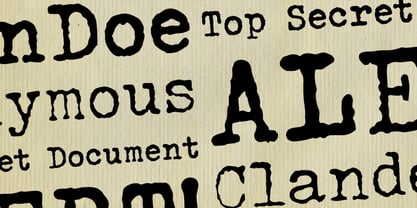
- Good Dog by Fonthead Design,
$- - Bon Apit by Papermode Co,
$16.00 Bon Apit is a monoline script typeface with extra features. Bon Apit comes in a handmade style and can perfectly be used for an elegant addition to any logo, invitation, product packaging, hand-written quote, greetings card, labels, logos, magazines, books, greeting/wedding cards, packaging, fashion, stationery, novels, labels or any type of advertising purpose. Includes multi-lingual support and special ligatures If you do not have programs that support OpenType features like Adobe Illustrator and CorelDraw X Versions, you can access all alternates using Font Book (Mac) or Character Map (Windows). Thank you!
 - Italiano Doc by RM&WD,
$35.00 ITALIANO DOC is a fontface inspired by the Italians Futurismo artists in the early of the 1900's. The font is completed with a Grunge Wall version, great Extra Icons and lighted futurist weigth. All the glyphs contained in the font, including OpenType variants that may only be accessible via OpenType-aware applications.
 - Spiraling Down by Hanoded,
$15.00 I was listening to an Opeth album called Blackwater Park. By the time I had decided that this font needed some swirls, the band was playing a song called The Drapery Falls - which has the word ‘spiraling’ in it (see poster 2) - and the name was born. Spiraling down is a surprisingly elegant font (given its roughness). I probably wouldn’t set a whole text in it, but it will really stand out as a titling font for packaging or book covers.
 - ION B by Setup,
$19.95 ION B is a part of the ION superfamily, which consists of 3 families: condensed (ION A), normal (ION B) and wide (ION C), each having a compelling range of 10 weights. Styles Thin to Black have 436 glyphs supporting more than 70 Latin-based languages and the three heaviest weights, named U1, U2 and U3 have 94 basic glyphs. ION glyphs are based on the classic 7-segment display, but for readability and aesthetic reasons, some alphabetic characters don't follow this matrix strictly. In case you like things in order, don't worry, there’s a stylistic set that replaces all characters with their strict alternatives. The special characters, such as #, @ or % are composed of special segments, but are designed to fit seamlessly within the whole character set. ION was designed with the needs of contemporary graphic design in mind. There are alternative characters, discretionary ligatures, slashed zero, superior & inferior numbers, fractions, ordinals and three handy stylistic sets. The ten styles of ION B are accompanied with a special 11th style called Cells, allowing you to design a special underlying layer of black or outlined cells. This way you can create various containers and boxes for your text, highlight what’s important or go wild and draw a space invader, using the cells as building blocks. Learn more about the OpenType features and Cells at www.urtd.net/ion.
 - Dog Eared by Andy Babb,
$19.20 Each character of Dog Eared began its life as a half-inch wide strip of paper, folded and Scotch-taped into formation, and then scanned and recreated digitally. Dog Eared is distinguished from other folded paper style typefaces by its robustness and versatility: each numeral and upper- and lowercase letter has a stylistic alternate. Dog Eared Striped is a traditional single color font, while Dog Eared Solid is a chromatic variant that can be used for a two-toned effect. Layer and multiply Dog Eared Striped and Dog Eared Solid together to achieve even more color variety.
 - D3 Smartism TypeA - Unknown license

- D3 Concretism typeB - Unknown license

- D3 Smartism TypeB - Unknown license

- D3 CuteBitMapism TypeA - Unknown license

- D3 CuteBitMapism TypeB - Unknown license

- D3 Concretism typeA - Unknown license

- WBP Red Tape by Studio Jasper Nijssen,
$20.00 A wise orange cat said once: There are three things certain in life. Death, taxes and teddy bears. The closest thing to a fourth is red tape. Restricting you, bounding you to the rules of a bureaucratic organisation. My advise, carry a scissor with you all the time to cut through it. WBP Red Tape is a great monospace font specifically designed for headings and logo design.
 - Hype vol 2 by Positype,
$20.00 Hype lives up to its name. An energetic attempt to blow past previous sans’ descriptive words of massive, large, extensive, super and others. Hype transcends the everyday marketing terms and rests solely atop them all with a jaw-dropping current offering of 432 fonts that spans 18 widths and 12 weights. Insert a long pause and mic drop here, because nothing compares. Hype Volume 2 includes 6 of the 18 subfamilies that comprise the full Hype Collection. Each of these subfamilies represent 1 of the 18 available widths and each width contains 12 weights and matching italics. Volume 2 contains 144 fonts. Families included in Volume 2: Hype 0200, Hype 0500, Hype 0800, Hype 1100, Hype 1400, and Hype 1700. If you would like to complete your collection be sure to view and purchase Hype vol 1 and Hype vol 3. Hype’s bombastic approach meant supplying everything it could within each typeface: including small caps, yes small caps, a full numeral set that includes inferiors and superiors, super- and subscripts, full fraction support, case-sensitive forms, stylistic alternate letterforms, and more while touting a full Western, Central and South Eastern European character support. Embracing a Univers-esque bravado and a willingness to push the envelope, Hype leaves even more room to grow. No corners were cut, no shortcuts taken with a focus on sensible, efficient letter construction and functional reliability that ignores any one classification and instead looks to form an amalgam of classic sans styles influenced by wood type, movie showcards, and urban industrial letterforms.
 - Hype vol 3 by Positype,
$20.00 Hype lives up to its name. An energetic attempt to blow past previous sans’ descriptive words of massive, large, extensive, super and others. Hype transcends the everyday marketing terms and rests solely atop them all with a jaw-dropping current offering of 432 fonts that spans 18 widths and 12 weights. Insert a long pause and mic drop here, because nothing compares. Hype Volume 3 includes 6 of the 18 subfamilies that comprise the full Hype Collection. Each of these subfamilies represent 1 of the 18 available widths and each width contains 12 weights and matching italics. Volume 3 contains 144 fonts. Families included in Volume 3: Hype 0300, Hype 0600, Hype 0900, Hype 1200, Hype 1500, and Hype 1800. If you would like to complete your collection be sure to view and purchase Hype vol 1 and Hype vol 2. Hype’s bombastic approach meant supplying everything it could within each typeface: including small caps, yes small caps, a full numeral set that includes inferiors and superiors, super- and subscripts, full fraction support, case-sensitive forms, stylistic alternate letterforms, and more while touting a full Western, Central and South Eastern European character support. Embracing a Univers-esque bravado and a willingness to push the envelope, Hype leaves even more room to grow. No corners were cut, no shortcuts taken with a focus on sensible, efficient letter construction and functional reliability that ignores any one classification and instead looks to form an amalgam of classic sans styles influenced by wood type, movie showcards, and urban industrial letterforms.
 - Cellophane Tape JNL by Jeff Levine,
$29.00 Cellophane Tape JNL is a stripped-down and slightly modified version of Eckhardt Trilinear JNL with open-ended letters. While the name Cellophane Tape JNL is nostalgic (tape is no longer made from cellophane), its still a fun, novelty font for many applications.
 - MC Jungle Hype by Maulana Creative,
$12.00 Jungle Hype is a modern display typeface font. With bold stroke, fun character with a bit of ligatures and alternates. To give you an extra creative work. Jungle Hype font support multilingual more than 100+ language. This font is good for logo design, Social media, Movie Titles, Books Titles, a short text even a long text letter and good for your secondary text font with sans or serif. Make a stunning work with Jungle Hype font. Cheers, Maulana Creative
 - Mixed Tape Rough by Ksenia Belobrova,
$29.00 Mixed Tape Rough is a simplified version of the Mixed Tape font family. It’s a rough calligraphic font duo which includes 2 Styles: Regular and Capitals. It doesn’t have as many alternates as Mixed Tape and supports more languages. Mixed Tape Rough is a dynamic calligraphic font so it can be used for posters, t-shirts, menus, packaging, headlines, etc.
 - Linotype Typo American by Linotype,
$29.99Mark Stanczyk designed Linotype Typo American in 1999. The font is an excellent revival of American style typewriter type. As most of us can remember from our childhood years, or through old stories and movies, everyone used to type with typewriters before the invention of computers. Unlike computers, most individual typewriters only had one typestyle, or font, to chose from. To make matters worse, the letters in a typewriter font would wear down with use. Over time, text typed out on a typewriter would look more and more corroded, old, and uneven. Stanczyk has captured exactly these features in this “revival” font! Also like most older typewriter styles, Linotype Typo American’s letters are all mono-spaced, i.e., the letter i is the same width as the letter w. Typewriter letters also all tended to be cast in the same size, around 12 points or so. When using typewriter-style fonts, it is best to keep setting your text in similar sizes. (Of course, you can set really large and fun headlines with Linotype Typo American, too; if anything the unevenness of the design will come even more across in these applications.) - Punch Tape JNL by Jeff Levine,
$29.00 Punch Tape JNL emulates the old-style pin-punched paper tapes that were used in everything from ticker tapes to moving electronic signage to early digital typesetting equipment. Pin punch characters were also used in the early days of banking as a secure way of canceling a check so that it was rendered useless if re-submitted. In this version, the "dots" are square rather than round.
 - Hype Vol 1 by Positype,
$20.00 Hype lives up to its name. An energetic attempt to blow past previous sans’ descriptive words of massive, large, extensive, super and others. Hype transcends the everyday marketing terms and rests solely atop them all with a jaw-dropping current offering of 432 fonts that spans 18 widths and 12 weights. Insert a long pause and mic drop here, because nothing compares. Hype Volume 1 includes 6 of the 18 subfamilies that comprise the full Hype Collection. Each of these subfamilies represent 1 of the 18 available widths and each width contains 12 weights and matching italics. Volume 1 contains 144 fonts. Families included in Volume 1: Hype 0100, Hype 0400, Hype 0700, Hype 1000, Hype 1300, and Hype 1600. If you would like to complete your collection be sure to view and purchase Hype vol 2 and Hype vol 3. Hype’s bombastic approach meant supplying everything it could within each typeface: including small caps, yes small caps, a full numeral set that includes inferiors and superiors, super- and subscripts, full fraction support, case-sensitive forms, stylistic alternate letterforms, and more while touting a full Western, Central and South Eastern European character support. Embracing a Univers-esque bravado and a willingness to push the envelope, Hype leaves even more room to grow. No corners were cut, no shortcuts taken with a focus on sensible, efficient letter construction and functional reliability that ignores any one classification and instead looks to form an amalgam of classic sans styles influenced by wood type, movie showcards, and urban industrial letterforms.


