10,000 search results
(0.044 seconds)
- Rollgates Victoria by Cotbada Studio,
$16.00 It's too much fun! Of all the fonts I have designed, this is my favorite. Thin strokes and delicate embellishments really do it for me and I hope it's for you too! You won't find curves like this in regular fonts. This is modern meets the classic, minimally meets the decorative. Look at the numbers ... then, look again. They have curves of all kinds of unusual places. If you want to stand out then this is the font for you. Logo or title, fashion distribution to masthead, monogram or Instagram, create beautiful art with this font. Rollgates Victoria can do it!
 - Brohillo by Alit Design,
$12.00 Brohillo font is created from the frequent use of typeface for wedding needs. This font has an elegant and bold concept. It is perfect for designs with romantic themes such as wedding properties, Valentine cards, romantic quotes and others. This Dio font when combined is really good with a bold and bold serif combined with an elegant and spontaneous script to create an awesome design.
 - Orbi Sans by ParaType,
$30.00 Orbi Sans was designed as an extension of the font system Orbi released on the end of 2010. It’s a low contrast humanist sans serif of open design with the elements of dynamic nature that inherited from Orbi its elegance and clearness. The faces were coordinated with Orbi on metrics, proportions, weights, and design features. Orbi Sans consists of 4 roman weights with corresponding true italics. It can be used together with Orbi and separately. Due to wide variety of styles the family is very good for books, periodicals, and business papers. The fonts were designed by Natalia Vasilyeva. Released by ParaType in 2011.
 - P22 Tyndale by IHOF,
$24.95Quill-formed roman/gothic with an olde-worlde flavor. Some background in the designer's own words: "A series of fonts came to mind which would be rooted in the medieval era -for me, a period of intense interest. Prior to Gutenberg's development of commercial printing with type on paper in the mid-1400s, books were still being written out by hand, on vellum. At that time, a Bible cost more than a common workman could hope to earn in his entire lifetime. Men like William Tyndale devoted their energies to translating the Scriptures for the benefit of ordinary people in their own language, and were burned to death at the stake for doing so. Those in authority correctly recognized a terminal threat to the fabric of feudal society, which revolved around the church. "This religious metamorphosis was reflected in letterforms: which, like buildings, reflect the mood of the period in which they take shape. The medieval era produced the Gothic cathedrals; their strong vertical emphasis was expressive of the vertical relationship then existing between man and God. The rich tracery to be seen in the interstices and vaulted ceilings typified the complex social dynamics of feudalism. Parallels could be clearly seen in Gothic type, with its vertical strokes and decorated capitals. Taken as a whole, Gothicism represented a mystical approach to life, filled with symbolism and imagery. To the common man, letters and words were like other sacred icons: too high for his own understanding, but belonging to God, and worthy of respect. "Roman type, soon adopted in preference to Gothic by contemporary printer-publishers (whose primary market was the scholarly class) represented a more democratic, urbane approach to life, where the words were merely the vehicle for the idea, and letters merely a necessary convenience for making words. The common man could read, consider and debate what was printed, without having the least reverence for the image. In fact, the less the medium interfered with the message, the better. The most successful typefaces were like the Roman legions of old; machine-like in their ordered functionality and anonymity. Meanwhile, Gutenberg's Gothic letterform, in which the greatest technological revolution of history had first been clothed, soon became relegated to a Germanic anachronism, limited to a declining sphere of influence. "An interesting Bible in my possession dating from 1610 perfectly illustrates this duality of function and form. The text is set in Gothic black-letter type, while the side-notes appear in Roman. Thus the complex pattern of the text retains the mystical, sacred quality of the hand-scripted manuscript (often rendered in Latin, which a cleric would read aloud to others), while the clear, open side-notes are designed to supplement a personal Bible study. "Tyndale is one of a series of fonts in process which explore the transition between Gothic and Roman forms. The hybrid letters have more of the idiosyncrasies of the pen (and thus, the human hand) about them, rather than the anonymity imbued by the engraving machine. They are an attempt to achieve the mystery and wonder of the Gothic era while retaining the legibility and clarity best revealed in the Roman form. "Reformers such as Tyndale were consumed with a passion to make the gospel available and understood to the masses of pilgrims who, in search of a religious experience, thronged into the soaring, gilded cathedrals. Centuries later, our need for communion with God remains the same, in spite of all our technology and sophistication. How can our finite minds, our human logic, comprehend the transcendent mystery of God's great sacrifice, his love beyond understanding? Tyndale suffered martyrdom that the Bible, through the medium of printing, might be brought to our hands, our hearts and our minds. It is a privilege for me to dedicate my typeface in his memory." - Origins Smooth by Laura Worthington,
$39.00 Origins is based on letters hand-drawn with a crow quill on parchment paper, a testament to calligraphic grace and antique ambiance. Its tight, energetic angularity can be complemented with swooping swash capitals, alternate ascending and descending letterforms, and graceful ending characters. Origins sings in settings related to food and wine, celebrations, travel, and history. Origins features 120 alternates and swashes, 8 ligatures and 20 ornaments. See what’s included! http://bit.ly/2hsRQ15 This font has been specially coded for access of all the swashes, alternates and ornaments without the need for professional design software! Info and instructions here: http://lauraworthingtontype.com/faqs/
 - Chimphand by One Fonty Day,
$6.00 Chimphand is an organic, natural and contemporary handwritten typeface with their tall x-height. Weights of light, regular and bold for both normal width and condensed allow you to play with the typeface more. In addition, you will have an access to their style sets ( Gap ) to add stencil-ish character to every weights. This gap style is much more subtle than normal stencils, but unique and nicely fit to the typeface. Gaps are more visible on larger fonts and bolder weights. Chimphand is good for any purpose, but works more on shorter text. Thanks and enjoy!
 - Megaphone by Red Rooster Collection,
$60.00 It was our initial intention to develop a suitable lowercase for Les Usherwood's Elston typeface, based on a few characters from an old German typeface called Hermes Grotesque (Woellmer, Berlin). The new design became Creighton. Then, for good measure we decided to experiment with a 'crisper version' of this design; the result is 'Megaphone'.
 - Elephant by Alias Collection,
$60.00 A contemporary interpretation of grotesque (historic) typestyle, relying on geometric shapes applied to a grid. Idiosyncrasies within the typeface are based on how this grid is constructed and applied rather than those inherent in drawing type with a pen or cutting from a block of wood. Other grot types retain the quirks of original woodcut typefaces. Elephant has a different vocabulary of quirks that remove it from being too reverential or constrained to a historic context.
 - Fineprint by Monotype,
$29.99The script typeface named Fineprint is based on its designer's own handwriting, or at least as Steve Matteson saw his handwriting on a really good day. Unlike many digitizations of handwriting, Fineprint maintains a consistent harmony and balance across its letters in a line of text. The Fineprint family includes a number of swash and alternate letterforms, which helps pull this quirky personal nature off. Use Fineprint whenever you want to make something appear personal, friendly, or informal! - Brim Narrow by Jamie Clarke Type,
$15.00 Brim is inspired by antique woodtype and chromatic type from the 1800s. Its various styles stack together creating a variety of decorative combinations. Each style can be assigned its own colour, resulting in a rich assortment of eye-catching combinations. The font began as a handful of letters created for a logotype. It became clear that it would make an excellent display typeface, so it was expanded to include all uppercase letters, numbers, European accents and more. Warm and tactile, Brim produces punchy headlines and decorative titles. Perfect for posters, packaging and logotypes. The name Brim accurately describes the expanded outer edge designed to produce its distinctive outlines. This overlapping structure couldn’t function correctly in wood or metal type; however for digital typography this system produces a more efficient solution for colour type, both in design and smaller file size, important for web typography. Many thanks to Dave Foster, Toshi Omagari, & Terrance Weinzierl, who generously gave their time to guide the design of this typeface. For a flattened version, see Brim Combined
 - KT Nirma by Kotivoro Lab,
$14.00 KT Nirma Sans Nirma is a typeface with 9 Weight Sans Serif from thin to Black, inspired by Founders Grotesk, This project start from April 2022 and start from the stretch until shaped the solid character to represent the Dynamic Sans Serif. Nirma has total 462 glyph and 218 Support language. Nirma support Latin Basic, Latin-1 Supplement, Latin Extended A-B, Spacing Modifier Letters, and Combining Diacritical Marks. The Solid Character has multi function Display Sans & Body text based on Display Grotesk. Especially in te Thin to Regular is more legible for body text and the black one good for Display Sans, with dinamyc shape and more wide.
 - SK Seren by Salih Kizilkaya,
$9.99 SK Seren is a clean, double weight and semi-serif font family. This font family, which you can use in long texts or headlines, logos and posters you will design without hesitation, manages to stand out even in the most crowded environments. As you can easily use in print and web design, this is the only font you need in every medium. This family consists of 10 different fonts and 5890 glyphs. In this way, it contains all the typographic materials you will need in your design and offers full support to the Latin alphabet. This font family is a new version of the first font I designed while studying college in 2018. This version includes many new glyphs that were not available in the first version, and all bugs found in the first version were fixed and kerning settings were reconfigured.
 - Thenie Dawson by Grezline Studio,
$15.00 Thenie Dawson is a stylish serif font with classy and timeless charm. This font was designed to enhance the beauty of your projects. Very suitable for headlines, titles, advertising, vintage mood board, branding, logotypes, packaging, editorial design, blog/websites, social media quotes, wedding branding, vintage designs and much more. Add this font to your collection and let its beauty tell your story. Feature : Alternates and Ligatures Multilingual Language Works on PC & Mac Simple installations Accessible in the Adobe Illustrator, Adobe Photoshop, Adobe InDesign, even works on Microsoft Word. We highly recommend using a program that supports OpenType features and Glyphs panels like many of Adobe apps and Corel Draw, so you can see and access all Glyph variations. Thank You! Grezline Studio – Akhmad Reza Fauzi
 - MSung PRC by Monotype HK,
$523.99 Song style typefaces originated in the age of woodblock printing in Song Dynasty. Being an essential Chinese type style for printing and publishing all since Ming Dynasty. Based on the Kaishu calligraphic script, its structure has evolved, regularised and standardised with thick stems (豎), thin horizontal strokes (橫) and triangular finials. Dots (點), hooks (勾) and downstrokes retained some features of calligraphy, hence an appropriate choice for continuous reading. The typeface is equipped with a variety of stroke weights, all highly legible .
 - Masha by Vladislav Ivanov,
$15.00Masha is a new 3D font notable for its unique style and attractiveness. It is appropriate to use this font as addition to different pictures or pieces of art, it is a good final touch for something unusual and beautiful. The hand made letters provide individuality and an unusual appearance. It supports all European languages. - Holland Matcha by Attype Studio,
$16.00 "Holland Matcha" – the handwritten font that adds a touch of organic elegance and warmth to your food and beverage brand. Elevate your identity with this unique, memorable typeface and make your culinary creations truly stand out. Explore "Holland Matcha" today for an unforgettable brand transformation. Features : - Holland Matcha Font - Multilingual, US Roman, Latin 1 Support
 - Ala Kazam by Scholtz Fonts,
$22.00 Ala Kazam is a new take on Calligraphic fonts. It has all the drama and pen-like quality of the calligraphy genre, but presents as a casual, quirky, magical font. Ala Kazam evokes many moods - it's fun, it's sophisticated, it's fashionable, it's contemporary romance. It's perfect for a host of uses - branding, packaging, kids stuff, fashion, wedding stationery, greeting cards. Vigorous and readable, Ala Kazam has all the features usually included in a fully professional font. Language support includes all European character sets, Greek symbols and all punctuation. Ala Kazam makes use of OpenType features to avoid the mechanical look caused by two identical characters side by side.
 - Echowarp by Luxfont,
$18.00 Introducing Echowarp is an unusual COLORED font family. Main idea of this font is that a colored echo spreads and fades from minimalistic letters to the sides. Distorted letters give the effect of temporary refraction. The originality of this family is primarily suitable for a bold design. And if you add a random distortion in a graphics program to the finished heading written in this font, the inscription will turn into an absolutely unique and inimitable one. Futuristic set has 23 fonts in the family! Do not limit your imagination, because the font opens up a huge space for creative experiments. Check the quality before purchasing and try the FREE DEMO version of the font to make sure your software supports color fonts. Features: Free Demo font to check it works Letters with color echo & distortion 23 OTF SVG color fonts in the family Gradient and hologram fonts Kerning IMPORTANT: - OTF SVG fonts contain vector letters with gradients and transparency. - Multicolor OTF version of this font will show up only in apps that are compatible with color fonts, like Adobe Photoshop CC 2017.0.1 and above, Illustrator CC 2018. Learn more about color fonts & their support in third-party apps on www.colorfonts.wtf - Don't worry about what you can't see the preview of the font in the tab "Individual Styles" - all fonts are working and have passed technical inspection, but not displayed, they just because the website MyFonts is not yet able to show a preview of colored fonts. Then if you have software with support colored fonts - you can be sure that after installing fonts into the system you will be able to use them like every other classic font. Question/answer: How to install a font? The procedure for installing the font in the system has not changed. Install the font as you would install the classic OTF | TTF fonts. How can I change the font color to my color? Adobe Illustrator: Convert text to outline and easily change color to your taste as if you were repainting a simple vector shape. Adobe Photoshop: You can easily repaint text layer with Layer effects and color overlay. ld.luxfont@gmail.com
 - Pantographia by Intellecta Design,
$9.00Pantographia Collection is a Intellecta digitization, in facsimile style, without artistical interpretation of any kind, of the work of Edmund Fry (monumental book), Pantographia , a work on languages containing over 200 alphabets. We just are collecting in digital way these alphabets. Each alphabet has a short pdf description (see in the gallery). For example, in the pdf brochure of the "Saracen One" font, according to Edmund Fry, "This characters, according to Theseus Ambrosius, was used by the Saracens at the time of their conquests. Claude Duret, p. 475." Ambrosius, Theseus: Introductio in Chaldaicam lingua, Syriaca, atque Armenicam, [et] dece*. - 1539. Theseus Ambrosius or AMBROGIO, was an Italian orientalist, which born in 1469, and died in 1539 - He wrote his Introduction to the Chaldean, Syrian, Armenian, and ten other tongues, with the alphabetical characters of about forty different languages, 4to." The Pantographia font have only the original characters showed in Fry's book. There are instructions in the PDF files to get them. These fonts have no philological (or linguistic) academic pretentions. They are digitized and faithful versions of the original, like first published at Fry's book. - FS Sammy by Fontsmith,
$80.00 Chalky Spritely and full of personality, FS Sammy is a hand-drawn font with a chalky texture, available in one weight only. Give Sammy a run in branding, packaging or billboard advertising for a fresh, informal, honest personality. Calligraphic Too many script fonts have a rushed and thrown-together feel about them. It’s a deceptively complex feat to achieve forms that hold together neatly in text yet still have the breezy, natural air of real handwriting. That’s FS Sammy: considered and crafted. Pencil FS Sammy was originally drawn for a drinks manufacturer by Fontsmith’s calligrapher, Sehmi Satwinder, who made handwritten impressions with a large soft pencil on textured watercolour paper. The digital interpretation of Sehmi’s letters was pushed to its limits and, after a lot of experimentation, a balanced alphabet was achieved. Texture and spirit FS Sammy’s success and uniqueness within the script font category is down to its versatility. In the large text of billboard advertising or headlines, all of its texture comes to life, and small, on menus or booklets, it conveys all of the spirit and personality of a considered piece of handwriting.
 - Cairoli Now by Italiantype,
$39.00 Cairoli was originally cast by Italian foundry Nebiolo in 1928, as a license of a design by Wagner & Schmidt, known as Neue moderne Grotesk. Its solid grotesque design (later developed as Aurora by Weber and Akzidenz-Grotesk by Haas) was extremely successful: it anticipated the versatility of sans serif superfamilies thanks to its range of weights and widths, while still retaining some eccentricities from end-of the century lead and wood type. In 2020 the Italiantype team directed by Cosimo Lorenzo Pancini and Mario De Libero decided to produce a revival of Cairoli, extending the original weight and width range and developing both a faithful Classic version and a Now variant. The Cairoli Classic family keeps the original low x-height range, very display-oriented, and normalizes the design while emphasizing the original peculiarities like the hook cuts in curved letters, the high-waisted uppercase R and the squared ovals of the letterforms. Cairoli Now is developed with an higher x-height, more suited for text and digital use, and adds to the original design deeper ink-traps and round punctuation, while slightly correcting the curves for a more contemporary look. Born as an exercise in subtlety and love for lost letterforms, Cairoli stands, like its lead ancestor from a century ago, at the crossroads between artsy craftsmanship and industrial needs. Its deviations from the norm are small enough to give it personality without affecting readability, and the expanded weight and width range make it into a workhorse superfamily with open type features (alternates, stylistic sets, positional numbers) and coverage of over two hundred languages using the latin extended alphabet.
 - Cairoli Classic by Italiantype,
$39.00 Cairoli was originally cast by Italian foundry Nebiolo in 1928, as a license of a design by Wagner & Schmidt, known as Neue moderne Grotesk. Its solid grotesque design (later developed as Aurora by Weber and Akzidenz-Grotesk by Haas) was extremely successful: it anticipated the versatility of sans serif superfamilies thanks to its range of weights and widths, while still retaining some eccentricities from end-of the century lead and wood type. In 2020 the Italiantype team directed by Cosimo Lorenzo Pancini and Mario De Libero decided to produce a revival of Cairoli, extending the original weight and width range and developing both a faithful Classic version and a Now variant. The Cairoli Classic family keeps the original low x-height range, very display-oriented, and normalizes the design while emphasizing the original peculiarities like the hook cuts in curved letters, the high-waisted uppercase R and the squared ovals of the letterforms. Cairoli Now is developed with an higher x-height, more suited for text and digital use, and adds to the original design deeper ink-traps and round punctuation, while slightly correcting the curves for a more contemporary look. Born as an exercise in subtlety and love for lost letterforms, Cairoli stands, like its lead ancestor from a century ago, at the crossroads between artsy craftsmanship and industrial needs. Its deviations from the norm are small enough to give it personality without affecting readability, and the expanded weight and width range make it into a workhorse superfamily with open type features (alternates, stylistic sets, positional numbers) and coverage of over two hundred languages using the latin extended alphabet.
 - Rostrum by Canada Type,
$24.95The Rostrum fonts are a revival and expansion of a type called Oleander, designed in 1938 by Julius Kirn for the Genzsch & Heyse foundry in Hamburg. Many of the original uppercase letters had some blackletter remnants tacked onto them, so in this digital version they were relegated to the Rostrum Two font, while more contemporary forms were designed for the Rostrum One font. Characters from both fonts are interchangeable via software programs' font menus and glyph palettes in the Postscript and True Type versions, while the OpenType version takes advantage of the Ligatures, Contextual Alternates and Stylistic Alternates features to perform character substitutions. Rostrum finds the middle ground between italic and brush script, which makes it quite usable in all-caps settings. Its majuscules have a very distinct curl that makes the typeface effect-ready and very appealing in packaging design. Plenty of alternates and ligatures are sprinkled throughout the character set. - PR Arco by PR Fonts,
$10.00 Arcs for framing curved lines of text, in a style common on Victorian posters and almanac covers, and still seen on modern food packaging.
 - Final Edition JNL by Jeff Levine,
$29.00 A classic sans grotesk wood type design, Final Edition JNL was modeled from actual headlines found in online examples of an old daily newspaper.
 - 1495 Bastarde Lyon by GLC,
$38.00 Font designed from this who was used by an unknown printer in Lyon (France) to print the “Conte de Griseldis ” (Griseldis' tale), from Petrarque, inspired by Boccace, in 1495. The original font has a relatively small number of special characters and ligature, for the time. This font includes “long s”, naturally, as typicaly medieval but numerous letters - as accented ones - were added for this version. A render sheet, enclosed with the file, helps to identify them on keyboard. It is used variously in web-site titles, posters and fliers design, editing ancient texts or greeting cards as a very decorative and fine font... This font works at a small size like 9, remaining clear and easy to read on screen, but always better when printed.
 - Chokana by NREY,
$19.00 Introducing Chokana, a nostalgic multi-line font inspired by the 70's aesthetic. Font looks amazing as alone words and as full text blocks. Also it good for bright captions and unforgettable logos. This font could be the perfect solution if you want to give a lovely retro touch to your designs. If you have any questions, please let me know. Thank you and have a great day!
 - Azbuka by Monotype,
$29.99 The Azbuka™ typeface family has its roots in a fairly pedestrian source. “The idea came in part from an old sign in London that read ‘SPRINKLER STOP VALVE’,” says Dave Farey, designer of the typeface. Like all good sign spotters, Farey took a photograph of the sign and filed it away for possible use in a lettering or typeface design project. In Prague a number of years later, the street signs reminded Farey of the London signage - and his camera came out again. Comparing the two back in his studio, he realized that the signs from London and Prague were not as similar as he initially thought. However, they were enough alike to serve as the foundation for a no-frills, 21st century sans serif typeface family. “I wanted to draw a wide range of weights, italic and condensed designs all in one go,” recalls Farey, “rather than add on to the family later.” His goal was to create a family that could be used for text and display copy, with sufficient weights to provide a broad typographic palette. Indeed, the completed design, created in collaboration with fellow type designer Richard Dawson, consists of twenty typefaces in eight weights ranging from extra light to extra black. The five mid-range designs have complementary italics. Seven condensed designs round out the family. Azbuka’s lighter weights perform remarkably well in blocks of text composition. “They’re clean and legible - and perhaps a little boring,” says Farey, “but they are perfect for copy with a down-to-earth, yet contemporary flavor.” The heavier weights are equally well suited for a variety of display uses. The designs are authoritative but not overbearing and will readily make a strong statement without calling attention to themselves. The condensed weights of Azbuka are ideal for those instances where you have a lot to say - and not much room to say it. The name Azbuka? It’s Russian for “alphabet.” And what more appropriate name could there be for this utilitarian, industrial-strength type family than alphabet? The Azbuka family is available as a suite of OpenType Pro fonts. Graphic communicators can now work with this versatile design while taking advantage of OpenType’s capabilities. The Azbuka Pro fonts also offer an extended character set that supports most Central European and many Eastern European languages
 - Behrens Ornaments by SIAS,
$39.90 With Behrens Ornaments SIAS presents a historic revival font for the very first time. Peter Behrens (1868–1940) was a German designer and architect rooted in the style of the Art nouveau era but later became one of the most prolific exponents of the modernist movement in the 1920ies and 1930ies. The design of typographic ornaments was one of many fields of his activities. The “Behrens Schmuck” set of adornment types layed dormant for many decades, known only to letterpress freaks and specialists. After 100 years, with this release SIAS celebrates one of the creative masterminds in German design history, unearthing a treasury of 80 unique ornaments and embellishment pieces for nowaday’s use. In order to attain a faithful remake as authentic as possible, the Behrens ornaments have been photographically reproduced from a 1914 specimen book. The outlines have been edited carefully to minimize accidental visual disturbances, yet the main goal was to keep the “smell” of the original letterpress printing as good as possible. If you like fine ornaments you should also have a look at Arthur Ornaments, Andron Ornaments and Leipziger Ornamente.
 - Horrified Tonight by Arendxstudio,
$16.00 Horrified Tonight - Halloween Font Horrified Tonight - Halloween Font is a display font that is inspired by horror style because its shape is very unique and is perfect for any project that you will use with this theme. Horrified Tonight came with opentype features such stylistic alternates, stylistic sets & ligatures good for logotype, poster, badge, book cover, tshirt design, packaging and any more. Features : 1.Uppercase & Lowercase 2.Multilingual support 3.Number 4.Symbol 5.Punctuation 6.Extra Dingbat 7.Support in Mac and Windows OS -Support in design application (photoshop, illustrator, and more)
 - Seventies by Lián Types,
$37.00 'Meeeeoooow'! Seventies is another of my 'funkadelic' attempts (1) to fill the existing gap of seventyish looking fonts. In my opinion, that decade has a hidden treasure regarding type that remains unexplored: Only very few fonts rescue its 'groovy' essence, its ‘colourful’ qualities. But, don't have a cow man , and keep on truckin! With Seventies, my new foxy mama , your projects will stand out among the rest. Since there’s not much information available about this kind of lettering I had to get ideas from other styles: Nowadays it’s easy to find all kind of books or guides to understand and practice how different styles of calligraphy and lettering should be done. However, for some reason, 60s and 70s letters seemed to ignore/be free of rules... Was this suggesting the birth of postmodernism? I incorporated some ideas of the copperplate style of calligraphy: The ductus of its forms may be compared to the way letters are made in snell/engrosser’s script. Obviously, this is just the idea behind; the delicacy of thins is replaced here with the graceful imprint of really thick thicks with a brushy look and tons of good vibe . Seventies will work awesome in posters, brands, magazines, book-covers of any kind, due to its modern look adapted to our century. Well, catch you on the flip~side ! STYLES To make you more psyched , Seventies is a layered font! See examples in the posters using Seventies Shade, Seventies Shine and Seventies Printed. NOTES (1) My first one was with Beatle in 2014.
 - WL Rasteroids by Writ Large,
$5.00 Rasteroids is a typographic flashback to computing of the mid 1980s, when 9-pin dot-matrix printers were the state of the art, and most home computer displays were TVs hooked up to RF modulators. Rasteroids not only captures the dot-matrix printer look, but recreates the rasterized appearance of text on those lower-resolution monitors. Unlike that dot matrix type of yore, Rasteroids does have some variation in character width, and is legible in small blocks of copy. Still, it is best used sparingly, or as a special effect.
 - Sanitation JNL by Jeff Levine,
$29.00 Sanitation JNL is a bold Art Deco sans design inspired by some stylized hand lettering on a 1930s-era WPA (Works Progress Administration) poster and is available in both regular and oblique versions. The topic of the poster was "Your home is not complete without a sanitary unit" and that was recommended by the State Department of Public Health. A "sanitary unit" is the formal name for what rural folks called an "outhouse", and it's presumed the target group were homeowners not hooked up to major sewer lines such as in those rural areas.
 - BD Megatoya by Balibilly Design,
$25.00 Overview of BD Megatoya Consists of 41 fonts, including nine upright, nine italics, nine extended, nine extended italics, all in nine weights from thin to black. 4 outline version in black weight. 1 variable with three axes (weight, width, slant). 1,470 glyphs in each font. Opentype features include small caps, stylistic alternates, ligatures, complete numeral figures, ordinal, case-sensitive forms. language support: Western European, Central European, and Southeastern European. About BD Megatoya Taking a geometric sans serif approach, we designed the letterform with details on round characters to pursue harmony and leave a slightly boxy feel to the extended style. The stylistic alternate is one of our concentrations to make them versatile yet still preserve consistency in stem and metrics to provide good readability in small text. Overall, the various treatments for each character will encourage each other to dynamic colours, flexible, and functional impressions in their application. Slicing edges The edge of the letter slice in 45 degrees will give the impression of a sparkle of light when you look at them for the first 2 seconds (our experience). This is what we did a few years ago when working on automotive branding. The word-mark logotype with slicing form gives an exclusive and different impression from its crowds. If you agree with us, does BD Megatoya deserve to be called a problem solver in branding projects? Jump over to .ss07, .ss08, .ss09, and .ss10 to find them! The Features BD Megatoya font family includes 41 great fonts in nine weights, an extended character set of over 1400 glyphs, multilingual support such as Southeastern Europe, Central Europe, Western Europe. Also advanced & useful open-type features: case-sensitive forms, small caps, standard and discretionary ligatures, stylistic alternates, ordinals, fractions, numerator, denominator, superscript, subscript, circled number, slashed zero, old-style figure, tabular and lining figure. Use BD Megatoya BD Megatoya is very suitable for branding projects and many designs purpose like advertising, posters, invitations, branding, logos, magazines, merchandise, presentations, etc. It's a FREE Get one weight from the BD Megayoya family for Free! Apply to your amazing projects and enlarge your creative tools by adding the complete BD Megatoya family to your font library.
 - Capsbats by Typephases,
$25.00 Everything your head should not be or would rather not do is here. A complete collection of 225 illustrations (plus bonus shadows) in three fonts. The illustrations collected in the Capsbats keep the free-flowing lines of the ink-on-paper sketches. As a dingbat, or pictorial typeface, the Capsbats are very versatile: you can use them immediately in any application. The vectorial format of the font file means they are scalable with no loss of quality. And you can customize them in no time in your favourite graphics program. They can be used out of the box, as accents or spot illustration, or enlarged, combined, coloured, textured... to achieve an infinite variety of results easily. With Capsbats you have an incredible resource for your concept illustration needs: enlarge them and you can create a high impact page layout, posters, magazine covers and book jackets, advertising... The Capsbats Shadows are bonus silhouettes that you can use in very different situations. Use these shadows to fill them with your own patterns, or use them as a mask or clipping path, to paste the images you want inside them. The possibilities are endless. We didn't limit our imagination in drawing them, so why would you when using them? The book 1000 Heads is a compendium of the drawings featured in the Capsbats and Entestats and it gives a glimpse of the limitless applications of this collection.
 - Bandera Display Cyrillic by AndrijType,
$21.00 This contrast serif typeface is good for display use. Bandera Display Cyrillic has six weights with original italics. It catches attention in headlines of posters and magazines. It works well with Bandera Cyrillic (slab serif), Osnova Cyrillic (sans serif) and Bandera Text Cyrillic (serif) fonts. Bandera is Spanish for 'flag'. And Bandera is a symbol of Ukrainian fighting for freedom for many years.
 - Longbranch by Solotype,
$19.95A modern cutting designed to give the appearance of an old wood type. The letters were cut as linoleum blocks about 2 inches high, then duplicated as copper electrotypes. Used for some Ringling Bros. circus work. - Hijrah by Omotu,
$17.00 Hijrah! A blackletter display font with 2 styles, regular (clean) and textured (stamped). Hijrah is perfect for logos, apparel, T-shirt, Hoodie, product packaging, or anything else. What's Included? 1. Uppercase and lowercase characters 2. Supports international languages 3. Numerals, punctuations, stylistic alternates, stylistic sets 4. Accessible in the Adobe Illustrator Glyphs panel, or under Stylistic Alternates in the Adobe Photoshop OpenType menu, Adobe InDesign, Corel Draw, even work on Microsoft Word. Thanks for looking, and I hope you enjoy it! Please don't hesitate to drop me a message if you have any issues or queries. (ibnu.blawong2@gmail.com)
 - Salim by Omotu,
$18.00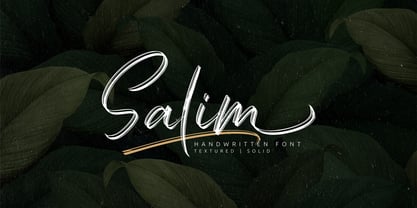 Salim is a handwritten brush font with 2 styles, regular (brush texture) and solid. Salim is perfect for branding, logotype, apparel, T-shirt, Hoodie, product packaging, quotes, flyer, poster. Comes with Uppercase and lowercase characters, Supports international languages, Numerals, punctuations, ligatures, stylistic alternates, and stylistic sets. Accessible in the Adobe Illustrator Glyphs panel, or under Stylistic Alternates in the Adobe Photoshop OpenType menu, Adobe InDesign, Corel Draw, even work on Microsoft Word. Thanks for looking, and I hope you enjoy it! Please don't hesitate to drop me a message if you have any issues or queries.
 - Namira by Omotu,
$12.00 Namira is a modern calligraphy script font. Namira is suitable for branding, logotype, apparel, T-shirts, Hoodies, product packaging, quotes, flyer, poster, advertising, and more. What's Included? 1. Uppercase and lowercase characters 2. Multilingual support 3. Numerals, punctuation 4. Accessible in the Adobe Illustrator Glyphs panel, or under Stylistic Alternates in the Adobe Photoshop OpenType menu, Adobe InDesign, Corel Draw, even work on Microsoft Word. Please message me if you're unsure of any language support. Thanks for looking, and I hope you enjoy it! Please don't hesitate to drop me a message if you have any issues or queries. Omotu Studio