10,000 search results
(0.058 seconds)
- Tolkien Tengwanda Gothic by Deniart Systems,
$15.00A gothic style script based on a writing system devised by J.R.R. Tolkien, also known as the Tengwar of Feanor, used for many languages in Middle-earth. NOTE: this font comes with an interpretation guide in pdf format. - Tolkien Tengwanda Namarie by Deniart Systems,
$15.00A cursive style script based on a writing system devised by J.R.R. Tolkien, also known as the Tengwar of Feanor, used for many languages in Middle-earth. NOTE: this font comes with an interpretation guide in pdf format. - Egizio by Linotype,
$29.99Italian designer Aldo Novarese first created Egizio in 1955. Egizio is a Clarendon-style typeface, based on type fashions that were especially common in Britain during the 19th Century. This font is a popular choice for newspaper headlines. - Old Miami Beach JNL by Jeff Levine,
$29.00 The grandeur of what was Miami Beach had its golden years peak in the 1940s. One of the grande dame hotels that stood at Collins Avenue and 23rd Street was the Roney Plaza; built in the 1920s and demolished around 1969. An online auction offered a pair of gummed labels provided by the hotel to be used by their guests for shipping souvenir packages back home, thus also giving the hotel a promotional plug. Jeff Levine not only created two typefaces from this hand-lettered label - Old Miami Beach JNL and Old Miami Beach Nights JNL (a solid black version), but painstakingly recreated the look of the label for the promotional flag and banner for the fonts.
 - Higakles by Edignwn Type,
$16.00 The font collection is called "Higakles", it is a display font for logotype. These collections contain serif and sans serif font. Every font comes with 4 style typefaces (regular, rounded, rough and stamp). Higakles give more extras 24 mystic and mythology illustrations. This stamp style has unique vintage handmade looks. The Higakles matches apply in some designs such as the logo, poster, label, badge, packaging, t-shirt, branding, quotes and more custom design. Higakles features : 4 style typefaces (regular, rounded, rough and stamp) Uppercase, lowercase, numeral, symbol, punctuation in serif font All-caps, numeral, symbol and punctuation in sans serif font Multilingual PUA Encoded Higakles includes : 9 fonts (serif, sans serif and dingbat) 24 hand-drawn illustrations in dingbat If you have any questions, please contact (edignwn11@gmail.com)
 - Mavblis by Aga Silva,
$34.99 Mavblis fonts have playful and fancy look, which may recall that seen in fifties ads. The look, which is quite bold may well allow for using this font in titles, packaging, or catchphrases. There are also some ligatures and alternates encoded, so you are not stuck with one look in case you require to add some variety to your text. There are over 900 characters in each font, and many languages are served.
 - Teimer Std by Suitcase Type Foundry,
$75.00Typographer and graphic designer Pavel Teimer (1935-1970) designed a modern serif roman with italics in 1967. For the drawing of Teimer he found inspiration in the types of Walbaum and Didot, rather than Bodoni. He re-evaluated these archetypes in an individual way, adjusting both height and width proportions and modifying details in the strokes, thus effectively breaking away from the historical models he used as a starting point. Teimer's antiqua has less contrast; the overall construction of the characters is softer and more lively. The proportions of the italics are rather wide, making them stand out by their calm and measured rhythm. This was defined by the purpose of the typeface, as it was to be utilised for two-character matrices. The long serifs are a typical feature noticeable throughout the complete family of fonts. In 1967, a full set of basic glyphs, numerals and diacritics of Teimer's antiqua was submitted to the Czechoslovak Grafotechna type foundry. However, the face was never cast. At the beginning of 2005 we decided to rehabilitate this hidden gem of Czech typography. We used the booklet "Teimer's antiqua - a design of modern type roman and italics", written by Jan Solpera and Kl‡ra Kv’zov‡ in 1992, as a template for digitisation. The specimen contains an elementary set of roman and italics, including numerals and ampersands. After studying the specimen, we decided to make certain adjustments to the construction of the character shapes. We slightly corrected the proportions of the typeface, cut and broadened the serifs, and slightly strengthened the hair strokes. In the upper case we made some significant changes in the end serifs of round strokes in C, G and S, and the J was redrawn from the scratch. The top diagonal arm of the K was made to connect with the vertical stem, while the tail of Q has received a more expressive tail. The stronger hairlines are yet more apparent in the lower case, which is why we needed to further intervene in the construction of the actual character shapes. The drawing of the f is new, with more tension at the top of the character, and the overall shape of the g is better balanced. We also added an ear to the j, and curves in the r have become more fluent. To emphasise the compact character of the family, the lining numerals were thoroughly redrawn, with the finials being replaced by vertical serifs. The original character of the numerals was preserved in the new set of old-style figures. To make the uppercase italics as compact as possible, they were based on the roman cut rather than on the original design. The slope of lowercase italics needed to be harmonised. The actual letter forms are still broader than the characters in the original design, and the changes in construction are more noticeable. The lower case b gained a bottom serif, the f has a more traditional shape as it is no longer constricted by the demands of two-matrice casting, the g was redrawn and is a single storey design now. The serifs on one side of the descenders of the p and q were removed, the r is broader and more open. The construction of s, v, w, x, y, and z is now more compact and better balanced. Because Teimer was designed to make optimal use of the OpenType format, it was deemed necessary to add a significant amount of new glyphs. The present character set of one font comprisess over 780 glyphs, including accented characters for typesetting of common Latin script languages, small caps and a set of ligatures, tabular, proportional, old style and lining, superscript and fraction numerals. It also contains a number of special characters, such as arrows, circles, squares, boxed numerals, and ornaments. Because of its fine and light construction, the original digitised design remained the lightest of the family. Several heavier weights were added, with the family now comprising Light, Light Italic, Medium, Medium Italic, Semibold, Semibold Italic, Bold, and Bold Italic. - Comicblast by Kustomtype,
$25.00 Comicblast is a comic and hand-drawn font family with a universal and timeless design. The font is inspired by the work of acclaimed Belgian comic artists. The font is unique and helps you to complete your designs with a custom and handmade look. This typeface has six styles, available in regular, medium and bold weights, with italic counterparts, all-in-one style-linked. In short: a complete and affordable package for each designer. Comicblast has smooth and round shapes. It looks friendly and casual, is completely handmade and suitable for comics, logos, titles, package design or wherever you need a fun and warmhearted comic font, for all your fantastic designs! Comicblast is designed by Coert De Decker in 2018 and published by Kustomtype Font Foundry.
 - Zomsenso by Pootis Type Corp.,
$31.99 Zomsenso is an angular, semi-modular typeface that supports OpenType alternates. The angular part means that the entire* font uses only angular segments and shapes. The alternate glyph shapes are under Stylistic Set 01. This font includes Seven Segment display (U+E000 to U+E07F) and arbitrary fractions (U+E1nd, n=numerator; d=denominator) that are mapped to the Private Use Area, so users can easily insert them via Unicode input. You can combine these fractions with the superscript and subscript numerals to create more fractions. This font can be used for essays, signs, logos, posters, commercial projects, videos, and many more. *except the circles in the Geometric Shapes block, which are still round
 - Tolkien Certar by Deniart Systems,
$10.00Based on the more usual pen stroke form of 'runes', (translation of Elvish Certar and Cirth). The richest form was also known as the Alphabet of Daeron. NOTE: this font comes with an interpretation guide in pdf format. - Rahman by Kah Khiong Design,
$13.00 Rahman font is based on the idea of reflecting the personality of the first Prime Minister of Malaysia, Tunku Abdul Rahman in a typeface design. This sans serif font shows the founding father of Malaysia as a modern, simple, open-minded, uncomplicated and straightforward person. The font is suitable for posters, labels as well as book covers and paper printing.
 - Bright Flicks by Nathatype,
$29.00 Bright Flicks is a delightful script font that embodies a playful and whimsical spirit. With its rounded letterforms and charming swings at the ends of some letters, this typeface adds a joyful and lively touch to your designs. The defining feature of this script lies in its rounded shape, which gives the font a friendly and approachable appearance. The letterforms flow smoothly, creating a sense of fluidity and movement. Each letter flows into the next, creating a harmonious and lively composition. The uppercase letterforms are crafted with precision and creativity, maintaining legibility while embracing the playful nature of the font. Adding to its character are the swings at the ends of select letters, adding a touch of playfulness and spontaneity. Bright Flicks captures the essence of creativity and imagination. The rounded shapes evoke a sense of warmth and friendliness, while the swings at the ends of certain letters add a touch of whimsy and fun. This font brings a sense of joy and positive energy to your designs. You can also enjoy the various features available in this font. Features: Stylistic Sets Ligatures Multilingual Supports PUA Encoded Numerals and Punctuations Bright Flicks fits in logos, branding materials, packaging, and any design project that aims to evoke a sense of cheerfulness and creativity. Whether you're working on invitations, greeting cards, posters, or any project that needs a touch of playfulness, this font will bring a vibrant and lively vibe. Find out more ways to use this font by taking a look at the font preview. Thanks for purchasing our fonts. Hopefully, you have a great time using our font. Feel free to contact us anytime for further information or when you have trouble with the font. Thanks a lot and happy designing.
 - Pacific Sans by Holland Fonts,
$30.00The Pacific Sans and the Pacific Serif originated from the Pacific Standard, a space effective type face, especially designed for poster lettering. The implementation of serif strokes in the Pacific Serif and the contrast in vertical and horizontal strokes in the Pacific Sans, gave these fonts a distinct elegance. - Pacific Serif by Holland Fonts,
$30.00The Pacific Sans and the Pacific Serif originated from the Pacific Standard, a space effective type face, especially designed for poster lettering. The implementation of serif strokes in the Pacific Serif and the contrast in vertical and horizontal strokes in the Pacific Sans, gave these fonts a distinct elegance. - Sweet Couple by Krafted,
$10.00 Introducing Sweet Couple - A Calligraphy Font Sweet, lovely and most beautifully crafted Sweet Couple font that can be used on different projects and promotions. Go ahead and use it on your website, for your social media branding, Pinterest banners, printed materials, and more! Inspire and give love to your audience, clients, or guests with this stylish Calligraphy font. What you’ll get: Multilingual & Ligature Support Full sets of Punctuation and Numerals Compatible with: Adobe Suite Microsoft Office KeyNote Pages Software Requirements: The fonts that you’ll receive in the pack are widely supported by most software. In order to get the full functionality of the selection of standard ligatures (custom created letters) in the script font, any software that can read OpenType fonts will work. We hope you enjoy this font and that it makes your branding sparkle! Feel free to reach out to us if you’d like more information or if you have any concerns.
 - Chayton by Jorsetype,
$16.00 Chayton is the font style handmade dancing and then live trace to have unique, the writing style is very natural. Chayton works great in any branding, logos, magazines, films. The different weights give you a full range of whole hosts of applications, while the outlined fonts give a real modern feel to any project. Chayton also comes with extra Extruded and Outline Font versions. as a function to create an extrusion effect for this font. The Features of this fonts is; Standart ligatures, Stylistic Alternates, Stylistic sets, PUA Unicode (Private Use Areas), OpenType features can be accessed by using OpenType smart programs such as Adobe Photo Shop, Adobe Illustrator, Adobe Indesign, Corel Draw and Microsoft Office.. can also be accessed through the character map.
 - FG Well Well by YOFF,
$13.95 Here you have the FG Well well font who's a scribbling man in the 40+ years who's in a terrible rush.
 - Figgins Sans by Shinntype,
$79.00 The first sans serif types were made in London in the early 19th century. They were severely modern, all caps and bold. The Figgins foundry, inventor of the term sans serif, showed a ?ne example in its specimen of 1836. The extra bold weight of Figgins Sans is a close revival of the original, with the addition of a lower case which retains its partly geometric, partly grotesque quality. The family is rounded out with other weights and an italic, and extended into Cyrillic and Greek, all executed in what is assumed to be as authentic a manner as possible, given the hypothetical nature of the exercise. Together with Scotch Modern, comprises The Modern Suite of matched fonts.
 - Alpha Juliet by Wiescher Design,
$39.50 Alpha Juliet is another font in my alpha-series, the experimental font series. It lends itself to modern designs in all forms. The font can be used together with Alpha Papa since it has the same origins. Your experimental designer, Gert Wiescher
 - Bitmap by Tipos do aCASO,
$22.90Building a modular digital typeface is like playing with the pieces of a Lego. Possible combinations are induced by the shapes of the pieces. All designers must have tried something like this once. Bitmap is a simple unpretentious font. It is the first pixel font made by the Brazilian typeface designer Buggy in 2001. - Tasneem NF by Nick's Fonts,
$10.00The pattern for this elegant, if slightly quirky, Art Deco typeface was drawn by Gustav Jensen for the 1931 classic, American Alphabets. Perfect for suggesting the exotic, the font also includes several graphic elements in Jensen’s inimitable style. Both versions of the font include 1252 Latin, 1250 CE (with localization for Romanian and Moldovan). - Jacob Graffiti by Quatype,
$15.00 Jacob Graffiti is a font inspired by graffiti. In order to reflect the feeling of spray paint, the beginning or the end of the characters show a sense of stroke. When designing this font, to add some fun, a pictorial ligature was specially designed: jacob. And it's on the smile face Unicode block too.
 - Nimrod Paneuropean by Monotype,
$92.99Nimrod was released by Monotype in 1980. Designed for current newspaper technology, the Nimrod font family evolved as a result of extensive examination of newspaper industry needs. Nimrod retains many of the features of the traditional newspaper Ionics, but some of the fussier detailing has been replaced by the more sober forms of the old styles, such as Plantin. A highly legible font family, especially in smaller sizes, its clear unambiguous character shapes make easily readable blocks of text. Nimrod also withstands the degradation encountered in newspaper production and printing. First used for body text in the Leicester Mercury newspaper, the Nimrod font family has subsequently become a popular choice in newspapers for text and headlines. - Linotype Afroculture by Linotype,
$29.99Like the name suggests, the pi font Afroculture from typeface designer Boule Yvan depicts symbols and figures from African folk art. Stylized masks with different expressions and a number of sculptures lend variety to this font. The figures are consciously simple but shown from different perspectives. The black and white surfaces contrast with another and suggest the interplay between shadow and light. The figures of Afroculture are perfect for illustrating texts in a related context and their details come through best in larger point sizes. - Dulcinea Serif by JVB Fonts,
$29.50 The aim of this typeface is to merge two historical moments in the form and style of writing, on the one hand calligraphy uncial, and on the other Roman serif was established as a universal standard for type fonts continuous text at the time. Is intended in terms of their functionality as a font for titles. The family includes some extended range glyphs as several Caps swashes and stylish alternatives for upper and lower case, standard and discretional ligatures, old numerals and other OpenType features.
 - Evergreen by Sudtipos,
$39.00 Evergreen is Koziupa and Paul going all Zeitgeist after a few Malbec drinks. Two fonts praise nature from when the lights go out to the crack of dawn, and vice versa. That's 24/7/365 of wild leafy Kumbaya. Even butterflies and flowers were mystified so much they had to get in there. Evergreen is local, organic, and certified free trade. At some point we wrote down the name of the jungle where it originated, then lost the parchment in the hot springs a few hours later. But that's immaterial. Crank up your Deep Forest sound, prep your Earthtone and Foliage palettes, and get into the big herbal.
 - Leronda by Larin Type Co,
$16.00 Leronda is an awesome font that can look austere and classic or vintage and softer and more pliable thanks to alternatives. They will add charisma, diversity to your project and emphasize your brave decision. Also lowercase ligatures are included in this font, use them and it will also show your personality. This font is quite heavy weight and is perfect for creating logos, headlines, advertising, branding, book covers and magazines, and much more. Use it in headings and text to highlight important information. This font is easy to use and has OpenType features.
 - Cologics by Allouse Studio,
$16.00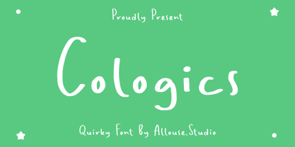 Cologics a Quirky Font which will give you mood impression.. Cologics wome along with Multi-Lingual Support to fulfill your need. We highly recommend using a program that supports OpenType features and Glyphs panels like many of Adobe apps and Corel Draw, so you can see and access all Glyph variations. Cologics is perfect for any tittle, lyrical video music, logo, product packaging, branding project, megazine, social media, wedding, or just used to express words above the background. Enjoy the font, feel free to comment or feedback, send me PM or email. Thank You!
 - Metrolox - Unknown license

- Maebashi by CBRTEXT Studio,
$20.00 Maebashi is a display font in Japanese style. This font comes with a Japanese feel and you can feel it every time you use this font. It's the perfect font for multipurpose projects like logos, branding, posters, headlines, and more (especially for Asian-themed projects).
 - Grafista by Scannerlicker,
$44.00 Grafista is an extrapolation on what fonts are used for: in spite of the possibility to use it for setting text, Grafista strives when used as a texture library, the same way that one would set up tiles. Thus, Grafista was built as two different things compiled in the same font: the letterforms (for setting text) and the texture library. Both of the sets are monospaced (with every glyph having the same width), but the letterforms are half of the texture tiles' width. On the tech side, the letterforms are 500/1000 UPMs, while the tiles are 1000/1000 UPMs.
 - Bathysphere by Kickingbird,
$24.00 This steam era typeface, created by Gustav Schroeder in 1884, found popular use on soap box labels and tobacco tins during its initial release. Then, later, a successful and stout revival of Gustav's face, named Othello, was carried out by Morris Fuller Benton in 1934, and the typeface's appeal widened to include items such as broadside posters featuring Boris Karloff's Frankenstein. After metal gave way to film type, Gustav's creation experienced a brief fashion moment in the 1960's, but then disappeared entirely, never re-surfacing as a full digital typeface. With the release of Bathysphere, the typeface comes full circle, having been completely redrawn from scratch using Gustav's original specimens. The new extended language support establishes the typeface firmly in the modern era, while Bathysphere's refinement of subtle blunt corners restores a deep-sea grace to this iron giant.
 - Rockwall NF by Nick's Fonts,
$10.00 Two offerings from the Page specimen book, Aldine and Aldine Extended, provided the patterns for this family of Western-style standards, named for the smallest county in Texas, at least area-wise. Both flavors of this font feature the 1252 Latin, 1250 Central European, 1254 Turkish and 1257 Baltic character sets.
 - Really Big Shoe NF by Nick's Fonts,
$10.00This quaint headline typeface is based on an offering from the Cleveland Type Foundry, originally named Oxford. The centered small caps treatment makes for unusual and alluring headlines. All versions of this font include the Unicode 1250 Central European character set in addition to the standard Unicode 1252 Latin set. - Nanuk by Hanoded,
$15.00 Nanuk in the Inuit language means polar bear. My 2 year old son's favorite animal is the polar bear and he loves to watch the 'Earth' DVD. Nanuk font is an all caps, outlined affair, ideal for use in posters and covers. It comes with a bear-load of diacritics!
 - Fierro by Los Andes,
$16.00 Fierro is a heavy-geometric-retrofuturistic typographic construction that, without any curve, still retains good legibility. These shapes are based on great bended metal pieces, which represent its name, meaning "hardware store". It has been designed to be used in large sizes and for designs with character that look to create a strong visual block. Designed by Jko Contreras.
 - SF Mabsut by Sultan Fonts,
$19.99 Sultan-Mabsut, designed by Sultan Maqtari in 2018, is an Arabic typeface in the style of Maghribi (Moroccan Mabsut). This style, which originated in western North Africa, is characterized by a strong baseline and long, fluid, and curvaceous curves. It can be used in headlines or in text and gives a very fresh and calligraphic look. The font combines two methods of writing at one time (writing oriental and writing Moroccan). It also includes lots of Stylistic Alternates.
 - Daymore by Rillatype,
$15.00 Introducing, Daymore Font duo! Daymore is a duo font that complements each other. By using Daymore, you can simply use one font family without thinking about other fonts to complete the design you need. In the process of making this font, I was careful in choosing what font concept would be able to complement a bold sans serif font so that it could be balanced so that it would produce a blend of firm and strong sans serif fonts, as well as handwritten fonts that flowed naturally. The Daymore font duo is perfect for use as wedding invitations, branding, logos, etc.
 - Hardy Har Har NF by Nick's Fonts,
$10.00In their circa 1900 specimen catalog, Barnhard Brothers and Spindler called this typeface "Samoa", suggesting exotic locales. On the other hand, it also suggests some serious fun, and is named in honor of British artist Dudley Hardy, whose posters used a very similar typeface extensively. Both versions of this font include the complete Unicode Latin 1252 and Central European 1250 character sets. - Turtellini NF by Nick's Fonts,
$10.00This quirky little number is based on a typeface originally named Turtle, which made a very brief appearance in Letraset's product line catalog in the 1970s. Admittedly, its uses are limited, but its cryptic and playful nature will reward those with imagination. Both versions of this font include the complete Latin 1252, Central European 1250 and Turkish 1254 character sets.
