10,000 search results
(0.062 seconds)
- Schoeffer by Proportional Lime,
$14.95 Peter Schoeffer was a printer who was apprenticed to Gutenburg and after leaving Gutenburg in 1455 he set up shop with Facob Fust. His son, Peter the Younger, moved to Mainz and carried on the trade. This particular font is based on a typeface of Peter the Younger that was cut circa 1509-1520. This font has over 900 characters. While there are only about 80 in the historical exemplar the rest have been developed for modern usage. This font is based on Typ.7:146/148G also known as Gesellschaft für Typenkunde plate no. 258.
 - Ardenwood by Scriptorium,
$18.00Ardenwood is based on a wood-carved alphabet from the early 1500s. It features gothic characters with elaborate floral decorations. The lower case has the more basic versions of the letters while the upper case characters are more extensively decorated. - Alvia by Zane Studio,
$12.00 Alvia is a clean, modern script font that is carefully crafted with a touch of elegance. This font can be used to write letters, invitations, food products, headlines and more. It will turn any creative idea into a true work of art!
 - Boomboyah by Letterara,
$10.00 Boomboyah is a natural dry brush font. This font has a striking look and a good flow that can add a stylish touch to your designs. It’s perfect for logos, quotes, posters, for clothing, and every other design which needs a unique touch.
 - Higher Jump by Letterara,
$14.00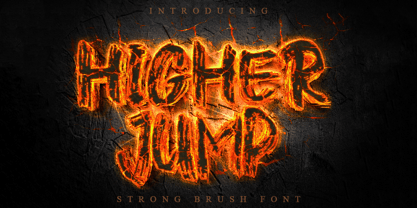 Higher Jump is a natural dry brush font. This font has a striking look and a good flow that can add a stylish personality to your designs. It’s perfect for logos, quotes, posters, clothing, and any design which needs a strong touch.
 - Dreaming Outloud by My Creative Land,
$15.00 Say hello to a casual handwritten font family - Dreaming OutLoud. 8 handwritten typefaces made to complement each other in the best possible way. They are easy to use and perfect for expressing your thoughts, posting quotes and simple daily updates on social media. The font package is complemented by more than a 100 transparent background marker lines (easy to change color!) - to emphasise what you are saying :) - and dingbats & doodles font. Two sub-packages included: Elementary package. Use this one if you primarily work in Canva/Cricut and similar applications and don’t want to deal with OpenType features of the PRO fonts. To access alternates - simply change the font to it’s ALT version. Voilà. You can use these fonts on your iPad in Procreate app! Charged package. You need this one if you feel comfortable with OpenType features, if you work in Adobe Suite and similar applications that have OpenType panel to access OT features. You can use these fonts in Canva-like applications as well - they are fully unicode mapped. Contact me with your MyFonts order # to get a free bonus - more than a 100 "Marker selection lines" in png and psd
 - Butt Smuggler by Buttfaces,
$18.00Buttsmuggler is a light-hearted puffy font, good for a cartoon-like or casual hand-drawn look. - Jeeks by Oleg Stepanov,
$12.00 Jeeks is a simple hand made font, good for children and comic books, cartoons, posters and games.
 - Arrow Hero by Alit Design,
$21.00 Introducing "Arrow Hero" - A Typeface of Elegance and Adventure Unleash the power of elegance and adventure with our latest font creation, "Arrow Hero." This unique serif font seamlessly blends the mystique of archers, the allure of elves, and the boldness of superheroes. Crafted with precision, this font is more than just letters; it's a journey into a world where every curve and angle tells a story of heroic feats and enchanted realms. Key Features: Elegant Serif Design: The Arrow Hero font boasts a sophisticated serif style that adds a touch of refinement to your projects. Each letter is meticulously crafted to exude an aura of strength and grace, perfectly suited for a variety of design applications. Illustrated Elements: Dive into the fantastical with Arrow Hero's unique illustrations. Arrows gracefully adorn each character, symbolizing precision and direction. Delicate elf ears and majestic wings enhance the overall aesthetic, creating a harmonious balance between the worlds of archers, elves, and superheroes. Versatile Usage: Whether you're working on branding, book covers, invitations, or digital designs, Arrow Hero is a versatile font that adapts to various contexts. Elevate your projects with a touch of magic and heroism that this font effortlessly provides. Tailored for Storytelling: Arrow Hero is not just a font; it's a storyteller. Use it to bring narratives to life, creating visual experiences that resonate with the mythical and the extraordinary. Let the characters on your screen or page become heroes in their own right, guided by the elegance of Arrow Hero. Multiple Styles: The font comes in various styles and weights, allowing you to express different moods and atmospheres within your designs. Whether you're aiming for a bold statement or a subtle enchantment, Arrow Hero has the right style for you. Elevate your design projects to new heights with Arrow Hero, where the elegance of serif meets the magic of arrows, wings, and elf ears. Download this font today and embark on a design journey that transcends the ordinary, celebrating the hero within every letter.
 - Hexa by Hexa,
$19.00 The font HEXA is inspired by the Hexagon. The HEXA fonts are dynamically and uniquely designed typefaces based on the grid systems of the hexagon that extends infinitely. From this image, we have created the HEXA font. Hexa is Latin-based and a completely crafted font that consists of 3 typefaces. Each typeface contains 190 sets of characters. This font family is in all-caps fonts, and we provide different styles of uppercase and lowercase glyphs with the exception of letters c, ç, and comma/ single low-9 quotation mark. In lowercase glyphs, we emphasize the image, character, and identities of Hexa. The font family includes regular, black, and thin. We created the witty expression with Hexa’s regular identity; thin emphasizes the lines; black fills in the blanks. Hexa is a monospaced fonts. So kerning is not applied. We recommend using our fonts for big-sized uses. This typeface is a display font and looks more attractive in larger formats than on main texts. Features: -190 characters -Monospaced fonts -All-caps fonts (different styles provide uppercase and lowercase)
 - Crique Grotesk by Stawix,
$25.00 This contemporary typeface is inspired by the neo-humanist and geometric industrial tones presented in late 2000s typefaces. The font family is also composed of the normal width and display width in order to support different applications in delicate designs.
 - Bodoni Classic Inline by Wiescher Design,
$49.00 Bodoni Classic Inline is a very elaborate extension of my Bodoni Classic family. The font has 5 different swashes for each capital letter, diverse swashes for lowercase letters and a full set of ligatures, oldstyle and normal numerals, all together 669 glyphs. This Inline font is good for all kind of official looking documents and of course goes together well with my forever growing Bodoni Classic family. Your Bodonian type-designer Gert Wiescher
 - Swaziland by Get Studio,
$15.00 Introducing... Swaziland Modern Calligraphy Font! For those of you who are needing a touch of elegance and modernity for your designs. This font is particularly well-suited to create the most lovely wedding designs, invitations, mood board, social-media template or for your editorial design needs. Swaziland comes with more than 430 glyphs, includes beginning and ending swashes, alternate swash characters, uppercase and lowercase letters, numerals, and a large range of punctuation.
 - Bashington by Motokiwo,
$15.00 Cute and sweet script font, this is Bashington. The expression of a sweet personality delightfully presented by Bashington, lets you transform type into an exciting and beautiful piece of work. It works perfectly for weddings, food, e-commerce brands, trend blogs, boutiques or any business that wants to appear upscale and sweet. Features: Uppercase & Lowercase Standard Ligatures Numerals & Punctuations (OpenType Standard) Multilingual characters (AÀÁÂÃÄÅÇEÈÉÊËIÌÍÎÏNÑOØÒÓÔÕÖUÙÜÚÛÝŸÆŒß) PUA Encoded
 - Widdershins by Hanoded,
$15.00 I like strange words. Widdershins is one of them: it means ‘to go counter clockwise’ and I picked it up from a book I am reading at the moment. Widdershins font was created using a broken bamboo satay skewer and Chinese ink. It is a little messy, uneven and maybe even unnerving, but I am sure you’ll find a way to put it to good use.
 - Bangel by Art Grootfontein,
$19.00 Bangel is a contemporary display font family with a strong personality. The eye-catching letter design is quite geometric, but also pretty expressive and fun. It supports broad latin languages and comes with 4 styles + a special free Wave bonus. Bangel is a pretty good choice for logotypes, branding, headlines and posters. This typeface is also a powerful option for use on social media, web & UI design.
 - Fluze by CozyFonts,
$20.00 The Fluze Fonts This is the 21st font release from CozyFonts Foundry, a California Font Foundry established in 2011 with it’s first Official Release in 2012 with the Aladdin Bold Family. Inspirations for the design of this font family, by California Graphic Designer/Illustrator/Font Designer Tom Nikosey, is based on the wacky, weird & quirky films that have graced the screen with their offbeat styles and characters. Movies that come to mind are Mary Poppins, Beetlejuice, Wizard of Oz, Edward Scissorhands, Alice in Wonderland, Little Shop of Horrors, Addams Family, Labyrinth, Ghostbusters, etc. The absurd, the sublime, the animated, the scary, and the illustrated are all descriptors to define the possibilities Of the many uses and applications of Fluze and Flute Outline as presented in a sampling of the posters here. The intentional crooked hand drawn’ glyphs and extras lend their personalities to create this effect. Whether in black, white & grays or psychedelic color combos, Fluze can be comical, frightening and Downright irreverent. This font works as main titles, end titles, branding, signage, numeric displays and even logotypes and monograms. Have fun and let your inner cartoonist inspire.
 - Benton Sans RE by Font Bureau,
$40.00 A redesign of drawings of News Gothic from the Smithsonian, Cyrus Highsmith and the Font Bureau studio created Benton Sans, one the most popular and versatile families in this genre. This version of the family is part of the Reading Edge series of fonts specifically designed for small text onscreen, having been adjusted to provide more generous proportions and roomier spacing, and having been hinted in TrueType for optimal rendering in low resolution environments.
 - Kochire by Grontype,
$10.00 About the Product : Richest is a very attractive display font, each Fonts has its own uniqueness, is made with great care to produce a good work. Richest font can be used to make flyer banners title, logo, Book or magazine header. it also can be used for product branding Features : Kochire All Character Ligature Alternate Character Multilingual Support
 - Nvma Titling by Stone Type Foundry,
$49.00 Nvma is based on Roman letterforms which appeared during the period from the earliest extant examples in the sixth or seventh century BC until the end of the third century BC. For Nvma the J, U and W had to be fantasies as they did not exist until much later, similar to the G, numerals and other non-alphabetic signs in the font. Thus not all of the archaic forms are represented in Nvma. Nvma was designed to work with Magma, as it matches the weights and heights for Magma Thin and Magma Titling Thin.
 - Mundo DemiBold by Type-Ø-Tones,
$40.00 Mundo DemiBold is the perfect counterpart of the Hannover Modern, the other Javier Mariscal typeface in our catalogue. This nice font belongs to a series of drawings used in the Señor Mundo comic strip of the nineties.
 - Signsurfers Script by Learning Kiddos,
$18.99 Signsurfer is a unique retro font - a signpainter font, handwritten by me. Inspired by the golden ages of handlettering, this script font highlights: - a bouncy baseline - tight spacing - and full Latin support --- Lots of really cool catchwords & shapes (you will get all the catchwords & shapes seen in the preview pics), five alternates and 37 ligatures help you to really get creative with this one. --- What you can use it for: - branding - logotype - poster - t-shirt designs - all kind of labels - greeting cards - wedding invitations ...and so much more --- This font also works great as a running text, too. = ) --- Process behind it: first I drew all of those fancy letters & catchwords with a brush on paper. I then carefully traced all of those letters & catchwords in Illustrator and transferred them into my Font Creator program. This helped getting the unique sign painters flow. --- Note: You will a need program that support OpenType Features for accessing the alternative glyphs.
 - Nebora by Product Type,
$15.00 Nebora is a typeface that makes a big statement with clean, basic lines and an emphasis on negative space. This geometric style font is excellent for magazine headlines, product packaging, posters, and more, and is inspired by the magnificent beauty and fresh air of the Arctic. In lowercase, Nebora is charming and charismatic; in capital letters, she is sophisticated and authoritative. The humanist feel adds warmth, while hard lines and sharp edges flow into the smooth rounded curve of the letters. To develop a typography-focused design that really jumps out, try it in 16 weights, including obliques. of course, your various design projects will be perfect and extraordinary if you use this font because this font is equipped with a font family, both for titles and subtitles and sentence text, start using our fonts for your extraordinary projects.
 - Liturgisch by Lamatas un Slazdi,
$19.00 Liturgisch was created by Otto Hupp for Klingspor foundry in 1906. The basis of this font is a publication in the magazine "Das Plakat" of October 1921. The font contains contextual alternates, ligatures, discretional ligatures for use in German, ornamental bullets and other OpenType features. It supports all the European languages using Latin alphabets (including slashed S and slashed longs used in Latvian old orthography till 1930s).
 - NOW YOU SEE ME - Personal use only

- Only Fools & Horses - Personal use only

- LIGHT EMITTING DIODES - Personal use only

- Fulcanelli by Illuminaut Designs,
$10.00 A clean and balanced humanist grotesque. Like many an alchemical process, this font had to be designed and redesigned from the ground up many times. Each time it blew up in the designer's face until finally the conditions and process were in perfect alignment and this new font was born.
 - Maya Month Glyphs by Deniart Systems,
$15.00 Contains the 19 months of the Maya solar year (in outline and silhouette mode) as well as the 19 Maya numerals. NOTE: this font comes with an interpretation guide in pdf format.
 - Wade Sans Light by ITC,
$29.99Wade Sans Light was designed by Paul Hickson and Key Characters and appeared in the ITC library in 1990. The basic forms of the font are those of a constructed sans serif, as seen in the circular O and triangular A. The low x-height of the lower case letters make this font particularly reserved and graceful and the high ascenders give it a certain elegance. The high, wide capitals need a lot of space and dominate the overall look of this font. Wade Sans Light is reminiscent of the elegant cabarets of the 1920s and 30s. - Cowboya Tuscan by deFharo,
$15.00 Cowboya is a typography with concave Tuscan serif very contrasted and modernist inspiration with letters in small caps, includes 4 versions of the font that can be used by superimposed layers which results in multicolored typographic titles. For the design of this typeface I was inspired by the credit titles used in the black film directed by Frizt Lang in 1950 called "The House of the River", to the drawing of the original forms of the letters i added decorative elements to give the fonts a festive character, traditionally this type of decorative fonts that emerged in Italy in the nineteenth century were used in large headlines and posters that were closely related to circus shows, carnival or environments of the Far West American. I have also rounded the sharper joints of the antlers and counterforms to create a contrast with the sharp Tuscan serifs which brings a modern background of retro inspiration and soft shapes.
 - Suboel by Subtitude,
$- This bitmap font is made of 97 icons to use to express this time of the year... You will find christmas tree, Santa, cake, stars, gobelin, and a lot more. They work well for background tiling, just as symbols, or for anything else. We hope you like them ! Best size in bitmap is 20pt.
 - Vtc-NueTattooScript - Personal use only

- VTC-KomikaHeadLinerChewdUp - Personal use only

- Ciseaux Matisse by Harald Geisler,
$65.74 Ciseaux Matisse was inspired by the exhibition Drawing With Scissors, which I visited at the Kunsthalle Schirn in my hometown of Frankfurt am Main in 2003 and the book Jazz published in 1947 by Henri Matisse. Admittedly, before that time I wasn’t a fan of Matisse’s work, neither his late nor the early work. That definitely changed after the exhibition. While his motifs have been overused on postcards and mouspads, in front of the originals you forget those tiny pictures. Some of the works were massive—larger than 24ft. By cutting directly into the color Matisse created shapes with strong dynamics. Years later, in 2007, I used that inspiration to cut an exclusive font for a newspaper that I designed at that time (see Gallery Pictures). Later I developed that font into the four styles featured here. The cut-out style is a paper cutout; boxed is the paper background. Both linear and boxed linear have no curved outlines, so they are more aggressive. As drawing with scissors implies, all characters are cut by hand. With only uppercase letters, this font is designed for editorial use: headlines, slogans in ads, or musical usage in posters and flyers that need the little touch of the jazz scissors. In special cases the lowercase letters contain alternate shapes to the uppercase forms.
 - Munchkin Land NF by Nick's Fonts,
$10.00This typeface bears a superficial resemblance to Belwe Extrabold, but is based on a work called Thor, issued by Frederic Wesselhoeft Ltd of London in the 1930s. The characters in this font are loosely spaced for use in attention-getting subheads, but you can tighten the tracking to get spectacular headlines, should you wish. Both versions of the font include 1252 Latin, 1250 CE (with localization for Romanian and Moldovan). - Worstveld Hand by Typotheticals,
$5.00 A rough hand-drawn plain sans serif that would be good for non-formal use. Do not expect a polished set of fonts from a professional, this family is hand drawn, hand spaced and hand kerned.
 - Eckmann by Linotype,
$29.99The font Eckmann is named after its designer, Otto Eckmann, and appeared with the Klingspor font foundry in 1900. The influence of the Jugendstil is clear to see in the flowing floral contours of the letters. This font was made for larger point sizes, like on posters, and while relatively legible, it is not meant for smaller print. The font was often used in book titles and advertisements of the 19th century and today Eckmann is often used to suggest a feeling of nostalgia and is often found on the Jugendstil facades in Germany, Austria and Switzerland. - Gutenberg A by Alter Littera,
$- This is a free abridged edition of the full-featured Gutenberg B and Gutenberg C fonts. Although (as the name suggests) it was originally conceived as the first release in the B42-type series, it actually represents the colophon to this series. In addition to having a narrower scope, the font differs from its full-featured predecesors in both letter and word spacing, as well as in glyph design, using exclusively straight lines for every glyph and providing a significantly rough appearance at medium to large point sizes. The font includes the usual standard characters for typesetting modern texts, as well as a few special characters, alternates and ligatures that can be used for typesetting nearly as in Johann Gutenberg’s 42-line Bible and later incunabula. Please note that the use of this free font is subject to the same terms and conditions as those for Alter Littera’s pay fonts. Specimen, detailed character map, OpenType features, and font samples available at Alter Littera’s The Oldtype “Gutenberg A” Font Page.
 - Hokuba Grabs by Afkari Studio,
$15.00 Hokuba Grabs - New Fun Display Font Hokuba Grabs is a New display font that creates with a very good concept and adjusted well to keep the legibility. Hokuba Grabs Display Font Comes with upper and lowercase Standard Characters, Punctuation, Numerals, And other Glyphs variation of the OpenType features/ Ligatures. Hokuba Grabs Display Font is suitable for logos, posters, school flyers, university banners, modern advertising design, product labels, cartoons, comics, kid books, custom mugs, pillows, t-shirts, youtube thumbnails/covers, subtitles, poster quotes, editorial design, book/cover Title, website/blog, social media post, packaging designs, and other designs. Features; - 2 Styles; Regular and Outline - Special Alternates - Uppercase, Lowercase, Number, and Punctuation - Works on PC & Mac - Simple installations - Accessible in Adobe Illustrator, Adobe Photoshop, Adobe InDesign, even work on Microsoft Word - Fully accessible without additional design software. - Mültîlíñgúãl Sùppört for; ä ö ü Ä Ö Ü ß ¿ ¡ Hope you enjoy our font and this font is useful font for your projects!


