10,000 search results
(0.045 seconds)
- Cambourne by Studio K,
$45.00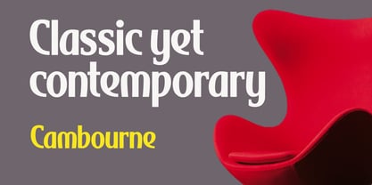 Classic yet contemporary, Cambourne is a crisp, curvaceous and timelessly elegant display font ideal for branding or promoting luxury goods.
 - Wald by Volcano Type,
$19.00A font completely made of nature elements. Pieces of wood, branches and leaves. Do not go limp, use Wald instead! - Gruyere by Atlantic Fonts,
$26.00 Gruyère is rich with character and always in good taste. Earthy and assertive, Gruyère adds distinctive flavor to every occasion.
 - Tattoo God by Forberas Club,
$16.00 Tattoo God font is good to application for tattoo artist logo, vintage style, and black letter style and many more.
 - Portuguesa by Sudtipos,
$49.00 Inspired by the graphic spirit of old packaging and store signs of Portugal, this font seeks to transmit the warm and sunny sound of Portuguese language in a visual way. Portuguesa has 3 partners, designed to work nicely together and to complement one with each other. Portuguesa Script, with friendly and rhythmic personality, great for titles and short text, Portuguesa Caps, with small caps and ligatures that perfectly match (and contrast) with the script version. And Portuguesa Icons, that recalls the legendary blue tiles. This last version was specially designed to mix signs up with delightful combinations for creating patterns, borders, stationary, tableware and all kind of commercial products and projects that needs a memorable strike. The possibilities are numberless. As a mantra, Portuguesa is always in a positive mood, spreading the “Portuguese art of welcoming people”. Seja Bem-Vindo!
 - Leather by Canada Type,
$24.95 Over the past few years, every designer has seen the surprising outbreak of blackletter types in marketing campaigns for major sports clothing manufacturers, a few phone companies, soft drink makers, and more recently on entertainment and music products. In such campaigns, blackletter type combined with photos of usual daily activity simply adds a level of strength and mystique to things we see and do on a regular basis. But we couldn't help noticing that the typography was very odd in such campaigns, where the type overpowers all the other design elements. This is because almost all blackletter fonts ever made express too much strength and time-stamp themselves in a definite manner, thereby eliminating themselves as possible type choices for a variety of common contemporary design approaches, such as minimal, geometric, modular, etc. So extending the idea of using blackletter in modern design was a bit of a wild goose chase for us. But we finally found the face that completes the equation no other blackletter could fit into: Leather is a digitization and major expansion of Imre Reiner's forgotten but excellent 1933 Gotika design, which was very much ahead of its time. In its own time this design saw very little use because it caused problems to printers, where the thin serifs and inner bars were too fragile and broke off too easily when used in metal. But now, more than seventy years later, it seems like it was made for current technologies, and it is nothing short of being the perfect candidate for using blackletter in grid-based settings. Leather has three features usually not found in other blackletter fonts: - Grid-based geometric strokes and curves: In the early 1930s, blackletter design had already begun interacting back with the modern sans serif it birthed at the turn of the century. This design is one of the very few manifestations of such interaction. - Fragile, Boboni-like serifs, sprout from mostly expected places in the minuscules, but are sprinkled very aesthetically on some of the majuscules. The overall result is magnificently modern. - The usual complexity of blackletter uppercase's inner bars is rendered simple, geometric and very visually appealing. The contrast between the inner bars and thick outer strokes creates a surprising circuitry-like effect on some of the letters (D, O, Q), wonderfully plays with the idea of fragile balances on some others (M, N and P), and boldly introduces new concepts on others (B, F, K, L, R). Our research seems to suggest that the original numerals used with this design in the 1930s were adopted from a previous Imre Reiner typeface. They didn't really fit with the idea of this font, so we created brand new numerals for Leather. We also expanded the character set to cover all Western Latin-based languages, and scattered plenty of alternates and ligatures throughout the map. The name, Leather, was derived from a humorous attempt at naming a font. Initially we wanted to call it Black Leather (blackletter...blackleather), but the closer we came to finishing it, the more respect we developed for its attempt to introduce a plausible convergence between two entirely different type categories. Sadly for the art, this idea of convergence didn't go much further back then, due to technological limitations and the eventual war a few years later. We're hoping this revival would encourage people to look at blackletter under a new light in these modern times of multiple design influences.
 - Sugarbang by astroluxtype,
$20.00 The 1960’s and 1970’s are the inspiration for Sugarbang! Everything from music packages, beach party movies of the 60’s to cereal box art of the 1970’s are reflected in the kooky style that this font evokes. Sugarbang! is built on a random baseline so letterforms bounce up and down adding to the “zany” look of the design. Look to the second font, Koo Koo Puff, to be the next release in the Cerealboxx collection. Available now. It is a minimal font set which includes uppercase and lowercase letterforms. Suggested uses for the font would be above 42 points in size. Please note its normal tight spacing and that cap “T” and cap “L” have been specially kerned to account for the overhang of certain other letterforms. Sugarbang! - just add milk and it’s sugar frosted font goodness.
 - Freigeist by René Bieder,
$29.00 The story of Freigeist is a journey into the past, back to the early grotesk fonts and long before Helvetica and Co were standard fonts in operating systems. For what we take for granted today is the result of innovation and pioneering spirit of type foundries such as Caslon or Stephenson Blake in the 19th century, whose expressive designs are mostly forgotten today. The Freigeist family captures this untamed spirit — hence the name (German for “free spirit”) — and puts it into a contemporary context, resulting in a multi-faceted family with a wide range of applications, font styles and features for modern typesetting. Design Details Unlike other modern grotesk typefaces like Helvetica or Univers, Freigeist is characterized by a warm and dynamic appearance. It draws inspiration from various historical models such as Caslon’s Doric or the Grotesque variants of Stephenson Blake. Particularly noticeable are the narrow terminals, the serpentine S or the dynamic g in combination with ascenders that reach to the cap-height only. Italics Many italic grotesk fonts are strongly oriented towards their upright counterparts. Unfortunately, this often means that they cannot do justice to their actual task, which is to highlight words or sections of a text. The italic cuts of Freigeist try to remedy this situation by using the greatest possible formal distance while reinforcing the untamed spirit. What adds to this, is a reminiscent of handwritten forms, which can be found in a, n, y or g, as well as the German sharp s or the ampersand. Alternate Characters Alternative letterforms are ideal for customizing the overall appearance of a text, for usage in logos or they can even work as custom fonts for companies. Freigeist comes with ten stylistic alternatives that are easy to insert via the Opentype window, such as the single-storey a, a tail-less version of the a for compact text, when uses in condensed widths or a dialed down version of the r. Languages Freigeist has a built-in support for Latin and Cyrillic based languages and covers more than 210 languages. Opentype Features and Symbols The family comes with many opentype features to support modern typesetting. This includes ligatures, different number sets or alternative shapes for texts set in all caps. Styles Freigeist is available in five widths (XCon, Con, Normal, Wide, XWide) and six weights (Thin, Light, Regular, Medium, Bold, Black). Including the accompanying italics, the family comes in 60 cuts that are suitable for any application. Testfonts If you like to test the fonts before buying the full version, please follow the link below: https://www.renebieder.com/test-fonts Update 1 A lot has changed in this first update. It is more than just a 1.01 or 1.02. It is actually the 2.0! I’ve gone through all! single glyphs of the 18 master files, making the family more sharp and even a bit more modern. I’ve added some new opentype features and redesigned the italics, because I wasn’t happy enough with the result. I’ve added new kerning pairs, new metrics, and even new glyphs. Please check my website for more details on the new design and overview about the opentype features and alternate shapes. If you purchased the Freigeist family already, thanks a lot!! It is the most advanced family that I published so far. I hope that you’re happy with this new version. Thanks!
 - In a Jar by Latinotype,
$29.00 In a Jar is a display typeface based in hand lettering. Inspired by the grandmother's kitchen, its colors, forms, smells and the new way for rescue this old things. Designed for use in short text and big sizes is perfect for brand design, headlines, labels, greetings cards and all kind of things related to kitchen and foods. In a Jar is a sweet little family that include alternates, compounds words, ligatures plus a serie of dingbats and ornaments very cute to compliment and accentuate the handmade design. Try and enjoy all fun in a jar! Designed by Coto Mendoza with technical support of Luciano Vergara.
 - Andalia by Arterfak Project,
$30.00 Introducing Andalia, the romantic script typeface, that is modern, casual, and elegant. Created with slanted strokes, and a clean ornament that visualizes the more dramatic typographic looks. Andalia is ready to play with you. It comes with hundreds of alternates characters and some ligatures that you can mix and match. This font was created especially for food branding or advertising, and fashion. Consists with 500+ glyphs, Andalia is PUA Encoded, which means you can access the special characters from Font Book (Mac) or Character Map (Win). No special software is needed. Here is what you'll get : Uppercase Lowercase Numbers, symbols, & punctuation. Accented characters (Multilingual) Stylistic alternates Stylistic Set 01-11 Ligatures
 - Nootdorp by Garisman Studio,
$10.00 Welcome to Nootdorp, a Sans Serif! Inspired by modern sans serifs, the powerful typeface Nootdorp is born. The name comes from a place in Germany: Nootdorp. This font is versatile for branding, labels, packaging, logotypes, websites, headers, headlines, magazines, and more. Nootdorp comes with 3 styles: Regular, Italic, and Outline. So, very good for pairing the fonts! Features and advantages: - Simple Installation - Opentype Ligatures - PUA Encoded - Support for MAC and PC. Also for Adobe Illustrator, Corel Draw, Indesign or Photoshop - 23 Language Support: Afrikaans Albanian Catalan Croatian Czech Danish Dutch English Estonian Finnish French German Hungarian Icelandic Italian Norwegian Polish Portuguese Slovak Slovenian Spanisch Swedish Zulu
 - Wistar Type by Ana's Fonts,
$15.00 Wistar Typewriter is a monospaced typewriter font in two styles: Regular and Faded, in both vector and SVG versions, with dashed line and underline alternatives and a bonus caps font, for a total of 14 fonts. This font family is versatile and ready to use in modern and retro designs alike. With its soft realistic texture, Wistar looks great in both long or short texts, in digital collages, branding and packaging, social media posts, logotypes, etc. Software requirements for the SVG font: Photoshop CC2017+ // Illustrator CC2018+ No SVG support? No problem! The font includes a vector version of the font that keeps its textured goodness.
 - Soup Du Jour by PizzaDude.dk,
$18.00 "Soup Du Jour" is French and simply means "Soup Of the Day" - may not sound interesting, but I can tell you that I have had several tasty soup of the day served. I wanted to make a font that resembles that feeling of not really knowing what you get served, but you got a feeling that it is something good! The font has got 6 different versions of each letter, and they automatically changes as you type - it makes your text organic and lively, and probably quite tasty too! :) "Soup Du Jour" is also a well-known quote from one of my favourite movies: "Dumb and dumber"
 - Wagner Grotesk by Canada Type,
$49.95 This is the elaborate digital version of Edel Grotesque Bold Condensed (also known as Lessing, Reichgrotesk, and Wotan Bold Condensed) a 1914 typeface by Johannes Wagner, which was later adopted by pretty much every European type foundry, exported into the Americas, and used on war propaganda posters on either side of the Atlantic. Bold, condensed, yet clear and legible, Wagner Grotesk is good for cramming information into tight spaces. Extended language support includes Western, Central and Eastern European character sets, as well as Greek, Cyrillic, Baltic, Esperanto, Maltese, Turkish, and Celtic/Welsh languages. Biform letters and small caps make Wagner Grotesk a most versatile and functional headline face.
 - Mizwinki Display by Tondi Republk,
$31.00 Mizwinki Display is an all caps sans serif font family that seamlessly blends organic elegance with ornate industrial precission reminiscent of the Art Deco period. The typeface has organic forms that give it a clean decorative and somewhat oriental appeal. This trendsetting trio consists of three font styles, all denoted as MD (Mizwinki Display): MD-Base: This style forms the foundation of the font family, featuring smooth stems and geometric terminals. It blends organic and industrial designs, with letterforms like E, F, W, N, and M crafted from continuous flowing geometry. MD-Ink: Building upon MD-Base, this style introduces spurs and slits, evoking the ornate look synonymous with classic tattoo art letterforms. MD-InkLine: A unique offshoot of MD-Ink, this style features an inline aesthetic that enhances the ornate appeal. Tighter spacing between letterforms allows the glyphs to blend into each other while maintaining legibility within the inline letter silhouettes. Ideal for logos, headlines, packaging, digital ephemera, and apparel, Mizwinki Display is versatile. Despite being a display font, it works well at smaller sizes and is suitable for low-count body copy. Technical Specs: _____________________________________________________ 3 Font Styles / 12 Open Type Features / Extended Latin Character set (Basic Latin; Western, Central and South Eastern European Latin) / Currency Symbols / Punctuation and Parenthesis / Arrows / Basic Mathematical Symbols / Special Symbols / Basic Numerals / Circled Numerals / Numerators and Denominators / Table Figures / Inferiors and Superiors & Fractions Support for 112 Languages: _____________________________________________________ Afrikaans / Akan / Albanian / Asturian / Asu / Bafia / Basque / Bemba / Bena / Breton / Catalan / Chiga / Colognian / Cornish / Croatian / Czech / Danish / Duala / Dutch / Embu / English / Estonian / Ewe / Faroese / Filipino / Finnish / French / Friulian / Fulah / Galician / Ganda / German / Gusii / Hungarian / Icelandic / Igbo / Inari Sami / Indonesian / Irish / Italian / Jola-Fonyi / Kabuverdianu / Kalenjin / Kamba / Kikuyu / Kinyarwanda / Koyraboro Senni / Koyra Chiini / Langi / Latvian / Lingala / Lithuanian / Lower Sorbian / Luba-Katanga / Luo / Luxembourgish / Luyia / Machame / Makhuwa-Meetto / Makonde / Malagasy / Maltese / Manx / Masai / Meru / Metaʼ / Morisyen / Northern Sami / North Ndebele / Norwegian Bokmål / Norwegian Nynorsk / Nuer / Nyankole / Oromo / Polish / Portuguese / Quechua / Romanian / Romansh / Rombo / Rundi / Rwa / Samburu / Sango / Scottish Gaelic / Sena / Serbian / Shambala / Shona / Slovak / Soga / Somali / Spanish / Swahili / Swedish / Swiss German / Taita / Tasawaq / Teso / Turkish / Upper Sorbian / Uzbek (Latin) / Vai / Volapük / Vunjo / Walser / Welsh / Western Frisian / Yoruba / Zarma / Zulu
 - Jugo Script by Sudtipos,
$39.00 Jugo Script is a Koziupa/Paul near-parody of the soft and speedy late-1980s, early-1990s display scripts. Though it essentially is one of the usual exhibits of Koziupa's calligraphic skill, its individual shapes and overall construct show a mischievous wink at Oz Cooper and the hundreds of lens-blurred film types he inspired in the 1970s and 80s. Koziupa's unique sense of letterform and proportion is on full display in the uppercase and the figures, while the lowercase is an eccentric exercise in single stroke lettering, complete with quick and subtle wrist bends, minimal pausing, and hurried exits. Jugo Script's softness and internal call-and-answer structure make it a natural for comfort food packaging, especially the sweet stuff.
 - Chalet by House Industries,
$33.00 Experience the precision, elegance and history of the Chalet font family. This collection of ten typefaces in three unique styles is the creative genius of acclaimed clothing designer René Albert Chalet. Originally used in his early advertising campaigns, Chalet appropriately echoes the attitude of its creator: function with flair. Modest and unpretentious yet bold and daring, Chalet’s distinctive air allows for a variety of uses ranging from text to display applications. Add modern panache to any design with the Chalet font family. CHALET CREDITS: Typeface Design: Ken Barber, René Albert Chalet Typeface Production: Rich Roat Typeface Direction: Ken Barber, Andy Cruz Like all good subversives, House Industries hides in plain sight while amplifying the look, feel and style of the world’s most interesting brands, products and people. Based in Delaware, visually influencing the world.
 - Pipa by Canada Type,
$24.95 Originally made for a health food store chain we cannot name, Pipa is the embodiment of organic display typography. Although it draws inspiration from some cold type ideas, like the uncredited Atlantis from VGC and a couple of older photo-lettering faces, its overall expression is right in line with what has become today's vernacular in integrity organic display packaging. Pipa's construct approaches the thick-and-thin idea from a rarely used perspective, where the flow in form contrast naturally seeps out from within each stroke, while minimizing the amount of strokes helps the totality of the setting come positively alive. This is bead and lava lamp psychedelia for the 21st century. Pipa comes with plenty of alternates, including some very cool unicase variations, and extended Latin language support.
 - Kardinal by Ani Dimitrova,
$30.00 Kardinal is a sans serif humanistic type family. The family has 16 weights, ranging from Thin to Black with extra drawn italics and small caps versions. The Kardinal type family is ideally suites for small text, books and magazines, branding, posters, as well as web and screen design, headlines and more. Kardinal comes in 16 styles with extended language support. All weights contain standard ligatures, proportional figures, tabular figures, old style figure, numerals and arrows, matching currency symbols and fraction. The construction of characters combines clean grotesque style and calligraphic features with humanist fragrance. Out standing for the designs are the small serifs. They are giving the letters movement and freshness, as well as contribute to a better readability in different volume texts and including lots of details that give it a unique personality. The Regular and Medium weights are perfect for body text while the italic give an interesting texture to the text. The range of styles give a good flexibility to this family. The fonts are carefully hinted and perfect for digital use.
 - Tin Lizzie JNL by Jeff Levine,
$29.00 One of the most unusual sets of antique stencils spotted for sale online comprises a set of twenty-four classic logos of early 20th Century automobile companies. For whatever purpose that is now lost to time, these stencils represented the logos of many of America's finest auto manufacturers; most now just historical memories. The logos were painstakingly redrawn, maintaining the distinctive look of the hand made cutting, although it was an exacting process - some of the images were taken at an angle, and a bit of artistic license had to be used as a compensatory factor. It is to be noted that any and all of the logos presented in this font are the intellectual property of the companies, successors or assignees that may still hold the rights to these symbols. No endorsements by such corporate entities are either expressed or implied. Additionally, it is advised that any use of these logos be restricted to historical or hobby purposes, and they should not be used in a way that would construe any authorized reproduction of the logos in a commercial fashion.
 - Eurotypo Bodoni by Eurotypo,
$48.00 Talking about the numerous types that today bear the name of Giambattista Bodoni are a kind of tribute as much to his reputation as a printer as to his ability as designer and engraver. In fact, all of them tent to be more in the way or style of Bodoni than simply copy of his letterforms. Like many other type designers, we’ve been seduced also to develop our own point of view of his work, nowadays enriched by some features of OpenType format that allows a variety of combinations: standard ligatures, discretional ligatures, stylistic alternates and old styles figures. Whereas the Bodoni serif in the capitals was of the same weight as the thin stroke but joined with a very slight fillet (Bracket) and the lowercase serif were like his French rivals, the Didots, featured straight- edged serifs that were unbracketed. The ascenders and descenders of this new Bodoni are shorter, giving in this way, more space for enlarge x high. Specially designed for editorial design and advertising, can be used in magazines, annual reports and all kind of fine print materials or web pages. The beauty of his letterforms can enrich headlines; this font can also be used as body text for its good legibility and accurate kerning.
 - Unconscious by Pavel Boog,
$18.00 When we fall asleep, we become free in our thoughts, in our judgments, in our choice, we decide on bold actions and words. This font will bring all this to life. UNCONSCIOUS-This font is for brave, free and liberated creators. For people with a good sense of humor and able to derive joy even from bad things.
 - Hebrew Esther Tanach by Samtype,
$189.00 This is a font to build an hebrew Bible (Tanach) or any Hebrew prayer book. Hebrew Esther Tanach has all unicode hebrew marks and others like, ShevaNa, Dagesh Chazak, Qamats Katan and Cholam Chaser. This font has a complex and exclusive programmation of opentype features. This font is very good to read even in small texts
 - Hell Rider by Vozzy,
$10.00 Introducing vintage label font named Hell Rider. This font has an additional characters and multilungual (check out all available characters on previews). This font family has six styles: Regular, Shadow, Shadow FX, Scratch, Scratch Shadow, Scratch Shadow FX. This font will look good on any vintage styled designs like a poster, T-shirt, label, logo, etc.
 - Chipperly by Greater Albion Typefounders,
$16.95 Chipperly is a brand new face inspired by the art of the Edwardian poster, especially travel posters. It’s good for clear ad legible headings which need a gentle and unobtrusive period touch, and is the latest is Greater Albion’s line of faces to explore the ‘small capitals’ idea. In its regular weight, Chipperly’s glyphs are semi-shaded within an outer outline giving a distinctive look, while the Heavy weight maintains the separate outline but is completely filled. The Light form is an outline alone. All forms unite period elegance with the modern need for clear readiility.
 - Processual by letra Um,
$2.00After readings and reflections about the process-poem,“anti-literary” movement, contemporary of concretism, a font of simple form that could provide directions and sense of reading demanded its creation. So we have done the labor of the processual, modulate by consequence and not by option, born with autonomy and authority. The process demanded soon two things: first, to not be one more “hard to read pixelfont” used only by its creators; second, to attend to the requirements of the poem-process, not like a good daughter but like a modern and comprehensive grandchild (the generations understand themselves to the jumps). - Mundbind NL by Hanoded,
$15.00 I just visited my good friend Jakob Fischer from Pizzadude.dk in Denmark. As always we talked fonts, drank coffee and walked endlessly through Copenhagen, the city where he lives. We thought it would be a fun idea to each create a font from a handmade sign we saw in the city. We only had like 7 glyphs to work with, so the rest was up to our imagination. We also thought it would be nice to give the fonts a similar name. Mundbind means mask in Danish. When you Google translate it, it will give you the wrong translation (it will say 'mouth piece'), so trust me on this one! My font is called Mundbind NL - where the NL stands for Netherlands. Jakob will hopefully call his finished font Mundbind DK - where the DK stands for Denmark. Mundbind NL comes with a monster load of diacritics (including Vietnamese) and two alternate glyphs for the lower case letters that will cycle as you type.
 - Eckhardt Poster Display JNL by Jeff Levine,
$29.00Eckhardt Poster Display JNL continues Jeff Levine's series of lettering popularized by sign painters. Named in honor of Albert Eckhardt, Jr. - a good friend of Jeff's and a talented sign writer, this font is a traditional block style that's perfect for posters or headlines. - After Dark BB by Blambot,
$20.00All good things happen After Dark! This handwritten font has delicate, long lowercase characters and huge, care-free caps. Both dangerous and feminine, perfect for signing your signature, After Dark has a large assortment of European characters to assist in your late-night adventures. - Slenco by Patria Ari,
$20.00 Slenco Font Family is suitable for headlines of all sizes, editorial design, branding, packaging, web and broadcast use, etc. This font designed with modern forms, so each individual character is quickly and easily recognized. Such distinctness makes it good for signage and display work.
 - Osaka Chips by Ergibi Studio,
$15.00 Osaka Chips is a unique all uppercase characters font equipped with extrude effects that make this font look more attractive and very suitable for a variety of funny needs such as chips packaging, snack and food packaging, quotes, needs of school children, and more.
 - Cosmic Lager by Vozzy,
$5.00 A vintage look label font named "Cosmic Lager".Typeface includes four styles for clean version and four styles for rough version, for sample look at 4th preview. This font will good viewed on any retro design like poster, t-shirt, label, logo etc. Thank you!
 - Haglos by Vultype Co,
$29.00 Haglos Script was inspired by Modern Vintage & Retro style in combination with old American traditional style. It's bold and has amazing swashes. In my examples I show how this script can be used. It's very well suited for logotypes, product labels, food flyer, and others.
 - Neilvard by Arterfak Project,
$17.00 Neilvard is inspired by vintage labels and old school illustrations. Carefully created with high consideration of the versatility and classic feel. There are 4 fonts with different letterforms that gives a great combination with 2 major font and 2 secondary fonts as the sub-headline text. Also, completed with extra rough illustrations to boost your design projects. Neilvard font set is perfect for labels, posters, typographic design, packaging, sign painting, vintage logo, packaging, and apparel design. These fonts are basically created to be combined with other graphic elements such as illustrations, badges or icons. PS: These are All-caps fonts, that suitable for display needs, with uppercase, numbers, symbols, and accents. Hope you enjoy this good stuff, as much as I excited create them.
 - Hokagata Brush by Fargun Studio,
$12.00 Hokagata is a casually and quickly written brush script. Letters are made with brush pen on a paper. Then scanned and carefully drawn into vector format. There is just a right amount of texture left so it looks good in small and big sizes. These elements gives Hokagata its organic, authentic and laid-back characteristics. The Hokagata Family includes 2 font files: 1. Hokagata • A handwritten script font containing upper & lowercase characters, numerals and a large range of punctuation. 2. Hokagata Swashes • A set of 64 hand-drawn swashes, the perfect finishing touch to underline your Hokagata text. Simply install this as a separate font, select it from your font menu and type any A-U character to create a swash.
 - Paradise Garden by Nathatype,
$29.00 Would you like a professional, yet friendly looking design? If so, Paradise Garden is the best option. Paradise Garden is a serif font in thick weights and round shapes. Due to the weight and shape, this font expresses cute, friendly impressions on your designs. Its main characters are first, the noticeable differences between the thick and the thin lines and second, vertical and horizontal hooks or little wipes on the edges of each letter. It is better applied for big texts for a legibility purpose. You can also enjoy fascinating features on this font. Features: Ligatures Stylistic Sets Multilingual Supports PUA Encoded Numerals and Punctuations Paradise Garden fits for various design projects, such as posters, banners, logos, book covers, album covers, quotes, invitations, greeting cards, printed products, social media, etc. Find out more ways to use this font by taking a look at the font preview. Feel free to contact us if you require more information when you are dealing with a problem. Thank you. Happy designing.
 - Happy Brain Creepy Thalamus by TypoGraphicDesign,
$19.00 CONCEPT/ CHARACTERISTICS The base was a head-vein illustration. This served as a design grid. Novel letterforms were sought and found. Hand-drawn analog and digitized later. Experimentally, novel, fresh and an eye-catcher. Completely new insights into the human brain. A font for happy thoughts. ghostly visions, or simply for the next freshen party flyers. APPLICATION AREA The happy, creepy, Horror handmade font »Happy Brain Creepy Thalamus« with many language support would look good at headlines. Magazines or websites, party flyer, movie posters, music Poster, music covers or webbanner. TECHNICAL SPECIFICATIONS Headline Font | Display Font | Handmade Horror Font "Happy Brain Creepy Thalamus" OpenType Font with 283 glyphs, alternative letters and ligatures (with accents & €) & 1 style (regular).
 - Aceituna by Hanoded,
$15.00 Aceituna means ‘olive’ in Spanish. It comes from the Arabic Al-Zeitoun. I am multi-tasking today: finishing this font and thinking about what to cook for my family tonight (yes, I am the one who cooks!). We normally eat Asian food, but I was toying with the idea of serving something Mediterranean and realised we had run out of olives. So there you have it: the super simple trick of naming a new font! But enough of cooking: Aceituna font was made with a Japanese brush pen. It is a very versatile font: tall and thin, elegant and a little messy. A hint of texture and, like olives, it goes with almost anything.
 - Core Rhino by S-Core,
$29.00 Core Rhino is a contemporary typefamily designed by S-Core. The fonts have the mood of brushed feeling and come across as soft and gentle. Core Rhino displays warmth through its roundness and curved letterforms. Also it is legible in prints and on screens. The Core Rhino family consists of 7weights (Thin, Extra Light, Light, Regular, Bold, Heavy, Black) plus matching italics. The OpenType fonts contain complete Latin 1252, Cyrillic, Central European 1250, Turkish 1254 character sets. Each font includes proportional figures, tabular figures, numerators, denominators, superscript, scientific inferiors, subscript, fractions. If you are looking for a sans serif style font which is practical and friendly, get this family and save your time.
 - Gladick Display by Dora Typefoundry,
$17.00 Gladick is a modern take on a sans style typeface but mixes in the added contrast of serifs to make the font contemporary and memorable. Each letter is crafted with care to make your text unique yet stylish. Soft curves make for a bold type Now with the addition of italics. Great for fashion branding and editorial design. Features: All Uppercase and Lowercase Number & Symbol Supported Languages Alternates and Ligatures PUA Encoded This type of family has become the work of true love, making it as easy and fun as possible.I really hope you enjoy it! if you have any questions or problems please contact email:doratypefoundry@gmail.com Thank you and good job.