10,000 search results
(0.021 seconds)
- Enfluence by Thera Type,
$9.00 Enfluence is a modern typeface perfect for titles and short texts. It could worked in print and digital mediums. It depicts a fresh and modern image but with some winks to older typefaces. About the shape of the letter, it was built with a wide “x” height, short ascendants and descendants, a high contrast, angular serif, and some round terminals. Some letters such as “m, n, h” show a light inclination in the right stem. These characteristics give this typeface great readability with a strong attraction to the eye for its cool forms. Not enough? Also includes a set of ornamental capital letters perfect for the creation of awesome designs.
 - Mero by Deltatype,
$49.00 Mero inspired by the Roman Capital Proportions which we have seen in Trajan Inscription. With different widths; There are applied each letter to visual proportion. Mero inspired by this measurement method and would like to create the primary typeface in terms of simple form. This sans serif typeface designed to use for any media with a little notice from designer eyes. You won't notice much about style, but something will let you feel extraordinary and trust. Mero has supported over 30 languages and come with nine weights for a complete family. With the standard of CSS font-weight, Mero complete family will map beautifully for your digital layout.
 - Picastro by URW Type Foundry,
$39.99 Marit Otto about Picastro: The revolutionary typeface. Picastro is a fusion of Picasso and Castro. Don’t be alarmed by the second name! It is no political statement. Both characters represent different qualities in the typeface. The Picasso influence is the artistic, freestyle and frolic part. The Castro influence is the firm, square, perseverant look with a hint of propaganda to it. To combine two opposite inspirational sources (innovative versus persistent) makes the shape a bit edged. This typeface is very suitable for all kinds of graphic design (flyer, posters, CD covers and artworks) but also casual enough for (non academic) letter and text writing.
 - Struffoli by Hanoded,
$15.00 Struffoli are small, marble sized deep fried dough balls from Naples. They are served with a variety of sweet condiments, like honey, sugar and sprinkles. There is nothing deep fried about Struffoli font, nor does it resemble a deep fried dough ball: I just liked the name and at least now I can say what Struffoli are! Struffoli was handmade using a brush and Chinese ink. It does look like a connected script font, but it is not (really): only a few letters connect, making it a more versatile font. Use it for your cookbooks, posters and toy packaging. Rest assured, it comes with a generous serving of diacritics.
 - Albia Nova by Greater Albion Typefounders,
$9.50 Albia Nova is a bit of a new departure for Greater Albion-an unashamedly futuristic typeface. It was originally developed for a friend of ours-a set designer who needed some lettering on props for a science fiction play-the brief was to evolve conventional letter forms and speculate as to what they may look like in the future. As released Albia Nova is a more refined version of this idea, placing a bit more emphasis on readability (today) over evolution of the letterforms. The result is good for giving design projects a futuristic feel, but also has something of the 1970s and 1980s about it.
 - Suzanstein by Arterfak Project,
$29.00 When horror and retro are combined in a more elegant composite, we present Suzanstein! Because darkness is not always about ghosts, death, and sadness. Suzanstein takes you to explore other possibilities. This font is perfect for horror themes surely, but can also be used on themes of darkness, passion, youth, idealism, social issues, even motivation. Suzanstein is an all-caps font with small caps and comes with an OpenType feature to add variety to your designs. You can apply Suzanstein for T-shirts, logos, posters, flyers, stickers, quotes, book covers, short editorial, and many more! Featured : Uppercase Smallcaps Numbers Punctuation Symbols Multilingual accents Stylistic alternates Ligatures That's all, folks!
 - Christmas Warmth by HandletterYean,
$14.00 This font is made special for the most wonderful time of the year, Christmas. Enjoy the warmth of Christmas with your family and friends by making a simple Christmas design using this font. It's casual style suitable for your various design needs like greeting cards, posters, invitations, social media posts, advertisements, product packaging, product designs, label, photography, watermark, special event, magazine, web design, etc. To access the alternate glyph, you need a program that supports Open-type features such as Adobe Illustrator CS, Adobe Photoshop CC, Adobe Indesign, and CorelDraw. More information about how to access alternate glyph, check out this link: http://goo.gl/ZT7PqK
 - SIAS Gramma by SIAS,
$29.90 The Gramma font family provides about 240 very basic graphic structures. Compilation of of this set has been inspired not by symblic but by graphical-morphological concerns. Therefore the three fonts (A, B, C) represent the entirety of all possible and simple graphic forms. Glyphs of this kind are likely to be found anywhere: in scripts, in signage, in branding marks – and so on. So, the Gramma font package is applicable to a great variety of usage. Whenever a free choice of elemental graphic motifs is desired – be it ideographical, pictographical or for brand design, this package provides you with nearly any graphic shape imaginable.
 - Hyperdrive by Comicraft,
$19.00 If you're about to make the jump into hyperspace, buckle up and engage your R2 unit with our new font release, HYPERDRIVE! Ten years in the making, we've spent almost as much time developing these characters as George Lucas spent developing his! Co-created by Starkings & Roshell (HYPERDRIVE, not George), this font is guaranteed to keep TIE fighters off your tail and will always come in useful if you get menaced by phantoms or attacked by clones. So sit back, relax and enjoy the flight -- but don't forget; let the Wookiee win! Remastered Hyperdrive includes new letter shapes, 200+ connecting letter combos, improved spacing & kerning and support for Western & Central Europe.
 - Wellingborough by Greater Albion Typefounders,
$11.50 Wellingborough is a family of six late-Victorian inspired faces, principally for display work and headings but also including a text form suitable for use in ‘feature’ paragraphs and short documents. The regular, small capitals and italic forms provides good clear headings, with a modicum of individualism and flair about them, while the Flourish and capital faces carry the family to rather more elaborate-yet still readily legible- heights. The italic form also works well alone to suggest a sense of flow and movement. The whole family is ideally suited for poster and advertising work, as well as book and record covers and period themed signage.
 - Kansas Casual by Kyle Wayne Benson,
$10.00 Kansas Casual offers a more upright, gothic, and modern alternative to the conventional sign painter's one stroke. Kansas provides a completely unique take on a overdone classic with proportions and crossbar heights inspired by the more friendly Chicago style. This all-caps set provides six weights so that you can adjust size with weight to maintain that authentic single brush weighted look. The proofing process included projecting, tracing, and then painting the letters out to see how true the small details were to the medium. The set also includes wide language support, opentype fractions, and arrows. You can learn more about its development here.
 - Mero Thai by Deltatype,
$59.00 Mero inspired by the Roman Capital Proportions which we have seen in Trajan Inscription. With different widths; There are applied each letter to visual proportion. Mero inspired by this measurement method and would like to create the primary typeface in terms of simple form. This sans serif typeface designed to use for any media with a little notice from designer eyes. You won't notice much about style, but something will let you feel extraordinary and trust. Mero has supported over 30 languages and come with nine weights for a complete family. With the standard of CSS font-weight, Mero complete family will map beautifully for your digital layout.
 - Rougon by VanderKeur,
$30.00 The reason for Nicolien van der Keur to design the Rougon font was the translation of twenty novels written by Emile Zola, a French writer, and translated by Martine Delfos. It follows the lives of the members of the two titular branches of a fictional family living during the Second French Empire (1852–1870) and is one of the most prominent works of the French naturalism literary movement. This series deserved a font with French roots and corresponded to the period in which Zola’s books were written and published, the period between 1870 and 1893, the end of the nineteenth century. Extensive research into French historical typefaces has led to a type specimen from the French type foundry Deberny et Cie in Paris around 1907. It turned out to be good and helpful source as it contained a sample of a typeface that reflected the content and style of the novels, but also represented the period in which the books were written in France. A large part of the novels are about the generations of Rougon, so it seemed a natural choice to give the font that name. It is available in one weight and contains stylized portraits of Emile Zola and the French Marianne. This font also contains various ornaments.
 - Disclover by Zang-O-Fonts,
$25.00Disclover came about when I was doodling on a pad of paper. I was thinking about contemporary font designs, and disclover came to mind. The original sketches were scanned and then re-drawn in Illustrator. The name is just made up. - Ace Attitude by Limelight Artistry,
$24.00 Ace Attitude is a friendly, readable font with character and flair. When I started designing this font I wanted something that was readable as well as interesting and appealing. Something that showed character. When I look at this font now I think of an old fashioned aviator. One of those poeple that likes to show off and have fun but can still follow rules. This font is perfect for logo's and branding. But its also very versatile would be great in things like magazines, posters, packaging, billboards, etc. Ace Attitude has an impressive 179 Contextual alternates. These are like ligatures, but oh so much better. These contextual alternates will give any project that personal touch - all without any extra effort. All you have to do is make sure that they are turned on in your program. Unfortunately, these do not yet show up in the sample text. To help with this I have created a demo version of the font so that you can still try it out before you spend the money. Ace Attitude also has Over 800 glyphs and includes features such as small caps, ordinals, ligatures, fractions, tabular numbers, proportional numbers, subscript, superscript, numerators and denominators.
 - Mah Jongg by Bogusky 2,
$10.00No, it's not the complete set but a great way to send out invitations for Mah Jongg Parties, Notices, Posters, Banners and Flyers. Here's a menu of what's contained and take a look at the Character Chart for some close-ups. It may seem complicated but not really. Shift, Alphabet keys will give you caps Mah Jongg characters, tiles beside a letter of the alphabet. The "lower case" alphabet is the same letter font used in the caps but without a tile. The regular keys "1 through 9" are the actual Crack tiles with the correct oriental glyph. Numerals to match the "lower case" are found using Shift and the Number keys. The $ sign is the Forward Slash and the "¢" sign is the Back Slash Dragons: Left & Right brackets Nice One Bam symbols: Shift, Left & Right brackets Hitting Option & the keys, "A,S,F & C" will reveal attractive flower designs. Punctuation, period, comma, quotes, etc. are in their usual locations. You may want to print this menu as a handy guide. The license agreement stipulates that you may disassemble and use elements from this font to create colorful art as in the illustration shown with the font listing. - Legendary Legerdemain by Comicraft,
$29.00 Are you watching closely? We know what you're looking for -- the secret. Comicraft’s magic formula, our Legendary Legerdemain. But you won't find it because of course, you're not really looking. You don't really want to work it out. You want to believe in the magic. Every great Comicraft font consists of three parts. The first part is called “The Pledge”. Comicraft shows you an ordinary looking font: A through Z, nothing more than the letters of the alphabet, unaltered, normal. But of course... they aren't. The second part is called “The Turn”. Comicraft takes the ordinary letters of the alphabet and makes them look extraordinary. Now you are peering closely -- you convince yourself you're looking for the secret... even though you really don't want to know. You want to be fooled. And you are! But don't applaud yet. Because making something extraordinary isn't enough... That’s why every Comicraft font has a third part, the hardest part, what we call “The Prestige”. That''s when we have to SELL the font. And that’s the real trick. See the families related to Legendary Legerdemain: Legendary Legerdemain Leggy.
 - Rinzler AOE by Astigmatic,
$19.00 Rinzler AOE is a revival of a LetterGraphics film type called Caren. A modular, mechanical, sans-serif stencil all rolled up into one retro typeface. It's not an all-purpose typeface, it's not an everyday typeface, but it is a cool typeface for the right design projects. Rinzler AOE carries itself with a bold weighted style, and stencil cutouts that don't follow standard stencil formatting. It might be considered more of a techno stencil (if there is such a thing). It reminded me in a vague way of TRON, hence the main poster graphic styling, although it looks NOTHING like the Tron titling typeface. Nevertheless, it's a fun typeface that needed to be preserved and used again. WHAT'S INCLUDED: Extensive language support. Rinzler has accented and special characters that support the following languages: Afrikaans, Albanian, Basque, Bosnian, Breton, Catalan Cornish, Corsican, Croatian, Czech, Danish, Dutch, Embu, English, Esperanto, Estonian, Faroese, Filipino, Finnish, French, Galician, German, Hungarian, Icelandic, Irish, Indonesian, Italian, Kurdish, Leonese, Luxenbourgish, Malay, Maltese, Manx, Maori, Meru, Morisyen, North Ndebele, Norwegian Bokmål, Norwegian Nynorsk, Nyankole, Occitan, Oromo, Polish, Portuguese, Rhaeto-Romanic, Romanian, Scottish Gaelic, Scots, Serbian (Latin), Slovak, Slovenian, Spanish, Swahili, Swedish, Tagalog, Turkish, Walloon, & Welsh. One of my guilty pleasures is in taking the time to recreate historical typefaces as digital fonts, but a lot of incredible historical typestyles created as wood or metal or film type usually have bare bones character sets and have been lost or only exist as limited specimen proofs in old books. These typefaces may have more niché uses than modern typefaces, but I believe it is important nonetheless to preserve these typefaces for future generations. These typefaces, if nothing else, can often inspire new creations.
 - Ranelte by insigne,
$- The beauty of a classic is that it never really goes out of style. The pure, simple elements which define its greatness only strengthen and solidify with time and exposure--elements like those that inspired Ranelte, the new sans serif from insigne design. While it pays homage to the enduring DIN series of the early-20th century, the new Ranelte is far from outdated. The classic style happily connects with its more modern side, incorporating a more pronounced curve than many of its contemporaries do. This accentuated curve helps pad the type against being cold or overly technical, especially with its inherent semi-modular form and geographic feel. In short, you end up with a good vibe at the intersection of high-tech and friendly. A versatile typeface, Ranelte is designed for headline use as well as print and web copy. Within this family’s three widths and eight weights (along with italics), the letter proportions remain easily readable through their tendency toward equalisation, while still avoiding strict monospacing. The typeface also features sophisticated typographical help in the form of OpenType features. Included in the set are case-sensitive types, fractions, super- and subscript characters, and stylistic alternates. It comes using a comprehensive array of old style and lining figures. All features comprehensively cover the Latin-based languages. Thinking about it again, a classic may never go out of style, but that doesn’t mean you can’t improve on it. A little adjustment can have a beauty all its own. So discover the tuning of Ranelte, and enjoy all the new things you can do with a classic.
 - Baldione by Greater Albion Typefounders,
$15.00 Baldione is a highly stylised variation upon a classic Didone typeface, incorporating a globular decorative 'ball' or 'blob' in each character's design. The result has a feel of the 1970s about it somehow and works well in poster and advertising designs with a hint of the outré' about them. Balidone includes an extensive range of ligatures and stylistic alternates. Article abstract: Baldione is a highly stylised variation upon a classic Didone typeface, incorporating a globular decorative 'ball' or 'blob' in each character's design. The result has a feel of the 1970s about it somehow and works well in poster and advertising designs with a hint of the outré' about them.
 - Raylig by Khaiuns,
$16.00 Raylig is a graceful serif but full of energy, Raylig is an experimental project full of selfishness in it, this project was designed by khaiuns in May 2021, he made it himself so it took about 4 months. Raylig is a desire to present the perfect font for your wide variety of projects so that this type of font can be selected for branding, especially in the UI / UX industry, also suitable for typographic layout for magazines, posters, books, etc. With hard work and spending a lot of time, comes the Raylig Serif font that has interesting things, such as: 10 styles: 5 Original, 5 Alternative 650 glyphs in each style Support for more than 190+ languages: Expanded Latin, and many other languages Each style has 33 really cool alternatives, and find something interesting Raylig also has classic characters, but it is also perfect for your modern design, you can see it on display, such as in thin body size (light), Raylig makes a neutral impression, but when the size is getting bigger (Bold), users are taken on a fun search to find interesting movements, graphic peculiarities, and unusual solutions. All letter patterns are perfectly adjusted. I hope you have a blast using Raylig. Thanks for use this font ~ Khaiuns X zelowtype
 - FT Military Dingbats by Fenotype,
$19.00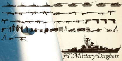 Pictograms of military boats, personnel, firearms and other weapons.
 - Vtc-NueTattooScript - Personal use only

- ITC Aram by ITC,
$29.99Jana Nikolic was finishing her degree program at the Faculty of Applied Arts, in Belgrade, with a final project that would combine her two majors: type and book design. Three stories from William Saroyan's My Name Is Aram would provide the text for the book, to be set in a typeface that Nikolic would design. Nikolic knew something special was happening the moment she put pen to paper. The letters just emerged," she recalls. "I started to explore a few new pens and found one I loved. I was able to make its tip bend with pressure." Like the family Saroyan writes about, the design flowing from Nikolic's pen would be simple but a little quirky. "When there were a whole bunch of little black letters around me," continues Nikolic, "I saw that this was going to be a very interesting typeface family." Nikolic drew Latin and Cyrillic letters, lowercase and capital letters, wide letters and narrow letters. She was surprised at how quickly and easily the design came. "There were no badly written letters," she says. "I hardly had to rework them and they fit together remarkably well." ITC Aram's standard character complement consists of one set of lowercase letters and two sets of capitals: one narrow and the other wide. The wide caps can be used with the standard lowercase, or mixed with the narrow caps for a variation on "cap and small cap" copy. The ITC Aram create the opportunity to mix and combine the letters into playful typographic expressions. Words and sentences that twinkle; text that seems light and alive - one runs the risk of creating work that is both delightful and charming when setting copy in ITC Aram." - Behrensschrift iF Plus by Ingo,
$29.00 Peter Behrens’ renowned art nouveau type from 1902 – with ornaments. Newly revised and neatly digitalized by Ingo Zimmermann In 1902, Peter Behrens (1869–1940), architect, designer and typographer, created a new ”German“ type which became very successful very quickly for the Rudhard’sche Gießerei (foundry which later became Gebr. Klingspor AG) in Offenbach am Main. It served, for example, as the official German type for the world expositions in 1904 and 1910. Behrens himself writes about the development of this type ”...For the actual form of my type, I took the technical principle of the Gothic script, the stroke of the quill feather. The proportions of height and width and the boldness of the strokes of the Gothic letters were also decisive for me in producing a German character. A cohesive character could be hoped for by avoiding all non-necessities and by strictly carrying out the design principle of holding the quill at an angle…“ By the way, when “long s” is activated, the typographically correct “round s” is automatically placed at the end of the word so that you need only pay attention to the correct s on syllable endings within words. When using “long s,” you must ensure the correct use of the rules for the Fraktur font: “round s” is always at the end of the word, also in compound words. For those of you who want to be even more correct, read the corresponding article in >> Wikipedia. Peter Behrens also drew matching ornaments for his typeface – we have likewise carefully revised these decorative touches and arranged them into a font. The "Behrens-Schrift" fits best on all topics that have something to do with art history or the time around 1900.
 - Signyard by Albatross,
$19.00 Based on the popular Microbrew Family (Rising Star, May 2014), Signyard is a display family trapped in time. Inspired by vintage restaurant and hotel signs, Signyard comes decked out in incandescent bulbs for a an authentic retro feel. The family has a unique vintage cinema style, but also works well with a variety of subject matter including weddings, birthdays, breweries, coffee houses, cigar shops, and many more. Signyard is an all caps display font, but the lowercase act as alternates. For super-easy alternates, just mix uppercase and lowercase letters. To add to the realism, Signyard includes double-letter ligatures. Sporting a healthy compliment of features and languages, Signyard is a very versatile display family. Signyard features 6 styles, 4 layers, symbols and opentype features. Opentype features include automatic fractions, subscript numbers, superscript numbers, and double-letter ligatures. Also included are old style numerals, and catchwords. (in the symbols font)
 - Quidic by Ingrimayne Type,
$12.95 Quidic is an unusual display typeface. The upper-case letters are strongly vertical, condensed, and bold. Used by themselves, they make headlines and titles that stand out. The lower case letters do not have serifs similar to those on the upper-case letters, but rather have the serif shapes one expects from an italic style. The lower-case is also quite short compared to the upper-case letters. The italic styles of the family are unusual because the lower-case letters keep their shapes and the upper-case letters and numbers change. The family has three styles that differ more by width rather than by weight. Although some Bauhaus fonts have several letter shapes that are similar, there is no other typeface quite like Quidic. The family can be used for many things, but not for text. For a "normalized" version of this typeface, see Qwatick.
 - Arpona by Floodfonts,
$49.00 For anyone who prefers to stand out from the crowd, than to go with the flow! Arpona is a typeface with small wedge serifs and a strong character, ideal for corporate design and all projects characterized by a sense of individualism – for example art, fashion, food, beverage and lifestyle topics. Arpona is inspired by roman letters carved in stone but otherwise difficult to categorize. It is neither a pure serif nor a sans but rather a symbiosis of different design concepts. Because of its display qualities, Arpona is a good choice for packaging, advertising and editorial design and is well readable even in running text on screen. The family has nine weights, ranging from Thin to Black plus corresponding italics. Each style includes 590 glyphs supporting all western-, eastern- and central-european languages including four sets of figures and various currency symbols. For more information visit the microsite: http://floodfonts.com/arpona
 - Renner Antiqua by Linotype,
$29.99First published in 1939 by Stempel, Renner Antiqua is a classic serif text typeface. Designed by Paul Renner, the father of Futura, this design stands out as strikingly different from his other designs. The letterforms are relatively compact and space saving and the strokes have a strong contrast to look as if made by a pen. This design is extremely distinctive and individualized, but without being overly distracting. Notice many of the small details such as the serifs on the uppercase C, E, and L and the bar at the top of the uppercase A. Also observe the special curve in the bowl of the lowercase b, the dot of the i, and the tail of the y. This design is wonderful for extended amounts of text at 10pt, but the subtle details will be fully appreciated when used larger for titles and display settings. - Hero Sandwich Combos by Comicraft,
$19.00 As comic book readers know all too well, team ups are every super hero’s bread and butter... when the brave and the bold are in a pickle, and super villains are running onion rings around them, here’s how they roll: They Meat! They Team-Up with your taste buds! They Fight Hunger! Yes, some hero combos may get along better than others, but they are always more powerful together. So take a footlong bite out of crime, and make the subways safe again with our mouthwatering HERO SANDWICH! Prepared with plastic gloves on by those awfully nice chaps at the Comicraft deli. If you're an avenging hero on the go, have no fear, we've pre-assembled these eight classic Hero Sandwich Combos! Because choosing your fillings shouldn't get in the way of knocking out a supervillain’s fillings. See these families related to Hero Sandwich Combos: Hero Sandwich Ingredients Hero Sandwich Pro
 - Ply by chicken,
$17.00 So the lumber was cheap - just a pile of offcuts - and so was the carpenter… And you couldn't say he was exactly lazy, but he was certainly efficient… mostly he would just cut a couple of planks to size, slice off a corner now and then, once in a blue moon hash up a curve… I guess he didn't have a drill, cos there are no holes… and he sure as hell didn't have a ruler… But he did have some kind of an eye, and until it falls off the wall it'll look pretty OK… Ply comes in six styles, offering differing degrees of neatness and adorned or not with fixings… There are money-saving packages too… It’s uppercase only, with variations between upper and lower case, and OpenType types can switch on Stylistic Set 1 to take the effort out of keeping things varied…
 - Space Colony by Dharma Type,
$19.99 Before the original sketches, I had imagined and dreamed this font was used for side characters of retro robot animations such as Gundam and Ideon. But the sketches were put in a PENDING folder. It was a few years ago. In the begining of 2011, I restarted working with the sketches to complete as a font file. Detail and some shape were improved retaining the original concept and they were completed, then named ‘Space Colony’. Just as the name implies, this wide and geometric font family consisting of six weights was designed targeting at use for futuristic product of game, movie, logo and so on. Not only that but the rounded shape makes a lovely, cute and soft impressions so this font is also suited for cartoons, animations and character merchandise too. We released 4 big Sci-Fi families in 2013. Check it out! Clonoid Controller Geom Graphic Space Colony
 - Sebale by Craft Supply Co,
$20.00 Introducing Sebale – Handwritten Script A Playful Handwritten Script Sebale, a font brimming with delightful whimsy, injects a playful touch into your designs. Charming Whimsy Sebale’s design is not only handwritten but also exudes charming whimsy, making it an ideal choice for a variety of creative projects. Versatile for Creative Endeavors Moving beyond its charm, Sebale’s versatility shines through, allowing it to seamlessly enhance a wide range of design projects. From greeting cards to branding, it offers a wide array of possibilities. Engaging and Memorable Sebale ensures that your content is not only engaging but also incredibly memorable, leaving a lasting and delightful impression. In Conclusion To sum it up, Sebale – Handwritten Script is the font that effortlessly infuses a delightful playfulness into your designs. Its versatility makes it suitable for a broad range of creative endeavors, ensuring accessibility to a diverse readership. With Sebale, your projects will undoubtedly stand out.
 - Vintage Mintage by VP Creative Shop,
$30.00 Introducing Vintage Mintage retro font Vintage Mintage is fat, rounded font. Retro serif font loaded with alternate and ligature glyphs to make you typography truly unique! Language Support : Belarusian, Bosnian, Bulgarian, Chechen, Macedonian, Russian, Serbian, Afrikaans, Albanian, Asu, Basque, Bemba, Bena, Breton, Chiga, Colognian, Cornish, Czech, Danish, Dutch, Embu, English, Estronian, Faroese, Filipino, Finnish, French, Friulian, Galician, Ganda, German, Gusii, Hungarian, Indonesian, Irish, Italian, Jola-Fonyi, Kabuverdianu, Kalenjin, Kamba, Kikuyu, Kinyarwadna, Litvian, Lithuanian, Lower Sorbian, Luo, Luxembourish, Luyia, Machame, Makhuwa-Meetoo, Makonde, Malagasy, Maltese, Manx, Meru, Morisyen, North Ndebele, Norwegian Bokm ål, Norwegian Nynorsk, Nyankole, Ormo, Polish, Portuguese, Quechua, Romanian, Romansh, Rombo, Rundi, Rwa, Samburu, Sango, Sangu, Scottish Gaelic, Sena, Shambala, Shona, Slovak, Soga, Somali, Spanish, Swahili, Swedish, Swiss German, Taita, Teso, Turkish, Ukrainian, Upper Sorbian, Uzbek (Latin), Volap ük, Vunjo, Walser, Welsh, Western Frisian, Zulu FEATURES Uppercase, lowercase, numeral, punctuation & Symbol Cyrillic support ligature glyphs alternates Multilingual support - 95 languages No special software is required to type out the standard characters of the Typeface. How to access alternate glyphs? To access alternate glyphs in Adobe InDesign or Illustrator, choose Window Type & Tables Glyphs In Photoshop, choose Window Glyphs. In the panel that opens, click the Show menu and choose Alternates for Selection. Double-click an alternate's thumbnail to swap them out. Feel free to contact me if you have any questions! Mock ups and backgrounds used are not included. Thank you! Enjoy!
 - Redmark by VP Creative Shop,
$30.00 Introducing Redmark - Elegant all caps serif font Redmark is vintage yet clean font inspired from 80s typeface loaded with alternate and ligature glyphs to make you typography truly unique! Language Support : Belarusian, Bosnian, Bulgarian, Chechen, Macedonian, Russian, Serbian, Afrikaans, Albanian, Asu, Basque, Bemba, Bena, Breton, Chiga, Colognian, Cornish, Czech, Danish, Dutch, Embu, English, Estronian, Faroese, Filipino, Finnish, French, Friulian, Galician, Ganda, German, Gusii, Hungarian, Indonesian, Irish, Italian, Jola-Fonyi, Kabuverdianu, Kalenjin, Kamba, Kikuyu, Kinyarwadna, Litvian, Lithuanian, Lower Sorbian, Luo, Luxembourish, Luyia, Machame, Makhuwa-Meetoo, Makonde, Malagasy, Maltese, Manx, Meru, Morisyen, North Ndebele, Norwegian Bokm ål, Norwegian Nynorsk, Nyankole, Ormo, Polish, Portuguese, Quechua, Romanian, Romansh, Rombo, Rundi, Rwa, Samburu, Sango, Sangu, Scottish Gaelic, Sena, Shambala, Shona, Slovak, Soga, Somali, Spanish, Swahili, Swedish, Swiss German, Taita, Teso, Turkish, Ukrainian, Upper Sorbian, Uzbek (Latin), Volap ük, Vunjo, Walser, Welsh, Western Frisian, Zulu FEATURES Uppercase, numeral, punctuation & Symbol ligature glyphs alternates Multilingual support - 95 languages No special software is required to type out the standard characters of the Typeface. How to access alternate glyphs? To access alternate glyphs in Adobe InDesign or Illustrator, choose Window Type & Tables Glyphs In Photoshop, choose Window Glyphs. In the panel that opens, click the Show menu and choose Alternates for Selection. Double-click an alternate's thumbnail to swap them out. Feel free to contact me if you have any questions! Mock ups and backgrounds used are not included. Thank you! Enjoy!
 - Probity by VP Creative Shop,
$29.00 Introducing Probity creative serif font (latin and Cyrillic) Probity is casual and creative font loaded with 95 languages support, alternate and ligature glyphs to make you typography truly unique! Language Support : Belarusian, Bosnian, Bulgarian, Chechen, Macedonian, Russian, Serbian, Afrikaans, Albanian, Asu, Basque, Bemba, Bena, Breton, Chiga, Colognian, Cornish, Czech, Danish, Dutch, Embu, English, Estronian, Faroese, Filipino, Finnish, French, Friulian, Galician, Ganda, German, Gusii, Hungarian, Indonesian, Irish, Italian, Jola-Fonyi, Kabuverdianu, Kalenjin, Kamba, Kikuyu, Kinyarwadna, Litvian, Lithuanian, Lower Sorbian, Luo, Luxembourish, Luyia, Machame, Makhuwa-Meetoo, Makonde, Malagasy, Maltese, Manx, Meru, Morisyen, North Ndebele, Norwegian Bokm ål, Norwegian Nynorsk, Nyankole, Ormo, Polish, Portuguese, Quechua, Romanian, Romansh, Rombo, Rundi, Rwa, Samburu, Sango, Sangu, Scottish Gaelic, Sena, Shambala, Shona, Slovak, Soga, Somali, Spanish, Swahili, Swedish, Swiss German, Taita, Teso, Turkish, Ukrainian, Upper Sorbian, Uzbek (Latin), Volap ük, Vunjo, Walser, Welsh, Western Frisian, Zulu FEATURES Uppercase, numeral, punctuation & Symbol ligature glyphs alternates Multilingual support - 95 languages Cyrillic support No special software is required to type out the standard characters of the Typeface. How to access alternate glyphs? To access alternate glyphs in Adobe InDesign or Illustrator, choose Window Type & Tables Glyphs In Photoshop, choose Window Glyphs. In the panel that opens, click the Show menu and choose Alternates for Selection. Double-click an alternate's thumbnail to swap them out. Feel free to contact me if you have any questions! Mock ups and backgrounds used are not included. Thank you! Enjoy!
 - Malinger VP by VP Creative Shop,
$40.00 Introducing Malinger - Stylish Serif font - latin and cyrillic Malinger is stylish and creative font loaded with 95 languages support, alternate and ligature glyphs to make you typography truly unique! Language Support : Belarusian, Bosnian, Bulgarian, Chechen, Macedonian, Russian, Serbian, Afrikaans, Albanian, Asu, Basque, Bemba, Bena, Breton, Chiga, Colognian, Cornish, Czech, Danish, Dutch, Embu, English, Estronian, Faroese, Filipino, Finnish, French, Friulian, Galician, Ganda, German, Gusii, Hungarian, Indonesian, Irish, Italian, Jola-Fonyi, Kabuverdianu, Kalenjin, Kamba, Kikuyu, Kinyarwadna, Litvian, Lithuanian, Lower Sorbian, Luo, Luxembourish, Luyia, Machame, Makhuwa-Meetoo, Makonde, Malagasy, Maltese, Manx, Meru, Morisyen, North Ndebele, Norwegian Bokm ål, Norwegian Nynorsk, Nyankole, Ormo, Polish, Portuguese, Quechua, Romanian, Romansh, Rombo, Rundi, Rwa, Samburu, Sango, Sangu, Scottish Gaelic, Sena, Shambala, Shona, Slovak, Soga, Somali, Spanish, Swahili, Swedish, Swiss German, Taita, Teso, Turkish, Ukrainian, Upper Sorbian, Uzbek (Latin), Volap ük, Vunjo, Walser, Welsh, Western Frisian, Zulu FEATURES Uppercase, lowercase, numeral, punctuation & Symbol ligature glyphs alternates Multilingual support - 95 languages Cyrillic support No special software is required to type out the standard characters of the Typeface. How to access alternate glyphs? To access alternate glyphs in Adobe InDesign or Illustrator, choose Window Type & Tables Glyphs In Photoshop, choose Window Glyphs. In the panel that opens, click the Show menu and choose Alternates for Selection. Double-click an alternate's thumbnail to swap them out. Feel free to contact me if you have any questions! Mock ups and backgrounds used are not included. Thank you! Enjoy!
 - Forbidden Love by VP Creative Shop,
$30.00 Introducing Forbidden Love - Display font | Latin & Cyrillic Forbidden Love is stylish and creative font loaded with alternate and ligature glyphs, 95 languages support to make you typography truly unique! Language Support : Belarusian, Bosnian, Bulgarian, Chechen, Macedonian, Russian, Serbian, Afrikaans, Albanian, Asu, Basque, Bemba, Bena, Breton, Chiga, Colognian, Cornish, Czech, Danish, Dutch, Embu, English, Estronian, Faroese, Filipino, Finnish, French, Friulian, Galician, Ganda, German, Gusii, Hungarian, Indonesian, Irish, Italian, Jola-Fonyi, Kabuverdianu, Kalenjin, Kamba, Kikuyu, Kinyarwadna, Litvian, Lithuanian, Lower Sorbian, Luo, Luxembourish, Luyia, Machame, Makhuwa-Meetoo, Makonde, Malagasy, Maltese, Manx, Meru, Morisyen, North Ndebele, Norwegian Bokm ål, Norwegian Nynorsk, Nyankole, Ormo, Polish, Portuguese, Quechua, Romanian, Romansh, Rombo, Rundi, Rwa, Samburu, Sango, Sangu, Scottish Gaelic, Sena, Shambala, Shona, Slovak, Soga, Somali, Spanish, Swahili, Swedish, Swiss German, Taita, Teso, Turkish, Ukrainian, Upper Sorbian, Uzbek (Latin), Volap ük, Vunjo, Walser, Welsh, Western Frisian, Zulu FEATURES Uppercase, lowercase, numeral, punctuation & Symbol ligature glyphs alternates Multilingual support - 95 languages No special software is required to type out the standard characters of the Typeface. How to access alternate glyphs? To access alternate glyphs in Adobe InDesign or Illustrator, choose Window Type & Tables Glyphs In Photoshop, choose Window Glyphs. In the panel that opens, click the Show menu and choose Alternates for Selection. Double-click an alternate's thumbnail to swap them out. Feel free to contact me if you have any questions! Mock ups and backgrounds used are not included. Thank you! Enjoy!
 - Chillout by YdhraStudio,
$20.00 Chillout is a stylish script font inspired by bold and colorful hand lettering style, so you can bring your design look more beautiful, chill and stylish with this typeface. We give you bonus a swash to make your design look more awesome with Chillout. Chillout also has a standard Multilingual Support. Chillout is great for Logotype, Branding Design, Logo Design, Digital Lettering Arts, Instagram Design, T-Shirt/Apparel, Poster, Magazine, Quotes, Signs, Advertising Design, and any Cheerfull and Colorfull design needs. Chillout Features : - Upper and Lowercase Standard Characters, Punctuation, Numerals. - Opentype Features such as Standard Ligatures, Discretionary Ligatures and Stylistic Set (ss01 - ss09) and swashes. - PUA Encoded Characters - Fully accessible without additional design software. - Includes a range of multilingual characters. You can access all those alternate characters by using a program that supports OpenType features such as Adobe Illustrator CS, Adobe Indesign & CorelDraw X6-X7. Guides to access all alternates glyphs : http://adobe.ly/1m1fn4Y Mix and match the alternate characters to add an attractive message to your design. Please, feel free to contact me by e-mail yyudhara@gmail.com for any question about my font, Extended License document and more. Good Luck and Have fun ! YdhraStudio
 - Weg by Huerta Tipográfica,
$18.00 WEG* font is an experimental type system where legibility isn’t the focus. This project studies how glyphs are constructed and how their ductus can be modified. I explored how far I can move the limits if I don’t worry about the legibility. In Weg, letters are built by a single line that connects them, along with words and paragraphs. When weight decreases, the legibility of the signs increases. This is the first stage. It’s a project in expansion. The set contains uppercase, lining figures and basic punctuation in three weights: Regular, Light and Thin. The current supported languages are Spanish, Guaraní and English. If you need any other language, please let me know. I would like to expand the character set. Second stage project WEG is an experimental in-expansion font family. Here I present to you the second stage. I’m planning the first upgrade for middle 2021. I’m preparing a pattern set for July 2021. Here you can see the first four patterns. If you buy the font before July 2021, you’ll get this upgrade! • Second stage April - July 2021: pattern set (first four ready). • This upgrade will be available on August 2021.
