1,401 search results
(0.015 seconds)
- Bellayla by Motokiwo,
$18.00 Bellayla (also known as Bridgesty), a lovely calligraphy font with romantic taste. It's bouncy, elegant, and gorgeous script font that very recommended to be your wedding font. Bellayla comes with ligature, contextual alternates, initial & final form features, stylistic set, swash, and multilingual that already PUA encoded.
 - Shanders by Dirtyline Studio,
$17.00 Shanders is a hand brush typeface, with authentic Clean Brush imperfections, and a very bouncy baseline. It has a perfectly paired complimentary marker font, and a super handy bonus Swash weight. This is ideal for logos, handwritten quotes, product packaging, header, poster, merchandise, social media & greeting cards.
 - Garden Gnome by Hanoded,
$15.00 I am not really fond of Garden Gnomes, but this font is kinda cute and I figured it'd be a nice name. Garden Gnome is a very happy, easy to read Children's Book font. It is bouncy, rounded and comes with all the diacritics you need.
 - Happy People by Blankids,
$23.00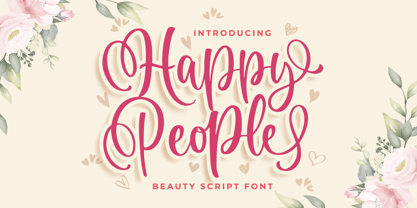 Introducing of our new product the name is Happy People Beauty Script Font. Happy People inspired by bouncy script style this font is a fun theme very good for display, tshirt design, craft, quote sign, logotype and etc. FEATURES : Uppercase Lowercase Number Punctuation Multilingual PUA Encode Opentype
 - Bluesman JNL by Jeff Levine,
$29.00 The classic blues album "I'm Jimmy Reed" released on the legendary Vee-Jay label out of Chicago featured title lettering in a bouncy, fun, casual take on the classic Latin Wide style of alphabet. Bluesman JNL offers a full digital typeface based on that album titling.
 - Skywalker by Dirtyline Studio,
$17.00 Skywalker is a hand brushed typeface, with authentic dry brush imperfections, and a very bouncy baseline It has a perfectly paired complimentary marker font , and a super handy set of bonus Swash. Ideal for logos, handwritten quotes, product packaging, header, poster, merchandise, social media & greeting cards.
 - Monk SPF by S6 Foundry,
$19.00 Monk is a multi-language geometric harmoniously balanced font in Arabic and Latin. The font family has its origins in Benedictine and Franciscan writing. Both Arabic and Latin work seamlessly together having shared counters, stem thickness, and curved forms. Monk is a type family that seeks a balance between the openness and legibility of humanist sans serifs. Letterforms have a distinct direction of the ductus, a wide overall stance, large open counters that help in its legibility. The typeface is versatile and can be successfully used in magazines, posters, branding, websites, headlines, large-format prints, brand identities, social media, advertising, editorial design, posters. The family contains over 40 alternative glyphs and over 50 ligatures in each style and comes in 10 styles with their corespondent italics. The family Latin supports Western, Central, South Eastern, South American, Oceanian, Pan African, Vietnamese, Sámi & Arabic
 - Hello Darling by Nk Studio,
$14.00 Your purchases include the Hello Darling Script, conjunctive handwritten script, and printed, handwritten, and printed script fonts. Hello Darling is made side by side to work together. All lowercase letters are placed to receive a connecting tail from Hello Darling. You can mix and match the same words to your heart's content! Hello Darling is also made with the crafter in mind: there are no closed counters on either type, meaning they can easily be used for stencils and electronic cutters such as the Cricut line and the Silhouette. The Hello Darling package includes: - More than 300 glyphs in the Hello Darling font, designed to work together! - No closed counters - useful for stencils and vinyls! - More than 200 accented characters in each font. - Double letter binder staggered for a hand drawn look! - PUA-encoded for easy character map access! Enjoy and thank you.
 - Stretto by Canada Type,
$29.95 Stretto (Italian for narrow) is a revival, correction and expansive update of an Aldo Novarese reverse-stress font called Sintex, which he did for VGC in 1973. Openly idiosyncratic and playfully rebellious in its design, this alphabet fuses the straights and rounds in an unusual manner, riffing on the idea of hand-made sign and wood type forms while adhering to its odd grid’s parameters. In spite of its counter-stress, its legibility is high and even, helped by its unicase forms and very distinct counters. First released in 2007, it became quite popular with film studios and nostalgia designers (Sintex was the font used for David Bowie’s Hunky Dory album and Life on Mars? single). A dozen years later we revisited it for an update. Stretto now comes with over 660 characters and includes Pan European language support.
 - Disforia Inersia by Skinny Type,
$15.00 Introducing Disforia Inersia! Your purchase includes Disforia Inersia Script, conjunctive handwritten script, and Print, handwritten, printed script typeface. Disforia Inersia created side by side to work together. All lowercase letters are placed to receive a connecting tail from Disforia Inersia. You can mix and match in the same word to your heart's content! Disforia Inersia was also created with the crafter in mind: there are no closed counters in either type, meaning they can easily be used for stencils and electronic cutters such as the Cricut line and the Silhouette. Disforia Inersia Package includes: - Nearly 300+ glyphs in Inertia Dysphoria font, designed to work together! - No closed counters - useful for stencils and vinyls! - More than 200 accented characters in each font. - Double letter staggered ligatures for a hand-drawn look! - PUA-encoded for easy character map access! Enjoy and thank you. Skinny Type
 - PR Vanaheim by PR Fonts,
$10.00 This is a perfect font for historical or fantasy titles. It is influenced by ancient Nordic runes. the strokes flare slightly, to a concave terminal for a finely carved appearance. There are two sets of capitals in PR-Vanaheim-DC (Dual Capitals); one set of narrow letters, more closely related to Runic forms, and one set which includes wider and circular letters, which can be freely combined with the narrow letters for the variety associated with hand lettering. There is one version with dots placed in the centre of large counters and one version without the dots. The broad caps character set includes characters which allow for tight spacing; a dropped L, and a tall T. There are also two different lowercase sets, one modern, and one archaic, all of which can be freely mixed to fine tune the appearance of your text. Here is the brief description of the available faces: PR-Vanaheim-Med-DC-01 Duplex Caps PR-Vanaheim-Med-DC-02 Duplex Caps, Dotted counters and dot space PR-Vanaheim-Med-DC-03 Duplex Caps, Dotted counters PR-Vanaheim-Med-LC-04 Broad Caps, with modern style lower case. PR-Vanaheim-Med-LC-05 Narrow Caps, with modern style lower case. PR-Vanaheim-Med-LC-06 Broad Caps, with archaic lower case. PR-Vanaheim-Med-LC-07 Narrow Caps, with archaic lower case.
 - Kubrick by Quadrat,
$25.00 Kubrick is an experiment in extremes. The Light font is very tall and slender, the Black font is very massive, and Kubrick's slender counters push some of its glyphs to the edge of recognition. The thin counters and negative spaces also give text set in Kubrick a definite visual sparkle, especially in all-uppercase settings. Because of its extreme letterforms, Kubrick is recommended only for large display use. The default letterspacing is set fairly wide to keep text legible. Kubrick was a double-experiment. One part of it was to see how heavy and massive a typeface I could make while still keeping it legible. The other part was to develop a Multiple Master font. Multiple Master fonts were a format developed by Adobe that allowed the user to change things like the weight and width of a typeface. Monollith started as just such a Multiple Master typeface, but when Adobe discontinued the Multiple Master format, I stopped work on the typeface. Later I decided to continue work on it, but as five separate font weights: Light, Medium, Bold, ExtraBold and Black. Very rectilinear letterforms with extremely narrow counters and negative spaces. The five fonts go from very thin and condensed to very heavy and extended. Use in large display settings where unornamented high visual impact is desired.
 - ATF Railroad Gothic by ATF Collection,
$59.00 First introduced by the American Type Founders Company in 1906, Railroad Gothic was the quintessential typographic expression of turn-of-the-century industrial spirit—bold and brash in tone, and a little rough around the edges. A favorite for the plain speak of big headlines, Railroad Gothic quickly gained popularity among printers. Its condensed but robust forms were likely a source of inspiration for later families of industrial sans serifs. The design feels like a cleaned-up version of some earlier Victorian gothics, notable for their uneven proportions and awkward letterforms. ATF offered a number of sizes of Railroad Gothic as metal type, with cuts varying in design considerably from size to size. Creating this new digital version involved interpreting the characteristics of different sizes and making some aesthetic choices: where to retain the design’s familiar unstudied gawkiness, and where to make improvements. The new ATF® Railroad Gothic features a measured, harmonious interpretation of the original, and has been extended with four new weights (each bolder than the last). The heaviest weights are carefully designed to keep counters open, no matter how dense the overall effect may be, maintaining legibility at any display size. This contemporary rendition of a historic American design boasts a full Latin character set, including glyphs undreamed-of in the heyday of railroads.
 - This year by Jadatype,
$10.00 This Year is a duo font that contains fine line script font and playful slab that had cute, playful, joy, youth, and bouncy feel. suitable for social media, branding, craft, products, handwritten, and so on. contains standard English letters, numbers, punctuation, and several accents that support multilingualism. Thank you!.
 - Monstora by Blankids,
$18.00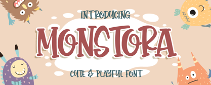 Introducing of our new product the name is Monstora Cute & Playful Font. Monstoray inspired by bouncy quirky this font is a fun theme very good for, book cover, poster, t-shirt, quote, logotype, craft and etc. MULTILINGUAL ACCENT : ØÆøæ¢ÐŒœÁĂÂÀÄĄÅÃǼĆČÇĈĊĎÉĔĚÊËĖÈĘĞĜĢĠĤÍĬÎÏİÌĮĨĴĶĹĽĻĿŃŇŅÑÓŎÔÖÒŐǾÕŔŘŖŚŠŞŜȘŤŢÚŬÛÜÙŰŲŮŨẂŴẄẀÝŶŸỲŹŽŻáăâäàąåãǽćčçĉċďéĕěêëėèęğĝģġĥíîïìįĩĵķĺľļŀńʼnňņñóŏôöòőǿõŕřŗśšşŝșťţŭûüűùųůũẃŵẅẁýŷÿỳźžż FEATURES : Uppercase Lowercase Number Punctuation Multilingual PUA Encode Opentype
 - Underdoug by PizzaDude.dk,
$15.00 All caps font with squarish letters. At first sight, it may look a little bit ordinary, but watch it with massive text - then you will notice the bounciness and the contextual alternates that automatically switches between the 5 different versions of each letter! Comes with massive language support!
 - Barbeque Grill by Mvmet,
$12.00 Barbeque Grill is a whimsical skinny bouncy font. You can use it for anything ranging from t-shirts, book designs, restaurant or cafe menu, greeting cards, stickers, and posters, or anything that needs a casual touch. Try it to create lovely designs and feel the good vibes with it!
 - Spumoni LP by LetterPerfect,
$39.00 Spumoni plays freely off of the typeface Bodoni . Though commercial lettering is becoming a disappearing craft, Spumoni provides this hand-drawn quality in a digital medium. Its bouncy, playful letters infuse a sense of humor into headlines, titles and blurbs of text in need of a merry touch
 - Chauncy Pro by Chank,
$99.00 Chauncy Pro is a bouncy, artistic, childish handwriting font that comes in four practical weights: Regular, Italic, Bold and Bold Italic. The jaunty little font is based on the left-handed penmanship of an artist and it's ready to go play with some of your fanciful, light-hearted designs.
 - Tati by Wiescher Design,
$33.33I only had this bouncy curve and a photograph of a daily menu (Truite Meunière) I took outside an obscure Paris restaurant when starting the design of this font. But while working on it I suddenly started thinking about Jacques Tati the famous but almost forgotten french director of Les Vacances de Monsieur Hulot, Jour des Fêtes, Mon Oncle, Playtime, Trafic etc. I thought about his bouncy walk and his hilarious ideas. The memories never left me while working on the font, so I decided to name the font after this great French moviemaker who gave me so many happy hours. Since Tati was a very funny character, I gave my characters a funny price. Thank you Jacques Tati, yours Gert Wiescher - See Saw by Jonahfonts,
$22.00 SeeSaw is a novelty bounced display font. Suitable for children's books, packaging and greeting cards as well as other creative possibilities. Pick and choose letter combinations between caps and lower case letters. Have Fun!
 - Great Sage NF by Nick's Fonts,
$10.00This pseudo-Egyptian fantasy originally was named Karnac, and was unearthed in the pages of the 1888 American Type Founders Specimen Book. This version derives it name from a continuing character from Johnny Carson's stint on the Tonight show. Both versions of this font include the Unicode Latin 1252 and 1250 Central European character sets, with localization for Moldovan and Romanian. - Bric-a-Braque NF by Nick's Fonts,
$10.00This assertively Art Deco face is based on Cubist Bold, designed by John W. Zimmerman for Barnhart Brothers & Spindler in 1929, and takes its name from one of the co-founders—with Pablo Picasso—of the Cubist Movement. Both versions of this font contain the complete Unicode 1252 (Latin) and Unicode 1250 (Central European) character sets, with localization for Romanian and Moldovan. - Harry Pro by Red Rooster Collection,
$60.00This revival of Harry is based on the original design by Marty Goldstein (and C.B. Smith). Goldstein, born in Chicago in 1939, was the co-founder of the groundbreaking Creative Black Book. He graduated from the Pratt Institute in 1960. Harry, first published by VGC in 1966, was named for his father. ITF has added four new weights to the original six. - Stilson by Carter & Cone Type Inc.,
$35.00 Since 1997, The Washington Post’s iconic headlines have been distinguished by their own sturdy, concise variation on Bodoni, designed by Matthew Carter. For the 2009 redesign, Richard Lipton, Jill Pichotta, and Dyana Weissman expanded the family with more refined Display and Condensed styles for use in larger sizes. Originally called Postoni, the fonts were renamed in honor of The Post’s founder, Stilson Hutchins
 - Nouveau Display JNL by Jeff Levine,
$29.00 Vintage sheet music for the 1920s song "Where Did Robinson Crusoe Go with Friday on Saturday Night?" yielded the hand lettered Art Nouveau alphabet for Nouveau Display JNL. Because the Art Nouveau movement was so influential in the graphic designs of the 1960s "Love Generation" counter culture, this typeface blends itself well with projects crossing many decades and varying styles.
 - Duly Noted NF by Nick's Fonts,
$10.00This upscale offering, with its understated elegance, is based on a release from the 1912 American Type Founders specimen catalog named, quite simply, "Freehand". Use it for any occasion which otherwise might require the services of a skilled Osmiroid wrangler. Guaranteed to please and to impress. Both versions of the font include 1252 Latin, 1250 CE (with localization for Romanian and Moldovan). - Giane Gothic sans by XdCreative,
$25.00 Giane Gothic sans is stylish sans serif font with Gothic touch, Giane Gothic is a younger brother of the original "Giane" family font. Giane Gothis is perfectly matching pair with Giane Serif Giane Gothic sans Perfectly suited for graphic design and any display use ( for the logos, t-shirts, the web as well as for print, and also great for headings), Thank You
 - Secret Mango by Bejeletter,
$14.00 "Secret mango" ia a simple character shapes and open counters, make for an exceptionally legible design. Secret mango consist 9 weight of slab serif with matching oblique to make more touch and allowing you to make each word look completely stylish. True to the reflection of Slab serif, always associated with confidence, solidarity and courage, "Secret Mango" represents all of that.
 - Cool Crayon by Hanoded,
$15.00 Cool Crayon is a nice typeface I created with the black crayola from my 3 year old son's crayola box. It was broken (because he tends to throw them around), but I managed to get the glyphs onto a sheet of paper. Cool Crayon is similar to Crayon Crumble, but is rounder and thicker. Cool Crayon comes with extensive language support.
 - SchoolBook by ParaType,
$30.00The typeface was designed at the Polygraphmash type design bureau in 1949-61 (project manager Elena Tsaregorodtseva). Based on Shkolnaya ('School') typeface, 1939 (project manager Evgeny Chernevsky), a version of Century Schoolbook of American Type Founders, 1915-1923 by Morris F.Benton. The low-contrast text typeface of the Ionic-Legibility group, it is designed expressly for schoolbooks and children books. - PAG Julio by Prop-a-ganda,
$19.99Prop-a-ganda offers retro-flavored fonts inspired by lettering on retro propaganda posters, retro advertising posters, retro packages all the world over. This is perfect font for your retrospective project. PAG Julio is a eye-catching, counter-contrast font with retro touch. This cool and cute font woks best for display uses, headlines, branding, print, and web design projects. - Capitol Skyline by Device,
$39.00 DF Capitol features two faces, DF Capitol Skyline and DF Capitol Capitals (a multi-weight all-caps compliment) that epitomise Streamline Moderne. Strong geometry and large, open counters with heavily condensed verticals and a succession of contextual alternates and discretionary ligatures. DF Capitol presents a nice companion in two weights. Both contain full support for Eastern and Central European languages.
 - Metro Retro Redux NF by Nick's Fonts,
$10.00The typeface Modernistic, designed by Wadsworth A. Parker for American Type Founders in 1927, provided the design cues for this typeface which, unlike the original, includes lowercase letters. Best used sparingly for dramatic and memorable headlines. Both versions of this font contain the complete Unicode 1252 (Latin) and Unicode 1250 (Central European) character sets, with localization for Romanian and Moldovan. - Capitol Capitals by Device,
$29.00 DF Capitol features two faces, DF Capitol Skyline and DF Capitol Capitals (a multi-weight all-caps compliment) that epitomise Streamline Moderne. Strong geometry and large, open counters with heavily condensed verticals and a succession of contextual alternates and discretionary ligatures. DF Capitol Skyline presents a nice companion in two weights. Both contain full support for Eastern and Central European languages.
 - Libran by Bean & Morris,
$35.00 The Libran font family consists of Libran Regular, Libran Italic, Libran Antique and Libran Small Caps. The broad open counters make for easy reading with a touch of classic roman clarity. The diminutive serifs add a suggestion of the hand crafted origins without obstructing Its clean, contemporary lines. Libran’s generous x-height and short ascenders have been carefully proportioned to maximise reproduction qualities.
 - Spaceland by Pepper Type,
$35.00 Spaceland is a narrow display font family with constant counter width and gradually growing stroke over 11 weights with matching obliques. Spaceland is a perfect choice for designs that require extra narrow but legible letters, such as movie posters, health warnings, bold titles etc. It has rich language support, including Cyrillic, as well as numerous OpenType features to customize your design.
 - Stymie by Linotype,
$40.99In 1931, Morris Fuller Benton created the Stymie typeface for the American Type Founders (ATF). Stymie is a reworking of a slab serif type that was popular in Europe at that time, Memphis. For the past one hundred fifty years, slab serif types (sometimes called Egyptian or Egyptienne-style faces) have been a popular choice for headline text in newspapers, magazines, and advertising. - Cartella NF by Nick's Fonts,
$10.00This no-nonsense titling face is based on a Morris Fuller Benton 1934 offering for American Type Founders called, simply, Poster Gothic. Its crisp, clean lines and subtle Art Deco modeling make for attractive and attention-getting headlines. Available in plain and prismatic styles. Both versions of this font include the complete Unicode Latin 1252 and Central European 1250 character sets. - Coupler by District,
$25.00 Coupler is a sturdy text face with low contrast, airy counters, and a strong baseline for smaller sizes and extended reading. Lightly bracketed serifs and pleasantly conspicuous italics temper Coupler’s formal demeanor—well suited for financial reports, news magazines, catalogs, academic journals, and any instructional setting. Four weights with italics and advanced typographical support provide design flexibility in any layout.