10,000 search results
(0.016 seconds)
- Callmounth by Allouse Studio,
$16.00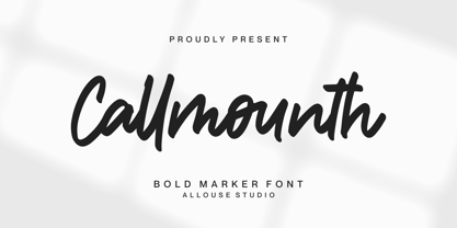 Proudly Present, Callmounth a Bold Marker Font Callmounth is perfect for any titles, logo, product packaging, branding project, megazine, social media, wedding, or just used to express words above the background. Callmounth also come with Multi-Lingual Support. Enjoy the font, feel free to comment or feedback, send me PM or email. Thank You!
 - August Rush by Callie Sharp,
$13.00 August Rush is a delicate handwritten script font. The font comes in 2 weight options: regular and semi-bold. It's best used as a main headlines or as a secondary headline combed with other simple serif or sans-serif fonts. It can be used for various designs such as packaging, wedding stationery or branding.
 - Hamilton by Scriptorium,
$12.00Hamilton is a tall, bold display font developed from hand lettering by Samuel Welo. It embodies elements of art nouveau poster lettering and turn-of-the-century advertising design. The result is handsome and versatile, well suited to many uses. The full version includes lots of nice alternate versions of many of the letters. - Kohirug by Twinletter,
$15.00 Looking for a font that exudes style and elegance? Look beyond the KOHIRUG Blackletter font. This font evokes a strong, confident personality with striking details on each side of the lettering. Whether you’re creating a vintage-inspired project or want to add a bold classic look to your visuals, this font is a perfect choice.
 - East To West JNL by Jeff Levine,
$29.00 Sheet music for a song featured in "East to West", a film starring Mexican bombshell Dolores Del Rio, had the movie's name lettered in a bold sans style with early Art Deco influences. East to West JNL preserves not only the name, but all of the characteristics of this wonderful bit of typographic nostalgia.
 - Brolink by Sarid Ezra,
$13.00 Brolink is a wide bold sans based font with unique lowercase that will make your design looks sci-fi and modern. You can use this font for any purpose, especially to make logotype. You can mix and match the uppercase and lowercase to make your logo more readable. This font also comes with outline style!
 - Feogra by limitype,
$20.00 Feogra is a font inspired by the geometric shape of a robot designed in a modern style that makes this font look futuristic and unique, suitable for your modern design and requires a bold and prominent typeface. This font can also be applied to posters, magazines, etc. Feautures: All Caps Font Numbers Symbols Multilingual
 - Talesian by Viaction Type.Co,
$15.00 Talesian is in an original handwriting style, and looks very natural and beautiful. It is suitable for boutique brand, photography, magazine, quote, business card, logo, poster and many more. There are two weights: regular and bold, script is equipped with OpenType features such as ligatures and multilingual support. I hope you enjoy and thank you.
 - Miqdad by Viaction Type.Co,
$15.00 Miqdad font is inspired by Arabic letters which have bold characters. It is perfect for use as logos, quotes, and various other designs with Islamic or Arabic themes. Equipped with multilingual. Font files include: This font includes 2 styles, regular & oblique. It is very profitable to buy the Miqdad font. Get it Now ! Thanks.
 - Satreva by Balevgraph Studio,
$12.00 Satreva is a stylish and elegant sans serif font. It can easily be matched to an incredibly large set of projects, so add it to your creative ideas and notice how it makes them stand out! What's Included : Light, Regular, Bold (TTF) Alternates & Ligatures Works on PC & Mac Simple installations Multilingual support PUA Encoded
 - Rough Cut NF by Nick's Fonts,
$10.00An old Art Nouveau typeface named "Daphne" provided the inspiration for this decidely different font. This version is upright, but the linocut treatment employed visually suggests the slight rightward slant of the original typeface. Bold, unusual and distinctive. Both versions of the font include 1252 Latin, 1250 CE (with localization for Romanian and Moldovan). - Throostle by Allouse Studio,
$16.00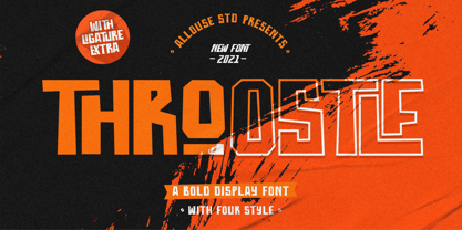 Proudly Presenting, Throostle a Bold Display Font Family. Throostle is perfect for any titles, logo, product packaging, branding project, megazine, social media, wedding, or just used to express words above the background. Throostle also come with Multi-Lingual Support. Enjoy the font, feel free to comment or feedback, send me PM or email. Thank You!
 - Bigroads Script by Figuree Studio,
$20.00 Bigroads Script is a layered bold script with extruding, inspired by a Retro aesthetic. Made in combination with hand lettering, it comes with dramatic movement and it’s great for any next creative project that needs a retro vibe or modern touch. Ideal for logos, handwritten quotes, product packaging, header, poster, merchandise, social media & greeting cards.
 - Radio Actor JNL by Jeff Levine,
$29.00 Bold and squared with rounded corners, the hand lettering found within the November, 1936 issue of Radio Mirror magazine really stands out. This stylized sans serif design, when used in poster displays or headline lettering, is attention-getting and drives the point home. Radio Actor JNL, is available in both regular and oblique versions.
 - Guidebook by Fenotype,
$25.00 Guidebook is a bold vintage style serif font with a nonchalant charm and sturdy confidence. Guidebook has clean features and it expresses credibility with a reminiscence of familiar nostalgic feeling. Guidebook is equipped with Swash, Stylistic and Titling alternates. These features can be accessed by OpenType controls or straight from Character or Glyphs window.
 - P22 Sniplash by IHOF,
$24.95 Sniplash is a lively font inspired by cartoons and comics of the 1960s and '70s. Casual and organic, this font features curly lines and irregular weights in Regular, Light and Bold styles. This design defies serious analysis and offers a fun attitude for lighthearted design. Excellent for parties, retro packaging or any number of uses.
 - Mechaniclove by ahweproject,
$14.00 Mechaniclove is a gorgeous and bold handwritten font, crafted to give your headlines and logotype projects a retro touch. This font reads as strong, confident, and dynamic and can add tons of nostalgic character to your designs. This font is PUA encoded which means you can access all of the glyphs and swashes with ease!
 - Suspiria Vampira by Konstantine Studio,
$10.00 Halloween is coming. Get prepared earlier with our Suspiria Vampira. A bold and bouncy fonts with 2 styles, Clean and rough. Very good for a halloween concept, but the versatility level are high in this font. It can be placed into any fun and cheerful branding or event concept. So many possibilities coming up!
 - Hetigon Vintage by RahagitaType,
$17.00 Hetigon Playful Vintage is a bold and captivating font that seamlessly blends vintage charm with a playful twist. Its distinctive character lies in its ability to evoke a sense of nostalgia while maintaining a contemporary and dynamic feel. This versatile typeface is suitable for branding, logotypes, and flyers, where it effortlessly injects personality and style.
 - LA QATRIE by Hishand Studio,
$15.00 Experience refined design with La Qatrie, a display font that boasts an elegant look and a touch of luxury, setting a new standard for sophistication in typography. Perfect for those needing a touch of elegance, classy, stylish, beautiful bold type, and modernity for their design. Complete with ligatures alternates regular hollow icon kerning multilingual support
 - Creamer by Creativework Studio,
$14.00 Creamer is a gorgeous and bold handwritten font, crafted to give your headlines and logotype projects a stylish touch. This font reads as strong, confident, and dynamic and can add tons of nostalgic character to your designs. Creamer is PUA encoded which means you can access all of the glyphs and swashes with ease.
 - Rooster Scratch by Fat Hamster,
$20.00 Rooster Scratch is an uppercase handwritten typeface, it'ill give your work natural and hand crafted feel. Now you can see what happens, when rooster takes a marker pen in its foot. Perfect for quotes, logos, magazine & poster design, bold headers, apparel, packaging & label design. In other words this typeface is perfect for your next project!
 - Freich Monsta by Nasir Udin,
$15.00 Trick or treat! The spookiest time of the year will be here soon! Spread the Halloween spirit with this chilling, creepy, and scary typeface, Freich Monsta! Freich Monsta is an evolution of my previous font - Freich. It's mutated from a clean, strong, and bold font to a spooky display font with a vintage horror twist.
 - Montageway by Allouse Studio,
$16.00 Proudly Presenting, Montageway A Bold Brush Script Font. Montageway is perfect for any titles, logo, product packaging, branding project, megazine, social media, wedding, or just used to express words above the background. Montageway also come with Multi-Lingual Support. Enjoy the font, feel free to comment or feedback, send me PM or email. Thank You!
 - Blackside by Din Studio,
$29.00 Blackside is a bold and authentic blackletter font. The font is suitable for any branding project like logo, t-shirt printing and many more. Outstanding in a wide range of contexts. Includes: Blackside (OTF) Featured : Alternates Accents (Multilingual characters) PUA encoded Numerals and Punctuation (OpenType Standard) Thanks for downloading premium font from Din Studio
 - Sun & Rain by Bonez Designz,
$25.00 A fun and fresh font that encapsulates both summer and winter with its tall, hand rendered style. A versatile style,the family works well for all kinds or projects from window displays to music albums The Sun and Rain family consists of three weights, light, regular and bold. The weights cover diacritic, Greek and Cyrillic.
 - Walftower by Arendxstudio,
$15.00 Walftower - Bold Handwritten Font with its distinctive character that can be easily implemented in your various design projects . Walftowert came with opentype features such stylistic alternates, stylistic sets & ligatures good for logotype, poster, badge, book cover, tshirt design, packaging and any more. Features : • Character Set A-Z • Numerals & Punctuations (OpenType Standard) • Accents (Multilingual characters) • Ligature
 - Chellinda by Portograph Studio,
$20.00 Chellinda Bold Script is a stylish and refined Script font. It looks beautiful on a variety of designs requiring a personalized style, such as wedding invitations, thank you cards, weddings, greeting cards, logos and so much more. This font is PUA encoded which means you can access all of the glyphs and swashes with ease!
 - Benoa by Creativemedialab,
$20.00 Benoa is a versatile font family for your design, consist of 6 weights from thin to black with dozens of alternates. Benoa works well with any style of design concept, from branding to a nice bold modern look! Benoa also available in Variable format, multilingual support, numbers, and currency symbols, and dozens of alternates.
 - Claudia Fiesta by Brenners Template,
$19.00Claudia Fiesta's sensitive and natural contrast appeals their styles more cultivated. The bold contrast between styles is minimized, but individual styles are displayed to stand out. And Uppercase's valiant Alternates will make your designs impressive. These stylistic alternates apply to all uppercase glyphs. You can choose according to your concepts to improve your design. - ITC Panache by ITC,
$29.99Typefaces, like most other works of art, provide a small window into the personalities and sensibilities of the artists who create them. ITC Panache not only provides this window, it is also aptly named. Mr. Edward Benguiat the dreator of ITC Panache, has all the dash, verve (and panache) hinted at in the design, Creative, capable and prolific, Ed Benguiat has drawn hundreds of exciting and popular typeface designs. Benguiat's design goal was to create a sans serif typestyle that is versatile, utilitarian - and distinctive. We think he has succeeded admirably. ITC Panache's three weights mix exceptionally well to complement each other or provide emphasis where necessary. Extensive testing at text sizes and design fine-tuning has produced a typeface family which is remarkably homogenous and consistent in color. Text set in ITC Panache is inviting without dissapointment. It is exceptionally easy to read, even in long text blocks of copy or small point sizes. When set in larger sizes or used for headlines, ITC Panache's character traits becomes more apparent and pronounced to the reader. They help to create graphics with distinction and style. Big or small. a little or a lot. it's hard not to use ITC Panache well. If you could pigeonhole ITC Panache, it would probably be classified as a stressed sans", but this would not completely describe, or do justiceto, the design. There is a slight contrast in stroke weight, which becomes more pronounced as the familiy weight increases; but there is a more to distinguish ITC Panache from ather sans serifs. Perhaps most obvious is its high waist and correspondingly slight condensation of the top half of the "round" capitals. Both of these traits link ITC Panache with the sensuous forms of art nouveau creations. In contrast are the typicall old style "e" found in designs like Cloister and ITC Berkeley Old Style, and the two storied "g" common to the early 20th century sans serif designs. The capital "A" even has the cupped top found in Caslon designs. Part of the beauty of ITC Panache is that all of these seemingly unrelated desig traits are melded into a design of exceptional continuity." - Soho Gothic by Monotype,
$29.99 “There is just something magical about type design,” says Sebastian Lester. “If you draw a successful typeface it can travel the world, taking a part of you with it.” If this is true, his Soho® Gothic family has taken him far and wide. Understated, modern and exceptionally versatile, the family has been put to good use in just about every application imaginable. A good choice for virtually any type of project, The Soho Gothic family performs equally well as the backbone of a global brand as it would in an edgy fashion magazine. Versatile, extensive, customizable, and multilingual – the Soho Gothic typeface family has it all.With the same proportions as Soho, its slab serif cousin, Soho Gothic ranges across seven weights, from a willowy hairline to a brawny ultra – each with a complementary italic.Lester took care to ensure that the Soho and Soho Gothic designs work in perfect harmony. According to him, “The typefaces were developed alongside each other so that I could consider every aspect of each design and be certain that they would be absolutely compatible.”Soho Gothic is a more understated and more subtle design than Soho. Features that give the design its distinctive tone are the flat, crisp apexes of the diagonal characters like the A and V, and the marked horizontal stress in the a, g and s. “I wanted the family as a whole to radiate effortless modernity,” recalls Lester, “to be a master communicator that works in all conditions and at all sizes.” A collection of alternate and “semi-slab” characters were also part of Lester’s plan. “I like to develop alternate characters for all my type designs,” he says. “I believe they give graphic designers greater flexibility and make a typeface more valuable.” Soho Gothic is available as OpenType® Pro fonts that have an extended character set which supports most Central European and many Eastern European languages. If you’re looking to complete your designs, consider pairing it with Bembo® Book,Joanna® Nova,Neue Frutiger®,PMN Caecilia®,or ITC Stone® Serif.
 - Celestina by Piñata,
$- Celestina is the lively spirit, just like drops of ink on a piece of paper or clouds in the sky. The same spirit is maintained by the rounded letters of the script and by the characters' small whorls. Celestina has come to life as a result of a peculiar game in which I tried to bring together the letters with different tempers with help of calligraphic instruments. I wanted to create a very light and playful font which would look like a quick inscription on a piece of paper, but would also be easy to read in a text array. As I was working on the font, my cat Celestina has been very interested in the brush painting process, and I had no other option but to name the font after her! Celestina works perfect for both Moomins stories and personal blogs, as well as for the design of hand-made things, and even just then when you want to put yourself into a good mood!
 - Richard Starkings by Comicraft,
$39.00 A NEW HOPE! You begged with us..! You pleaded with us..! But we decided to release the official Richard Starkings font anyway! Huh? WHAT? You heard that line before? Where? Hmm... on this very site...? Well, yes, the Hedge Backwards font is all fine and dandy and does resemble the lettering legerdemain of comic book lettering robot, Richard Starkings... but has it been tweaked over the years to better suit the writing stylings of ELEPHANTMEN creator and writer, Richard Starkings? Has it been refurbished and digitally remastered by ELEPHANTMEN designer and Comicraft Secret Weapon, John JG Roshell? Hmm? No? Well then... here it is, retooled, reimagined and reStarkingsed...ah, what the hell, we started from scratch! This ain't no Greedo Shoots First -- you won't have to keep your pasty '70s VHS recordings of previous Richard Starkings Fonts inside a concrete bunker. Because any other font that claimed to be the official Richard Starkings font would have been called The Official Richard Starkings Font, would it not?
 - DM PopCap by DM Founts,
$20.00 DM PopCap is the third typeface released by DM Founts. It was created to accompany a 2013 LEGO-based project, which itself was inspired by the music video for Scream by Michael and Janet Jackson. I had to create the typeface in order to make title cards, as no such typeface appeared to exist. Although the resulting typeface looks similar to the text appearing in the music video, I also set myself the challenge of creating the remaining characters of the alphabet, as well as others that some would find useful. As suggested by the music video, the typeface would be ideal for a futuristic or technological setting, particularly concerning space travel. In the project I had paired this typeface with Myriad Pro. As with my other offerings, this font is intended for use heading or standalone title use - but it also appears to work on its own for small paragraphs of text.
 - Streetbrush by Robert Arnow,
$21.99 When I was in high school, I would wreck my notebooks with multiple layers of graffiti tags, which would start in the margins, and then creep in to cover the entire page. I developed a sensibility towards a very fast, expressive use of my hand, which later easily and naturally translated into brush. I used this style typographically on several projects throughout the years, and even turned it into a signature illustration style. Recently, by repeating letters hundreds of times each with brush on paper, this ad-hoc brush style became Streetbrush. The style is characterized by a unique blend of urban grafitti meets Asian calligraphy. The font is best used for large titling or signage, as it is extremely detailed and really captures the feeling of a brush pulling ink across a textured surface. That said, the font will also work well for body copy, and includes most basic symbols. The font has some ligatures, mainly for legibility.
 - Mundbind NL by Hanoded,
$15.00 I just visited my good friend Jakob Fischer from Pizzadude.dk in Denmark. As always we talked fonts, drank coffee and walked endlessly through Copenhagen, the city where he lives. We thought it would be a fun idea to each create a font from a handmade sign we saw in the city. We only had like 7 glyphs to work with, so the rest was up to our imagination. We also thought it would be nice to give the fonts a similar name. Mundbind means mask in Danish. When you Google translate it, it will give you the wrong translation (it will say 'mouth piece'), so trust me on this one! My font is called Mundbind NL - where the NL stands for Netherlands. Jakob will hopefully call his finished font Mundbind DK - where the DK stands for Denmark. Mundbind NL comes with a monster load of diacritics (including Vietnamese) and two alternate glyphs for the lower case letters that will cycle as you type.
 - P22 Tyndale by IHOF,
$24.95Quill-formed roman/gothic with an olde-worlde flavor. Some background in the designer's own words: "A series of fonts came to mind which would be rooted in the medieval era -for me, a period of intense interest. Prior to Gutenberg's development of commercial printing with type on paper in the mid-1400s, books were still being written out by hand, on vellum. At that time, a Bible cost more than a common workman could hope to earn in his entire lifetime. Men like William Tyndale devoted their energies to translating the Scriptures for the benefit of ordinary people in their own language, and were burned to death at the stake for doing so. Those in authority correctly recognized a terminal threat to the fabric of feudal society, which revolved around the church. "This religious metamorphosis was reflected in letterforms: which, like buildings, reflect the mood of the period in which they take shape. The medieval era produced the Gothic cathedrals; their strong vertical emphasis was expressive of the vertical relationship then existing between man and God. The rich tracery to be seen in the interstices and vaulted ceilings typified the complex social dynamics of feudalism. Parallels could be clearly seen in Gothic type, with its vertical strokes and decorated capitals. Taken as a whole, Gothicism represented a mystical approach to life, filled with symbolism and imagery. To the common man, letters and words were like other sacred icons: too high for his own understanding, but belonging to God, and worthy of respect. "Roman type, soon adopted in preference to Gothic by contemporary printer-publishers (whose primary market was the scholarly class) represented a more democratic, urbane approach to life, where the words were merely the vehicle for the idea, and letters merely a necessary convenience for making words. The common man could read, consider and debate what was printed, without having the least reverence for the image. In fact, the less the medium interfered with the message, the better. The most successful typefaces were like the Roman legions of old; machine-like in their ordered functionality and anonymity. Meanwhile, Gutenberg's Gothic letterform, in which the greatest technological revolution of history had first been clothed, soon became relegated to a Germanic anachronism, limited to a declining sphere of influence. "An interesting Bible in my possession dating from 1610 perfectly illustrates this duality of function and form. The text is set in Gothic black-letter type, while the side-notes appear in Roman. Thus the complex pattern of the text retains the mystical, sacred quality of the hand-scripted manuscript (often rendered in Latin, which a cleric would read aloud to others), while the clear, open side-notes are designed to supplement a personal Bible study. "Tyndale is one of a series of fonts in process which explore the transition between Gothic and Roman forms. The hybrid letters have more of the idiosyncrasies of the pen (and thus, the human hand) about them, rather than the anonymity imbued by the engraving machine. They are an attempt to achieve the mystery and wonder of the Gothic era while retaining the legibility and clarity best revealed in the Roman form. "Reformers such as Tyndale were consumed with a passion to make the gospel available and understood to the masses of pilgrims who, in search of a religious experience, thronged into the soaring, gilded cathedrals. Centuries later, our need for communion with God remains the same, in spite of all our technology and sophistication. How can our finite minds, our human logic, comprehend the transcendent mystery of God's great sacrifice, his love beyond understanding? Tyndale suffered martyrdom that the Bible, through the medium of printing, might be brought to our hands, our hearts and our minds. It is a privilege for me to dedicate my typeface in his memory." - LOVE-BOX - Personal use only

- WetPaint - Unknown license


