10,000 search results
(0.036 seconds)
- Crowd Funded by Hanoded,
$15.00 Crowd Funded fonts wasn’t really crowd funded… In fact, all of the funding came from me, as I had to buy paper and a new pen to get this font going! Crowd Funded is an all caps display font, which I based on a recent font of mine called Longreach. Crowd Funded is narrower and rounder than Longreach and, in a way, more delicate. It comes with a generous amount of diacritics and basic Cyrillic as well!
 - Hammered by Ingrimayne Type,
$14.95 In Hammered all the letters are made up of hammers and an occasional nail. It is caps only, but the characters on the lower-case keys differ from those on the upper-case keys. It has a large set of accented characters. It is not often that one needs a typeface made of hammers and nails, but if one does, there is a font for that. For related, tool-based typefaces, see Screwged, NailsNStaples, and WrenchedLetters.
 - Flagstaff JNL by Jeff Levine,
$29.00Flagstaff JNL takes the lettering from Roma Initial Caps JNL and gives them the movement of an unfurled banner. For added effect, there are flagpoles facing in either direction on the lesser and greater keys. Left and right flag ends are placed on the parenthesis keys; a wide blank flag panel is on the left brace key and a narrow blank flag panel is on the right brace key. Letters only; no punctuation or extended characters. - Upside by Little Fonts,
$15.00 Upside is an all caps font. The design of the font is tied to historic golden ages gone by, but with a modern flair giving it a contemporary edge. It is a tall and condensed geometric sans serif, with four unique styles and appearances. Upside is a distinctive display font, perfect for headlines and headings across a range of formats such as graphic design posters, editorial pieces, or anything that needs that extra eye-catching touch.
 - Yeti by Glyphon,
$10.00 Yeti is tall and hand-drawn with a hint of calligraphy. It is quite possibly influenced by a yeti’s penmanship, but even that cannot be proven. Whether you enjoy writing or designing in all-caps or not, this font has something for you. Something furry. Yeti supports multiple languages and includes graphics and web icons to help get those creative juices flowing. Naturally, yetis love Easter egg hunts and being superstitious. This font is no exception.
 - MC Groben by Maulana Creative,
$15.00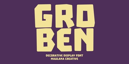 Groben is a All Caps Bouncy Sans Display font. Bold stroke, fun character with a bit of ligatures and alternates. To give you an extra creative work. Groben font support multilingual more than 100+ language. This font is good for logo design, Social media, Movie Titles, Books Titles, a short text even a long text letter and good for your secondary text font with script or serif. Make a stunning work with Groben font. Cheers, Maulana Creative
 - Isbellium Pro by No Bodoni,
$35.00 Isbellium is a sans serif version of Dick Isbell’s Americana type, designed in 1967 and the last type cut in metal by the American Type Founders Co. (ATF). Isbellium retains the large x-height, open character, wide stance and elegance of Americana, but with a quieter voice and polite authority. Isbellium is a display face with broad Latin support along with small caps, fraction support and other typographic niceties are included in the ten font family.
 - Donkeyman by Hanoded,
$15.00 A Donkeyman is a person who is in charge of a ship’s engine room. I didn’t know this, but when I was looking for a nice name for this font, I sort of stumbled upon it. Donkeyman font is quite a useful font: it is a handmade, all-caps font that comes with two sets of alternate glyphs. The alternates cycle as you type, creating a ‘random’ effect. Comes with extensive language support, including Sami and Vietnamese.
 - Salacious by PizzaDude.dk,
$18.00 Salacious is my soft/rough all-caps font, inspired by both comics and grafitti. The weight and width of the letters varies a bit. Not in a disturbing way, but more in a lively and organic way. I've added 5 (slightly) different versions of each letter (which automatically cycles as you type!) The letter shapes are a bit rough, due to the fact that they are handmade, and all corners are rounded, which gives a nice soft look!
 - Kereru by Daniel Reeve,
$20.00 Artist and calligrapher Daniel Reeve, well known for the lettering and maps in The Lord of the Rings films, is creating hand-crafted fonts of some of his writing styles - Kereru is the inaugural release, allowing users to emulate some of his much-admired calligraphy. Nominally a half-uncial style, clever arrangements of the stylistic sets allow Kereru to be set as full uncial or standard roman, as well as offering numerous alternates, ligatures, swashes and flourishes, ornaments, unlimited fractions, scientific inferiors and numeric superscript, all accessible via OpenType features. Cyrillic and Greek alphabets are included, in addition to the letters required for all the languages of Western, Central and Eastern Europe, Scandinavia and the Baltic. Kereru is very legible and easy on the eye, without sacrificing calligraphic flair. A pdf description of the Stylistic Sets and their usage is included with the font package, which comprises regular, bold and italic variations. Kereru Italic supercedes and improves upon its previous incarnation, Shire Regular. The name Kereru comes from New Zealand's Maori language - it is our native wood pigeon, a bird of generous and rounded form, like the font itself.
 - GERALDINE PERSONAL USE - Personal use only

- Witch Hazel by Missy Meyer,
$16.00 Witch Hazel has been quite a while in the making; a fun font with slightly flared serifs, lots of ligatures and alternates, and over 1150 glyphs! This font is great for holiday designs, from Valentine's Day to Halloween to Christmas! It also bridges modern and vintage styling, so you can use it for fairy tales and pirates, or for your company's branding and logo! I just couldn't stop adding more and more to this font. Witch Hazel includes: - The usual A-Z, a-z, 0-9, and tons of punctuation; - Greek uppercase letters; - Cyrillic uppercase letters; - Over 430 extended Latin characters; - Small caps; - Decorative alternates for all letters (some letters have up to 8 alternates!); - Numbers and uppercase letters with pointy spurs; - Numbers and uppercase letters with rounded spurs; - 40 two-letter ligatures! All characters are OpenType coded and PUA-encoded, so they can be accessed by all design programs. And I'm including a PDF with the full character list; you can use it for reference, or you can copy/paste directly from the PDF into your project!
 - TWT Prospero by Three Islands Press,
$24.00TWT Prospero is the kind of typeface you seldom find in blocks of continuous text these days. Similar fonts based on late-18th-century work by Bodoni, the Didots, and others tend to be reserved for display type: their exaggerated contrast and vanishing hairlines can make you squint and strain at small sizes. But TWT Prospero, with its moderate contrast and fairly robust hairlines, is impressively legible in book text while remaining ideal for use in display situations. The full family has seven styles: roman, italic, bold, bold italic, condensed roman, condensed italic, and condensed bold. - Kidyzen by Niznaztype,
$10.00 Kidyzen is a sans handwritten typeface. Inspired from the character of kids writing in their book. Kidyzen have unique style because it like same with typing of children. Kidyzen is perfect for comic, illustration, cartoon, kids design and very suitable for speech bubble text. It have very fun, cute, easy communication, easy reading and unique styles. You can use it for kids t-shirt, cover book, tagline, poster, branding, advertising, wall painting letter and graphic designs that use kids character . Kidyzen have 6 styles, there are regular, italic, bold, bold italic, thin and thin italic. Be enjoy it with my fonts.
 - Airco Std by Typofonderie,
$59.00 Designed between italic and script styles Airco is a typeface designed between italic and script styles. The letterform finish is rounded. Designed ultra slanted (27°), the shapes evoke a fast and assertive movement. The result is a human typeface, dynamic, that will visually work well in technology and sport, without ever being dry, rigid or dehumanized. The structure of the letters is influenced by Renaissance italics, at the difference that in the case of Airco, the lowercases and capitals are visually homogeneous thanks to the giants lowercases. In fact, the default numerals can be used in capital as well lowercases settings.
 - CentreForward by The Northern Block,
$12.80 CentreForward is an 8 font family consisting of 4 weights with italics. A smooth modular font that draws on ideas observed in the 1982 Football World Cup. Influential players: Paolo Rossi, Socrates, Zico & Tardelli.
 - Herron by Fontron,
$35.00Herron is a monoline Sans face with all rounded ends in Condensed and Italic, Regular and Italic, Expanded and Italic. - PIXymbols FAR Marks by Page Studio Graphics,
$39.00Aircraft marking alphabets and numerals drawn in accordance with FAR Part 45 ¤ 45.29 (c), (d), and (e) of Federal Aviation Regulations. All characters are also in EPS files. - Compiler by Identity Letters,
$39.00 Legible, technical, clear—with a hint of retro: Compiler is a no-frills font family straight from the heart of a microprocessor. Inspired by console typefaces, the humanist sans serif typeface combines a large x-height with striking serifs on certain letters such as i and l. Those serifs evoke the aesthetics of monospace typefaces for programming. Even though Compiler is a proportional typeface, this detail improves glyph recognition and helps differentiate between individual letters. Combined with vertical stroke ends, which allow for particularly even spacing, the serifs make for an extremely legible typeface. (Even in small sizes.) Brand recognition guaranteed: Compiler is ideal for applications that require a mechanical flavor without appearing offish. You can use it for websites, apps, branding, corporate design, annual reports, signage, and many other areas with perfect results. Compiler consists of two font families; the second one is Compiler Plain. In Compiler Plain, the signature letters lose their serifs and the forms of "a" and "g" are simplified. This way, the shapes are neutralized. The technical impression recedes into the background. Both families can be combined smoothly: you might use the standard Compiler fonts for display sizes and Compiler Plain styles for body copy. For total design control, you can toggle each of the defining design elements individually from Compiler to Compiler Plain and vice versa. Just use Stylistic Sets to fine-tune your Compiler fonts. Compiler provides you with 8 weights in 4 variations: Upright, Italics, Plain Upright and Plain Italics. That's a total of 32 fonts. Each style contains more than 860 glyphs, including advanced typographic tools such as proportional and tabular figures (both lining and old-style) or small caps—something you'll rarely find in this genre. Other glyphs are optimized for display sizes, such as circled figures and various arrows. There's also a set of glyphs designed for web use: with symbols for shopping carts, hamburger menus or checkboxes, you can implement your web projects elegantly and consistently without relying on third-party tools (like an external icon font). Powered by highly productive OpenType functions, Compiler is an intermedia workhorse straight from cyberspace.
 - HU Roundsans by Heummdesign,
$280.00 HURoundsans is a geometric sans serif variable typeface with matching italics. It has a variable width that adapts to your needs, pushing for maximum readability. Useful for any quirky display uses. Variable is very versatile and can be used in print or on-screen environments. It's perfect for logos, posters, titling, UI/UX design, visual identity, social media, music cover art etc. * Specifications : Files included : Variable including italics Multi-language support
 - Counte by NamelaType,
$19.00 This is our first experience of creating serif fonts. It resulted in a modern slab serif family designed with symmetrical bracketed serifs for uprights and cursive serifs for Italics. Crafted with low contrast strokes, it makes this font versatile and can be used for text and printing. Counte contains many International diacritics and OpenType Features. It consists of 9 weight, going from Thin to Black with matching italics.
 - Darwin Office by Los Andes,
$16.00 We have adapted the version of our Darwin font for use in Microsoft Office. It only has 4 variants: regular, italic, bold and bold italic. Font weights have been named in a way that can be clearly shown up in the font list in Office programs for the sake of a good hierarchy (the bold variant is quite bold and does not look the same as the original font).
 - Kiddy Kitty by Alexandra Korolkova,
$15.00 Kiddy Kitty is a soft and friendly sans-serif type family which consists of 6 upright italic and 5 italic weights. It supports Western and CE Latin and Cyrillic, and it also has some ligatures and swashes and 16 carefully drawn cat dingbats in each font. Kiddy Kitty is good for greeting cards, children's books and package design. It is designed by Vasily Biryukov with some support of Alexandra Korolkova.
 - Butterfly Wingz by Ingrimayne Type,
$5.00 IngrimayneType has put letters inside a variety of objects, including bowling pins, book covers, coffee mugs, teapots, pumpkins, Christmas ornaments, train cars, tombstones, old bottles, circles, and rectangles. In each case the letters were placed on a single shape. The use of the Opentype feature of contextual alternatives makes it easy to use two different but alternating shapes. ButterflyWingz puts its letters on the right and left wings of a butterfly. The wings provide a large surface for drawing letters, but they have a odd shape so letters must be distorted to fit. The wings are symmetrical but some letters are not, so the right and left wing versions of the same letter are sometimes quite different. Without the contextual alternative feature one could design a typeface like ButterflyWingz but the user would have to alternate upper and lower case keys. With contextual alternatives turned on, the computer automatically alternates the letters creating a line of complete butterflies. Turning on the Opentype feature stylistic styles one (ss01) replaces the empty spaces with empty wings. However, sometimes an empty wing at the end of a line is unwanted and it can be removed by changing the typeface or by turning off the stylistic style for that character. The family contains two styles, a filled style and an outline style. They can be used separately or together in layers to add color. (Empty wings are on the logicalnot and registered characters.) ButterflyWingz is hard to read and should be used in small doses for decorative effects.
 - Almanor Peninsula by Subqi Studio,
$15.00 Introducing our new font, Almanor Peninsula . Not too shabby a name, right? A display logotype script, not too bold and not too thin either. This font has been created for your sporty display projects, whatever they may be. This font contains the basic script ligature 'tt' with some necessary alternates here and there. Plus some swash for the cherry on top. This font is PUA encoded already, so you can access all the glyphs with the basic character map apps. So have fun with this one !
 - Auttera Signature by MJB Letters,
$17.00 Auttera Signature is a bold script font with a casual style and modern concept, this font has an attractive ligature and beginning and ending swash that can make the design more attractive. To enable the OpenType Stylistic alternates, you need a program that supports OpenType features such as Adobe Illustrator CS, Adobe Indesign & CorelDraw X6-X7. There are additional ways to access alternates, using Character Map (Windows), Nexus Font (Windows), Font Book (Mac) or a software program such as PopChar (for Windows and Mac).
 - Methalia by Romie Creative,
$15.00 Methalia modern script typeface. Contains a complete set of lowercase, uppercase, alternative, ligatures, punctuation, numbers and multilingual support. Work in sync with Methalia to create awesome calligraphic creations. You can use it for a variety of purposes: logos, wedding invitations, titles, signatures, t-shirts, letterheads, signage, labels, posters, etc. How to access all alternative characters, using the Windows Character Map with Photoshop: https://www.youtube.com/watch?v=Go9vacoYmBw How to access all alternative characters using Adobe Illustrator: https://www.youtube.com/watch?v=XzwjMkbB-wQ thank you
 - Wellington by Masinong Studio,
$14.00 Wellington is simple and easy to create awesome lettering. Just type your words and then you will immediately see the great results. Wellington also includes Stylistic alternatives, swashes, ligatures, initials and finals, and symbols. If you don't have a program that supports OpenType features such as Adobe Photoshop or Illustrator, you can access all the alternate glyphs using Font Book (Mac) or Character Map (Windows). If you have any question, do not hesitate to contact me by email masinong.studio@gmail.com Thanks and happy designing :-)
 - ANGELES PERSONAL USE - Personal use only

- Emoli by Arttype7,
$10.00 Emoli is a strong font family with a laid-back style. Inspired by the strong bending of iron, a unique character can be felt through controlled letterforms and blunt finishes. Each font in this family is standalone, and strong and cute. Emoli consists of ten fonts Emoli-Thin & Emoli-Thin Italic, with the thinnest complexion looks luxurious in high appearance. Emoli-Light and Emoli-Light Italic looks elegant combined with the weight of the Emoli Font family. Regular and italic emojis, the basis of emollient fonts, balance shapes, and letter uniqueness are found in this weight. Emoli Bold and Emoly Bold Italic will gently emphasize a strong character. Emoli Extra Bold and Emoli Extra Bold Italic, the thickest weights that will facilitate legibility and strong attitude. FEATURES 10 weights / Italics / Lines / Numbers & Signs Font family Emoli works well on applications, brands, logos, magazines, films. Different weights give you the full range to explore a variety of applications, while illustrated fonts give a modern, relaxed and powerful feel to any project.
 - Morris Sans by Linotype,
$40.99 Morris Sans is a newly revised and extended version of a small geometric family of typefaces originally produced by Morris Fuller Benton in 1930 for ATF. His initial design consisted of an alphabet of squared capital letters with a unique twist that characterized its appearance: corners with rounded exteriors and right-angle interiors. The types were intended for use in the fine print found on business cards, banking or financial forms, and contracts. But over the ensuing decades, this design became a popular element in all sorts of design environments, and several foundries revived the typeface in digital form. Since digital fonts are bicameral, with slots for both upper and lowercase letters, new cuts of the type opted filled the lowercase slots with small caps. In 2006, Linotype commissioned its own version of the typeface-an extension for 21st century use. Under the advisement of Linotype's type director Akira Kobayashi, Dan Reynolds redrew the uppercase and added an original lowercase for the first time. Additionally, a number of extras were brought into the fonts, including six figure styles (tabular and proportional lining figures, tabular and proportional oldstyle figures, and special tabular and proportional small cap" figures). Small caps, which have become an iconic element over time, are accessible in each font as an OpenType feature. To differentiate this version from the original, Linotype's new family is named Morris Sans, in honor of Morris Fuller Benton. All fonts in the Morris Sans family are OpenType Com fonts; they include a character set capable of setting 48 European languages that employ the Roman alphabet, including all Central and Eastern Europe languages, those from the Baltics, and Turkish. This glyph coverage extends to the small caps as well. Morris Sans is a wide typeface, especially in its regular widths; the condensed faces set a more conventional line of text. The new lowercase letters are less geometric than the uppercase, except for those that share the same basic forms (e.g., c, o, and s). Instead of following this geometric trend, the new lowercase tends to strengthen the humanist elements that were present in several characters from the original type, including the uppercase D and the figures 5, 6, and 9. Morris Sans also sports a number of glyphic flares, like the stroke found on the original uppercase Q. Morris Sans is a clean, modern design best suited for headlines, advertising, posters, expressive signage (especially on storefronts), and corporate identity work."
 - PF Das Grotesk Pro by Parachute,
$79.00 Das Grotesk was inspired by earlier nineteenth-century grotesques, but it is much more related to American gothic designs such as those by M.F. Benton. Due to their pure geometric structure, most grotesque typefaces tend to have a rather monotonous and lifeless appearance, thus failing to express the ideals of the modern creed. Das Grotesk on the other hand is a lively design with several distinguishable characteristics which attract attention when set at large sizes, whilst they become subtle and blend evenly at small sizes, fostering a neutral identity. This is a very legible and space-saving typeface with a narrow structure. It was designed with slanted curved ends and sheared terminals applied on several straight strokes. It has two-storey ‘a’ and ‘g’ but includes single-storey alternates. The family consists of 14 weights ranging from Extra Thin to Black (including true-italics). It provides simultaneous support for Latin, Cyrillic and Greek and is loaded with several advanced typographic features such as small caps. Download its complehensive PDF Specimen Manual for further details.
 - Gessetto by Resistenza,
$39.00 Gessetto is an extensive chalk font family, containing script, sans, roman, figures and ornaments. One of the things most charming about chalkboard lettering is the variation; in both texture and style. Our goal was to achieve a real chalk effect using the varied typographic genres in a digital format. With flexibility and control for the designer in mind, we built a digital chalk toolkit. The script is a fusion of Italic Roman and cursive, it contains swashy alternates for each capital letters with some long and extended flair on some ascendent and descendent letters. An all caps high contrast sans is in 5 complimentary styles. The Roman is precisely proportioned and maintains elegance while being bold. There is a set of Figures and ornaments. Gessetto is perfect to grab attention on signage, print advertising and editorial applications like book covers, but suits branding applications too. The diverse styles and subtle handcrafted textures in this display type family will well serve any designer looking for the authentic chalkboard aesthetic. We recommend to combine Timberline with: Turquoise
 - Yalta Sans by Linotype,
$29.00 Yalta Sans combines the warmth of a traditional humanist design, the clarity of a grotesque and the modernity of a square sans. Several design traits contribute to this melding of diverse typographic concepts. Characters find their foundation in stroke-based shapes rather than constructed forms. Curve stokes are also slightly squared and counters are open. Curved strokes join verticals at nearly right angles to create a strong horizontal stress, aiding the reading process. The resulting design is exceptionally legible while still inviting. Although Yalta Sans is clearly differentiated from its calligraphic ancestors, many details of the design emulate the distinctive characteristics of typefaces from the Renaissance. Tapering horizontal stokes also give Yalta Sans a dynamic relationship with linear grotesque while its angled stroke terminals echo the work of a calligraphic brush Yalta Sans italics are cursive designs that are in keeping with humanistic letterforms and are markedly narrower than the Roman characters. Lining and old style figures, small caps and a suite of ligatures also make for a remarkably versatile typeface family.
 - Another Grotesk by Aleksandrs Golubovs,
$32.00 Another Grotesk is a contemporary typeface that was inspired by the early grotesques. Upon closer inspection you will notice the terminals of some of the characters are slightly turned inwards, this detail gives Another Grotesk its distinctive and friendly personality. Another Grotesk is functional and has been crafted with a great attention to detail. It is available in 9 weights and two optical sizes with matching italics which adds up to 36 styles. Another Grotesk Text family has been carefully redesigned some of the details were removed and simplified, x-height increased, and ink traps added, but preserved the overall look and feel of the display version, to ensure a greater legibility and clarity in running text. The extensive language support allows type setting in more than 200 languages across Latin, Cyrillic and Greek scripts. Another Grotesk also includes small caps and punctuation, tabular and old-style figures, as well as case sensitive feature and offers stylistic alternates for K, a, g, and y to fulfil any creative need of a designer.
 - Plantin by Monotype,
$29.99 Plantin is a Renaissance Roman as seen through a late–industrial-revolution paradigm. Its forms aim to celebrate fine sixteenth century book typography with the requirements of mechanized typesetting and mass production in mind. How did this anomalous design come about? In 1912 Frank Hinman Pierpont of English Monotype visited the Plantin-Moretus Museum in Antwerp, returning home with “knowledge, hundreds of photographs, and a stack of antique typeset specimens including a few examples of Robert Granjon’s.” Together with Fritz Stelzer of the Monotype Drawing Office, Pierpont took one of these overinked proofs taken from worn type to use as the basis of a new text face for machine composition. Body text set in Plantin produces a dark, rich texture that’s suited to editorial and book work, though it also performs its tasks on screen with ease. Its historical roots lend the message it sets a sense of gravity and authenticity. The family covers four text weights complete with italics, with four condensed headline styles and a caps-only titling cut. Plantin font field guide including best practices, font pairings and alternatives.
 - Akko Paneuropean by Linotype,
$79.00The Akko typeface family is the first new design from Akira Kobayashi in a very long time - and it is well worth the wait. Picture an industrial strength typeface like the Isonorm™ design. Now blend this with an organic design like the Cooper Black™ typeface. It was the idea of the fusion of these two design concepts that inspired Kobayashi to draw Akko. „My initial idea was to create a sanserif type with a ‚soft-focus‘ effect,“ says Kobayashi. „From here, the design evolved into two families, the robust and structured sanserif Akko and soft and friendly Akko Rounded.“ Akko has a wide range of weights, with options including complementary italics and a new Condensed range. The Akko typeface family is available as a suite of OpenType™ Pro fonts, allowing for the automatic insertion of small caps, ligatures and alternate characters. Pro fonts also offer an extended character set supporting most Central European and many Eastern European languages. And new Paneuropean versions introduce support for Cyrillic and Greek. - Larsseit by Type Dynamic,
$37.00 Larsseit is a sans which mixes a very low contrast and classical proportions. Larsseit emphasizes cleanliness, readability and objectivity. The Larsseit family includes 6 weights, from UltraThin to Black, with their corresponding italics and Small Caps. Each font includes OpenType Features such as Proportional Figures, Tabular Figures, Numerators, Superscripts, Denominators, Scientific Inferiors, Subscript, Ordinals, Ligatures and Fractions. Larsseit family supports Latin and Cyrillic, all these languages are covered: Latin language support: Afrikaans, Albanian, Asturian, Azeri, Basque, Bosnian, Breton, Bulgarian, Catalan, Cornish, Corsican, Croatian, Czech, Danish, Dutch, English, Esperanto, Estonian, Faroese, Filipino, Finnish, Flemish, French, Frisian, Friulian, Gaelic, Galician, German, Greenlandic, Hungarian, Icelandic, Indonesian, Irish, Italian, Kurdish, Latin, Latvian, Lithuanian, Luxembourgish, Malagasy, Malay, Maltese, Maori, Moldavian, Norwegian, Occitan, Polish, Portuguese, Provençal, Romanian, Romansch, Saami, Samoan, Scots, Scottish, Serbian, Slovak, Slovenian, Spanish, Swahili, Swedish, Tagalog, Turkish, Walloon, Welsh, Wolof Cyrillic language support: Adyghe, Avar, Belarusian, Bulgarian, Buryat, Chechen, Erzya, Ingush, Kabardian, Kalmyk, Karachay-Balkar, Karakalpak, Kazakh, Komi, Kyrgyz, Lak, Macedonian, Moldovan, Mongol, Permyak, Russian, Rusyn, Serbian, Tatar, Tofa, Tuvan, Ukrainian, Uzbek
 - Ouido by Hanken Design Co.,
$30.00 The Ouido typeface has tastefully narrow characters with enough default spacing for comfortable reading at small sizes. Equipped with features like letter-spaced small caps and conservatively drawn italics for emphasizing words that maintain the reading speed—providing the reader a pleasant overall experience. Ouido (pronounced as “widow”) is derived from the Portuguese word OUVIR which means to hear or to listen. Ouido refers to the ability to play a song on any musical instrument after listening to it a couple of times and without reading the notes. The Ouido typeface is a modernized nostalgia for music enthusiasts, a whimsical revamp of the classic serif font. It bears resemblance with printed classical music scores, characterized by each letter’s rounded strokes like how one drew clefs with passion. Each dot is a twin of the quarter note minus the stem, so weaving sentences together could feel like composing a melody. Inspired by the astounding phenomenon of absolute pitch, the visual appeal of this typeface may hone your imaginative ability to embellish your creation without needing a reference.
 - Internacional by Los Andes,
$26.00 Internacional, inspired by the International Style, is a Latin American-flavored neo-grotesque sans serif typeface made with organic ingredients and sweetened with organic sugar and chocolate. Internacional is well-suited for corporate identity, branding, publishing projects, logotypes, magazines and advertising. Its large x-height and small difference between x-height and cap-height make it a high-impact font, ideal for powerful headings, while providing legibility. Internacional was designed for use with short and mid-length paragraphs that require a balanced type color. Internacional is an extended width font with rounded forms and angled terminal ends, in characters such as “c” or “a”, which make it suitable for use in advertising and branding. The proportional relation in height between uppercase and lowercase letters may be useful when composing text in German language. The Internacional font family comes in 7 weights with matching italics and includes an alternative version, with the same number of styles, yet it tastes differently. Special thanks to everyone in the Latinotype Team (especially to Rodrigo Fuenzalida) for their support, help with corrections and digital editing.

